TagAid

Standard

Marathons, half-marathons and Triathlons.
Huge gatherings of people that comes together to be active.
For most people it’s an event to prove or improve psychical abilities, and this can differ from each person. Today, the most common monitoring system of each runner is RFID tags, which monitors your time during the run
But there is a lot of things under the surface to a great performance. The goal with TagAid is to explore the indicators to a great run, and replace the RFID tags with a more in-depth device with the same wearable features.

Wearable technologies has entered a phase of huge improvement, and the abilities to implement technology into textile is now used in many cases around the world.
TagAid can take advances of some of these techniques, and monitor four indicators during the run:

1. Blood pressure
2. Pulse
3. Temperature
4. GPS tracking

This information will be transmitted through a WIFI network, and the end result will be a tracking software for the medical staff and statistics available to each runner on an online platform. This way possible dangers can be detected by the medical staff and results can be universally enjoyed be every participant.
But it’s not always about the psychical abilities, but psychological features can often be very significant. The TagAid will try to improve these features by taking use of Ghost running. Ghost running is proven to be a very useful tool to improve the motivation during a run (see article below). The Ghosts
pace will be adjusted according to the data that is dynamically collected.

The core goals of the TagAid product is achievable as a wearable technology, but in order to become a success, people should be comfortable wearing it. The idea, that is a working process, is to have the technology implemented as a compression sleeve on the arm of the runner. This even opens up opportunities to have a display or at least more information displayed during the run.

  • Bio-metric sensors
  • Thermocouple
  • Magnetic Strip
  • Strain Sensors
  • Galvanic skin response
  • Muscle sensor
  • Heart rate sensors
  • GPS
  • RFID


Questions:

Why would people start wearing these if they weren’t athletes.

How would it benefit them as regular runners and as competitive runners.


Things that we would be working on this coming week is to run our surveys, gather more information from marathon runners and create user personas to design for.


http://uk.businessinsider.com/nike-track-race-led-ghost-yourself-manila-philippines-interactive-running-shoe-foot-lap-2017-5/?IR=T

New Hydration Technology to Be Worn by Boston Marathon Participants for the First Time

https://www.nature.com/news/wearable-sweat-sensor-paves-way-for-real-time-analysis-of-body-chemistry-1.19254


https://www.phillyvoice.com/ghost-race-virtual-run-schuylkill-river-trail-lululemon/

Future World // Art Science Museum // Week 6:Field Trip Write up

Standard

“teamLab is an art collective, interdisciplinary group of ultratechnologists whose collaborative practice seeks to navigate the confluence of art, science, technology, design and the natural world. Various specialists such as artists, programmers, engineers, CG animators, mathematicians and architects form teamLab is an art collective, interdisciplinary group of ultratechnologists whose collaborative practice seeks to navigate the confluence of art, science, technology, design and the natural world. Various specialists such as artists, programmers, engineers, CG animators, mathematicians and architects form teamLab”


teamLabs to me is an ambitious collective of people that come together to create experiences that artists themselves cannot deliver. The brains of design has to match the technologies behind to deliver this experience, and if anything less that what we have experienced. It has to be immersive and yet showcase the advancements of technology technology of today, if not it would fall quite short, and this is where they really excel.


The exhibit’s first section is a combination of a few of their pieces, they are so blended together that it is hard to tell them apart.

https://www.teamlab.art/w/butterflies_ephemerallife_people/

https://www.teamlab.art/w/waterparticles-transcending/

https://www.teamlab.art/w/flowerandpeople-transcendingboundaries/

These are the 3 exhibits that were once on their own , now combined, I guess its also a play on the boundary theme


One of the things i noticed is that the projections are of certain low resolutions, however the projections appear vibrant and clear using digital lenses. Its one way that pictures really pop out. One reason i could think about is reducing the graphical load on the processors or the graphic cards that they use, but on the other hand create stunning photos for the visitors to see.

The signature model of exhibit by teamLabs uses combinations of sensors, projectors, screens as well as speakers for sounds.

They often create experiences for sight and sounds as the core primary senses with a touch of interactivity.

The sounds composed and created for the exhibits throughout is a very good take on how much detail they place in the exhibition. The rooms must have been surveyed for sound , and the set up is deliberately balanced throughout the entire room to create this seamless experience throughout the room. The scores and music development created has a surreal sense to them and it feels almost that you are transported into another reality

Colours on the other hand are vibrant and this makes a whole world of difference, their choices of colours really influences the moods and emotions very well.


Here are some of the other photos from the exhibition.


https://www.teamlab.art/w/100yearssea_100yearsData

100 years sea is one of their work that also stands out to me, it is a representation of the sea in which they represented 100 years of sea level data into a video. The best part of it is that the video’s run time is a 100 years and it does not discount or shorten it. The purpose is a statement to the rising sea levels, to actually experience the changes, it also invites the visitor to come back to the exhibit over and over again, to compare their personal experiences.

Their methodology is not about the technology, its the story and creating the empathy for it, to create the . Technology is a must , but not the focus

A good video to watch is  https://www.bloomberg.com/news/videos/2017-11-28/takahiro-iwasaki-on-brilliant-ideas-video on really understanding what they do and operate and their intentions.

What they do can be considered as art by some, but with all projects and bids, to me teamLabs have created their own genre of “art” as their take on even the client’s request are very distinguishable. One look and you would know that their pieces are done by them. The distinction is not relevant at all, the closest thing that i can think about calling it a “commercial work” is the same as commissioning an art piece.

The methods, feel, standards and visual identity of the works do not change, and in its own sense, their work brings about commercial value to their clients as they do attract the crowds that then bring about the traffic or attention they need.

Way Finding ADM// Week 3 Assignment

Standard

For this assignment we made the approached it by putting ourselves in the shoes of a student trying to find his/her way to b1-17. The journey would showcase the problems that we face with way finding in ADM.

We each took a entry point to the basement and documented our path finding towards the room

Beyond the open space, the classroom was easy to find as the pathway was wide and classroom linear.

Donald A. Norman // Chapter 1: The Psychopathology of Everyday Things // Week 1-2 Reading Response

Standard

Good designs are designs that you take for granted. The biggest take away from this reading is this. Good design often goes unnoticed , while bad ones usually get the most limelight.

Its the little things that designers must pay attention to in order for good design, its always good to put yourself in the position of your user, they do not understand the things that you do, and that not everything is about aesthetics.

Discoverability, is the learning process that the product has. The learning curve of the product, its components and likewise

Understanding is the pre-knowledge that comes with experience, certain signs and designs that reminds you of it’s function.

And with complex devices with more and more functions coming together , we do indeed have the need for instruction or certain levels of guidance, but inevitably i feel that sometimes what is lost from the designer to the person with the product is the loss of the transference of intention . Designers and their teams would set certain expectations and considerations, which should be expressed through the design. However , when there is no base of comparison, how are we to then appreciate these considerations. One of the examples would be the aluminium textures engineered for the macbook, however unseeming it is, one would only appreciate the tactile skin like feeling only when you read or watch their videos featuring them. If you have not used any other kinds of laptops , you would then never appreciate the subtle differences and efforts placed into this feature.

Image result for apple aluminium macbook

Design is inevitably a give and take issue, the balancing of trade-offs, and with every consideration to features, affordability and form. And thats why design is hard, because you can never please everyone. However, i feel a big change that considerations should be showcased, to let us appreciate the everyday product. And the psychopathology and reception of good and bad design would then greatly differ.

Jan Chipchase : You are what you carry // Week 4 Reading response

Standard

You are what you carry best illustrates the conditions in which our current day situations influences the important items in our lives. The three items, the wallet, keys and mobile phone each represents a different need in which best describes the needs of an urbanite.

However as they have pointed out, as technology continuously progresses, everything is increasingly becoming less intangible. About 4 years ago, the lightest I would travel would be my identity card, credit card and my phone. And looking at today, all I really need is my phone. Even the hardest of things to prove such as identity can now be squeezed into your phone, though fingerprint and facial recognition. Even systems such as governmental bodies and private establishments such as shops and service providers as slow to catch on to implementation. You’ll still need your physical identifications in some situations.

The chapter then moves forward in expressing and presenting our needs in the different levels of importance and our behaviors surrounding them. This to me is interesting as most of these items do not actually have a object value to me, I could do without them, but i cant do without their function. The importance of usage is more important and the only pain is the inconvenience and cost of losing these item. More and more redundancies are in place, such as a cloud backup of your phone data and fingerprint locks.

I am however excited to see where does all these improvements in technology take us, to reduce the physical value of this to of nothing for everyone else, to put away the risk of theft and the benefits of it as a motivation. Which then in turn will make our society a much better place.

However certain things are irreplaceable, from the inhaler you need in a event of an asthma attack to the bottle of water you need to carry. These are the things that I feel really stand out, and are they inevitably are the things you carry that defines you.

A study on predominant ‘accents’ of Aesthetics

Standard


Lecture 2 introduced and discussed the 3 main ergonomics that large influence the form factor of products. They are main function , human factors and emotion.

The 3 main characteristics are are inter changeable and may or may not even skew to one single characteristic.

Below i would like to share 3 products that I feel are dominant in the accents that influence their form factors.

Blendtec Blender

The Blendtec blender line has always been marketed as a powerful professional kitchen line of blenders that can be utilised in any type of kitchen.  It’s function is simple, it is to blend and breakdown anything you put in the blender.

Therefore, in my opinion, the function and usability of the  blender largely affects its form factor, from the simple body design to the easy to use one touch and one screen design to the simple over all shape of the container and lid.


Polaris Slingshot


The Polaris Slingshot, a powerful 3-wheeled vehicle that retails for USD$20,000 is a vehicle that will make you feel like Batman. It is designed to give you the hype and thrill of an open vehicle, no windscreen, no doors, and certainly no roof. It’s puppy rear wheel also ensures that the vehicle does not commit to a straight path and is also able to handle extreme corners very well.

It’s emotion driven, a vehicle that makes the user feel good from the thrill of riding in it such a unconventional experience that no car or bike can offer on the road.

Its low body, bucket chairs and sleek removable hood to it’s striking colours are all testament to how emotion played a major roll to it’s form factor.


Ipanema Thing U

What happens when Philippe Starck Made slippers? Thing U is what happens when Phillipe Starck’s french brand of simple inventive design meets slippers. Targetted to represent high elegance paired with minimalism , i felt that the form design of these slippers greatly attributes to the Human factors. This is supported by the elegant design of the single strap that complements the bead located infront of the flipflop.


Naoto Fukasawa

Standard

The artist I most identify with is Naoto Fukasawa.

I am able to connect with the use of curves in his simplistic designs. His designs are simple and shares a sense of thoughtfulness to the user experience that is intuitive and yet not flashy at the same time.

Humidifier by Fukasawa

ZINE // Static Process

Standard

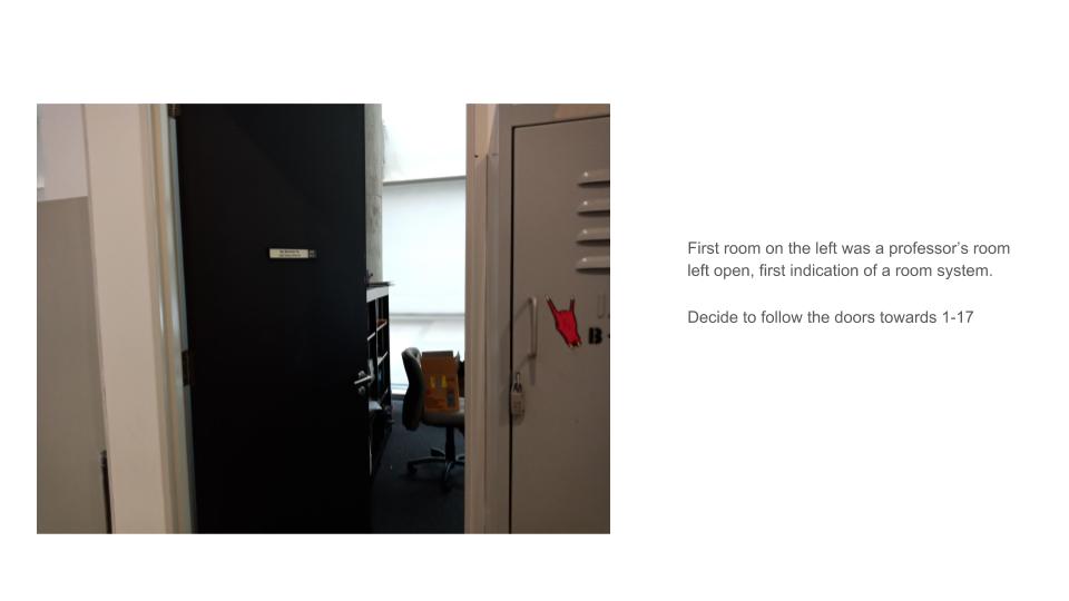
I approached the final project wanting to explore doing an experimental styled zine.


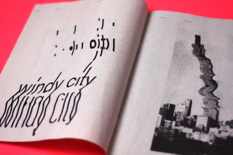
Sofia Clausse– Chicago zine

Adriana Crespo-Poster for International Zine Month

From my initial visual research, experimental zines tend to showcase some similar design elements which i have come to appreciate alot.

  • Experimental zines tend to be monochrome in colour choices, or use colours with high contrasts.
  • Similarly they have very extreme styles with either very hard, clean edges or a very raw approach to them, mostly handwritten brush strokes with very textured use of edges and patterns
  • They are thought provoking and usually try to express a particular viewpoint of the artist. ( If not they are just really visually interesting )

From this I attempted to come up with a zine that deals with us being a speck in the entirety of this world  and society and how irrelevant we are.


Like cogs to a machine.
Dragging, mundane.
Monotonous, lonesome soul.

Yet we despise the 
Static.
&the Fear of blending in.

A spark of madness.      
A false positive.
However, eventually like others.
We all will fade into the static.

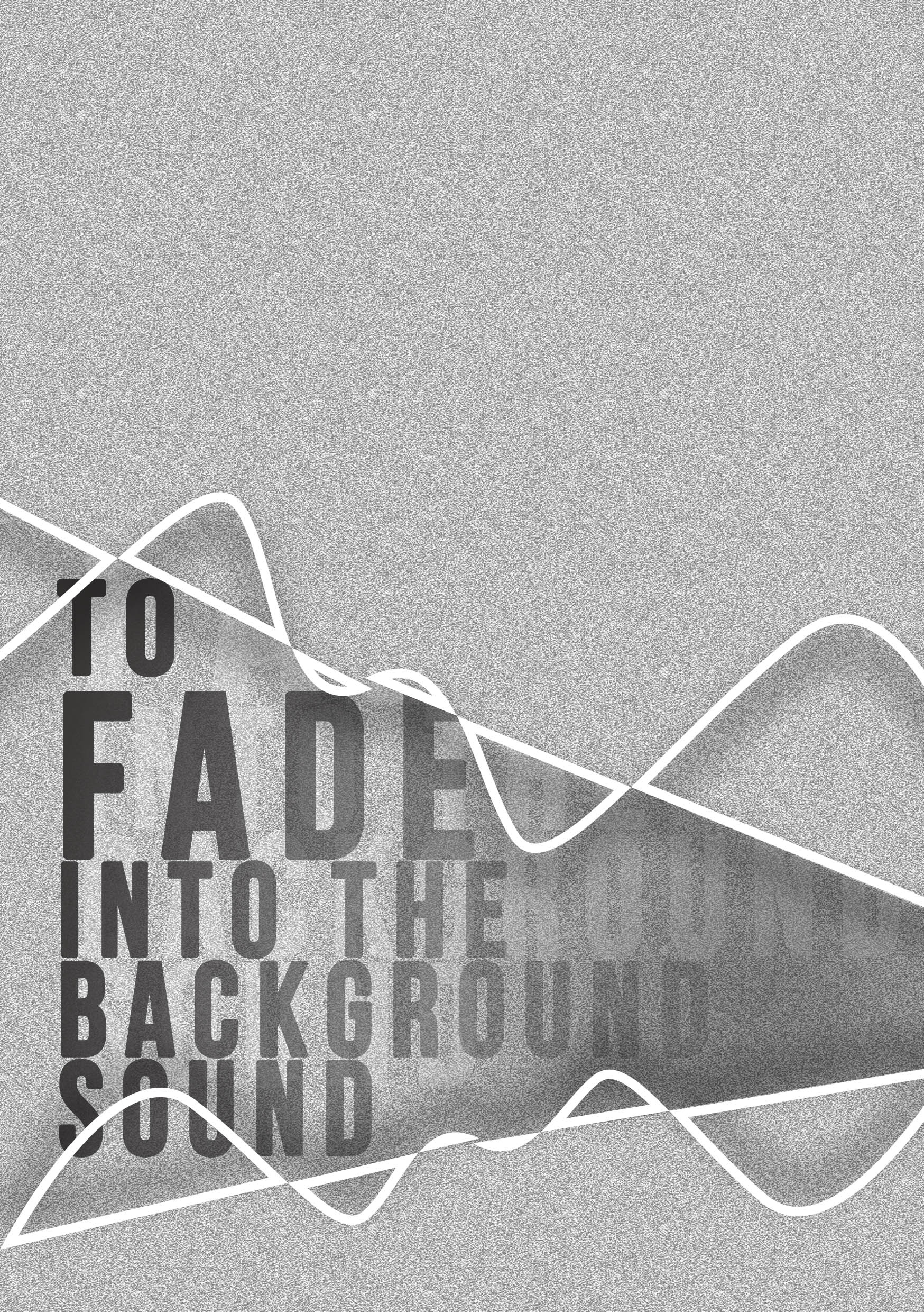
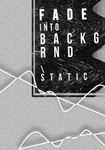
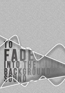
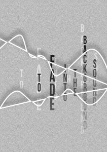
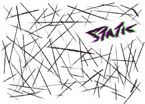
The initial cover was started on first , and although it took much more effort than the one chosen for the final zine, The cover helped conceptualise the overall feel and style of the whole zine. 

The first 3 designs were based around the play of static versus the use of the term background sound. I expressed the cover in different styles and methods to try to bring out the title much clearer and eye catching as it is ultimately the cover that would entice an individual to pick up a particular publication or zine for this case .

To fade into the background sound3    To fade into the background sound2     To fade into the background sound


Later part of my design process, I then standardised the whole concept and used static throughout the whole zine and thus created a logo to represent this.

Hand drawn in illustrator, the edges of the font was made to resemble somewhat the feel and look of distortion of sound/static. And with the use of a Red and green layer, I applied what I have learnt through the gestalt theory to create somewhat of a blur motion effect.staticrgb blur

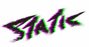
Later on, each brush strokes were individually drawn in on the cover to show  the feel of chaos and static, to bring about movement in the whole front cover. Line weight and type is varied also, taking note of things I’ve learnt from 2D’s Sem1’s first project.

static2

Monotone colours were used through the whole composition except for one element which is the logo. This sudden introduction of colour in the composition is targeted the bring the audience focus the element I have selected and the style is used throughout the rest of the following spreads.

Overall the final grey grained texture paper was utilized to accentuate the raw feeling of the whole zine, although a clean white paper would give the greatest contrast with the montone scheme.
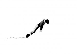


Spread1

Like cogs to a machine.
Dragging, mundane.
Monotonous, lonesome soul.

Trying to bring out the whole feel of dragging your feet and soul over the course of a whole day.

I made use of a graphic of a man that seems to be pulled and is dragging his feet across the spread.

bnwfeetdragging asdasd

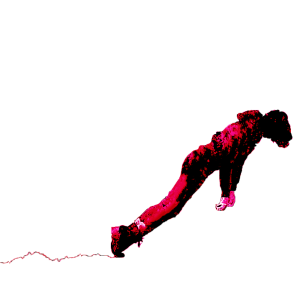
The use of monochrome is to add on to bring out this dull , colourless life. On the other hand, colouring one figure red helps to draw the attention of the whole page the section, it also act as an anchor on the page drawing readers attention to it as well as attempts to allow the reader to identify with particular figure and to picture themselves in his place.

The use of grainy wave-like textures also helped play a part to give movement to the spread. It acts as both a signifier to the current of life that slowly bring us along life, the major direction of the waves also complements the direction implied of the figures travelling too.

2dsem2finalspread2

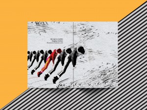
The use of the waves to frame an empty space to include the text , gives clear space and the location right above the coloured figure also helps draw the reader to the text.
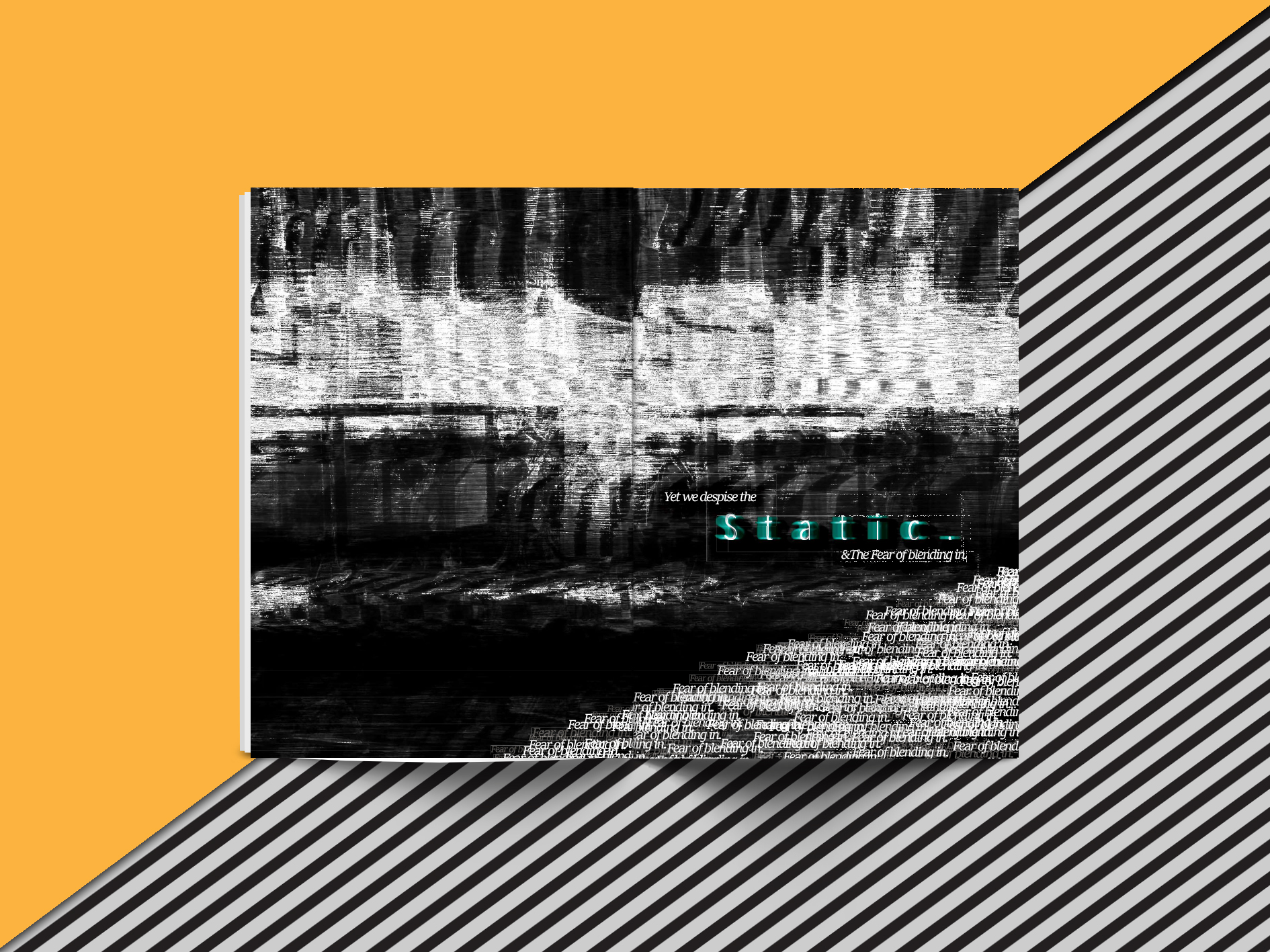
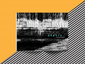

SPREAD2
Yet we despise the 
Static.
&the Fear of blending in.

In this spread I layered 3 different textures together to create my background, by using a darker background compared with the first spread,followed by the last spread also being mostly white it creates a more interesting overall scheme .

Similar to the front cover, one element was chosen to be highlighted in which is the word static.

The use of the textures to frame the words is also used here in this spread . However the main focus is brought over the the right hand side of the spread. On the bottom right hand corner is then a clever play of words , fear of blending in . By creating a texture through the use of repetition, relieving something I have learnt in the rhyme project last semester as well. The texts are of different font sizes as well as opacity to create a certain depth as well.
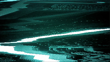
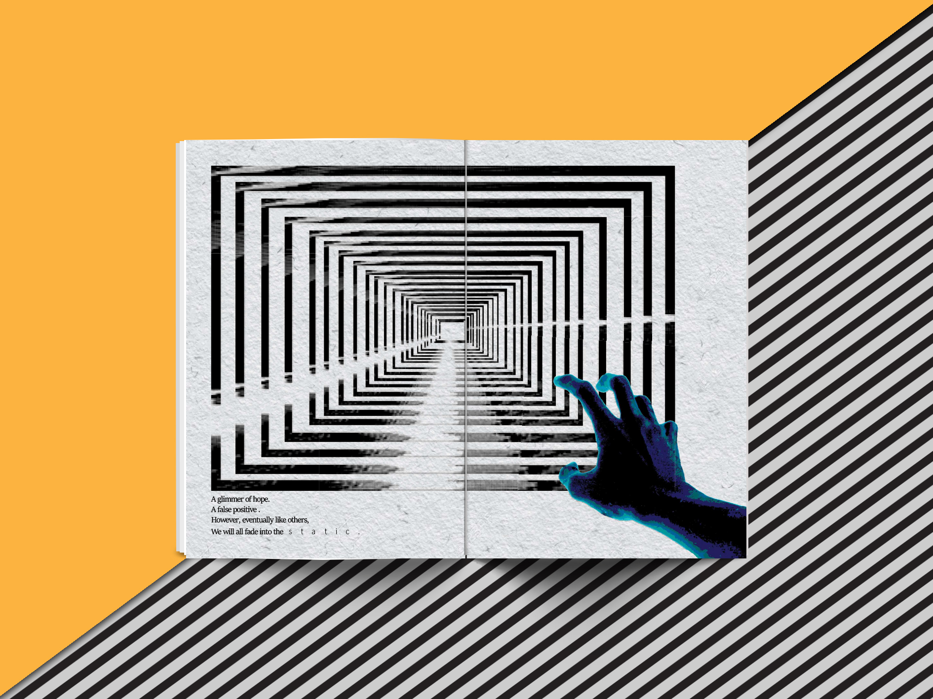
2dsem2finalspread3


SPREAD3

A spark of madness.      
A false positive.
However, eventually like others.
We all will fade into the static.

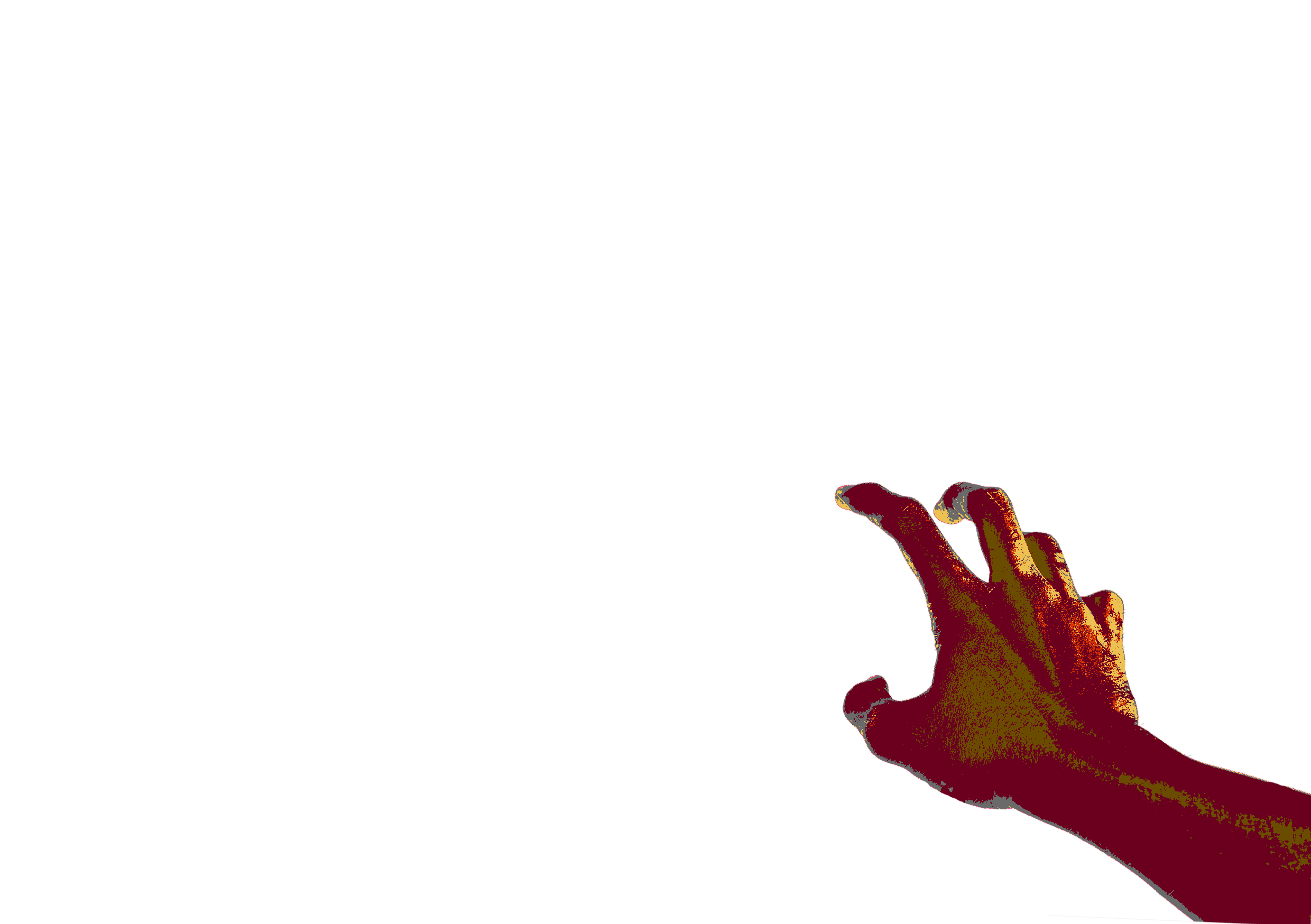
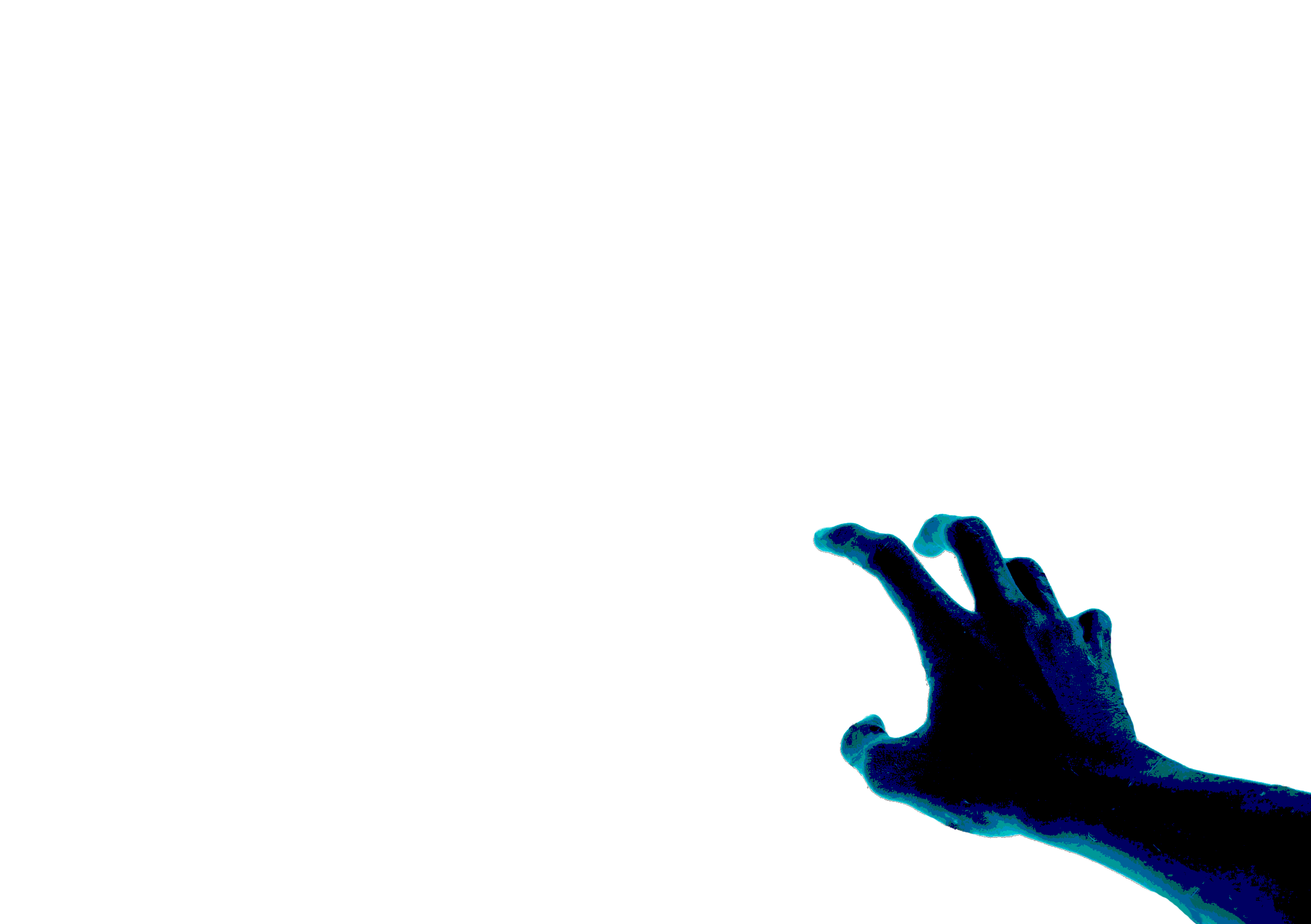
The last spread is an attempt to illustrate the final 4 verses of my writing by attempting to use one of gestalt principles again to create some what of a pull of gaze through the multiple repetitive frames .

tv_static tv_statdddic

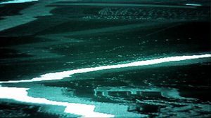
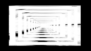
The frames were created from the use of the TV static rotated , duplicated and then blended in. A slight change in alignment of the frames in the middle also changes how you look at the whole composition as you focus towards the middle, as it will now seem to be extruding towards you like a top down pyramid view .

handreachingout1 handreachingout1blue handreachingoutblue

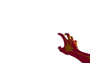
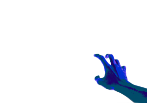
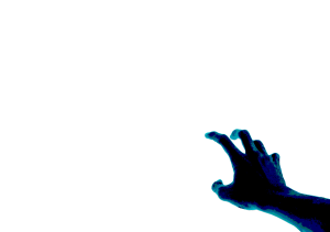
The colours , shades and number posterized levels are being experimented on, and to give off a creepier vibe a hand with a darker core shadow with high contrasts of light blue highlights was used2dsem2finalspread4

Finally after arranging the two graphics at an off center arrangement, the text was placed flushed to the edge of the frames also makes it easy to locate the text and to read it as well.


Overall I had much fun with the zine project and I really wanted to bring forward and showcase what I have gained from the whole year of 2D into this Zine .

What could be improved however, is that my initial wish was that the whole zine was hand drawn and digitized was not fulfilled and I should have pushed myself harder in this area. More exploration in paper type , quality and size as well printing and bookbinding techniques as I was not totally satisfied with the final print as the gsm of the paper was too thick.