


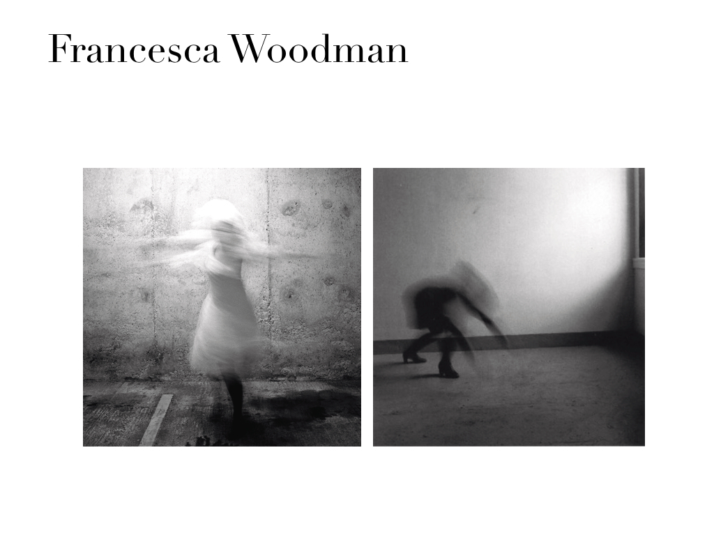


Documenting The Abstract: Emotions, Vulnerability, Self/Soul
Leave a reply


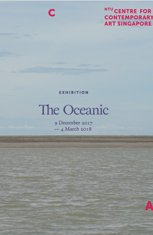
The Oceanic: A Voyage Into The Geopolitical And Biophysical Of The Pacific
The Oceanic is an exhibition that features contributions by 12 artists, presenting works that propose an urgency of looking at the ocean as a crucial aspect of our conversations surrounding the environment.
“Why should communities who only contribute one per cent of the global footprint be among the first ones to be fatally affected by the rise of sea levels caused by global warming?”
This exhibition presents a lot of works through a very factual, matter-of-fact method through visual data and artefacts rather than artistic approaches/responses. In this sense, the exhibition serves almost like a museum of documents be it through the angle of environmental, economic or socio-political concerns.
In this post, I will be going through three different works or strategies used throughout the exhibition that I am intrigued by and might find useful in my own documentary project plans.

When one enters the exhibition, one is immediately greeted by the neon blue of Tue Greenfort’s jellyfish aquarium exhibition. The intention of presenting live jellyfish is to “reference ways in which jellyfish might have migrated into new geographical waters due to the warming of ocean temperatures.” The installation aimed to mimic conditions compulsory to sustain life forms.
One thing I noticed about The Oceanic is that wall texts accompanying works often forgo context altogether. I would consider this to be an artistic decision as it leaves the audience to piece their own thoughts instead of being told what to think.
While the intended meaning behind Tamoya Obboya might have been lost on me (if not for the provided text in the exhibition guide), I found the presentation of live jellyfish in an exhibition that talked about the negative impacts of human intervention of the ocean ironic and effective.
Most of us would not know what we would have done or lost or the severity of our own actions until these questions are being brought up right before our own eyes. This installation by Tue Greenfort made me wonder about whether it was necessary or even ethical to remove the jellyfish out of their natural environments in the name of “art” but then again, it served its purpose in showing how humans would do just about anything to serve our own agendas.

2. (Untitled) Nimoa and Me: Kiriwana Notes by Newell Harry
As somebody who is not very well acquainted with documentary work, I found Newell Harry’s Black and white series while he was in Kiriwana to be completely understated. Amidst all of the works presented throughout The Oceanic, I found this body of work to be the most engaging. His treatment in pairing black and white “straight” photography with texts of his experiences presents the work to be agenda-less and in a sense, “pure” documentary. I would not doubt the authenticity of these images or his experiences and just consume them as they are.

It made me think about the nature of documentary-style photography and the implications of “straight” photography aesthetics. What if these images were actually staged? What if some of the images presented were not even taken in Kiriwana in the first place? What if some of the experiences in his texts never happened? Would we just consume them anyway as the truth merely because we associate the visuals of documentary with such vocabulary?

3. Documentations from Fiji, July 2017 by Kristy H.A Kang
In contrast to Newell Harry’s Nimoa and Me series, Kristy’s H.A Kang’s photographic documents are almost snapshot-like, lacking the impressive compositions and breath taking tonality present in Newell Harry’s black and white photographs. Not necessarily a negative thing, just different.
However, I find these two images below to be strong on their own and I felt were stand outs in her series of images.

Throughout the exhibition there was this unspoken binary between impacts of colonialism/modernism/globalisation vs culture/environment/conservation but in these two images I see a harmony of both.
We see Mother Mary & Jesus, a belief system, brought over via colonisation placed together with traditional Fiji tapestry and then you also see a collage of photographs placed on top of tapestry creating an image of modernism in harmony with conservation of culture.
During the Convening, I recalled Maureen Penjueli declaring during the Short Provocations session that her people have resisted before and they will continue resisting and I found the quality of this powerful declaration existing in these two images produced by Kristy Kang.
Reflections
There’s a little bit of everything for everyone at The Oceanic and I think one thing that I like about it is that it does not pretend to be anything that it is not. I do enjoy the clinical treatment quite a bit as it leaves the audience to think for themselves and I guess that should be one thing that documentary work should do.
I am still very much intrigued by the language of documentary visuals and how we would take the visuals as the truth and I think this is something I would like to explore in my own project.
 Image 1. Rooftop view over West Coast, on a 40mm lens.

Image 2. Canted Angle Shot of Rooftop View Over West Coast, on an 80mm.

Image 3. Rooftop View over West Coast while camera moves, at 1/15 secs, F16.

Image 1 : Choose one colour and shoot at minimum one film with only monochrome images

Image 2: Shoot an image with an additional colour, contrasting or in harmony.

Image 1. Sim Lim Square
This image was taken in an alley of shops in Sim Lim Square. This alley was lit by light coming in from where I was standing. I really enjoyed the quality of ambient lighting the signs from the shops provided here.

Image 2. Sim Lim Square
I went closer to the man in the previous image as he seemed like the only person that was there. I decided to make this image as I really liked the reflection of the neon sign in the glass doors. I noticed that the light coming in from outdoors had a blue-ish quality to it. This was around 5.30pm or so.

Image 3. Stairway To Heavenly Gifts
This was taken at around 5.45pm, also at Sim Lim Square. I was attracted to this scene as there was a fluorescent light bulb lit up even though the day was not very dark yet.

Image 4. Kopitiam Tings
This image was taken around 6pm. Again, there was a blue-ish quality to the light coming from outdoors. I was pretty surprised as I had expected a warmer quality of light during a supposed golden hour.

Image 5. Blue Is The Warmest Colour
This was taken around 6.30pm. I was drawn to the golden light on the edges of the building which added a nice touch to a scene of the blue building against a blue sky.
Conclusion
This exercise made me a lot more aware about available lighting and the different moods associated with the different colours of light. Perhaps I’m projecting but I felt there was a certain sense of melancholy with the light emitted from the neon signs within Sim Lim Square, despite red being associated as a colour of life. This mood seemed to continue as I shot during the golden hour.


We recently visited the Ecopark nearby school for a photo trip. It was a bright sunny afternoon and we had our hands on the medium format cameras. The photos above were taken using a Hasselblad and a roll of a Kodak Portra 120mm. During the trip, Elke guided me on how to take portraits. She also showed me how different an image can turn out using an 80mm and a 120mm lens on the Hasselblad.
Though this was supposed to be an assignment in which we exercised our vision to seeing monochromatic colour schemes, I was too excited to try out the medium format camera and shot whatever came to mind naturally. I was pretty amazed at the crispness of the images and the details present as compared to shooting using a 35mm camera.

Above is a picture of my dad’s brother from the early 90’s! I had chosen this picture because I thought it had a very endearing quality that can be found in family photo albums. I was drawn to the harsh shadow caused by the flash and the subject being out of focus, both of which were probably unintentional decisions.
With these two qualities in mind, I went ahead to recreate the image of my uncle with my sister. The image below is the result of the recreation.

The image turned out to be a lot more in focus as compared to the original. This could have been a result in the difference of lenses used. I used a Vivitar flash to recreate the flash and I had shot this during the late afternoon with a bit of side lighting coming in from the kitchen.
As it was my first time using an external flash, it worried me a little bit when I first saw the negative. I thought that my images were exposed to light leaks.

I shot this at an exposure of 1/60s at F1.8. When I asked around, my classmates told me that the black bar could have been a result of the shutter not going fast enough in comparison to the flash. This was a fun assignment and it made me more excited to get better acquainted with the mechanics and available tools for the analogue camera!