Recent Posts
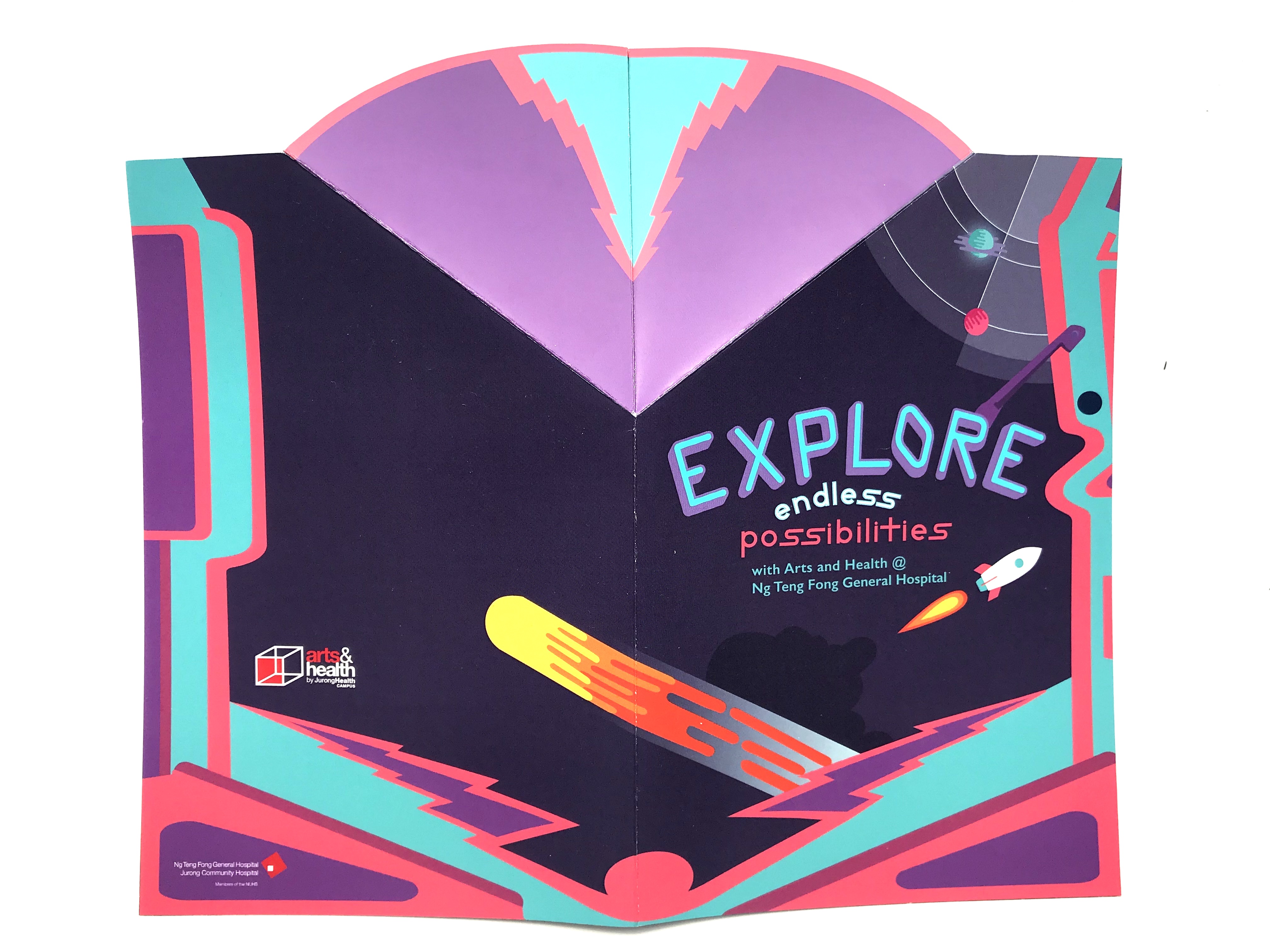
Project 3: Final design

In the final design, I decrease my text point size to 10 points for body text and 12 points for headers. Also, to emphasise on the various headers, I encapsulate them in a bubble. Next, I scaled down the images to increase my margins to provide more ‘breathing space’ and to avoid the ‘slap on’ feel, I rounded the corners Read more →
Project 3: Designs refinements

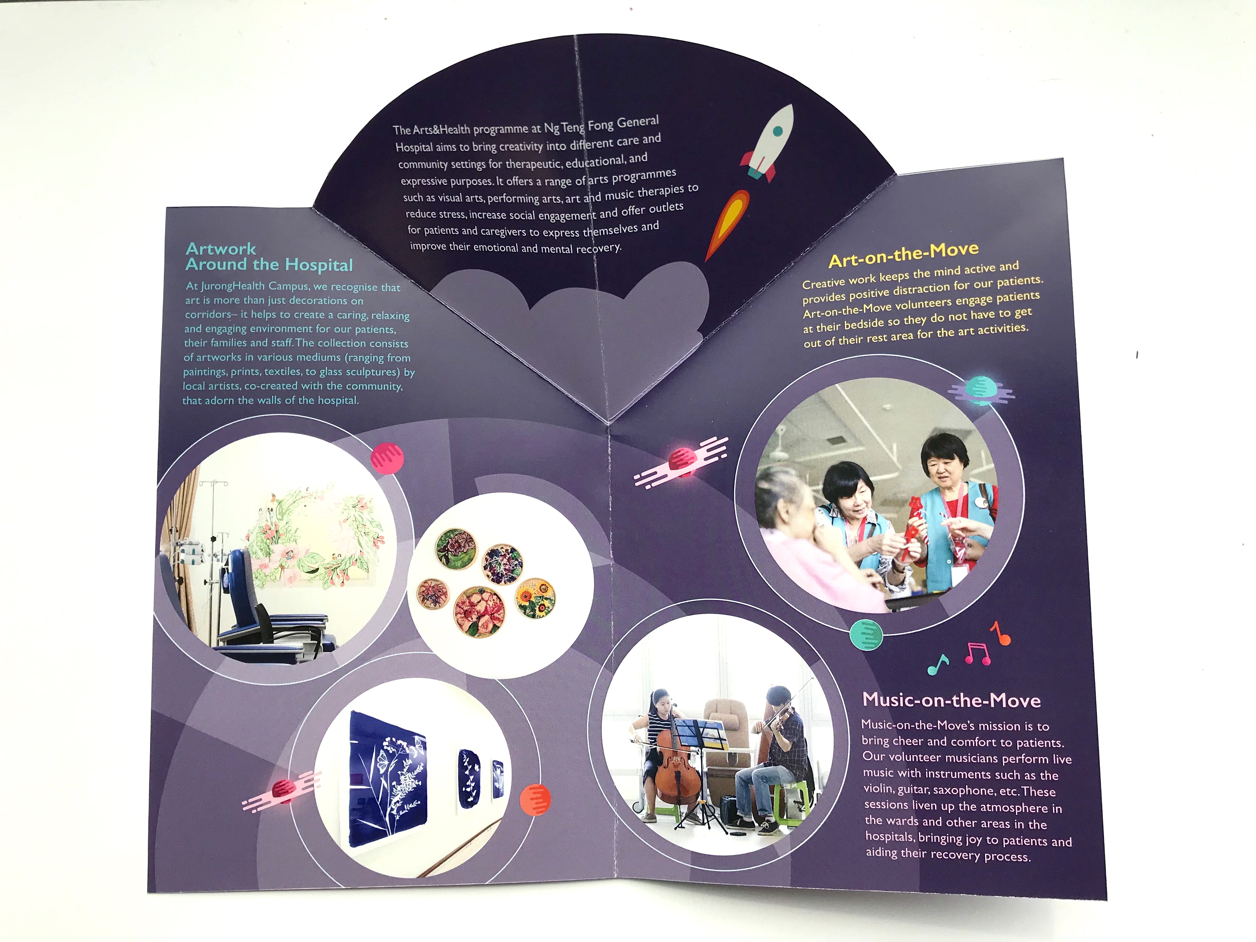
After the critique session on my first design, I adjusted the following:
Decrease in point size of text Change my arts and health full panel photo to just the logo and text itself Change the background colour on the inside page of the brochure Rearrange and add more elements to fill in some empty spaces and to ‘frame’ the text and photosInitial design:
Refinement:
Project 3: Arts & Health Brochure - Playing with Folds
Folding design
After looking at my reference brochure, I decided to try out a few folds. The first fold was the strike through effect. The main idea was to place images at the position of the ‘strike’ so as to show parts of the image on the outside and entice viewers to look at the brochure. However, when I Read more →
Project 3: Arts & Health Brochure - Design Exploration
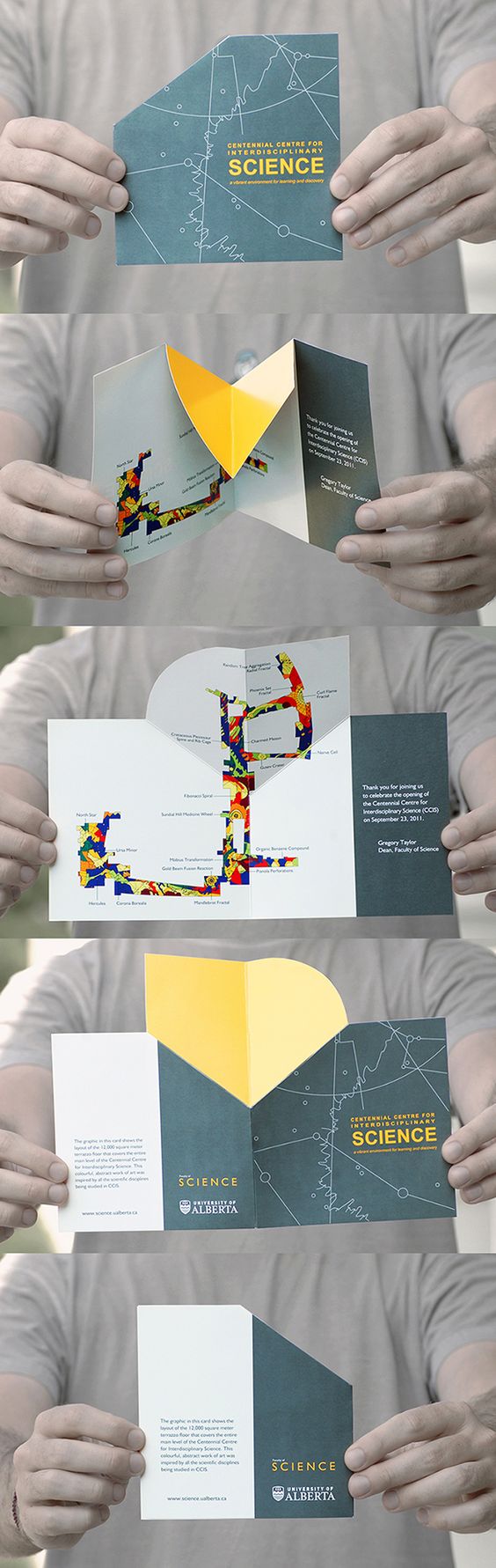
Existing Brochure Design
This brochure is interesting in terms of how it was laid out, where the top and bottom of the page gets folded up to form the outside of the brochure. The design stood out to me as there is a strip of the inside of the brochure exposed to the viewer on first sight, as if it is Read more →
Project 2: Final refinement and design
Final refinement
Explore on reflecting waterfall Changing position of text Changing arrangement of splatters Adjusting figures placement Adding ‘action’ lines to indicate movement Adding in musical notes to push for more art factor Removing red figure to ‘de-clutter’ poster Shifting ‘look out for…’ text box away from the green bubble
Comments:
Music notes brings out more of the art Composition where waterfall comes down from the right to the left Read more →Project 3: Task 2– Research and Development

Initially I wanted to do a dye-cut of the pinball machine, a continuation of my design for the poster but after feedback and much consideration, I decided that a dye-cut might not be necessary as it would be harder to determine the folds of my design.
FOLD
I found this fold online that I thought was pretty interesting and would work Read more →
Project 2: Task 2- Design Exploration
Composition studies
My concept for the posters is fun and happiness.
I started off with the slogan: Create Art, Enjoy Life. However, comments where that it sounded too aggressive. At the stage, I have not decided on the final slogan but it will be ‘Follow the flow of Happiness’. However, this slogan will not be placed in the poster composition yet as Read more →
Brochure Designs
For me, this brochure works because of how the layout flows across the panels. The images are treated to merge with the texts. The teal organic shapes direct our eyes to the first panel. Then, the title lead us on.
This is also an interesting poster because it uses one significant image to convey the message. I like the colours used Read more →