Recent Posts
Project 3: Task 2 – Research and Development
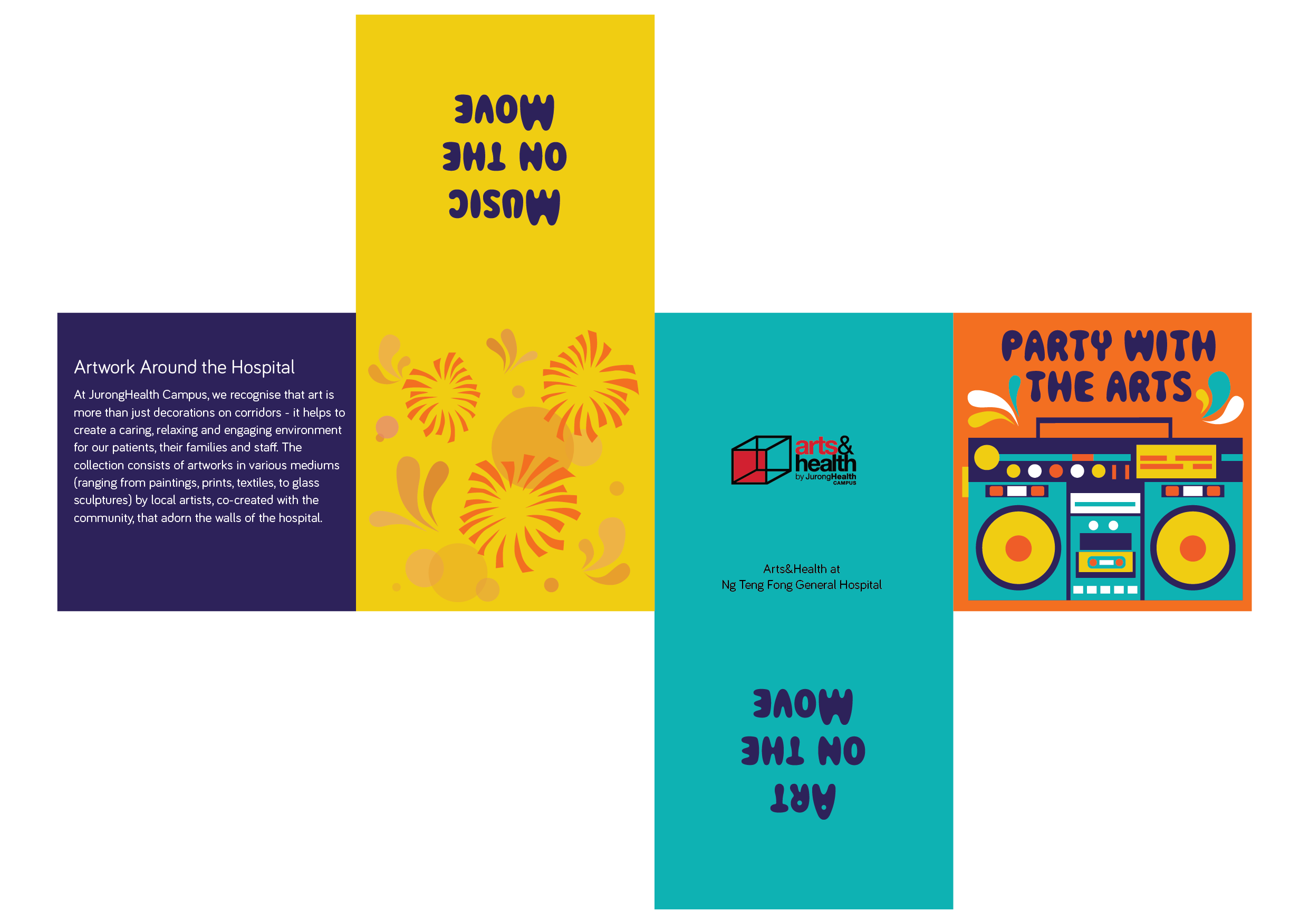
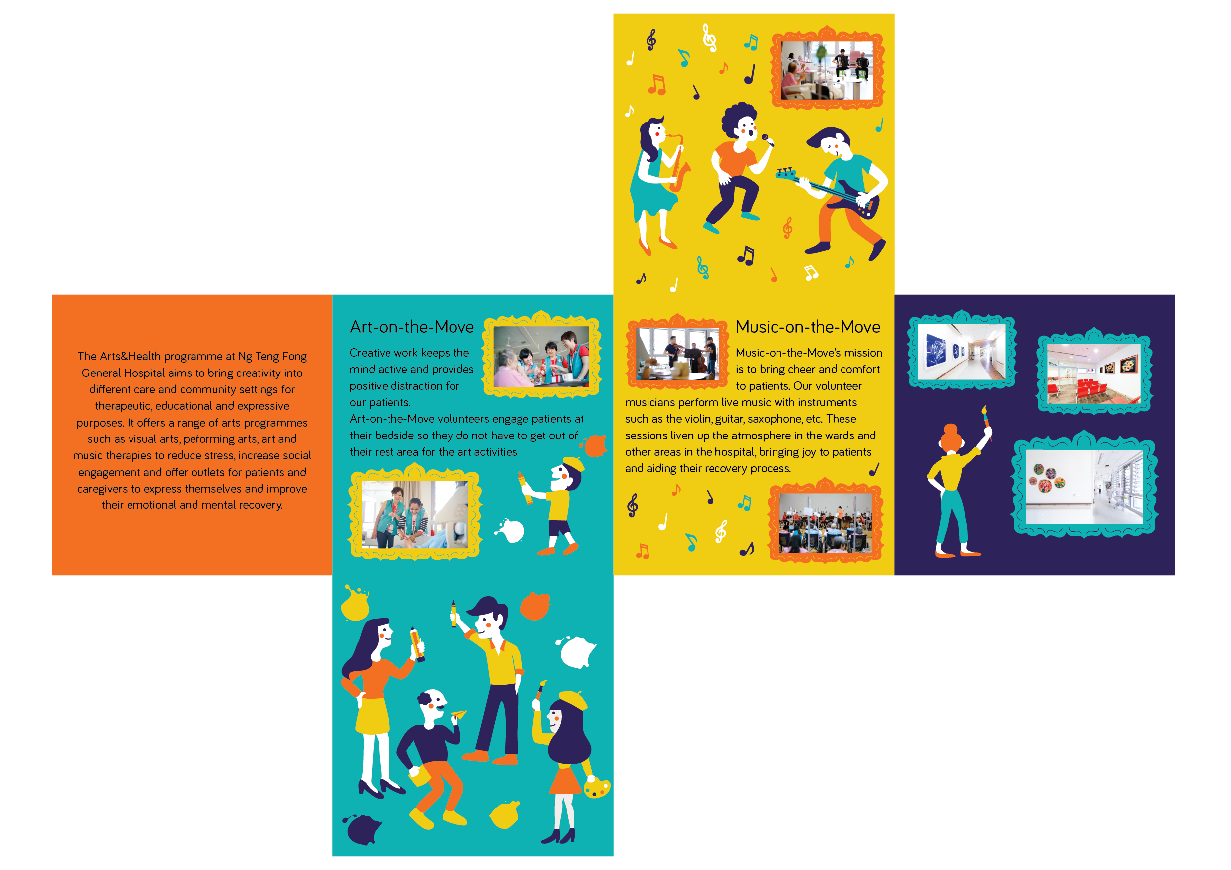
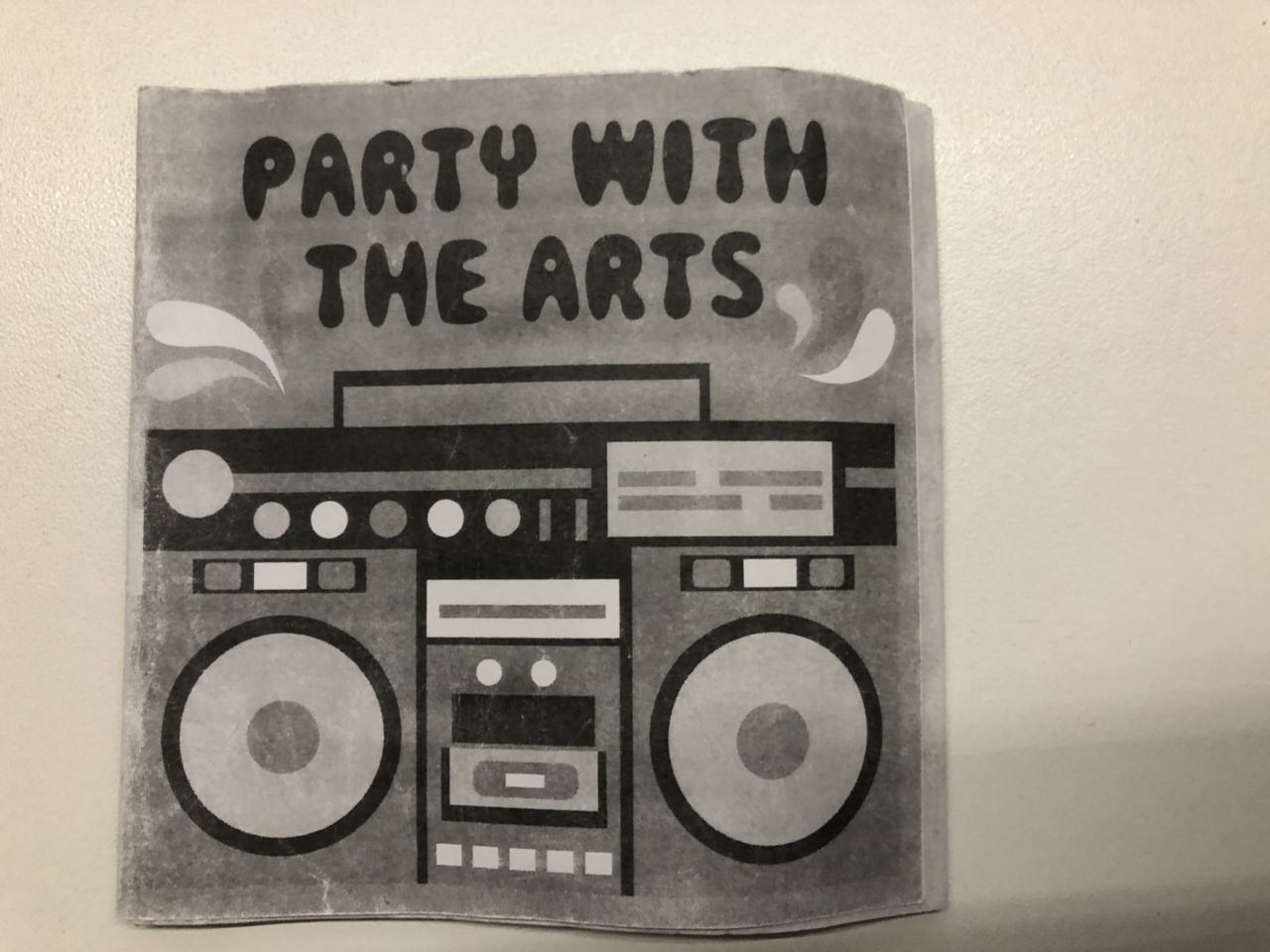
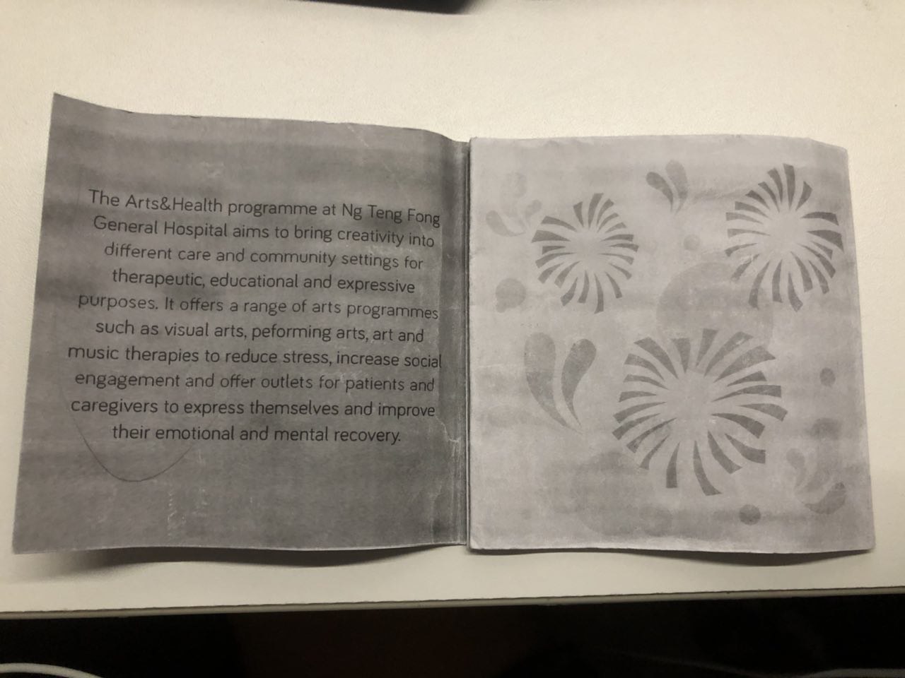
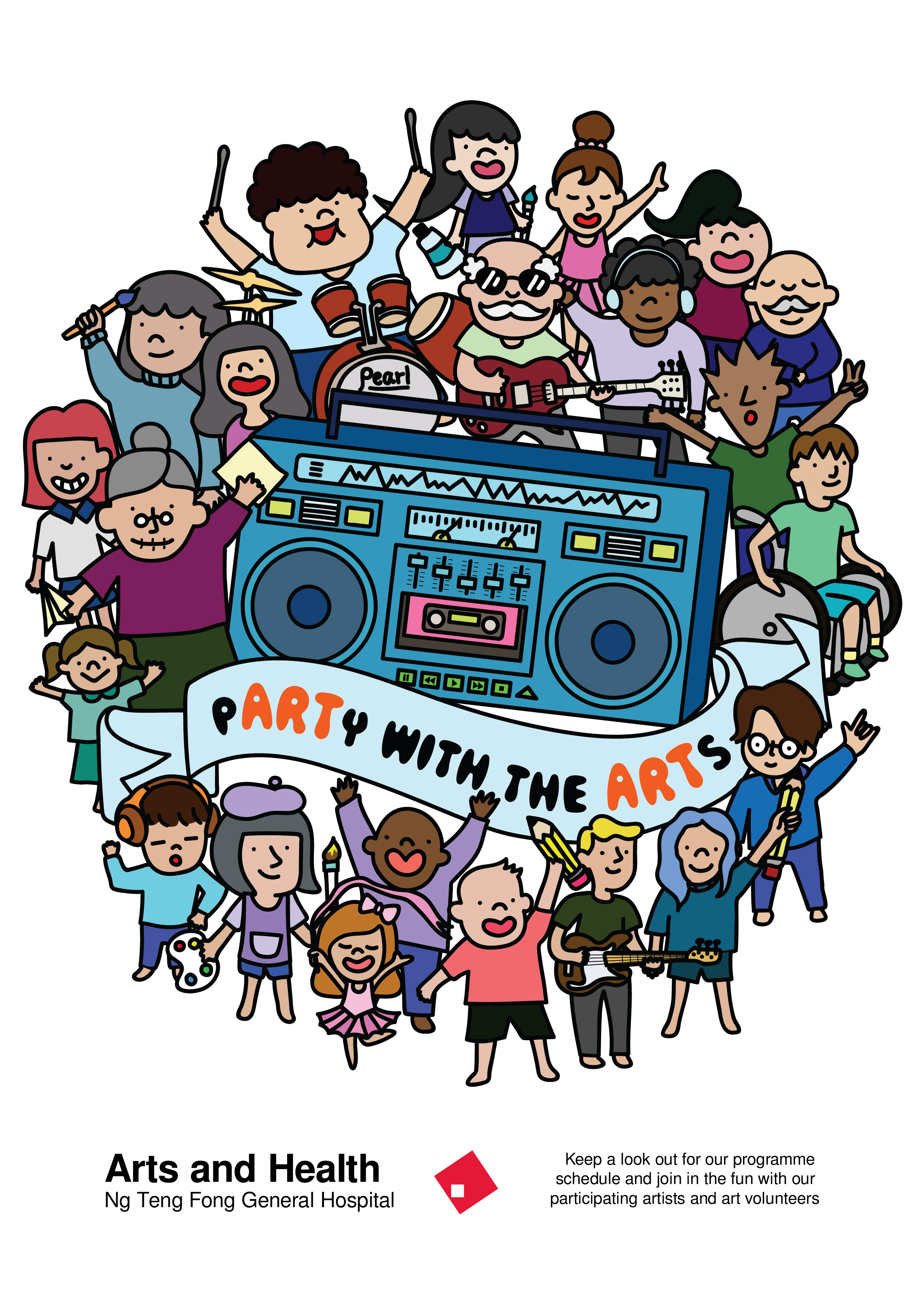
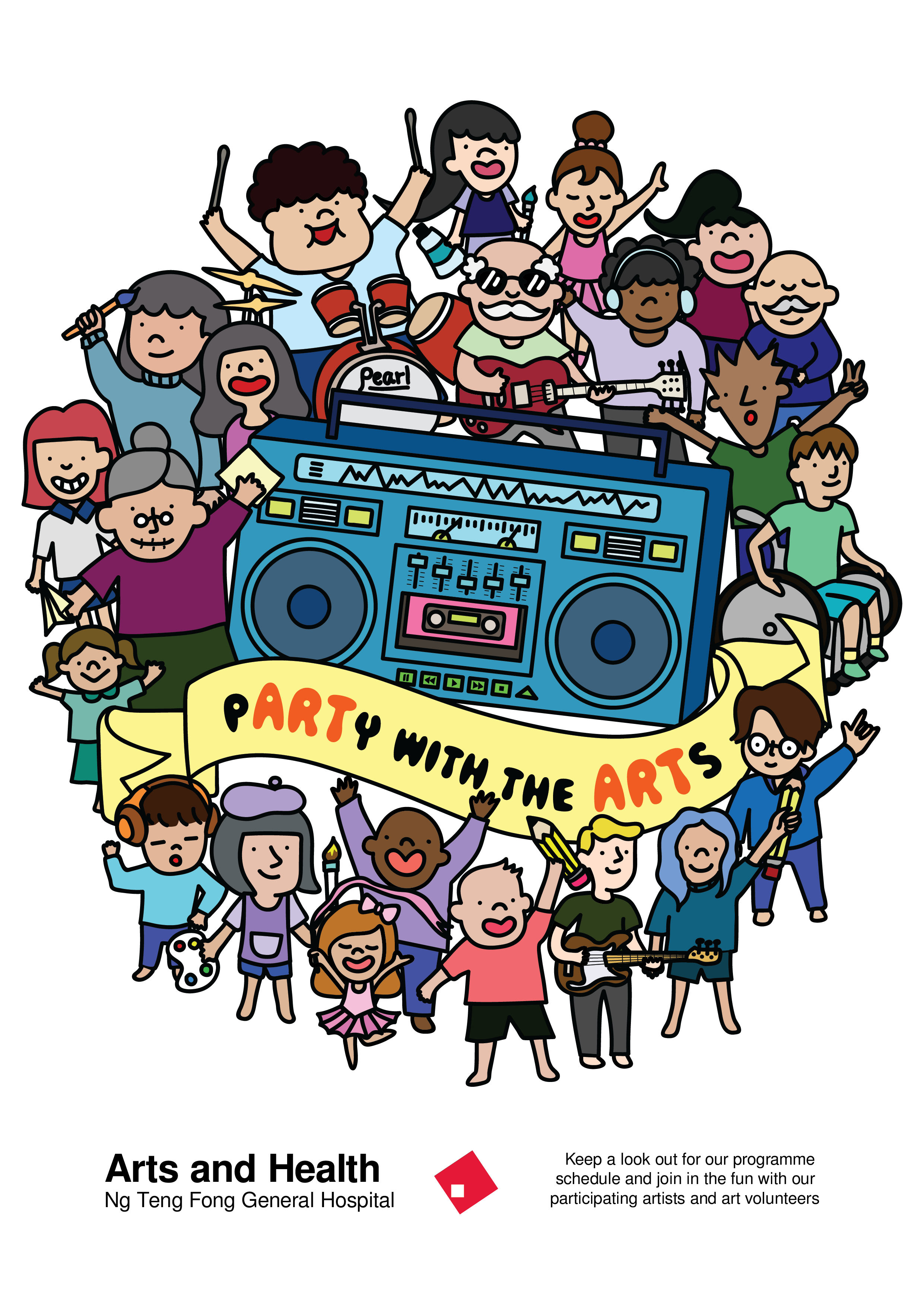
So I continued with my previous idea of “Party with the Arts” onto this project but changed the illustration style.
This is my layout on illustrator:
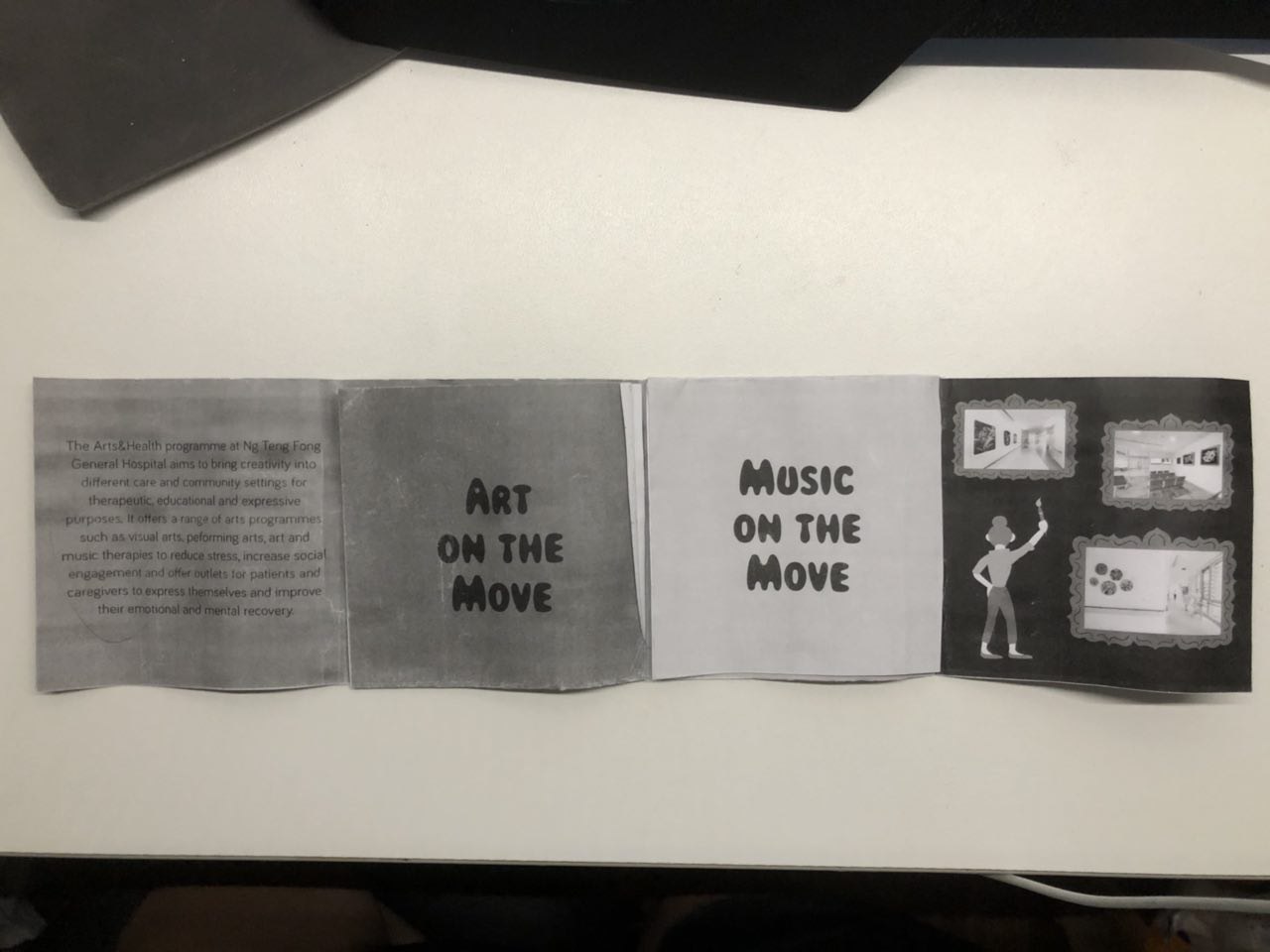
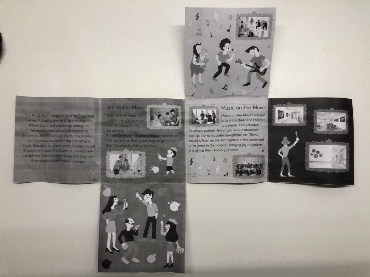
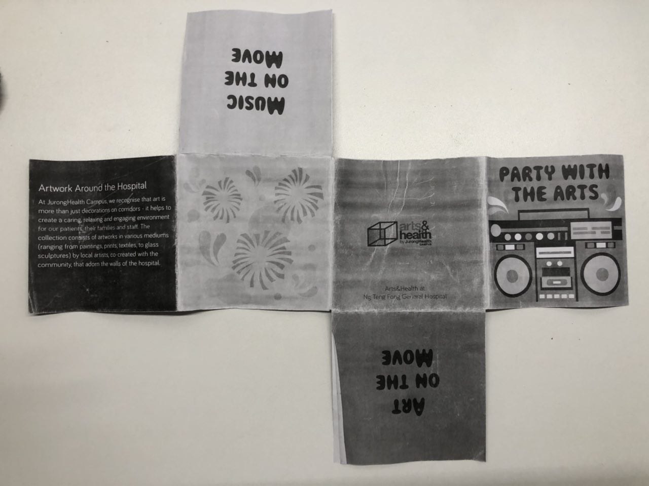
Here’s how it looks like when folded:
The feedback that I got for this first draft was:
The boombox in the cover page was static Read more →VC Project 3: Research and Developement
In the brief we were asked to look up on some brochures:
This is one of the brochures that caught my eye due to the fold and design. Even though the fold here used is extremely simple, it’s relevant and appropriate in imitating the way the BBQ cooker opened up, adding visual interest.
The below brochures I find aesthetic but I include Read more →
Project 2: Task 3 – Design refinement & Mock up

After receiving various feedback, I worked on the colour variations and moved people around to get a better sense of the hierachy within the design.
I tried to play with the colour of the banner to bring out the slogan. When I printed this out in A2, I realised that the lines became really thick when the poster Read more →
Project 2: Task 2 – Design Exploration

The slogan that I decided to explore further was “pARTy with the ARTs”.
So to incorporate the party within the design, I added a boombox with a community of people of all ages to signify the party and added elements of arts within. I tried to keep it within a circle shape but I still have to explore more and keep Read more →
VC Project 2: Part 2 (Research and Developement)
After doing visual research for part one of the project, I got inspired and came out with a few concept which I did in A5 sketches.
The first one (on the left) was supposed to be some sort of photography and illustrations overlaid on it. It was simple, very simple, and very safe idea. The second one (on the right) Read more →
Task 3: Final Designs

From the previous 2 designs, I reduced the number of elements in the logo and sought to combine both ideas. The biggest challenge I faced were to incorporate elements of the previous 2 drafts into the final versions.
I started working with a pink background as i felt it would complement well with the teal vests given to volunteers. The Read more →
Project 1 Design Process & Concept
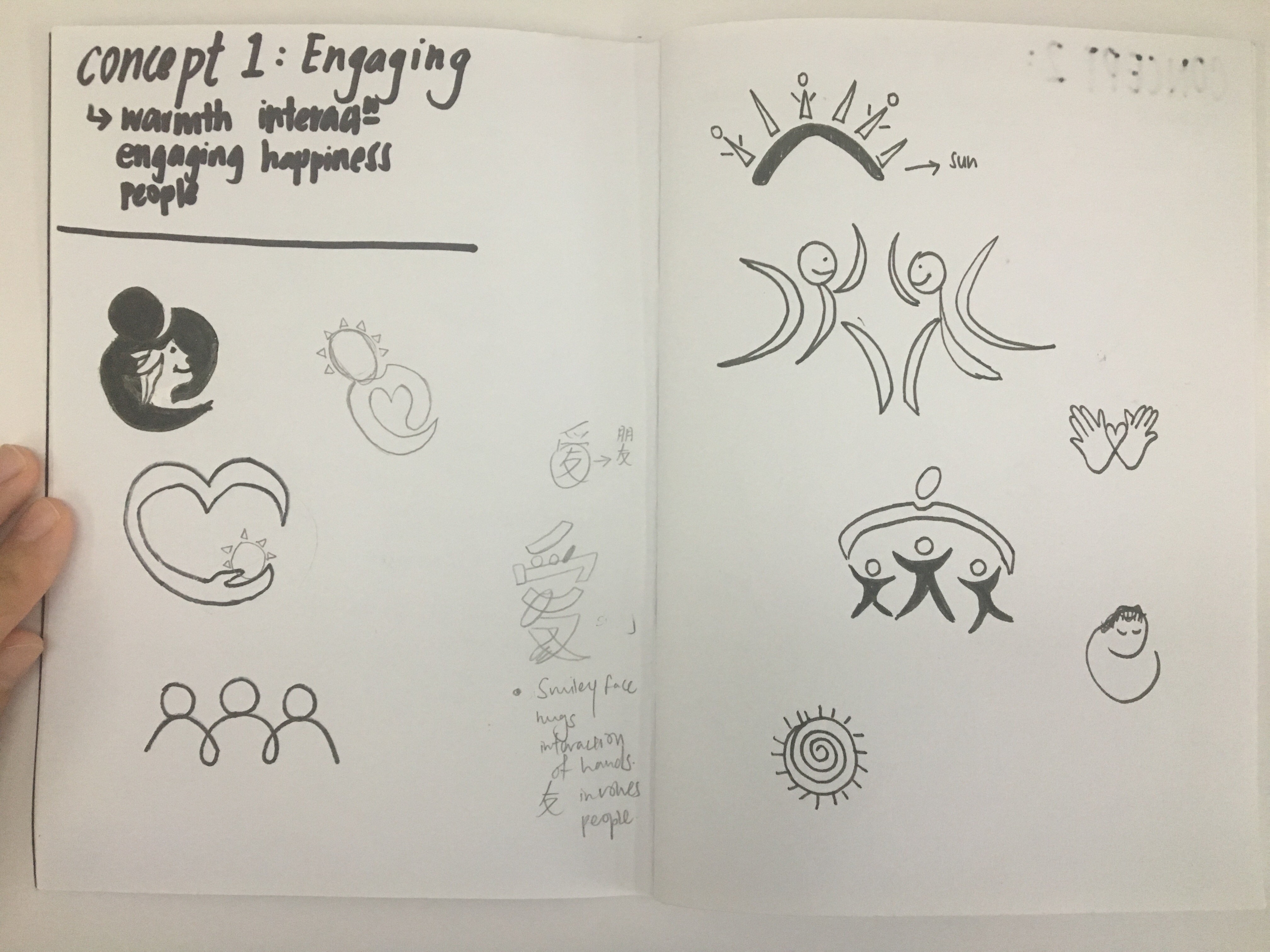
Task 2: Translating & Exploring Design
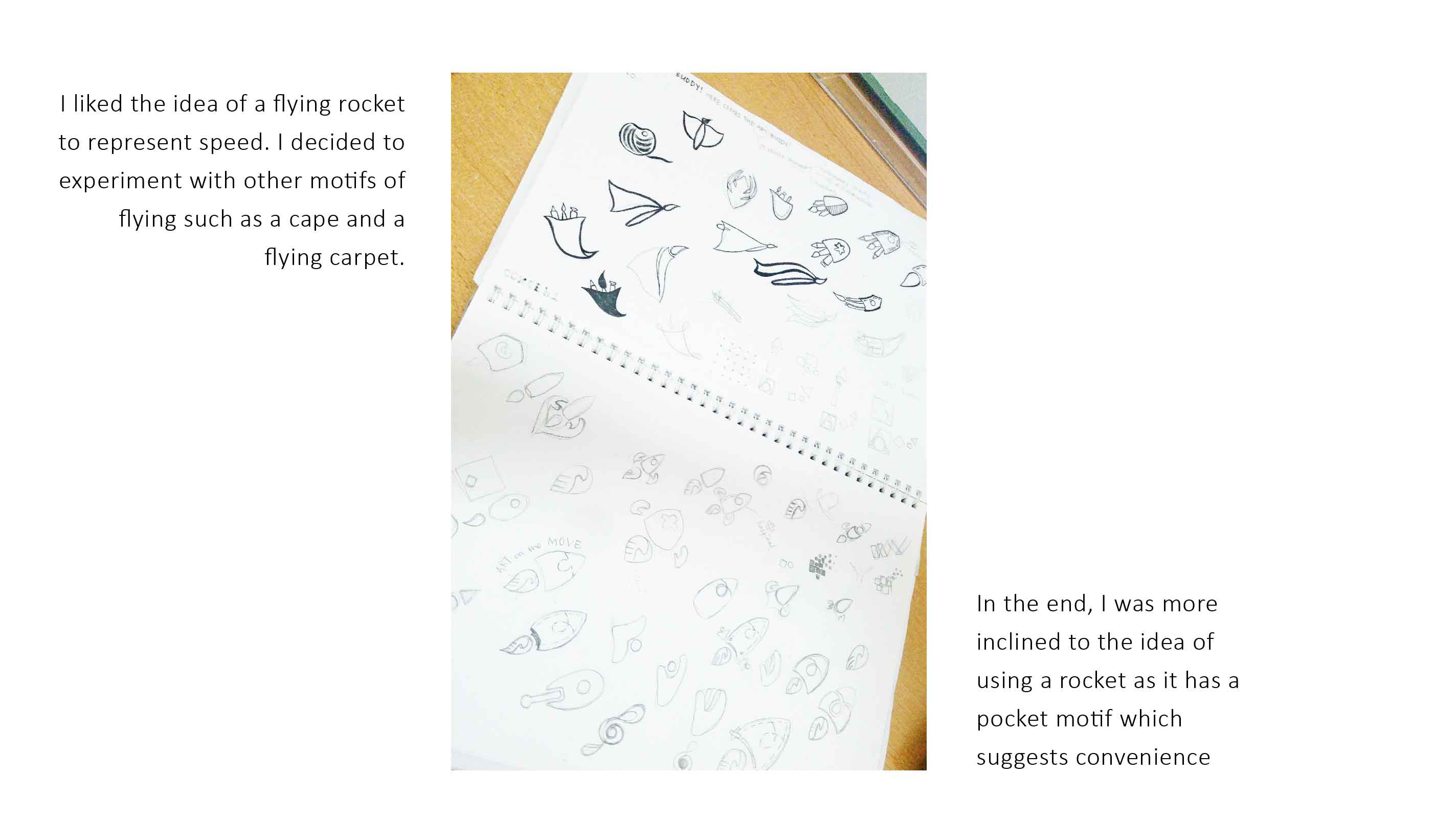
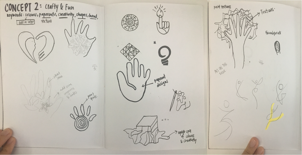
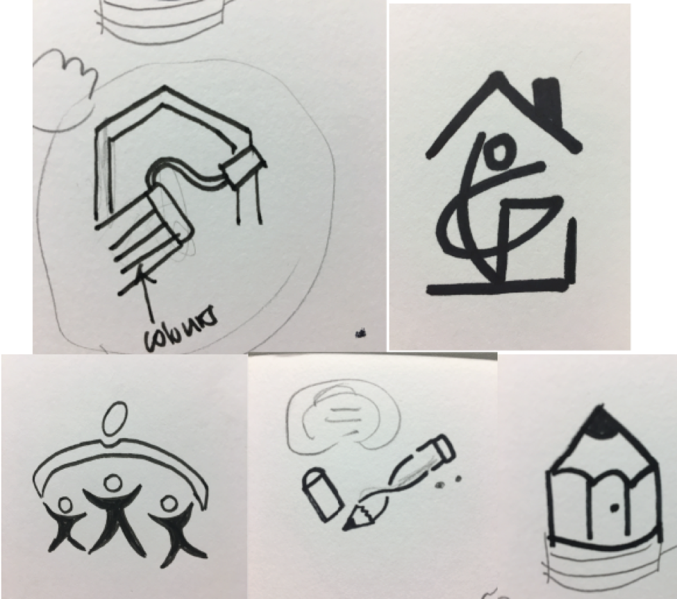
From the 3 concepts we have chosen, we were suppose to do at least 30sketches and these are some of the sketches i did:
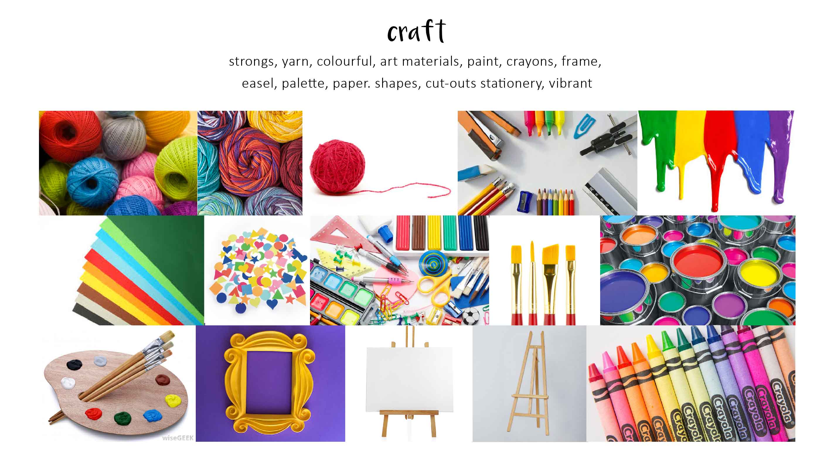
Concept 2: Crafty & Fun
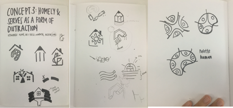
Concept 3:
These are some i really liked:
Thus, i decided to do a slight change to Concept 3 which is to allow patients to feel homely at the Read more →
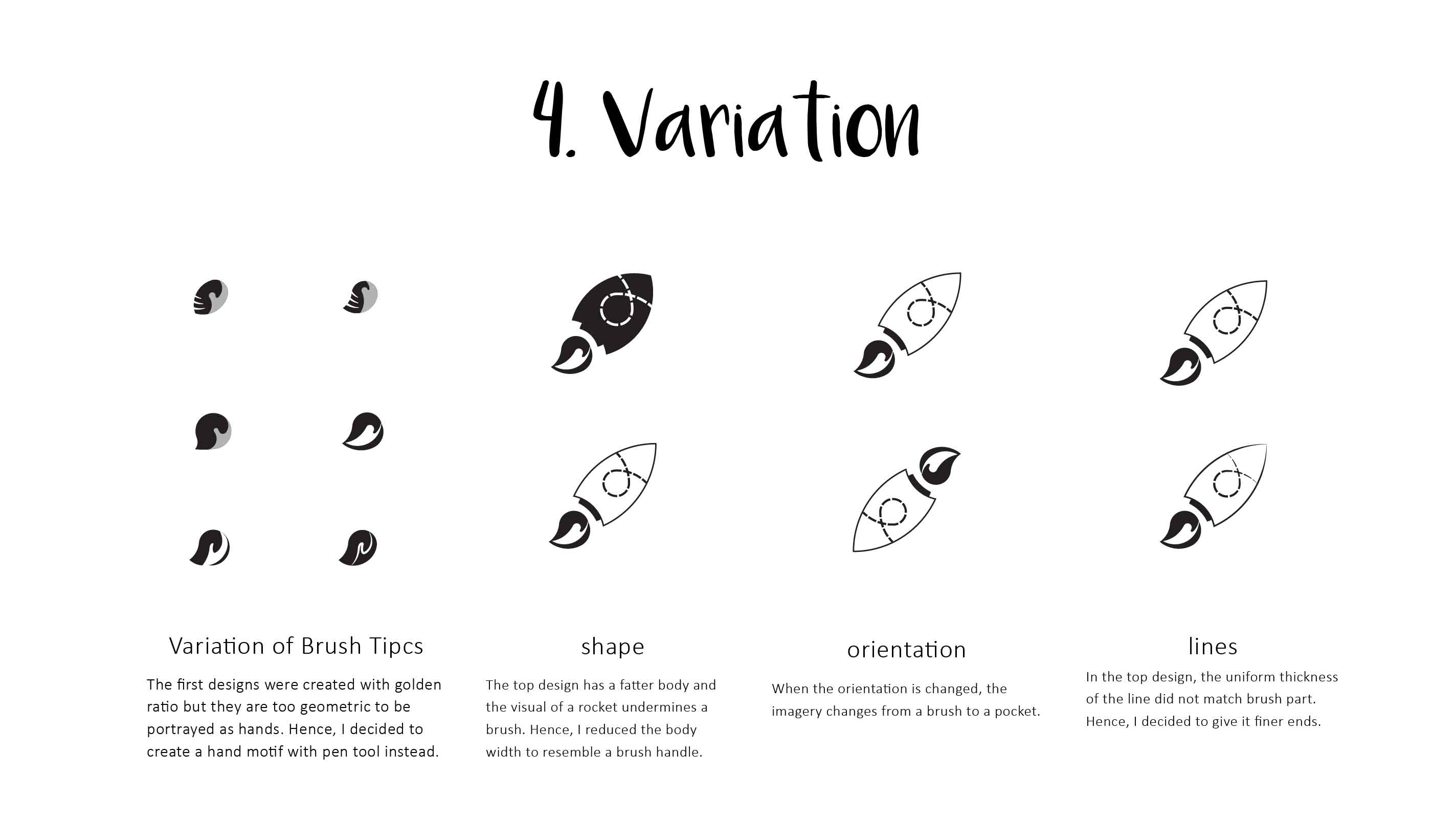
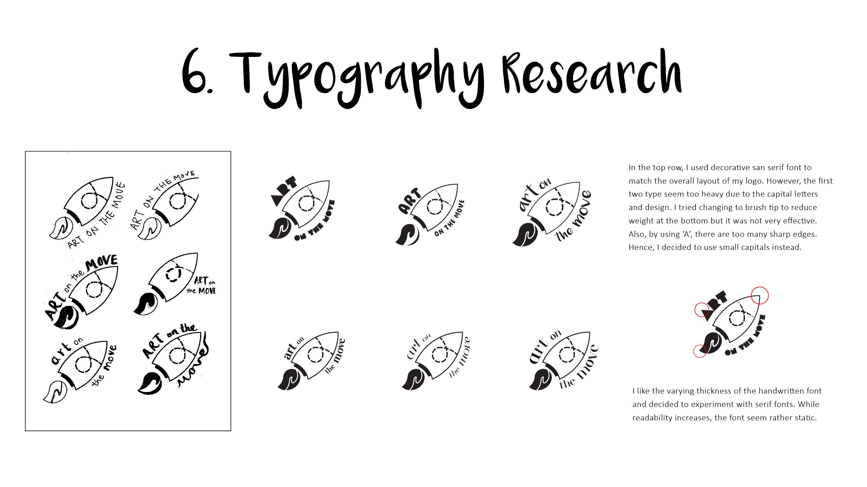
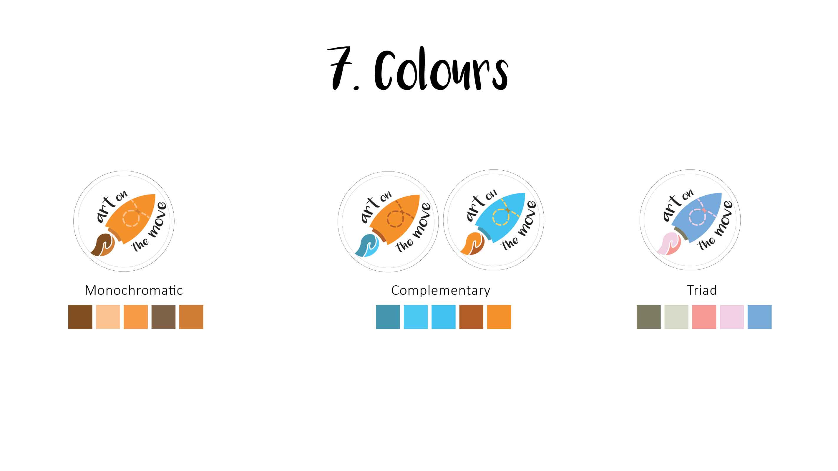
Task 3: Colour Exploration

Refinement:
Lengthen the brush stroke Change perspective of hands to improve on flow Simplify plant symbol Clean up on logo Insert text ‘Art on the Move’ into logo
After adjusting the elements of the logo, I went on to adjust the scale of the elements and text and eventually came to this:
I chose to change my ‘plant’ into a lighter shades such that it can Read more →