Recent Posts
Project 2: Task 1A - Visual research
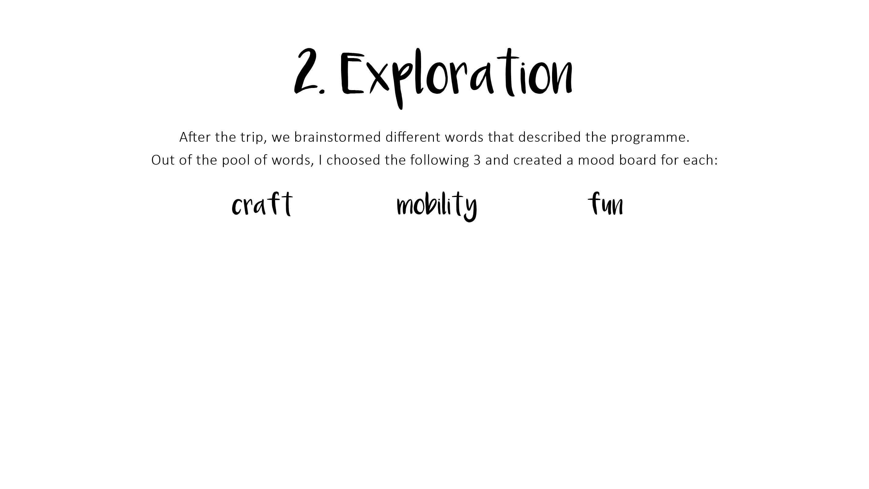
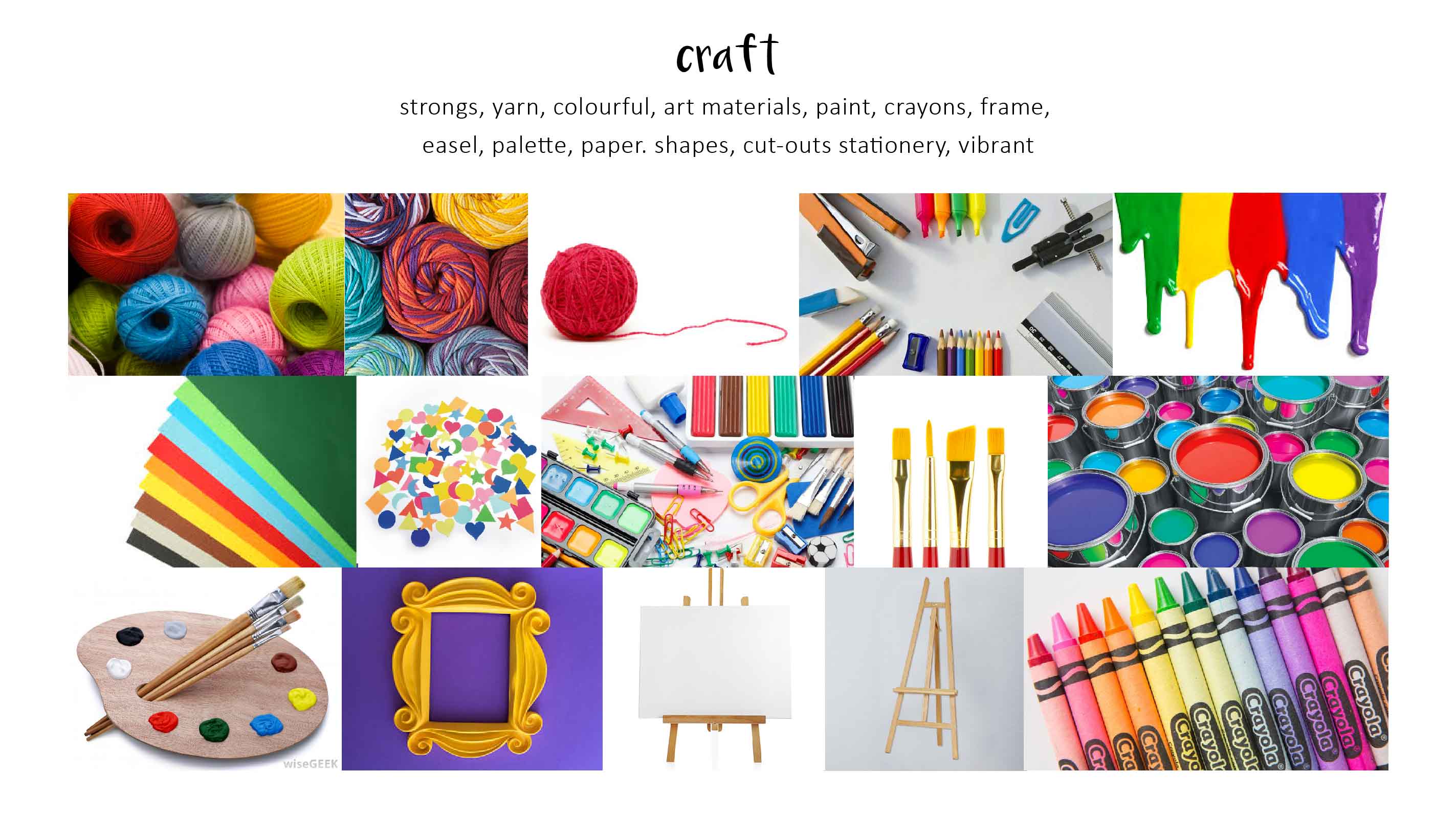
TUSK 3

C O L O U R E X P L O R A T I O N
Sticking to the colour scheme of the corporate identity with the colour red, and keeping in mind the teal vest which the pin will be pinned on, and a yellow colour to complement these two colours and at the same time capturing Read more →

Task 3 : Colour exploration

9. Simplify and rounder
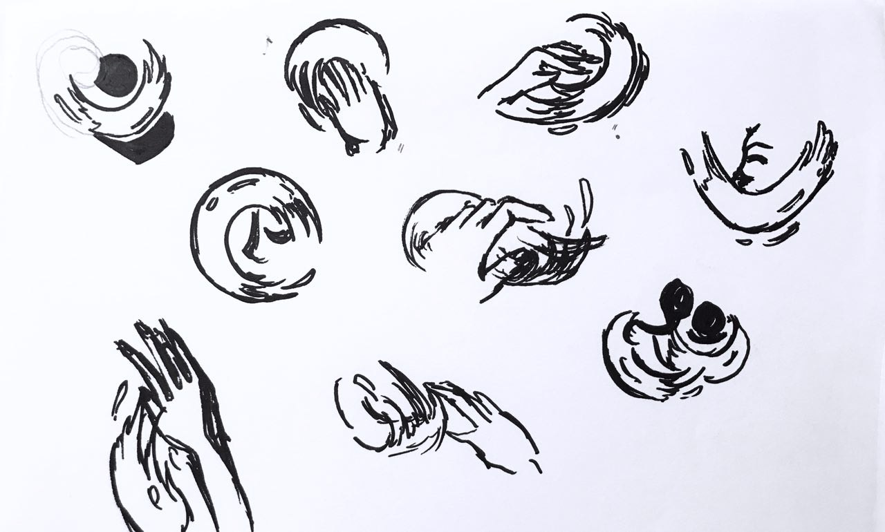
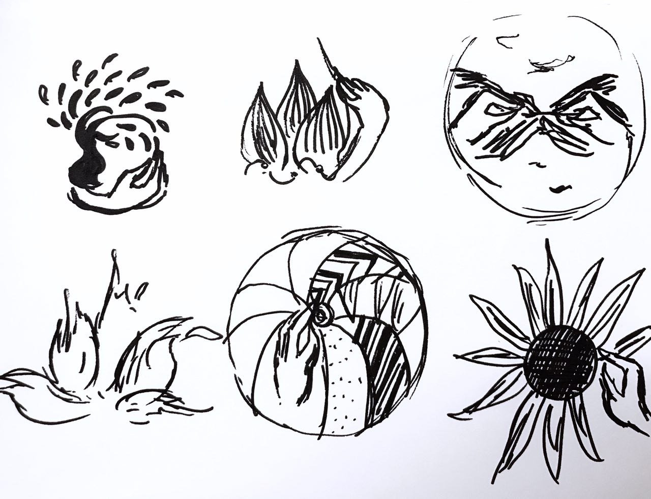
The swoosh is translated to various arts medium to give the artsy feel. I picked the paint swoosh as it is ‘neater’ and more dynamic. Trying out different expressionsSelected design 1
Update:
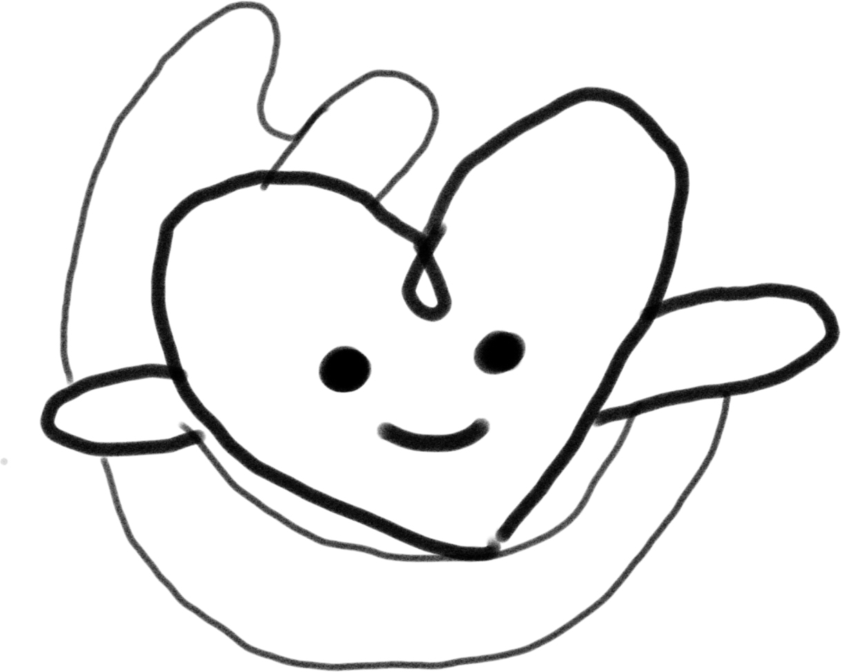
After receiving Michael’s comment, I realized the arms of the heart does not look like it’s arms, hence decided to add in Read more →

Project 1 Design Process & Concept
Task 3: Colour Explorations & Final Design

After the last lesson where we had some feedback on our chosen logo, I decided to go with the same logo, but refining the visual weight for some of lines and also to work on the where i should put the words “Art On The Move” in the badge.
This was my first attempt, and as mentioned, the feedback was Read more →
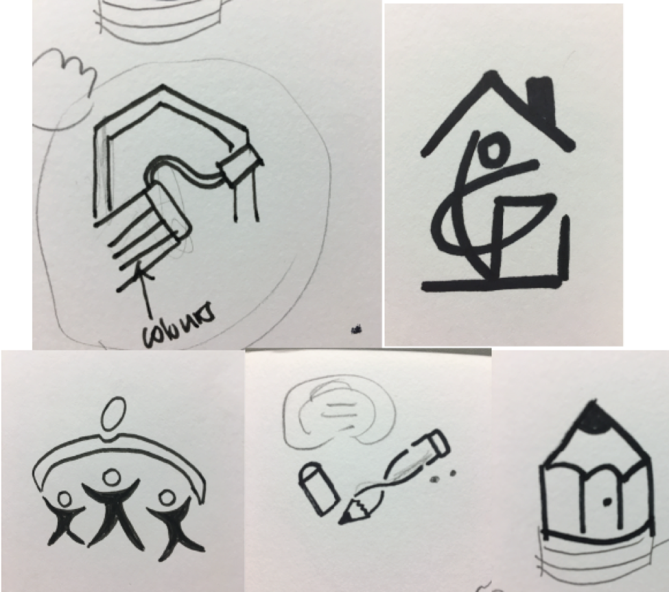
Task 2: Translating & Exploring Design
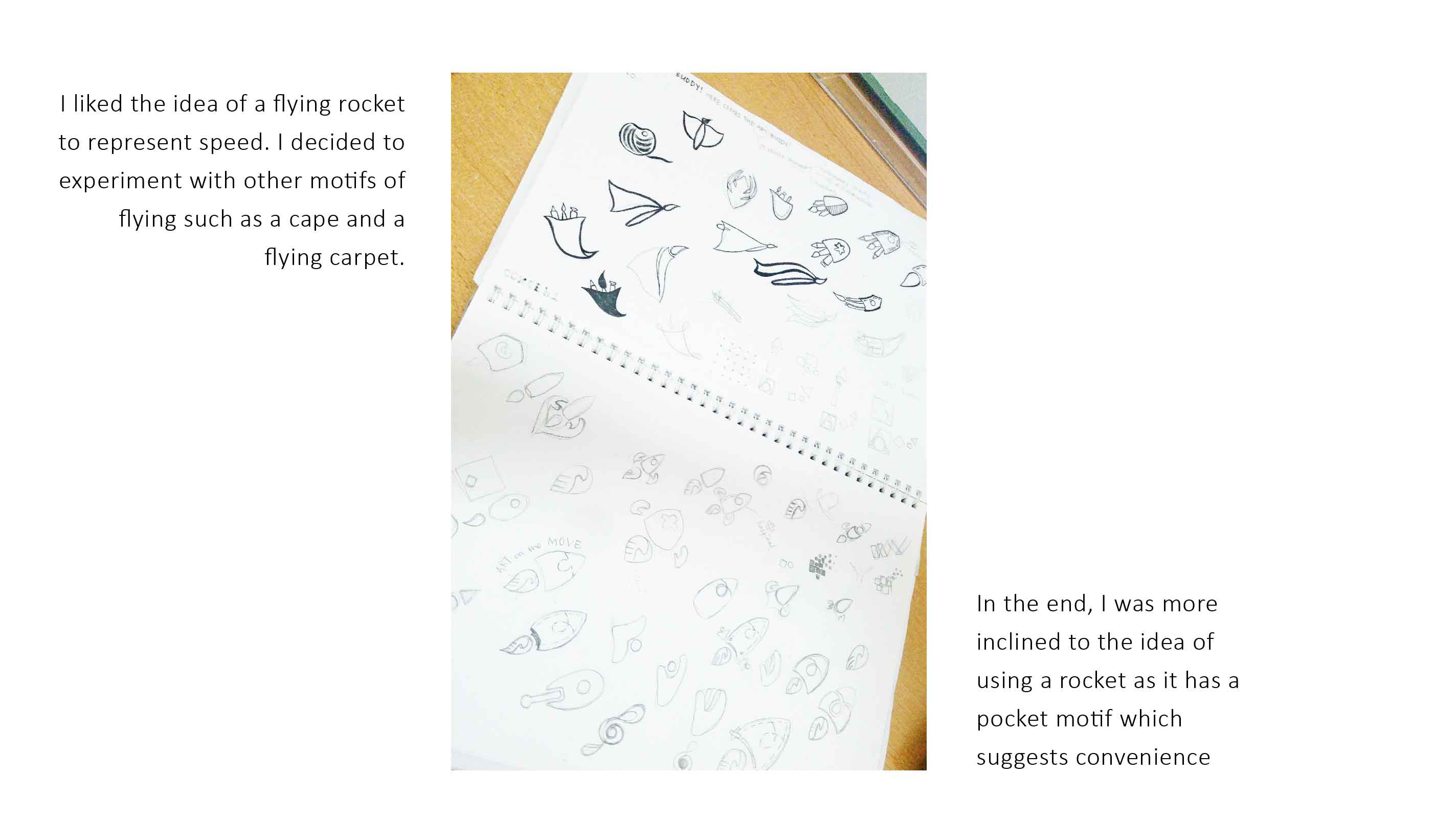
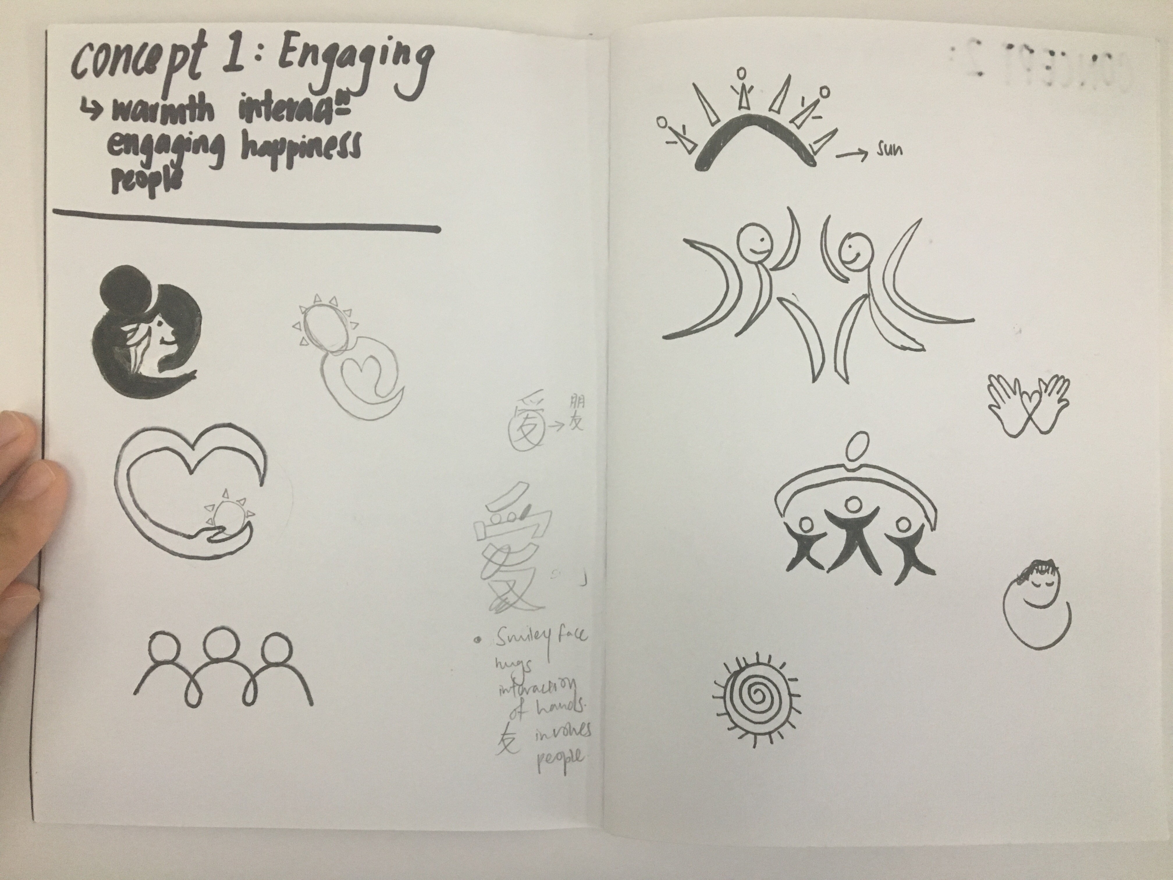
From the 3 concepts we have chosen, we were suppose to do at least 30sketches and these are some of the sketches i did:
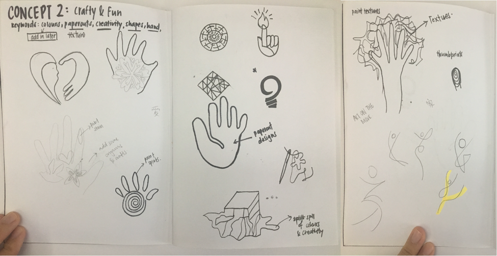
Concept 2: Crafty & Fun
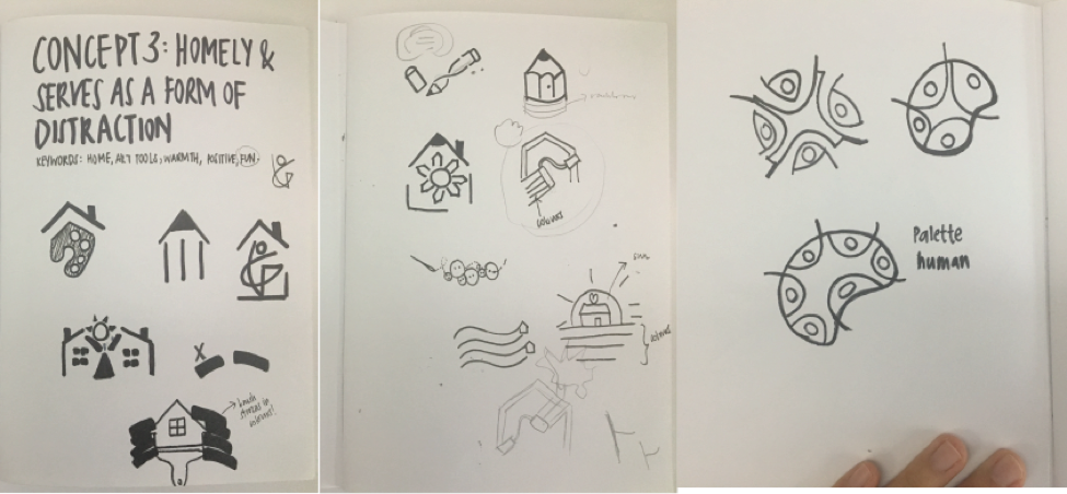
Concept 3:
These are some i really liked:
Thus, i decided to do a slight change to Concept 3 which is to allow patients to feel homely at the Read more →
Task 3: Colour Exploration

Refinement:
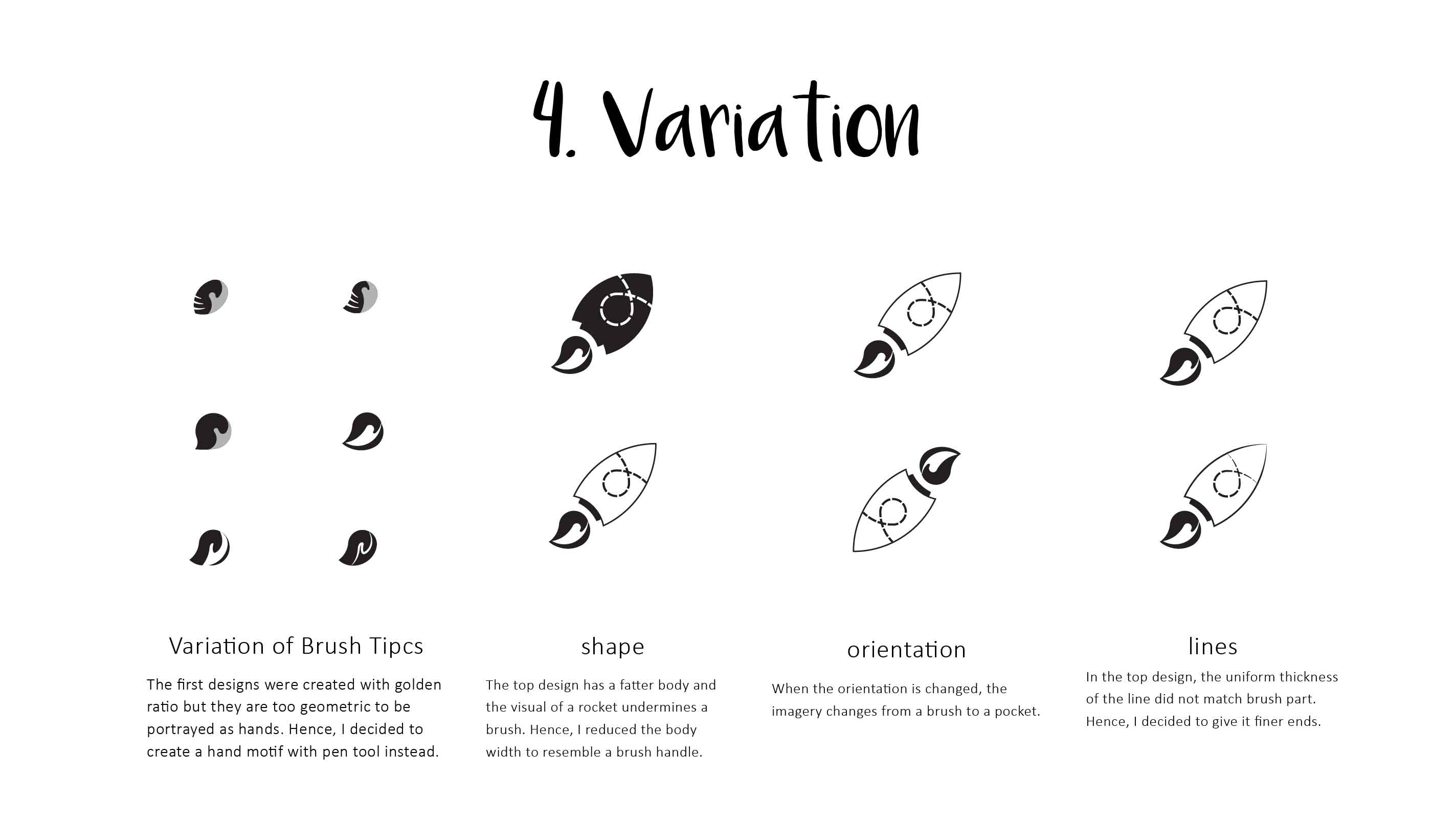
Lengthen the brush stroke Change perspective of hands to improve on flow Simplify plant symbol Clean up on logo Insert text ‘Art on the Move’ into logo
After adjusting the elements of the logo, I went on to adjust the scale of the elements and text and eventually came to this:
I chose to change my ‘plant’ into a lighter shades such that it can Read more →
VC Project 1 (Task 2 and 3: Translating design and colour exploration)
To translating my mood boards into design sketches, I did three themes of sketches in order of the mood board I posted in “Task 1”.
This was theme 1 exploring the concept of connection, thus human touch, and the paint strokes, signifying reach out through art.
The second theme, kaleidoscope.
And the third, therapy through nature motifs.
Through the first round Read more →