Recent Posts
Project 2: Research and Development II

I started off this project with a few moodboards based on a few different themes. I wanted to deviate from the common portrayal of arts in posters, with an element of storytelling.
Moodboard 2: enjoyment
Moodboard 3: fairytale
Thereafter, I came up with drafts of all 3 ideas based on the mindmap i created
TASK 3: DESIGN REFINEMENT & MOCK UP

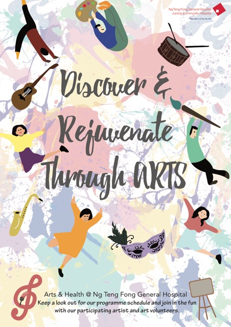
Feedback from sharing in class: -Need to play with scale of image -Tighten slogan -Pull Arts & Heath upwards -Mute the background more so it wont be distracting -Incorporate into a circular shape
Thus, after the feedback, i decided to change the background and decrease its opacity to mute it further, and then added a few more elements to create an oval around the texts. Read more →
TASK 2: DESIGN EXPLORATION

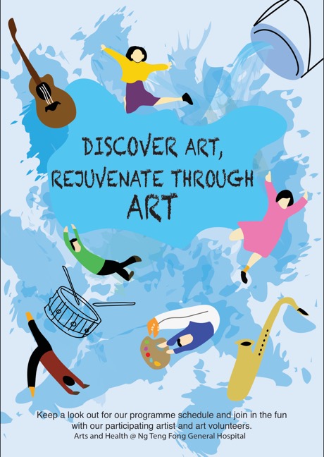
I only managed to digitalize one of my ideas, which has the slogan “DISCOVER, RECOVER” but later changed to “Discover & Recover from ART” which is then changed again to “Discover & Rejuvenate through ARTS” as recover sounded like the patients were really sick and it might remind them about their illness.
However, after the class, i realised Read more →
Final refinement

Feedback from Peers:
no distinct lines play with the title – very static – break it up move to the right – Jump St(art) – brackets colour or capitalise the main drive of shape create tension point – focus point – created by lines and etc move up- twist shapes a little bottom heavy – lift closer the orientation of shapes introduce colour Jumpstart could have shadowAs I only had Read more →
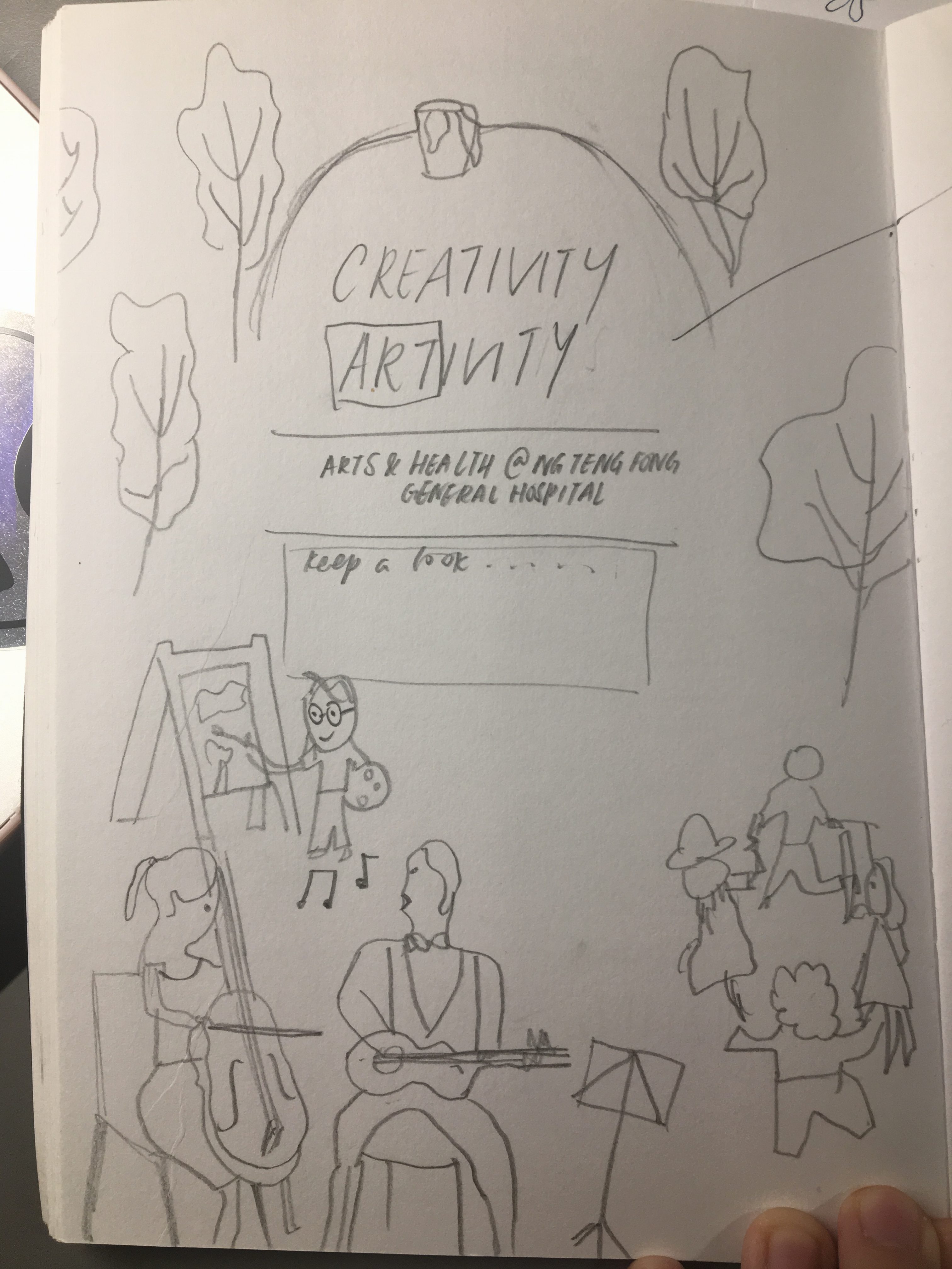
Task 3: Design Refinement & Mock Up
Mock Up 1
Mock Up 2
Mock Up 3
Feedback after consultation:
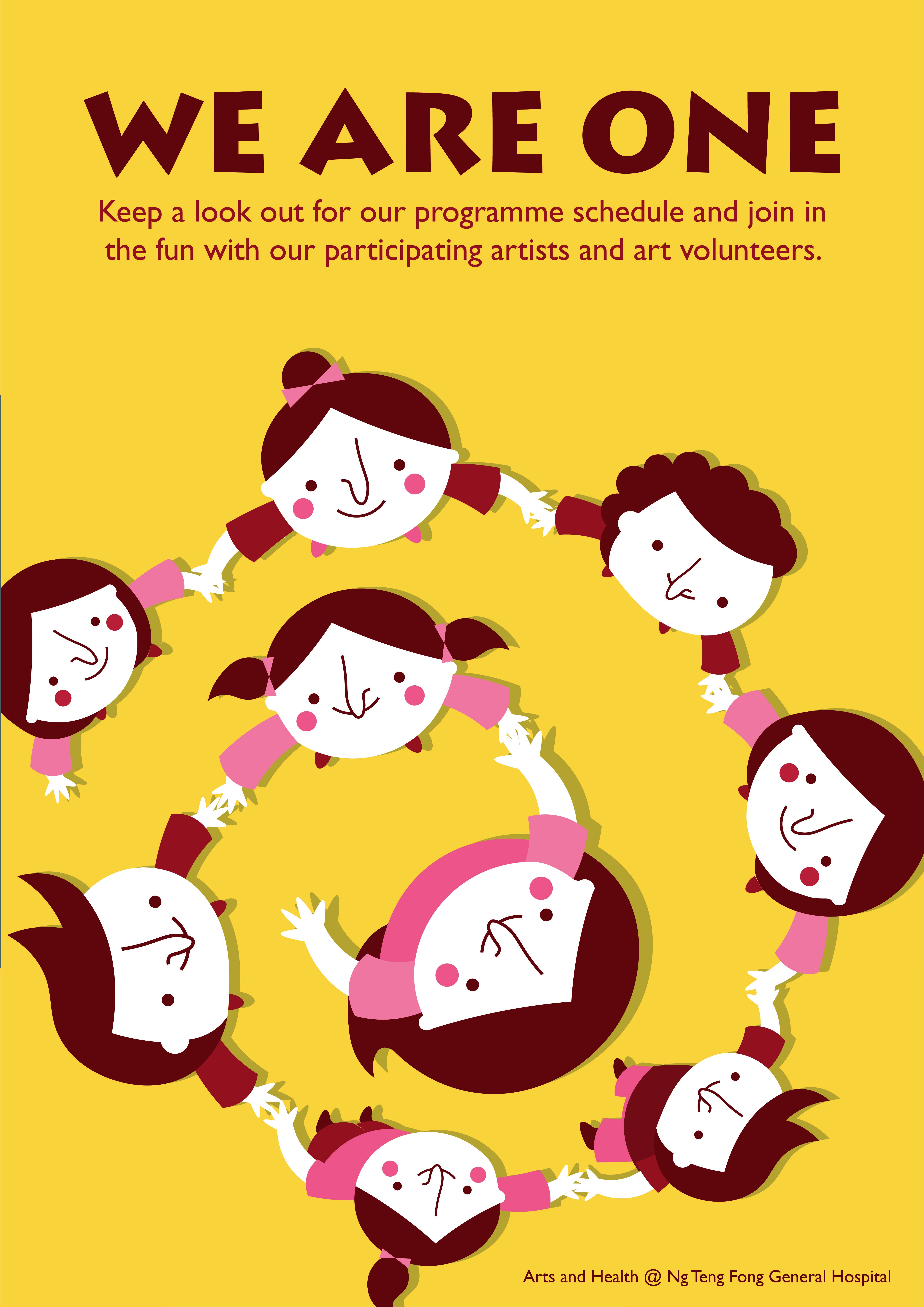
Action of elephant with smiling face The text of Arts and Health (Move to top) Slogan (Should separate the text) Colour of the objects and background (not contrast)- Music Notes and background The overall of shape of the objects (How the objects flow)Task 2: Design Exploration
My concept is caring.
Slogan: Let Us Be Your Sunshine
The main character is elephant. The hot air balloon is a palette. Also, I choose piano keyboard and music notes to represent arts and craft activities and performance.
I would focus on yellow on background. Yellow means happiness, positivity, energy and optimism.
TUSK 2

D E S I G N E X P L O R A T I O N
[PLEASE CLICK ON THE IMAGE TO VIEW, COLOURS ARE OFF IN THE THUMBNAIL]
W H E R E C R Read more →
VC Project 2: Part 2 (Research and Developement)
After doing visual research for part one of the project, I got inspired and came out with a few concept which I did in A5 sketches.
The first one (on the left) was supposed to be some sort of photography and illustrations overlaid on it. It was simple, very simple, and very safe idea. The second one (on the right) Read more →
(VC1) Assignment 2: Research & Development

1. Task 1B — Develop Slogan & Moodboard
Brainstorm Map!
It took me quite a while to gather my thoughts together. Any random thoughts I could think of, i jotted down. And as can be seen in my map, I was trying very hard to come up with slogans that fitted the hospital and the art programme.
Read more →
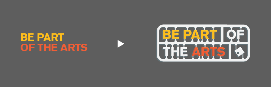
Task 3: Design Refinement & Mock Up

Based on the feedback gathered, I edited the title to make it fit better into my toy kit concept. I also changed my flat design into a “Table Top View” to make the composition more lively.
These are the feedbacks I got from the A2 B/W critique session: 1) The colour of the coffee is very distracting. (change to tea?) 2) The Cutting Read more →