Recent Posts
Project 2: Task 1A - Visual research
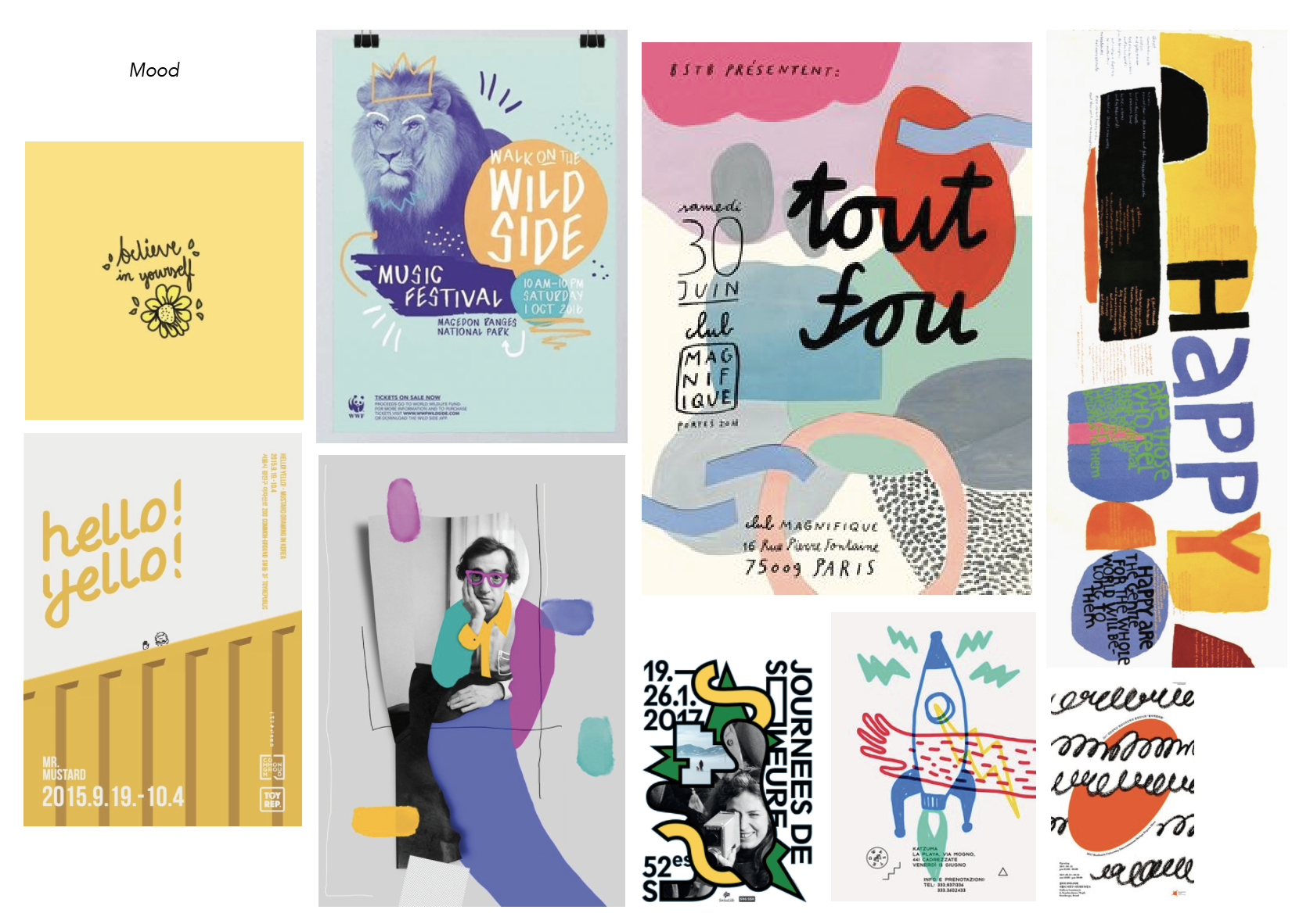
Week 5: Visual Research

Existing Event Promotional Posters
A study of existing promotional posters designs, rationale and design applications.
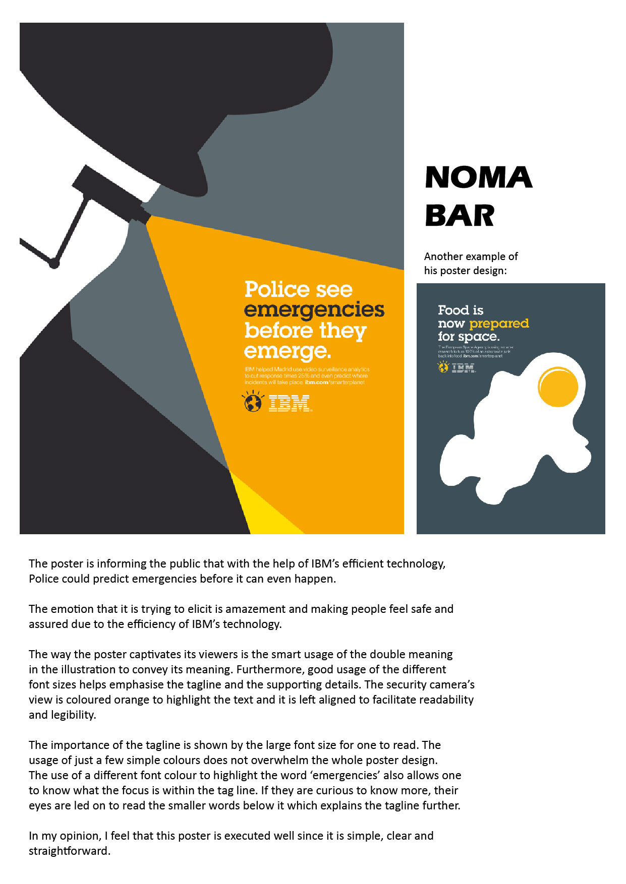
Reference Poster Design #01:
Communicate: In this poster design, it aims to communicate an energetic and fun marathon event. Stating informational details that relates to the event. The picture driven poster also depicts the outcome of the event after participation.
Emotions: Exited | Joy | Anticipation
Reflections: The overall approach Read more →
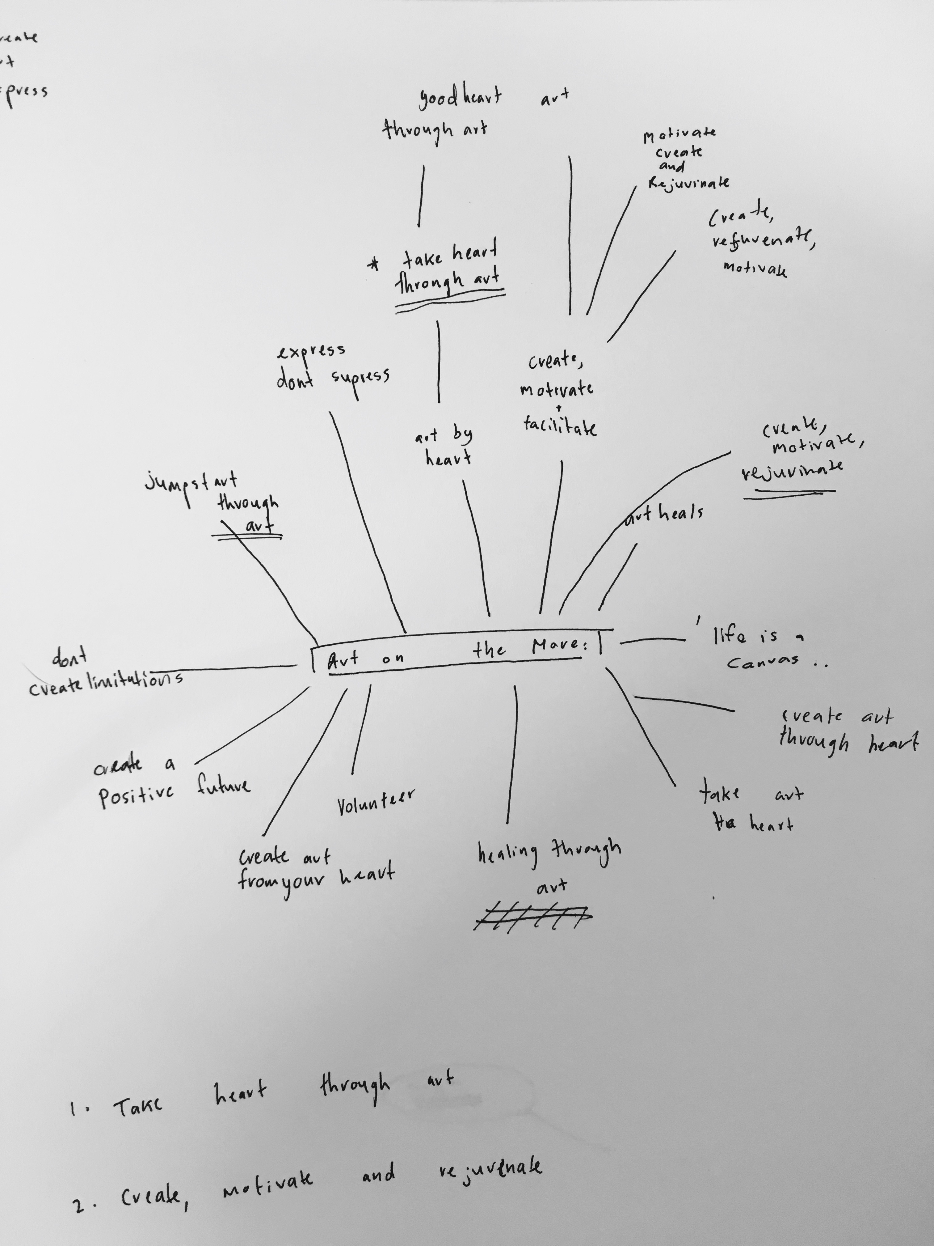
Week 5: Develop Slogan & Moodboard

Brainstorm Map
Keywords which I had derived were the words happy, fun, rainbow, hearts, caring volunteers, freedom. Of which, I chose to work with the idea of Arts & Hearts to derive the three slogans from below.
Proposed Slogans
#01 Arts On The Groove
Grooving is associated with a dance movement to jazz. I wanted to portray the performing arts side of arts Read more →
Task 1B: Develop Slogan & Moodboard

BRAINSTORM:
CONCEPTS:
MOODBOARD:
Handrawn and creative feel to the poster bright primary and secondary colours Nothing too detailed so it can be seen from afarSKETCHES:
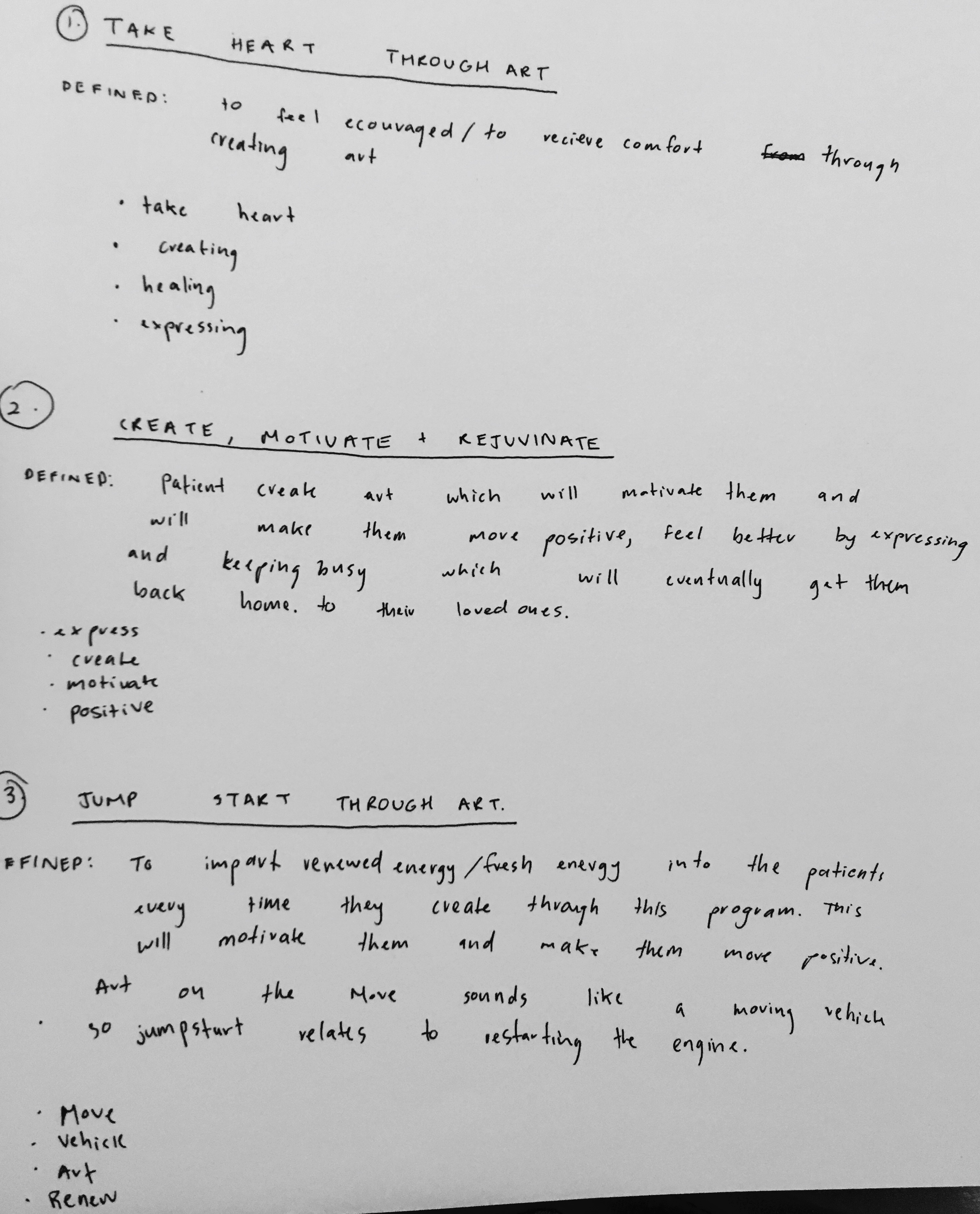
Concept 1 – Take heart through art:
Concept 2- Create, Motivate, rejuvinate:
Concept 3- Jumpstart through art:
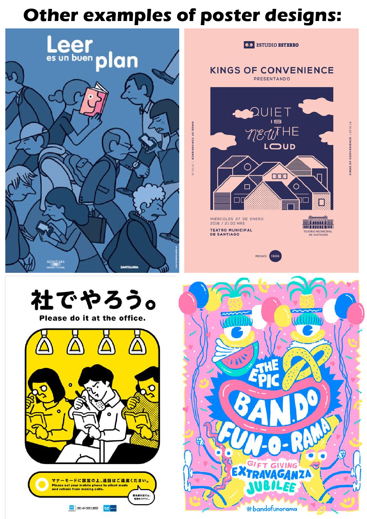
Task 1A: Visual Research

INTERESTING POSTER DESIGNS:
ANALYSIS OF POSTER:
The poster is promoting a summer day camp from June – August for 6-15-year-olds. This poster is a template for people to use for their club. It conveys a vibe that is fun, exciting, happy, youthful, fresh and creative. The poster captivates the viewer with the bold summer text layered in between the bright organic shapes Read more →
TUSK 3

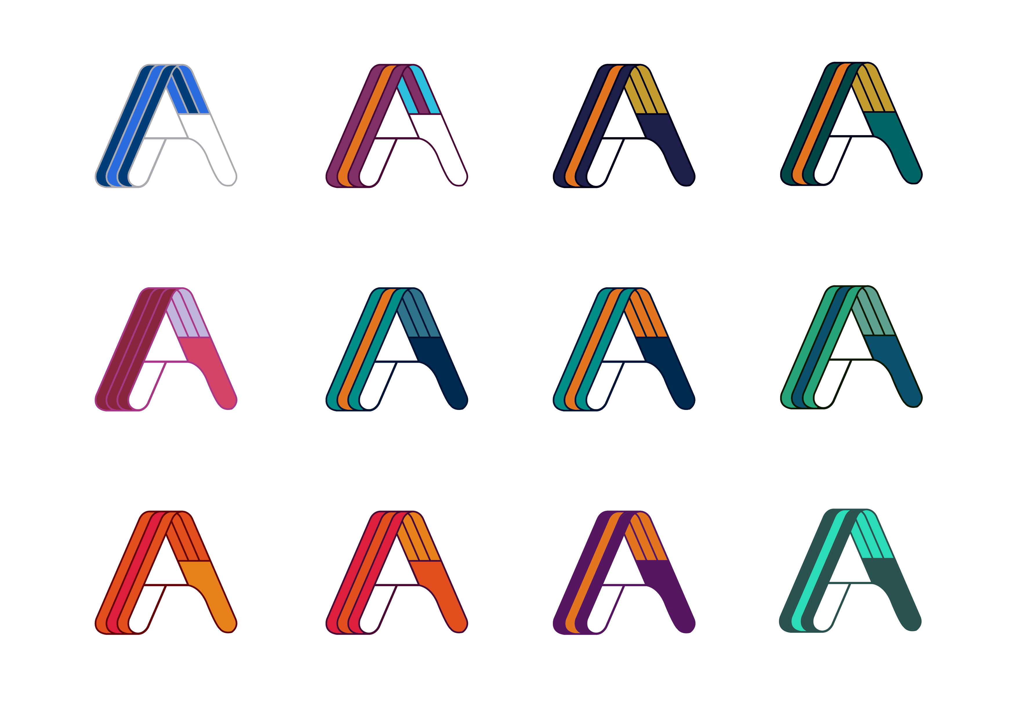
C O L O U R E X P L O R A T I O N
Sticking to the colour scheme of the corporate identity with the colour red, and keeping in mind the teal vest which the pin will be pinned on, and a yellow colour to complement these two colours and at the same time capturing Read more →
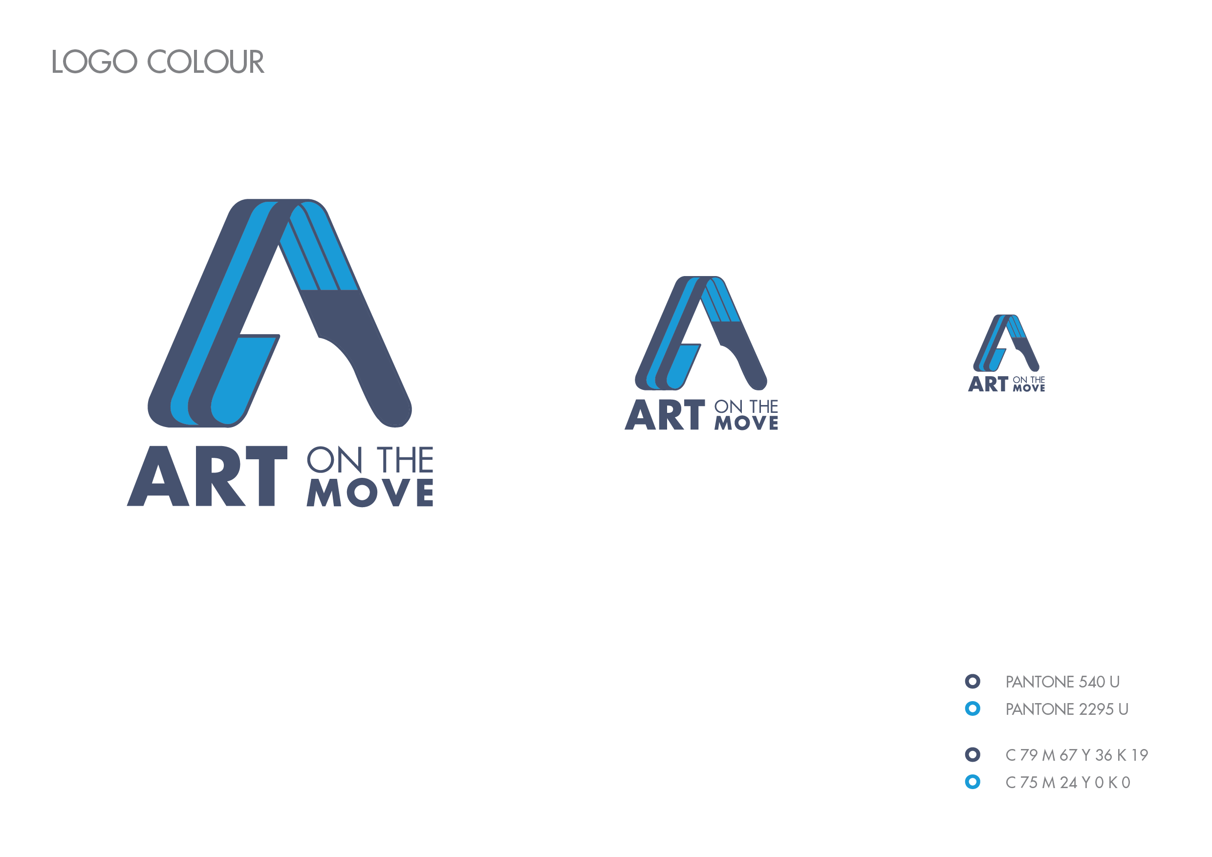
Art On The Move (FINAL)
The colour blue is seen to be trustworthy and dependable. Blue is also an important healing colour as it is linked with calm and serenity. It helps lower blood pressure and can reduce rapid heart rate.
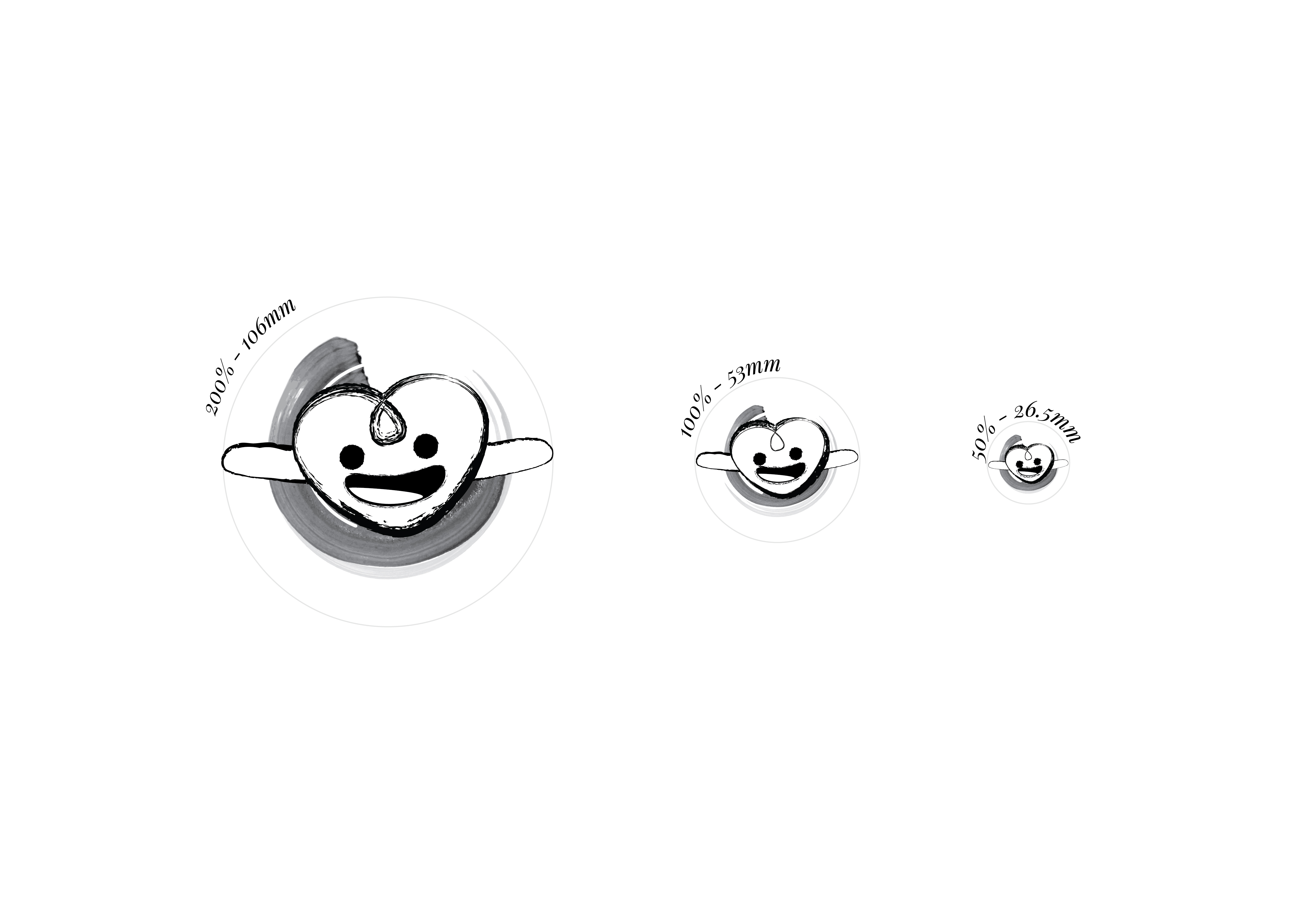
The client also highlighted that the logogram may be used for other activities. With that in mind, I created the logo with Read more →

Project 1: Final Design

FINAL DESIGNS
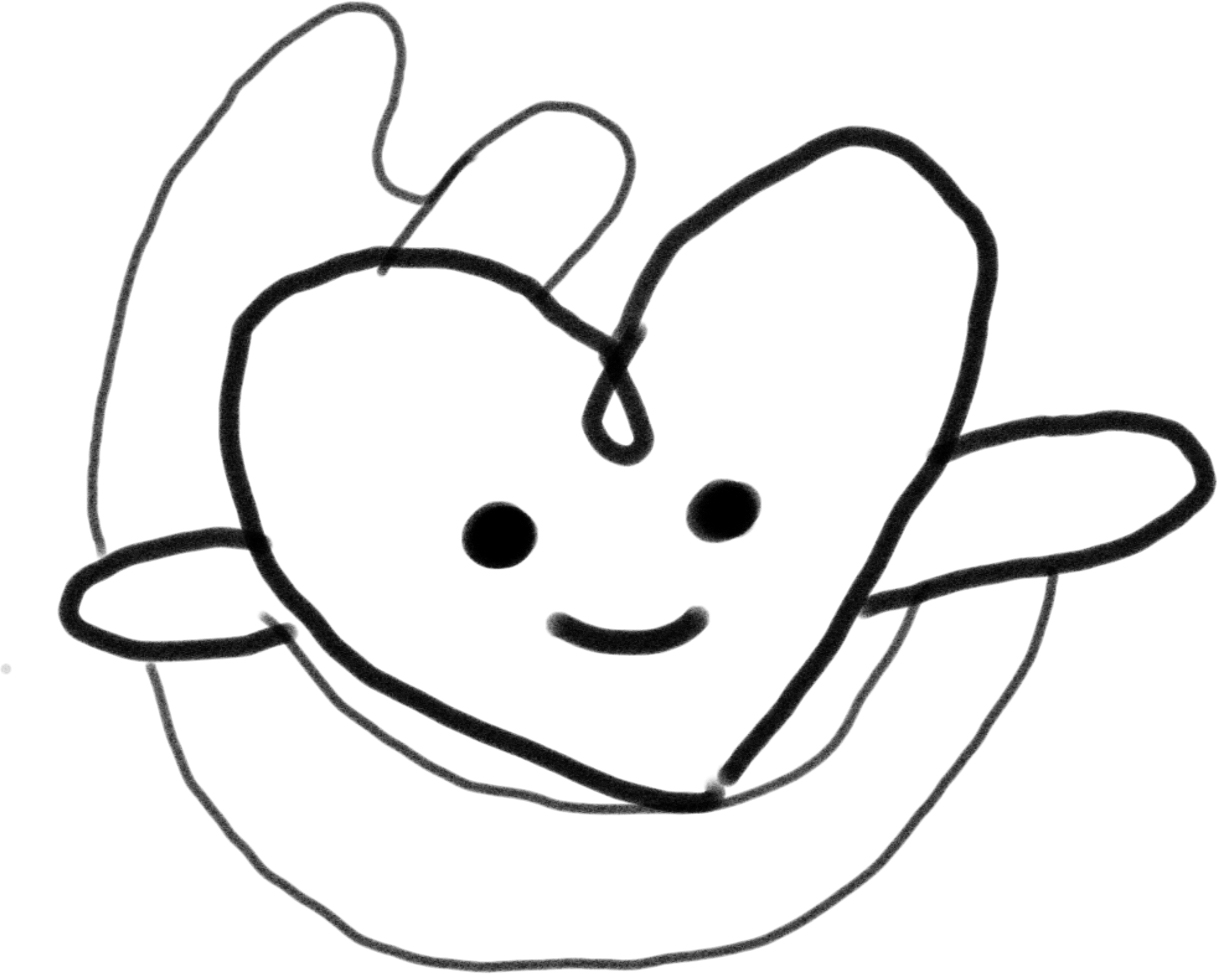
Incorporated brush and palette into my design.
My main concept was to have fun and be happy. So i added bright colours to make the design pop. When one is happy, they would be enjoying themselves and not think too much about their condition. So, it would be a positive distraction. Also I added shapes
Heart: Love
Square: Think out of the Read more →
Task 3 : Colour exploration

9. Simplify and rounder
The swoosh is translated to various arts medium to give the artsy feel. I picked the paint swoosh as it is ‘neater’ and more dynamic. Trying out different expressionsSelected design 1
Update:
After receiving Michael’s comment, I realized the arms of the heart does not look like it’s arms, hence decided to add in Read more →