Recent Posts
Project 3 (Final)

continue from the previous task
Readjusted the design > printed out to check.
Misalignment.Imaginary still looking weird
Revised design:
Added numbers as the page number. MORE bleeding.
Huge emphasis on the numbers. Remove the purple circle border. MORE Bleeding.
Final
Colour code the Read more →
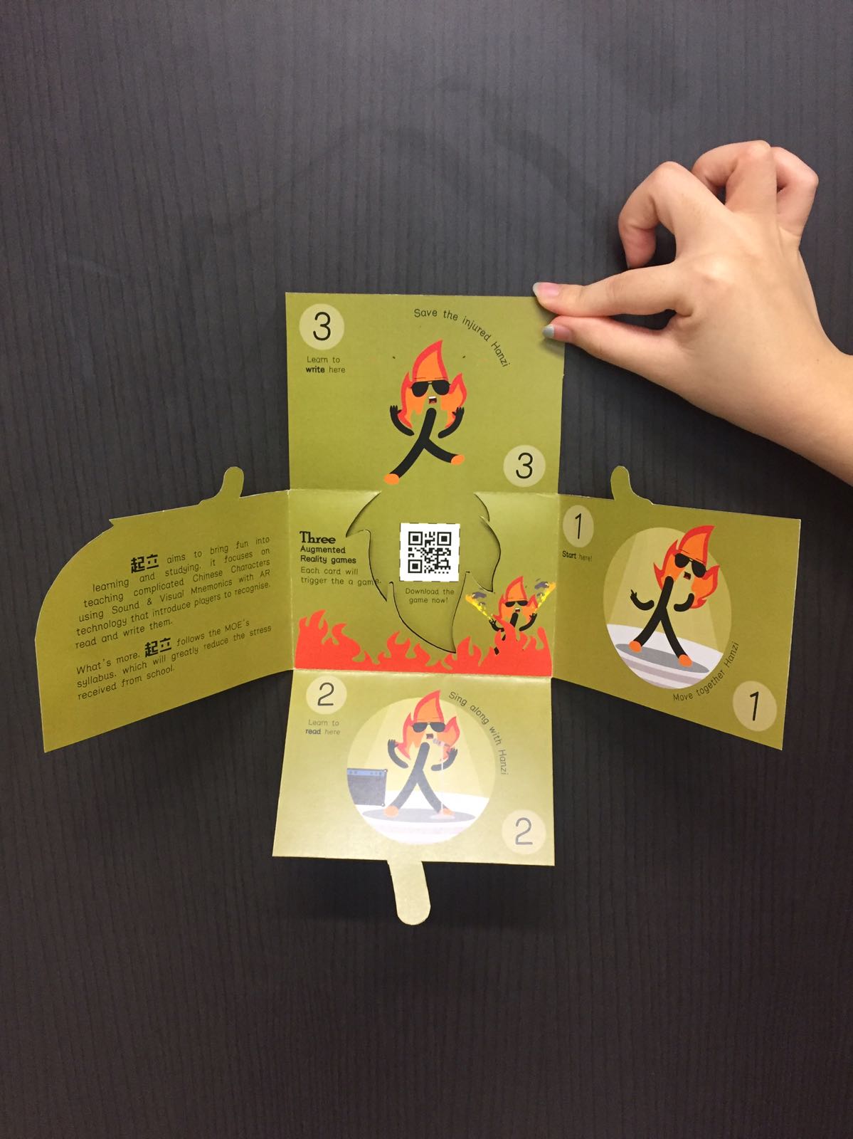
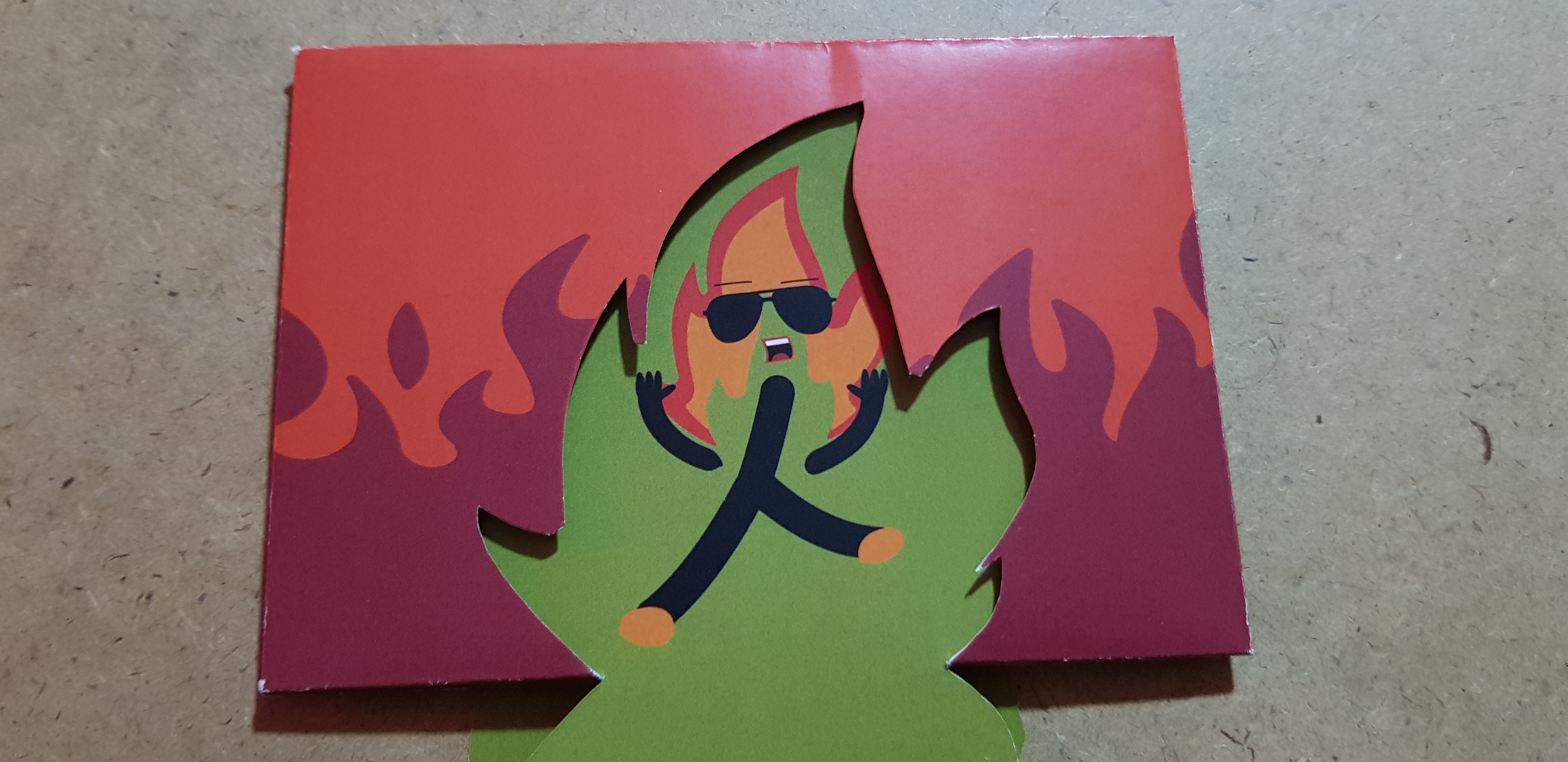
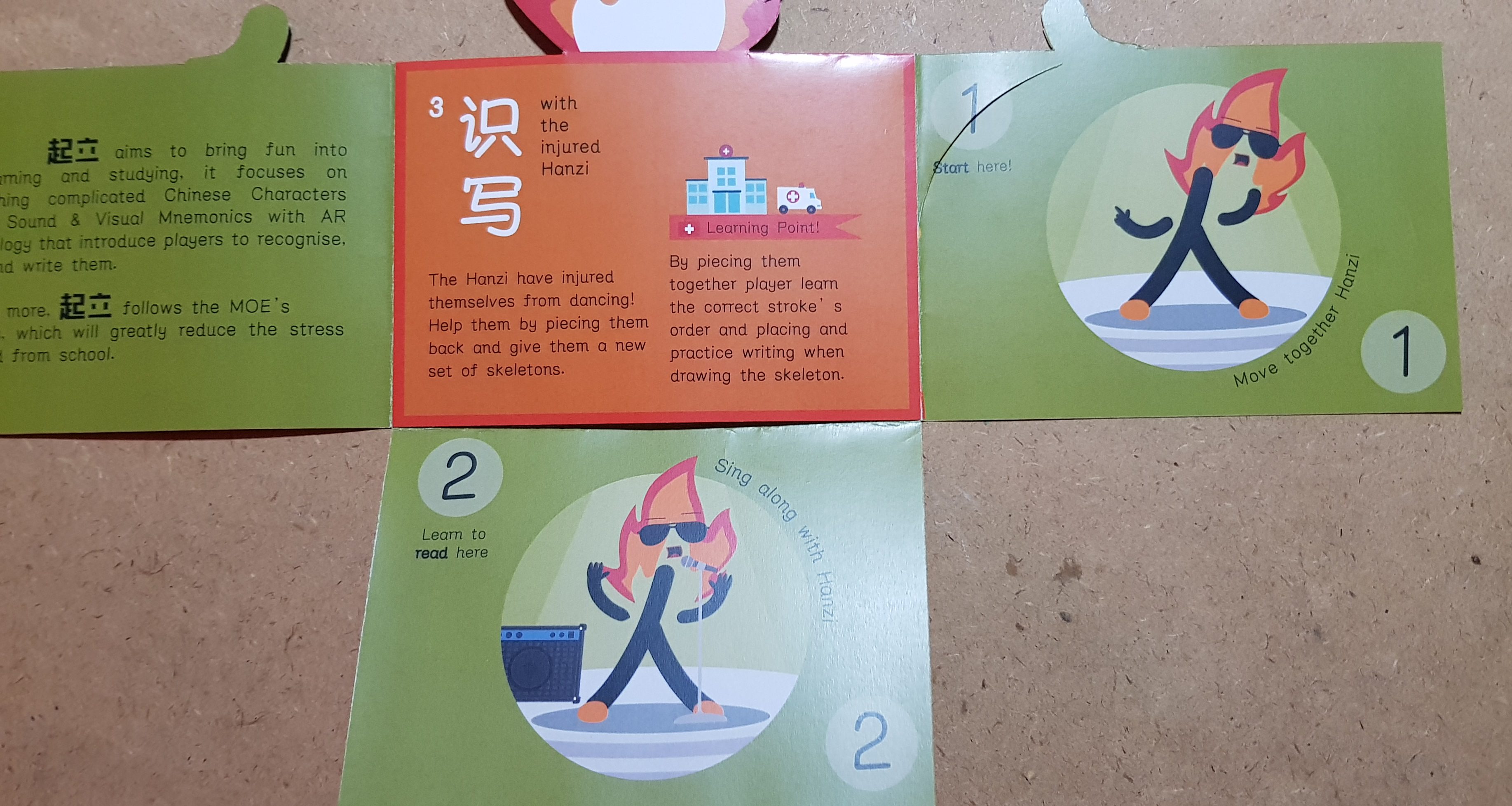
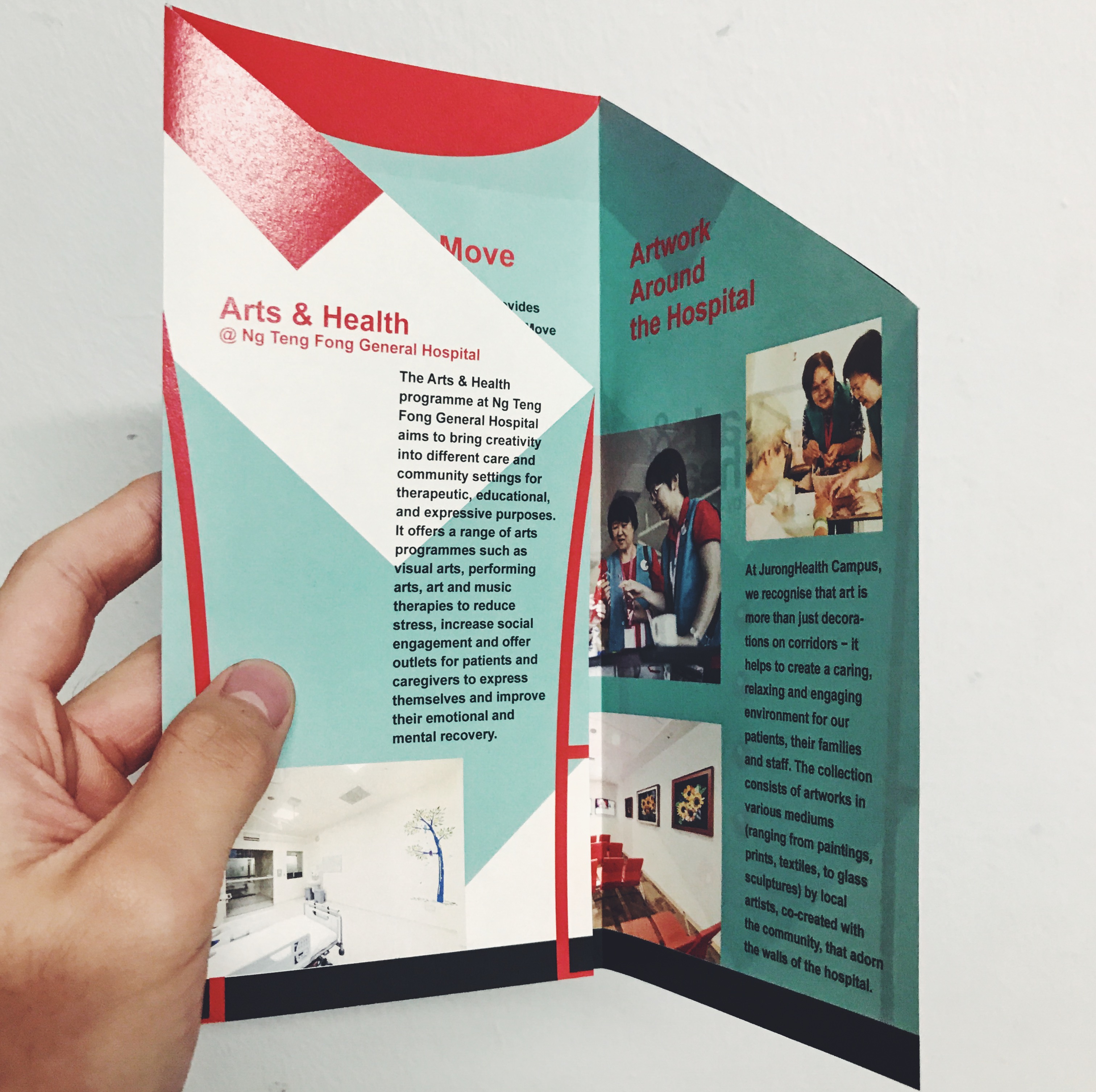
TUSK 2

F O L D 6 pages accordion fold
C O L O U R S Teal + Red (colour of the vest and the hospital’s colour)
Please click on the thumbnails the colours are off!
Lack of sense of flow, static placement, disjointed, include the photos, take note of margin, lines on the cover of the brochure are too sketchy, think of ways Read more →
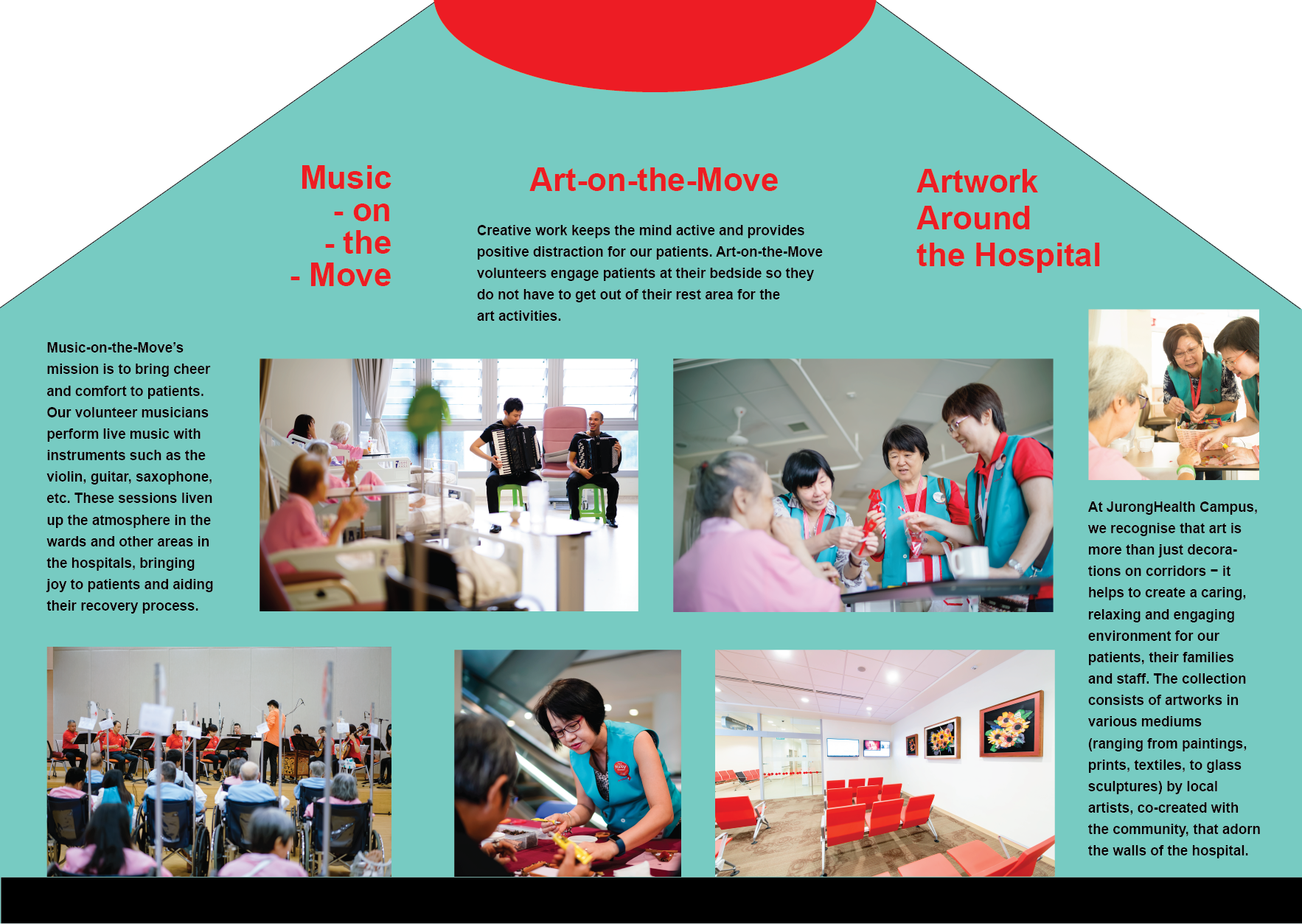
Final Brochure
Final Brochure Design:
By reducing the size of the shapes the attention is now focused on the body copy and the featured image. Each information page has similar features such as the yellow title and shapes framing the images making the whole design intergrate.
The final brochure could have been presented better as I didn’t have time to test print and I Read more →
Project 3: Final Design

Taking into account the feedback that was given during the consultation, I pushed the graphic elements even further, removed non-essential elements and weaved in a narrative flow to the information of the arts and health programme.
Week 12: Final Presentation

Final Phase of Design In my final phase of changes I contemplated on adding the line of flow on both sides of the brochure design. However, I felt that it spoilt the overall look and decided to make do without the suggestive line. I moved the alignment and text to allow the header to have a better balance (previously sinking Read more →