Recent Posts
Project 3 Brochure for Arts and Health at Ng Teng Fong General Hospital (Task 1: Design Exploration)
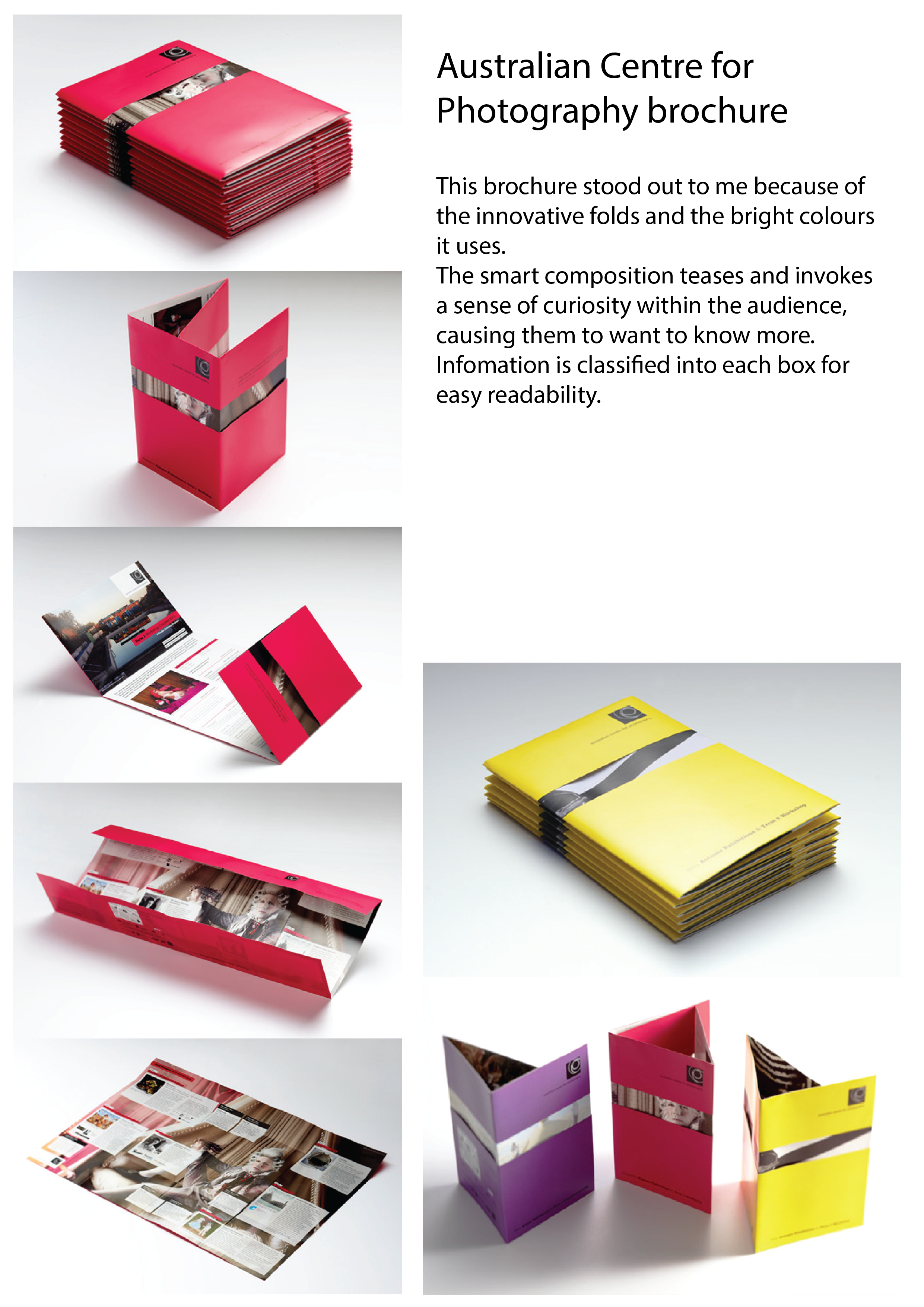
Shape of the brochure is triangle. It can be opened easily. Viewers can see the information easily. There is two figures in the brochure and look like connected when the brochure is closed. Colour of brochure is nice, it gives a sense of smoothly.
Minimal Design, fold easily. Viewers can understand and get the information easily. There is one die cut Read more →
Project 3: Task 2 – Research and Development
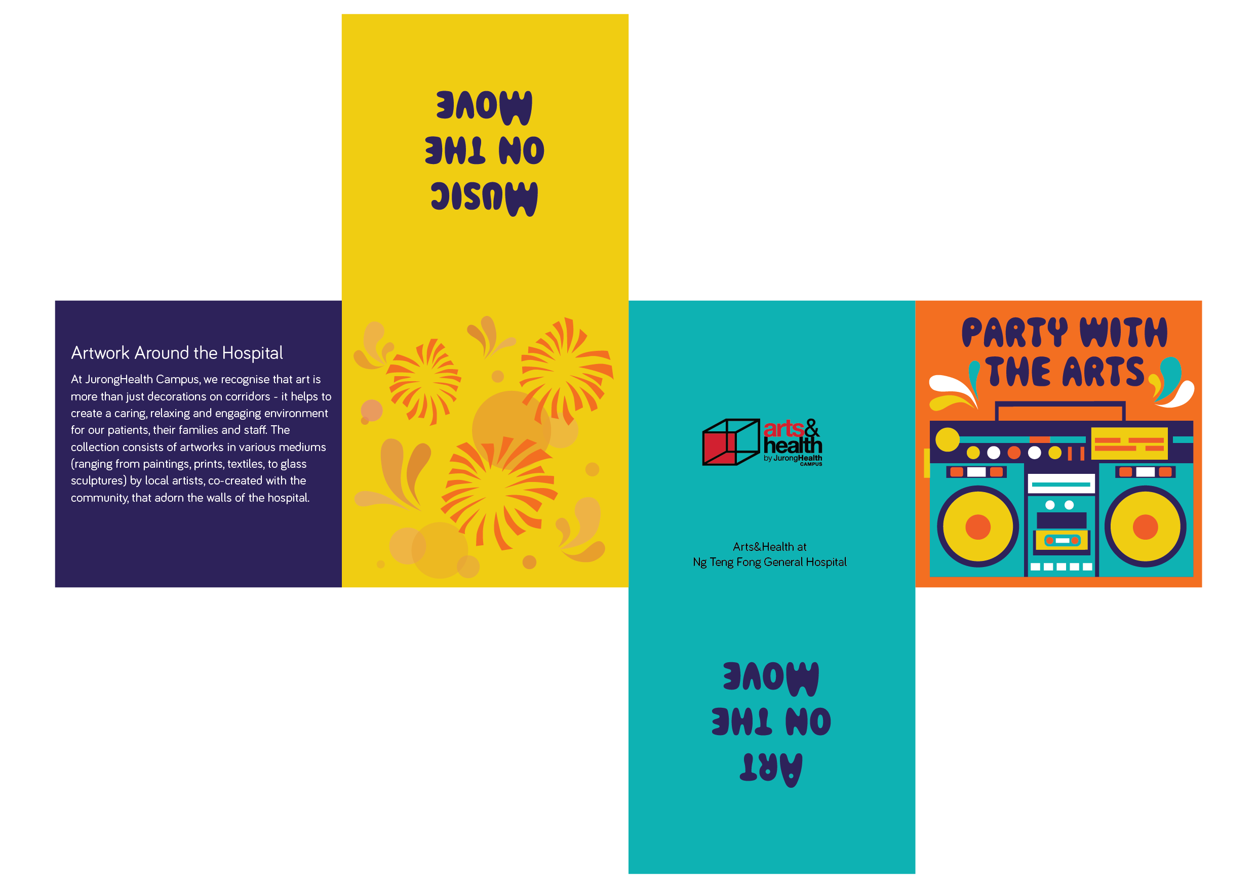
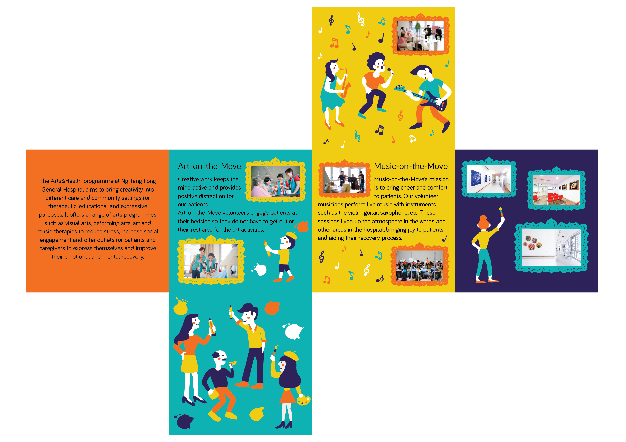
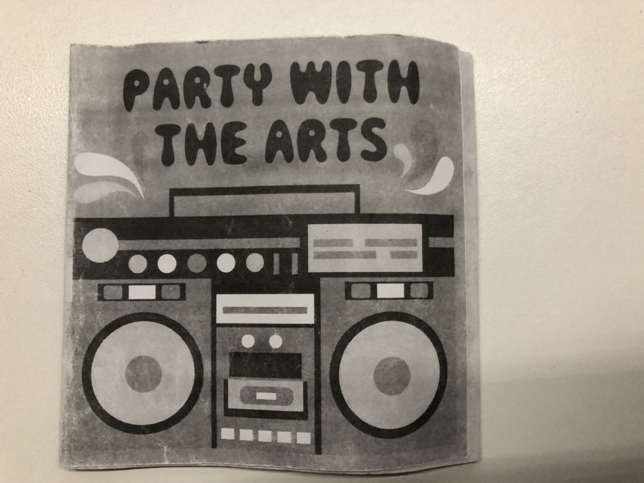
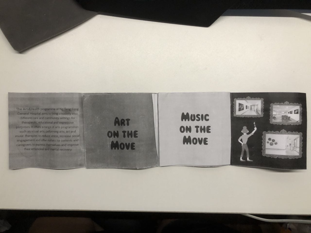
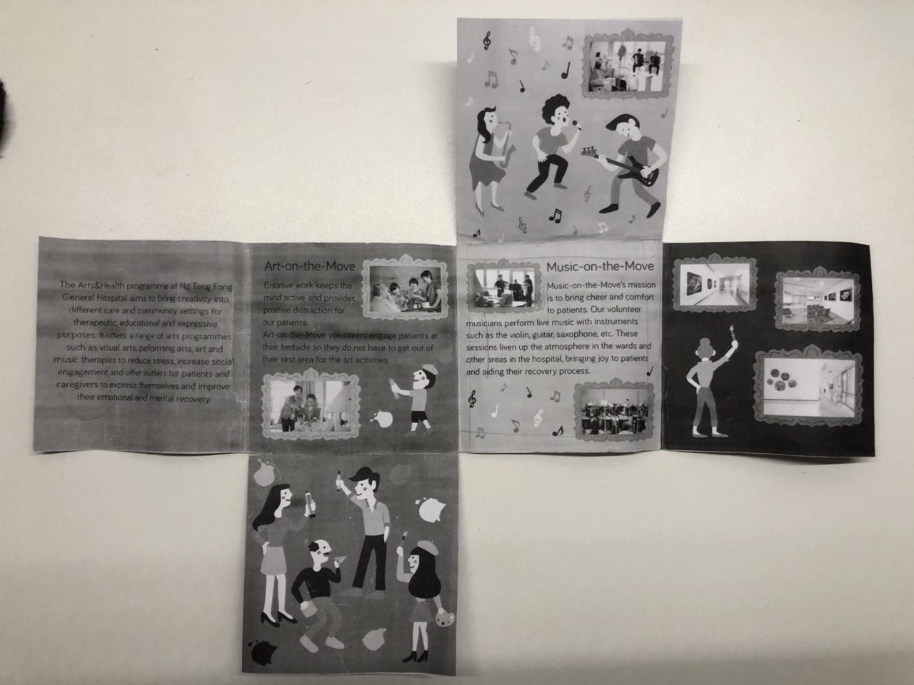
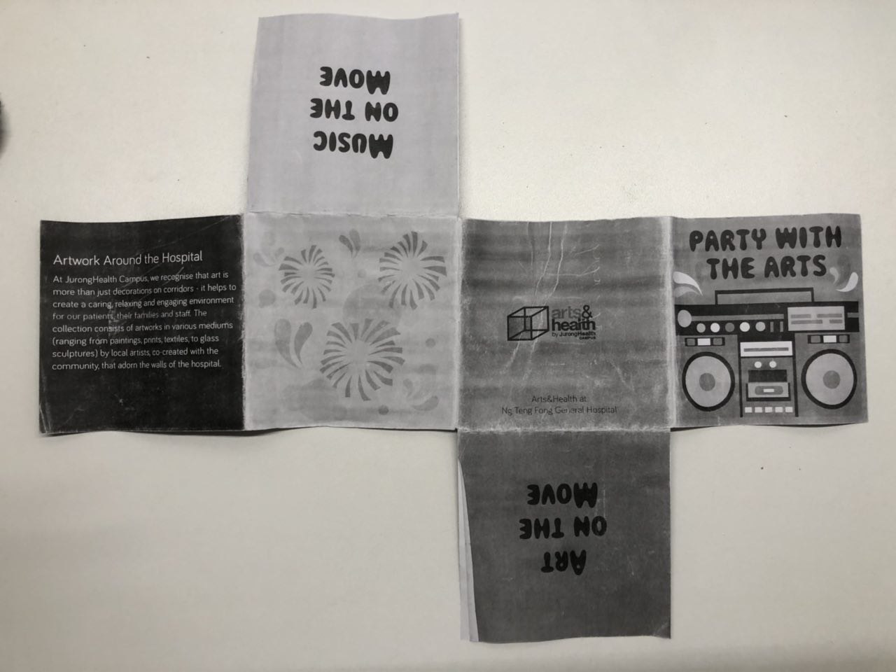
So I continued with my previous idea of “Party with the Arts” onto this project but changed the illustration style.
This is my layout on illustrator:
Here’s how it looks like when folded:
The feedback that I got for this first draft was:
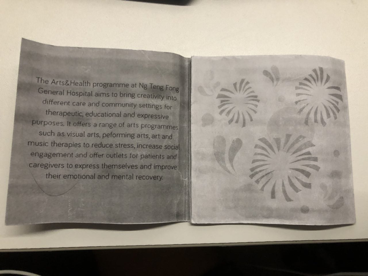
The boombox in the cover page was static Read more →Project 3: Task 1 – Design Exploration
VC Project 3: Research and Developement
In the brief we were asked to look up on some brochures:
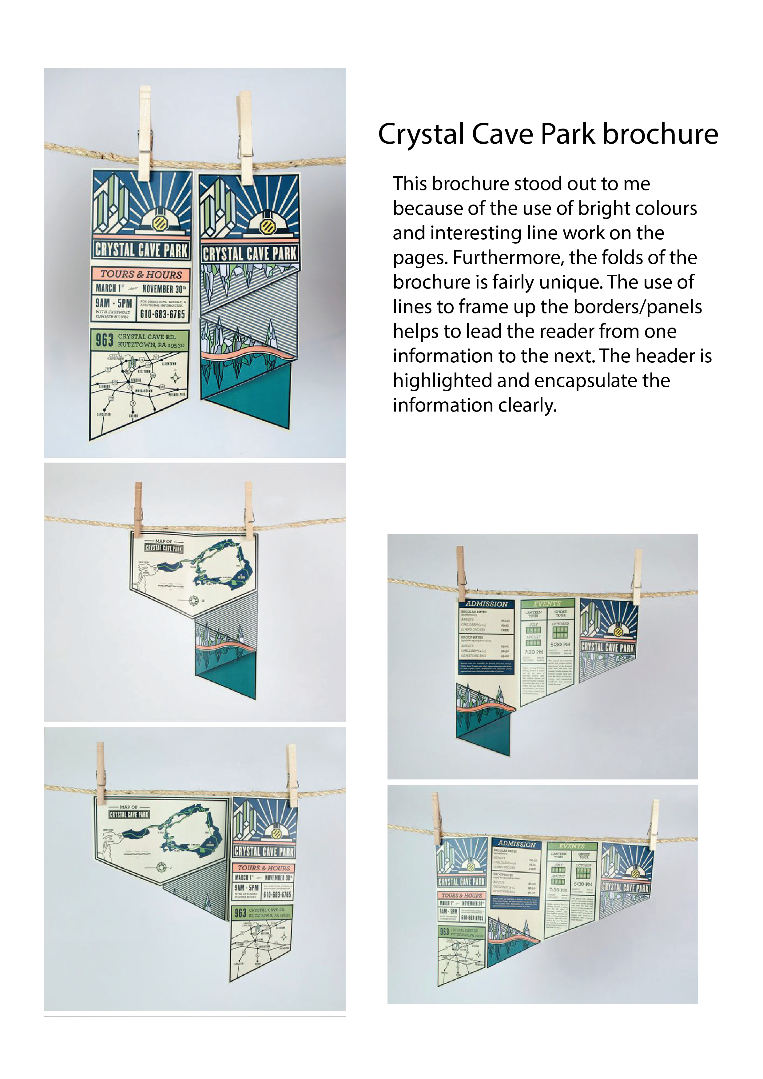
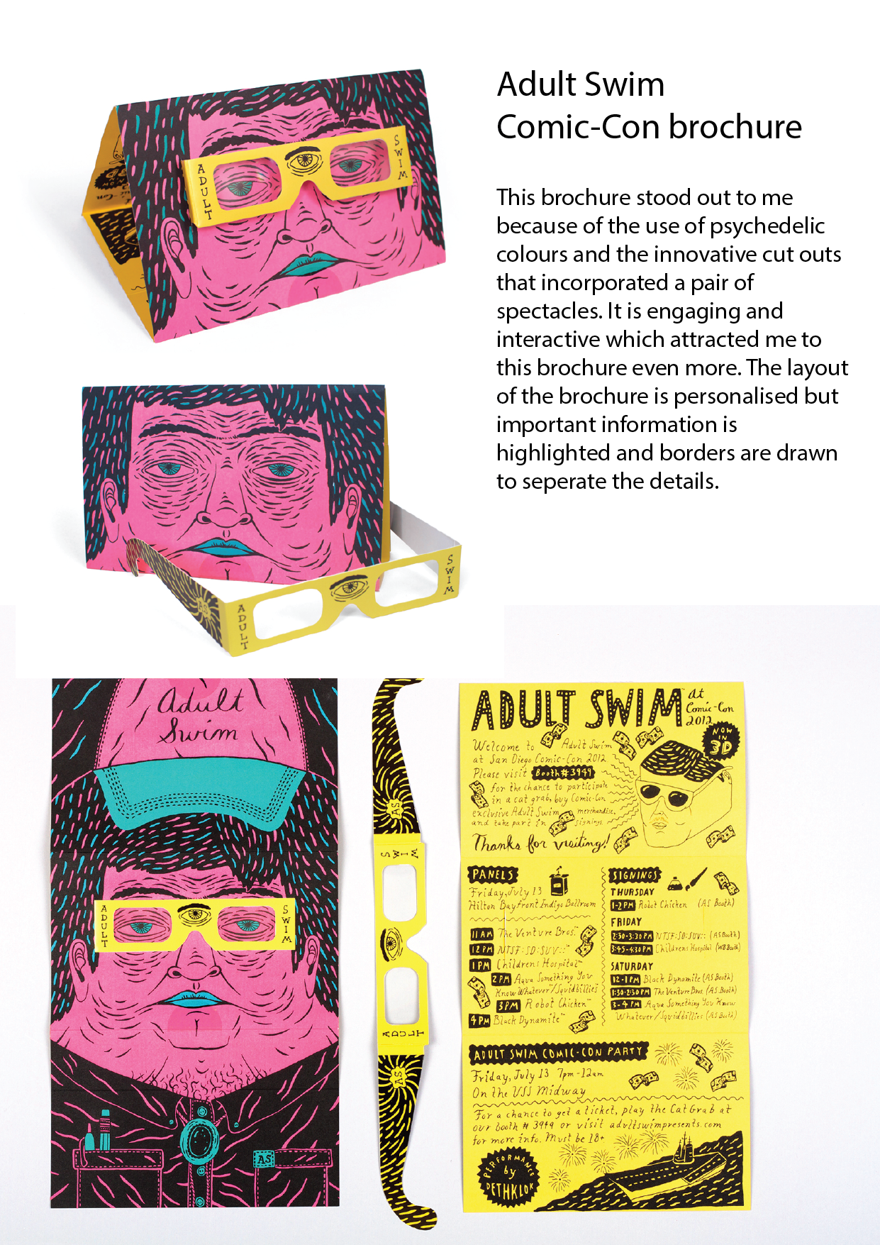
This is one of the brochures that caught my eye due to the fold and design. Even though the fold here used is extremely simple, it’s relevant and appropriate in imitating the way the BBQ cooker opened up, adding visual interest.
The below brochures I find aesthetic but I include Read more →
Project 3 (Next Task)

continue from task 1
From the feedback and mistakes made previously, I came up a new design:
Using Complementary color to color code the different pages. (Orange page) Using matching illustration to fill up the empty page. (Green page) Simplify the illustration (so it can be identity by the phone) and provide visual cue as the page’s number. Give a lot of bleeding Read more →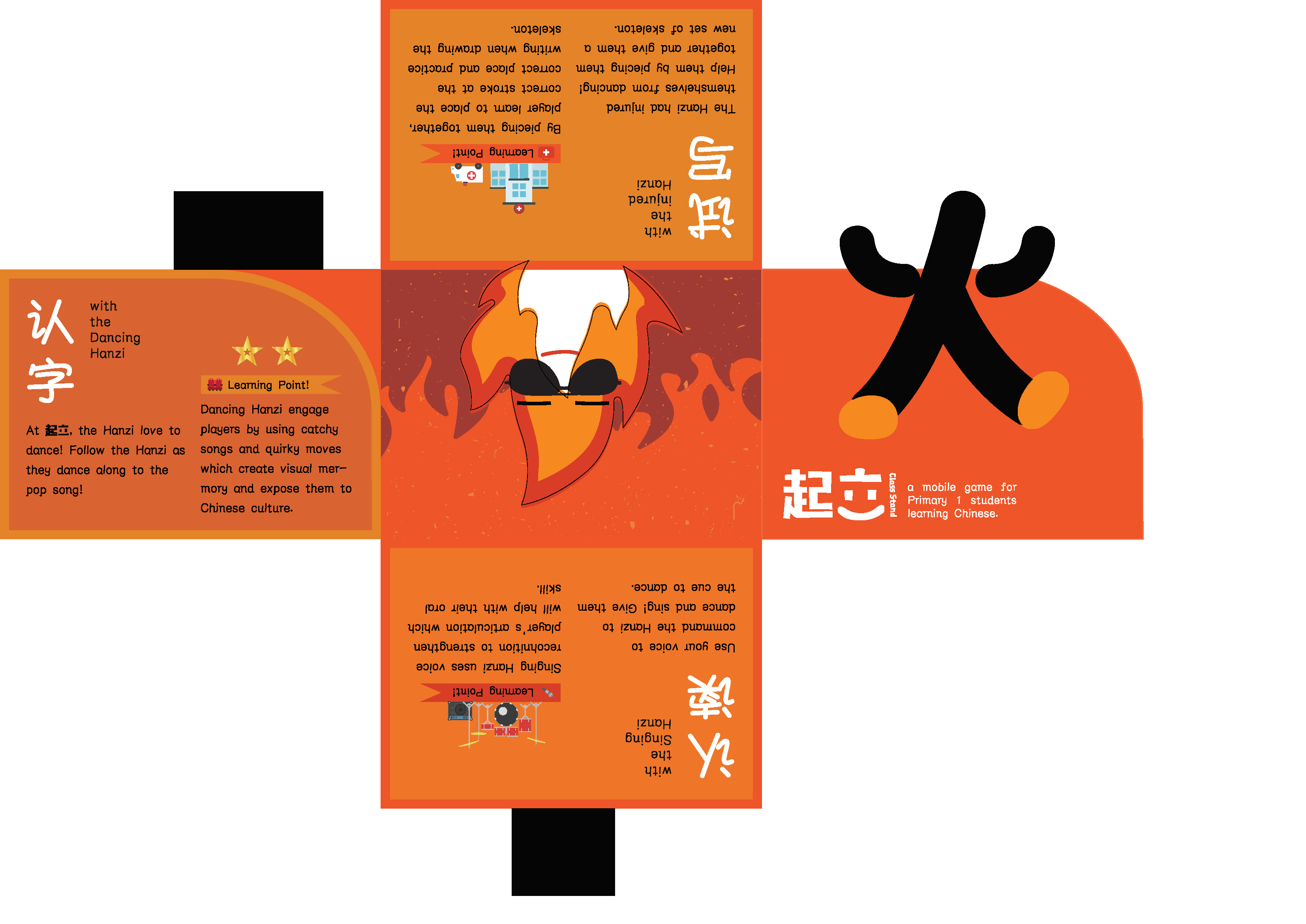
Project 3 (Task 1: Design Exploration)

1. Existing brochure design
Using illustration and it’s color to differentiate how it is going to look when folded and open.
Using folds and die-cut to make the illustrations from different page appear to be a single image.
Using cute illustrations and die-cut to differentiate the pages.
2. Playing with folds
I will be working on my own FYP which is a mobile app for Read more →
TUSK 2

F O L D 6 pages accordion fold
C O L O U R S Teal + Red (colour of the vest and the hospital’s colour)
Please click on the thumbnails the colours are off!
Lack of sense of flow, static placement, disjointed, include the photos, take note of margin, lines on the cover of the brochure are too sketchy, think of ways Read more →
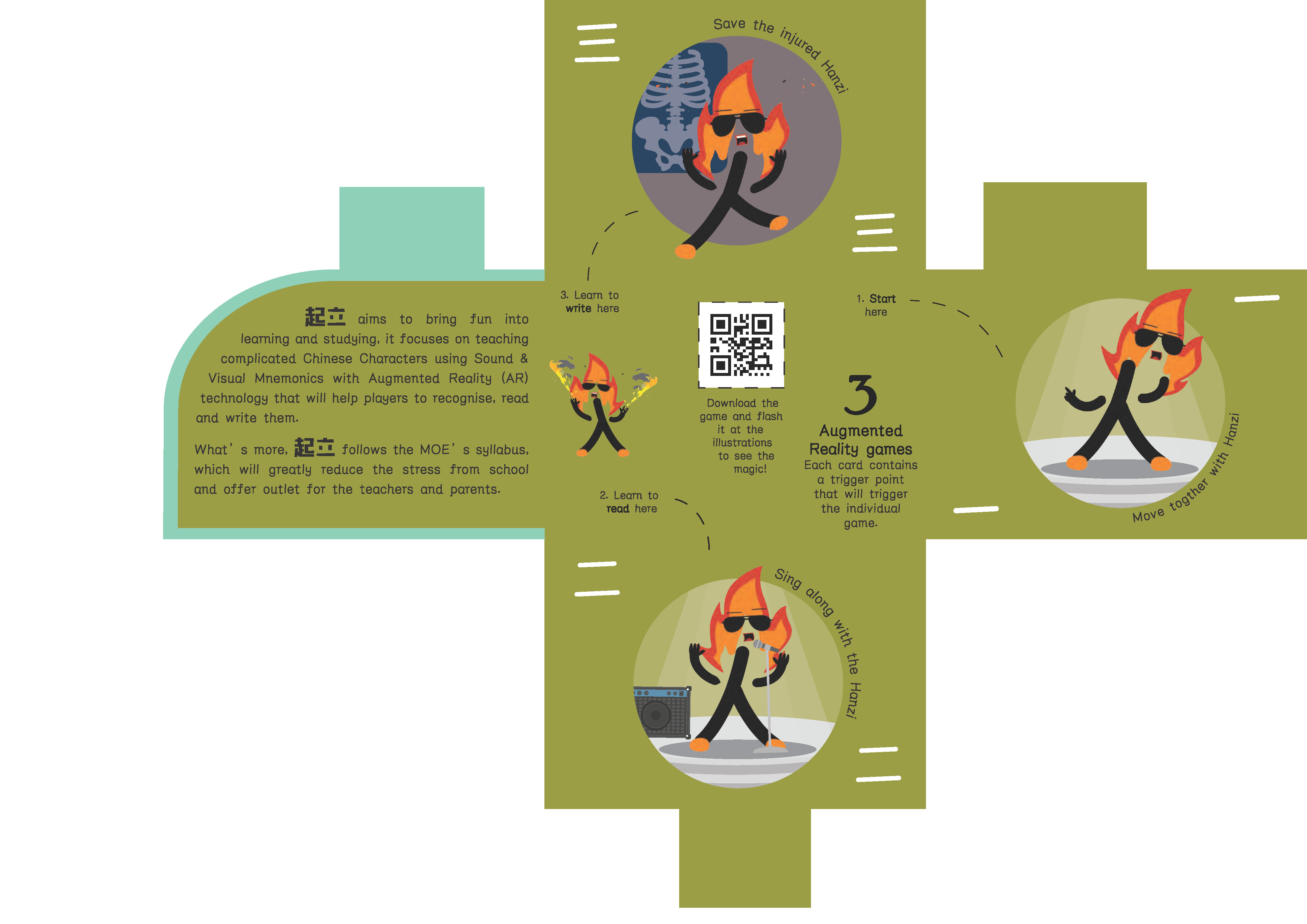
TUSK 1

D E S I G N E X P L O R A T I O N
F O L D I N G What stood out for me in this design is the method of folding, the flaps on the pages can fold up to form a cube which resembles the logo of Ng Teng Fong General Hospital hahaha.