Recent Posts
Task 2: Design Exploration

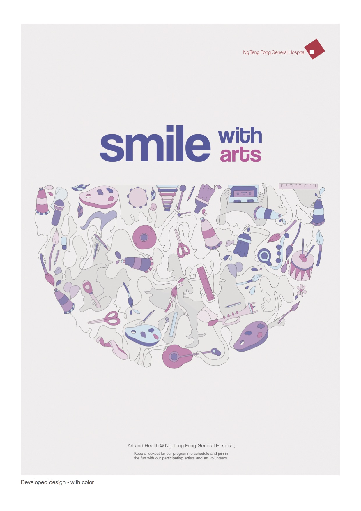
I experimented with various placement, rotation, scale and colour schemes. I was told that the overall design looks a little “too clean/swiss”. Consider changing my heading to something more fun. I started off with a very symmetrical balanced layout and modify from there.
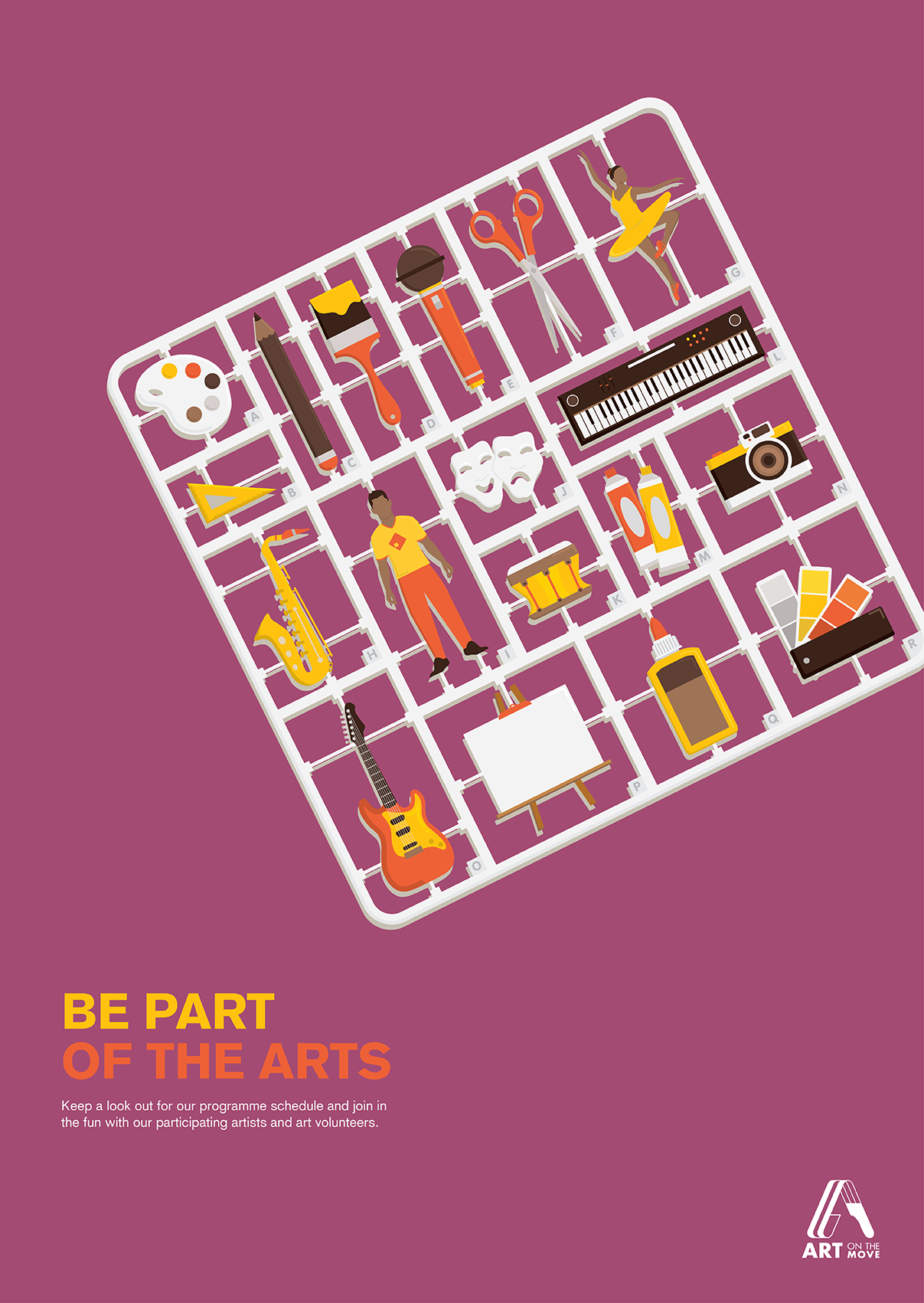
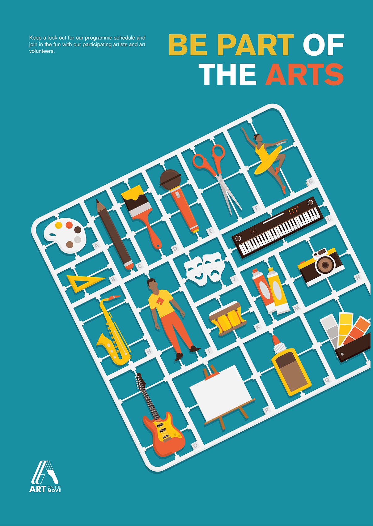
Week 7: Design Refinement & Mock Up

Colour Palette
As I added more elements to the poster design, I wanted to restrict myself to three main colours. Of which I chose the primary colours to work with.
Readability & Legibility
Script typefaces were selected as I wanted to bring out the crafty sense. However, when I looked at the typeface again, it was difficult to read from a distance Read more →

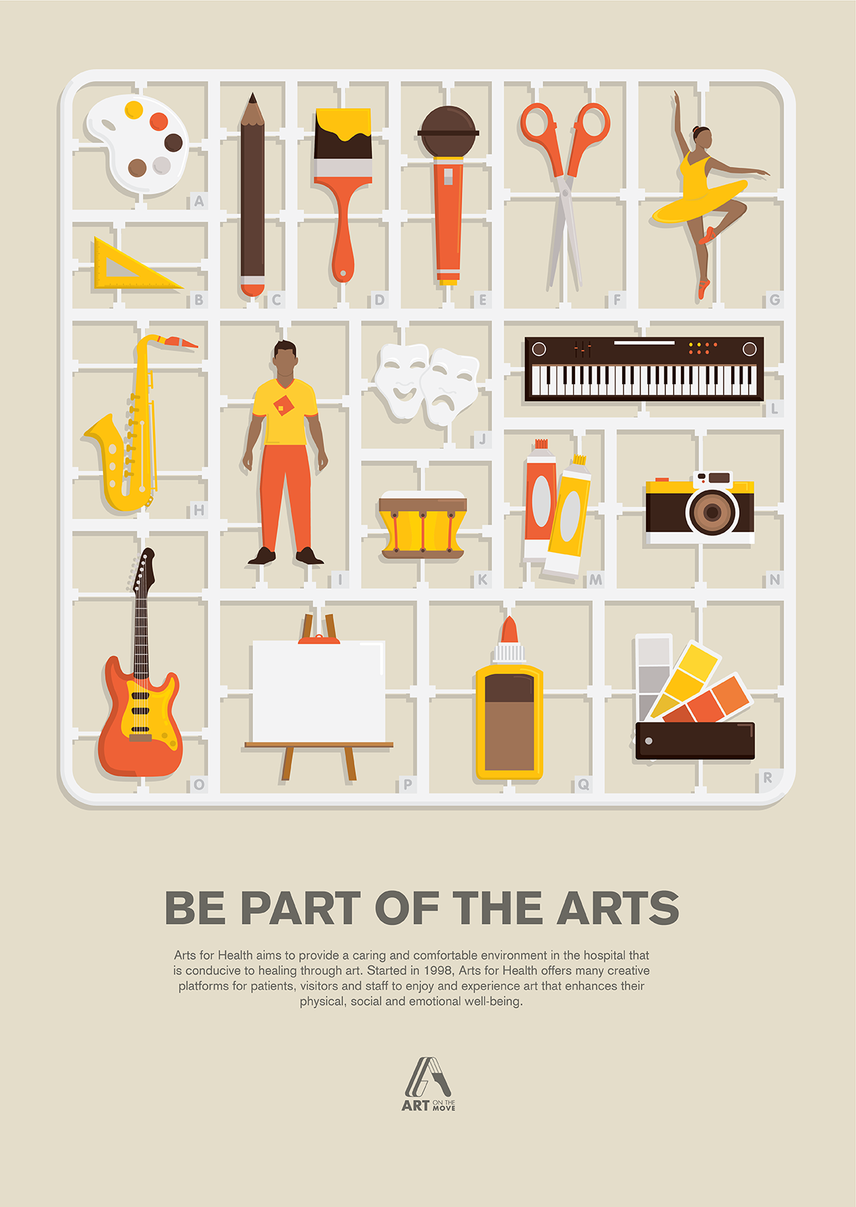
Task 3: Design Refinement & Mock Up
Task 3A: Readability and Legibility
Design Refinements:
Feedback from Peers:
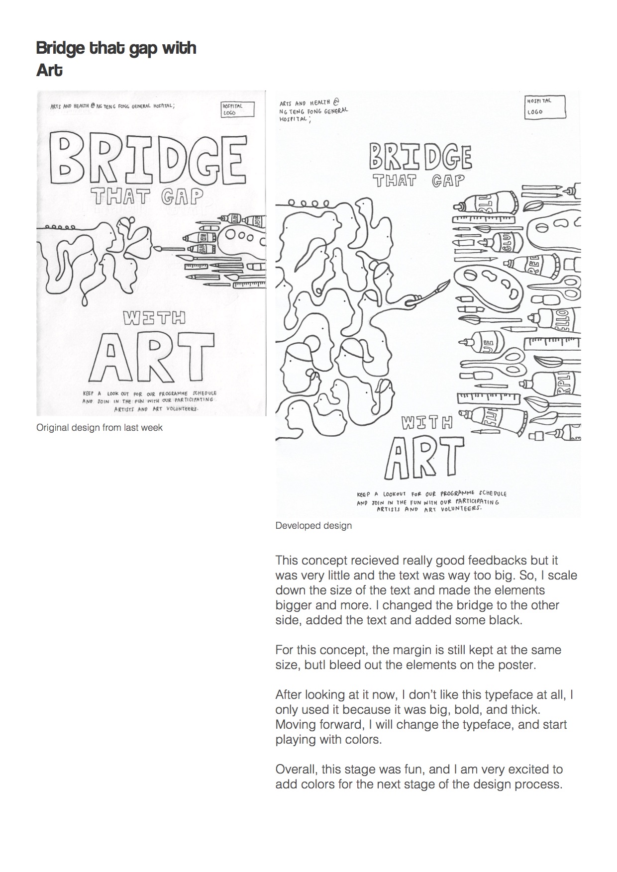
no outline more details – strings and palette confetti – vibrant, joy continue splash look into text details – a different voice emphasis – play with size and orientation the orientation of shapes – how to play with the elements try a different palette add Jurong Health Logo – monochrome can do accent – 3D the objects like the tubeThe two different Read more →
Week 6: Design Exploration

Compositional Study #01
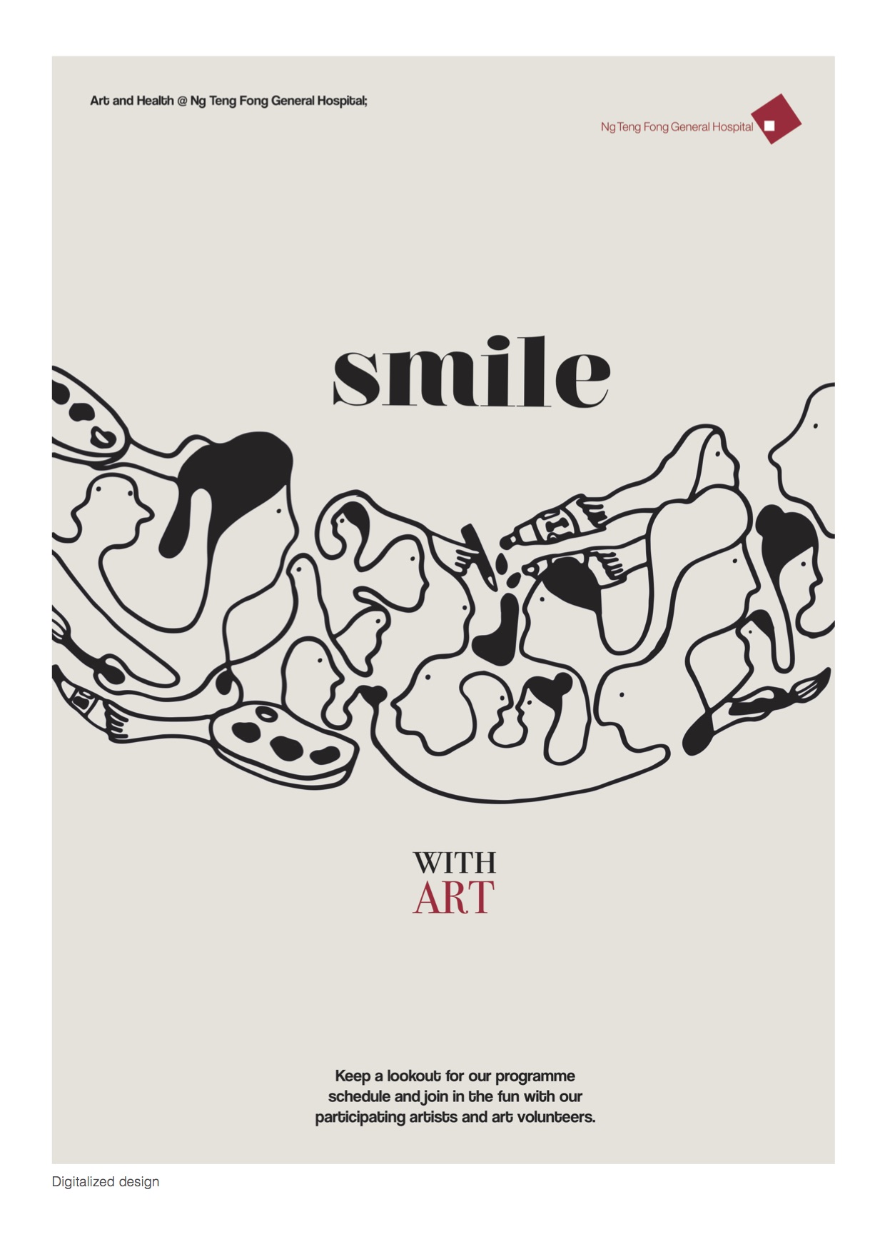
In my first digital translation, I tried to play around with placement of the images and text. I struggled to incorporate the text harmoniously with the poster design. I tried to go for an asymmetrical balance as I did not want the poster to seem too static. I also added musical elements with a flow line to enhance Read more →
Project 2: Arts and Health Promotional Poster ( Task 1B: Develop Slogan & Moodboard)
Our Arts & Health programme aims to bring creativity into different care and community settings for therapeutic, educational, and expressive purposes. Programmes such as visual arts, performing arts, art and music therapies reduce stress, increase social engagement and offer outlets for patients and caregivers to express themselves and improve their emotional and mental recovery.
Concepts Slogan
Join Us and Have Read more →
Project 2: Arts and Health Promotional Poster (Task 1A: Visual Research)
Existing Event Promotion Posters
This poster convey a message which is there is a bigger and better H&M store at Orchard building.
Design of this poster expressed the excited and happy of shopping.
From this poster, the first things I see is two models. This poster is symmetrical. There is two models with happy faces at the center of the poster. Secondly, the Read more →