Recent Posts

VC Project 3: Research and Developement
In the brief we were asked to look up on some brochures:
This is one of the brochures that caught my eye due to the fold and design. Even though the fold here used is extremely simple, it’s relevant and appropriate in imitating the way the BBQ cooker opened up, adding visual interest.
The below brochures I find aesthetic but I include Read more →
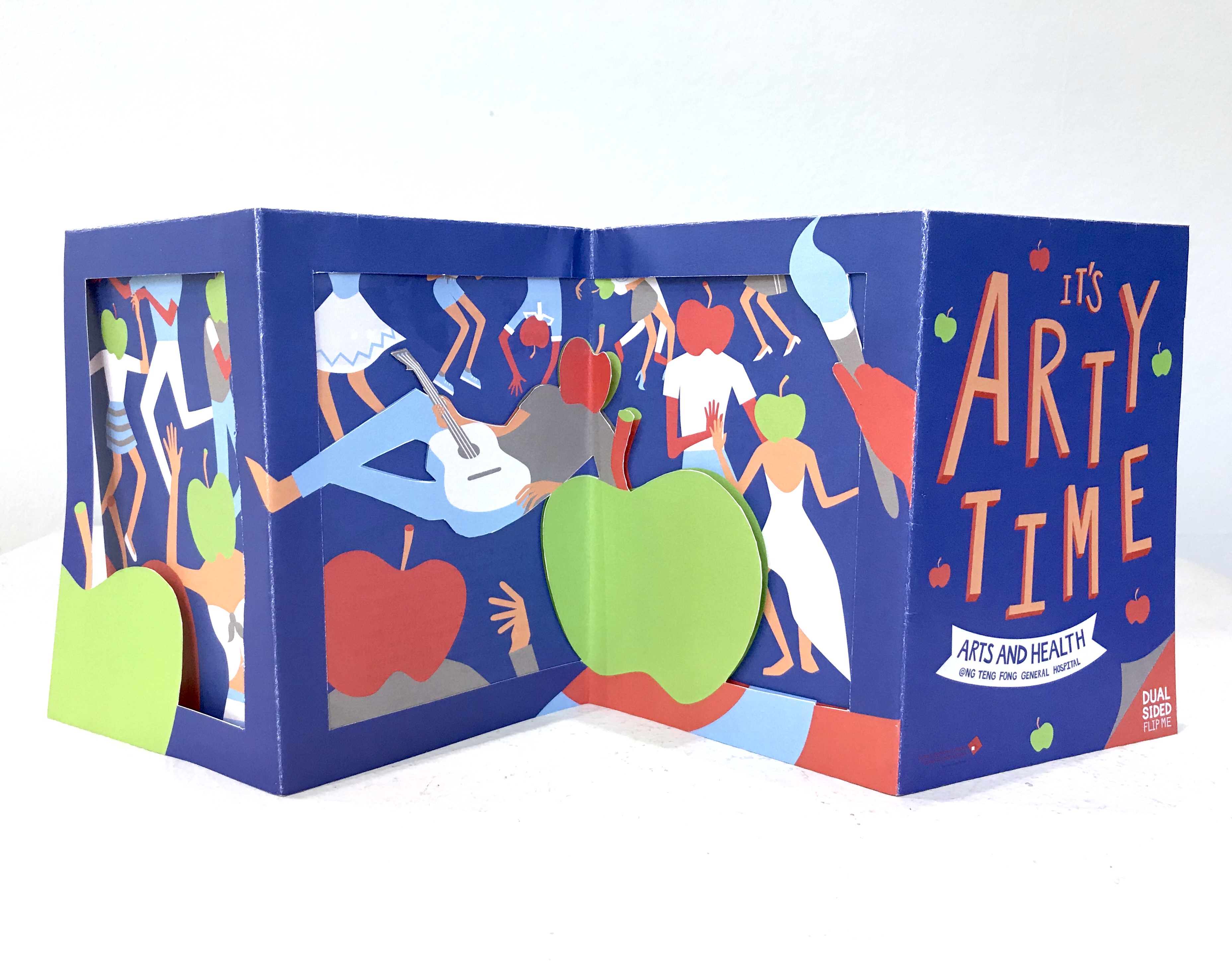
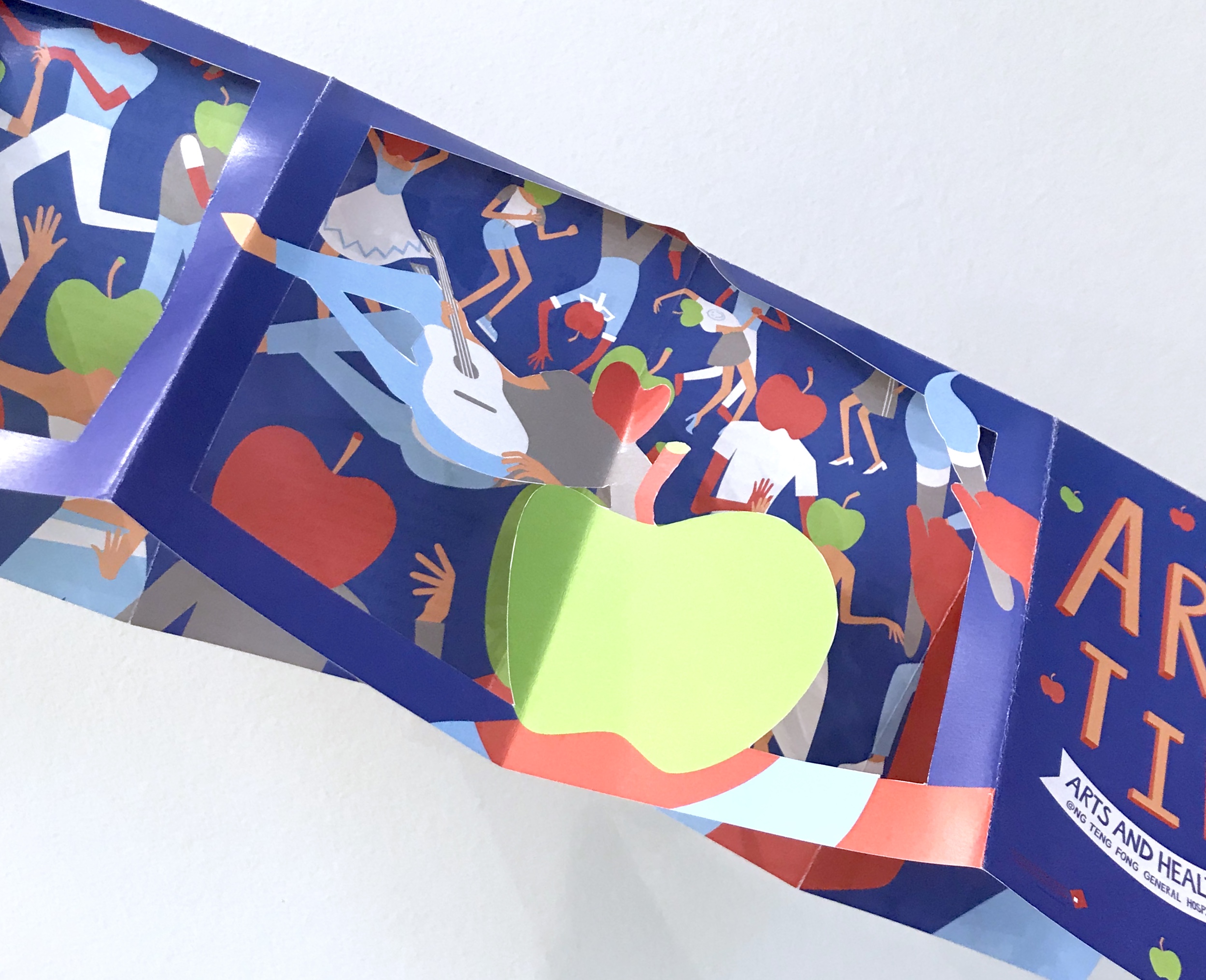
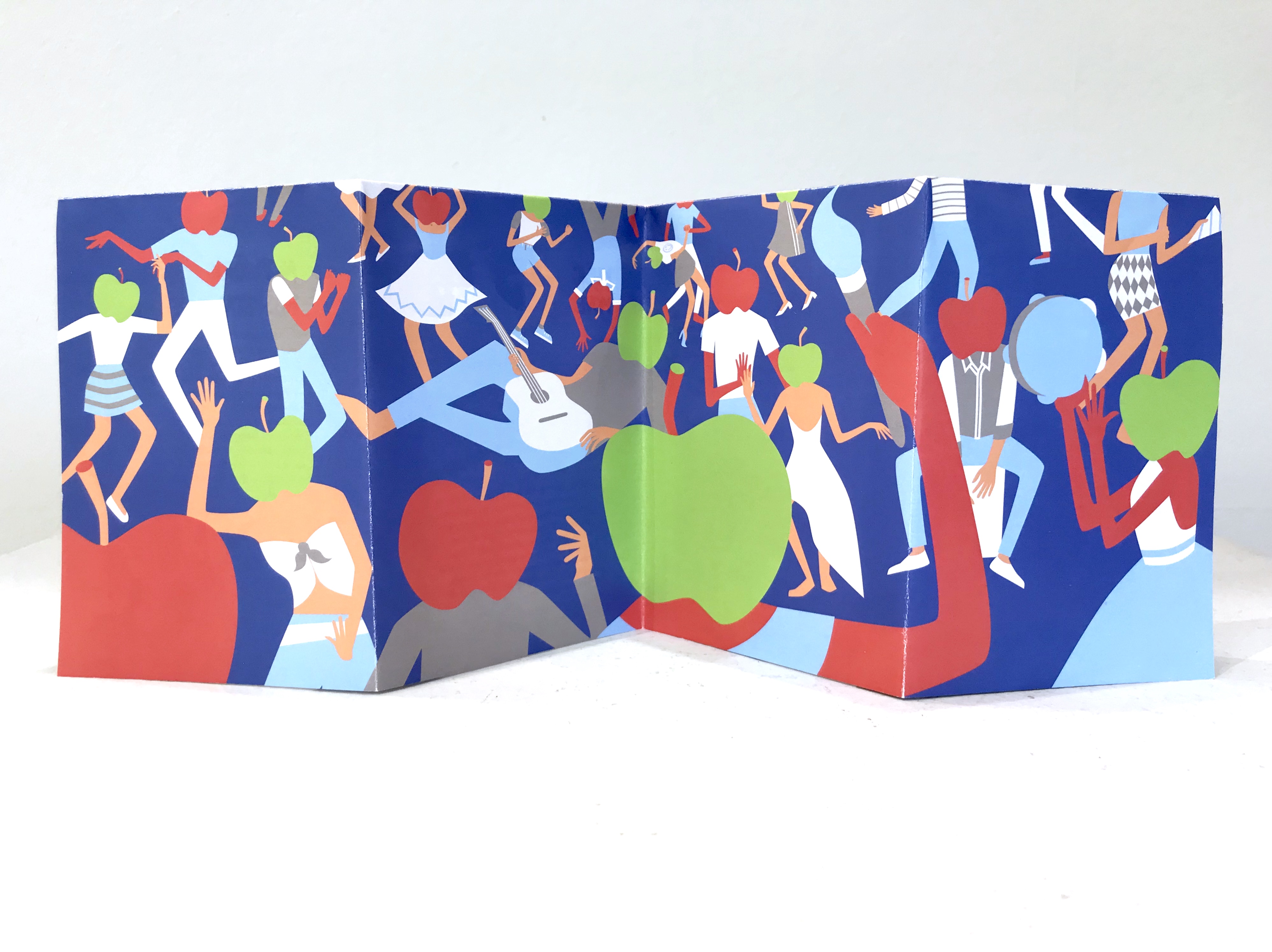
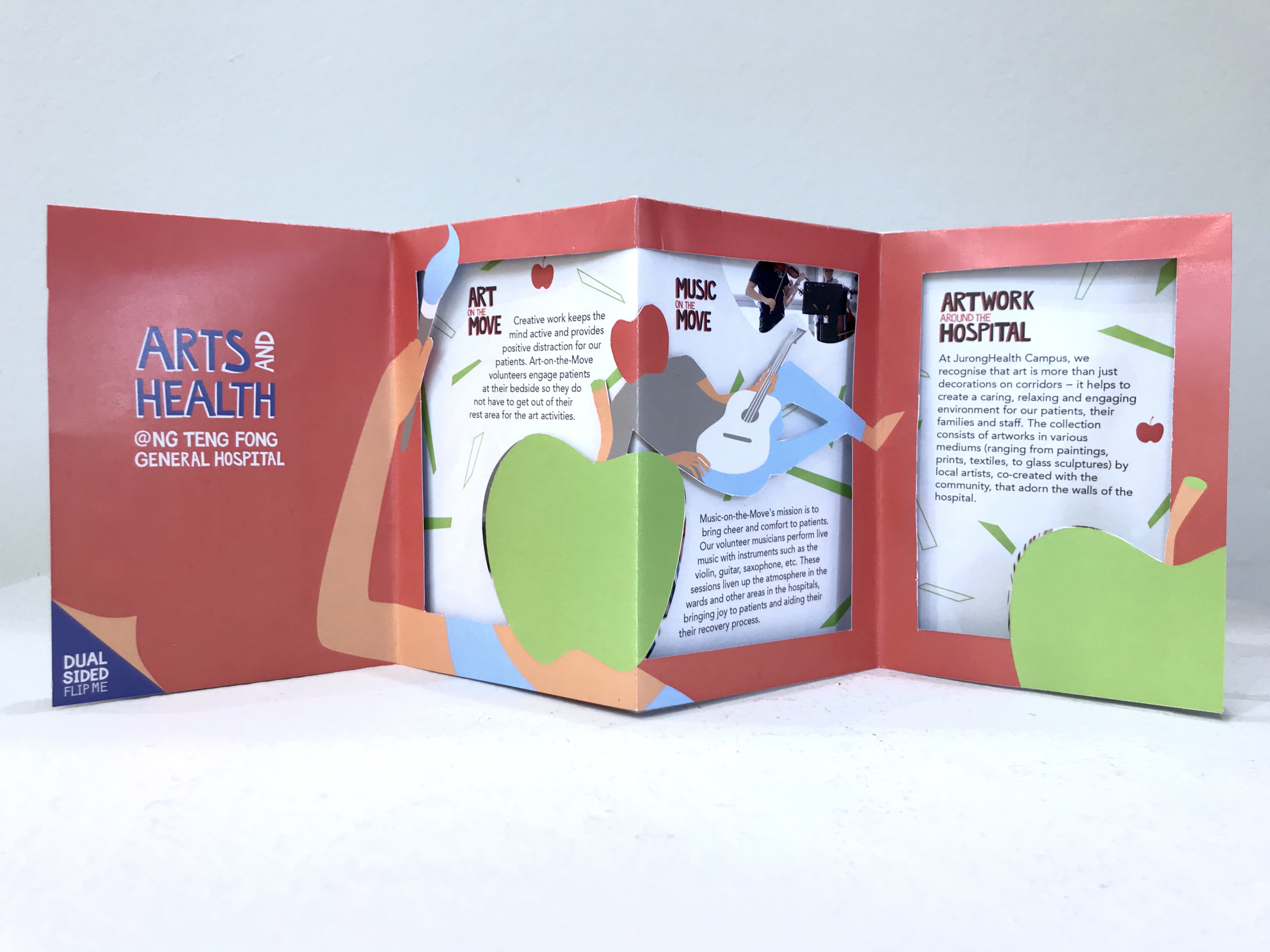
Project 3 (Final)

continue from the previous task
Readjusted the design > printed out to check.
Misalignment.Imaginary still looking weird
Revised design:
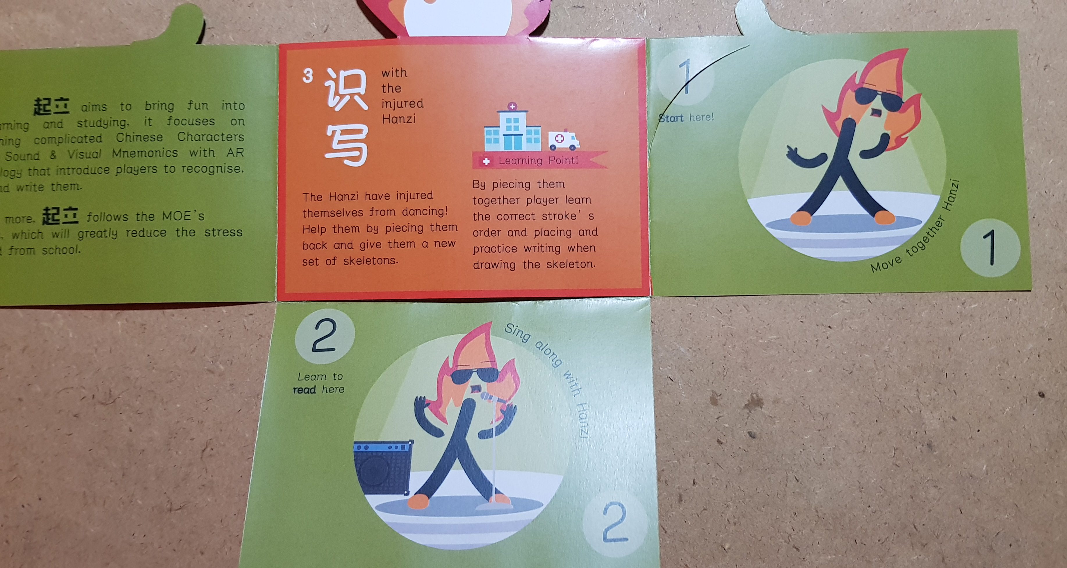
Added numbers as the page number. MORE bleeding.
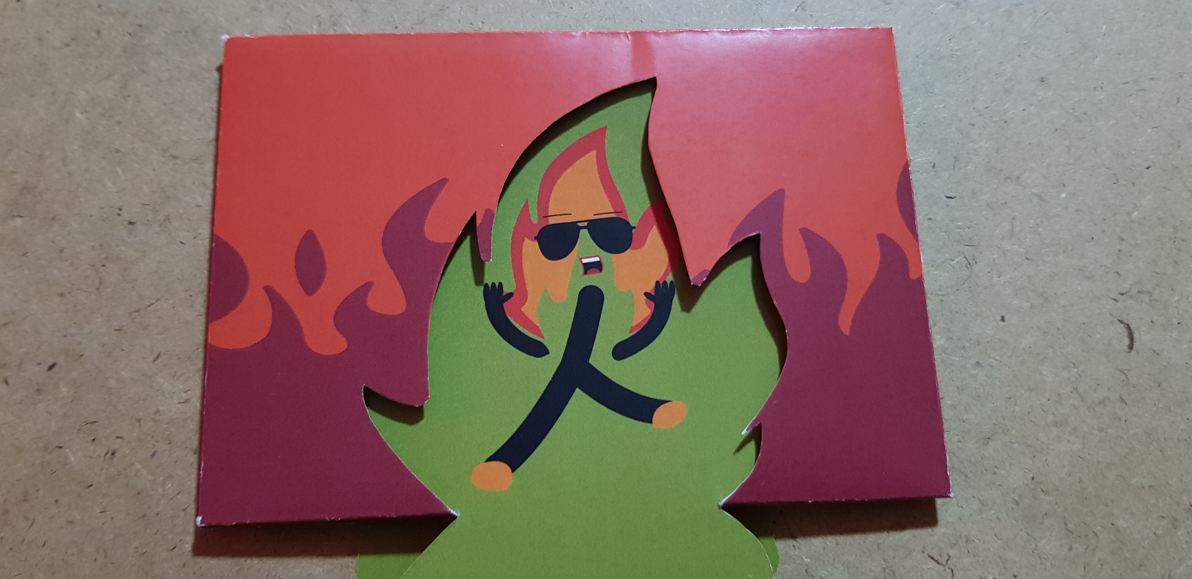
Huge emphasis on the numbers. Remove the purple circle border. MORE Bleeding.
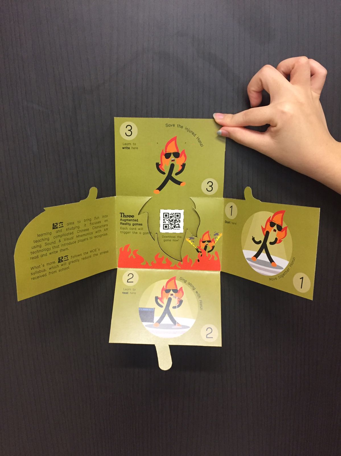
Final
Colour code the Read more →
Project 3 (Next Task)

continue from task 1
From the feedback and mistakes made previously, I came up a new design:
Using Complementary color to color code the different pages. (Orange page) Using matching illustration to fill up the empty page. (Green page) Simplify the illustration (so it can be identity by the phone) and provide visual cue as the page’s number. Give a lot of bleeding Read more →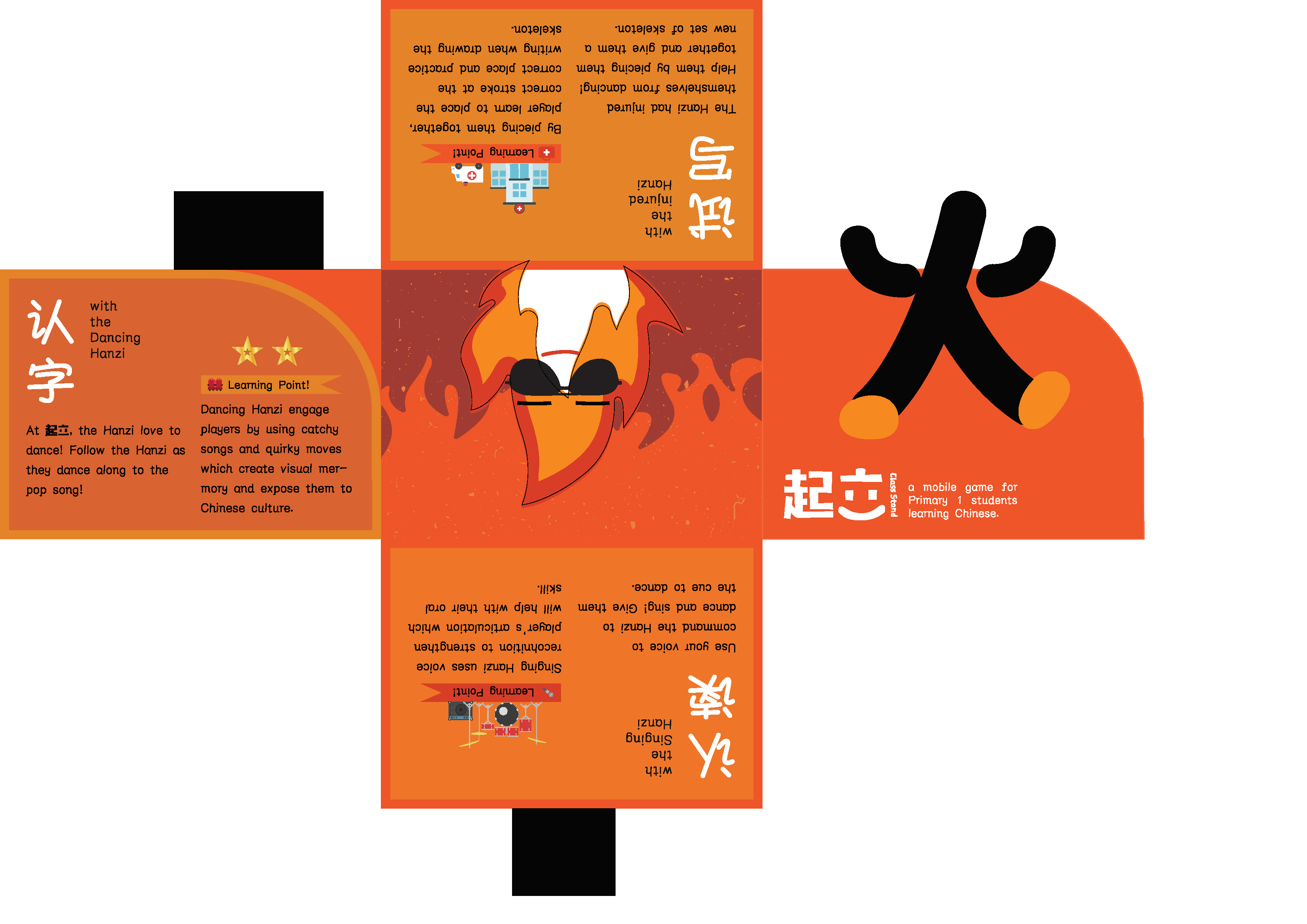
Project 3 (Task 1: Design Exploration)

1. Existing brochure design
Using illustration and it’s color to differentiate how it is going to look when folded and open.
Using folds and die-cut to make the illustrations from different page appear to be a single image.
Using cute illustrations and die-cut to differentiate the pages.
2. Playing with folds
I will be working on my own FYP which is a mobile app for Read more →
Project 2 (Final)

continue from Task 3
First print out:
After printing this in A2, I realized the photograph and illustrations look like 2 separate design. So I decided to add more illustration on the photograph.
Final print out
To summarized my take for this assignment, the poster is not about escaping reality or a program that will cure the patient, Read more →
Project 2 (Task 3: Design refinement & Mockup)

continue from Task 2
Mock up 1: Attention from 1. the patient 2. (from the direction of the patient is looking at to) The slogan 3. Ng Teng Fong’s logo 4. (illustrations pointing downwards to) the program’s detail.
Mock up 2: Layout the words with the images. Illustrations pointing at the logo as well.
Read more →
Project 2 (Task 2:Design Exploration)

continue from Task 1B
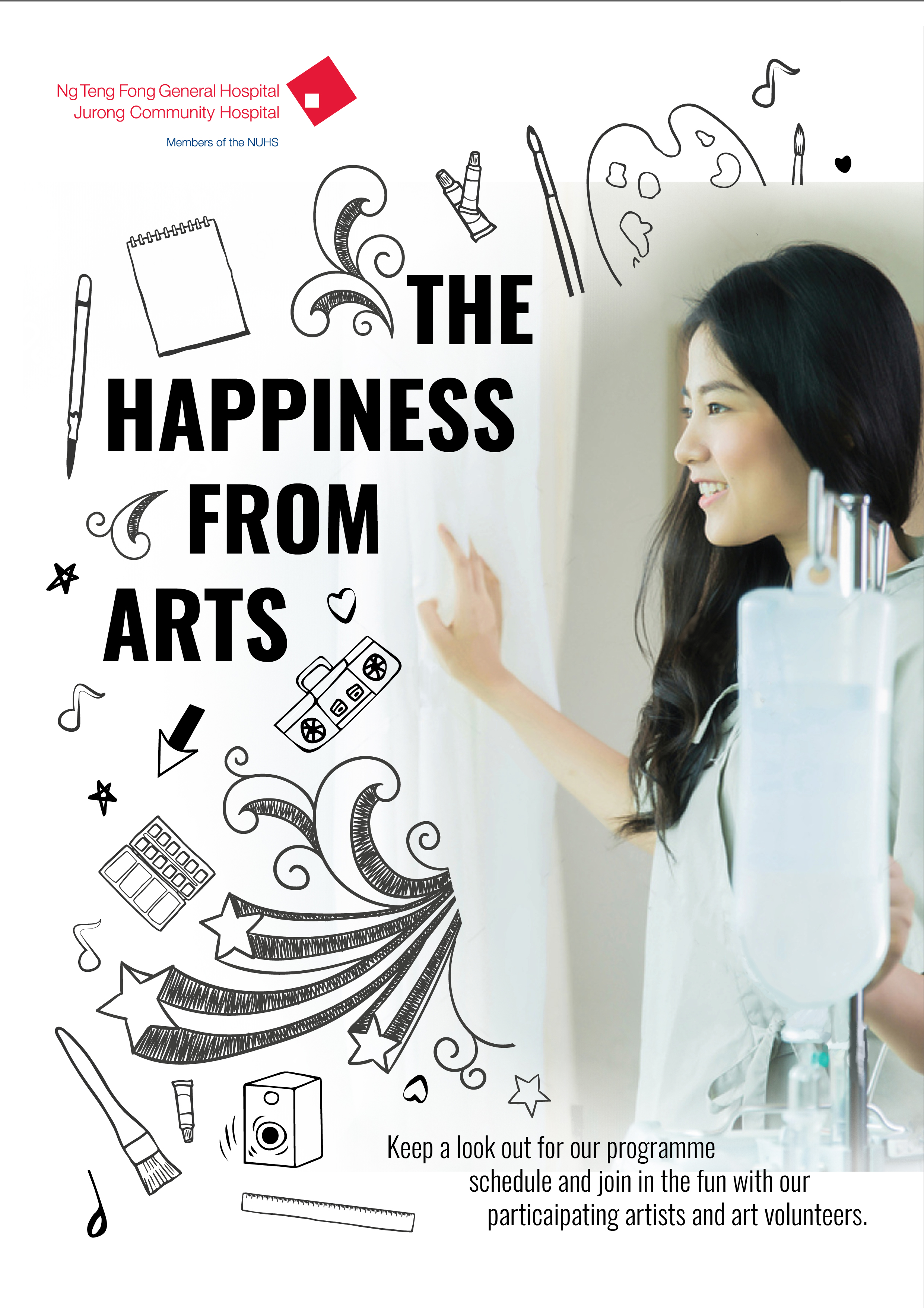
From the feedback received, I have changed the slogan to “The Happiness From Arts” , so it sound like the program is able find the patient’s happiness back.
2 Proposed layouts:
The symmetrical layout: The poster is differentiated with 2 sides, the left side is the side of life with Art and Health program which Read more →
Project 2 (Task 1B: Develop Slogan & Moodboard)

continue from Task 1A
My take on Art and Health program:
Art and Health program is targeted for patients who will be hospitalized for a long period for time, as short-term patients are usually rushed to discharge to not waste resources. Hence my take for the poster should be something the long-term patients can relate to, things that can be found in Read more →
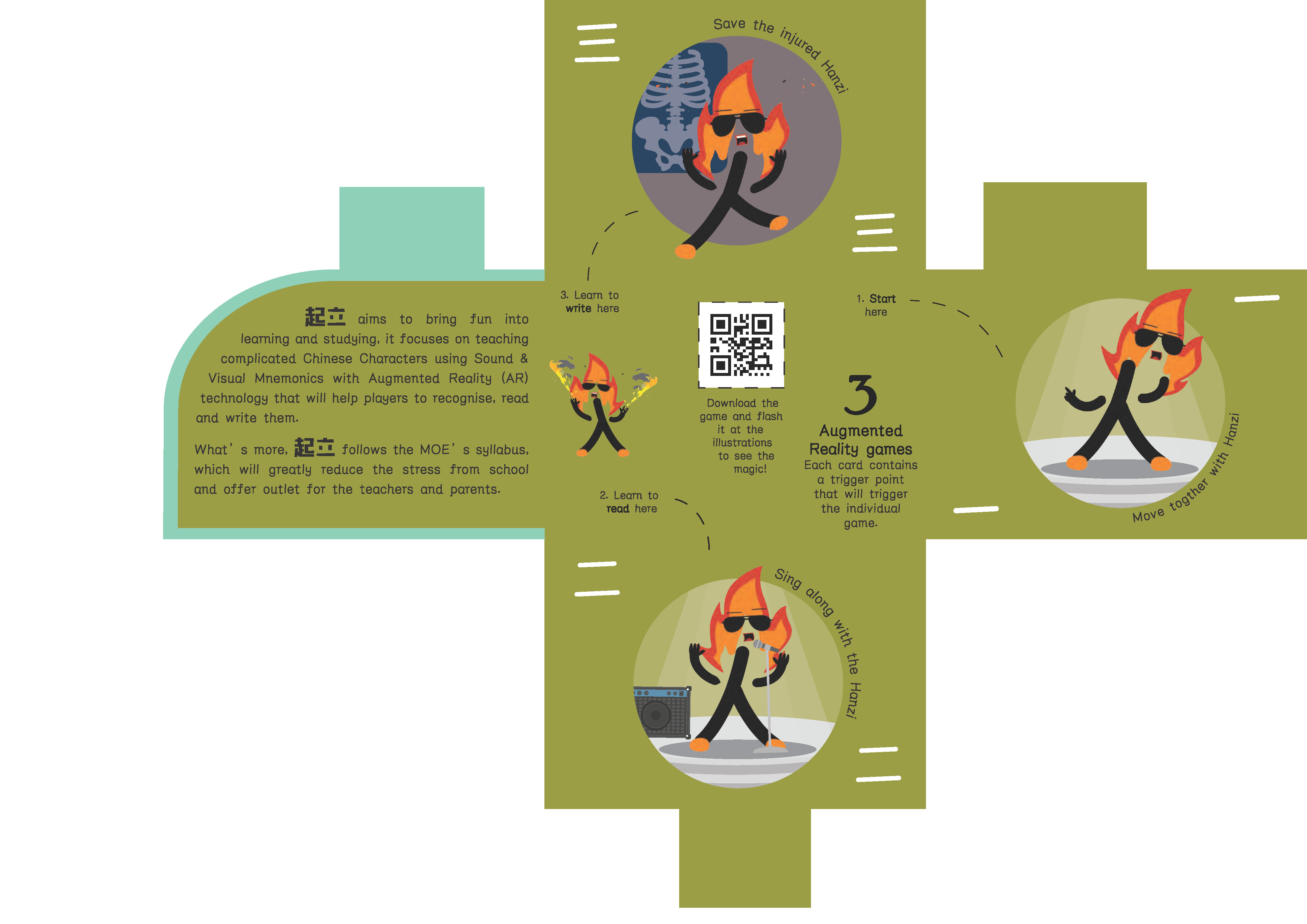
TUSK 2

F O L D 6 pages accordion fold
C O L O U R S Teal + Red (colour of the vest and the hospital’s colour)
Please click on the thumbnails the colours are off!
Lack of sense of flow, static placement, disjointed, include the photos, take note of margin, lines on the cover of the brochure are too sketchy, think of ways Read more →