Recent Posts
TUSK 1

D E S I G N E X P L O R A T I O N
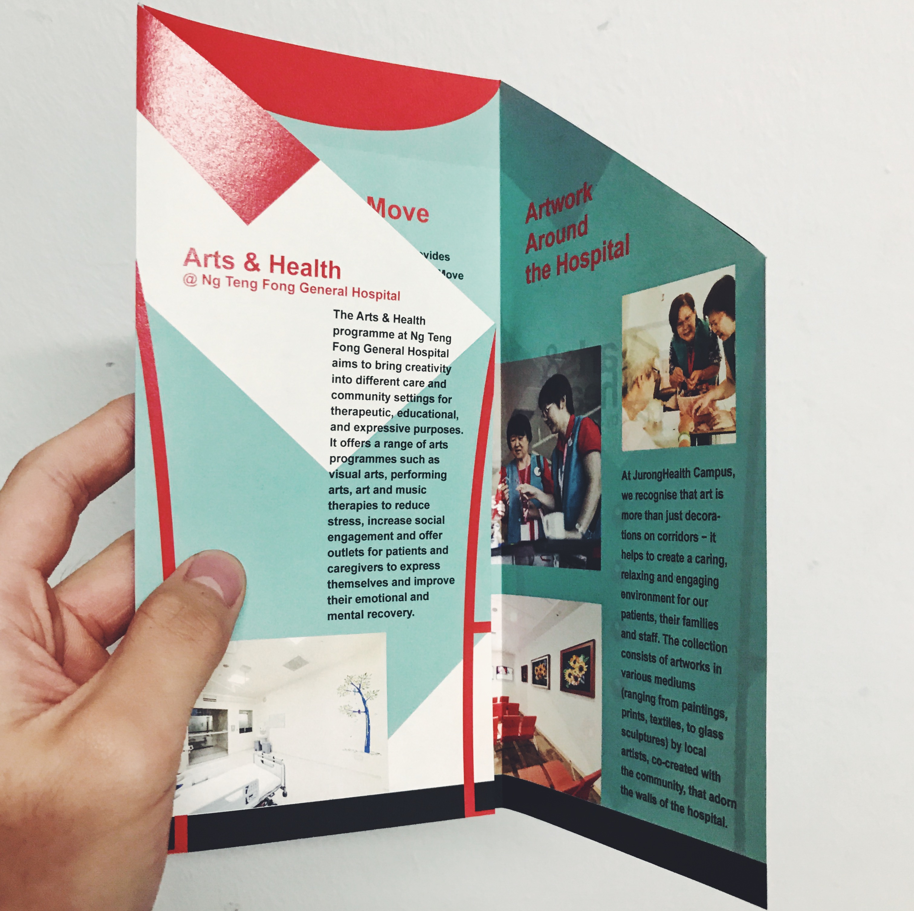
F O L D I N G What stood out for me in this design is the method of folding, the flaps on the pages can fold up to form a cube which resembles the logo of Ng Teng Fong General Hospital hahaha.
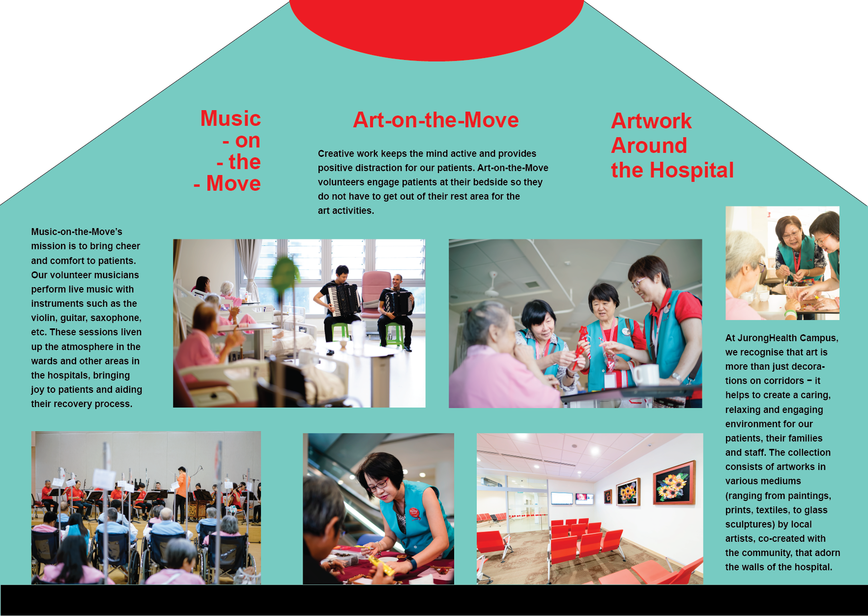
Final Brochure
Final Brochure Design:
By reducing the size of the shapes the attention is now focused on the body copy and the featured image. Each information page has similar features such as the yellow title and shapes framing the images making the whole design intergrate.
The final brochure could have been presented better as I didn’t have time to test print and I Read more →
Project 3: Final Design

Taking into account the feedback that was given during the consultation, I pushed the graphic elements even further, removed non-essential elements and weaved in a narrative flow to the information of the arts and health programme.
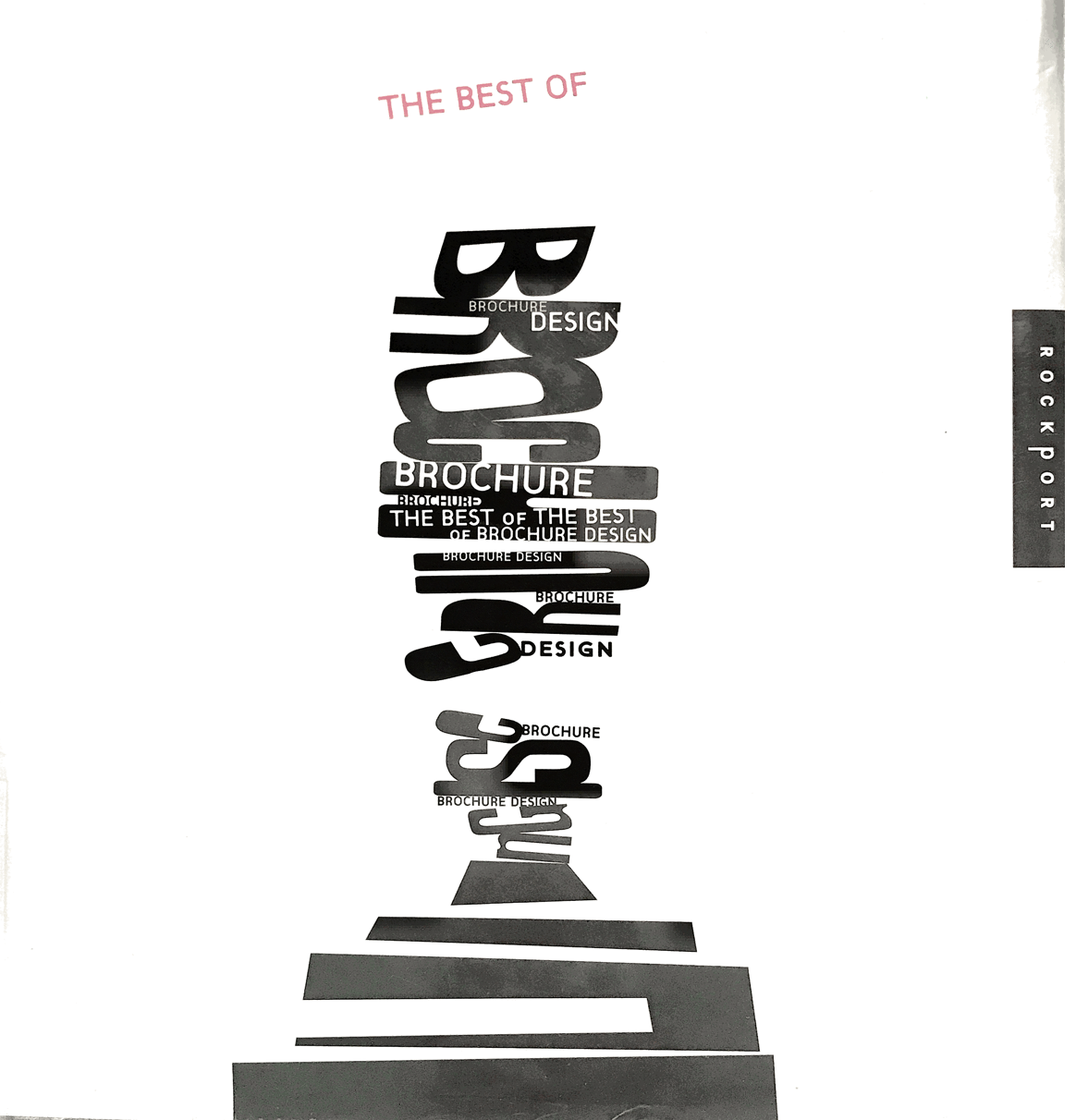
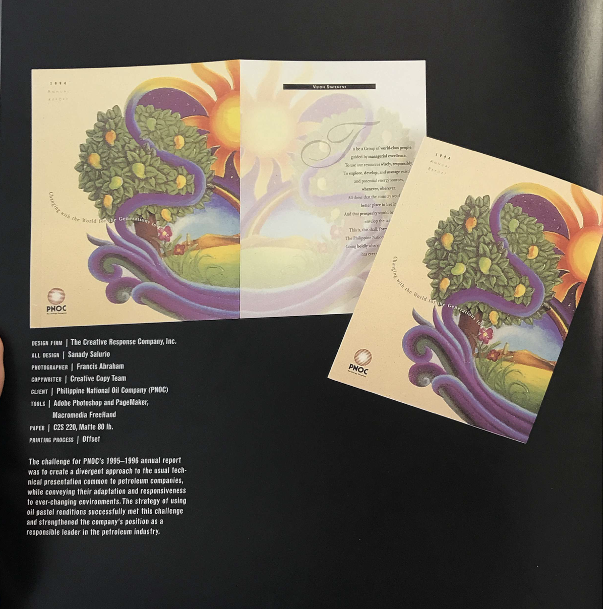
Project 3: Research and Development

I started off the brochure project by researching on brochure design and applications of graphic elements.
This book, titled The Best of Brochure Design, offered an insight into the process of making brochures.
I looked into handdrawn illustrations as a reference for its organic and friendly outlook.
I then looked into architectural brochures for their geometrical composition, clean simple lines Read more →
Work in Progress Check
Critic and feedback from one on one meeting:
currently the shapes compete over the body text – shrink down shapes integrate title to the bottom and integrate shapes into images remember margin crop image to tighten switch out the move with orange context need a sense of readiness the shape connection doesn’t need to be literal – broken lines title on the orange page or bold first line highlight art more keep Read more →Week 11: Work In Progress Check

Refinement Process With what I had last week, I proceeded on with the feedback given to me that I should include a captivating slogan (could be from the poster design) as it could better represent the overall theme rather than simply the generic lines of Arts & Health @NTF Hospital.
Also, the use of the pop up space at the back Read more →
Week 12: Final Presentation

Final Phase of Design In my final phase of changes I contemplated on adding the line of flow on both sides of the brochure design. However, I felt that it spoilt the overall look and decided to make do without the suggestive line. I moved the alignment and text to allow the header to have a better balance (previously sinking Read more →