Recent Posts
VC Project 2: Part 2 (Research and Developement)
After doing visual research for part one of the project, I got inspired and came out with a few concept which I did in A5 sketches.
The first one (on the left) was supposed to be some sort of photography and illustrations overlaid on it. It was simple, very simple, and very safe idea. The second one (on the right) Read more →
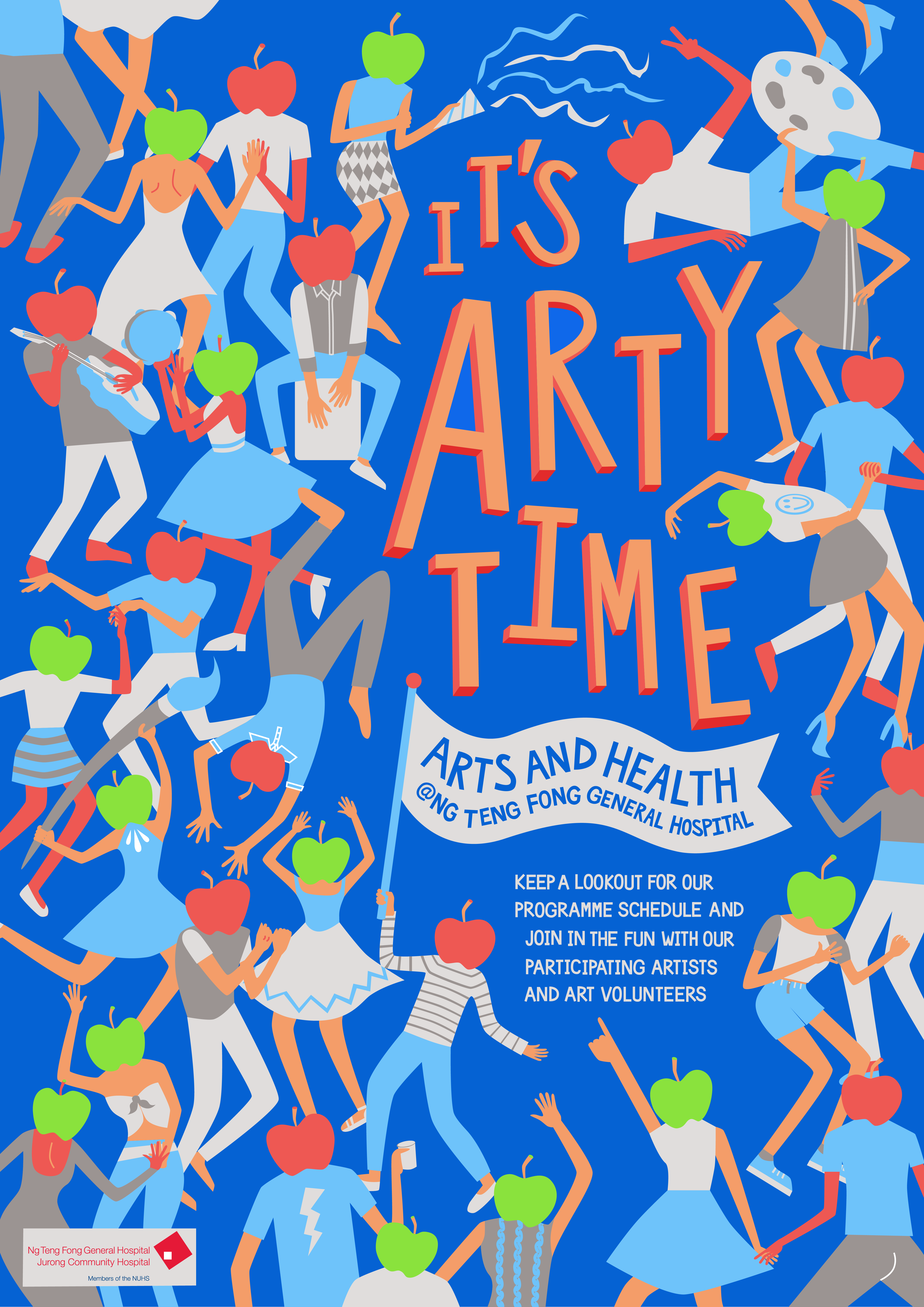
Week 8 : Poster Exhibition

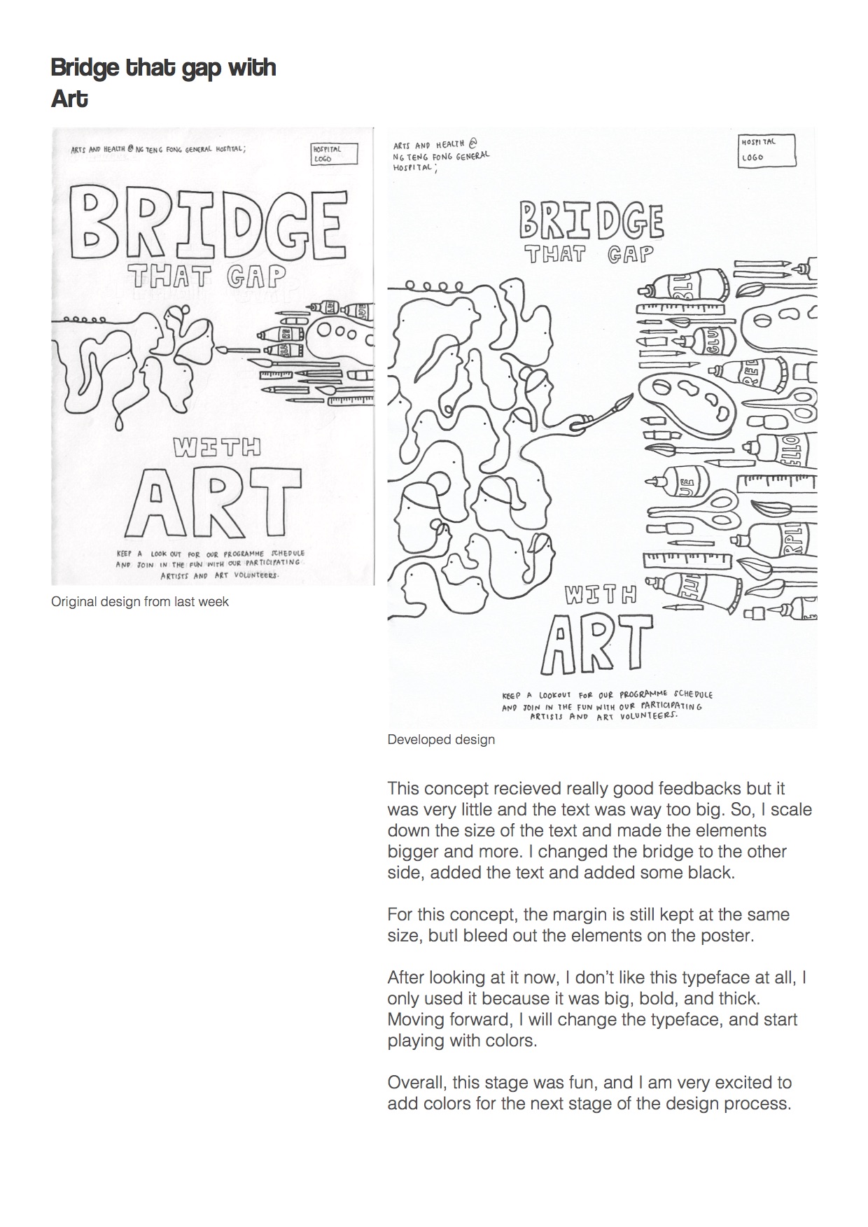
Final Improvements
As I continued to work on the layout and colours, I had to print out various test prints to look at how the poster is in real size. It was difficult to judge small details based on what we see on the screen as I could only see a small portion if I were to set to the A2 Read more →
(VC1) Assignment 2: Research & Development

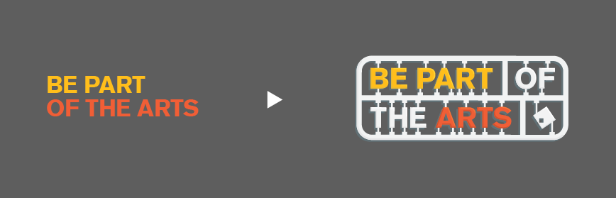
1. Task 1B — Develop Slogan & Moodboard
Brainstorm Map!
It took me quite a while to gather my thoughts together. Any random thoughts I could think of, i jotted down. And as can be seen in my map, I was trying very hard to come up with slogans that fitted the hospital and the art programme.
Read more →
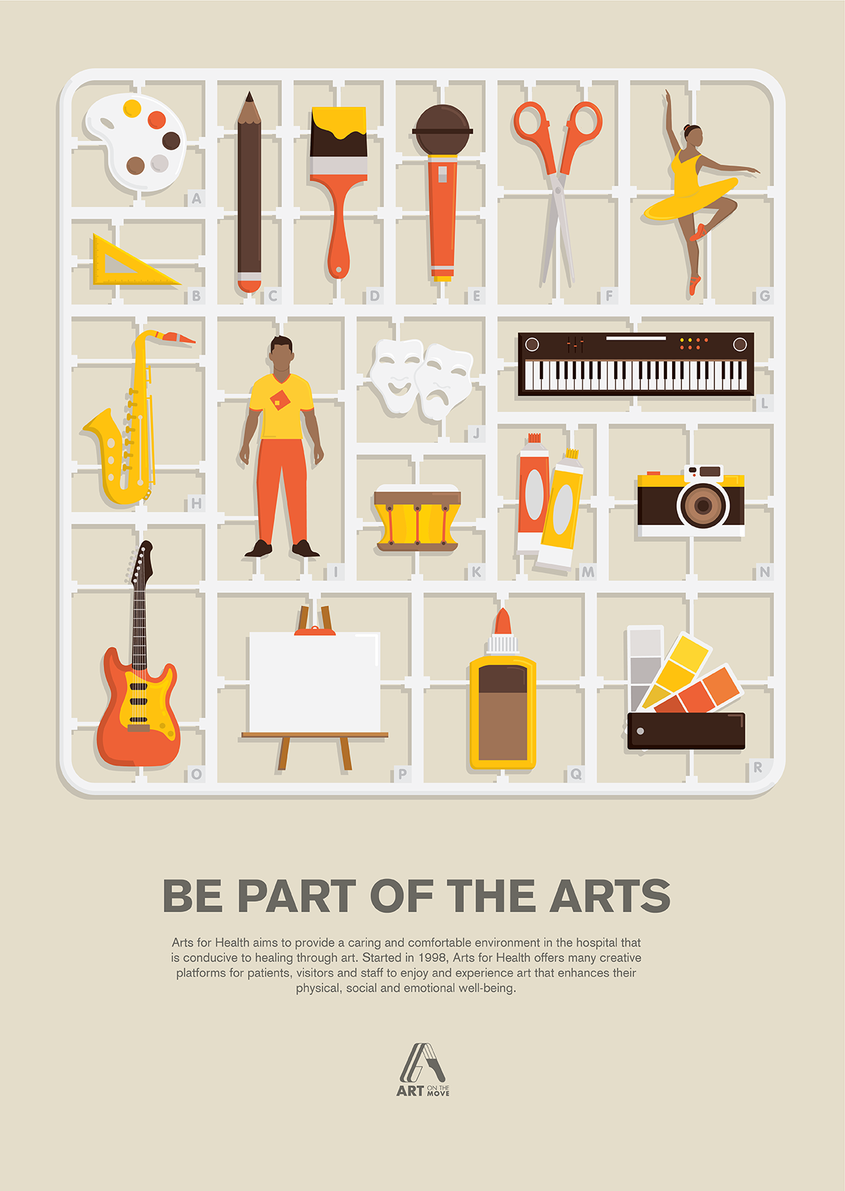
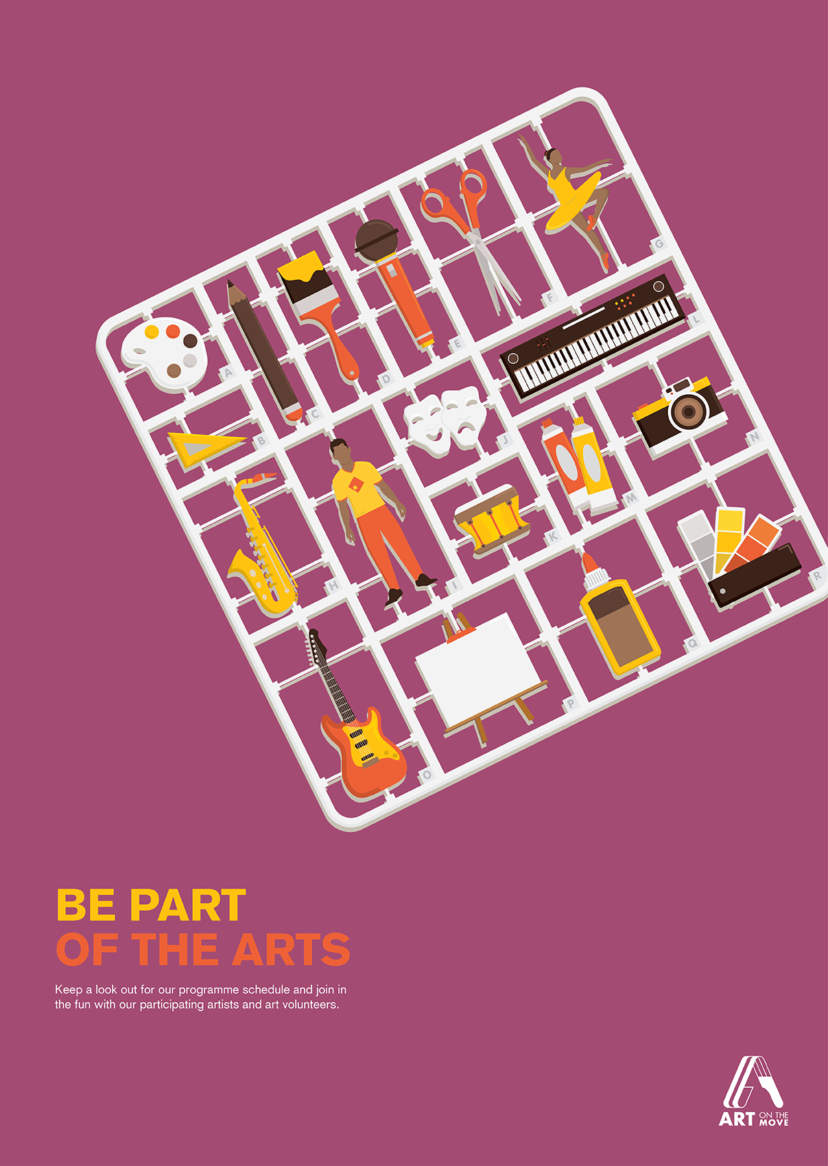
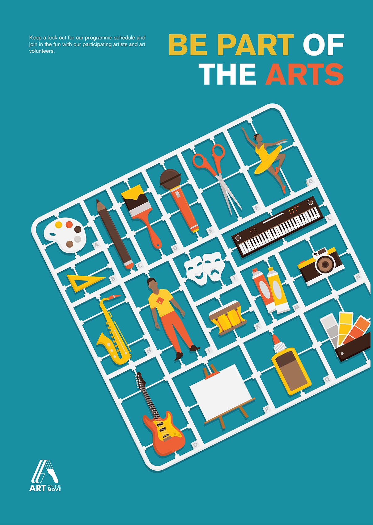
Task 3: Design Refinement & Mock Up

Based on the feedback gathered, I edited the title to make it fit better into my toy kit concept. I also changed my flat design into a “Table Top View” to make the composition more lively.
These are the feedbacks I got from the A2 B/W critique session: 1) The colour of the coffee is very distracting. (change to tea?) 2) The Cutting Read more →
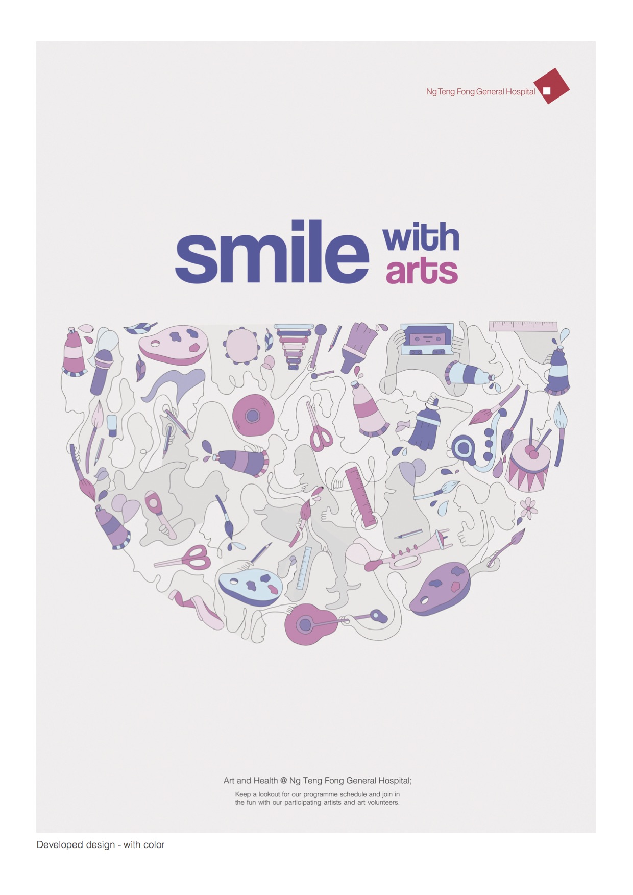
Task 2: Design Exploration

I experimented with various placement, rotation, scale and colour schemes. I was told that the overall design looks a little “too clean/swiss”. Consider changing my heading to something more fun. I started off with a very symmetrical balanced layout and modify from there.
Week 7: Design Refinement & Mock Up

Colour Palette
As I added more elements to the poster design, I wanted to restrict myself to three main colours. Of which I chose the primary colours to work with.
Readability & Legibility
Script typefaces were selected as I wanted to bring out the crafty sense. However, when I looked at the typeface again, it was difficult to read from a distance Read more →