Recent Posts

Illustration for design: Assignment 2 thumbnail sketches

Viena Lee

Sunday, Mar 04, 2018 - 02:09:28 pm

@ Viena Lee Lin Tsin

Here are the thumbnail sketches for the two different concepts:

Concept 1: Practice makes perfect

Concept 2: “OCD”, obsession with perfection

Still thinking about different forms and compositions that I can explore for the two concepts, as I have yet to decide which to work on!

Hi Viena I really like your second concept and It really does trigger me! haha I think you could create some beautiful patterns especially using a neon colour pallet. I'm sure you will have seen it but in Marian Bantjes' book I wonder she play very creatively with neons and detailed patterns. You may want to have a look at her project that she did for GQ magazine In the UK, they had a puzzle edition and her work is amazing. Look forward to seeing your progress next week Lisa
Hello!!:) your top right composition for concept one looks really interesting to me:) I'm really attracted to the diglett like design compare to the human sketches:) I feel like this creature itself is really attractive and would create a magazine cover that would draw my attention to the magazine:) So I'm curious how you would develop it if you choose this:) As for your concept 2, It kind of reminds me of batik pattern or like tribal pattern, and the idea of using it to reference to OCD is an really interesting concept and it conveys the idea well:) I think the color code would be very challenging but YOU CAN DO IT!!:)
Found this! My brain hurts! Lisa :) nd
IT would seem I can't attach the image I found :/ I'll email it to you instead :) Lisa

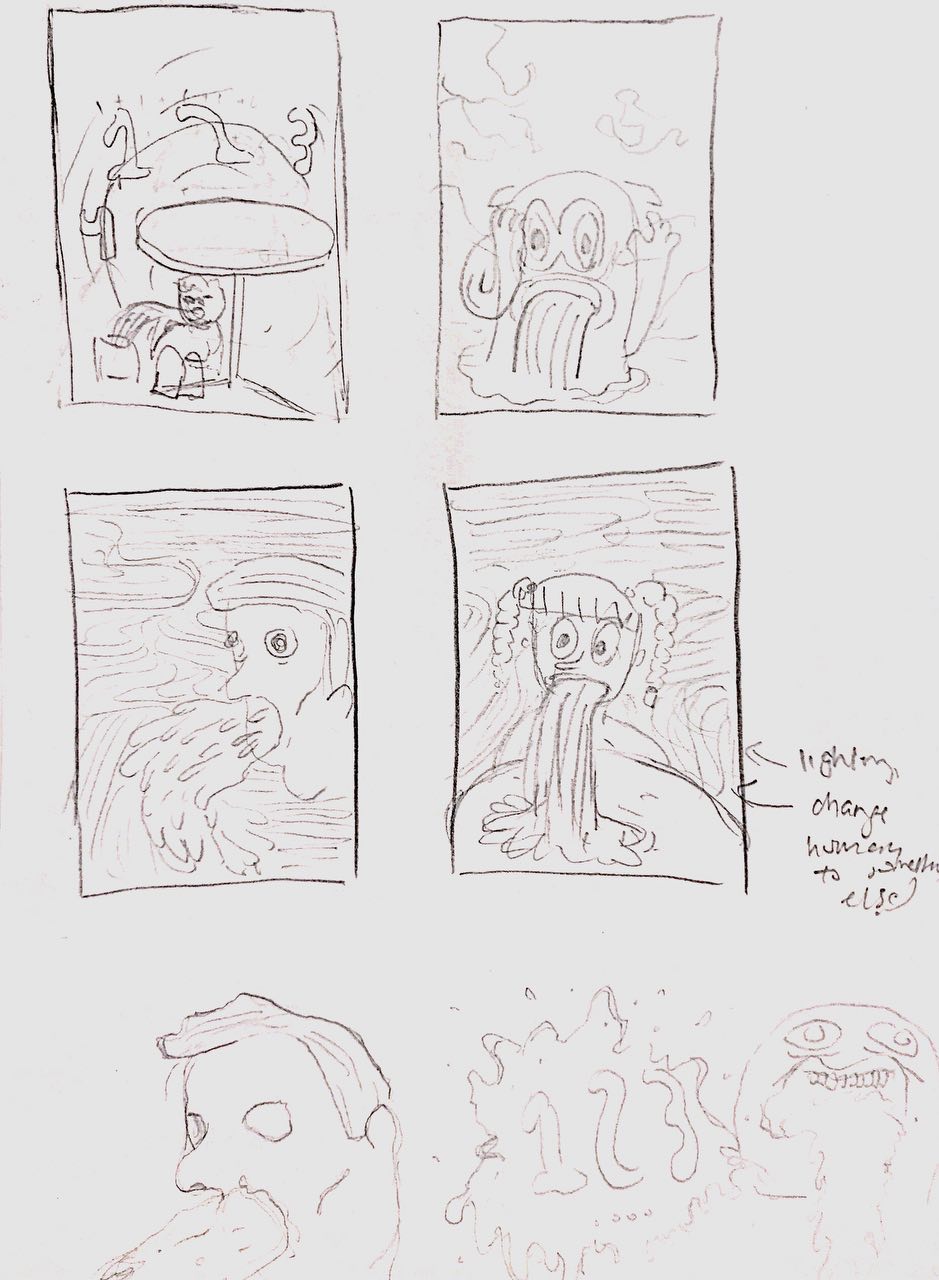
Editorial illustration #4: pencil compositions

Liying

Sunday, Mar 04, 2018 - 01:44:30 am

@ âś„âś„âś„

These are some really rough pencil comps I did to flesh out the ideas from the previous post:

I digitized them to better see how they would look:

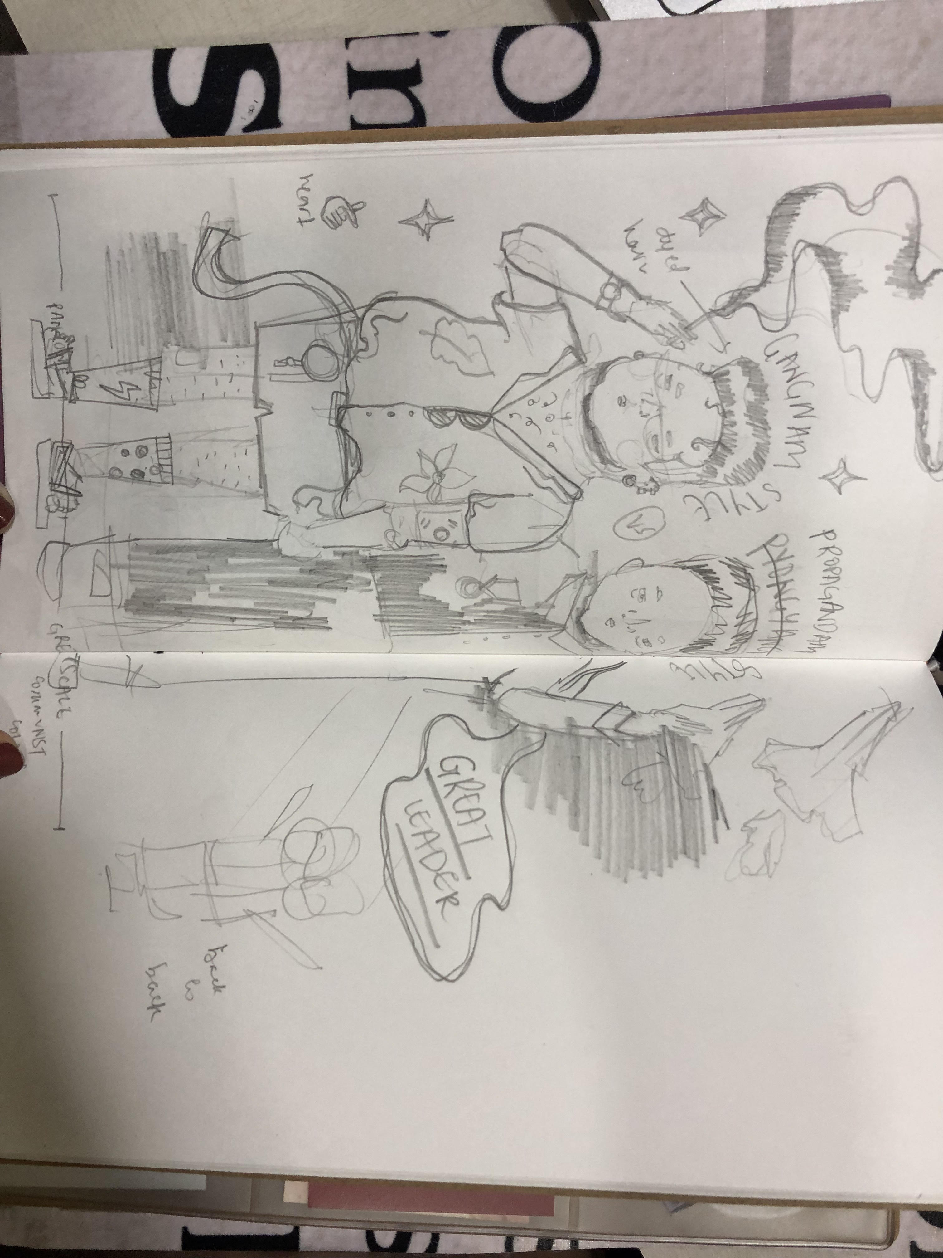
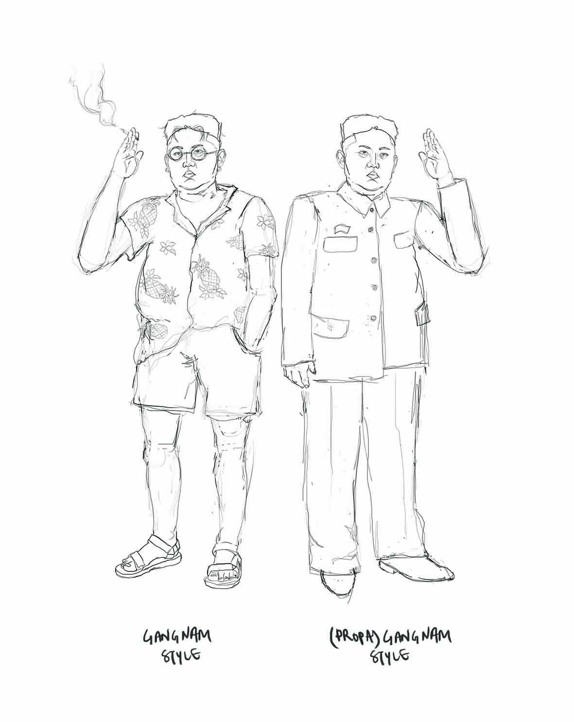
This idea wasn’t outlined in a previous post, but came to me in class. Here’s style epitomized by the division between the two Koreas. I think it’s really interesting how drastically differently Read more →

Hi Liying I think both your concepts have value and could make excellent front cover designs, however the Kim 'Gangnam style' idea cracked me up! I'd be really happy to see you progress this just because I find it so amusing! I do understand the deeper meaning behind this idea and I think after the initial amusement it proffers real food for thought as to the sheer absurdity of the situation. Lisa
Hi Liying! I think the gangnam style concept is really interesting and humorous. I can see it working very well on the front cover. I think that to more deeply convey the concept of "style" you should add in some more obvious or iconic references to South Korean style. This would also further develop the contrast between the two. I love your personal style! I think you could even go without adding color to let the line work shine, or add very subtle splashes of color. Good luck! Audrey

Grace

Saturday, Mar 03, 2018 - 12:04:17 am

@ Yay cake.

Idea 1: Conveyor belt

two versions, one with a clearer diagonal division.

Idea 2: Tiny people.

I wanted to try an isometric illustrative style for this concept

The second layout has more breathing space around it, keeping the graphics smaller .

Hi Grace I love the idea of having tiny people and huge trending items! It's fun but also quite (sadly) poignant of our time. I would avoid having the sign saying 2018 trends as I think your illustration needs to communicate this without words. Make the audience work a little! However having 2018 written on the paint buckets makes sense, giving the audience a clue rather than spelling it out for them :) I'm looking forward to see your progressions next week. Have a good break Lisa  
Hi Grace!! :) I am not sure which pencil comps post I am to reply to, but I chose this instead cause it seems like you are quite finalized with this concept ya? :D I really really LOVE the Idea 1 first version!! There is a strong visual hierarchy as to where the viewer's eyes should look and the size difference really adds depth :D Perhaps instead of saying '2018' in the case if this fab cover is used in '2060', maybe you can consider Months or Seasons? Lets say Bubble tea trend bucket labels ' Summer Hit ( Then you illustrate a summer calendar image?), or maybe those price tags with the famous person on it like Yeezy shoes with a Kanye face on the tag? :D Just a suggestion!  
Hi Grace! My favorite of these compositions is the first one with the conveyor belt. I really like the visual depth and the diagonal direction. It really pulls your eye throughout the composition. I like the conveyor belt a lot more than the little people idea for this concept because I think it better conveys the idea of mass consumption of trends. Showing many little people working on one object makes it look like a lot of care and effort gets put into each product, which isn't true nor is it what I think you're trying to convey here. I agree with the others that you shouldn't put the word "2018" in the actual piece. If you choose products that are very obviously 2018 trends, it wouldn't be necessary to label the year, anyway.   I'm looking forward to seeing where this illustration goes! Especially to see a colorized version, I think it'll really pop! Audrey

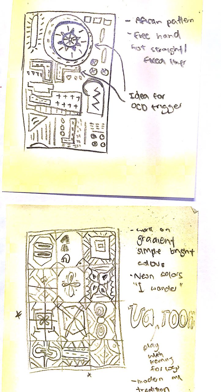
Editorial Illustration - Pencil Comps

Jan

Friday, Mar 02, 2018 - 07:53:14 pm

@ Jan`s Ponyhof

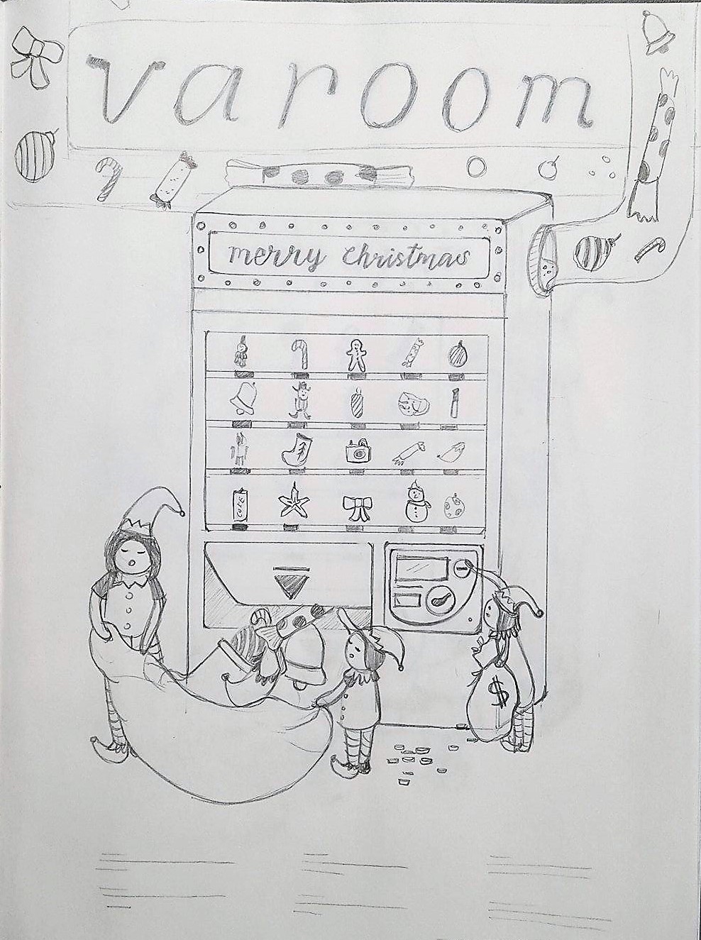
Pencil Compositions for Varoom Magazine – Obsession

Rainbow Machine 1.9.5

Rainbow Emitting World

Hi Jan I think your rainbow machine is really starting to work. Using an isometric composition is a good idea and conveys the process and mechanical aspects of the concept well. It's obvious that you have considered the practicalities of producing a rainbow from trash!  I'd perhaps like to see some actual trash being added to the process to ensure the concept is communicated effectively; maybe crushed cans or plastic bottles? Conceptually this is a strong idea and I think you should pursue this option. The rainbow world, although not a bad idea, seems a little weak in comparison. I'd push forward with the machine :) Have a good break Lisa
Hello:) I really like your idea of the rainbow machine:) The way you balance the whole composition with the tube like joints as well as the different "levels" is really working:) However, at the first look of the composition I was pretty attracted to the left side of the composition as there are quite alot of elements going on:) probably you could consider spreading the elements more equally so each part of the composition gets equal attentions?:) But if the chemical bottles and addictive color was you main focus then I think it was well delivered!:) But overall, really interesting!!!! looking forwards to the colors!:)
Hi Jan! I really like the 'Rainbow Machine 1.9.5'! The concept is pretty strong and there is a form of visual hierarchy for the viewer's eyes to follow through! I was just wondering if the place the Trash goes in is the same 'box' as the place the rainbow is emitted? ^^ More visual elements and motifs can be added to add more spice within the chutes to enhance the details of the illustrations! Really love the RGB conical flasks! I cant wait to see the colour choice for this piece!
Hey Jan! The rainbow machine is dope. So from what I understand, trash goes in and a rainbow comes out? The details such as smoke, RGB chemicals, and heat are really interesting. As Lisa said, adding the trash parts might be a really good idea; for me, especially because as of now I couldn't tell clearly where the flow begins and where it ends. (After reading the comments I'm assuming it would be the trash collection conveyor at the top which flows to the right side, and then on to the bottom conveyor and to the left part.) I think the right side wouldn't be so empty with the trash (and flattened trash) added, so that wouldn't be a big problem. Additionally, your references in the mood board seem to have quite a bit of details so I'm assuming you're aiming for the same level of intricacy from the rainbow machine, which would work really quite well with the concept. I would try to erase the pencil marks that are not part of the machine (the guiding isometric lines) to see if the composition still works and decide what to add in case there are awkward white spaces - but that's a small concern only :D Looking forward to the final!

The 3 Pencil Comps

Rachel Fong

Friday, Mar 02, 2018 - 01:03:26 am

@ Rachel Fong

Sketches 1 and 2 are linked to the vending machine concept as said in the previous post. Sketch 3 is a more detailed sketch of a little’s girl’s obsession over a gingerbread house . I am personally leaning towards sketches 1 and 3 but still can’t seem to make up my mind Read more →

I like sketch 3 the most because of its strong symbolic meaning. The house looks a bit like a church or chapel and underlines the contrast between the consumption and obsessive urge to decorate, buy and get into the christmas mood. At the same way the protagonist is kind of eating its own house and with this kind of use up the special meaning of christmas as a religios, cultural celebration where you go home and get together with your familie.
I agree, concept 3 is stronger and really conveys the message of obsession far more than the other 2. I hadn't initially noticed a link to a chapel/church but I think this is an excellent direction to move forward and make this a more obvious connection within your illustration. It adds an extra dimension to the overall concept, asking the viewer to question their own relationship with consumerism comparatively with the 'true' meaning of Christmas. From a composition perspective perhaps consider increasing the size of the girls mouth even more – really exaggerate this to emphasise the absurdity! Overall I think you can create a really great final piece from this concept and I look forward to seeing some progression next week. Enjoy the break! Lisa

Illustration For Designer: Editorial (Research - 3) Composition Sketches

Rachel Ng

Thursday, Mar 01, 2018 - 06:34:08 pm

@ GINS

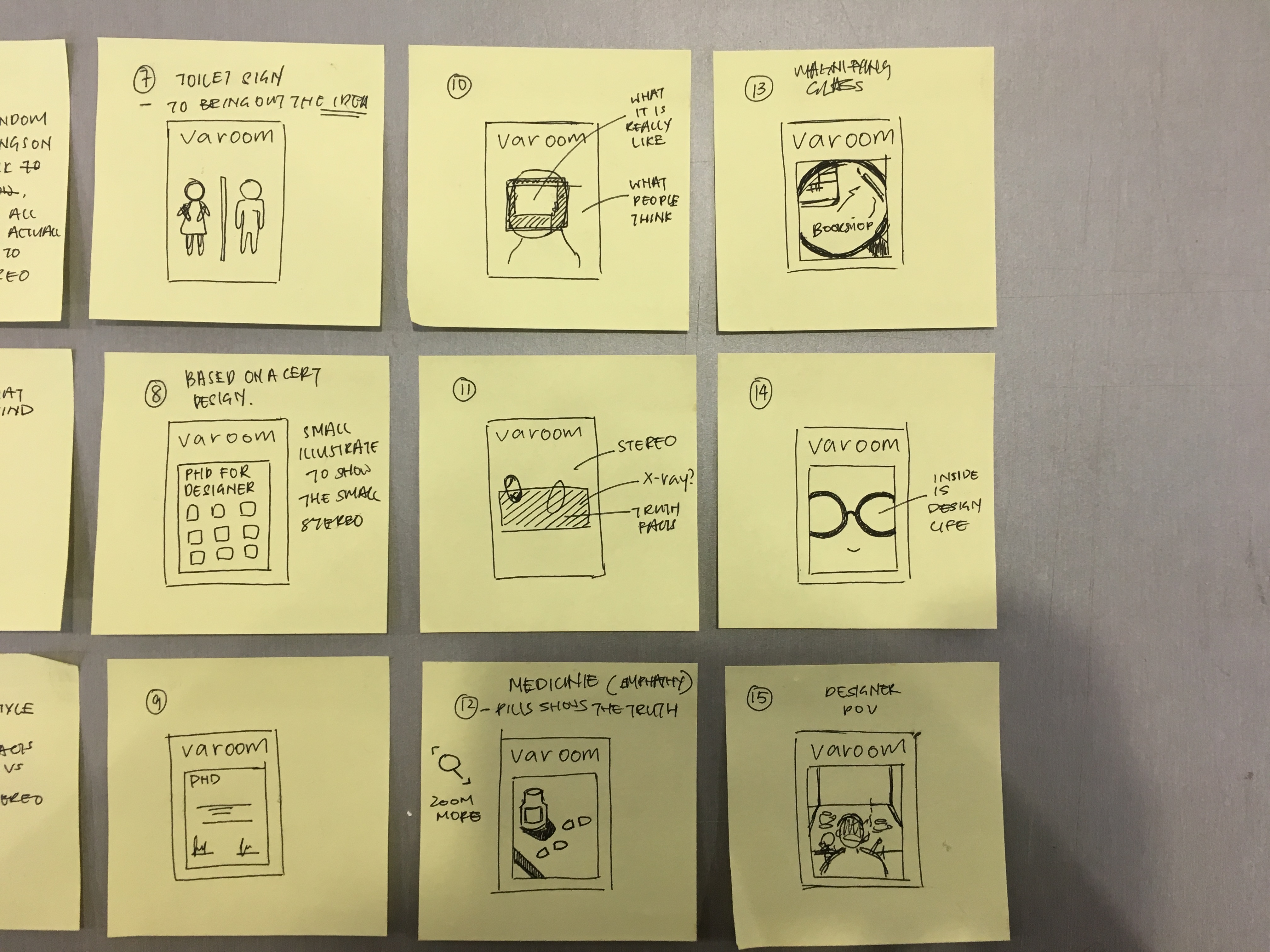
This is my Thumbnail Sketch on post-it for my composition:)

1-3, 5-7: I want to bring out the two side of of perspective in this composition, one side is the designer thoughts and another side is the stereotype thoughts people have towards designer.

4, This is one of my weakest composition i feel, personally I wanted to try Read more →

Hi Rachel! I really like your theme on Empathy and the topic you've chose as it is relatable amongst art and design student! Hence, you've already gotten a very obvious target audience that will be drawn to your choice of topic and cover! :D On first glance, the sketch that grabbed my attention the fastest is number 16! :) The idea of using a Gatchapon machine ( The dollar twist thing ;)) is really great! Because I a designer often has to twist their brain into thinking and satidfy the requirements of their clients, but on the outside, people who see the gatchapon machine just assume that upon paying the money, they can get what they wish for. Hence, I think you can ride on that Gatchapon idea and the PHD one, so for every ball capsule is the hard work put in for every designer (Eg. Designers slogging out on the designs, where each ball capsule is the designer's work place) and the exterior poster for the machine can just be a very stereotypical advertisement for the Gatchapon game ( E.g. Designers just draw, it is so easy! Just turn to get an easy design!) Then the turing knob can be a brain of the designer ^^ Just a whacky suggestion!

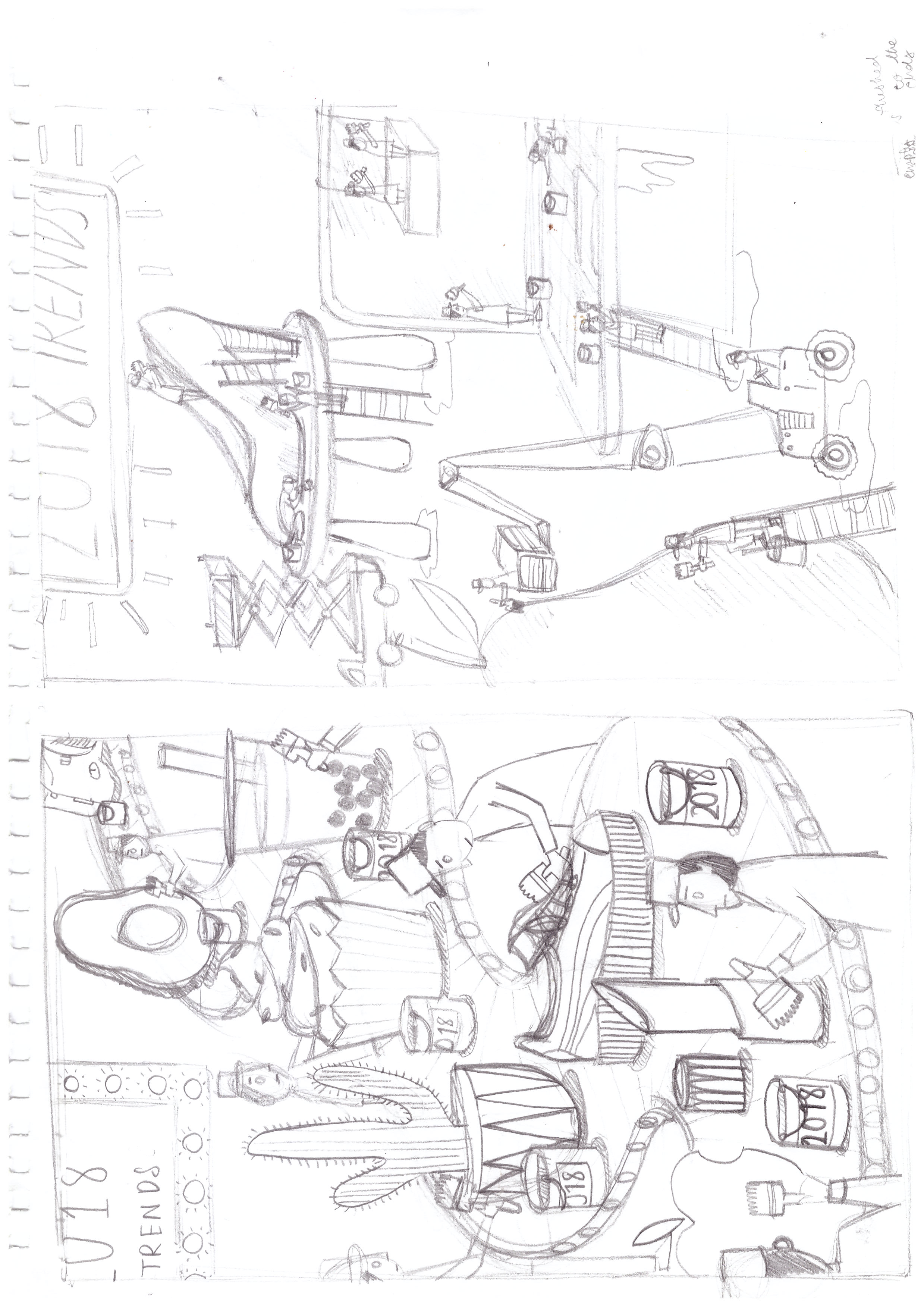
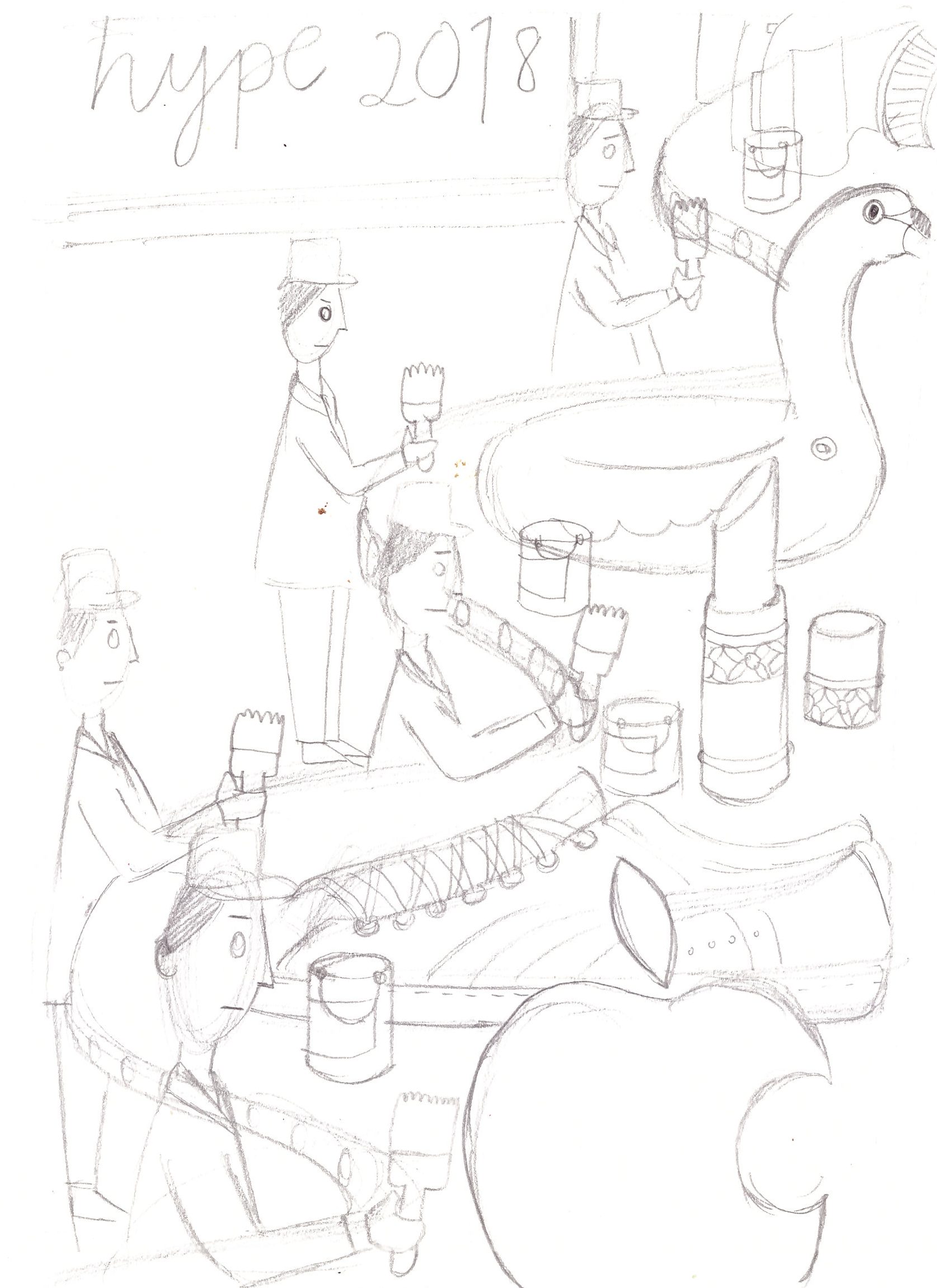
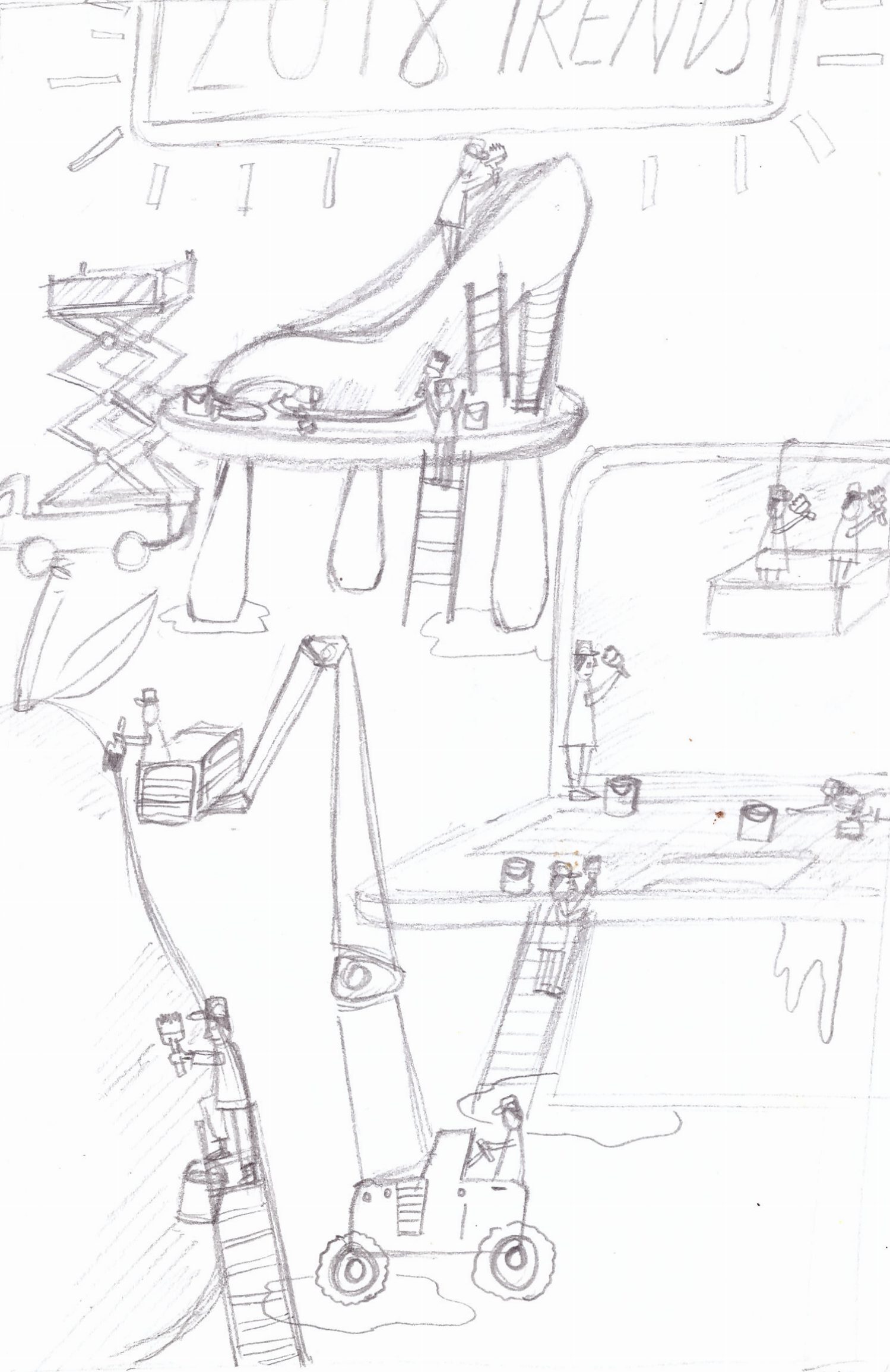
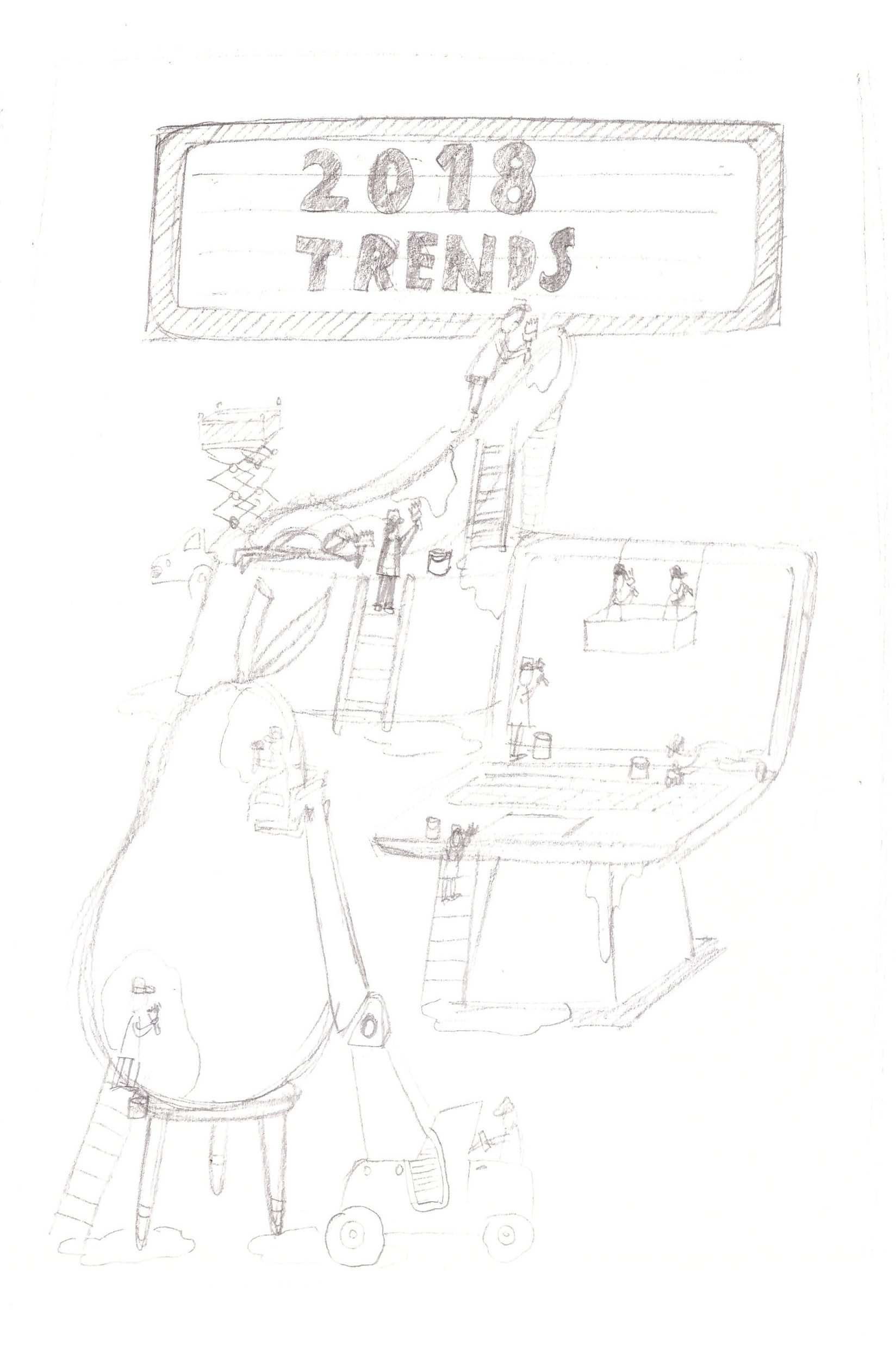
Thumbnail sketches + artist reference

Grace

Thursday, Mar 01, 2018 - 05:49:13 pm

@ Yay cake.

Continuing from my previous post on my idea of an almost obsessive emphasis on keeping in trends, I’m using the metaphor of production lines and disproportionately sized arbitrary objects to bring my point across. The uniformly dressed workers are totally emotionless as they paint all these objects the same shade of paint to keep them on trend yet rendering them Read more →

0 comments.

Assignment 2 The Three ideas comp sketches

XiaoJing Peng

Thursday, Mar 01, 2018 - 05:42:01 pm

@ Grace Peng

Hi, Class~ Here are my three sketch ideas. My topic will be the obsession – roads.

using Chinese calligraphy type of writing and also using the traffic light color as the main color in it. The mapping road of my life experience, the city/ country I been, and I like. But then so many places I had been, the obsession with it will be Read more →
I really like the mess and chaos in Comp 1 it underlines the restless quest to find the right place to live/ rest. You can maybe take a look at the picture "Relativity" from Escher and try to apply some ordered/ structured chaos/ mess to your composition.
Hello! I agree that the first one has a more interesting composition; the chaos conveys the absence of sense of belonging better than the other two. It kind of reminds me of the movie Inception where the architect Ariadne controls her own dream for the first time. (linked a short clip below!) I think it's also more interesting to use buildings and landmarks instead of too many signs/letters to show instead of tell :) https://www.youtube.com/watch?v=7yshUmxuEjE
Heya! :> I do like the composition 1 as the typography feels well-placed and interacts well with the map concept. I also find that the main three lights in the middle is a really nice focal point. If you are using the same colours for the circles around it, maybe you could consider making them smaller or desaturating them or other ways to make them more subtle, as compared to the main center traffic lights. Additionally, you could play up/down the sizes of things because as of now, although the sizes of the circles and the fences are already sliightly different, you could exaggerate the difference even more to add contrast which will lead the viewers' eyes around the composition better! :) Because as of now my eyes dart around the composition restlessly (which may be what you're aiming for to evoke confusion, I'm not sure?) But what Jan pointed out with MC Escher's work is a great point; it evokes the sense of endlessness and confusion and yet there is a strong triangular composition (for 'Relativity') that leads the eyes around the composition. Perhaps you could even render the street signs or the typography in different manners to highlight the different places, but this is at your discretion because it might disrupt the rhythm too much. So it's up to you!

DV2002: Assessment #2 - Editorial Illustration Part 2 (Process)

Seng Yi Ling

Tuesday, Feb 27, 2018 - 02:51:38 pm

@ Seng Yi Ling

Theme: Empathy

I chose the Empathy as the theme. And Self-love as the topic. Because many of the times we are so caught up with our hectic daily life schedule, we tend to forget doing what we love. Genuinely caring for ourselves physically and mentally, such that we detach ourselves from the world and retreat to our safe haven to recharge.

User Persona

  Mood Read more →

0 comments.

DV2002: Assessment #2 - Editorial Illustration Part 1 (Research)

Seng Yi Ling

Tuesday, Feb 27, 2018 - 02:50:30 pm

@ Seng Yi Ling

Welcome to the second assignment posting for Illustration for Designers! 🙂 So stoked to be able to be able to work on an editorial illustration, which I find that would be greatly practical for future use!

The brief states that…

We are commissioned to create an illustration for the front cover of The Associate of Illustrators bi-annual magazine, ‘Varoom’. Each of the edition Read more →

Tags: research
0 comments.