Glitch maker chance art

glitcher01 glitcher02 glitcher03 glittcher04


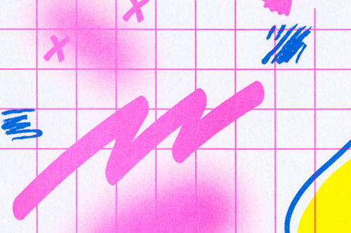
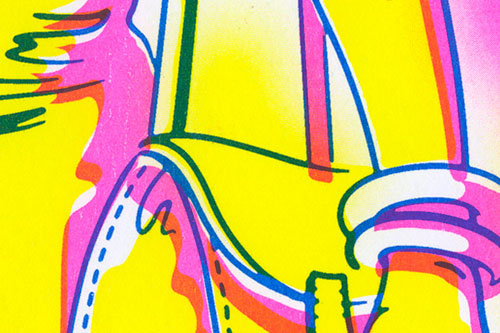
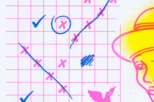
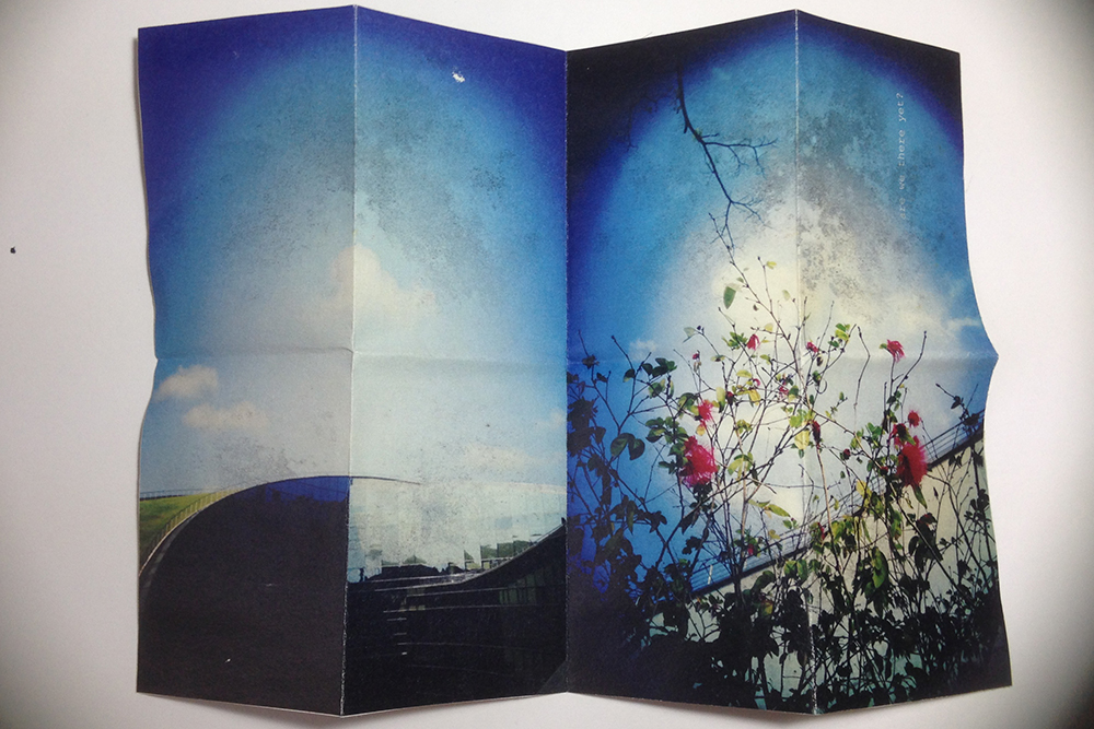
I haven’t quite written anything about making chance art yet, but this weekend I think I’ll do some research and include a few more references for chance art. Last semester I fooled around with some glitch makers online and I got some pretty crazy results. I used a couple of the outcomes in the large Photoshop artwork, but I mostly used it as a starting point for glitch experiments.

glitcherexperiemtn01

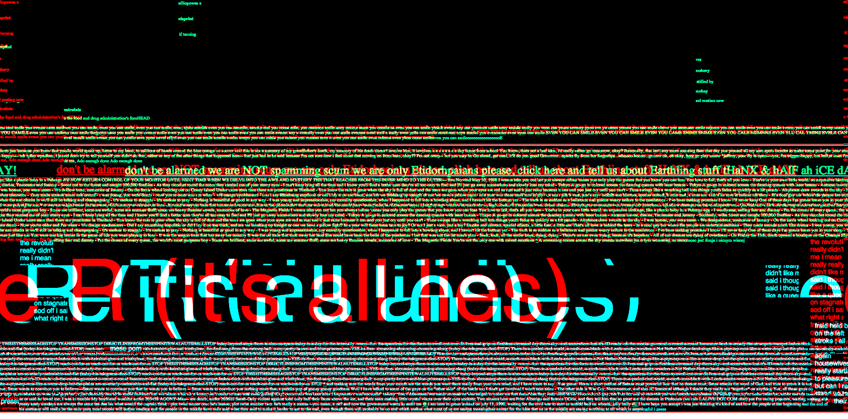
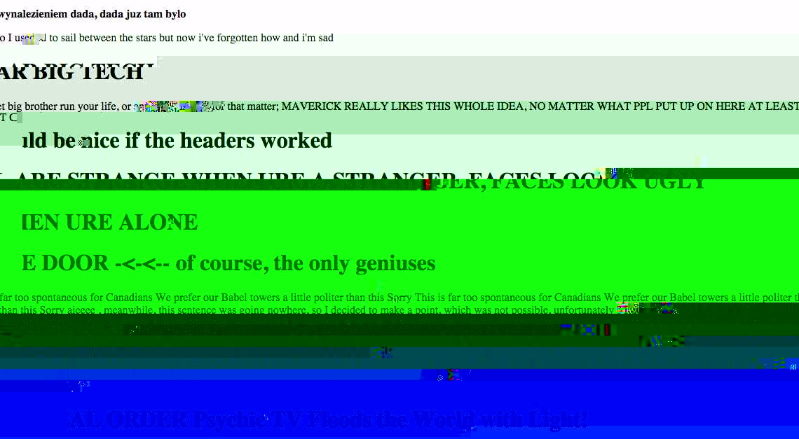
Made with image glitcher experiment

This online app manipulates a .jpg image, so that it creates all this weird, fancy errors. What I did was to play around with the sliders until I achieve some effect that’s quite nice: often it’s the colours that are produced, or how an area of the image is distorted. Then I make screenshots of the various results.

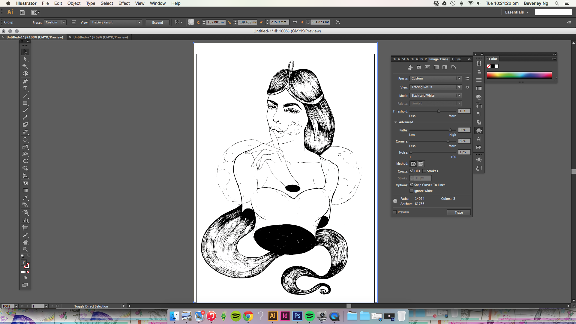
I’m currently doing bit more research into each area of my report as I work my way through the desired outcomes. A few days ago I had my meeting with Randall and we discussed making a longform WordPress theme. One of the girls in my fyp group, Boyan, is very good at making themes, so I thought maybe this time I’ll produce a sketch and rope in the help of someone who’s better at coding. To be honest, I think I will struggle quite a bit with learning the coding for WordPress theme. I don’t think it will be impossible for me to learn, or that I’ll not have the patience for it. But it has been a long time since I did any coding, and I quite look forward to working with Boyan to make something cool for the virtual part of my project.

While doing some reading on David Carson’s works, I wondered how he ever thought of making deconstructed typography. I feel that the experimental quality of his design is reminiscent of the Surrealist automatism concept. Automatism art taps into the subconscious mind of the artist, and allow that subconscious to work itself onto the paper. Sometimes I feel it is not as easy as it looks or seems, to create experimental artwork. It’s almost like meditation: you got to just kind of shut down a small part of your brain, and just make an artwork without really thinking about it. just go with the flowwwww~~

What I like about the image glitcher experiment is that it pushes that button: stop thinking! I glitched some body of text just to give me some visual ideas of what I can make, typographically, and then I can expand from there. I love this part of the work, definitely. Having no idea of the outcome can be an exhilarating thing, and from my experiences, is a pretty damn good!

To more experimenting!

Riso + inkjet

00c14e11fee48383d727bc3464589a98 ac60cece9d898531b2887e5a8fc08503 ca6de96a661b88b4742a6e7ff8fac548 ea5f2302f81ca7ca1b0958ee4123d7c2

The Risograph printing process can be best described as an occupant of the middle ground between the capabilities of offset lithographic printing, digital printing, photocopying and screen-printing. Traditionally used in schools, churches, small enterprises and independent political parties, the Risograph has now become an alternative method of production due to an increased interest in self-publishing, and its ability to produce high quality prints quickly and inexpensively using colours not achievable by traditional digital printers.

The technology of a Risograph is very similar to screen-printing, using a stencil-based printing process. This method allows the Risograph to produce spot colours and textures similar to screen-printing but at a much quicker rate and a fraction of the cost.

from Push—Press, Singapore-based risograph press

So here’s a brief description of how the risograph printing works. It is similar to screen-printing, and to print a work with risograph, it is necessary to separate the color layers in the document. The machine will then print each color separately. Because of this, it is also possible to do overprinting, which means that different colors can be printed on the same area on the paper, which can result in some fascinating outcomes. This aspect of risograph printing also means that it is possible for some misalignment to take place. Taking these things into consideration, I think the results could be quite interesting and unexpected, similar to what I was saying about making chance art and incorporating these technicalities as the process+outcome.

Apart from risograph, I am also likely to print the rest of my work with inkjet. Can’t print all of it with riso anyway cos I ain’t got money… Also because I can do it at home, and maybe see how I can manipulate and play around with my printer. Not sure if I want to approach a press to do offset-printing because I hear from seniors it’s a pain. DIY all the way.

Princess Bubblegum


Screen Shot 2015-08-25 at 10.24.11 pm Screen Shot 2015-08-25 at 10.24.22 pm


Trying my hand at digital illustration, I might want to do a big illustration piece that is influenced by Internet art culture.

Here’s an attempt at humanising Princess Bubblegum from Adventure Time. Did the drawing on paper, scanned and Image Trace-d it. I’m quite bad at colouring though. Might go black & white, or try and get better at it.


bbg_Draft01


rainicorn lady


it’s been a while since I picked up my pens.

this isn’t really related to what I’m doing for fyp

but it’s a reminder that sometimes we need to step back and do some other things, so that we can look at our project with a fresh perspective. it is also important to give some of our love to other things.

Instadiaries


My friend said this to me lately, “Beverley, when I look at your Instagram, you don’t seem to have photos of you and your friends. You make others think that you are better off living life by yourself, with your objects and whatever it is you are making.”

It was a timely thing to hear that from her, as I recently rediscover an old project that I made some time ago called Instadiaries. I made it when I started clearing my iPhone camera roll and found that there are many images I’ve captured which I had intended to share on my Instagram but I didn’t, because they didn’t fit in with the rest of the pictures I had already posted.

I would say this project makes me think about my participation on the virtual space and how that affects my way of documentation over recent years. When I write on my personal blog, I always feel that I am making conversation with a virtual abyss, and I never really feel that I had to censor myself or curate my words. If I were unhappy with myself, I could be very honest about what it is that made me unhappy and then I will read what I wrote again the following day and I could make a change about myself. I know there is not really anybody out there who is a constant reader of my blog. People are generally more interested in the pictures shared on Instagram or Facebook. But when I share a photo on my Instagram, I know that people do look at it and respond to it. And because I know it isn’t an entirely complete representation of who I am, sometimes I would rather not share at all.

Maybe some of us have experienced this phenomenon that seem to have taken over the users of Instagram at some point. We become quite particular about the way our pictures look on Instagram. Some users prefer to keep the original aspect ratios of their photos, square crops be damned. Some are really good at doing flat lays and enjoy arranging objects in a neat, stylish fashion to demonstrate their taste. The list goes on. There is nothing wrong with this, and some users have an attractive feed for their specific interests because of their careful curation. At one point, I was also very particular about how my pictures look together on Instagram, which made me wonder why I should. It is quite pretentious and honestly there were plenty of pictures that I would like to share online but I didn’t. I thought of how people enjoy the feed that I was sharing then, and something different might make them disinterested. More than that, I was ashamed to admit that I could allow social media to influence my decision in something so trivial such as sharing a photo I like a lot. So, as a result, I deleted my Instagram for a while, and made a project about it.

I collated some of my favourite photos taken in a month (the project unfortunately lasted for only about three months), and added some of the writing I made in the month as well.

Some pictures of the project:


Photo 16-8-15 11 34 01 am Photo 16-8-15 11 34 22 am

Each Instadiary is A4 size, printed on both sides on Ikea paper.Photo 16-8-15 11 34 38 am Photo 16-8-15 11 34 54 am

Some poor experimentation of layout.Photo 16-8-15 11 35 00 am Photo 16-8-15 11 35 16 am Photo 16-8-15 11 35 25 am Photo 16-8-15 11 35 30 amI think this could be something I can continue to look into. I’m not so much interested in the implications of social media or looking deep into how that affects our relationship with one another, but I am definitely keen on researching how that affects the way we look and present ourself. I also want to make comparisons between this manner of sharing with what I started wit: blogging and making friends on Internet forums.


is this the real life

lolfyp gg

first fyp post!

this is where it all begins. been spending some time converting my physical journals to digital formats. now i have my digital/physical archives all housed neatly in folders on my dropbox. it’s time to wade in and sieve through the contents. it’s going to be a massive project, but i’m looking forward to it!