
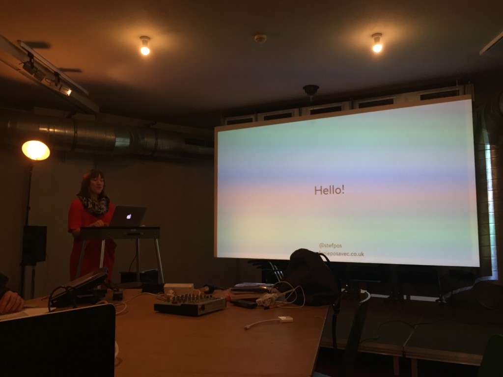
 The first week of the program is kicked off with a series of lectures and workshops by Stefanie Posavec. What a wonderful way of begin the program, because it was her work that really pointed me in the direction of my FYP.
An interesting note: she’s my flatmate too. We share the apartment of our host Rachel, and on the first day we went to school together. It was a really ~wow~ moment, and as much as I wanted to, I didn’t ask too much of her work and things like that because I didn’t want to sound too eager and fangirly… I told her a bit about what I am doing, that’s all. Also, the stuff I wanted to ask her was all covered in her presentation in the morning.
Talking about Dear Data: this project is about quantifying everything around and visualising it in analog form. The result is 52 weeks of 2 different visualisations. This is currently in the midst of being printed into a book so yay… we will get to see this in its full printed glory. Stefanie says it was challenging to do this, it took around 8 hours of her week, and making a conscious effort to take down notes about each week’s theme.
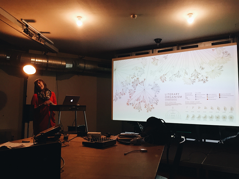
Stefanie sharing her work Writing Without Words.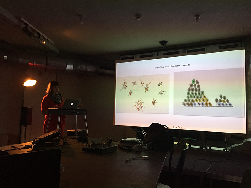
Even though this is the first week of the program, I am pretty certain this is quite the highlight already, being able to hear Stefanie share her working process, the ideas that go behind the works that she’s known for. Most artist/designer’s portfolio websites are often pretty straightforward, telling the work like it is, so it’s a real opportunity to hear her own thoughts about the work. She mentions that Writing Without Words was a project that she made almost ten years ago, which really directed her to her current career path as a data illustrator. It got really big on the Internet, and people were really receptive and curious about that work. This is really inspiring to hear, because you might never know that you’re on to something that people would be incredibly supportive of, and might open doors to much more exciting opportunities.
The first part of her presentation addresses her identity as a designer – Stefanie calls herself a data illustrator, and uses data as a material to create a graphic and to tell a story. She shares her data visualising skills and process from a designer point of view, and she often collaborates with someone who’s trained to do research and statistical analysis, like Miriam Quick, (who will be us next week to share with us how to work with datasets – the technical stuff) and they work in tandem to create a data story using graphics.
Some key takeaways from her presentation about using data as part of art and design:
- data visualising aims to communicate beyond the data – it is therefore important to make sure the visualisation is effective.
- as a designer, you can look for patterns within the data and translating them into visual language. Data as an aesthetic output.
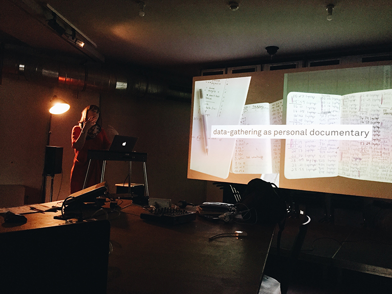
- data gathering can be used as a personal documentary: data is everywhere in the physical world, and it’s not impossible to visualise them.
- a good dataset is interesting, rigorously researched by you, or from a reliable source. Honesty and integrity is key.
- dataset can be a souvenir (referring to her work Dear Data with Giogia Lupi)
- the process of collecting data can be performative, an endurance test, a self-portrait.
- data can inspire feelings. It’s not all dry facts!
- data is a scientific and cultural material.
- data visualisation explains, explore, exhibit.
Next post will be about the visualisation techniques.
OH MY GOD SHES YOUR FLATMATE WHAT I CAN’T EVEN OMFG
BEVERLEY IM SO PROUD OF YOUUUU YOURE GONNA BE GREAT AND YOUR WORK IS GONNA GROW SO MUCH
OMG STEFANIE POSAVEC IS YOUR FLATMATE
OMG
…I mean, I’m really glad that you’re learning a lot from the course and again, I’m really really proud of you. I think we all are (: