Micro-Project: Pirate Broadcast II

Photo 14-9-15 9 48 16 pm Photo 14-9-15 9 48 35 pm Photo 14-9-15 9 49 06 pm Photo 14-9-15 9 49 56 pm Photo 14-9-15 9 49 58 pm Photo 14-9-15 9 50 07 pm    Photo 14-9-15 9 51 44 pm Photo 14-9-15 10 15 32 pm Photo 14-9-15 10 15 38 pm


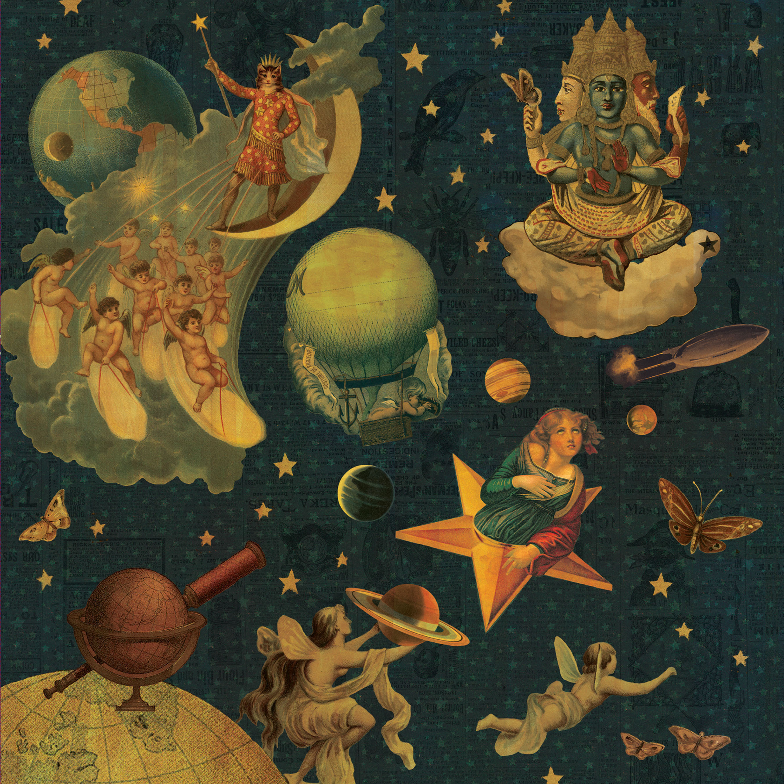
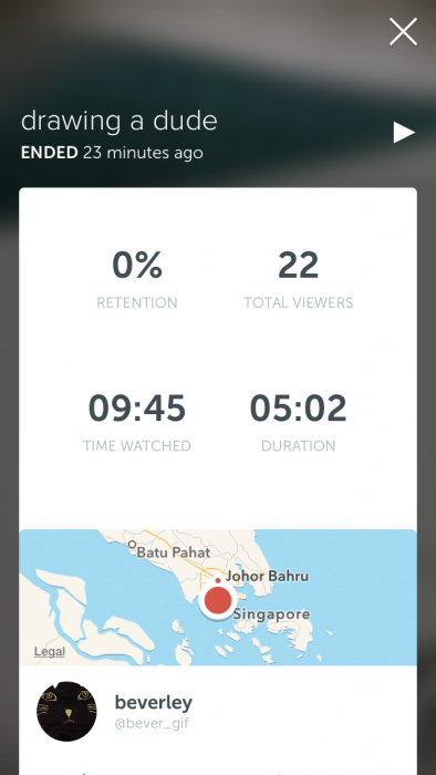
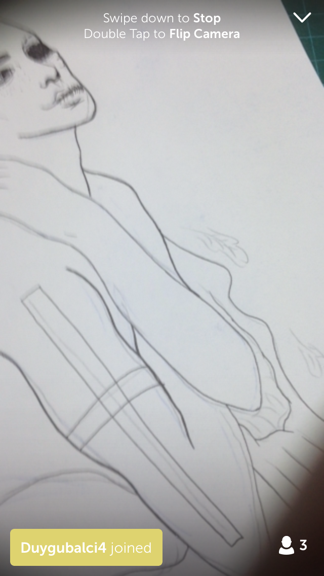
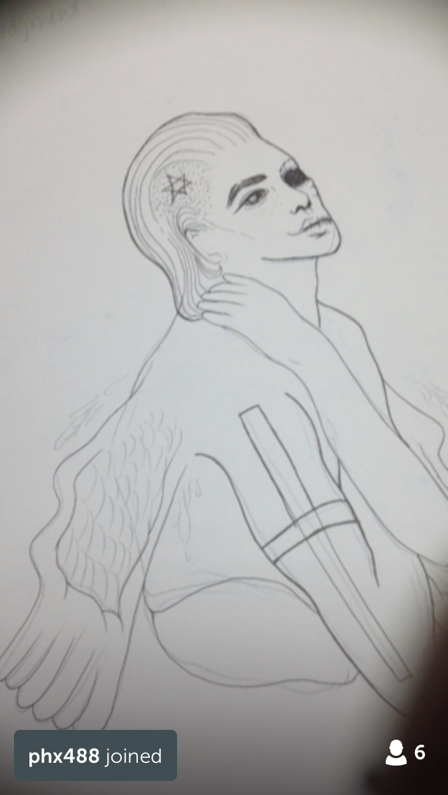
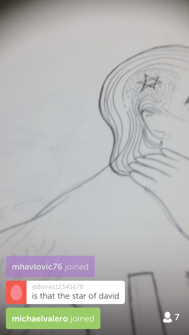
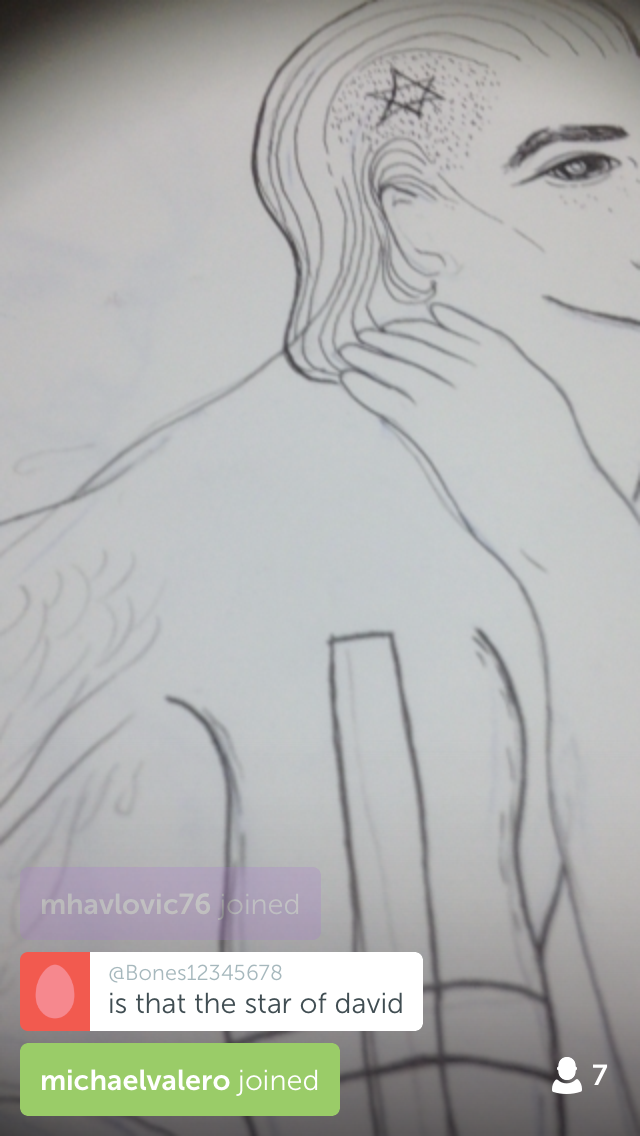
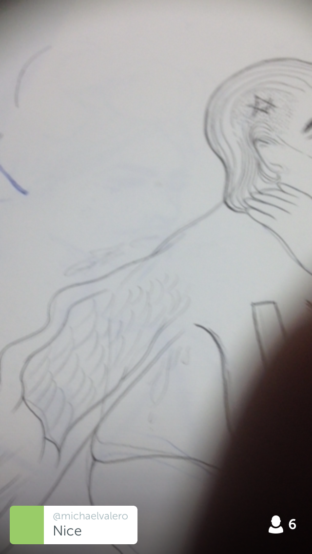
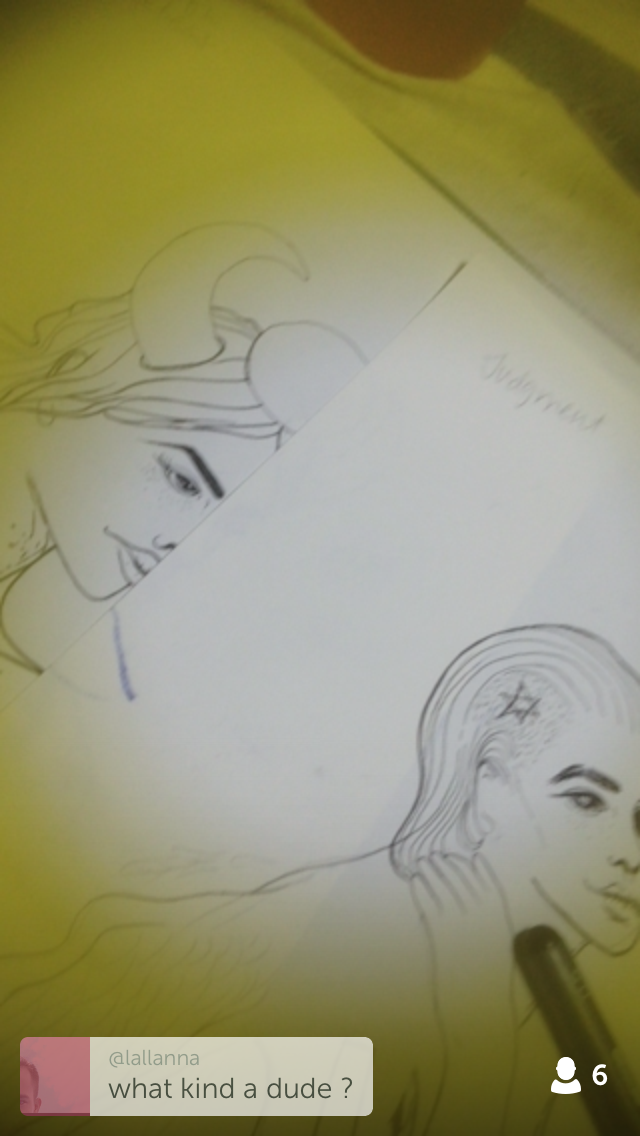
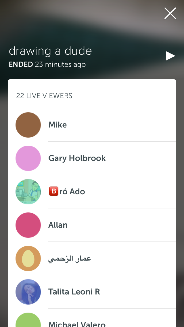
Here are some screengrabs from my latest broadcast on Periscope. I haven’t been shooting much outdoors because I’m afraid I’ll bust my bandwidth. Today I took a few random snippets of my activities, but this one had been my most viewed so far. I was quite surprised, honestly. This morning after I came back from the supermarket, I proceeded to make a Vietnamese-inspired chicken dish and I did a broadcast of that. I thought it was quite interesting, you know, since food is involved… but nobody was watching it. ha ha. While drawing just now, I made a broadcast. It was a little tricky to hold the phone on one hand and concentrate on my lines. I was focused on making sure I wasn’t drawing out of line and not really looking at the screen, and then suddenly all these little coloured bubbles started popping up with these hearts! People are actually watching it and commenting, live. It’s quite cool. The reaction is definitely instantaneous.

Anyway in my excitement, I forgot to save the broadcast to my phone. But you can view it on my periscope account (username: bever_gif).

This reminds me a little of Snapchat which my siblings encouraged me to join. They tell me that Snapchat is for broadcasting mundane details around us. I thought it was needless, and I couldn’t keep up with broadcasting every little thing around me. But I seriously admire my siblings’ effort to Snapchat everything.

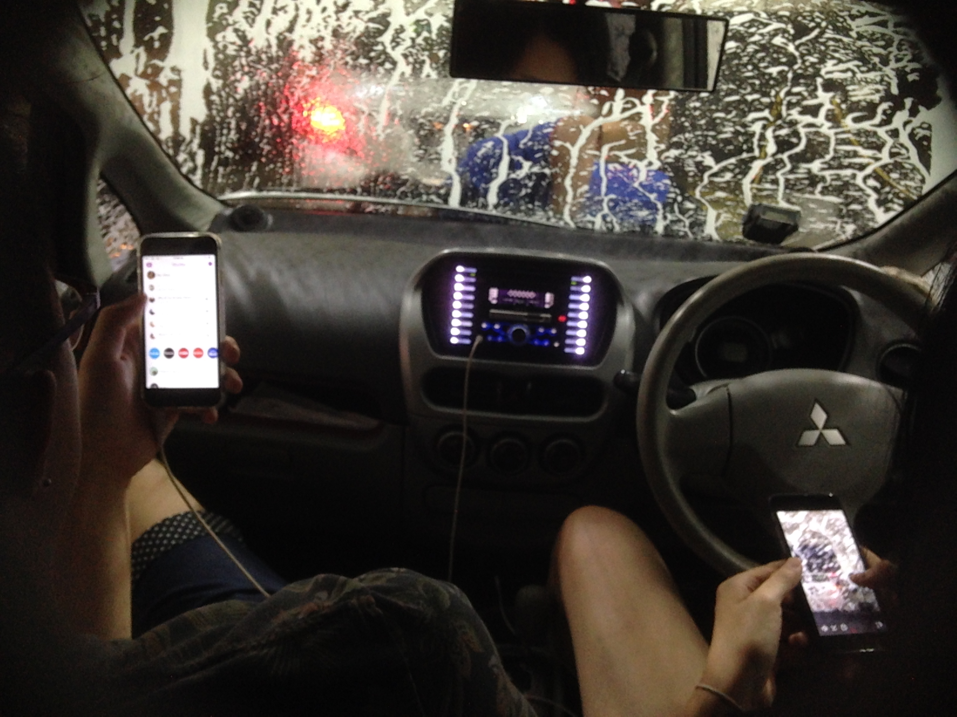
Here’s a photo of them Snapchatting a carwash scene:

Photo 12-9-15 10 45 28 pm


I find that I have to make a conscious effort to pick up my phone to broadcast things. I think this is something I’m beginning to learn since taking up this class. My kind of documenting usually only involves writing about stuff in my book and collecting ephemera from a certain event. I am also definitely learning from my siblings, who seem to have gotten this down pat.

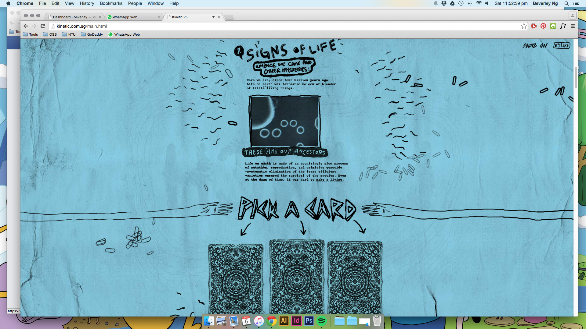
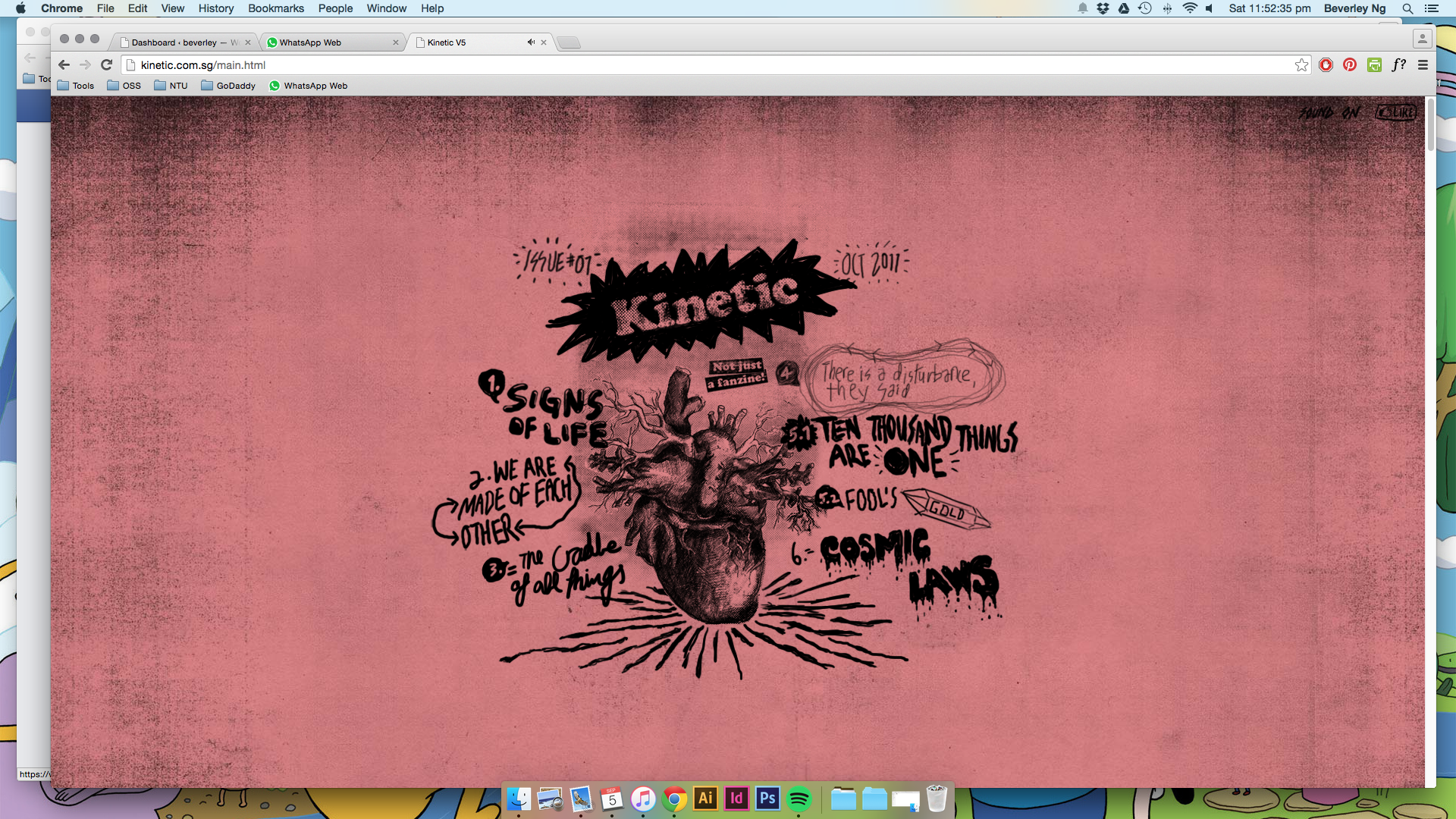
Going to experiment some more with Periscope and consider the possibility for its usage in my final project for Internet Art & Culture.

John Craig

johncraig02

THE SMASHING PUMPKINS' career-defining 1995 double album MELLON COLLIE & THE INFINITE SADNESS has earned Diamond certification for sales of 10,000,000 discs and digital equivalent per disc. This news comes in the midst of EMI Music's extensive reissue campaign honoring the legacy of the iconic alternative band. It continues December 3 with the PUMPKINS' fourth album MELLON COLLIE & THE INFINITE SADNESS receiving the fully remastered treatment for the first time. This follows last year's acclaimed reissues of the band's groundbreaking first two albums, Gish (1991) and Siamese Dream (1993), as well as this past summer's Pisces Iscariot (1994). (PRNewsFoto/EMI Music)

johncraig04


I came across an image of a collaged galaxy on Pinterest while researching ideas for my new tattoo and subsequently pinned it. Sometimes you see an image/artwork and you feel =a sense of familiarity… like you’ve seen something like it before. Anyway that bugged me and I couldn’t really find the artist who made it. Pinterest doesn’t really give proper credits for images. Later on, I collected some more images for my illustration references and I found out at last who made that fantastic galaxy collage. The illustrator is John Craig, who was the designer for one of my favourite albums Mellon Collie and the Infinite Sadness by the Smashing Pumpkins. It’s a gorgeous album, a two-CD set with the themes night and day, so throughout the album art design, there are lots of planetary/astronomy references. I would say John Craig’s style is quite similar to Eduardo Recife: think vintage, ephemera collages. Craig’s stuff is slightly more surreal and kitschy.

I’m including him as a reference for my illustration. In terms of composition, I might go with a montage. John Craig’s collages look like they are composed using kitschy, dollar stickers and I quite like that look. My illustration style is quite feminine and pretty, and while it’s not necessarily a bad thing, I feel it might be rather predictable and safe. Boring even. Also, keeping in line with my main ideas of remixing and deconstructing, I’m also thinking about how I can bring that to my illustrations.

WIP: type + collage

1409_01

03 01 02 03


Been spending these haze-filled days making these collages and experimenting with type layout. The first gif image of type shows my process of creating a few character styles on indesign. I think that would help speed up my process since I have tons of type to go through. Also, with just a click I can see how they come together. Been flipping through Carson’s books for this.

Then these are the scans of the collages I’ve been making. I will eventually print the manipulated type on tracing paper and wrap it around the printed collage, rather than directly on the collage itself. Helps to give the work some texture and dimension.

I’m working on a few different things at once, and I’m not really sure if it’s clear what I’m trying to do for each outcome, but writing here helps a lot. Also have tons of references that I got to categorise… I will work my way through slowly. All exciting and good stuff!!


Eduardo Recife

misprinted04  misprinted02


Eduado Recife is a total collage god. I’ve followed his work for about ten years now, and he inspired me a lot when I was making my old websites. I tried so hard to copy his style. It was so fun to be able to make these collages on the computer.

His collages and illustrations include a lot of old-fashioned stock images and vintage magazine cut-outs. The screenshots above were older versions of his website. He used to change them quite a bit, and I look forward to visiting his website each time, and then run off to make something inspired by his new things.

What I like about his work is that, like David Carson, he really plays with type. Working so much with collaging also inspired the way he viewed type, and he created a bunch of ‘deconstructed’ typefaces. His new website is much cleaner now, and easier for people to view his works, but he used to make longform websites too. I can’t find any of that on Google now.

Collage is often a big, experimental mess. But what I learn from Eduardo Recife’s work is that white spaces and minimalism is possible too. When he shrinks down some of this collages and place them right at the edge of the screen, it becomes quite an interesting visual experience.

misprinted03

These are some of his new works which I also enjoy:

Screen Shot 2015-09-14 at 12.59.35 pm Screen Shot 2015-09-14 at 12.59.41 pm


Longform websites: kinetic.sg

kinetic06 kinetic05 kinetic04 kinetic03 kinetic02 kinetic01


(images from Kinetic.sg, mute your computer if you are opening the link, the sound is a bit loud)


This is the homepage of local creative group Kinetic. I really like their approach to design, and I feel they definitely stand out from the rest of the prominent design groups in Singapore. That’s not to say that the rest are not good or anything, but I feel that Kinetic brings something different to the table.

Their homepage is a pretty excellent example of what I hope to achieve for the virtual part of my work, using the idea of longform storytelling to bring together different media in one place.

In terms of design, there are some grungy elements that I like a lot. The whole page looks like a photocopied creation, and it’s interesting to see how they bring this style to the virtual, and incorporate javascript and animated things to create such an engaging website. I love websites like these: it invites you to scroll down and look at each and every part closely. This is why I want to use the longform method as well. I think of it as entering a deep, fantastical forest that you just keep on walking through. (Think I’ve been watching too much Adventure Time.)


Together in Electric Dreams


tgt03

Spent the last few days looking at stuff on the internet for my WordPress theme sketch. Anyway, here’s a song that I like a lot called Together In Electric Dreams, by Philip Oakey and Giorgio Moroder. It’s from a film called Electric Dreams (which I’ve never seen…). The film is about a love triangle between a man, a woman and a computer. Computer becomes involved in man’s love life, and both shared a mutual love for the woman. Eventually the computer accepts the love between the humans and then self-destructs as a results.

The movie is made in 1984, when computers are still quite a new thing. I thought it is quite fascinating for the director Steve Barron to come up with such a storyline that humanizes the machine. There are definitely many films out there are does the same thing with machines and electronics, but perhaps few that envisioned the machines to mimic the emotions that we go through.

Electric Dreams was definitely an attempt to try and weave the early eighties music video genre into a movie.”

— Steve Barron, director of Electric Dreams

After watching the video, I went to look up some of the other popular 80s music that I kind of like, and I find that there’s a very distinctive aesthetic that runs through the videos: fascination of machines and electronics, saturated colours, a glowy, blurry effect all around.

Here’s another one I found by The Buggles, Video Killed the Radio Star

videoradio01

I personally enjoy the aesthetics of these music videos. They are comparably low-fi music videos, unlike much of modern music videos. (Do people still watch those stuff?) And these musicians are all singing about this new form of technology with a kind of wide eyed wonder. I thought maybe for my WordPress theme sketch and my final illustration piece, I could try and dig out what are the aspects of the Internet world that I was acquainted with that strikes me with the same feelings. I think that would help bolster my concept for the theme creation.


pirate broadcast

I’m trying to combine various methods of capturing footage and put them together in this pirate/unedited fashion.

  • screen recordings
  • filming with my iphone
  • using cheap special effects

I haven’t been out of the house in the past five days because I’ve been caught up with making some work, so I don’t have a very exciting story I can tell. So everyday I filmed a few minutes of ‘pirate’ footage of something that I’m doing. I try to do it from an outsider point of view, like what would somebody think of this girl who haven’t left her home in a few days, all cooped up in this room? How would somebody snoop around my working area, and what happens if somebody turned my screen recording on without me knowing? It’s nothing very Cloverfield though. But I can possibly expand on this. I haven’t tried putting my camera in anywhere that’s dangerous or particularly sneaky.

Research Critique 4: The Big Kiss


And from this ubiquitous state of shared presence we have come to inhabit an entirely new way of seeing via a fracturing of perception. The window through which we view the world is multi-layered, composited, and non-linearily re-arranged.

The Third Space, Randall Packer

Annie Abraham’s The Big Kiss demonstrates a sense of intimacy between two people from their remote locations, showing the audience the possibility and impossibility of intimacy via a network. It is fascinating to watch them trying to “kiss” each other by trying to align their lips on the big screen. It also highlights the awkward difficulty of trying to evoke that sense of physical touch via a network.

The Big Kiss can also be viewed as a collaborative work. Despite the intimate nature of the ‘kiss’, what is formed on the big screen is an effort of both kissers, a display of utmost concentration. I refer to the quote above from the reading. The screen becomes this shared space, composited, and it breaks down the barriers of locations and perceptions. It is seamless.


Recycled mix process

IMG_9550  IMG_9562 IMG_9563 IMG_9564 IMG_9565 IMG_9566 IMG_9567


I’ve been making stacks of these collages, from torn magazine papers. Trying to layer different patterns and elements to form a texture, which will be the background for the type from my blog. Will make a couple of spreads this weekend.IMG_9570IMG_9568  IMG_9571 IMG_9575

Thinking about layering text over the collage surface to give it some dimension rather that having it all printed on the page.


IMG_9576 IMG_9577


Recycledmix

dirtyprogress02 dirtyprogress01


Think it’s time to get my hands dirty and start cutting some things up before reassembling them again in photoshop. Can’t do much of these stuff on the computer, and I think I enjoy cutting and pasting.

I also printed my journals out, and will get to work cutting them up and physically remixing/deconstructing them. Can’t wait…