Design Concept

As the first step, our group worked on incorporating games and puzzles in hopes to create a fun factor for the NTU museum tour. A tour that deviates from the usual you would see in a formal setting. We wanted the users to make use of a kit to solve puzzles that will tell them various locations of the artworks scattered around the NTU campus.
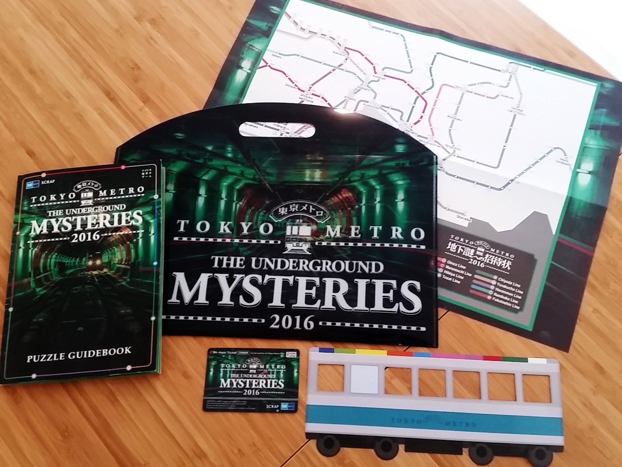
Our works took references to the Tokyo Metro Game as well as the collection of travel stamps trend overseas.
Design Concept
Through fun activities, our design was to create a physical set of game kit. Directing users around campus to view the artworks. The balance between good and bad game design was the difficulty and we struggled to fuse the difficulty level along with interest level of the users. Upon speaking to some of our friends, they felt that it was not extremely enticing to get on these tours as they felt that it might be too difficult to through some tasks. Time was key that the tours were not too long such that it disrupts their day.
/child-using-paintbrush-and-blue-ink-to-make-invisible-numbers-appear-on-paper-90116666-570e58123df78c7d9e514fb6.jpg)

Field Research
We made sure that each and everyone of us went down on different days and times to explore the situation and find out about the artworks. All of us had different perspectives and took note of different details. Menno in particular had the preference of looking at works from far, and how it harmonises with the surroundings while the rest of us took many close up shots.
Here are some photos which we had taken:
We hope to show you more and here are two links to the images we had taken
https://drive.google.com/open?id=10ZOC3O43lcCTZB6js35hAhSTHmUKkkcg
https://drive.google.com/open?id=1CTlEjIHaWxsHFe0CePA0o9U8Xo5dHRMe
It was during our field trip that we realise that even as a NTU student, we had a hard time when we tried to look for the artworks as some of them are secluded or are exhibited at places which we ourselves didn’t knew existed. We each went on separate occasions and found out that it took us at least 4 hours to finish exploring the artworks listed.
This idea became not fun anymore when the design issue is time.
The tour was to allow users to visit the artworks at their own time, thus it was important to retain the idea of time efficiency. We decided to morph this idea while retaining the idea of fun!
Interesting Finds
Something interesting that we had never expected to find out was the word MUSEUM created by some of the artworks. It was definitely a gem found and Laura recommended that we could possibly use it in one of the marketing collaterals as it was certainly a unique point we had in the project.
Ultimately we decided to develop them into stickers which could be interactive sticker and cards used for special occasions such as on NTU orientation or open house. As constantly replenishing the items on a long run would be extremely exhausting for the NTU museum team.


Hence, we decided to also implemented a challenging tour which requires the effort of uses to discover the Muse in them. Allowing them to look at these thoughtfully designed images and match them according to their artworks. Only upon matching are they allowed to proceed onto the next location revealed.

Mapping
We plotted out a map of the artworks on campus and came up with a full tour route that is the most time efficient. We also decided to incorporate the bus routes around the campus, which we already mapped out in our previous project. However, at this point since we realise that the tour will take approximately 4hours long to complete the entire tour which we had mapped out. The duration is too lengthy and users will be easily exhausted since they are required to do a lot of walking as the artworks are scattered around the whole school compound. Thus, we took in the suggestion to split the artworks up into themes to create various sub-tours. By doing so we cut down on the time spent to 1-2 hours on each tour, which is more manageable for the users.
Shorter Route Options
As mentioned in our first project, the ability to choose shorter tour routes was extremely important. This allows the user to hold the flexibility of choosing a longer or shorter route according to their own time constraints. Lastly, we had the numerical markers on the map and key to finding the artworks as the overall map. This allows users to look at a glance where were the works located for informational purposes.
Ultimately, we derived two tours of <Find Your Muse> as well as the <Sustainability Tour> which allows you to look at a fun and challenging tour vs another tour which is direction for educating methods of sustainability initiatives taken on by NTU Museum.

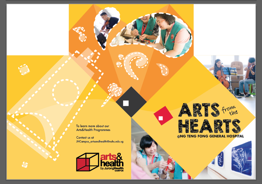
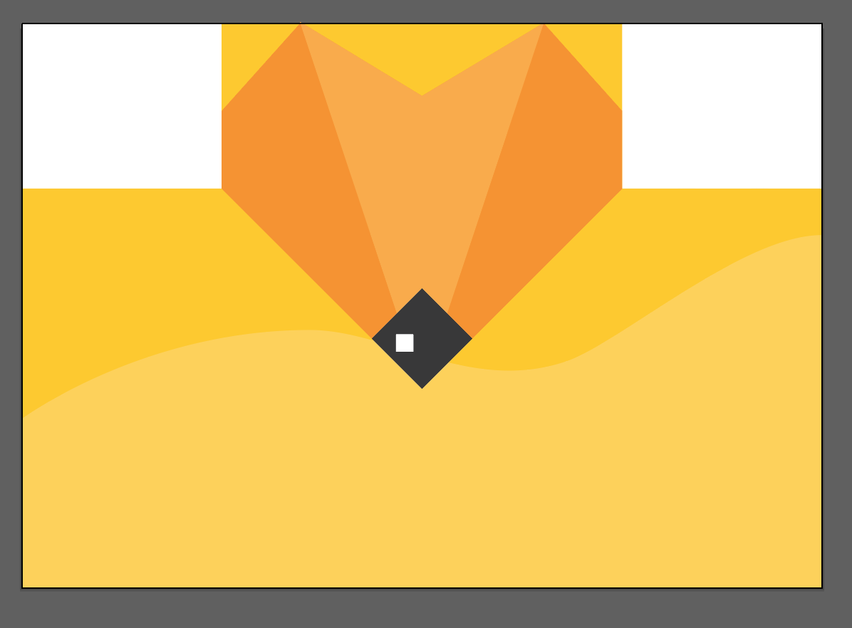
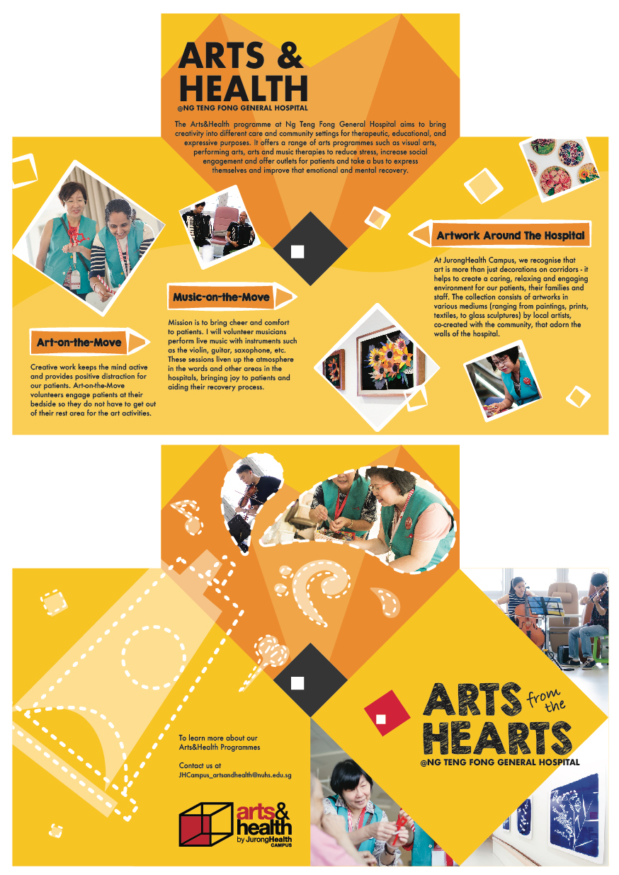
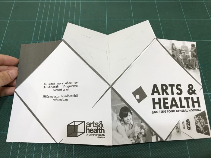
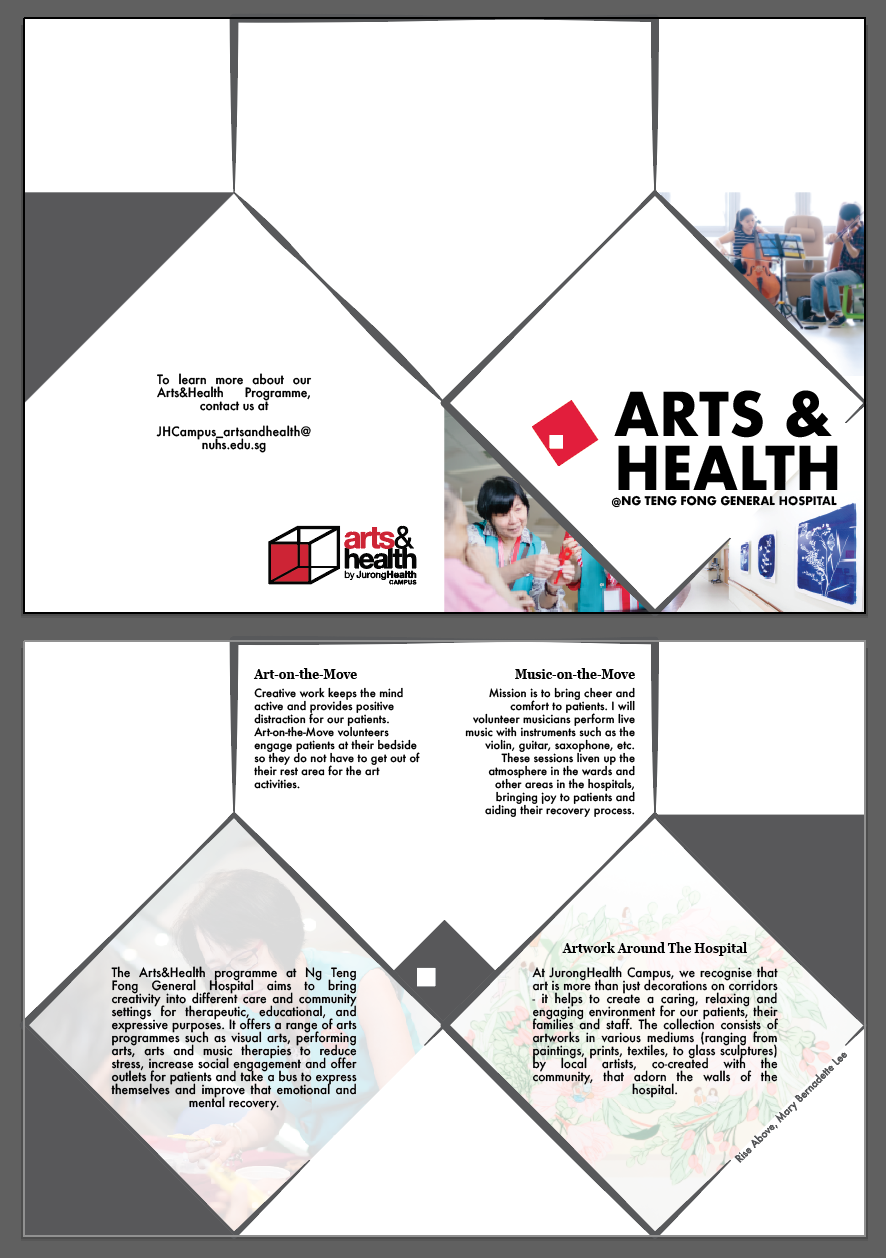
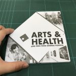
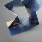
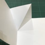
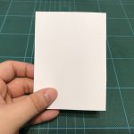
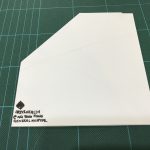
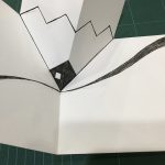
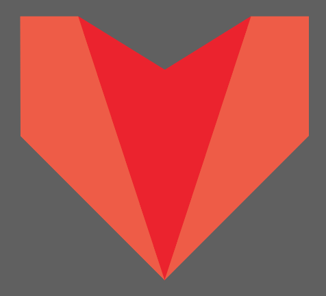 I explored the possibilities of the folds and harmonise it with an origami heart-pencil illustration. So that at one glance, people might feel that it is a pencil, but it doubles up as another meaning of a heart (in line with the slogan of arts from the hearts).
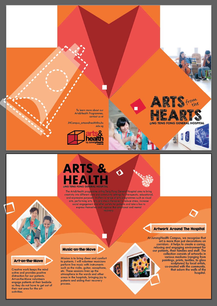 Colour Palette #02
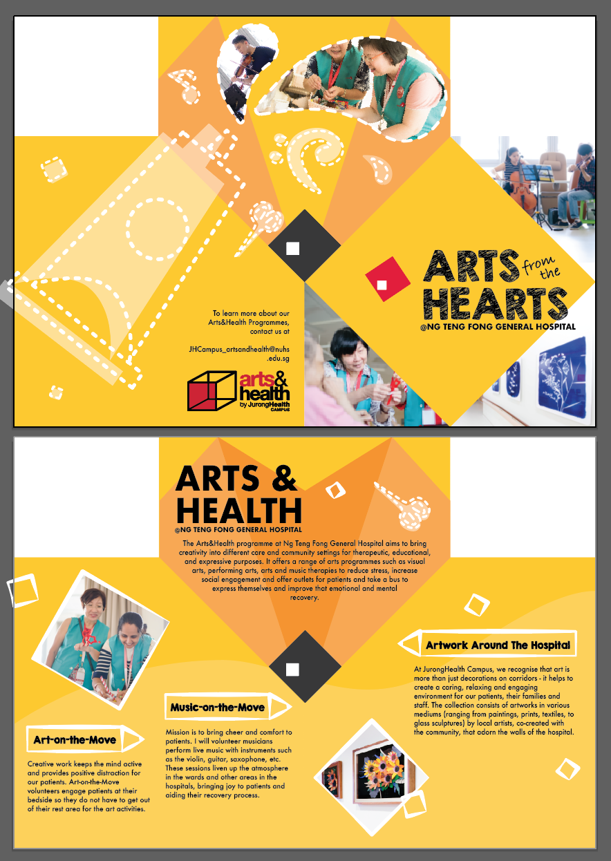


 Design Reference #01
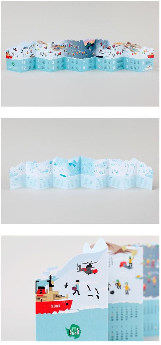
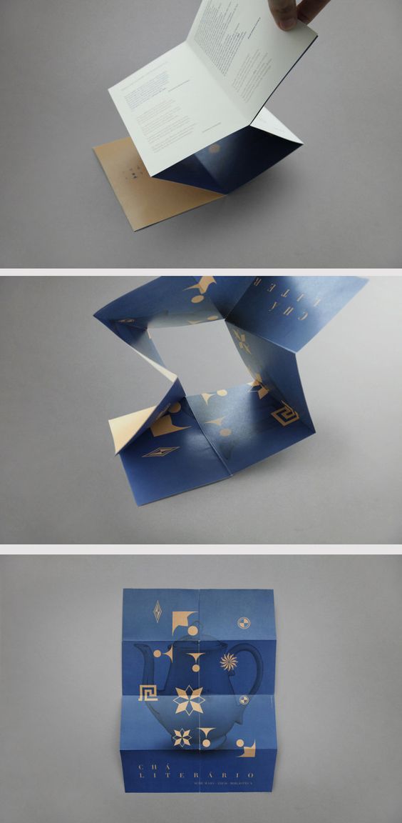
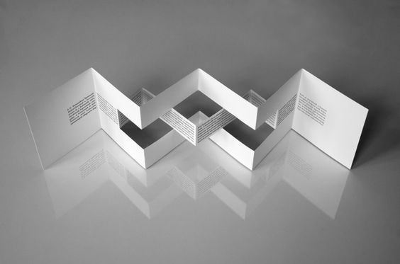 Design Reference #03
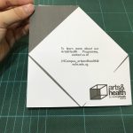
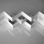
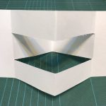
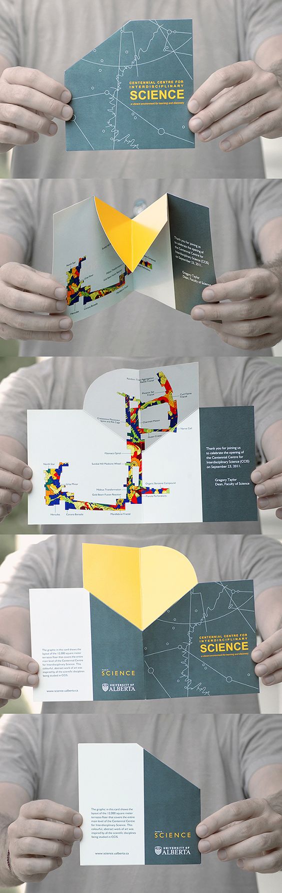 As I was exploring with folding methodologies, I tried to minimise the complexity of the fold or cut techniques mainly with considerations for mass production. As I refer to my internship experience, brochures that are designed with more cuts (die cuts) becomes more expensive. Also, the risk or error or bad production plays a part in these designs. Hence, I chose a more functional approach towards creating the folds, trying to seek a simpler form with a meaningful concept behind the simple folds.
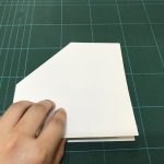
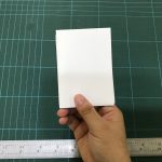
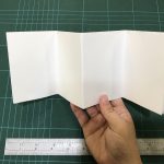
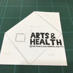
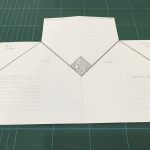


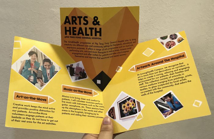
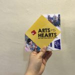
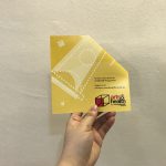
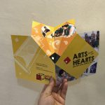
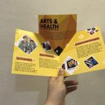
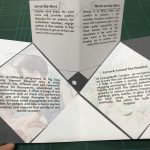
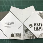
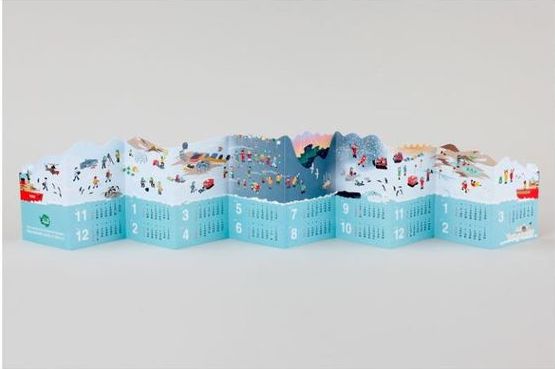
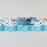
 Final Print Out
 I do acknowledge that there are still some small details which could be refined at this point of time. Nevertheless, the journey of poster design was an enriching one. I never expected myself to create a poster with so much thought and concept behind it. Looking back, I am proud of what had been achieved at the poster exhibition session.