
Field Study: User Experience of Hawker Centers and Food Courts


Field Study: User Experience of Hawker Centers and Food Courts
Assignment: Navigating Public Transport Presentation
Group Members: Kerin Ng, Hin Wai, Jordyn Valerie


Reading response: Hidden In Plain Sight
In this week’s readings, I felt that it was really intriguing to look at how culture is being observed in different context. The section on reading the signs really caught my interest as I agreed with it entirely. Many official signages are placed for the locals or people around it for they are most in contact with the area itself.
For example I have witnessed signages at MRT stations which says “Do Not Lean” and I believe it is a common habit for locals to lean against railings or walls which might have not been safe in certain scenarios. Personally, I do observe locals leaning unconsciously on objects while waiting in line, or just to relax.
It speaks a lot about the comfort level local have in the public. Whereby people behave in a relaxed manner even when there are on lookers. Sometimes, they might not even notice.
On the other hand, I am able to relate to this reading even more when I thought of the time I spent travelling in the states. I do see that some tourists hotspots are covered with major notice signages such as “Do not cross” or “Do not step” onto grassy areas for it might be common that people walk over these grass patches unknowingly for convenience rather than the designated pathway and create disastrous patches that are unsightly. In contradiction to what was mentioned before, these signages are then created for people who populate the area (tourist instead of locals).
Assignment: User Experience Analysis Of The ADM Building
For this assignment, I have decided to enter the freshmen’s point of view. Looking at how I would react if I were to enter the school for the first time.
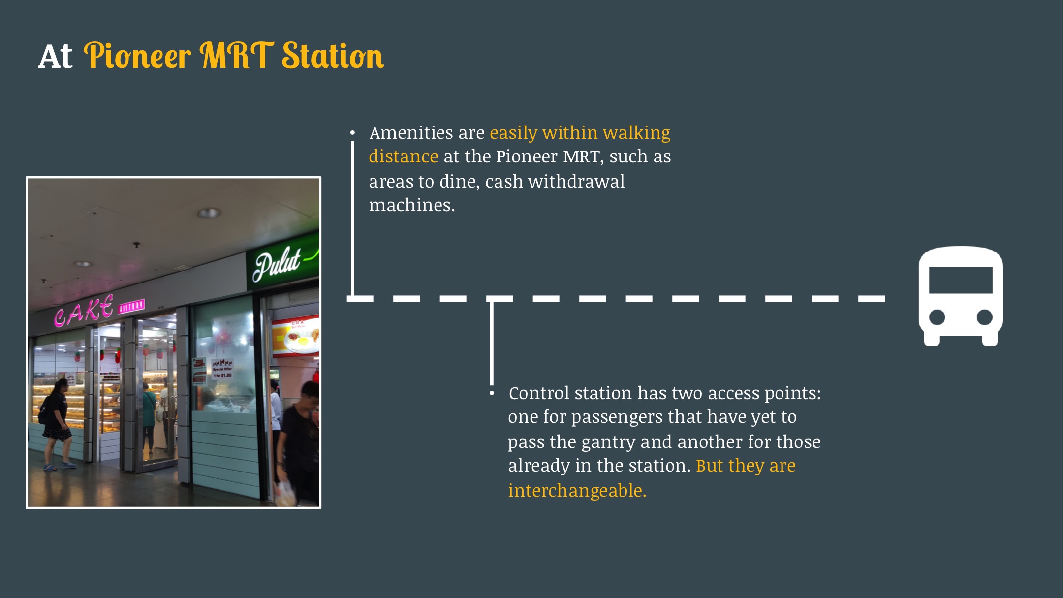
 Upon alighting the bus, there is a sheltered walkway which acts as a guide that the entrance to the building should be at the end of this walkway. No major signages to direct me otherwise.

The first thought for this would be the key card access. Do I tap? Or is it already open? Also, these doors are automated on one side, where the warning is written on the door as “Caution Glass Doors Swings Outwards”. It is difficult to gauge if the door on the other side swings out or inwards (push or pull) for there are no guided text.

This entrance shows no signs of where to head next. Left? Right?

(Left Walkway) Leads to the library and there is a handicap lift. So I do know that the different levels are handicap friendly.
 (Right Walkway) Leads to the this huge area. Judging from the high ceiling that it is the main lobby. Not much signages till now. To the right, is the general office with a map that does not have much floor plan (of individual floors) and studio rooms.
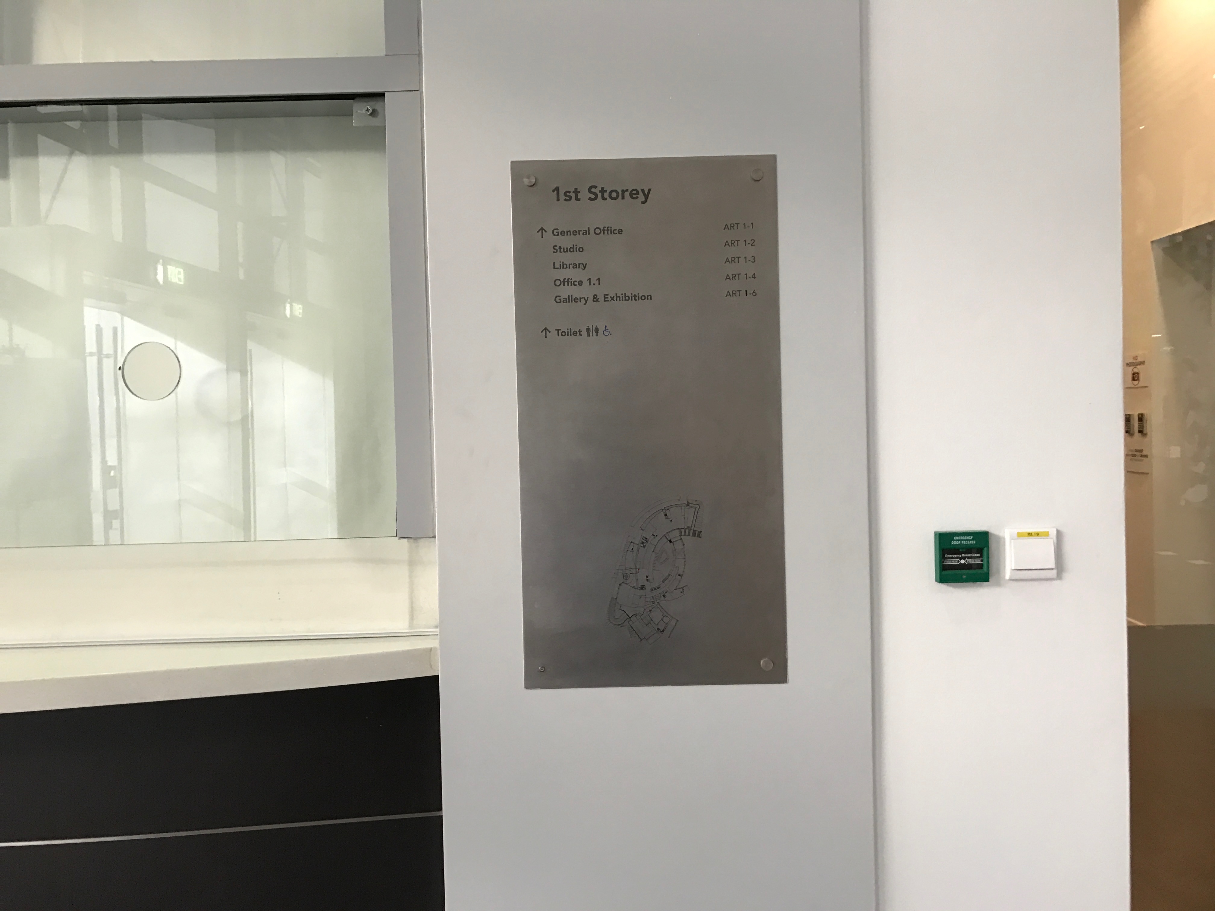
The map does not show where I am with the typical “you are here” tag. So it is difficult to judge which location am I headed towards on the map.


Lift does not show what is on the different levels and buttons are not labelled with the main categories of the floors (Eg. B1 Animation Studio/ Product Design Workshop).

This signage shows the general direction of the studio rooms. But….


Which walkway does it direct me to? The simple arrows were insufficient


Stairs heading up or down are generally good as it comes with handle bars for those who needs them. Also, the open concept makes it easy to look down and see if certain studio or workshops are what you were looking for.

Basement Level


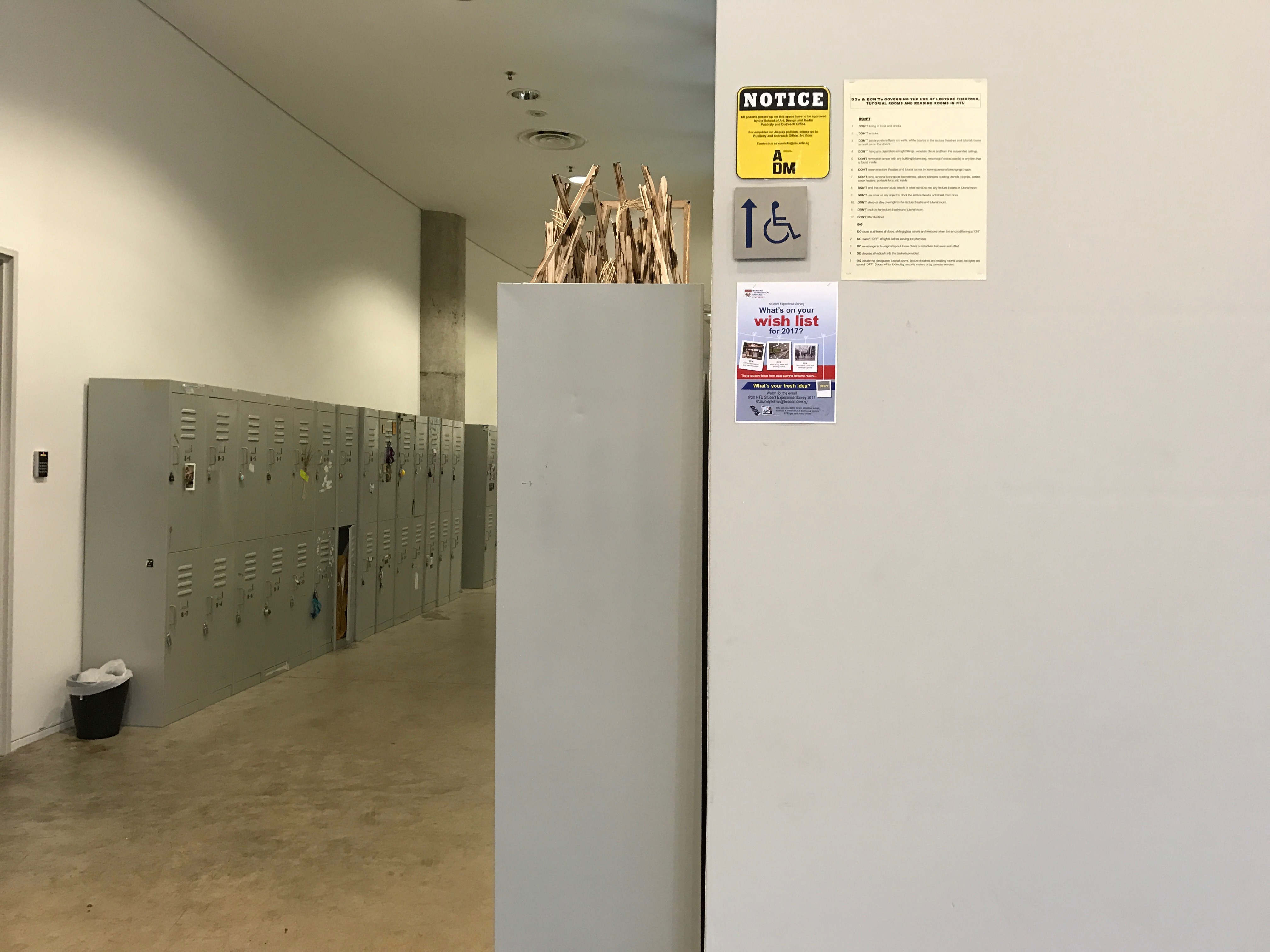
No clear maps on B1 for. No toilet signages, only colour coded maps which are not easily understood for navigating.
Fire extinguishers are generally hidden out of sight as there are rows of lockers, but for safety concerns the overhead signages are placed to indicate their placements whenever it is hidden.


Uncertain push pull doors as the handles are the same on both side and no guiding text are there.
Lecture in progress signages are switched on when lectures are being conducted in the room. 
Emergency evacuation labels are put around the school for people to read and evacuate accordingly when required. 

A map at the end of the hallway showing the animation studios. 

Reading: CH 1, Donald A. Norman, The Design Of Everyday Things (1988)
Norman’s problem of having troubles with doors seem to familiar to me. I often push the door that is supposed to be pulled, or pull the door which is supposed to be pushed. Sometimes it is a little embarrassing when people around see it, but at the same time the passer-bys seem to be understanding of my situation as though they have been through it before.
Something that caught my attention when I was living in Chicago was the push pull door that they had. It was extremely well thought of as the ergonomics were considered within the door design. 
Image Source: http://blogs.evergreen.edu/brookewalsh/push-sign-on-a-pull-door/
The door shown in the photo above builds upon a simple theory of push and pull movement of the body. When you see the long bar, your body is inclined towards pushing the doors while when you see the handles, your hand teaches itself to pull the handle. I remember telling my friend how I wish Singapore had more of these doors!
The author brought up the importance of how products should speak for itself. For example, many cameras are designed with consideration of hand ergonomics and placement of the index finger on the “click” for capturing images. This is because the index finger is more intuitive in pressing buttons, and it would feel rather awkward to use other fingers to do so. As such products can sometimes teach us how to manage it without its instructional notes.
This is inline with the fact that there are two most important characteristics of good design. Discoverability and understanding. Where the good design of these door makes it easy to know what actions is to be performed on which side of the door.
Form follows function, a principle which is generally associated with industrial design in the 20th century. Which clearly illustrates the idea of how design could follow the functionality of the product for a better experience design.
Question 1: Do our habits morph according to products or does products designs change according to our usage routine?
Question 2: Without ergonomics, could a product design still be a good design? (aesthetics?)
Assignment Part 1: Find 2 maps of a place you have visited
Good Example: Universal Studios Singapore 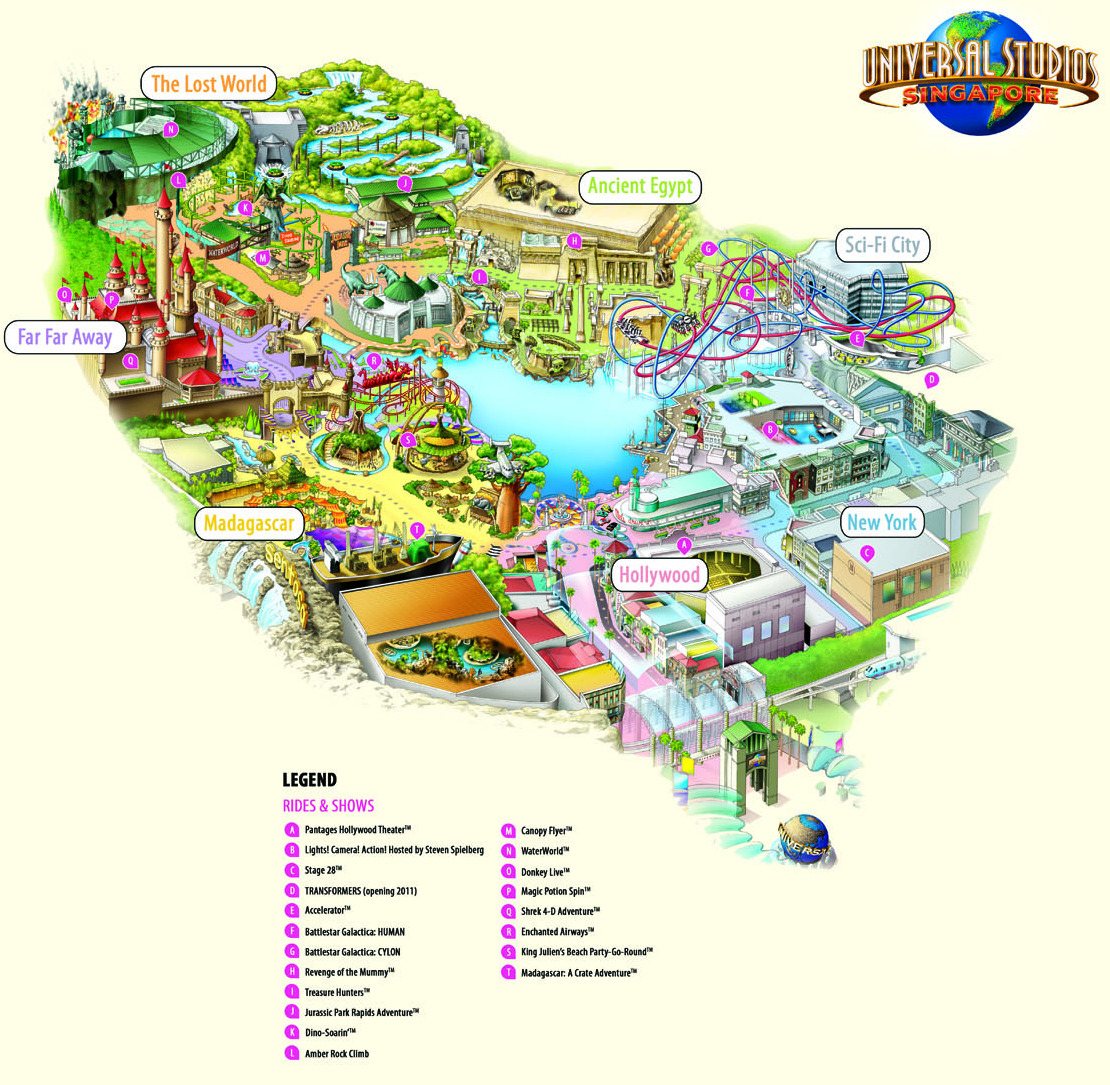
Image Source: http://thinletitbit.weebly.com/blog/free-download-program-universal-studio-map-singapore-pdf
I love visiting theme parks so I would like to discuss about the USS (Singapore) map. There is an overall design language spoken through the map for being fun and attractive with the appropriate use of colours. During my first visit where I got this map, I glanced through the map and felt that it is very informative and detailed. Even if I were not able to read the words on the map, I could still navigate through the clear images. Reason being that it is a 3D image which I could navigate throughout the theme park as though I was in the map with almost all the rides clearly illustrated through the map.
The map is classified into categories of fun rides such as the themed labels so that people could enjoy those rides within the same category to experience the theme they were to portray.
Map keys are listed in a straightforward manner in the bottom of the map so that people could navigate themselves to the rides which they are interested in (through their names or image). I love how the map was not over informative yet I was able to get the information which I required.
Bad Example: School of ADM

When I was asked to show a bad example of maps, I remembered the very first time where I entered the ADM building and I could not find my way around through the use of maps.
Firstly, the maps were not exactly too intuitive for the image of the building was simply made up of geometries (of the entire building, not level) without much information such as the typical *you are here* tag. The arrows were informative to a certain extent but it was not exactly accurate either. Some arrows pointed to the left but it would require you to walk straight ahead and then, turn left.
I have met visitors around the school (especially those on exchange) who simply can’t find their way around. Most of the time, they would panic as they were late for classes.
Journal Entry of Being Lost
Perhaps I would talk about the most recent time where I got lost at the Chicago airport. I was on exchange and about to fly off to San Francisco to meet my family there. Upon reaching the airport, the navigations were already unclear. We were puzzled by the numerous ‘queue here’ signs to get into the departure hall.
Moreover, it was our first visit to that airport terminal so that added on to our uncertainty. Upon clearing security, my friend and I immediately got lost. The gate numbers did not tele up as it was skipping numbers or alphabets. It got really scary as I was together with another friend who was as clueless about the place as I was. Luckily at the end of the day, my friend and I managed to catch our plane with the guide of a local staff.
User Experience Issue: Signages
The greatest issue I saw in the design for navigation was definitely the misinformed signs. First, it was the unclear direction of queuing. Followed by the gate numbers that did not go according to the standard numbering format. I remembered clearly that the numbers skipped one or two and it was misleading for I could not find the gate “in between” those numbers.
This is interesting how memory of navigating in other airports make me have a standard opinion of how directory in airports should be. Forcing me to look out for familiar things to relate to. Often enough it might be true, but in some cases we are forced to think otherwise.
Assignment Part 2: Two Objects I Use Everyday
Product 1: Cups
 Cups with handles are generally straight forward as it has an intuitive touch where by users are “encouraged” to grip it. Some other designs comes with a contoured surface for palm grip to replace the handles.
I have chosen to redesign the cups with such contours and added a lip to have a different functional product. Whereby the jar supports the palm grip with its contours as well as the pouring motion through the lip.
Also, if I were to reduce the height of the cup, I could create a saucer or a shallow dish.
Product 2: Remote Control

Also, the use of remote controls are generally straight forward as it allows your thumb to rest on the upper side of the remote controller where the buttons are). As it is generally labelled universally, the remote controller is pretty intuitive as well.
The side view of the controller which I have has an arc which reminds me of a possible design of a computer mouse. The computer mouse arcs towards the upward direction for curving along the palm.
Also, a rounder design while retaining its buttons could be a possible design of gaming controller (with joystick).