Field Trip & Observations
During the first week of class, we went onto a field trip @ Ng Teng Fong Hospital. We were tasked to create a badge design for the art on-the-move programme @ NTF Hospital. The vest and existing badge designs were shown to us along with a short tour around the place. Introducing the arts around the hospital and how these programmes were being carried out.
Friendly environment in the hospital, different from the cold stereotype with various artworks placed around. Artworks are meant to ease the environment to allow patients to feel relaxed while recuperating. High exposure of arts programme as there is high foot traffic with the neighbouring malls and path connectors, this allows many to be able to appreciate the artworks while walking by.
Aims of the programme
The aim of this programme was to provide a healing environment for the patients through art. A form of positive distraction or therapy for the patients as they participate in the programme. These programmes are sometimes carried out at their bedside to allow everyone to get a chance in participating as some might find it difficult to move around. The helpful and caring volunteers also encourages the patients as they accomplish beautiful art pieces which they might not feel they could achieve. Allowing them to feel a sense of pride in their works.
Design Direction
- Pride while wearing the badges
- Differentiate the volunteers
- Programme Identity
- Collectable Series of Badges
Concept & Explanation
Moodboards were created to form the imagery projection of my intended representation. The keywords which I picked were Freedom and Warmth. I chose these words because I felt that these words embodied the overall direction of Arts On The Move.
Moodboard #01 : Freedom
![]()
 When the programme was being presented to us, I found out that one of the main focus of this programme was freedom. The liberation that patients seek when they are ill. The art on-the-move programme acts as this channel whereby patients are able to be liberated physically and mentally.
** Special Note: The badge also had an intention to allow the volunteers feel proud while wearing the badges. To incorporate the concept of pride, I chose to explore the possibilities of a trophy or torch (similar to the olympics)
Moodboard #02 : Warmth

Next, was the idea of home away from home. Patients stay varies from short to long term. The idea of living in a place away from home could be quite intimidating. Hence, I wanted to develop a concept to represent and portray the caring acts of volunteers. These members of the team carry out the activities and provide a form of support for the patients in need. The relationships developed made me think of the warmth in the environment. ![]()
Small Group Discussion
During the small group discussion in class, I got to observe what others had thought of during the field trip. It was interesting to note that our brainstorming session led to a few main key words. Which became the focus of most of our projects.


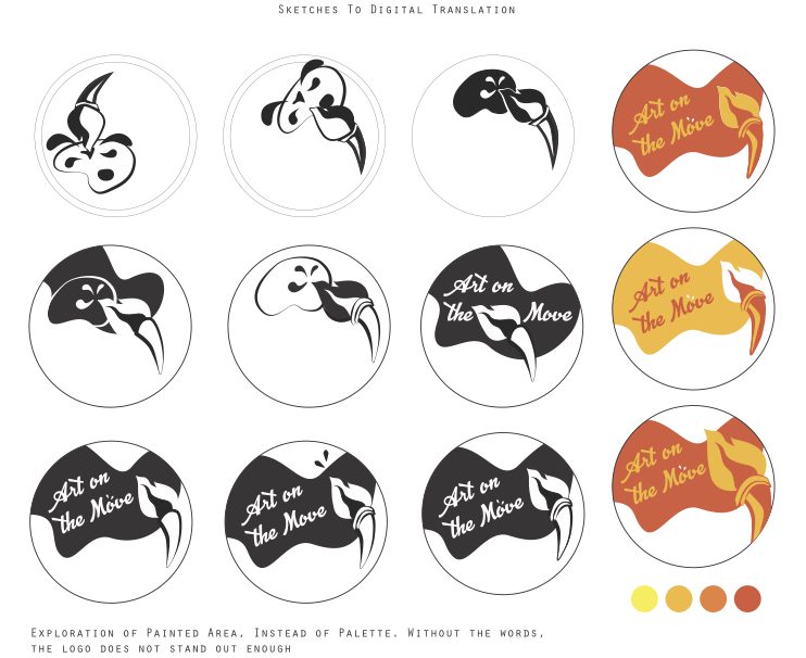
 Chosen Design #01 B&W
 Chosen Design #01 Greyscale
 Chosen Design #01 Colour
 Final Design


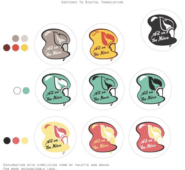
 Concept Development