
Digital Translation
During the translation of design, I did various arrangements and constantly got feedback from another person to see if my concept was retained after translation. Some parts were rather weak as it was a little cryptic and the message was difficult to decipher. Placement of objects were key but arrangement in terms of motifs facing upwards or downwards also played a part in creating the image which you want to portray.
The brush and palette icon was selected for final development. As I studied how the brush should be placed in order to show a fun spirited icon with the splashes as well as the torch/brush liberty message. The brush facing downwards did not seem to be successful as it did not show as a torch. Instead, it was simply a brush and palette motif at one glance.
 Concept Development
Being a little stuck at the idea of a palette and brush, I decided to break out of its form and explored with the possibilities of a painted area rather than restricting its form to a palette. With a dripping painted block, I was able to captivate the viewer’s eyes to look at the words Art On The Move. However, the brush did not seem to be eye catching and memorable at this moment. I observed while going through the edits that the logo was weak when the words are removed. Hence, I continued to work on the logo motif trying to achieve the idea of a motif that spoke for itself.
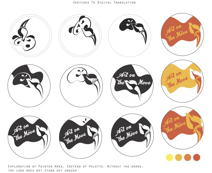

I looked at how negative spaces could suggest closure and did different arrangements to look at dominant and subdominant figures. An S shaped palette was included to make suggestion of a line of motion. It was important that the text harmonised with the logo design and does not dominate the concept. Also, the many splashes seem to be complicating things and I worked on how I could retain just one drop of paint splash while retaining its efforts of suggesting movement.
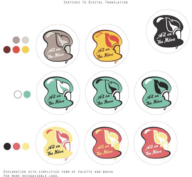
Colour Palette

Colours were chosen and implemented onto the final design. It was difficult to determine which colour to use as too many tone or shades might not go along with the aesthetics of the logo design. As such, I looked at how I could work around complementary colours with reference to the vest colour theme. In addition to that, I looked at how different colours had its own representation and meaning behind it. In relation to the concept, I chose three colours that represented therapeutic, fun and liberation.


Typography On Logo
Exploration of fonts were tested out on the final form. Serif fonts were easier to read while script fonts represented the organic form of creation. Varying font size showed the focus of the phase, with ART on the MOVE. Offsetting the ‘O’ upwards gives the word an upward lift when reading it as well. Typography in this context isn’t simply typing within a box.


