Refinement Process
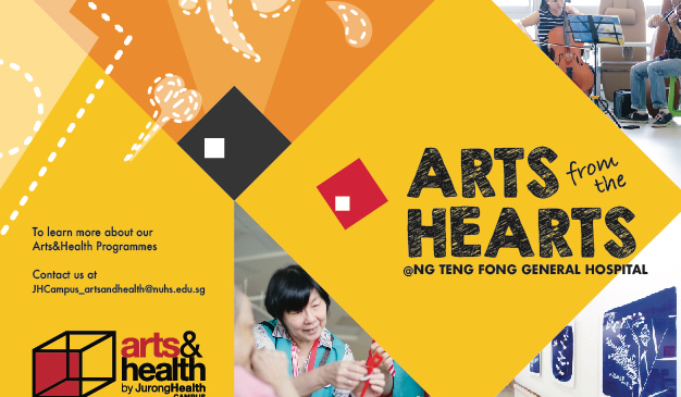
With what I had last week, I proceeded on with the feedback given to me that I should include a captivating slogan (could be from the poster design) as it could better represent the overall theme rather than simply the generic lines of Arts & Health @NTF Hospital.
Also, the use of the pop up space at the back should signify a better meaning and no panels should be left black. As clients pay for every page and leaving it black might be questionable. It could act as a form of advertisement when the user opens the brochure, and someone views the image from the other side.
 I explored the possibilities of the folds and harmonise it with an origami heart-pencil illustration. So that at one glance, people might feel that it is a pencil, but it doubles up as another meaning of a heart (in line with the slogan of arts from the hearts).
In addition to that, I made improvements on breaking the diamond shaped form. Allowing shapes to suggest the lines rather than directly showing the audience the intended shapes (Left paint tube signifies the diamond shape).
I added the header Art & Health @NTF General Hospital in the middle section, making use of the pop up attention and brought the viewer’s eyes to the text on top. To add more flow to the design, I was advised to create a flow line that could visually guide the viewers to look at other points on the brochure design.
Colour Palette #01
I tried to work with Analogous Colours with reference to the red logo. At this point, the design seem to be rather empty as there are too little visual elements involved in the print out. Also, the colour does not seem to work out as well as I had expected.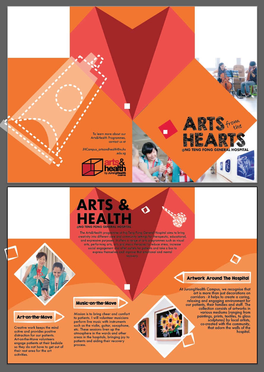 Colour Palette #02
This time, I tried using the split complementary colour palette with reference to the vest colour as it was appearing in many photos of the brochure design. The translucent white elements add a subtle effect to the entire print out instead of a bold series of elements. I really appreciate how it come together along with the choice of colours as it brings down the hierarchy of what was not important. 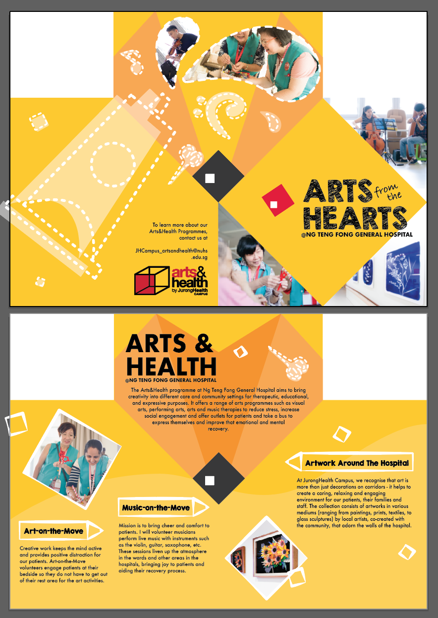
After consulting, I realise that there were too little photos in the brochure design. I was told to remove the orphans from the body text as well as to block out the headers with another colour as they were not clearly separated from the body text at one glance.
You must be logged in to post a comment.