Existing Brochure Design
I am always fascinated with origami folds. How it could unravel the message from within. I wish I could show more but here are three of my favourite designs.


# Numerical Order From Left to Right
 Design Reference #01
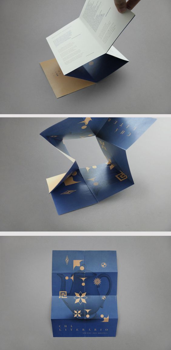
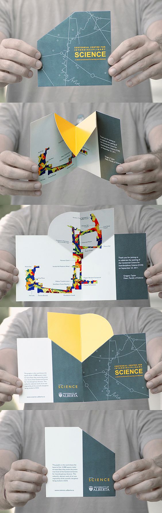
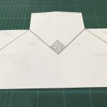
Unravelling the fuller picture when unfolded. This technique of fold only require a slit in the middle while retaining the mystery of an unusual fold technique. I really love the simplicity in layout of information and shapes played throughout the brochure design.
Design Reference #02
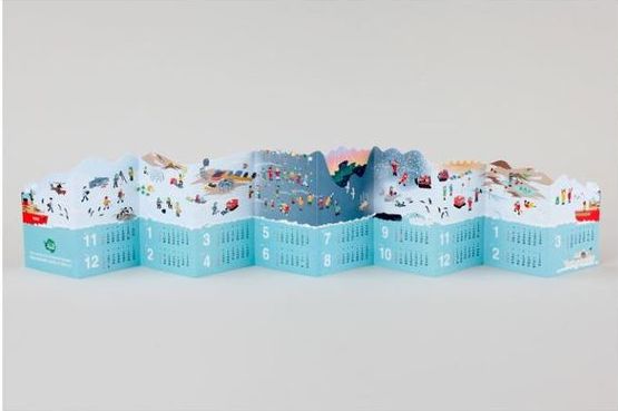
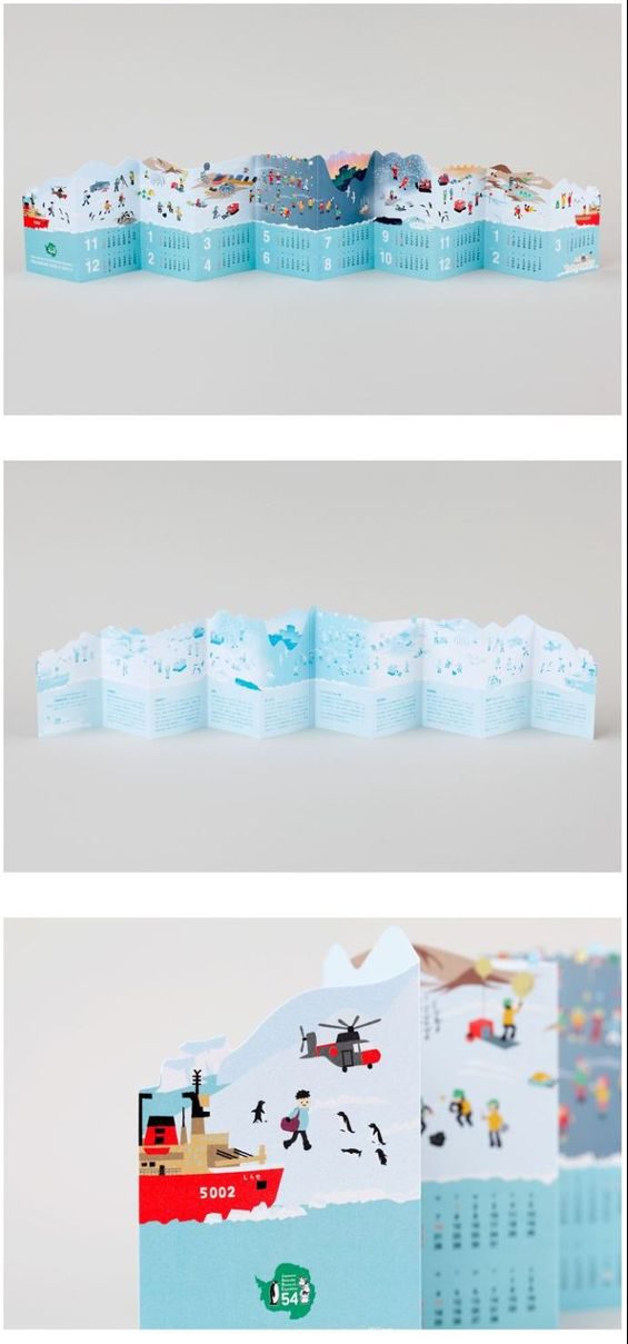
The die cut technique used in this context was extremely appropriate. I really love how the mountains are cut out to show you what you would expect when visiting the holiday resort. The bold colour at the bottom (blue waters) block out the text and let its audience read without any distraction in the area. This method of cutting really captivates the eyes and I felt that it was really well played.
 Design Reference #03
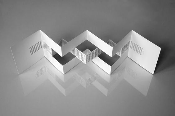
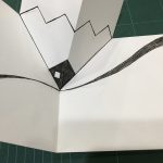
This method of cutting the paper is interesting because the maker blocks out an area in the middle (where the eye first goes) to draw the attention of its audience. With this method, one can place important text or highlights within this sunken area of folds.
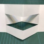
Playing With Folds
 As I was exploring with folding methodologies, I tried to minimise the complexity of the fold or cut techniques mainly with considerations for mass production. As I refer to my internship experience, brochures that are designed with more cuts (die cuts) becomes more expensive. Also, the risk or error or bad production plays a part in these designs. Hence, I chose a more functional approach towards creating the folds, trying to seek a simpler form with a meaningful concept behind the simple folds.
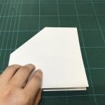
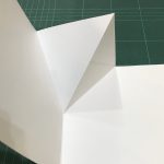
One last example I would like to show was this technique of one step folding. Whereby the users open in one step, views the information, closes in one step. I feel that this direct approach really attracted me as a user and I wanted to explore with its possibilities. Changing some shapes to develop what I ultimately want.
Mock Up Folds
There are three mock up folds you can see below varying from the usual panel folds to 3D cut outs and pop up folding styles.
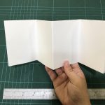
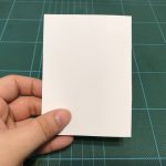
As I did the mock up folds, my focus was on the fact that there were not too many information. So I should not have too many panels that might end up empty. I looked at how a brochure could be easily handled and decided to go for an A4 choice rather than the allowed A3 size which most of my classmates were using.
Visual Studies
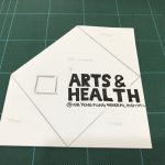
I studied how the placement of text affects the hierarchy of information. Also, I wanted to implement a flow line which was recommended during consultation that it could be a subtle line of information rather than a solid line work.
You must be logged in to post a comment.