Typography Potrait_Process (Part 2)

Mind map (Finalise)

59837


Determined


59838

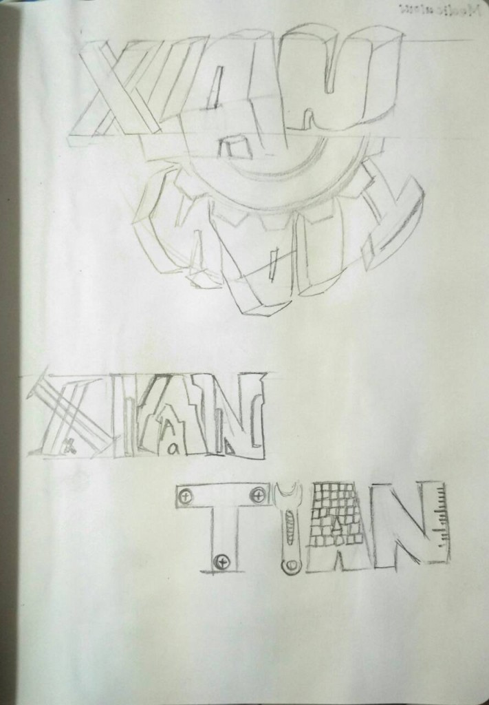
After trying to sketch out a few of my idea, finally I chose the design below which depicted my name ‘X’ as a STARTING point while ‘T’ as an ENDING point of a run. Oherwise, the rest alphabet of my name ‘IAN’ formed a shape of a running man means that I am running toward the end and the man will be done in motion.

The next step is colour chosen. First, I just random chose the colours which I like BUT I like it was meaningless in the end. I am thinking what colours I can use in this design and finally I got these colours. MALAYSIA FLAG COLOURS-RED,YELLOW,BLUE AND WHITE colours for the ‘X’ means that I was came from Malaysia. SINGAPORE FLAG COLOURS-RED AND WHITE for the character ‘T’ means that I am now staying at Singapore for studying art.12754925_1133494796674529_1390145428_o12736557_1133494766674532_893686144_o12722319_1133494740007868_17671757_o


Cold Surface, Warm inside

At fisrt, I am trying to use cat’s character(as in it is cool towards the strangers but it is royal to its owner). After consultation, Mimi gave me suggestion it didn’t give a sense that I am cold surface, it is more like I like cats.xiantian cat2 xiantian cat1

So, I decided to change my idea by using other cold elements like ice or something.

Untitled-9 Untitled-1

59839 12737114_1133494726674536_1668798763_o

I also did some research about Ice typography.
12755294_1133494706674538_1226804238_o
12597074_1133494656674543_1106160896_o


Poor time management:

I am very a poor time management student as I like to watching drama when I am free and my project always do in last minute. So, I must express this concept in this typography potrait.

12751814_1133494823341193_1610294195_o
Untitled-312751911_1133494493341226_1254487793_o

Colours chosen: For the clock, I am going to choose primary colours, there were two secondary colours intersect within the whole clock. It gave a sense of the many events in life, where they all overlap each other, making it harder for me to juggle my commitments.
12736903_1133494473341228_448370495_o12736573_1133494263341249_1954575388_o


Cannot be alone

For the last one, I decided to make the medium more interesting, so I combined photography into it. I took a pose which look alike the alphabet “A”.

Colour chosen: Their was two layers of colour theme for this design, At first, there is no colour for the name. After push it up, there are the blue and yellow which they are complementary colours. Blue is a colour that speaks of my sad feelings when I was previously alone. Yellow is a brighter colour where I am now more outgoing and more happy with friends beside me.

59938 12752151_1133494260007916_622095236_o 12755283_1133494806674528_369963722_o

Thanks for reading!:)

Typography Potraits_Final

Final Outcome:
final1. I am determined.

IMG_4599

  • To show a marathon where one is consistently running, step by step, to get to the end.
  • It shows my determination where I come all the way from Malaysia to Singapore and study at ADM, just for my passion towards Art.
  • Both the X and T are relatively rigid and straight, this shows that they are the fixed points for the start and the end.
  • For X, I use the colours of the Malaysia Flag while for T, I use the colours of the Singapore Flag.
  • For the rest of the letters of my name, I use I, A, N in a manner where they are in motion. The colours of the I, A and N are used from the attire of Malaysian sportsmen. determined

2. I have poor time management.

IMG_4598

  • The black letters on the clock are my name’s alphabets, Ngwe Xian Tian, they are all jumbled up, just like how you will imagine the digits on the clock to be all messed up.
  • This shows poor time management.
  • And if you take a closer look, you will realise the position of 11 on the clock is missing and shows that I am always do work at eleventh hours.
  • If turn the hands on the clock, you will see I and A, which forms TIAN- tian. (As the beginning the alphabet are all messsed up.)clock
  • The colours on the clock are primary colours, which are intersecting and this represents the many events in life, where they all overlap each other, making it harder for me to juggle my commitments.
  • The letters on the clock are inverted to highlight the fact that this is a negative trait.

3. I am cold on the surface but warm inside.

IMG_4600

  • My name Tian is depicted in blue colours and glue gun is used to give off a flowing motion. This reminds us of a melting ice.
  • The reason why it is melting is because of my inner passion, which is boiling inside.
  • When you talk to me, you might find me to be very quiet and one of very little words. However, as time passes, I will warm up to you and will express more of my inner thoughts.
  • This is seen by the little red beads, which will eventually take over the blue side of me.

ice


4.  I am afraid of loneliness.

IMG_4601

  • This is a negative trait so the alphabets are inverted.
  • When I am alone, it is colourless.
  • When I start to meet other friends, I see colours in my life, even when I am alone.
  • Blue and yellow are complementary colours as blue is a colour that speaks of my sad feelings when I was previously alone while yellow is a brighter colour where I am now more outgoing and more happy with friends beside me.
  • By mixing these two colours, I have accepted my past and now move on to a brighter future where I know I have friends waiting there for me.
    • The letters, X, T, I and N are broken into small pieces as I take the reference from the Secret Garden colouring book, where it is believed that by colouring part by part, it helps one to destress. This shows how by colouring bit by bit, my sad feelings disappear bit by bit, just like how I feel when I have my friends.alone


Thanks for reading!

Hello, my name is…

tumblr_mlzb45Igi11qkvaajo1_r1_500

“Looking for a formula will keep you from getting there.”

In first class activity, we were required to find “ourselves” by designing 3 name tags of different genres:

1) Typography 
2) Concept
3) Abstract Solution

12657911_1128261963864479_1561709487482903526_o

1)Typography

  • Inspired by Leonardo Da Vinci’s “mirror writing”, starting at the right side of the page and moving to the left.
  • YOU will see that the word “UNIQUE” positively by the reflection of the mirror.
  • It is a kind of self-reflection, YOU will find that what mistakes YOU have taken and do review through looking at the mirror.
  • The alphabet “Q” is coloured in blue, which means that I am different with others.
  • The light grey background show that simple but outstanding idea.
  • The lines of the draft I didn’t erase it on purpose because I think the process to reach an achievement is necessary and cannot be neglected.


12716095_1128262943864381_6634235999204121392_o

2)Concept

  • By extending the first idea, the concept is about a reverse world.
  • APPLE LOGO was drawn reversely.
  • ME(Unique) = only the apple was coloured and completed.
  • The lines behind showed that I am living a complicated society.
  • I am trying to overcome the difficulties that I had met.


12657358_1128262887197720_2789172953168182182_o

3) Abstract Solution

  • Similarly, it was extending the second idea as well.
  • But the more lines were added which mean that I become more and more struggle with life and also my aspiration.
  • The blank part was left purposely, the purity that I have even though I lived in a tangled and chaotic society.

Thanks for reading!