Combating Zika Outbreak (2)

Among the slogans that I came out last week, I chose 1)”Fight with Zika, Start with prevention” and 2)”Don’t feed your blood to Zika” to work on.

  1. By referring these influential and weighty poster from the website, I came out with a mother is hugging her baby with the illness of microcephaly. For the normal people who fells victim to the Zika virus, the illness is often very mild. But for a pregnant woman, it will cause pregnancy loss or a baby born with an abnormally small head and brain. For this composition, it occurred conflict about the knowledge of Zika symptom, which is the symptoms won’t be show for a mother who had already given birth.untitled-1

ad_sprs_softdrink

2. A mosquito is sucking the blood. The positive and negative spaces show in this poster while the colour of the skin will cover half of the poster. The red dots show the Zika symptom – RASH. But I think there is a conflict happened which is same with the previous poster. The man already had the symptom while the mosquito was spreading the virus.

untitled-2


3. A mosquito which formed by numerous of skull. This idea came from a mosquito with Zika virus. At first, I wanted to use bacterium but I think that it is not scary and serious enough so I changed to skull. After the discussion, Michael mentioned that the choices of the skull is crucial and essential also. Besides, he suggested that I can integrate the image and the words to avoid they look too separately. The images below is my reference piece for this idea.

zika h

Combating Zika Outbreak (1)

An effective poster

Stepping in this project, I went to research more on how should a poster to be more effective and also I want to conclude what I learned from the class last week. The first thing is to have the target audience so that we can focus on a single message to them. Next, use the images and graphs to tell the story. As a poster should be an eye-catcher, we should not put too much of information and it will make the audience confused. Besides, keep the sequence well-ordered and obvious.  The key things we can’t neglect are the layout, visual hierarchy and information flow which are we learned last week.

Google search “Health Communication Posters”

The posters which contain a lot of information make me don’t have the desire to click in. So we can see how the importance to control the information and images in a poster.

Screen-Shot-2016-09-12-at-01.56.49

Research on various types of health communication posters

As I know the target audience not only for adult but also for the child, I would make the poster illustrated (?)

c22ac4db63e07a6c76e8254971230f8e 6a5a146628b9ee9d3e6ce5891236dde7 2d0a5557b331579ce4db8bce7d193e53

I found this types of poster by using metaphor very interesting and they bring out the messages clearly.

cb70f00e341ae13e66ff36c15f16a0afb39387eb806b58b0c85df0717f703b8b7abc0f8331c15053ff78821fc3e59a4190ed429605b63b2f0e60b8808ccf4163

4bddc0f7940e42fa6a9d39a74b4ccbeb

afa974b3a98e7c5a38c61dc541c68789

f5359fb554676169fc0cbbf38234cdac

14eb170959a2830773d8b649a221af37
What are the exiting health communication poster?

I chose this become my favourite because it brings out the message obviously and it caught my eyes in “three-seconds hit”. The use of metaphor, a bottle as a child, it really impressed the audience. The back and clean background makes the graph and texts more stand out. The title ” HOW MANY CIGARETTES A DAY DOES YOUR CHILD SMOKE?”, it brings the awareness to parents to stop smoking especially a pregnant woman.

05674e3c90e097a3a58ab29e975cfa20I am weak on thinking this kind of slogan but I tried smilecry

  • Say No to Zika
  • You – Zika = A Healthy Life
  • Combating Zika, Start from You
  • Keep away from Zika, for child
  • Fight with Zika, Start with prevention
  • Fight Zika, It isn’t a game
  • Join the fight against Zika
  • Don’t feed your life to Zika
  • Live with no Zika

Ideas and mood boards

1. For my ideas, I am going to explore the poster with less text and playing around the images and space. The layout is similar to the example of the posters I research above and the graphics should be by photography or illustration. I prefer the layout with just a Aedes mosquito, with a scary look like and the down colour background. Another choice is illustrating a Zika patient with the symptoms.

Screen Shot 2016-09-12 at 13.54.31

2. Setting the target audience to mothers which is inspired by the posters below. Give them the awareness how important the mothesr should prevent the virus of Zika for their child.

Screen Shot 2016-09-12 at 13.34.41

3. I haven’t had any for the third ideas but my mind has been surrounded  by the Zika virus poster by GOV SG. I think it is a good example that the ordered layout and also the informative texts. The colour also catch the attention of the audiences and make them have desire to see that.14231157_10154434122793686_2490761139799190076_o


Project 1 (Final)

Finalise design

To show my process obviously, I made a GIF to show how the design changed from the beginning to now.

anigifwaves3edit

From the design below compared to the above, I felt the waves was too heavy and I decided to add more white lines and also changed the black curve lines to white line instead.

final waves2

The colour for this looks smooth but the lines are too flat 🙁

white waves1

After keep changing the design, finally I get the most satisfied design I tried to apply it on the window. Siqi said that this one looks more 3D and from far it will look better.

window

Finally, I chose this! embarassed

window1

For my concept, actually it looks like the waves nearby the shoal. This waves depicted in many horizontal and curly lines, it reminds us of a calm horizon or a person lying down. It gives us a sense of calm and clarity. The reason why I chose horizontal lines because to balance the visual effect between of the waves and the iron bar and also you can imagine the sound of calming or soothing waves and it is touching your feet. Lastly, in terms of colour scheme, cool colour schemes make you feel more soothing.

Project 1 (2)

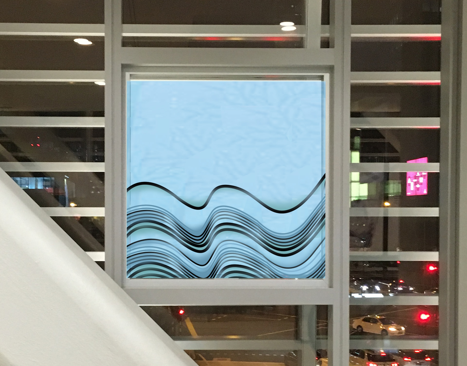
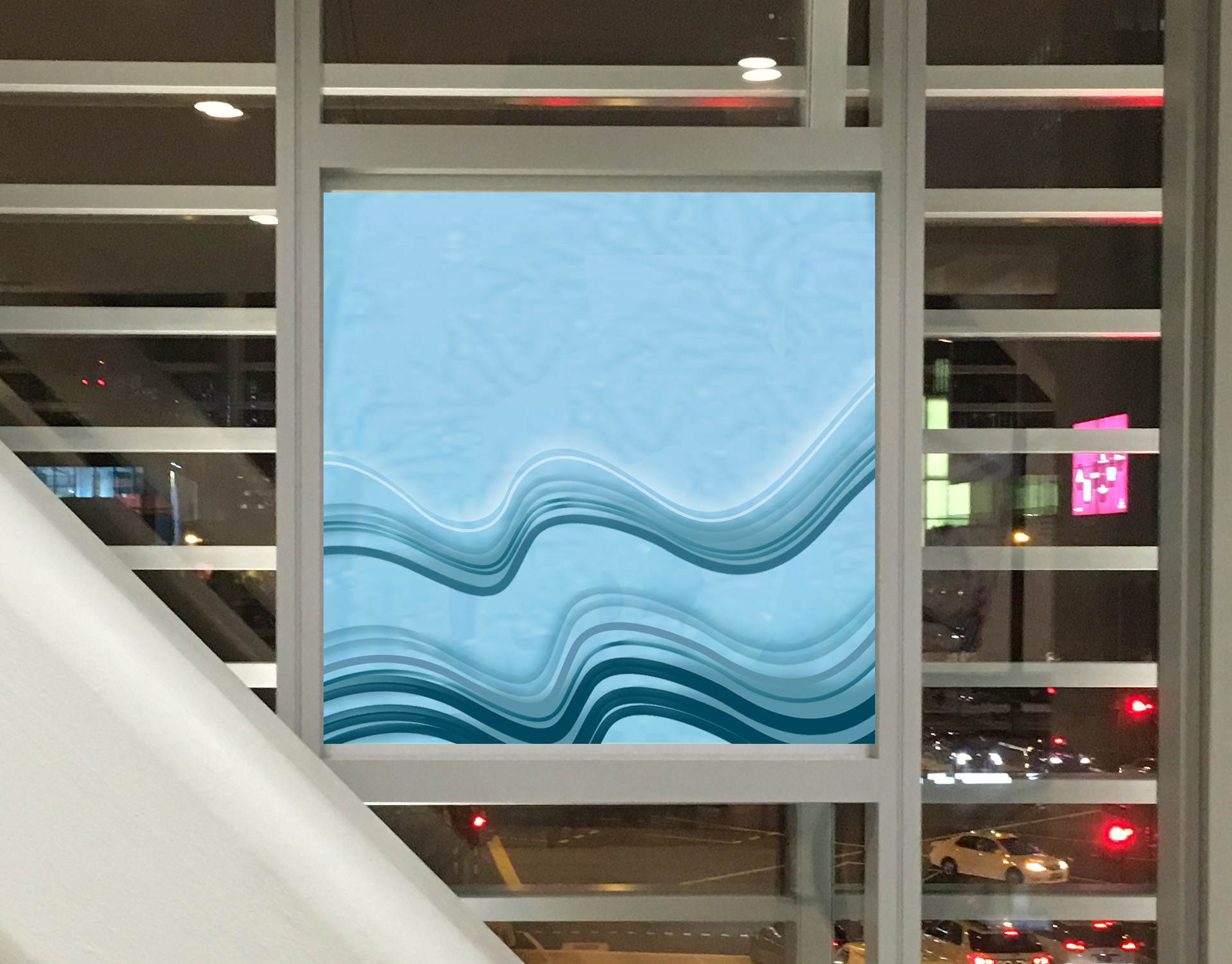
A Second Trip to Ng Teck Fong Hospital

After the one week was gone, I still haven’t had any ideas came out so I decided to go the hospital for second time with Siqi. We chose to go there between 1800 to 1900 to do another observation. It is because we not only can see the lights went through the window at day and also we can observe how the lights change at night.

IMG_1555

I found a wheelchair bay at the end of the travellator. This is a discovery that I did’t realise last time.

IMG_1534

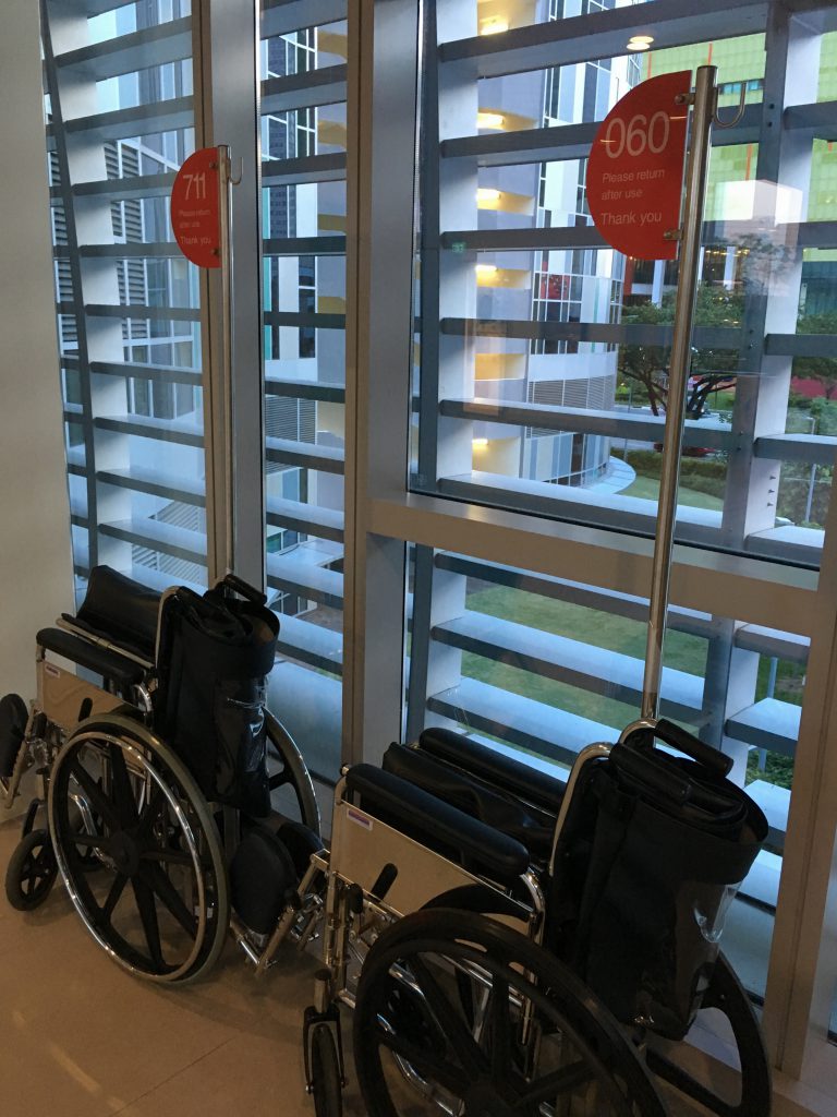
The whole environment looked lifeless while the sky was getting dark. This happened around 6:45pm.

IMG_1546

The lighting was so nice when the lights were all on!
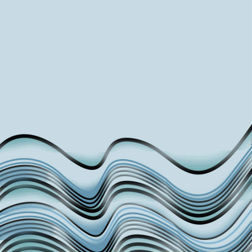
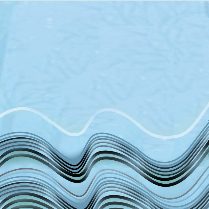
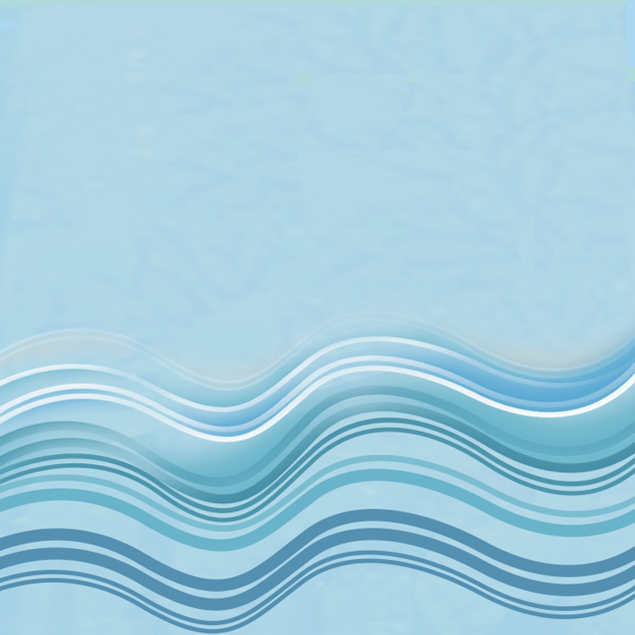
IMG_1551

Colour Scheme

After I decided to choose the OCEAN to be my theme for this project, I applied the cool colour scheme to be the main colour. Besides, the wave is in this colour scheme originally and it will make you feel more soothing.

968f9097b158b9534e3fbe9a84e2352bScreen Shot 2016-08-28 at 21.09.37


Process (First Stage)

Due to my very slow progress before, I forced myself to catch up the progress of our classmates after the consultation with Michael. I think I should do that because if I didn’t get this it to complete this time, I can’t imagine when I will postpone this project until.

Actually, for my primary idea was something like kids drawing and kids collage because it brings out the freestyle of an innocent child. After that, I came out with the idea of mosaic art which is inspired by the art of the children’s collage. Then, I ask for suggestion from my friend, she told me that the mosaic makes her feel uncomfortable because there is too much things going on in one image. So, I changed my idea from the mosaic art of ocean animals to the curly waves.

ccseahorse1 copysea-turtle copyseashell.edited1seashell.edited

Then, I ask for suggestion from my friend, she told me that the mosaic makes her feel uncomfortable because there is too much things going on in one image. So, I changed my idea from the mosaic art of ocean animals to the curly waves.

Here are the development of my first sketches:

Mosaic1Mosaic

Michael mentioned that the wave looks rough and it may be looks too dangerous like tsunami. He suggested me that I can still keep the layers of blues but maybe need to reduce the number of rolling looking waves. Besides, white lines can be used instead of black lines.

Process (Second stage)

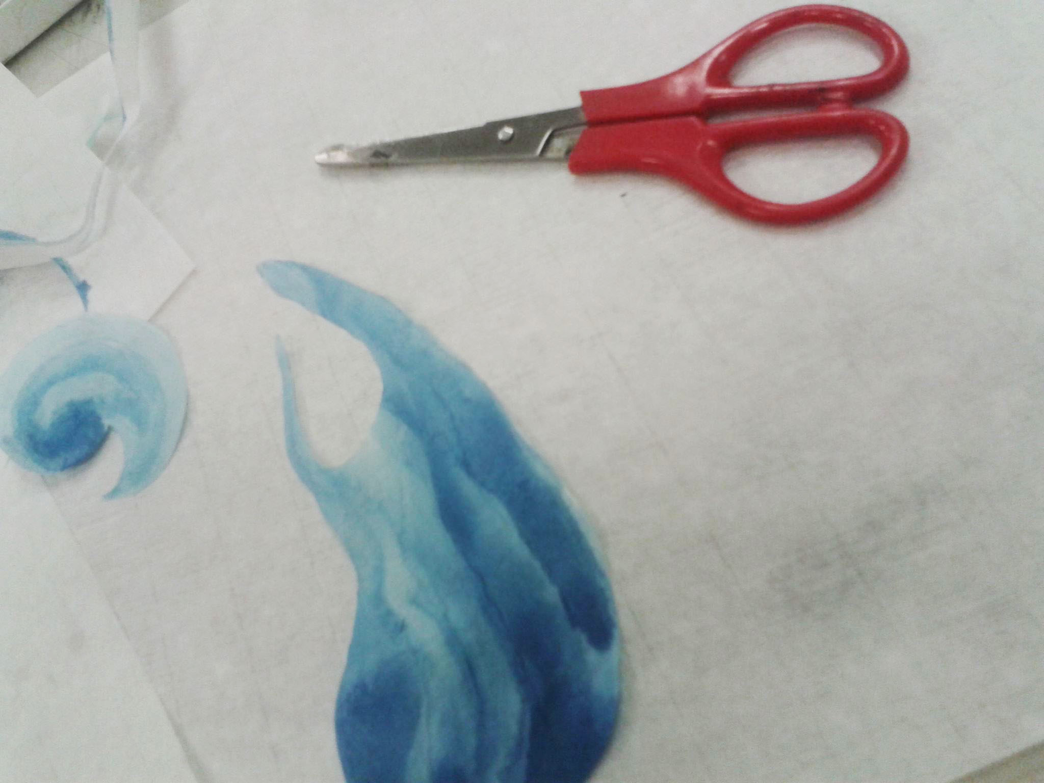
After that, I started all of this with my strength. The waves were painted in blue and green watercolour. I felt enjoyable this time because I didn’t define the shape of waves and how it should look like. This media was quite potential to develop as the watercolour will have different tones and shapes depended on how you paint it.14138947_1263512010339473_1924893134_o14113967_1263512020339472_572935242_o

The random waves I painted it didn’t give me a comfortable feeling and I decided to cut it with different shapes.

14139424_1263511963672811_665763408_o

I scanned it and see how it can be fun in photoshop!

scan3.jpegscan2scan1

By the repetition of the blue shape to make it looks like waves. I gave up this because it looks too organised and it doesn’t attract me.

waves2

waves11

Pushing the same idea by drawing shapes in Photoshop.

waves 2


Process (Third Stage)

Lastly, my friend sent me a picture that made her felt comfortable the most. It had inspired me why not to use horizontal lines to represent the waves. So I did the first tried out as below. For more process please refer to the next post 🙂

Screen Shot 2016-09-05 at 01.14.01

waves3