Point of view (Final)

Final Outcome:

For all the works, I chose the colour scheme of red, blue and yellow. These are the primary colours.


A tree from the point of view of  caterpillar is food.

  • The caterpillar is climbing up the apple and the apple looks like a heart shape
  • The importance of food toward a caterpillar in its life

1


A tree from the point of view of a bird is a shelter.

  • To make the rain and the bird look clearer, I used yellow colour instead of red in colour
  • The rain drops are purposely placed only on the umbrella, to show that the tree is a dependable shelter and this is why the bird remains fully dry in my work
  • The bird can fully rely on the tree, for this is where they live, eat and start a family at


2


A tree from the point of view of a monkey is a playground.

  • The tree as the structure for the carousel which is the symbol of fun
  • The monkey look like in motion, without which the monkey won’t seem happy

3


A tree from the point of view of an environmentalist is an ICU patient.

  • The tree is depicted as a patient heavily sick and is lying on the bed
  • Both the trees and the ICU patient require oxygen to survive and the usage of respiratory mask to help them better inhale oxygen shows how serious this situation is
  • A reflection on how the pollution of our environment is getting worse
  • if nothing is done to rescue the trees, they might slowly die just like some of the patients in ICU

4


A tree from the point of view of an ant is a mountain.

  • The ant specifically was placed at the end of the mountain, to better show the way to climb upwards is a difficult challenge.


6


A tree from the point of view of a child is an adventure.

  • A child is always curious about new things, they like to climb the trees to get a higher and a further view
  • A suspension bridge to represent a whole tree
  • There is a big hole in the middle of the bridge
  • This means that it is dangerous for a child to do so since they might fall off the tree

5

Reflection:

For this project, I am decided to challenge on myself as I am not quite used to the digital style. Although in the process, I am actually want to give up and go back to the traditional style but I felt uncomfortable like I didn’t achieve something that I promised myself at the start. My ideas for this whole project always go to the most simple one because I think that the execution of the artwork is very important.

Overall, to me, it is a quite good experiment to the digital illustration. Finally I have done it!

Point of View (Research)

This is my first time tried on digital illustration, after researching a few pieces of illustration artwork done by_ with different style, I decided to chose the style that it was easiest for me so that I can explore more and will not struggle with my DIGITAL skills.

I found that a clean and a clear style of illustration will be suitable for a start learner. Besides searching the artists online, I also borrow some books from ADM Library. I really get inspiration by a book named “ Limited Edition – Art and Design of GAMA-GO”. I take the most reference in this book.
limited_edition

014

015


Another artist has inspired me is 廖國成 Kuo Cheng LIAO. He was participate in an art and design exhibition-Let’s Dance! Animals. His artworks were tried to bring out the message of Disappearing White. Thus, it let me decided to choice a tree as a subject in this project. Instead of bringing out the idea of “Disappearing White”, my main focus is on “Disappearing Green”, it means that the destruction of many trees, the green colour will disappear as well.

20160101_CHIMEI_L_01 dca23a33996460.56c693988f021 640edf33996460.56c076d56f297 20160101_CHIMEI_L_01 20160101_CHIMEI_L_001_CMYK 20160101_CHIMEI_L_01

Screen Shot 2016-03-17 at 00.41.50


Screen Shot 2016-03-17 at 00.41.17Screen Shot 2016-03-17 at 00.41.28Thanks for reading!


Point of View (Process)

At first, I came out with ideas on different subjects.

A flower from the point of view of a man is a woman.
A flower from the point of view of a woman is a dream.
A flower from the point of view of a bee is food.
A flower from the point of view of a florist is her life.
A flower from the point of view of a magician is a stage property.
A flower from the point of view of a artist is a painting.
A flower from the point of view of a Indian is Henna art.
A flower from the point of view of a prisoner is hope.
A flower from the point of view of a Buddhism is an offering to Buddha.
A flower from the point of view of a couple is Valentine’s Day.


Facebook from the point of view of Siqi is Restaurant City.
Facebook from the point of view of a child is a face and a book.
Facebook from the point of view of a child is blue.
Facebook from the point of view of a child is the heaven and hell.
Facebook from the point of view of an idol is propaganda media.
Facebook from the point of view of the girls are a beauty contest.
Facebook from the point of view of me is addiction.
Facebook from the point of view of Google is a friend.
Facebook from the point of view of China is the bubble gum in Singapore.
Facebook from the point of view of MSN Messenger is an enemy.
Facebook from the point of view of Huizhong is a photo gallery.
Facebook from the point of view of me is a sense of honour.
Facebook from the point of view of Huizhong is a photo gallery.
Facebook from the point of view of me is the only way to contact.
Facebook from the point of view of Adele is a 64,496,357 likes.
Facebook from the point of view of an online businessman is a shop.
Facebook from the point of view of an emotional guy is a memo to record.


Brush from the point of view of an artist is life.
Brush from the point of view of an make-up artist is a tool.
Brush from the point of view of a child is a toy.
Brush from the point of view of a father is a rattan.
Brush from the point of view of two children is a weapon.
Brush from the point of view of the bacteria is home sweet home.
Brush from the point of view of Adobe Photoshop is a tool.


A home from the point of view of a family is security/ happiness.
A home from the point of view of a outsider is a space.
A home from the point of view of a owner is a place.
A home from the point of view of Hansel and Gretel is danger and jealousy.
A home from the point of view of a maid is faraway.
A home from the point of view of a bird is a tree.
A home from the point of view of a chick is its mum’s feathers.
A home from the point of view of a scrounger/ junkman is a street.
A home from the point of view of a designer is a bed.
A home from the point of view of a cockroach is a dustbin.
A home from the point of view of a frozen hand is a glove.
A home from the point of view of Elsa and Anna is a palace.
A home from the point of view of a teeth is the mouth.
A home from the point of view of a car is a garage.
A home from the point of view of a frozen food is a refrigerator.

1 2 3

I sketched out the idea of the POV of “HOME”, according to Mimi, she said that the execution and the communication was no clear as much, it doesn’t make sense. For example, “A home from the POV of a prisoner is a prison”, Mimi mentioned that it just looked like a minion inside the prisoner, while for the “A home from the point of view of Hansel and Gretel is danger and jealousy.”, it looked like two Teletubbies and it doesn’t give a sense of danger. Lastly, for the “A home from the point of view of a designer is a bed”,  Mimi said that mine looked like Hello Kitty. Haha, I felt same also but the most hilarious thing was I am not supposed to draw them like that, haha!


Brainstorm finalise:

A tree from the POV of a caterpillar is food.
A tree from the POV of a caterpillar is life.
A tree from the POV of a bird is a shelter.
A tree from the POV of a furniture manufacturer is a source.
A tree from the POV of a atmosphere is oxygen.
A tree from the POV of a human is a destruction.
A tree from the POV of a human is a source.
A tree from the POV of a soil is a nutrient.
A tree from the POV of an environmental protector is an ICU patient.
A tree from the POV of a fortune teller is a fortune telling tool.
A tree from the POV of a monkey is a playground.
A tree from the POV of a loan shark is a notice board.
A tree from the POV of a paper is a raw material.
A tree from the POV of a scientist is a cell.
A tree from the POV of an ant is a mountain.
A tree from the POV of a desert is an enemy.
A tree from the POV of a lion is not its cup of tea.
A tree from the POV of Isaac Newton is an inspiration.
A tree from the POV of a Halloween movie is a monster tree.
A tree from the POV of a primitive man is a house.
A tree from the POV of a child is an adventure.

4 5 6

6
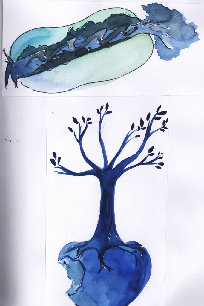
After the first consultation, I felt that I failed to draw out my idea visually,  so I decided to change my subject to “Tree” and also wanted to bring out the message of enviroment protection.


Process Work

A tree from the point of view of  caterpillar is food.

Screen Shot 2016-03-16 at 23.19.28


A tree from the point of view of a bird is a shelter.

Screen Shot 2016-03-16 at 23.24.34


A tree from the point of view of a monkey is a playground.

Screen Shot 2016-03-16 at 23.26.41


A tree from the point of view of an ant is a mountain.

Screen Shot 2016-03-16 at 23.27.51


A tree from the point of view of a child is an adventure.

Screen Shot 2016-03-16 at 23.30.17


A tree from the point of view of an environmentalist is an ICU patient.

Screen Shot 2016-03-16 at 23.32.02


Some ideas that were not be used in final.

Screen Shot 2016-03-16 at 23.36.23Screen Shot 2016-03-16 at 23.36.30

I tried out watercolour painting in my process while I felt stuck with my digital illustration. However, it does not look nice when I scanned it to the computer. This is because the colour differs on computer and I face difficulties in layering the different elements to form one proper composition. Hence, I decided to opt for digital drawing instead since I can better control the colours and arrangement of each part or element.

13.313.4

Illustare by using Flash.

Screen Shot 2016-03-15 at 7.28.46 AM Screen Shot 2016-03-15 at 7.30.00 AM

Thanks for reading!

Typography Potrait_Process (Part 2)

Mind map (Finalise)

59837


Determined


59838

After trying to sketch out a few of my idea, finally I chose the design below which depicted my name ‘X’ as a STARTING point while ‘T’ as an ENDING point of a run. Oherwise, the rest alphabet of my name ‘IAN’ formed a shape of a running man means that I am running toward the end and the man will be done in motion.

The next step is colour chosen. First, I just random chose the colours which I like BUT I like it was meaningless in the end. I am thinking what colours I can use in this design and finally I got these colours. MALAYSIA FLAG COLOURS-RED,YELLOW,BLUE AND WHITE colours for the ‘X’ means that I was came from Malaysia. SINGAPORE FLAG COLOURS-RED AND WHITE for the character ‘T’ means that I am now staying at Singapore for studying art.12754925_1133494796674529_1390145428_o12736557_1133494766674532_893686144_o12722319_1133494740007868_17671757_o


Cold Surface, Warm inside

At fisrt, I am trying to use cat’s character(as in it is cool towards the strangers but it is royal to its owner). After consultation, Mimi gave me suggestion it didn’t give a sense that I am cold surface, it is more like I like cats.xiantian cat2 xiantian cat1

So, I decided to change my idea by using other cold elements like ice or something.

Untitled-9 Untitled-1

59839 12737114_1133494726674536_1668798763_o

I also did some research about Ice typography.
12755294_1133494706674538_1226804238_o
12597074_1133494656674543_1106160896_o


Poor time management:

I am very a poor time management student as I like to watching drama when I am free and my project always do in last minute. So, I must express this concept in this typography potrait.

12751814_1133494823341193_1610294195_o
Untitled-312751911_1133494493341226_1254487793_o

Colours chosen: For the clock, I am going to choose primary colours, there were two secondary colours intersect within the whole clock. It gave a sense of the many events in life, where they all overlap each other, making it harder for me to juggle my commitments.
12736903_1133494473341228_448370495_o12736573_1133494263341249_1954575388_o


Cannot be alone

For the last one, I decided to make the medium more interesting, so I combined photography into it. I took a pose which look alike the alphabet “A”.

Colour chosen: Their was two layers of colour theme for this design, At first, there is no colour for the name. After push it up, there are the blue and yellow which they are complementary colours. Blue is a colour that speaks of my sad feelings when I was previously alone. Yellow is a brighter colour where I am now more outgoing and more happy with friends beside me.

59938 12752151_1133494260007916_622095236_o 12755283_1133494806674528_369963722_o

Thanks for reading!:)

Typography Potraits_Final

Final Outcome:
final1. I am determined.

IMG_4599

  • To show a marathon where one is consistently running, step by step, to get to the end.
  • It shows my determination where I come all the way from Malaysia to Singapore and study at ADM, just for my passion towards Art.
  • Both the X and T are relatively rigid and straight, this shows that they are the fixed points for the start and the end.
  • For X, I use the colours of the Malaysia Flag while for T, I use the colours of the Singapore Flag.
  • For the rest of the letters of my name, I use I, A, N in a manner where they are in motion. The colours of the I, A and N are used from the attire of Malaysian sportsmen. determined

2. I have poor time management.

IMG_4598

  • The black letters on the clock are my name’s alphabets, Ngwe Xian Tian, they are all jumbled up, just like how you will imagine the digits on the clock to be all messed up.
  • This shows poor time management.
  • And if you take a closer look, you will realise the position of 11 on the clock is missing and shows that I am always do work at eleventh hours.
  • If turn the hands on the clock, you will see I and A, which forms TIAN- tian. (As the beginning the alphabet are all messsed up.)clock
  • The colours on the clock are primary colours, which are intersecting and this represents the many events in life, where they all overlap each other, making it harder for me to juggle my commitments.
  • The letters on the clock are inverted to highlight the fact that this is a negative trait.

3. I am cold on the surface but warm inside.

IMG_4600

  • My name Tian is depicted in blue colours and glue gun is used to give off a flowing motion. This reminds us of a melting ice.
  • The reason why it is melting is because of my inner passion, which is boiling inside.
  • When you talk to me, you might find me to be very quiet and one of very little words. However, as time passes, I will warm up to you and will express more of my inner thoughts.
  • This is seen by the little red beads, which will eventually take over the blue side of me.

ice


4.  I am afraid of loneliness.

IMG_4601

  • This is a negative trait so the alphabets are inverted.
  • When I am alone, it is colourless.
  • When I start to meet other friends, I see colours in my life, even when I am alone.
  • Blue and yellow are complementary colours as blue is a colour that speaks of my sad feelings when I was previously alone while yellow is a brighter colour where I am now more outgoing and more happy with friends beside me.
  • By mixing these two colours, I have accepted my past and now move on to a brighter future where I know I have friends waiting there for me.
    • The letters, X, T, I and N are broken into small pieces as I take the reference from the Secret Garden colouring book, where it is believed that by colouring part by part, it helps one to destress. This shows how by colouring bit by bit, my sad feelings disappear bit by bit, just like how I feel when I have my friends.alone


Thanks for reading!

Hello, my name is…

tumblr_mlzb45Igi11qkvaajo1_r1_500

“Looking for a formula will keep you from getting there.”

In first class activity, we were required to find “ourselves” by designing 3 name tags of different genres:

1) Typography 
2) Concept
3) Abstract Solution

12657911_1128261963864479_1561709487482903526_o

1)Typography

  • Inspired by Leonardo Da Vinci’s “mirror writing”, starting at the right side of the page and moving to the left.
  • YOU will see that the word “UNIQUE” positively by the reflection of the mirror.
  • It is a kind of self-reflection, YOU will find that what mistakes YOU have taken and do review through looking at the mirror.
  • The alphabet “Q” is coloured in blue, which means that I am different with others.
  • The light grey background show that simple but outstanding idea.
  • The lines of the draft I didn’t erase it on purpose because I think the process to reach an achievement is necessary and cannot be neglected.


12716095_1128262943864381_6634235999204121392_o

2)Concept

  • By extending the first idea, the concept is about a reverse world.
  • APPLE LOGO was drawn reversely.
  • ME(Unique) = only the apple was coloured and completed.
  • The lines behind showed that I am living a complicated society.
  • I am trying to overcome the difficulties that I had met.


12657358_1128262887197720_2789172953168182182_o

3) Abstract Solution

  • Similarly, it was extending the second idea as well.
  • But the more lines were added which mean that I become more and more struggle with life and also my aspiration.
  • The blank part was left purposely, the purity that I have even though I lived in a tangled and chaotic society.

Thanks for reading!