Get well soon (2)

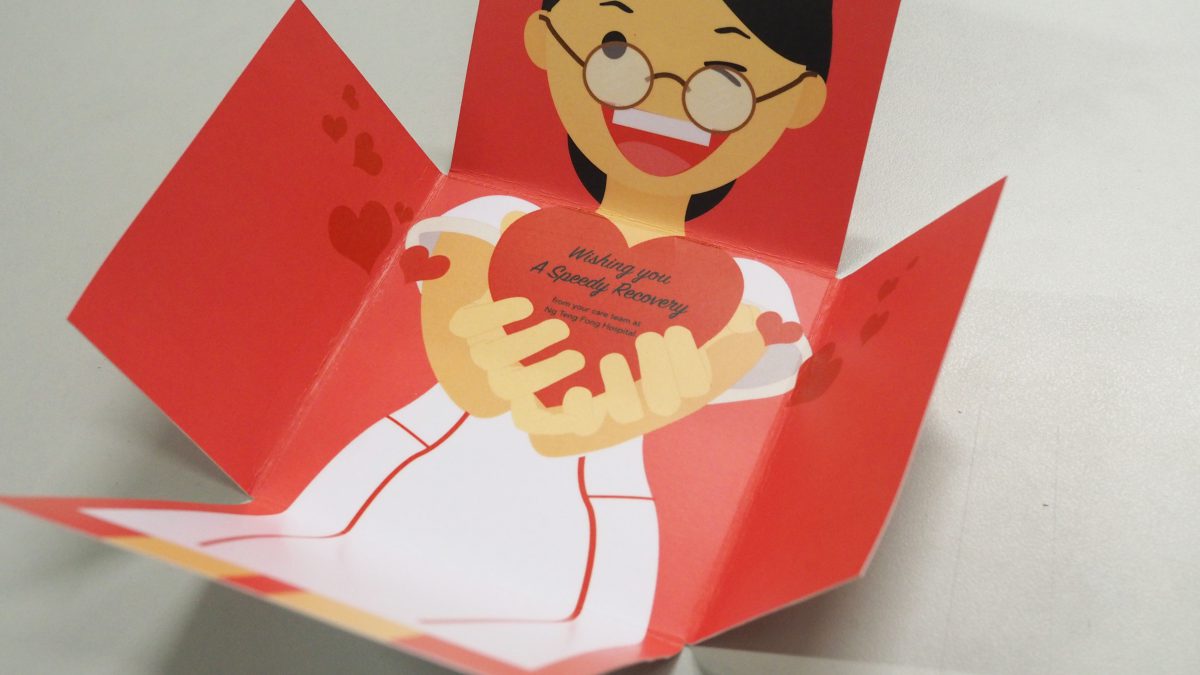
I spent a lot of time to redraw the character. At first, I came out with the illustration of a young girl and she looked lack of experience so I set myself to redraw a nurse probably she is above 35 years old which is the nurse has been used in my final. Putting the wishing text inside the heart definitely works rather than just put it beside because it seemed doesn’t have the connection with the image.

screen-shot-2016-11-11-at-23-32-55


By researching on the hairstyle of the nurse, most of them will just tie their hair neatly without a lot of colorful decoration. I thought of various ways to solve the head of the nurse, for example doing cut out according to the shape of the nurse but it seemed not a best solution.So, I just added a small ribbon on her head instead.

OLYMPUS DIGITAL CAMERA


The idea of the final card:

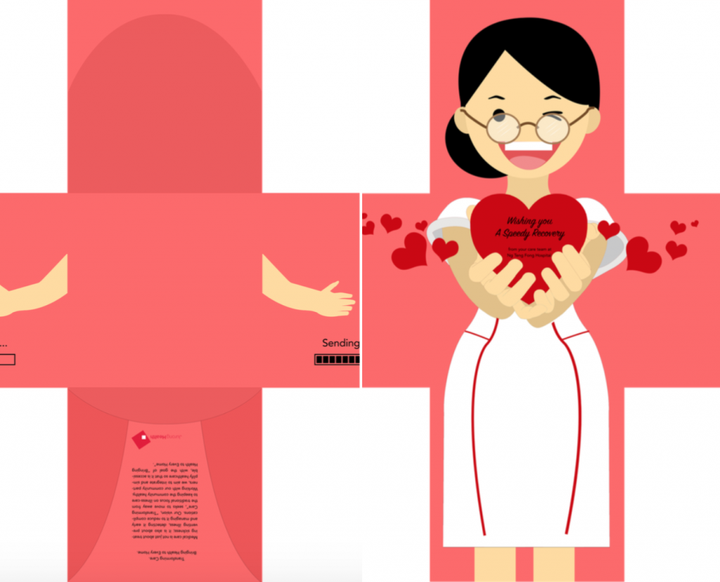
  1. The cross shape represents the sign of the hospital and the icon of recovery
  2. The process to send the heart is almost done (can be seen in the front page), the thing only left is waiting for you to open the card
  3. A nurse is waiting you inside the card to spread love
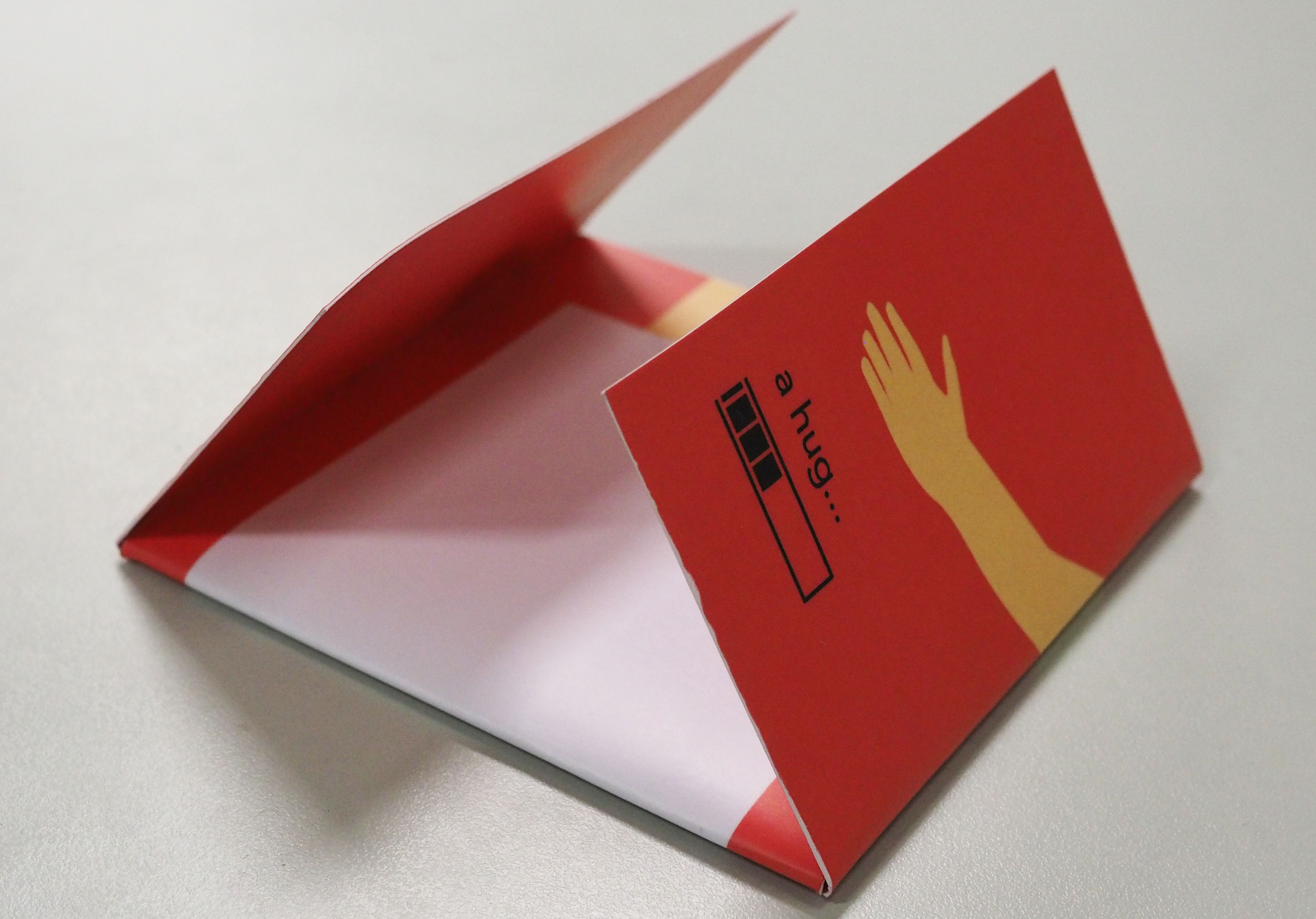
  4. The nurse show the action of giving hug by folding in the pages

OLYMPUS DIGITAL CAMERA

OLYMPUS DIGITAL CAMERA

OLYMPUS DIGITAL CAMERA

OLYMPUS DIGITAL CAMERA

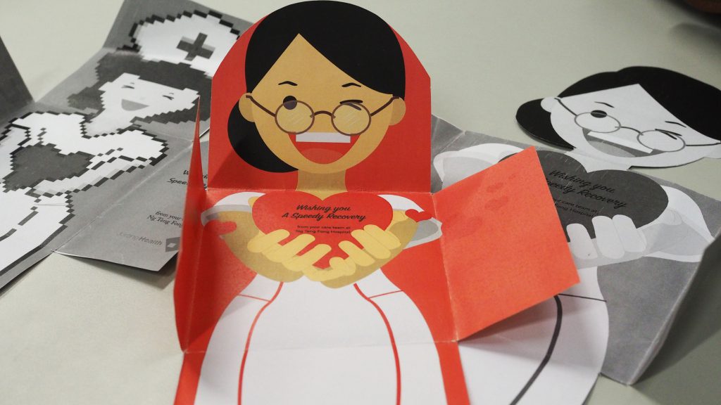
For the final, I encountered many difficulties to alight the pages and test print really helped me a lot to answer the questions especially when I can’t imagine how the card will look like. I regretted that I didn’t  test print on the actual paper used for my final to see how the difference paper will affect the quality of the card. A lot of improvement to work to get a better card design in this project especially I didn’t explore more with the flow of the information and images by folding.

Reflection

If giving for two more week, I will totally change my front pages which I have an idea but I didn’t have much time to work on. I was thinking my card can be an envelope or a present. For the envelope idea, I think it kind of can reflect the idea of sending as well. However, I gave up the idea of the envelope because the hands look weird and the design was so plain again. For the gift’s idea, probably I can go to the design of gift wrapper but I think this may crash with Jie Lin’s idea. Anyway, the imperfection result has stimulated me to improve to be better. I really learned a lot of new things in VisCom 1 and at the same time I grew up under the stressful environment. I appreciated that everyone who helping through this semester and make me stronger.

screen-shot-2016-11-11-at-23-28-54


Get well soon (1)

Research

To start with this project, I did some research about the various types of folding and to see how the informations flow in different type of folding. In addition, I found that the idea of hot tea, plaster, soup, animals, flower or nature can bring out the idea of wishing them get well soon.

whitechristmasstandupup50cd5c4670078be2c1e675b63ab1c918d

91fd996d1702bda31eae3b0ae331c767

screen-shot-2016-11-11-at-21-43-47screen-shot-2016-11-11-at-21-43-54 screen-shot-2016-11-11-at-21-43-29 screen-shot-2016-11-11-at-21-43-19screen-shot-2016-11-11-at-21-46-15


Brainstorming

  1. The Collection Fingerprints

At the beginning, due the patients in hospital may feel alone and they need the caring from other people. So, I came out with some idea which can suit the theme, for example, sunflower, ocean or sunshine. As I haven’t thought that any solutions to make the ideas above meaningfully as now they are too literal and normal. After that, I decided to go through the idea of “The Collection of People’s Fingerprint” to support the idea of accompany. It is because everyone’s thumbprint can be so different in the way to show that they are very personal. Other than that also to express the emotion that they are willing to help the patients to overcome the difficulties. I am going to illustrate the thumbprint characters in human-like and also show them in a narrative way. To make this card more playful, I also think that it can be a game such as snake and ladder as the patients still can play with it during the time in ward. However, Michael mentioned that this idea doesn’t really show the concept of “getting well soon” or maybe need to work with the elements which can support the idea of recovery.

screen-shot-2016-11-11-at-22-17-36

2. The idea of sending hug 

I was inspired by these few picture so came out the idea of “sending hug to the patient”. So, I decided to make my card seems like a patient being hugged.


2320956042232095604alt1


Ideas and design exploring

Week 1

Children’s drawing | My initial idea was I trying to fix the style to children’s drawing and I also tried to draw a character by crayon but it came up very messy style and I don’t think people will get comfortable when they received this kind of card.
draw

The mother hug (1) | As I was not sure I was going to the right track, so I just started with a random woman and trying to tell the audience this is a colorful card. After I drew out the character, I found that she looked like a mother who I think can deliver the idea of  giving the warm hug to a patient. For this card, you will see a kind woman when you opened the card. The idea of collecting people’s thumbprint also has been added to form a heart shape. The cooperated texts and the logo will be placed on the wings where inside the page.

screen-shot-2016-11-11-at-22-57-46The mother hug (2) | Another idea I presented on the same day is when you opened the card, you will see a patient lying on the bed. This make the fold interesting because when you fold the wings in, the woman is hugging the patient.

screen-shot-2016-11-11-at-22-59-05

After the consultation in class, I received the opinions that they were prefer the previous idea with a smiling woman.  Besides, they also mentioned that the unsure part for the hair of the nurse was awkward because when you fold down, it will look like a black color block or nothing. To overcome this problems, adding hair-clip, hairband or a nurse cap are the solution to do.


Week 2 

Ng Teck Fong nurse | Receiving the suggestions from classmates, I changed the main character to a nurse who was working in Ng Teck Fong Hospital. I took reference from the uniform in the hospital and another changing point was the heart held by the nurse was changed to a solid heart shape instead.

screen-shot-2016-11-11-at-23-18-15

Pixelated art | The pixelated font reminded me of the process of “sending” can be seen as a game. So, I hope that my card to be like a gaming card and people will feel relaxing when they saw my card.

screen-shot-2016-11-11-at-23-09-47

I haven’t think the solution to overcome the problem of the unsure part of the nurse hair, even adding hair clip or some decorations, I think that is kind of distraction because there are too many illustration on the pages. So, I prefer this design with just a pair of hand outside the card but this ideas may not work as seeing the hands floating in the air.

screen-shot-2016-11-11-at-23-12-38

After the presentation in class, Michael suggested that the wishing can be put inside the heart and the size of the heart should be bigger. The nurse also doesn’t look like a Singapore nurse as the nurse in Singapore won’t wear the cap. I keep reviewing this card I felt it was definitely ugly.  The way of the heart being held looks unnatural. So, I decided to redraw the character.


Combating Zika Outbreak (4)

Mosquito coil’s idea 

screen-shot-2016-10-03-at-02-01-51

screen-shot-2016-10-22-at-23-09-53


The call of the soldier 

screen-shot-2016-10-22-at-23-06-54


I changed my slogan to “United we stand, fight against Zika. I gave up all the ideas I came out before because I think that they all don’t have the strong message to get rid of Zika.

If we treated the fight against Zika virus as a war, I think a representative character towards a war is a soldier. This means that we should like a soldier to combat Zika bravely. In addition, the soldier is also a charismatic figure because he represents a country to fight against the evil forces justifiably.

For the design of this poster, I took reference from Russian Constructivism. It is because I think for a eye-catching poster, the shapes and the composition need to be simplified which I found Russian Constructivism is similar to this style.


Mock-up

screen-shot-2016-10-22-at-23-07-19


Some suggestion I gained from the group:

  • It shouldn’t be a lively mosquito.
  • The soldier does’t suit the theme of Zika and the message of UNITED didn’t show in the poster. It can be everyone, a child or a woman but not a soldier.
  • Try to add a number of people to support the message of “United”.
  • Margin: The word “Fight” is almost out of the margin.
  • Try to push the slogan at the middle to make the hierarchy smoothly.
  • As the face of the solider is the main focus, it shouldn’t be so dark.


Refinement

screen-shot-2016-10-22-at-23-21-16

Based on the idea of “It can be everyone!”. I try to take photo of my father to let it feels more local. The face of my father looks awkward and I decided to photoshop a stranger face onto it. I didn’t get what it so humorous and I gave up using my father be a model.

screen-shot-2016-10-22-at-23-22-11Adding silhouettes hands to support the idea. For the left side of the poster, Michael suggested me that can add more people and why not it could be a family? In addition, the slogan could be more higher until the middle of the poster and it should be a died mosquito! (Yea, I forgot…) Lastly, the people(where is women?)can add it behind too.

And I came out this but errrrr……..

screen-shot-2016-10-22-at-23-37-23


Final

screen-shot-2016-10-22-at-23-22-39

Finally, after keep editing, I came out this!

Reflection

When I was doing research, I found that one of the serious consequences that the Zika will cause is the, most affected target groups would be women. Of course, this type of posters are able to convey a strong message to the audience. So I conceived the idea from the beginning also. After that, I wonder that why not I just set the target audience to the normal people and see how it can bring the strong messages by using the illustration.

Instead of eye-catching color scheme, I would choose the army green specifically as the main color because I think this is a representative of the color of a war like to invite you to join this war.

Through this project, I gained the knowledge of designing not only a poster and also learnt how to get improvement by accepting suggestions from others. The process showed my idea and composition changed drastically, it proved that how well I got improvement when I keep asking opinion around. Although at last still has the imperfection part to improve, for instance, the mosquito was too dark and the poster is so political but the process of the learning fulfill the ending of this project.

Combating Zika Outbreak (3)

After last week’s discussion, I worked on this feasible idea digitally. For the left image, a mosquito is sucking the human’s blood. It’s a simple idea with the figure and ground features which I think can bring out the theme clearly. I am not satisfied with this because the meaning of the poster is only what you can see; it doesn’t have a strong idea that really can influence others.

For the another image, I tried to invert the mosquito. The words” FIGHT” with bloody background and the mosquito is connecting to the bloodstain. The composition won’t look separately but I felt that the sense of symmetry is lost compare to the previous one (The mosquito with the other side).

screen-shot-2016-10-01-at-05-09-09

I found that the concept of my previous ideas were not strong enough and they all don’t have a significant idea to depict on “how to prevent to fight against Zika”. My friend inspired me that the mosquito incense coil is a very good idea to play on and I decided to choose it. It reminds me that my mother always uses this at home when my house was attacked by mosquito. So, I changed the slogan to “Join the fight against Zika” and the idea was being described as a war with the brave soldiers. The numerous number of soldiers also represent that we all must become a soldier to join the war. I think the overall composition and hierarchy look fine in this piece. However, the visual message for the soldiers part is a bit confusing.screen-shot-2016-10-01-at-00-50-58

The colour of mosquito coil inspired me that kind of army poster. I used army green to be the main colour and take reference from Russian constructivism art to form this poster. I found that the position of the mosquito isn’t natural and it looks more like the hand is bitten by the mosquito. Perhaps I will work on the previous idea.

screen-shot-2016-10-01-at-00-51-36


Combating Zika Outbreak (2)

Among the slogans that I came out last week, I chose 1)”Fight with Zika, Start with prevention” and 2)”Don’t feed your blood to Zika” to work on.

  1. By referring these influential and weighty poster from the website, I came out with a mother is hugging her baby with the illness of microcephaly. For the normal people who fells victim to the Zika virus, the illness is often very mild. But for a pregnant woman, it will cause pregnancy loss or a baby born with an abnormally small head and brain. For this composition, it occurred conflict about the knowledge of Zika symptom, which is the symptoms won’t be show for a mother who had already given birth.untitled-1

ad_sprs_softdrink

2. A mosquito is sucking the blood. The positive and negative spaces show in this poster while the colour of the skin will cover half of the poster. The red dots show the Zika symptom – RASH. But I think there is a conflict happened which is same with the previous poster. The man already had the symptom while the mosquito was spreading the virus.

untitled-2


3. A mosquito which formed by numerous of skull. This idea came from a mosquito with Zika virus. At first, I wanted to use bacterium but I think that it is not scary and serious enough so I changed to skull. After the discussion, Michael mentioned that the choices of the skull is crucial and essential also. Besides, he suggested that I can integrate the image and the words to avoid they look too separately. The images below is my reference piece for this idea.

zika h

Combating Zika Outbreak (1)

An effective poster

Stepping in this project, I went to research more on how should a poster to be more effective and also I want to conclude what I learned from the class last week. The first thing is to have the target audience so that we can focus on a single message to them. Next, use the images and graphs to tell the story. As a poster should be an eye-catcher, we should not put too much of information and it will make the audience confused. Besides, keep the sequence well-ordered and obvious.  The key things we can’t neglect are the layout, visual hierarchy and information flow which are we learned last week.

Google search “Health Communication Posters”

The posters which contain a lot of information make me don’t have the desire to click in. So we can see how the importance to control the information and images in a poster.

Screen-Shot-2016-09-12-at-01.56.49

Research on various types of health communication posters

As I know the target audience not only for adult but also for the child, I would make the poster illustrated (?)

c22ac4db63e07a6c76e8254971230f8e 6a5a146628b9ee9d3e6ce5891236dde7 2d0a5557b331579ce4db8bce7d193e53

I found this types of poster by using metaphor very interesting and they bring out the messages clearly.

cb70f00e341ae13e66ff36c15f16a0afb39387eb806b58b0c85df0717f703b8b7abc0f8331c15053ff78821fc3e59a4190ed429605b63b2f0e60b8808ccf4163

4bddc0f7940e42fa6a9d39a74b4ccbeb

afa974b3a98e7c5a38c61dc541c68789

f5359fb554676169fc0cbbf38234cdac

14eb170959a2830773d8b649a221af37
What are the exiting health communication poster?

I chose this become my favourite because it brings out the message obviously and it caught my eyes in “three-seconds hit”. The use of metaphor, a bottle as a child, it really impressed the audience. The back and clean background makes the graph and texts more stand out. The title ” HOW MANY CIGARETTES A DAY DOES YOUR CHILD SMOKE?”, it brings the awareness to parents to stop smoking especially a pregnant woman.

05674e3c90e097a3a58ab29e975cfa20I am weak on thinking this kind of slogan but I tried smilecry

  • Say No to Zika
  • You – Zika = A Healthy Life
  • Combating Zika, Start from You
  • Keep away from Zika, for child
  • Fight with Zika, Start with prevention
  • Fight Zika, It isn’t a game
  • Join the fight against Zika
  • Don’t feed your life to Zika
  • Live with no Zika

Ideas and mood boards

1. For my ideas, I am going to explore the poster with less text and playing around the images and space. The layout is similar to the example of the posters I research above and the graphics should be by photography or illustration. I prefer the layout with just a Aedes mosquito, with a scary look like and the down colour background. Another choice is illustrating a Zika patient with the symptoms.

Screen Shot 2016-09-12 at 13.54.31

2. Setting the target audience to mothers which is inspired by the posters below. Give them the awareness how important the mothesr should prevent the virus of Zika for their child.

Screen Shot 2016-09-12 at 13.34.41

3. I haven’t had any for the third ideas but my mind has been surrounded  by the Zika virus poster by GOV SG. I think it is a good example that the ordered layout and also the informative texts. The colour also catch the attention of the audiences and make them have desire to see that.14231157_10154434122793686_2490761139799190076_o


Project 1 (Final)

Finalise design

To show my process obviously, I made a GIF to show how the design changed from the beginning to now.

anigifwaves3edit

From the design below compared to the above, I felt the waves was too heavy and I decided to add more white lines and also changed the black curve lines to white line instead.

final waves2

The colour for this looks smooth but the lines are too flat 🙁

white waves1

After keep changing the design, finally I get the most satisfied design I tried to apply it on the window. Siqi said that this one looks more 3D and from far it will look better.

window

Finally, I chose this! embarassed

window1

For my concept, actually it looks like the waves nearby the shoal. This waves depicted in many horizontal and curly lines, it reminds us of a calm horizon or a person lying down. It gives us a sense of calm and clarity. The reason why I chose horizontal lines because to balance the visual effect between of the waves and the iron bar and also you can imagine the sound of calming or soothing waves and it is touching your feet. Lastly, in terms of colour scheme, cool colour schemes make you feel more soothing.

Project 1 (2)

A Second Trip to Ng Teck Fong Hospital

After the one week was gone, I still haven’t had any ideas came out so I decided to go the hospital for second time with Siqi. We chose to go there between 1800 to 1900 to do another observation. It is because we not only can see the lights went through the window at day and also we can observe how the lights change at night.

IMG_1555

I found a wheelchair bay at the end of the travellator. This is a discovery that I did’t realise last time.

IMG_1534

The whole environment looked lifeless while the sky was getting dark. This happened around 6:45pm.

IMG_1546

The lighting was so nice when the lights were all on!

IMG_1551

Colour Scheme

After I decided to choose the OCEAN to be my theme for this project, I applied the cool colour scheme to be the main colour. Besides, the wave is in this colour scheme originally and it will make you feel more soothing.

968f9097b158b9534e3fbe9a84e2352bScreen Shot 2016-08-28 at 21.09.37


Process (First Stage)

Due to my very slow progress before, I forced myself to catch up the progress of our classmates after the consultation with Michael. I think I should do that because if I didn’t get this it to complete this time, I can’t imagine when I will postpone this project until.

Actually, for my primary idea was something like kids drawing and kids collage because it brings out the freestyle of an innocent child. After that, I came out with the idea of mosaic art which is inspired by the art of the children’s collage. Then, I ask for suggestion from my friend, she told me that the mosaic makes her feel uncomfortable because there is too much things going on in one image. So, I changed my idea from the mosaic art of ocean animals to the curly waves.

ccseahorse1 copysea-turtle copyseashell.edited1seashell.edited

Then, I ask for suggestion from my friend, she told me that the mosaic makes her feel uncomfortable because there is too much things going on in one image. So, I changed my idea from the mosaic art of ocean animals to the curly waves.

Here are the development of my first sketches:

Mosaic1Mosaic

Michael mentioned that the wave looks rough and it may be looks too dangerous like tsunami. He suggested me that I can still keep the layers of blues but maybe need to reduce the number of rolling looking waves. Besides, white lines can be used instead of black lines.

Process (Second stage)

After that, I started all of this with my strength. The waves were painted in blue and green watercolour. I felt enjoyable this time because I didn’t define the shape of waves and how it should look like. This media was quite potential to develop as the watercolour will have different tones and shapes depended on how you paint it.14138947_1263512010339473_1924893134_o14113967_1263512020339472_572935242_o

The random waves I painted it didn’t give me a comfortable feeling and I decided to cut it with different shapes.

14139424_1263511963672811_665763408_o

I scanned it and see how it can be fun in photoshop!

scan3.jpegscan2scan1

By the repetition of the blue shape to make it looks like waves. I gave up this because it looks too organised and it doesn’t attract me.

waves2

waves11

Pushing the same idea by drawing shapes in Photoshop.

waves 2


Process (Third Stage)

Lastly, my friend sent me a picture that made her felt comfortable the most. It had inspired me why not to use horizontal lines to represent the waves. So I did the first tried out as below. For more process please refer to the next post 🙂

Screen Shot 2016-09-05 at 01.14.01

waves3


Project 1 (1)

Therapeutic Graphic

An attractive drawing definitely can reduce pain. “A 2011 University of London study found that blood flow increased 10 percent to the “joy response” part of the brain when subjects saw a beautiful painting — just like when you look at a loved one.”

So, I went to research how to create calming effect for this project. I found a few point to emphasise which are: 1) Lines can give us a sense of calm, especially a horizontal line. 2) Value effects the mood of the artwork. Low value contrast creates a subtle. 3) Visual textures can be created by reproducing the value and color patterns of actual textures.

Site visit and observation

When I first came to this place, the first thing had attracted me is the scenery outside the window, the following was the travellator and the window with horrendous rows of bars. There are some stores related to F&B and also a florist connecting the link way. Besides, I discovered that there is one-point perspective happened at here. Black and white are the colors mainly be used in this place. Generally, most of the hospital will use the color above as the entire space will look clean and neat. Lastly, I found that the people will go through the travellator most of them who are the staff members of the hospital while the patients rarely pass through it.

IMG_1537

Outside of the window we can see many cars driving on the road and IMM Shopping Mall, it’s a symbol of a city. Looking out of the windows, I saw a lot of iron bars, possibly because of the security considerations so they have to this design. However, at the same time, because of these iron bars make me feel trapped in a space and it also blocking the scenery outside of the window. So, we need to considerate it as a part of our design.

The people here usually use travellator but they may not focus on the window or the scenery. Some of them will just look down at the phone while others are talking with their friends.

IMG_1533There is an exhibition between the two travellator, it provides some introduction about the hospital. I found that only a small number of wheelchair patients and hospital staff will use the middle road, otherwise others will use the travellator.

IMG_1540


Mindmap
mind-map

Moodboard

Screen Shot 2016-08-26 at 23.15.39Screen Shot 2016-08-26 at 23.19.29

Screen-Shot-2016-08-26-at-23.35.39 Screen-Shot-2016-08-26-at-23.35.56 Screen-Shot-2016-08-26-at-23.36.10


Sketches

Finally, I had chosen NATURE to be my theme of this project. I decided to work on the elements which are ocean and clouds.

Idea 1:

I found that when people was walking either travellator or the middle space, there will have some distance between them and the window. I will use mosaic art to present it because it is a combination of different shapes and I think it simplifies the curve of the waves. People can look the images clearly even it is a mosaic art due to the distance between them and the window.

waves waves2

Idea 2:

When I was on the way to get back my hall one day, I found that the sky was so beautiful because of the different shape of the clouds. The cold color tones of the clouds give me a comfortable mood. Siqi suggested me that I can work on the clouds of different shape of the animals.

Screen Shot 2016-08-28 at 04.31.59