
The sharing in week 2 lesson was inspiring as I was able to gather more ideas of what I want to do with Project 1. Some of them includes:
- exploring different digital mediums/software,
- computer generated art,
- incorporating traditional drawing with digital (such as doodle on top of photograph),
- searching Behance for reference/inspiration, and adding,
- using cultural context into the design of the typography.
It is a bit overwhelming for some reason as my research took me all over the place. First though, I want to share this piece of song Dreamers (which I discovered back in Polytechnic) that I feel more closer relate to the mood and feel of what I want to achieve.
Of course, another song that I feel goes hand-in-hand but a bit more upbeat would be Owl City’s Fireflies.
Here’s a recap of what I am doing for Project 1.
My Overall Theme: Dreamscape
Style: Doodle/Hand-drawn Drawings
Keywords: Cute, appealing, imaginative, surreal, reflective, serenity
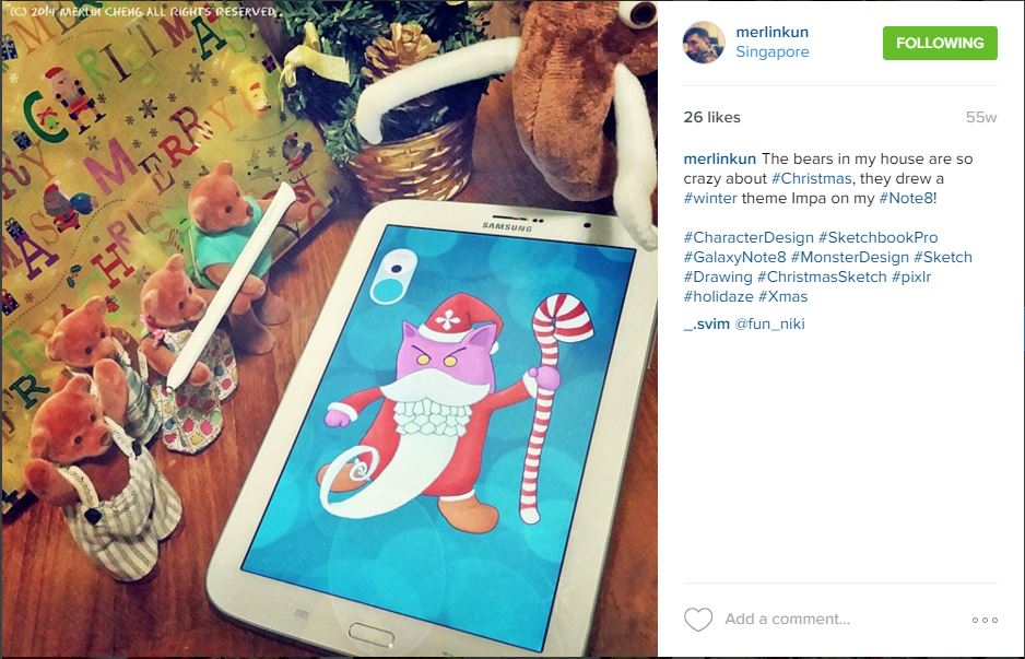
First up is trying out different digital medium/software. As a game art student back in Polytechnic (and through out my free time during NS), I like to explore using different software beside Photoshop (cuz I thought it will make my resume look cooler when I wrote that I can use a lot of different software lol). Some of them that I explored includes Sketchbook Pro for Android phone, tablet and PC.
YouTube celebrity voice: “If you like what you saw please click on the subscribe button below.”
Some website resource that I find useful for looking for alternative Photoshop software includes this article by creativebloq.com, and this article by gizmodo.com. I also found this article by animationcareerreview.com that I feel won’t be useful now but might be down the road.
Some useful software I found are…
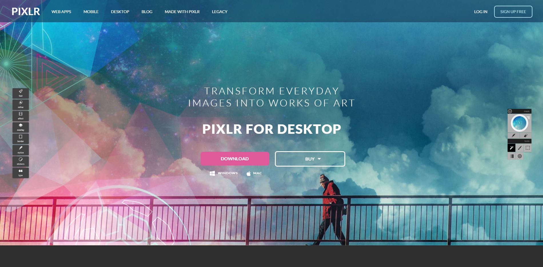
Pixlr for Desktop – This software is more of a photo editing software with a free and a pro version similar to photo editing apps on smartphones.
Sumo Paint – This is a Photoshop alternative and has a web and paid desktop version. The problem with web app is that there is no savable editable files that lets you continue editing after you close the app. It does have useful tools though.
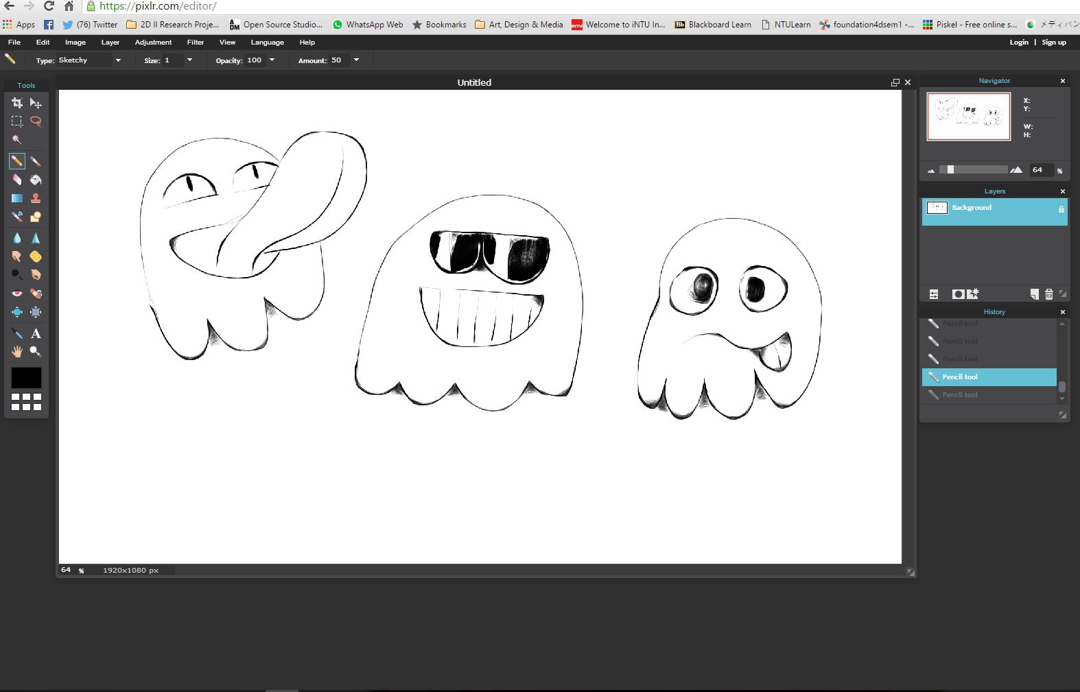
Simple and appealing characters drawn using my wacom tablet within 5 minutes using the sketchy pencil tool.
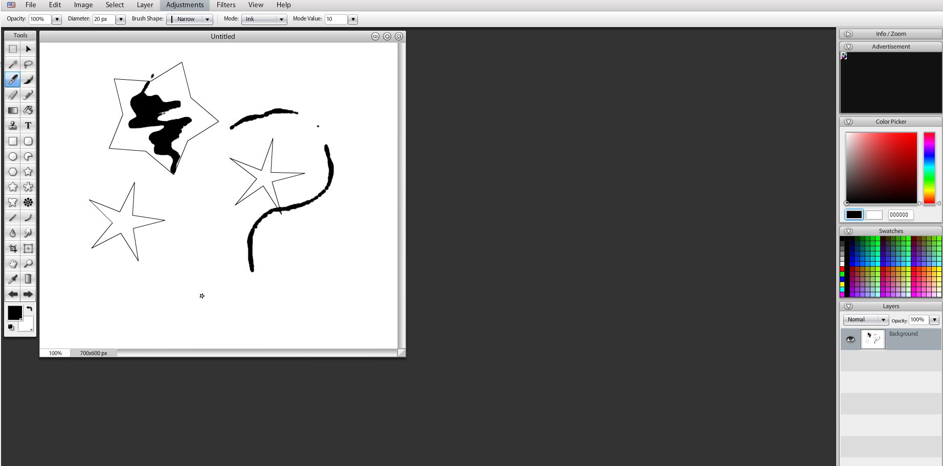
Pixlr Editor – Another Photoshop alternative that exist only in as a web version. Similar limitation as Sumo Paint web but it does have a interesting sketchy pencil tool. It also support keyboard shortcuts similar to Photoshop and it doesn’t have annoying ads. Useful when using a computer without Photoshop.
Rebelle – A paid painting program that lets you create “realistic wet and dry media artwork”. There’s a demo version avaliable as well, though due to my financial background, I think I will skip this. Might be useful in the future though. *hashtag FutureReference*
Krita – The best for last. Also come with a low low price of FREE. Krita is an open-source project that is basically Photoshop but skew towards purely just for painting and drawing digitally.
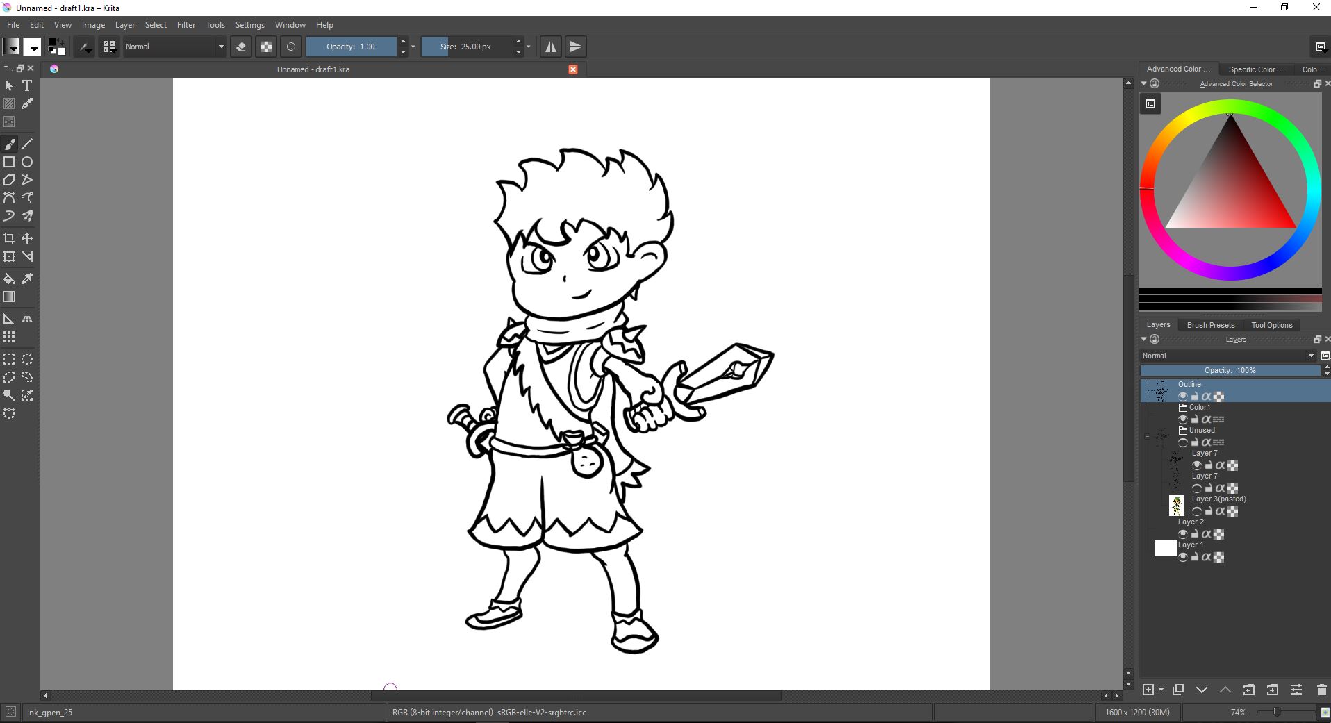
Testing out Krita, I tried drawing a character using it.
As a challenge to myself, I shall limit Project 1 without touching Photoshop at all. Krita will be my primary software I will use to create my Doodle Typography.
Related to trying out different softwares, I look into computer generated art. This led me to this article called “If you like programming and fine art, you will love Raven Kwok’s work made with Processing” and this called “115C8 and EDF0 by Raven Kwok – Recursive and transforming..”.
This led me to Interactive Generative Art, I then found this list called “Top 5: Interactive Generative Music Sites” that I find might be fun but not really useful for this Project.
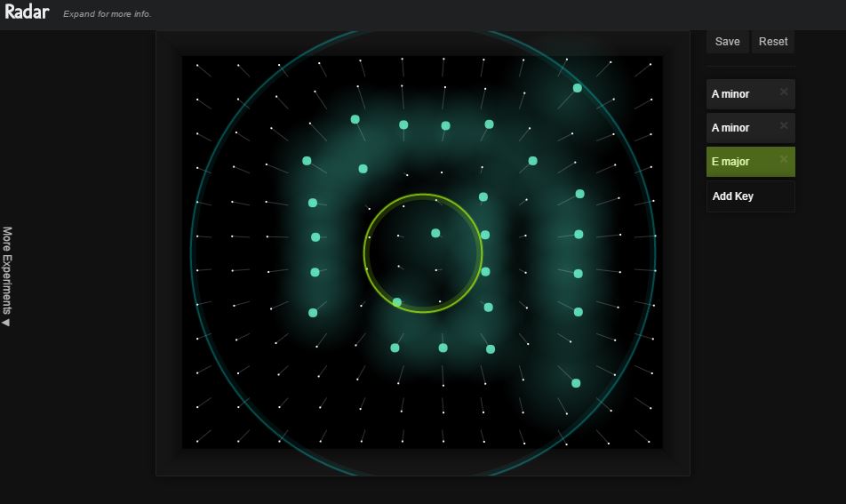
I tried out Radar and I was surprised how fun it was.
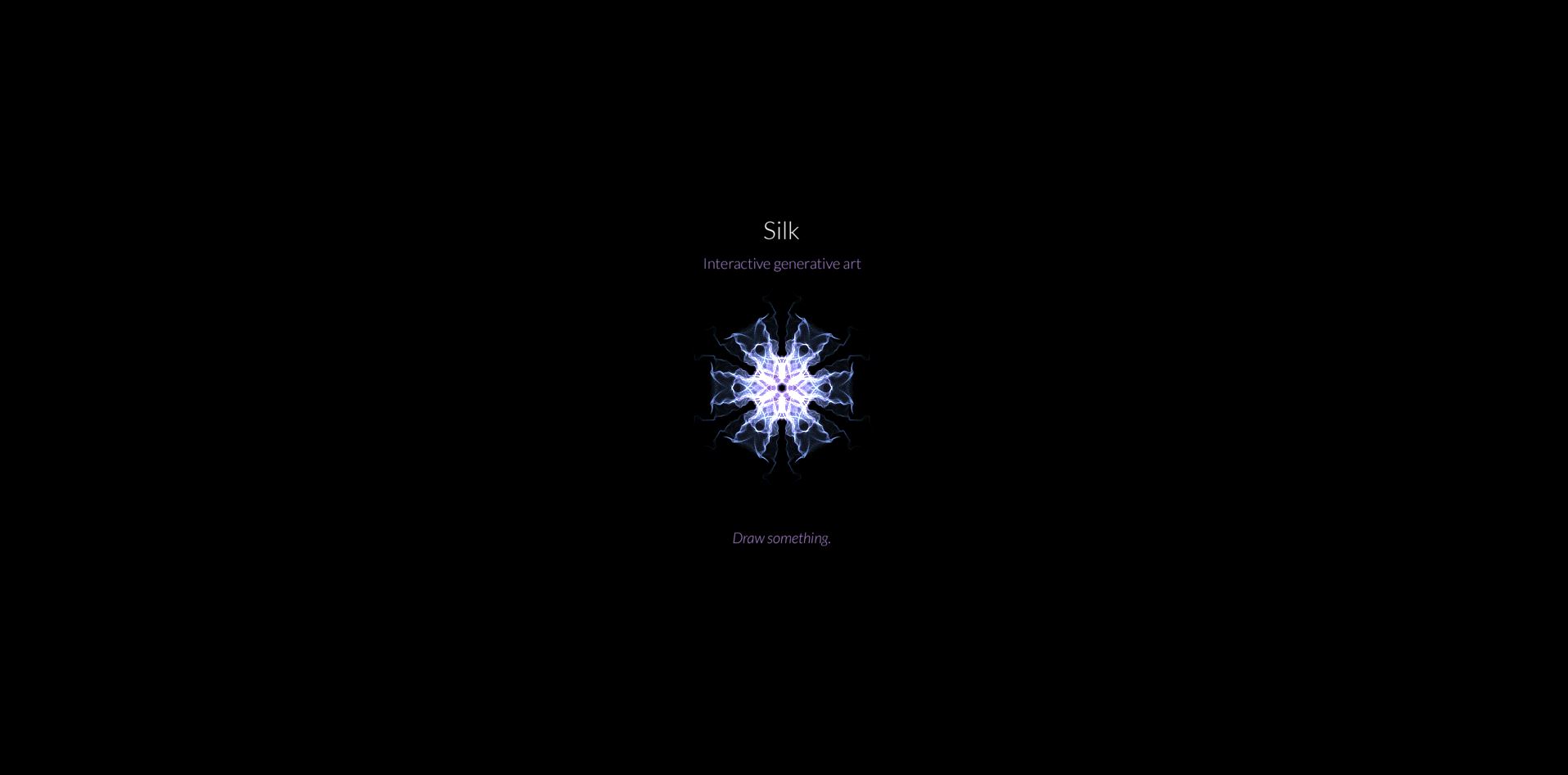
Silk – Next up I searched for something that is more visual-based and found this free web app called Silk. It basically draws out ghostly images and the longer you pause the thicker the stroke becomes.
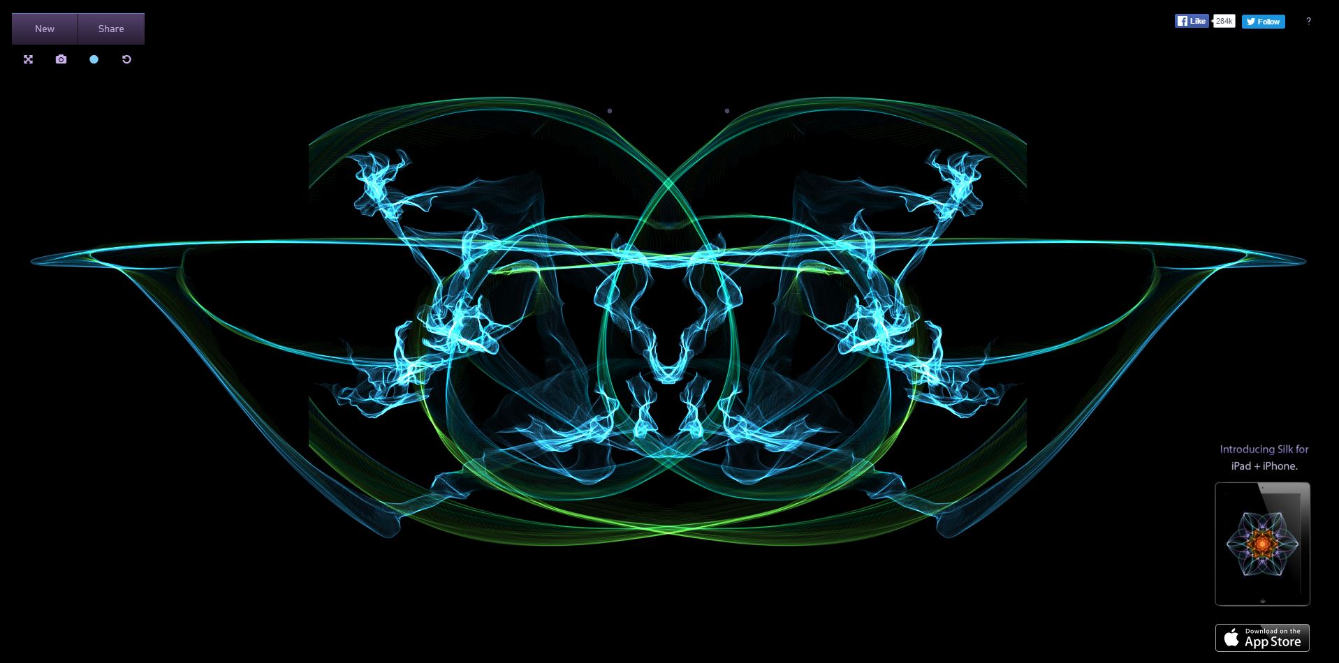

Apparently this app is so popular that Tumblr has a whole lot more on it. This place is a treasure trove. While I don’t think I will be basing the typography project solely on this, I want to incorporate it somehow, maybe as the background or layering it with the main doodle artwork. Either way it is free and it looks fancy.
Flame Painter – There’s also Flame Painter, made by the same company that made Rebelle. It is also a paid program, so this will just be more of future reference.
Next, the idea I had was to mesh traditional and digital together and one example of that is doodle on photograph.


I found this article of an artist Ryan Boyle’s Doodle Monster that I feel will be useful as the basis of the project. Perhaps the photograph can be the background that adds to the meaning with the typography of my name. The photographs could even be edited using Pixlr Desktop.
That brought me to an art style I have been noticing on the Indie Game Developer Group on Facebook lately – Low Poly Art. I initially wanted to use the Doodle on Photograph to apply to this as well.


Here’s an article on www.sessions.edu/ titled “What’s the Deal with Low Poly Art?” that discuss more about Low Poly Art. The problem with this is that I haven’t touch 3D softwares in years (I specialize in 2D not 3D sadly).
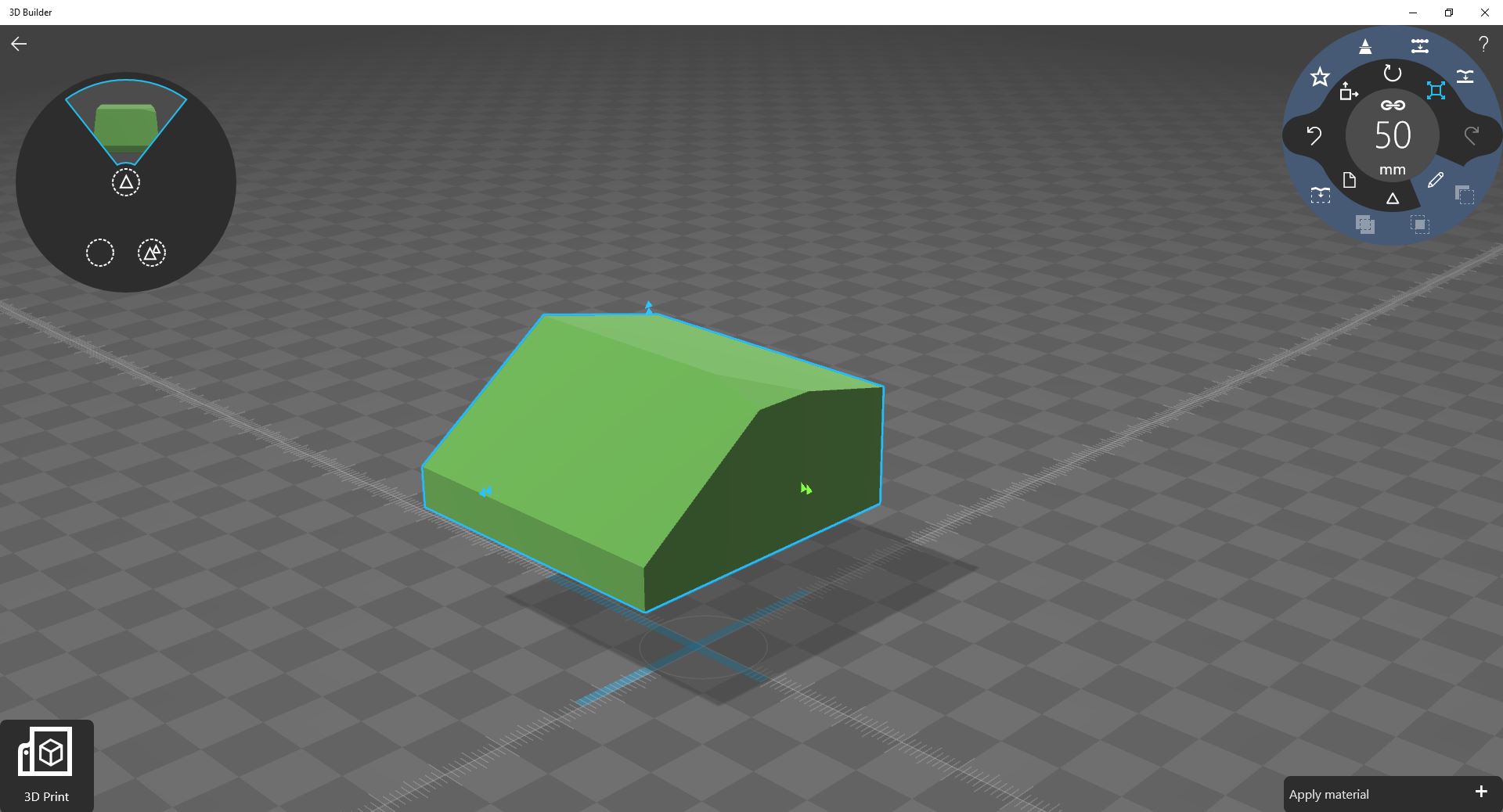
The 3D Builder software by Microsoft comes pre-installed with Windows 10 and while it is easy to use, it is meant for 3D printing and not for making landscape. Due to time and skill limit, this would probably be an idea best shelved for now.
Next part is searching for more inspiration in Behance.
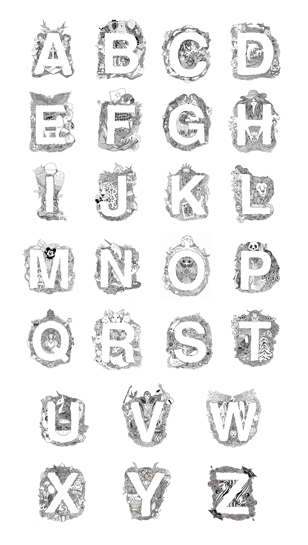

https://www.behance.net/gallery/18514213/Doodle-alphabet-typography
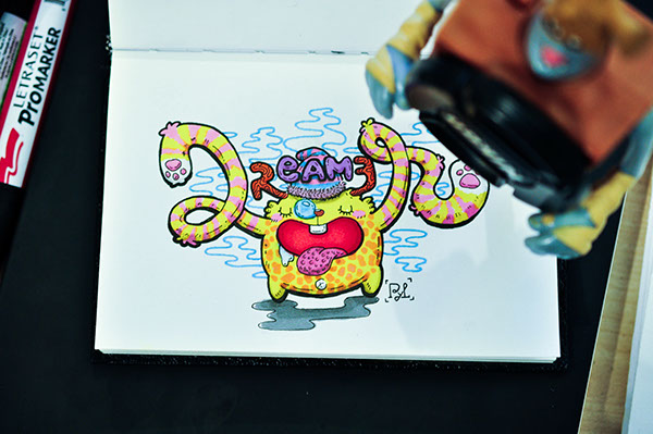
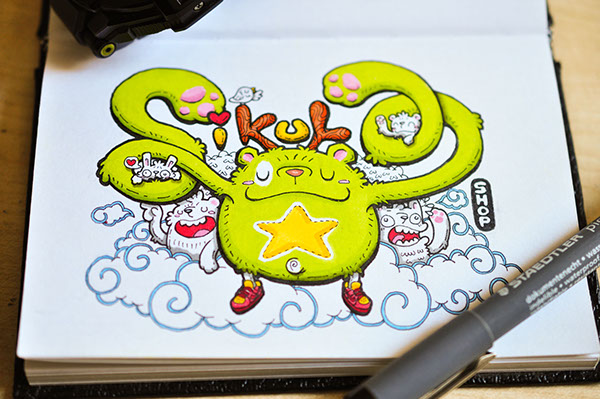
https://www.behance.net/gallery/19753843/5-Dreamer-Typonster-Project, https://www.behance.net/gallery/19924835/7-Sikula-Shop-Typonster-Project
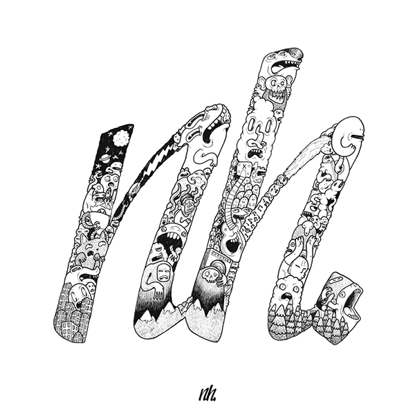
https://www.behance.net/gallery/24774159/Illustrated-Typography
Along with the Doodle typography I posted last week, they will form the basics of the Project 1.
More examples from the web:


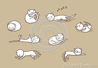
Cats look like letters when they are in different pose.


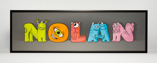


Characters made out of letters.
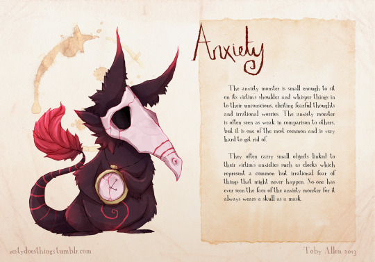
Personification of mental disorder. http://www.zestydoesthings.com/realmonsters#_=_
How can I make use of this idea to personify letters to give them meaning of what I wanted?
Lastly, one thing I learned from the presentations was to put cultural context into my work. This got me thinking, maybe I could make the characters be related to my identity as a person and as a Singaporean Chinese. Perhaps if I am going to continue with Doodle on Photograph, the photos I picked can be places in Singapore that is special to me personally.