As recap, these are the 6 phrases I will be using:
- A college from the point of view of a campus cat is a home
- A student caretaker from the point of view of a campus cat is a food delivery
- A community cat from the point of view of a campus cat is crude and vicious
- A community area from the point of view of a community cat is a safari
- An ex-owner from the point of view of a community cat is sadness and abandonment
- A campus cat from the point of view of community cat is smart alec
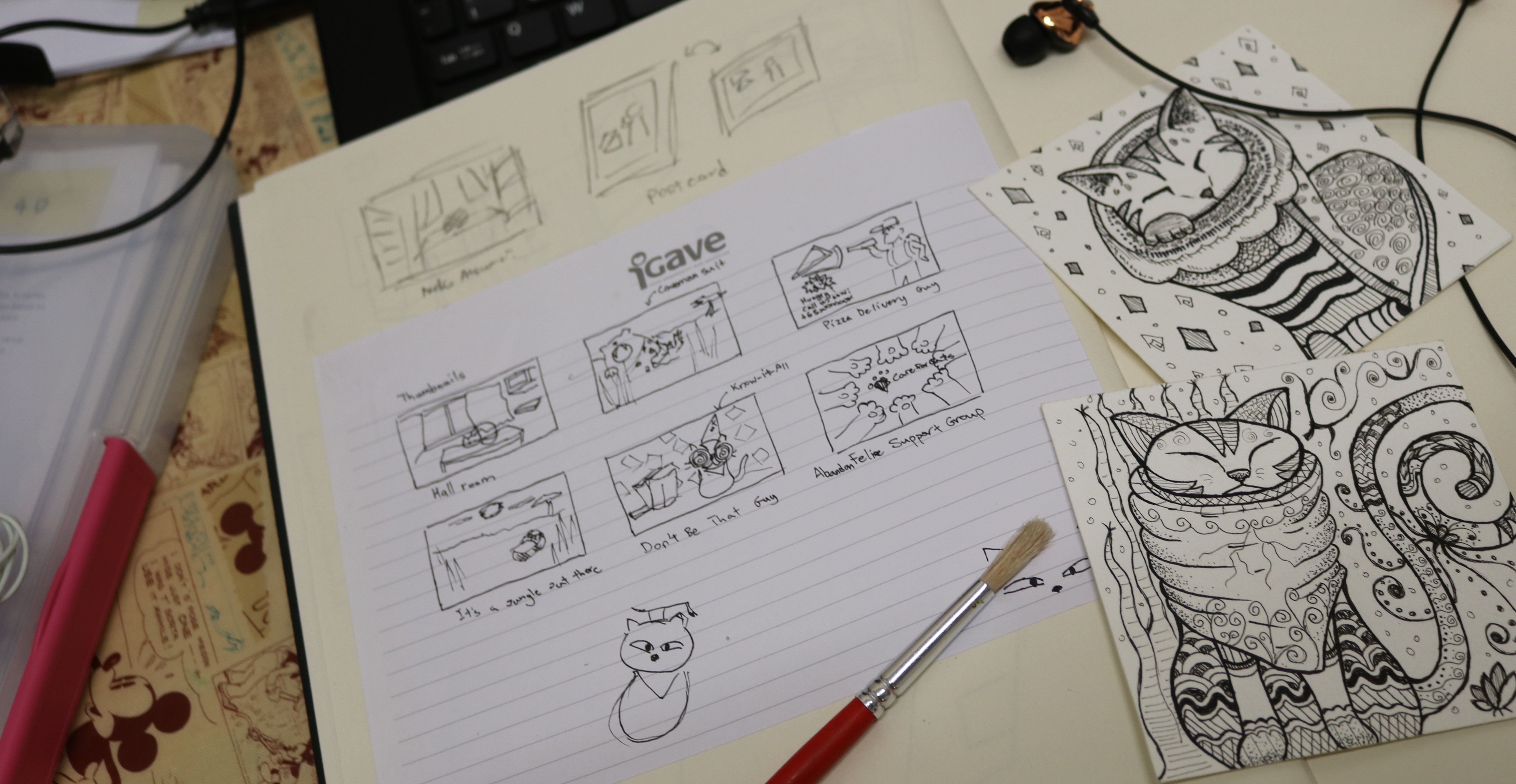
The above image is the thumbnails I drew to help illustrate what I want to draw digitally. I already have the basic composition in mind when thinking of the phrase but drawing it physically out helps with clarifying the idea.
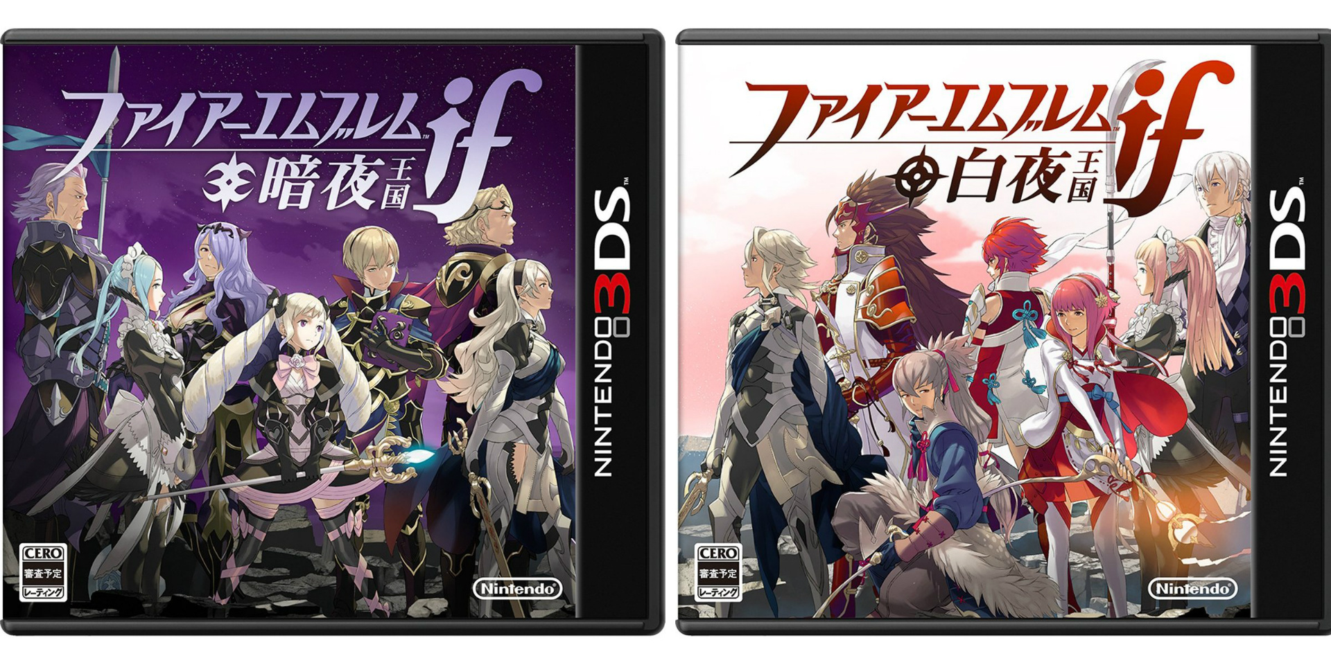 The split between Campus Cat and Community Cat and their respective fictional rivalry kinda mirror this video game I am playing now, Fire Emblem Fates, in which you pick one of two side of a war. One of the game is actually harder than the other which kinda also mirror the life of stray cats as campus cats are generally less likely to die from things that often kill community cat such as lesser chance of a cat murderer and having having health checkup led by the school’s CCA.
Because we are required to create 6 images, time management is very crucial in this project, especially since my take on it requires more time for perpetration. I decided to employ on a few techniques and ways to maximize my timing for creating the 6 artworks.
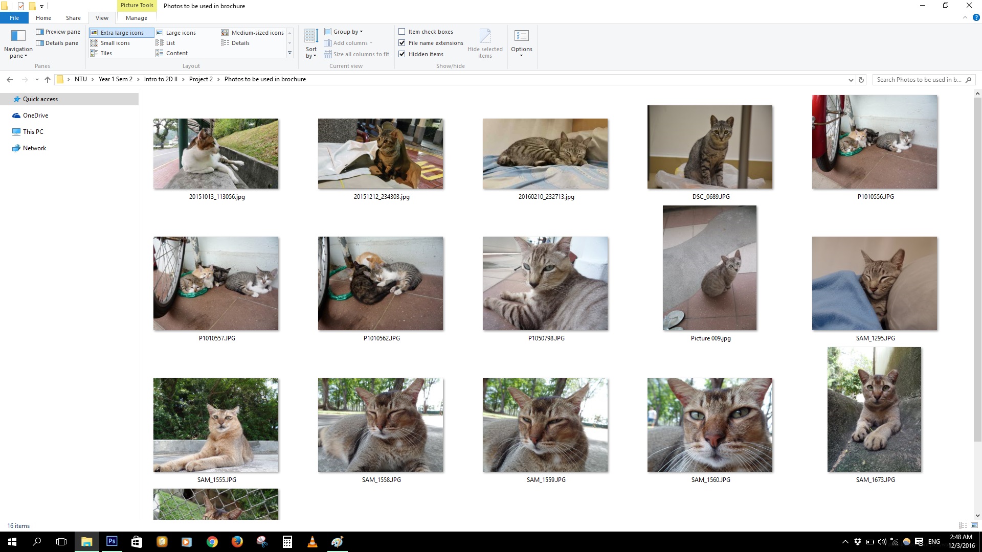
Because my idea was to turn the artworks into brochures, the side of the brochures will use photos instead of drawn image. So I dig into my personal collection of cat photos that I have taken over the years.
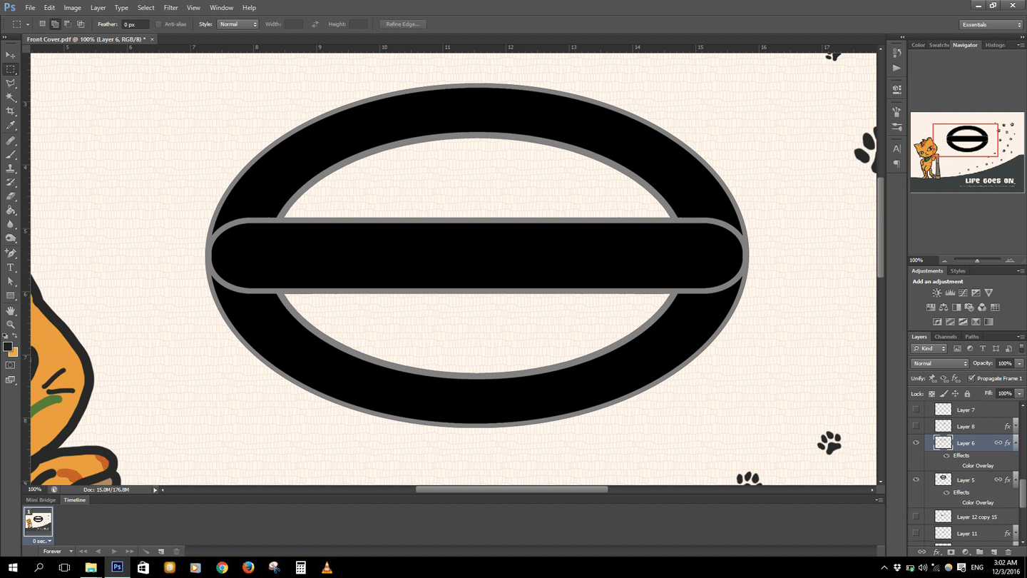
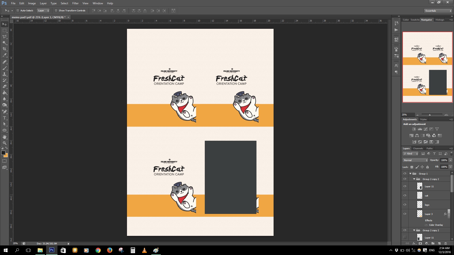
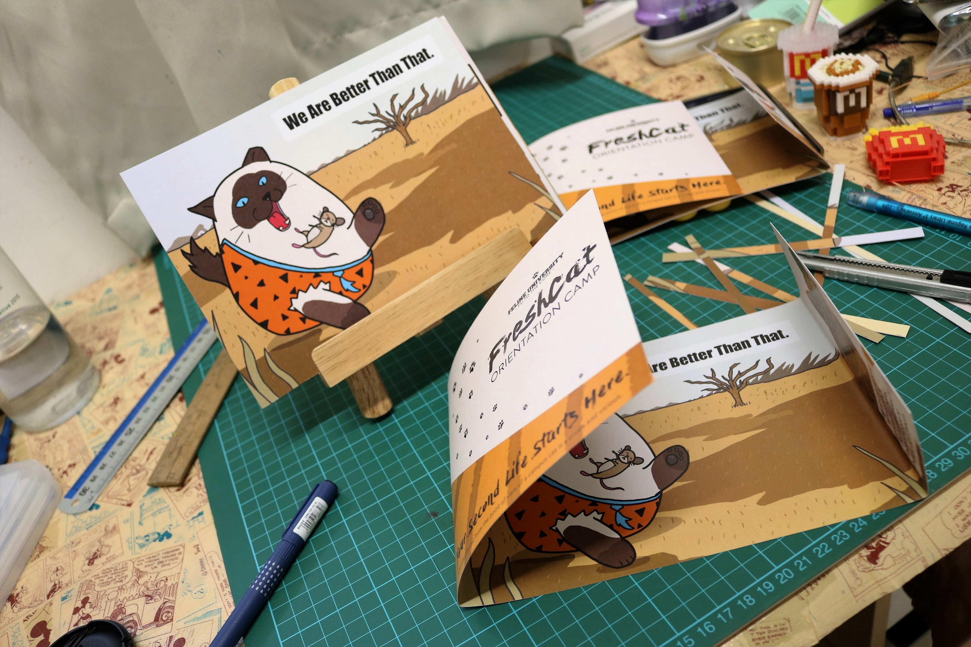
The first thing would be to create the logos for the respective brochures – FreshCat Orientation Camp and Community Cat Survivor Starter Kit. The former uses the same font as an image I posted in the previous post. The latter uses the Survivor TV show’s logo template as a base, although the fonts used are not the actual font from the logo but instead a similar one.
The texts inside the side of the brochures uses facts found mainly on NTU Cat Management Network’s Annual General Report and NUS Cat Cafe website, along with articles from Coconut Singapore I posted previously.
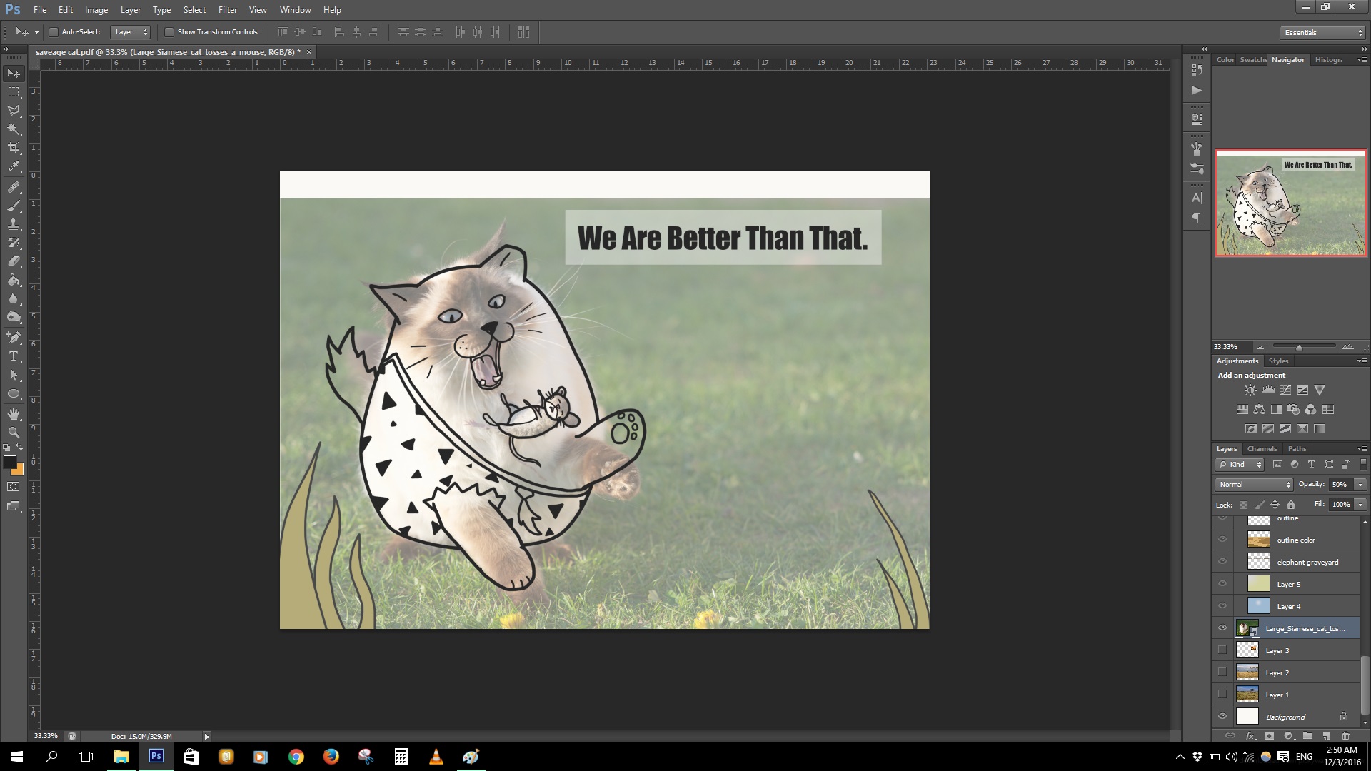
To save up time to keep drawing from scratch, I used a photo as a base to help guide me to draw the characters for this particular image.
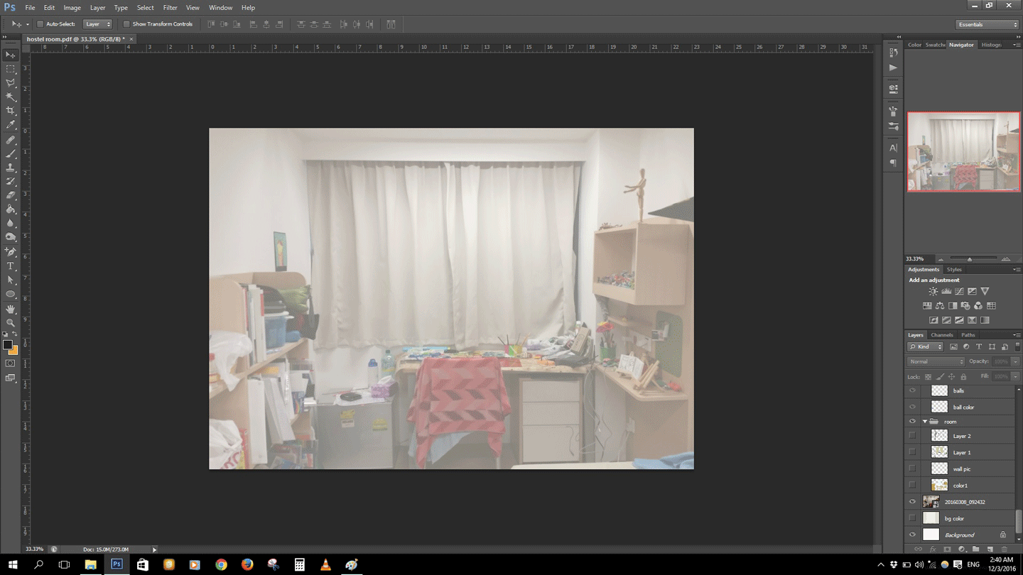
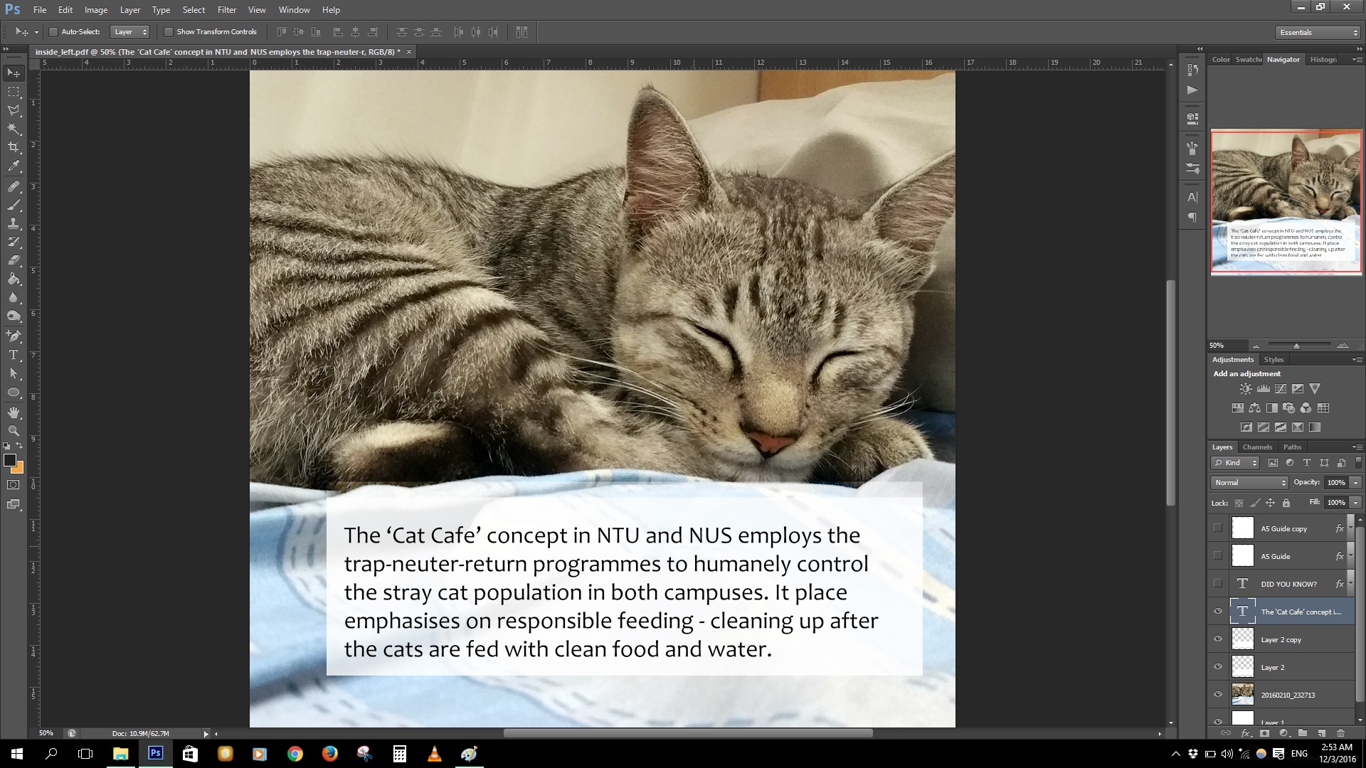
In this artwork, which is inspired/homage to Neko Atsume, I use a photo of my hostel room as a base. The phrase is based upon a common phrase in cat lover gift – Home is where your cat is.
Lastly is the making of the extra items in the respective goodie bag, which uses elements from the brochure to standardize the design and hasten the timing.

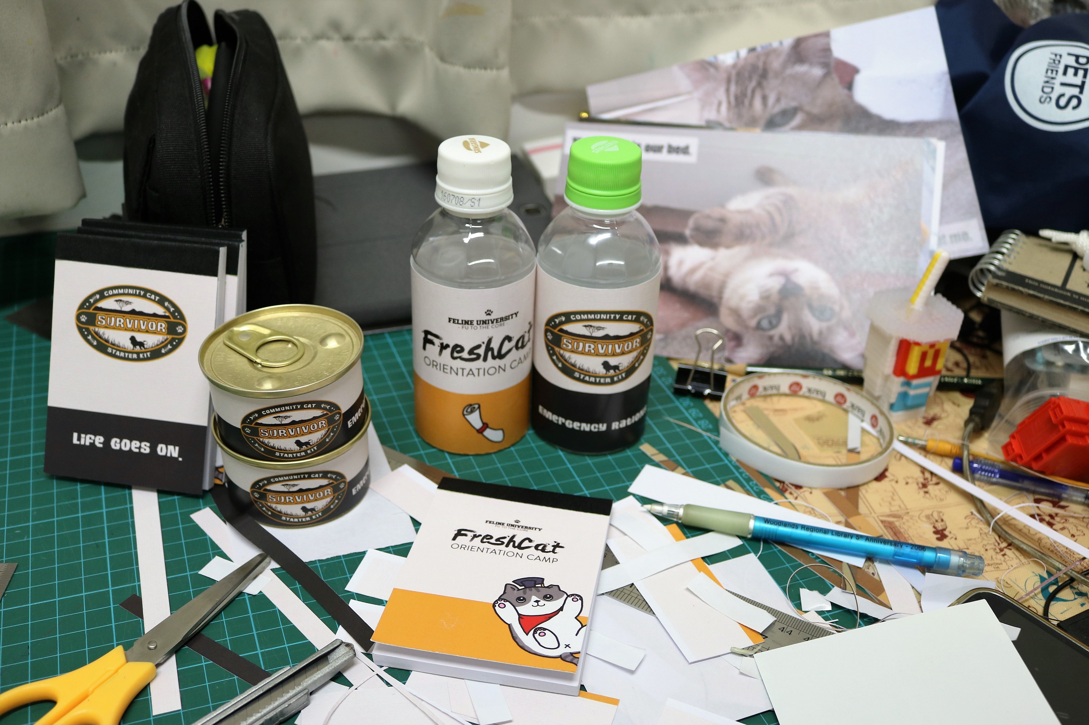
Lastly is putting up all together. I rushed down to print at Bras Basah on Saturday and I checked through like some would use the 100gsm paper, while some uses 160gsm and 300gsm papers. The total cost for printing went up to $38.80! That doesn’t even include the cost of the cat food, bottles, flags, bags and notepads yet!
It was fun learning how to make brochures and a package however. There were definitely mistakes made and some things aren’t prefect (which I will go into in my final Project 2 post), but like what the Survivor notepad tagline says – Life Goes On.
BONUS CAT VIDEO TIME: