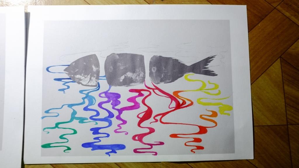
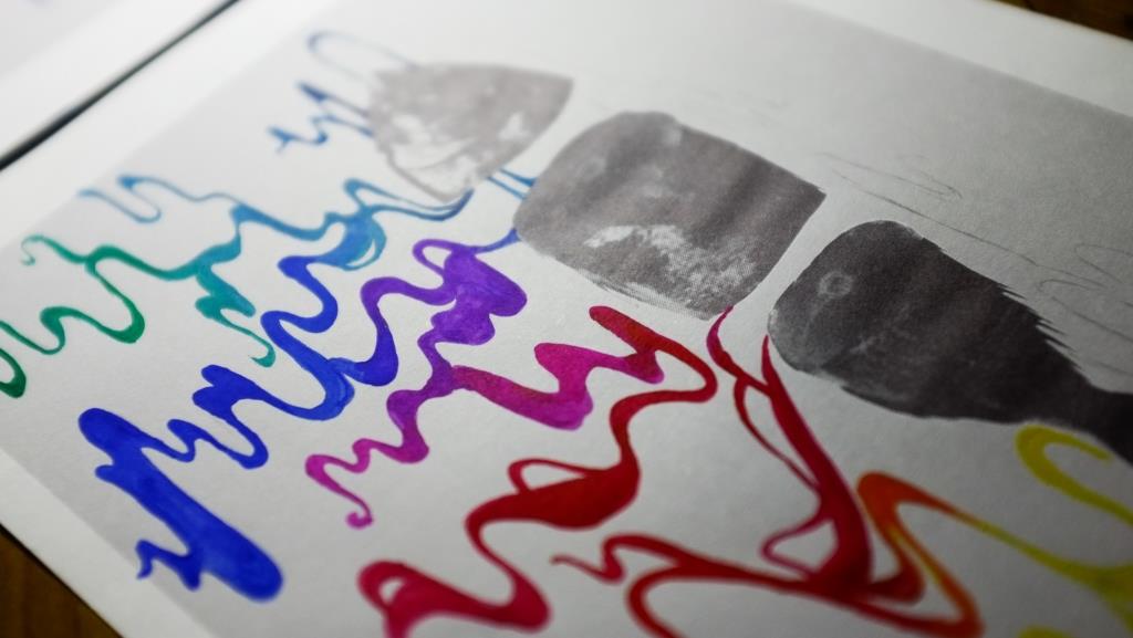
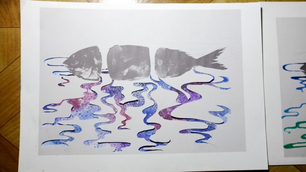
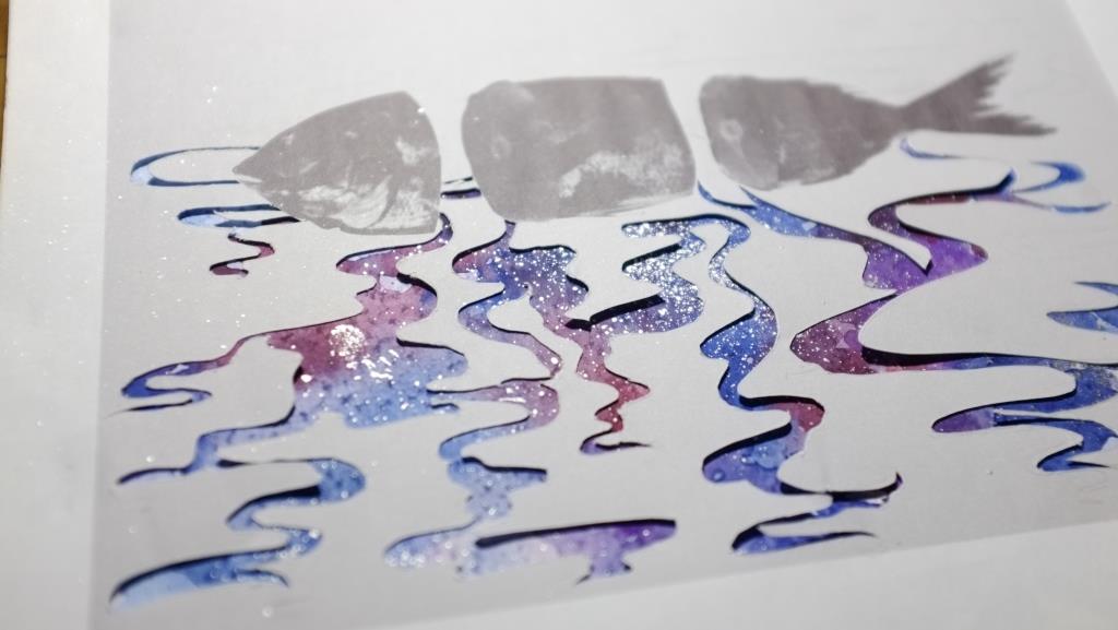
Assignment 1 “Alter Egos”


Process

Character Profiling:

Personally, I found it pretty hard to find characters that I identified with (instead of merely liking them or them having traits that I admire) hence many of these lists will not be filled up; a detailed analysis for the characters instead!

From literature/fiction (fictional characters)

Lemony Snicket

(The Series of Unfortunate Events)

handler-obituary

  • Private/ Secretive
  • Introverted
  • Melancholic but optimistic
  • Slightly self- deprecating
  • Whimsical
  • Well- read
  • Sensitive

Lemony Snicket is a character and author of the Series of Unfortunate Events series – he presents himself as a private and secretive person, often going to great lengths to hide his tracks. He tends to go on off tangent rambles throughout his narration of the stories, showing his slightly whimsical side, and occasionally ponders and reflects on his relationship with his lover, Beatrice, which gives us an insight into his sensitive, melancholic personality.

Tiffany Aching

(Discworld series)

Front_cover_of_the_book_The_Shepherd's_Crown_by_Terry_Pratchett,_drawn_by_Paul_Kidby

  • Independent
  • Spunky, knows when to have fun
  • Level- headed
  • Eager to learn

Tiffany Aching is a training witch from the Discworld series, and was thrust into the Wee Fee (a type of fairie) world when she was nine to rescue her brother, armed only with a frying pan. She is a spunky, strong and independent character that is not easily swayed by others.

Leslie Burke

(Bridge to Terabithia)

leslie-burke-profile

  • Imaginative
  • Not bothered by social conventions
  • Independent
  • Playful
  • Outgoing
  • Free-spirited

Leslie Burke from Bridge to Terabithia is a bright, imaginative girl with a sense of adventure. Although I’m not as outgoing as her, I love her sense of imagination, creativity and free- spiritedness and I identify with that part of her.

Kieren Walker

(In the Flesh)

tumblr_n670yaUVNI1r0eh1eo1_500

  • Private/ introverted
  • Unassuming
  • Passive
  • Troubled but tries to stay optimistic
  • Sensitive

Kieren Walker is a troubled teenager from the series In the Flesh where he took his own life, only to rise again as an Undead. Throughout the whole series, he struggles to deal with issues about his sexual orientation, the opinions of those around him, and his desire to protect his loved ones. I identify with the brooding, private nature of his character and how he tries very hard to avoid conflict, sometimes even sacrificing himself and therefore seen as being very passive.

From public figures

Nicki Minaj

nicki-minaj-quotes-tumblr-i15_large

  • Contrast between her onstage/offstage persona
  • Outlandish appearances/performances vs serious attitudes towards important issues

Personally what I found really interesting in Nicki Minaj is the large contrast between her very loud and flamboyant (almost crazy) stage persona to her serious personality especially with respect to important issues like black and female rights. Being a really prolific celebrity, she does not hesitate to point out important social issues and thus I find her to be a very strong role model. This contrast between her outer/inner personas is something I identify with as well and I find it really interesting.

Tablo (Epik High)

033115_epik-high-tablo_01

  • Goofy but also serious
  • Introspective
  • Onstage vs offstage personality

Tablo is a korean rapper that also holds a degree in English and English lit at Stanford University, has been known to showcase not only a goofy side to him (shown in his conversations with his daughter and his drunk freestyle rap), but also a very introspective, reflective and dark personality, as seen in the lyrics of his songs where he often talks about very dark internal struggles and social issues. This contrast is something that I find to be similar to myself.

From people I know

My mum

Being raised my her, I would say that many of my personality traits come from her – she has a very cynical/ practical world view, which I tend to have too sometimes.

My sister (starring in the video!)

Being my twin sister, we grew up together and so we have many similar and contrasting personality traits; while she is practical and organised, I like to daydream a lot and is very messy. However, we both tend to be more introverted in our mannerisms and straightforward in the way we talk.

Mr Teh (Highschool history teacher)

Mr Teh is a teacher that inspired me and influenced me alot throughout my years in high school. He has a very jaded world view and often cracks us up with his dry, cynical sense of humor. At the same time, I feel that he is very earnest in his teachings and puts in a lot of effort to help his students, something that I feel I share (or at least I hope so) with him.

Common threads:

  • Contrast between public/ private personas
  • Introspective/ private personality
  • Whimsical, imaginative

The alter ego that I chose to portray is a mishmash of all these traits, and is mainly derived from Lemony Snicket and Leslie Burke. But I tried to portray the other character traits that I identified with as well.

To portray the contrast between the public/ private personas, I cut between 2 scenarios: one with the girl playing alone in the playground (tinted with a purple tinge) and one with the girl with the candle (tinted with the warm orange tone). Despite being alone, the girl in the playground is still seen having a lot of fun (showing her imaginative and fun side); while the girl with the candle appears to be bright and cheery inititally, she turns serious when she decides to blow out the candle. In this way, I tried to portray the public/ private personas and how they merge into one another.

I decided not to put in any dialogue, instead only using one word “Goodnight” as I I felt like it would not fit with the scenes I wanted to create and I did not want the dialogue to sound too forced. I decided not to add any backing soundtrack as well, opting for just filtered ambient noise to give the video a more natural feel.

Reflections

Personally, this was a project that I found really hard to conceptualise – I found it really hard to turn and present abstract personality traits into very visual terms in video. It was also my first time directing – i had to express my concepts in very literal terms so that my sister could understand and act it out accordingly (not to mention the fact that she got impatient really quickly). All in all, this was a very different and refreshing experience for me.


Assignment 1 “Alter Egos” – character profiles

Character Profiles


From literature/fiction (fictional characters)

Lemony Snicket

(The Series of Unfortunate Events)

  • Private/ Secretive
  • Introverted
  • Melancholic but optimistic
  • Slightly self- deprecating
  • Whimsical

Tiffany Aching

(Discworld series)

  • Independent
  • Spunky, knows when to have fun
  • Level- headed

Leslie Burke

(Bridge to Terabithia)

  • Imaginative
  • Not bothered by social conventions
  • Independent
  • Playful

Kieren Walker

(In the Flesh)

  • Private/ introverted
  • Unassuming
  • Passive
  • Troubled but tries to stay optimistic
  • Sensitive
From public figures

Nicki Minaj

  • Contrast between her onstage/offstage persona
  • Outlandish appearances/performances vs serious attitudes towards important issues

Tablo

  • Goofy but also serious
  • Introspective

Assignment 1 “Typography Portrait Problem” – Project Prep 2 (Exploration)

Exploring Character Traits


1.I am a… Book worm

Personally, I am someone who really loves reading so I decided to pick this as my first personality trait to portray. Instead of using the imagery of books, I decided to portray the ‘book’ part of bookworm in the form of letters as I thought it would be interesting to use varying letter forms to see what effect I could get.

a m y

I cut out different letter forms of the letters A, M and Y that make up my name and scanned them in, and manipulated them on Photoshop to turn them into grey scale half-tone – so as to provide the contrast with the colourful gummy worms that were going to be used in the composition.

maze smol

Try to find the letters A M and Y!

maze

Where my name is hidden in the maze (gif)

To portray the idea of a ‘bookworm’ visually, I decided to create a maze of letters spelling my name and to have colourful gummy worms (depicting me) travel through it, as if they were eating up the words. It was hard to manipulate the gummy worms and make them stay the way I wanted them to on the paper but I think the irregularity adds to the fun spontaneity of the composition.

typography (5 of 6)

Final composition

Final composition

2.I am a… music junkieDSCF7136 DSCF7137

To show the kind of music junkie that I am, I decided to form my name using my favourite (and my best) pair of headphones, with a variety of album covers in the background, sorted by colour to showcase the variety of music that I listen to.

MUSIC smol

3.I am a… wanderer

cartography-visscher-1658

I find myself a person filled with wanderlust, often filled with the urge to find and explore new places. I also love to wander around and just observe.

My initial concept for this composition was to recreate a vintage cartography (maps) and let my name be spelled out by the trade routes. However, I found this idea to be too flat and not really fitting in with the other 3 pieces hence I decided to try something different.

ec2e9d1bf599978c11bda3feb5d809f1 (1)

Real Life Where’s Waldo

As I’m quite short, I always find myself getting lost in crowds when I wander around, making it hard for other people to find me – hence I decided to go in this direction to explore this character trait. I hid myself within the crowds of my friends in a way such that it would spell out my name when it’s all joined together

4.I am a… daydreamer

For the concept of daydreamer,my second trait, I decided to draw smoke to depict my name as it was dreamy and it was something that I liked to doodle when my mind was wandering. To add in the fantastical, whimsical element, I decided to add a photo of a fish to juxtapose with the hand-drawn, unreal feel of the smoke. The smoke was also depicted in bright colours to contrast with the black and white of the fish and the background.

typography (1 of 6)

typography (4 of 6)

Initially, I tried out gouache on paper but I didn’t like the result – it was hard to get a smooth layer of colour and the entire image seemed flat and dull. Some colours like the yellow also didn’t show very well on the grey background.

typography (2 of 6)

typography (3 of 6)

So I tried a different approach – paper cut. I layered the image of the fish with the cutting of the smoke on top of a piece of watercolour paper painted with watercolours and silver ink in various hues. Although I had to sacrifice some details in the smoke, I was able to vary the hue and saturation of the colours more to bring about more depth.

Overarching Concept


To link all the different concepts together, I decided to play on colour – I received feedback that all my traits had something to do with my introverted nature, hence I tried to juxtapose the black and white/ colour to show the difference between my outer and inner world. For example, the black and white letter maze in the first composition represented the words/ books I like to read, while the colourful gummy worms represent me happily immersing myself in the books.

For this project, I also stuck to a more photographic/ collage style as I wanted to try something a little out of my comfort zone.

Week I and II reflections

Artists’ works reviewed in class:

Issac Julien

– character driven narrative

– identity of characters; blurring of reality/ storytelling boundaries

Doug Aitken

– Example work: Altered Earth

– Focus on texture/ sensory experience

– Layered/ multiple screens

Personally, I really enjoyed the work shown in class; the juxtaposition of various scenes on the huge screens with the atmospheric music really created a very surreal experience.

Michal Rovner

– Israeli artist: context

– Projection of images on unconventional screens: additional meaning to work

– Abstraction of human figures

I found Michal Rovner’s work interesting, primarily because of the context that her background provided for her work which allowed me to understand her work more. I also found her choice of medium very interesting; the way she manipulated the footage of the figures to create abstract shapes really fitted her work well

Paul Pfeiffer

– On sporting events: real/ perceived memory

– Different versions of “reality”

Alex Pragner

– Example work: Face in the crowd

– The Crowd: Individual personalities vs the mob

– Characters: Caricature vs ‘real’ personality/experience

I really like Face in the Crowd, loved the very cinematic style of the production and delivery that contrasted very well with the documentary/ confessional style of the interviews.


Character in films

  • Woody Allen – Annie Hall

Use of monologues/ dialogues

  • Blade Runner – Tears in Rain monologue
  • Michael Fassbender – Shame

Anti-themes

  • The Virgin Suicides

Assignment 1 – Typography Portrait Problem – Project Prep 1 (Research)

What is typography?

Typography – the visual representation/ reinforcement of the written word.

Hence

  • Typography is primarily utilitarian;
  • Focus: On effectively conveying/ reinforcing the message portrayed by type
  • Effective typography > Typography that is aesthetically pleasing but ineffective

Methods:

  • Using visual image/ symbols that echo the message
  • Unconventional mediums/ presentation
  • Playing with colours, shape, scale etc.

Research

Hannah Hoch

Picture1

74314681b5dfc12ce3a773d88c2b0943

72f3662688c9d4f10d3533eaf858c370

Hannah Hoch is one of the few rare female artists from the Dadaist movement, and as a German artist created many prominent works in response to the the horrors of WW1 and the discrimination she faced as a female in the Dadaist artist community. To me, I like how she pieces together disparate images from various different sources (often bearing no semblance to  each other) to convey her message in a unique way.

Having experimented with digital collage last semester, I really liked the process of selecting and assembling images, as well as the end product – hence this might be a possible direction to take for my Project 1.

Handmade Typography

6207bd7d6979bd8fd8ebc09670526984

a1988cf3aa00997368b1d113284f9014

b0ddcca1e85d2f5a8b2d76f327079f98

ac663b30cd5d0e8d1fcc3f6f973659b7

Out of all the different examples of handmade typography I saw online, these few examples stood out to me as the presentation of the type (i.e. typography) was not only interesting, different but also really effective and successfully reinforced the message portrayed by the type.

Hence I feel that for my project 1 to be successful, a clear message needs to be defined, with the presentation of the type streamlined to fit the message – so that the typography does not become a mere gimmick.

43bffe25157101.5649cca732251

41fdb125157101.56359b86ba6f4

1ac2f325157101.56359b86ac483(1)

68804c25157101.56359b86cda1e

894f2725157101.56342489e9606

b8728a25157101.563424733fa69

d6fbd425157101.5634245c206c3

5e341a25157101.56342497ba6b7

597c9325157101.563424736b45d

9ecd7725157101.5634248d7d135

“Do not play with your food” #1 SWEETS AND CANDY by Alex Palazzi

Personally, I really liked this project as the focus on recreating the textures and look of the foods in the typography made the text more tangible and real to the viewer instead of being mere words. At the same time, the studio setup style of the typography background with the very consciously chosen colours makes the typography look unreal and fantastical. This creates a very interesting contrast in the portrayal of the words.

Sakanaction_Aruku_MV

14e_arukuaround sakanaction-thumb-765xauto-144

Z322001753

Sakanaction – Aruku Around

Personally this is one of my favourite examples of typography in video – the joining of seemingly random elements to form the characters creates a constant sense of surprise and suspense for the viewer, and it actually helps to create movement and flow throughout the entire music video. Hence, not only was the typography effective in conveying the song style and lyrics, it was able to adapt to the video format and add to it.

I found it interesting too how the director chose to add various elements of the type together, instead of cutting away (additive vs subtractive) as seen in the meat poster above. Hence, possible exploration can be done in this area to see how it affects the viewer(s)’ impression of the message portrayed.