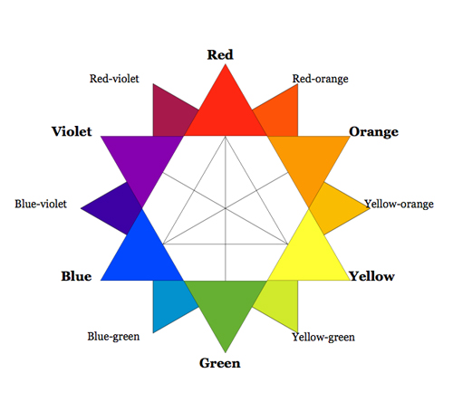
Assignment 3 “Ego” – Project Prep 2 – Colour Schemes/Harmonies

Colour Harmony

In design and the visual arts, colour is an important element in bringing out the best parts of an image – if the image is visually uninteresting, the viewer is disengaged; if the image is visually too chaotic, the viewer gets confused at what to look at. Hence, the use of colour harmonies or colour schemes become significant in its use to create a proper hierarchy for an image for it to be visually balanced.


Monochromatic 

02

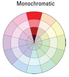
Rather than an actual harmony, monochromatic harmony consists of a single hue and varying tints of that colour. This harmony is typically low in contrast and visually homogeneous but it is considered pleasing to the eye and easy to apply with good result.

Analogous

01

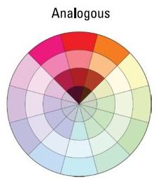
Analogous harmonies consists of a few colours adjacent to each other on the colour wheel. Typically, one colour will dominate with the other 2 or 3 as accent colours. As they are next to each other on the colour wheel, this harmony typically produces little contrast and instead creates unity and consistency in the colours without being too monotonous.

Diadic

08

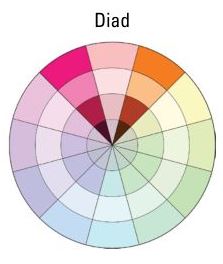
The diadic colour scheme consists of 2 colours one space away from each other in the colour wheel. Although the diadic scheme is still pretty harmonious due to the similarity in hue, it is unlike the analogous colour scheme as the slight gap between the 2 colours produce a slight contrast between them.
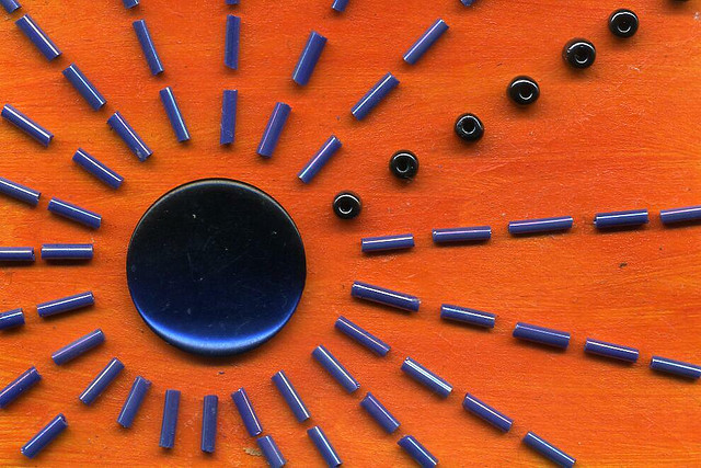
Complementary

05

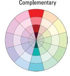
The colours in a complementary colour scheme are typically 2 that are directly opposite each other in the colour wheel; this scheme is the easiest way to bring out the most contrast in an image and can be used to make an image more striking. However, due to the high contrast, excessive use of this colour scheme without proper balance can make an image look jarring and hard to read.

Split Complementary

06

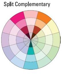
The colours in a split complementary colour scheme are derived from the two colours adjacent to the original colour complement – this still creates a great amount of contrast between the 3 colours but not to the extent of the direct complementary colour scheme. Due to the high contrast between the colours, proper care must be taken when using the colours to create a visually coherent image.

Triadic

03

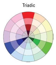
A triadic colour scheme consists of 3 colours equally spaced from each other in the colour wheel -their equidistance from each other creates equal contrast between each other and thus creates a overall vibrant colour palette. They are considerably harder to recognise (as a colour scheme) and appear comfortable to the eye.

Square Tetrad

04

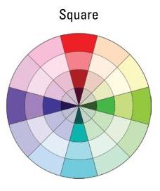
A square tetrad colour scheme consists of 2 primary colours and 2 secondary colours spaced equally between (and opposite each other in pairs) in the colour wheel. The positioning of the colours in the colour hue mean that the resulting colour scheme is extremely vibrant. The square colour scheme works best with all 4 colours used evenly in an image to balance out each other.

Rectagular Tetrad

07

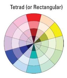
In a tetrad colour scheme, one can have 2 primary colours with 2 secondary colours, or 4 tertiary colours – this gives a wide variety of colour combinations to choose from but also makes it harder to juggle to create a visually balanced image. The colours, if not handled properly, can also tend to appear muddy – hence fixing one as a dominant colour and the rest of the colours as accents is a good way to balance this colour palette. The variety of hues in this palette also makes this colour scheme hard to recognise.


Assignment 3 “Ego” – Project Prep

colorstar

Colour – the visual perception of electromagnetic radiation by the eye that falls under the visible light spectrum; it is a continuous spectrum of colours varying from red (infrared) to violet (ultraviolet).

Between the colours red and violet in the visible spectrum of light, the continuous variation creates an infinite number of colours of varying shades, saturation and vibrancy. Hence, I will discuss a few basic colours and 2 basic colour systems right under the cut!

Continue reading

Assignment 2 “Nursery Rhyme” – Working and rejected compositions

The cow jumped over the moon

The cow jumped over the moon

This was my initial composition before more design principles were implemented

I tried to juxtapose the scale of the moon to the globe, and to stack the cows while varying size and opacity to suggest hierarchy but I felt that it was too literal an interpretation of the nursery rhyme which made it less interesting and dynamic.

There was an old woman who lived in a shoe.

There was an old woman who lived in a shoe.

For this composition, I tried to play around with the idea of “living in a shoe”  – thus the stacking of shoes to create a house where the old woman lived. Personally, I like this interpretation of the nursery rhyme but I felt that the composition was too static and boring so I decided not to use it.

The little dog laughed, to see such sport

The little dog laughed, to see such sport

This was my initial concept for this line of the nursery rhyme – I went with a more comic book/graphic novel-esque presentation by using a dominant “speaking figure”, lines pointing out from the figure’s mouth to indicate speech or movement.The little devil was alliterated to point outwards to indicate fun or mischief, and 2 rubber duckies were also put together to create a little bow tie for the dog. However , I felt that this composition was too simplistic so I decided not to use it.

Assignment 2 “Nursery Rhyme” – Project Prep 2

07 06 05 04 03 02 01 080910

These were the images that I prepared and submitted onto the shared folder for this assignment. Apart from the first and the last image(which were taken from vintage illustrations and dingbats fonts respectively), everything else was shot by me on my camera with things that I found around the house. I decided to use this hands on approach with objects that were not directly related to the nursery rhymes as I wanted to introduce variety into the collages made. In retrospect, the objects that I chose might have ended up to be too tangential for people to use them effectively.

Assignment 2 “Nursery Rhyme” – Project Prep

Principles of Design 

The principles of design that describe how artists use different elements in their art/images to create visual interest – and can also serve as a very general guideline for designers to understand design elements. Of course, there are other sets of guidelines that might be equally if not more applicable in conscious design (a personal favourite being the 5 Principles of Flag Design), and artists often break or contradict these rules, but it is interesting to see these common elements to present in different artists’ works nonetheless.


Figure-ground (gestalt)

gestalt

The figure – ground element of design consists of the relationship between an object (the figure) and the negative space surrounding it (the ground). The relationship between them is mutually exclusive, but their relationship inseparable – either must be viewed in relation to the other.


Balance – Symmetry/Asymmetry

51436b345a54b49313d2073810db43f0

Balance refers to the distribution of the visual weight of objects, colours, textures, and space. In a symmetrical balanced composition, the elements used on one side are similar to the other side; in an asymmetrical balanced composition, the elements used on each side are different but still weigh out to provide an overall balance in the composition.

Contrast/ Emphasis/ Dominance

3404713829_d39defbc70_z

Contrast refers to the juxtaposing of drastically different (and often opposite) design elements to draw the viewer’s attention to a particular point in the composition. It counteracts monotony in the composition by generating a particular point of interest.

Cropping

croppingwww

Cropping refers to the intentional discarding of certain portions of an image, either to reduce the amount of distracting elements or to generate visual interest on a particular point in the composition, thus emphasizing it. Effective cropping of letterforms, images and shapes can be used to make an image more visually dominating.

Hierarchy

bigboldred

Hierarchy can be created in an image by manipulating the aspects of design elements (e.g. size, shape, colour, contrast, arrangement) to create an order in which different elements in a composition are to be viewed. By varying these elements, the viewer’s eye can be guided along the image to view it in a more coherent manner.

Scale

13c

Scale is the size of an object in the composition as consciously chosen by a designer – it can be magnified to provide emphasis or to provide a different way of perceiving an object (e.g. the difference between a large circle and a dot).

Proportion

magrit

Proportion refers to the relationship of two or more design elements in a composition and how they relate to each other in terms of scale and size. Similar to scale, this can be manipulated to create an illusion of realism (in balanced, harmonious compositions) or distorted to create a sense of disharmony or surrealism.

Repetition/ Variety

79ede1210abf59bd7bf10770efb9f5e7

Repetition refers to the repeated use of particular design elements in a composition, though not necessarily in a particular order. It helps the composition become more active and creates a greater sense of unity in the work. Conversely, a wide variety of design elements can be used to create a sense of discordance and chaos.

Assignment 1 “A line is a dot that went for a walk” – Part 2

emotion: lyrical, turbulent, nonsensical

Lyrical: melodic, musical, symphony/harmonious, lilting, flowing, musical notation, soundwaves, beauty 

Turbulent: stormy, unstable – changing motion, turmoil, juxtaposition, harsh contrast, swirling, irregular, always changing, moody, dark

Nonsensical: Non sequitur, not making sense, meaningless, silly, childish, into the rabbit hole, ridiculous, random patterns, no relation to each other

Lyrical was one that I also had a lot of trouble deciding – all my previous experimentation looked too similar to Sensual, so I tried experimenting with musical notation and stacked lines to invoke the feeling of flowing movement.

My initial idea for nonsensical was to emulate a child’s doodle or drawing – but after getting feedback about that idea I decided to change it to something more abstract instead.

emotion: nonsensical (cont’d), systematic, ambiguous, sloven

Ambiguous I, Ambiguous II, Sloven (closeup)

Ambiguous I, Ambiguous II, Sloven (closeup)

Systematic: grid, mind map, interwebs, connections, regular, stable lines/dots, part of a system/machine, gears, solid, categorized, sorted, mathematical)

Ambiguous: neither here nor there, more than one meaning, not decided, foggy, veiled, vague, muddy, unfamiliar, faceless, no recognition

Sloven: untidy, messy, crumpled sheets/fabric, unmade bed, chaotic, scribbles

From my initial experimentation with Systematic, I tried doing a grid style with the spacing between the dotted lines following the proportions of the Fibonacci Sequence. However, I decided that that reference was too obtuse and indirect, so I tried a different style for systematic instead, focusing on how different parts are connected to each other to form a coherent system.

emotion: spontaneous, awkward, aggressive, indecisive

emotion: spontaneous, awkward, aggressive, indecisive

Aggressive (closeup)

Aggressive (closeup)

Spontaneous: creative, energetic, instinctive, unrestrained, impromptu, changing direction BUT with flow, single stroke, confident, bold, unplanned, on the spur of the moment

Awkward: uncomfortable, squeamish, uneasy, clumsy, bull in the china shop, feeling out of place, feeling big and bulky, not belonging, high contrast

Aggressive: angry/forceful, confrontational, high energy, violent, explosive, bold, pushy

Indecisive: fickle-minded, changing direction, changing style, forking paths, unsure, going back and forth

Spontaneous also gave me quite a lot of problems: the previous ideas I had were too similar to lyrical or nonsensical. So I tried to go with (literally) a more spontaneous and loose approach, with the entire drawing only made up of a single stroke done in one sitting.

Assignment 1 “A line is a dot that went for a walk” – Part 1

Process: With each emotion, I first mapped out a mindmap to plot out the keyword I associated with each emotion, then tried to represent them physically with lines and/or dots, typically doing 2-3 variations until I was satisfied with the result.

Emotion: anxious

Emotion: anxious

Anxious: High tension(knotted rope), antsy(ant trail), irregular pattern, scribble/tangles, nervous/jumpy, shaking hands, trembling motions, ball of nerves

I tried to use scribbles of lines jumbled together to convey the nervous, jumpy energy that comes from being anxious. I ended up doing a lot of variations as the first few versions of scribbles didn’t feel nervous and jittery enough to me.

emotion: embarrassed

emotion: embarrassed, distracted

Embarrassed: Low energy/simmering energy, confidence>embarrassment transition, sheepish, mortification, blushing(crosshatch), shy/hesitant, wanting to find a hole to crawl into(negative space), clouding embarrassment

For embarrassment, I tried to do something different – I wanted to convey the change of emotion state from confidence to mortification when someone gets embarrassed/does something embarrassing in public, so I tried to do that by using the contrast between the thick bold lines at the beginning to the soft scratchy lines at the back.

Distracted: Irregular, truncated paths, hopping from one thing to another, jagged lines,irregular weight

emotion: bizarre, psychotic

emotion: bizarre, psychotic

Bizarre (closeup) Experimenting with ink blot effect

Bizarre (closeup)
Experimenting with ink blot effect

Psychotic (closeup)

Bizarre: fluctuating energy, weird, unpredictable, random, oddity, clownish, eccentric, going off on weird tangents Rorschach pattern(ink blot test)

Psychotic: Bullseye (people staring at you), lunatic, mad, manic, frenzied, paranoia, crazy energy

For me this was a very interesting experiment – I was initially experimenting with the eye concept for Bizarre but eventually realized that it looked really psychotic instead – so I decided to do that for Psychotic and instead went with the Rorschach ink plot concept for Bizarre.

emotion: exhausted, sensual, fragile

emotion: exhausted, sensual, fragile

Fragile (closeup) Experimenting with ink (blown through straw)

Fragile (closeup)
Experimenting with ink (blown through straw)

Exhausted: worn out/drained, light tone/faded, tired, haggard, low energy/low battery, smudged

Sensual: flowing, indulgence, elegant, femme fatale, soft waves, locks of hair, relaxation, alluring, enticing, beckoning, flowing stream

Fragile: delicate, details, small/easily breakable, tiny, crystals/cells, lace, spider’s web, thin lines, intricate, woven, precious

Fragile was one emotion that I took many iterations to pin down – I tried to experiment with different imagery, from crystals to cells to webs, but they all didn’t have the kind of feeling that I wanted to fragile. Then, I tried blowing ink across the paper with a straw to emulate tendrils and it worked! So I decided to layer that over the web idea.

Test Post

Lorem ipsum dolor sit amet, consectetur adipiscing elit. Sed cursus tristique venenatis. Suspendisse metus ante, elementum non dolor vel, finibus vehicula orci. Ut ut eros fermentum, malesuada eros eget, semper nulla. Sed interdum quis ipsum vel faucibus. Vivamus pellentesque condimentum egestas. Donec quis ullamcorper velit. Mauris in tellus malesuada, vehicula ipsum et, rutrum elit. Praesent mollis dolor quis quam hendrerit volutpat.

Praesent vel neque pretium, porta lacus a, molestie nisl. Nunc nibh metus, volutpat ut tortor ac, varius ultrices mauris. Vivamus pharetra consequat cursus. Phasellus fringilla nunc lectus, a consequat nulla varius quis. In maximus velit et turpis malesuada tempus. Quisque massa tortor, ultricies vitae aliquam in, ullamcorper id tellus. Aliquam erat volutpat. Proin lobortis at risus nec convallis. Aenean non lacinia ex. Curabitur blandit arcu sapien, ut tristique leo porta ut. Curabitur magna metus, finibus eleifend viverra ac, dictum at urna. Praesent eu sem et dolor vehicula consectetur.

Nam convallis mauris id scelerisque bibendum. Nunc consectetur nisl elementum rutrum maximus. Aliquam id molestie justo, quis rutrum mauris. In fringilla neque sit amet auctor blandit. Morbi in efficitur magna. Cras dignissim, odio ac facilisis laoreet, nisl tortor sagittis erat, vitae faucibus mi purus in erat. Vestibulum ornare dui erat, non luctus justo egestas ac. Donec placerat nunc vitae libero lacinia faucibus eget ac urna. Vestibulum ante ipsum primis in faucibus orci luctus et ultrices posuere cubilia Curae; Vivamus eget viverra massa, a volutpat nulla. Maecenas porttitor mollis vehicula. Donec et facilisis augue. Mauris aliquam in quam a dignissim. Phasellus malesuada libero eget urna sollicitudin, at varius mauris pulvinar.

Pellentesque eget lectus ac sapien placerat pellentesque ac eget velit. Morbi consequat eu tellus et cursus. Quisque ante mi, egestas eu enim vel, maximus luctus nulla. Curabitur placerat congue leo sed dignissim. Vestibulum egestas massa eu lorem tempus iaculis vitae a metus. Aliquam vulputate nunc eu lorem commodo sollicitudin. Suspendisse eu dapibus nibh, vitae dapibus dolor. Nunc tempor, nunc at accumsan dignissim, massa lacus mattis est, vel molestie leo justo at nisi. Fusce sed nunc molestie, viverra sapien ac, venenatis diam. Mauris interdum sit amet lectus eget rhoncus. Nunc imperdiet non nunc sed cursus. Nullam rhoncus leo sed lacus venenatis, eget dictum metus dignissim. Maecenas fringilla, diam ac efficitur faucibus, mi nisi aliquet purus, nec sollicitudin lacus velit eget turpis.

Donec at leo scelerisque, laoreet elit in, accumsan ante. Ut vestibulum orci non orci finibus consequat. Vivamus tempor vitae mauris at consequat. Praesent facilisis, est vel convallis venenatis, nulla velit dictum nulla, in feugiat purus magna vel nisl. Donec pretium malesuada augue id volutpat. Pellentesque habitant morbi tristique senectus et netus et malesuada fames ac turpis egestas. Sed a gravida est. Nunc aliquam odio ac dolor hendrerit lacinia.