
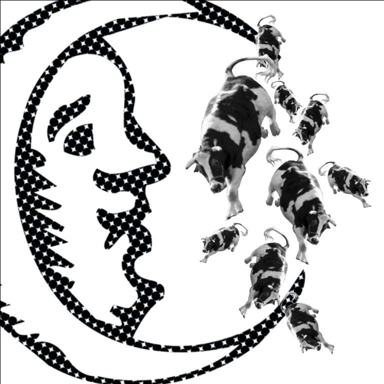
The cow jumped over the moon
For this composition, I wanted to juxtapose the scale of the moon and the cow to emphasize the difference in size – I also decided to choose a realistic looking cow (instead of the cartoon ones) to contrast with the cartoonish style of the moon.
Initially, I tried to overlap the moon with the cow (to show the cow jumping OVER the moon) but I felt that it covered too many details of the moon and made the image very awkward. Hence, I decided to just use the cow to cover the space between the edges of the crescent moon, with many cows in different sizes to evoke the motion of jumping/falling.
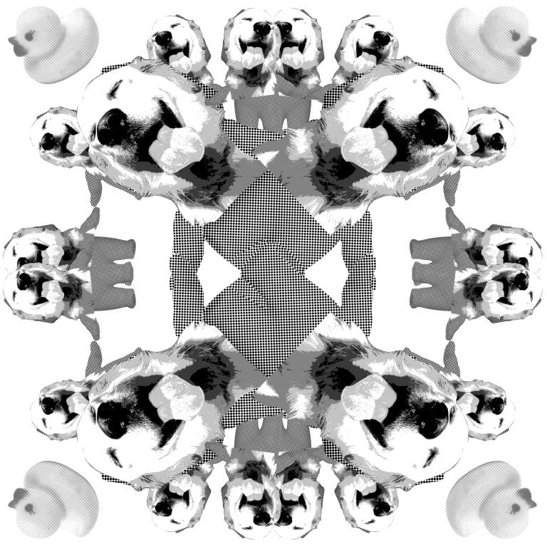
The little dog laughed, to see such sport
For this image, I decided to combine an image of a baby figurine and the dog head to create a humanoid/animal figure instead of a simple dog as I wanted to bring out the fun (and almost bizarre) feeling of the poem. I rotated and reflected elements of image to create a kind of pattern similar to a kaleidoscope – to evoke the feeling of fun, light-heartedness and absurdity like that of the poem.
The rubber duckies along the side were also added to add to the fun feeling, to express the dog’s laughter and amusement. The opacity of the rubber duckies were toggled to make them part of the background pattern, preventing them from taking attention away from the dog humanoid, the dominant figure in the composition
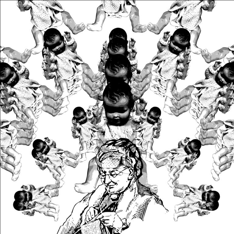
She had so many children, she didn’t know what to do
To evoke the feeling of “didn’t know what to do”, I tried to juxtapose many children hanging over the old woman’s head to create a looming, overwhelming effect. The stacking of the baby patterns was also done to create a feeling of dizziness, to emphasize the dilemma of the old woman. The babies right in the middle of the composition, however, were not stacked but instead gradually increasing in size as they near the woman’s head , stopping right above her. This was to create an overall dominant figure in the composition in spite of the distracting patterns in the background and also to emphasize the relationship between the old woman and her children (children>old woman, overbearing and overwhelming).
The size of the baby patterns in the back ground were also varied to a smaller extent as they became further away from the woman’s head to create and emphasize the radial symmetry in the image; it was also to emphasize the woman in the middle of the composition but creating implied lines that lined up to point at her head.
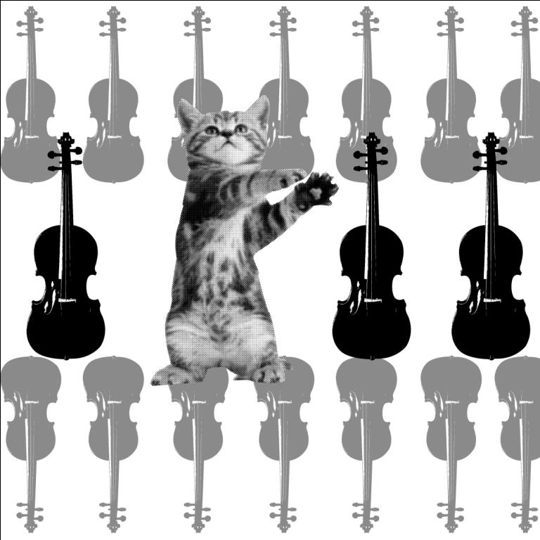
Hey diddle diddle, the cat and the fiddle
For this composition, I didn’t want to do the most instinctive interpretation of the nursery rhyme – which was to depict the cat holding or playing the fiddle in some way or another. While I was playing around with the different images, I realized that the image of the upright cat somehow resembles the thin, tall silhouette of the fiddle hence I tried to play up that similarity. By lining up the cat with three other fiddles in the foreground, I wanted to make the cat the dominant figure by making it the break in the lineup of fiddles. I decided to align the cat slightly off center, as well as to increase its size such that it was bigger than the fiddles beside it, to emphasize it even further. The organic, irregular nature of the cat’s silhouette also contrasts highly with the symmetrical, regular silhouette of the fiddle, bringing out their differences even further and thus making the cat even more obvious in its similarity yet difference from the objects around it.
In the background,the lineup concept was used again to echo that of the foreground and to create an overall pattern and harmony in the image – the opacity and size of the fiddles were manipulated to ensure that it stayed in the background as a pattern instead of dominating the foreground. The lineup was also made tighter in the background than the foreground to imply horizontal lines across the composition to create a strong, stable composition. A slight overlap was used as well between the foreground and the background to make the foreground stand out more and to make the break in the regular pattern (the cat) more obvious.