

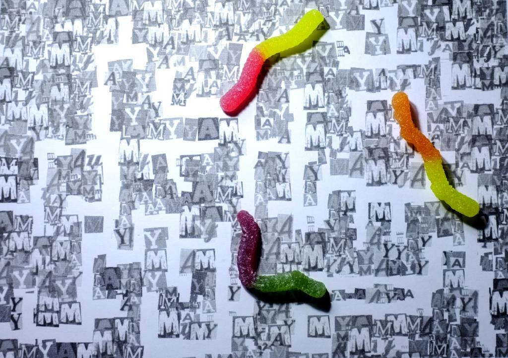
Final composition


There are 3 posts filed in Typography Portrait Problem (this is page 1 of 1).
Final composition
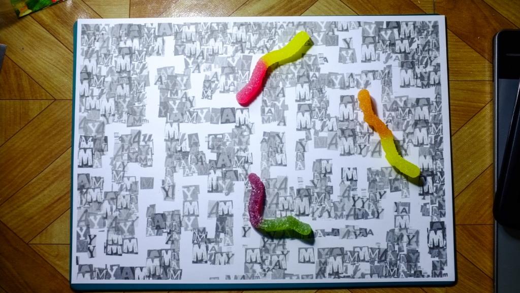
1.I am a… Book worm
Personally, I am someone who really loves reading so I decided to pick this as my first personality trait to portray. Instead of using the imagery of books, I decided to portray the ‘book’ part of bookworm in the form of letters as I thought it would be interesting to use varying letter forms to see what effect I could get.
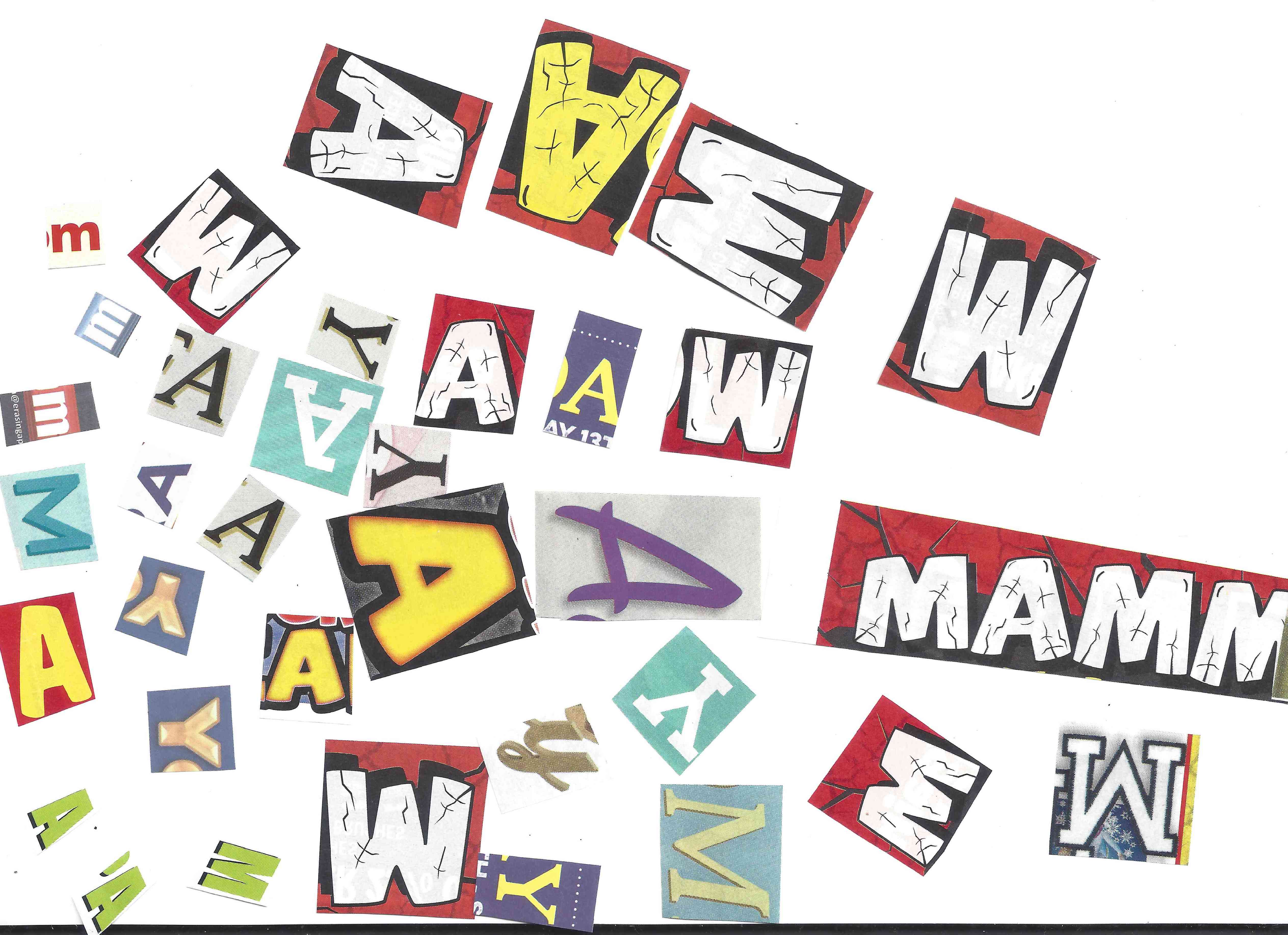
I cut out different letter forms of the letters A, M and Y that make up my name and scanned them in, and manipulated them on Photoshop to turn them into grey scale half-tone – so as to provide the contrast with the colourful gummy worms that were going to be used in the composition.
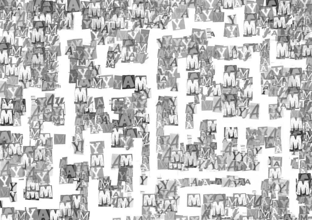
Try to find the letters A M and Y!

Where my name is hidden in the maze (gif)
To portray the idea of a ‘bookworm’ visually, I decided to create a maze of letters spelling my name and to have colourful gummy worms (depicting me) travel through it, as if they were eating up the words. It was hard to manipulate the gummy worms and make them stay the way I wanted them to on the paper but I think the irregularity adds to the fun spontaneity of the composition.
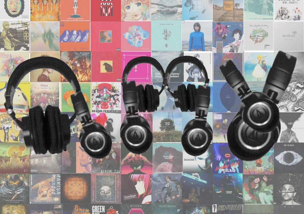
Final composition
2.I am a… music junkie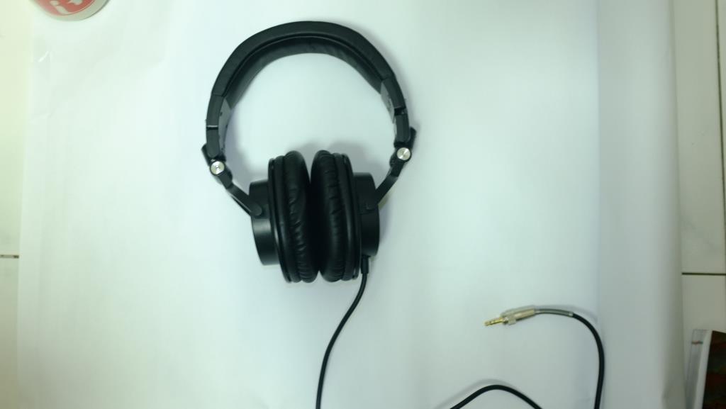
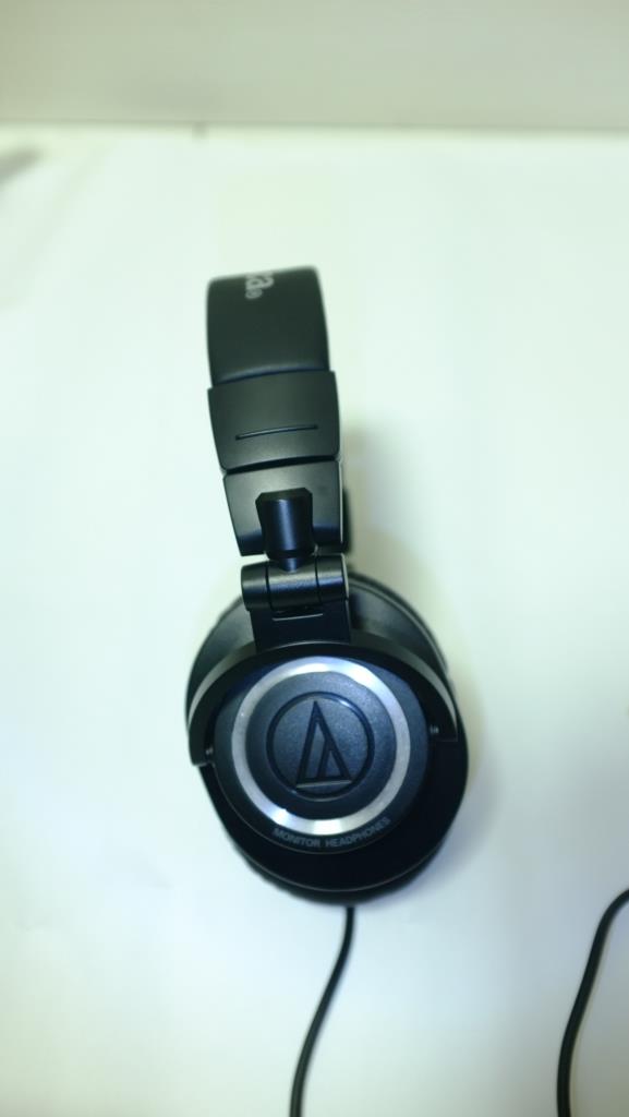
To show the kind of music junkie that I am, I decided to form my name using my favourite (and my best) pair of headphones, with a variety of album covers in the background, sorted by colour to showcase the variety of music that I listen to.
3.I am a… wanderer
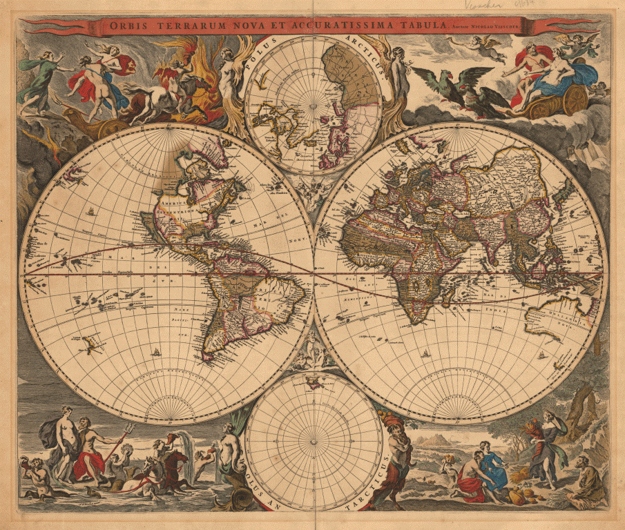
I find myself a person filled with wanderlust, often filled with the urge to find and explore new places. I also love to wander around and just observe.
My initial concept for this composition was to recreate a vintage cartography (maps) and let my name be spelled out by the trade routes. However, I found this idea to be too flat and not really fitting in with the other 3 pieces hence I decided to try something different.

Real Life Where’s Waldo
As I’m quite short, I always find myself getting lost in crowds when I wander around, making it hard for other people to find me – hence I decided to go in this direction to explore this character trait. I hid myself within the crowds of my friends in a way such that it would spell out my name when it’s all joined together
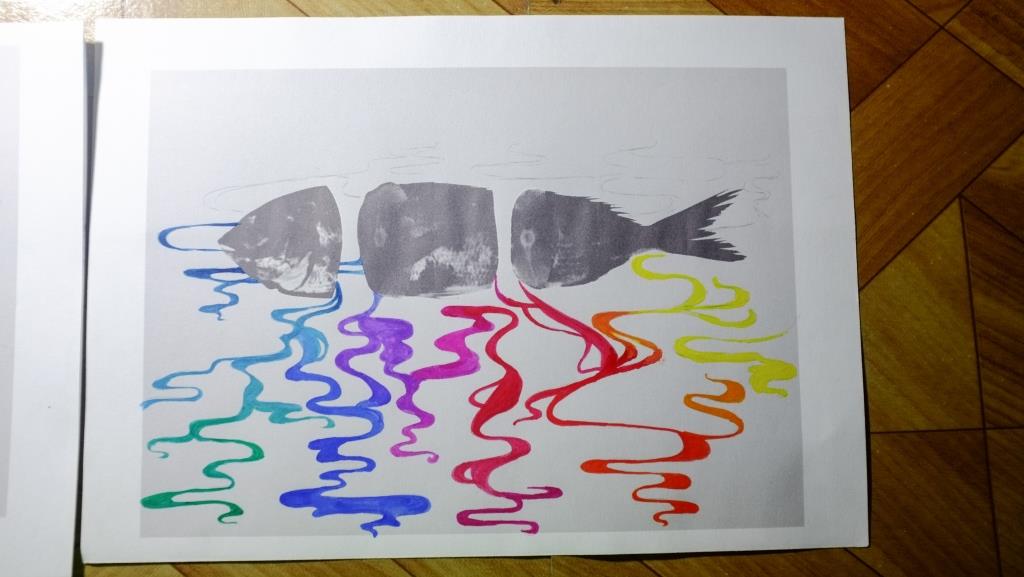
4.I am a… daydreamer
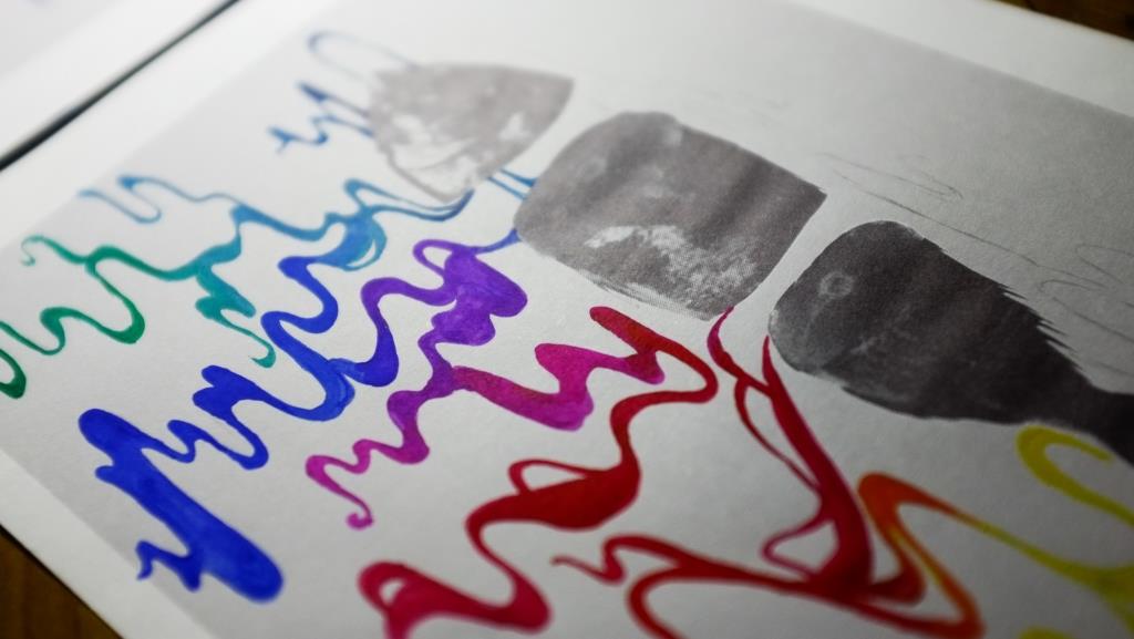
For the concept of daydreamer,my second trait, I decided to draw smoke to depict my name as it was dreamy and it was something that I liked to doodle when my mind was wandering. To add in the fantastical, whimsical element, I decided to add a photo of a fish to juxtapose with the hand-drawn, unreal feel of the smoke. The smoke was also depicted in bright colours to contrast with the black and white of the fish and the background.
Initially, I tried out gouache on paper but I didn’t like the result – it was hard to get a smooth layer of colour and the entire image seemed flat and dull. Some colours like the yellow also didn’t show very well on the grey background.
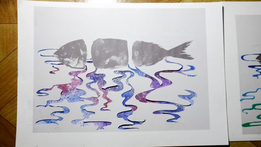
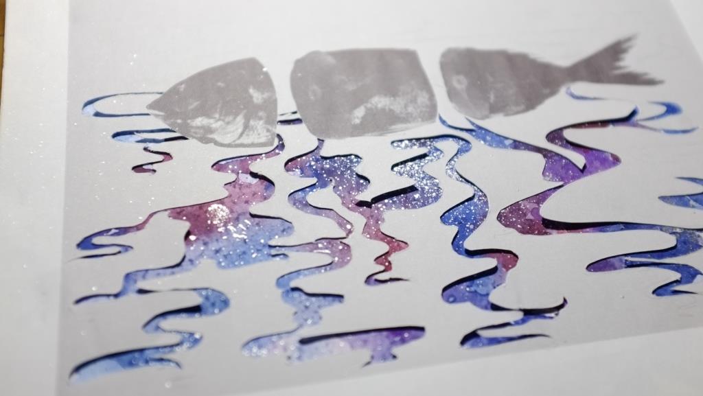
So I tried a different approach – paper cut. I layered the image of the fish with the cutting of the smoke on top of a piece of watercolour paper painted with watercolours and silver ink in various hues. Although I had to sacrifice some details in the smoke, I was able to vary the hue and saturation of the colours more to bring about more depth.
To link all the different concepts together, I decided to play on colour – I received feedback that all my traits had something to do with my introverted nature, hence I tried to juxtapose the black and white/ colour to show the difference between my outer and inner world. For example, the black and white letter maze in the first composition represented the words/ books I like to read, while the colourful gummy worms represent me happily immersing myself in the books.
For this project, I also stuck to a more photographic/ collage style as I wanted to try something a little out of my comfort zone.
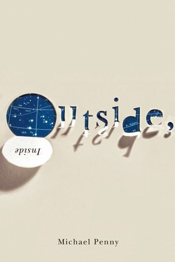
Typography – the visual representation/ reinforcement of the written word.
Hence
Methods:
Hannah Hoch
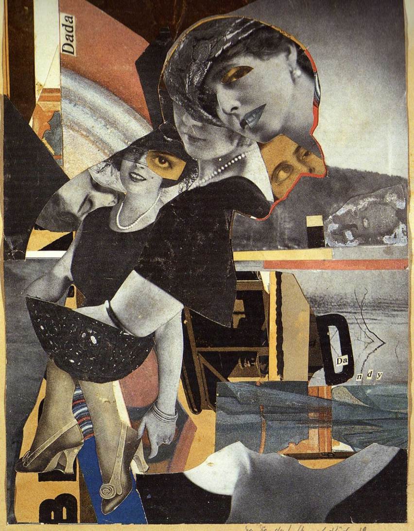
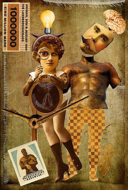
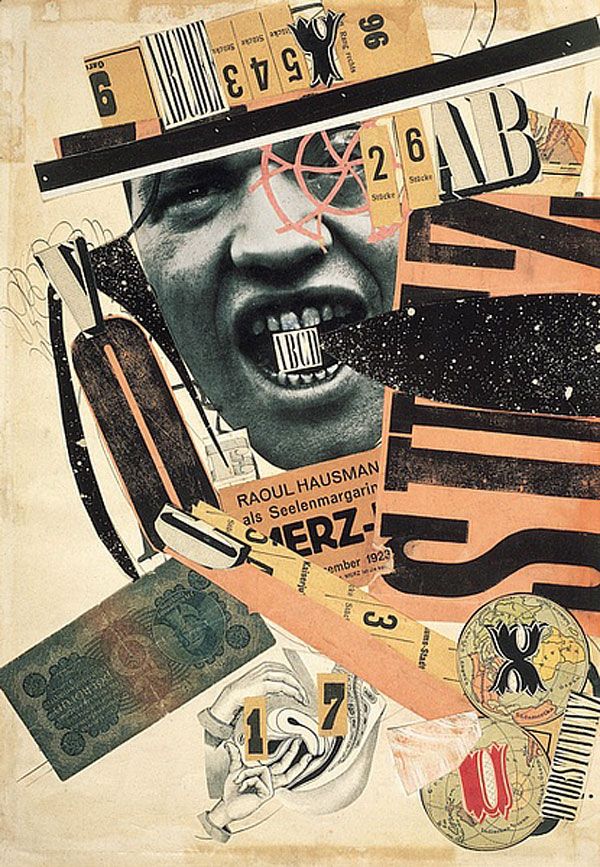
Hannah Hoch is one of the few rare female artists from the Dadaist movement, and as a German artist created many prominent works in response to the the horrors of WW1 and the discrimination she faced as a female in the Dadaist artist community. To me, I like how she pieces together disparate images from various different sources (often bearing no semblance to each other) to convey her message in a unique way.
Having experimented with digital collage last semester, I really liked the process of selecting and assembling images, as well as the end product – hence this might be a possible direction to take for my Project 1.
Handmade Typography
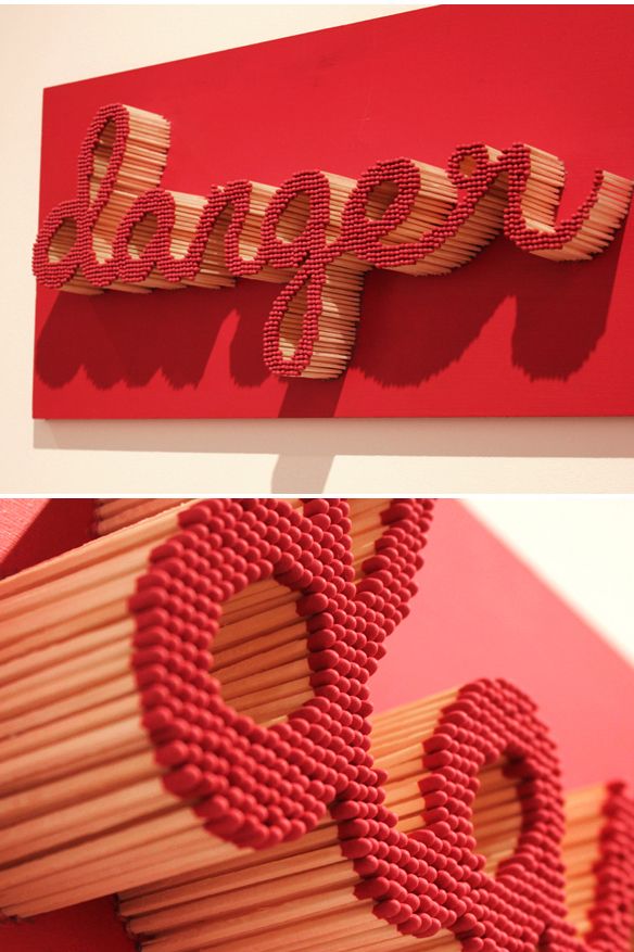
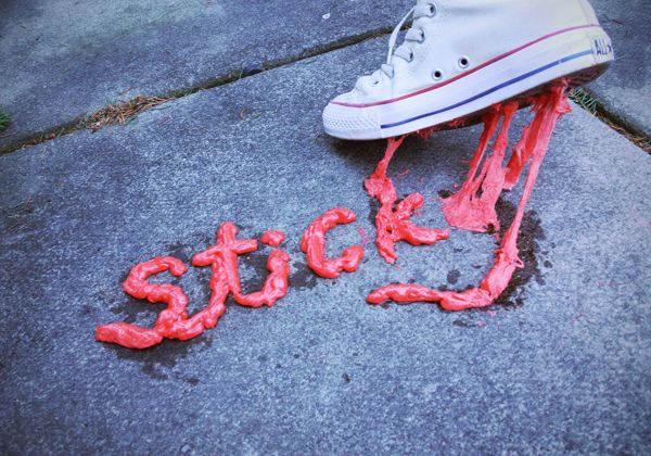
Out of all the different examples of handmade typography I saw online, these few examples stood out to me as the presentation of the type (i.e. typography) was not only interesting, different but also really effective and successfully reinforced the message portrayed by the type.
Hence I feel that for my project 1 to be successful, a clear message needs to be defined, with the presentation of the type streamlined to fit the message – so that the typography does not become a mere gimmick.
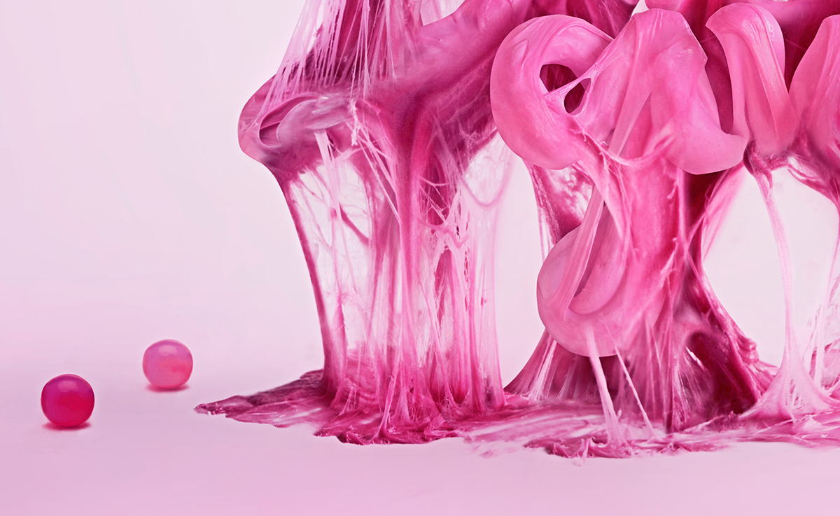
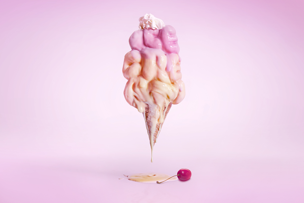
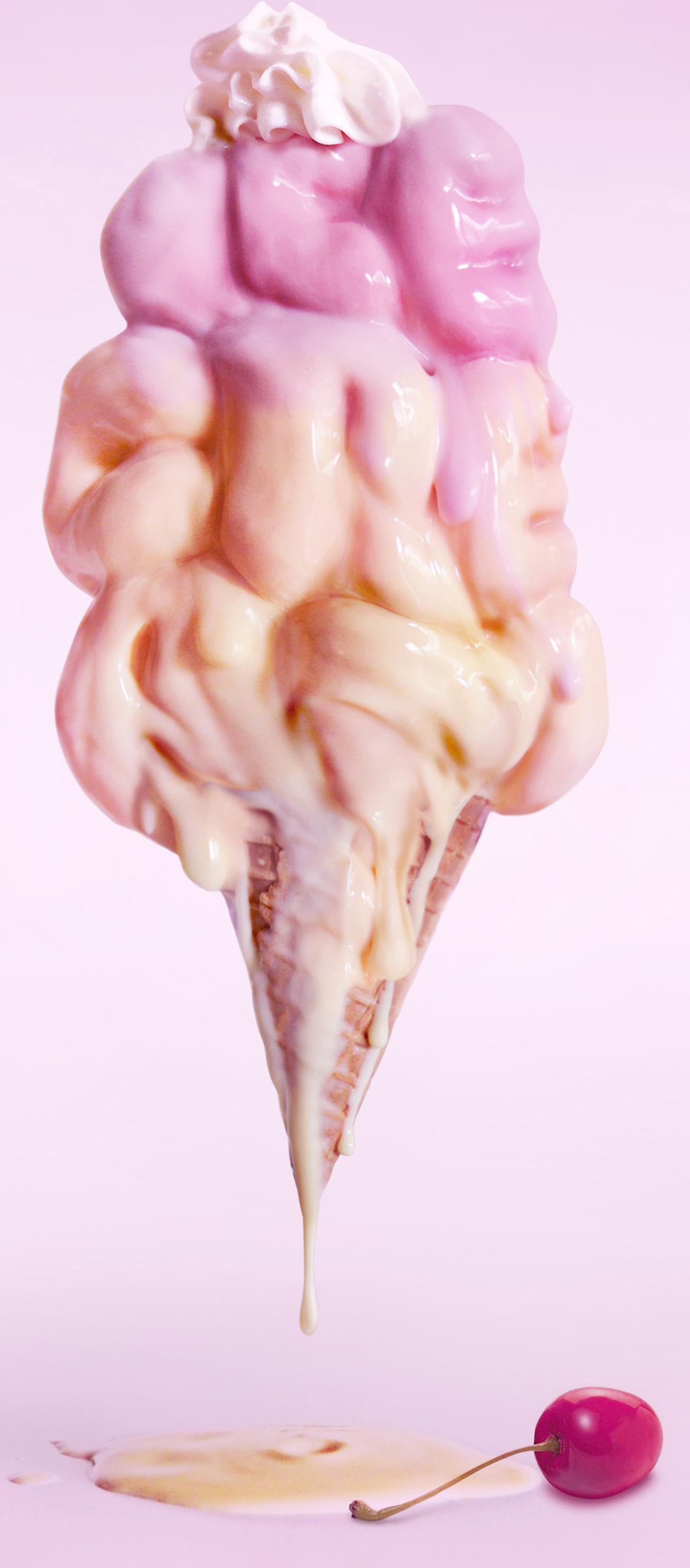
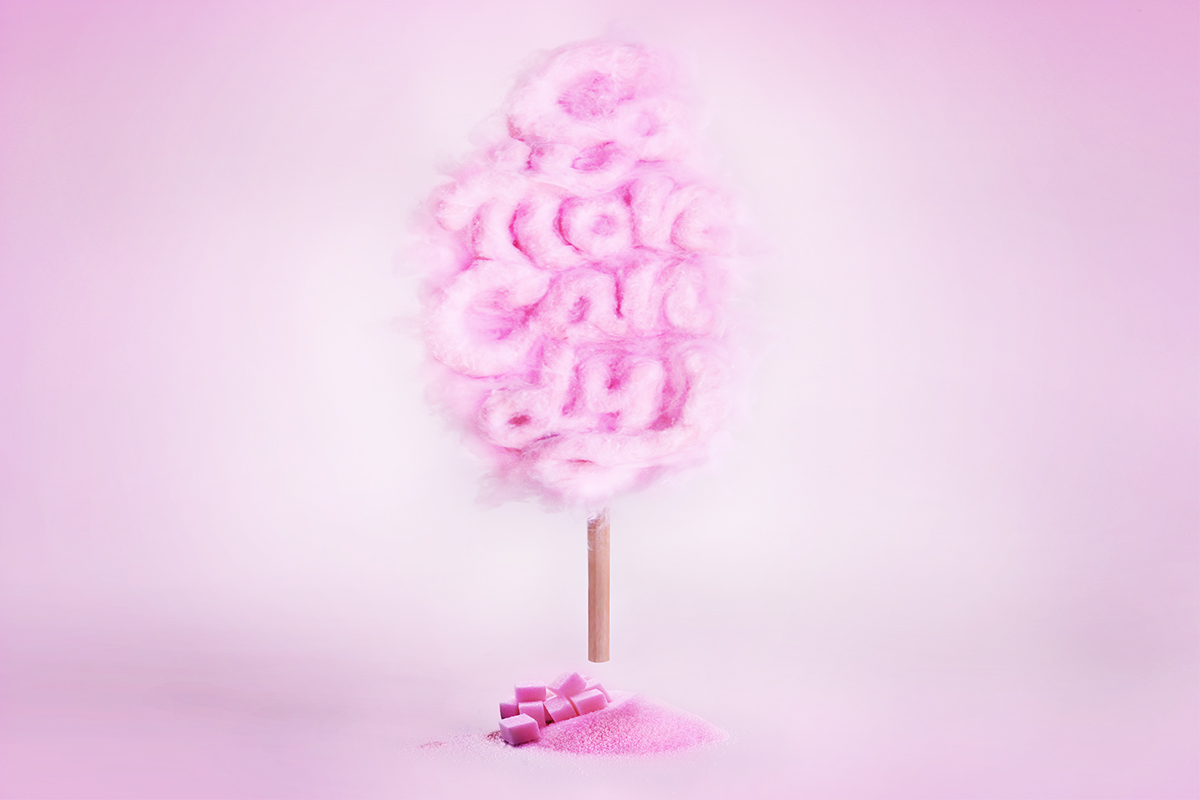
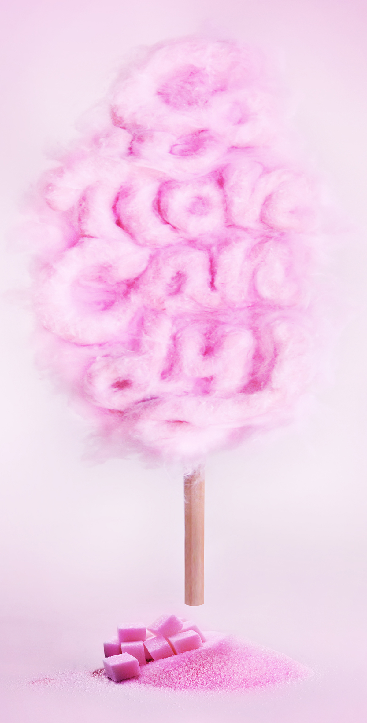
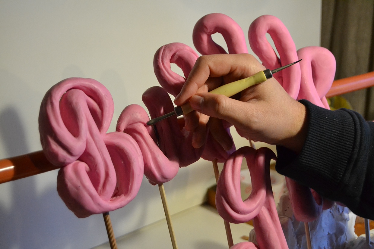
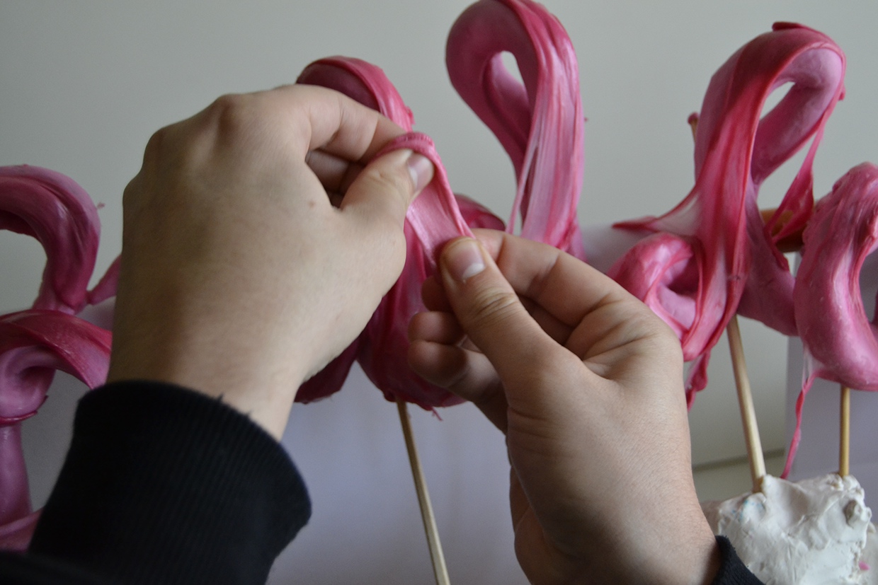
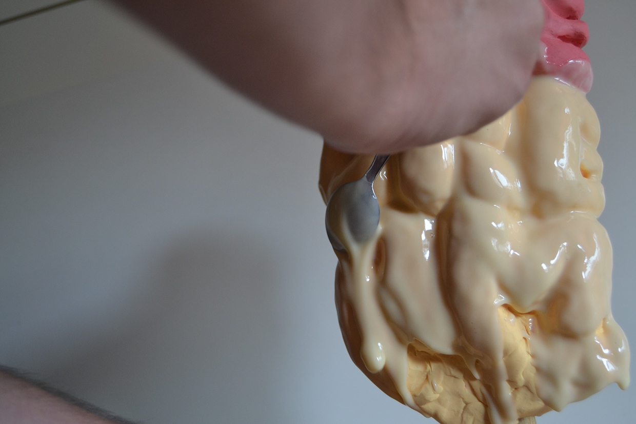
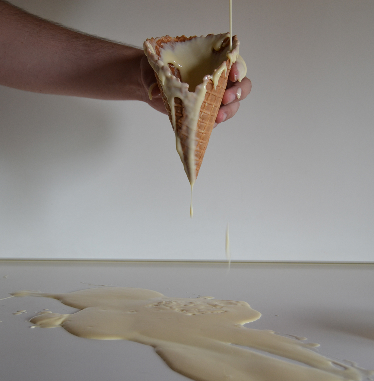
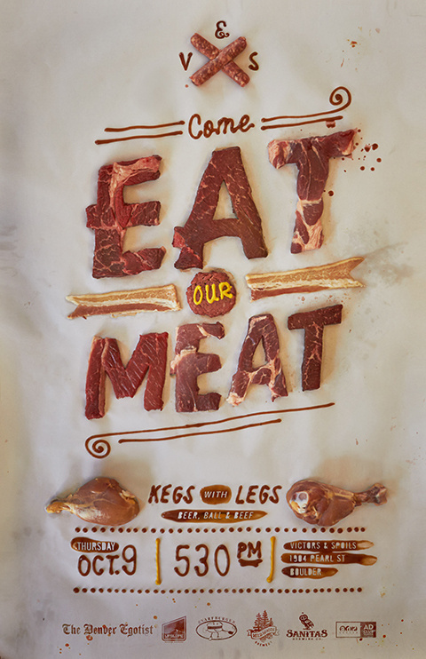
“Do not play with your food” #1 SWEETS AND CANDY by Alex Palazzi
Personally, I really liked this project as the focus on recreating the textures and look of the foods in the typography made the text more tangible and real to the viewer instead of being mere words. At the same time, the studio setup style of the typography background with the very consciously chosen colours makes the typography look unreal and fantastical. This creates a very interesting contrast in the portrayal of the words.
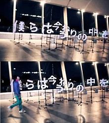
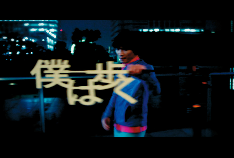
Personally this is one of my favourite examples of typography in video – the joining of seemingly random elements to form the characters creates a constant sense of surprise and suspense for the viewer, and it actually helps to create movement and flow throughout the entire music video. Hence, not only was the typography effective in conveying the song style and lyrics, it was able to adapt to the video format and add to it.
I found it interesting too how the director chose to add various elements of the type together, instead of cutting away (additive vs subtractive) as seen in the meat poster above. Hence, possible exploration can be done in this area to see how it affects the viewer(s)’ impression of the message portrayed.