Project 3 “Speedy Recovery” – Brainstorming and Development

Brainstorming and Development


After the initial visual research, I tried to branch out on the third concept as I felt that it was the one that most suited the brief.

I brainstormed out 2 ideas based on the mechanism of the pop up card: planets and oceans – as both were interesting landscapes that had elements that could be stacked against each other.

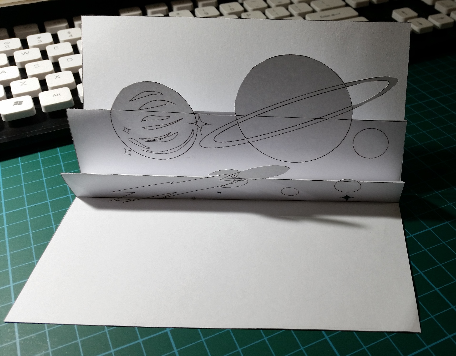
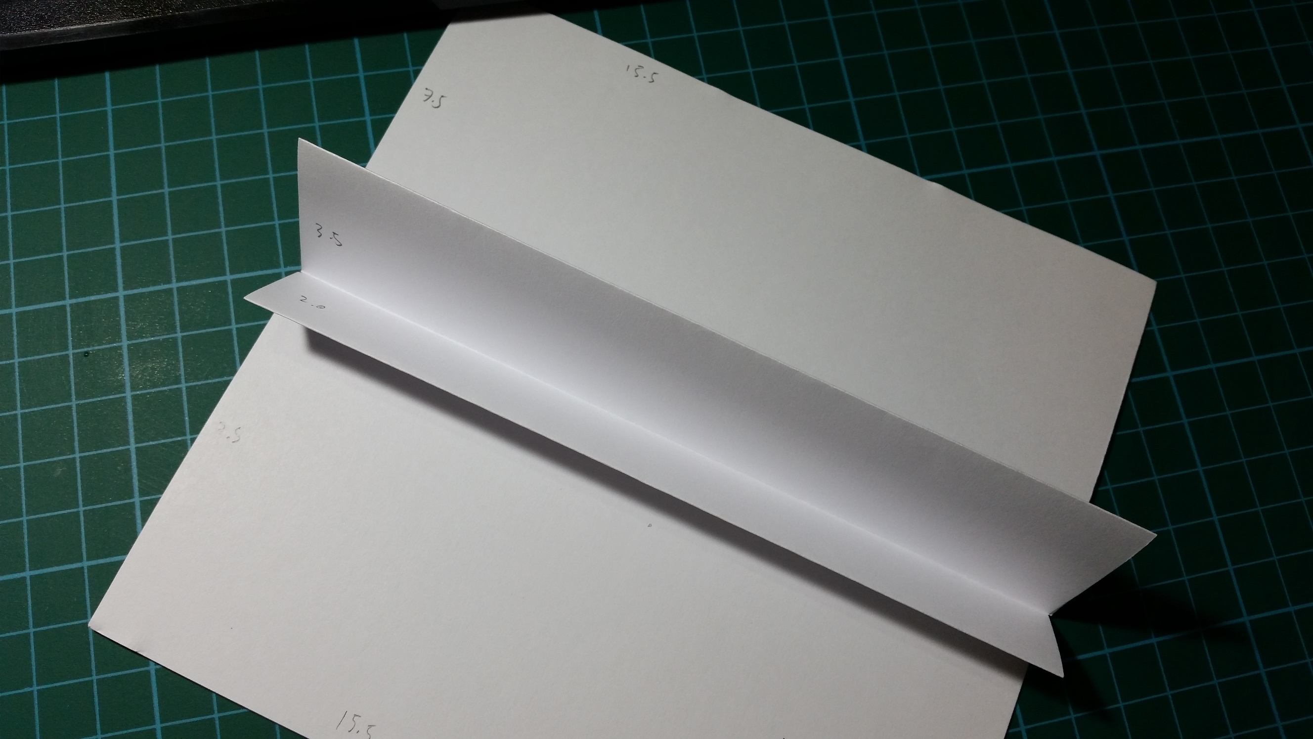
Based on these 2 ideas, I made 2 prototypes to try out the visual effect. I made a half-sized model to measure and check dimensions, then created the illustration draft based on those measurements.

20161114_224419

Prototype for initial measurements

The initial prototype for measurements was especially important as the illustrations had to stay within those boundaries, especially when folded together so as not to leak out of the card. At the same time, the different layers (I decided on 2) had to be balanced with each other propotionally so each had enough space to contain the illustrations but was also different enough that the stacking effect would be obvious.

After confirming the dimensions, I created the mini prototype with illustrations for each concept.

20161114_224339

01: Planets


20161114_224453

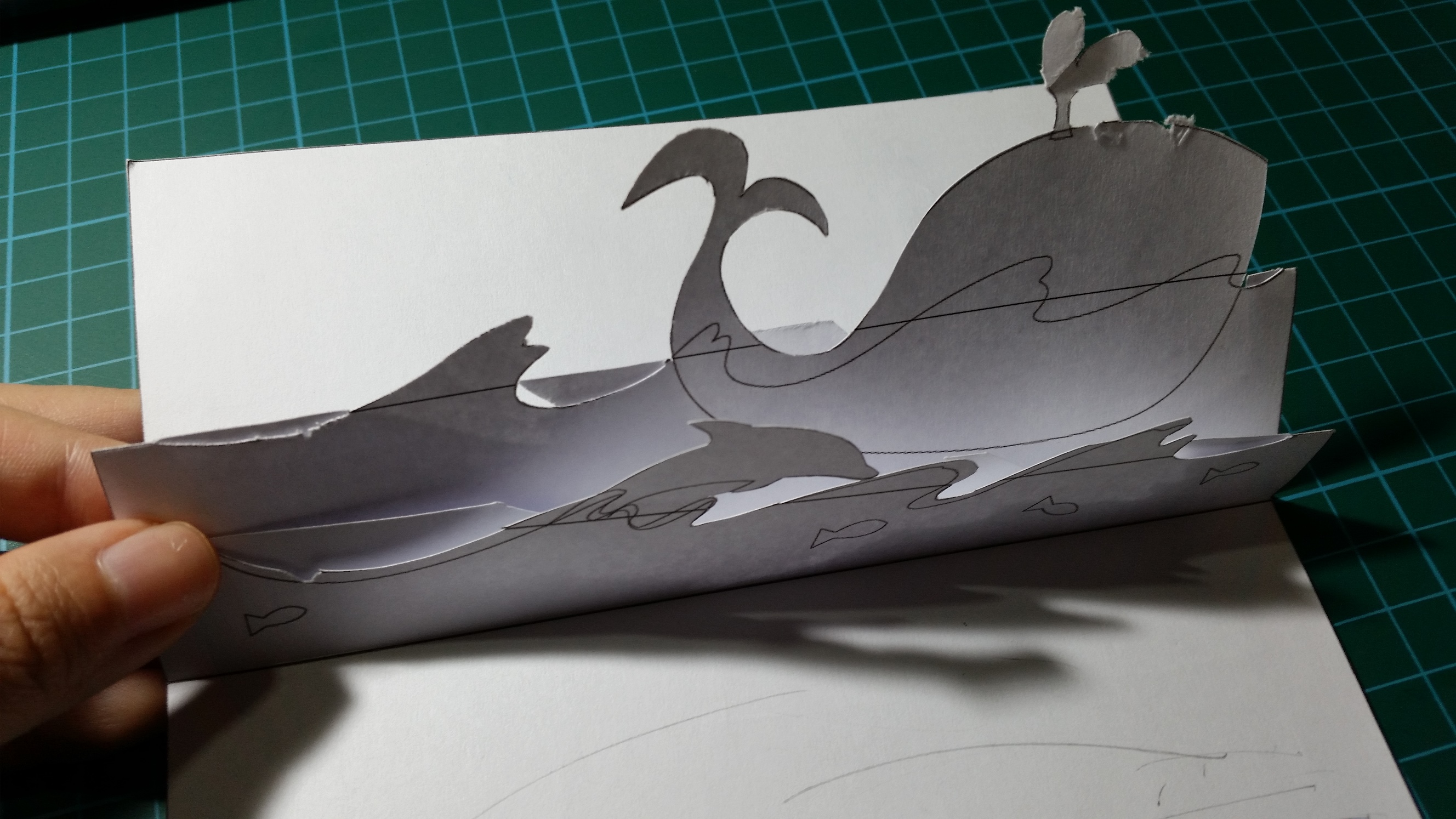
02: Oceans

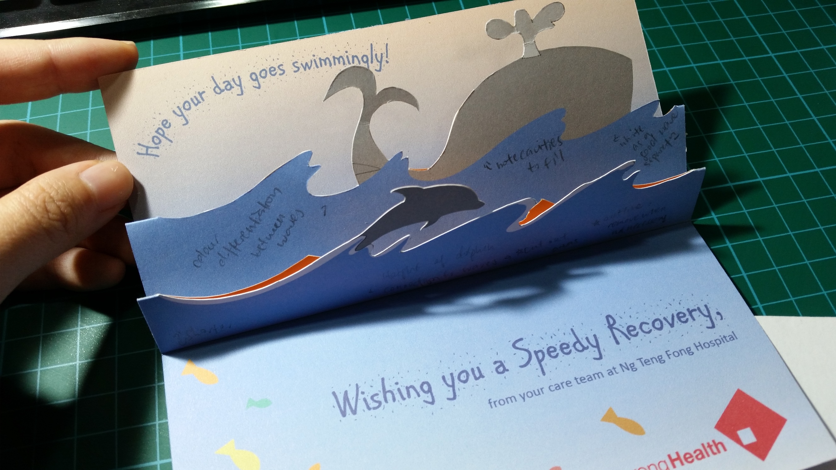
After feedback from class critique, it was felt that the second concept (oceans) fitted the brief better. However, while creating the prototype, I realised that the connectors were too small and thus made the pop-up very flimsy. Smaller parts such as the steam from the whale’s blowhole and the dolphin were also very fragile. Thus there was a need to revise the design to make it more secure.

Further feedback was also given that there could be a stronger narrative in the card to create better flow. Also, as I mainly focused on the mechanism itself, I now had to think about the placement of text and narrative.

20161114_224506

After the first trial, I edited the design, and added in the required body copy, sample text and logo. I tried to create some form of narrative as well in the form of an additional caption (hope your day goes swimmingly!) to tie in with the brief and the little fishes to aid the viewer in the reading order.
Project 1 “Therapeutic Graphics” – Initial Colour and Composition

After the initial experimentation with abstract compositions, I was dissatisfied with what I came up with and hence decided to branch into more narrative-based compositions.

I came up with a basic composition of a character within an imaginary landscape to create a dreamy atmosphere that the viewer could immerse within. To frame the image, I used the idea of a window-within-a-window by creating a porthole frame – to give the experience of peering out from a vessel (e.g. a submarine) to see new lands.

For the colour palettes, I picked colours from various nature photographs to compose a variety of colour palettes. Then I superimposed that colour palettes on the composition to test out the mood each colour palette could create.

Colour Palette

Colour Palette

(From top) Earth/Forest

Sky

Woods

Sunset

Colour Composition 1 (Earth/ Forest)

Colour Composition 1 (Earth/ Forest)

Colour Composition 02 - Sky

Colour Composition 02 (Sky)

Colour Composition 02

Colour Composition 03 (Woods)

Colour Composition 04 (Sunset)

Colour Composition 04 (Sunset)

Based on the critique from the class, most of them liked the second colour palette (sky) and thought it to be the most dreamy (and thus the most therapeutic). In contrast, many people found the presence of the figure slightly disturbing and to hold pretty negative connotations with regards to the viewer and the hospital environment – something that I didn’t really notice until I was done with the work.

Hence, I decided to

  1. Branch out on purple/ blue colour scheme
  2. Do up a more general landscape (without the character)

(to be continued in next post!)

Assignment 3 “Ego” – Project Prep

colorstar

Colour – the visual perception of electromagnetic radiation by the eye that falls under the visible light spectrum; it is a continuous spectrum of colours varying from red (infrared) to violet (ultraviolet).

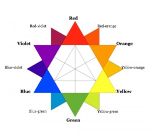
Between the colours red and violet in the visible spectrum of light, the continuous variation creates an infinite number of colours of varying shades, saturation and vibrancy. Hence, I will discuss a few basic colours and 2 basic colour systems right under the cut!

Continue reading