The first equation: introversion + eccentricity = me
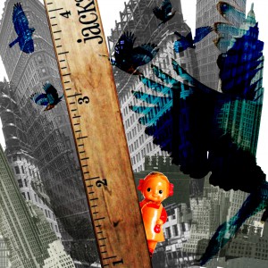
Introversion: To create the image of introversion, I tried to juxtapose the element of the little doll (representing me) and her surroundings by varying things like colour (contrast between warm and cool colours) as well as scale. The blue birds were also added in overlay to emphasize the small size of the doll and the contrast between the warm reds and cool blues.
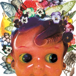
Eccentricity: For eccentricity, I wanted to express the concept of different weird and interesting ideas popping into my head at random – hence I tried to vary my use of colour instead of restricting it to a specific colour palette to reflect the diversity and eccentricity of thought. More vibrant and saturated shades of colours were used as well, including bright crimson, yellows, purples, greens.
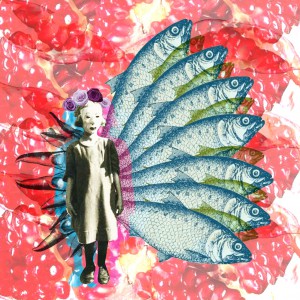
Me: To reflect an amalgamation of the concepts in the previous two compositions, I adopted the red/warms colours-blue/cool colours contrasting palette with the main figure in black and white to stand out by contrast. The black and white of the figure was also adopted to imply the versatility of the self; to become one projected image or another (represented by the different colours) but still maintaining an inherently core essence. I felt that the black and white also helped to bring out the red blue contrast as well.
The second equation: social circles/sociability – anxiety = a better me
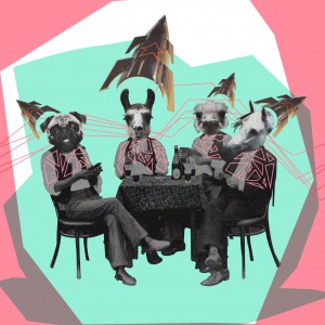
Social circles/ sociability: For this composition, I tried to go for a more quirky, light-hearted colour scheme to match with the whimsicality of the vintage collage image (of the group of friends at the table). Hence, I picked pastel, lightly saturated colours that still had a strong contrast with each other (mint green/rose pink) to invoke the playful mood that I wanted the image to have. The playfulness was also recreated in the use of kaleidoscopic triangles and polygonal shapes, as well as the jagged lines in the background to inject a sense of energy into the composition.
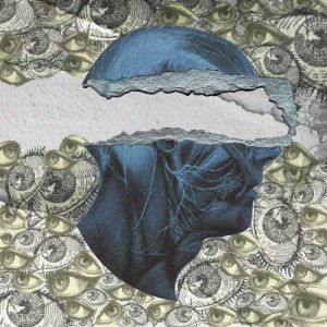
Anxiety: To express the feeling of anxiety, I picked three colours – grey, blue and yellow. The grey was supposed to be the dominant tone of the composition – to create a hazy muddy effect to express one’s unclear mind when being anxious. The blue was used to signify the negativity and loneliness when being anxious, and also to project an overall cool tone to the image. The yellow was an interesting experiment for me – I wanted to use the colour yellow as I liked its association with cowardice (I felt that it fitted well with my concept) but I was worried that the brightness and positive vibe of the colour would change the meaning of the image. In the end, I chose to tone down the saturation of the yellow a lot, almost mixing with the grey tones and thus allowing the more saturated blue to take dominance.
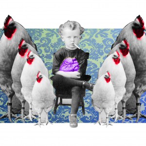
A better me: Although I also used grey tones and blues in the composition, I tried to use them with the elements in the image to portray a different concept. For this image, I wanted to portray a feeling of comradeship and new found confidence – the blue and greys in this image thus referred to the calm, cool and impassive demeanor of the little kid in the centre of the composition. The kid is also flanked by chickens (representing a coop of friends) and I used a bright red to bring some positivity to the image and invoke some sense of camaraderie. At the same time, the purple in the heart is used to symbolise a mixture of the two colours (red and blue) to represent the best of both worlds.
The third equation: time management + curiosity = an ideal me
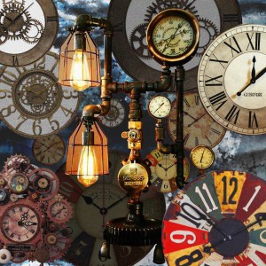
Time management: To create the impending rush of deadlines, I juxtaposed clocks of various types, sizes and scale to create an illusion of depth. For the background, I chose to adopt a cool colour palette with dark blues and greys to contrast with the warm tone of the clocks in the foreground. This allowed the clocks to pop out more despite the chaotic nature of the composition. Some clocks were also intentionally desaturated to bring down the colour contrast and to make it belnd more naturally into the background to create a sense of depth.
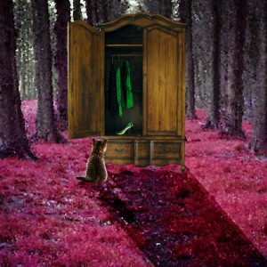
Curiosity: For this composition, I tried to my own interpretation of the saying “curiosity kills the cat” – I contrasted the bright purple/violet of the forest background with the green items in the closet to create a strong contrast and thus invoke a sense of curiosity. Conversely, the cat and the closet, being lesser subjects in the composition, had more natural, less saturated contrast to maintain the focus on the green/purple.
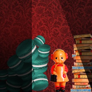
An ideal me: I wanted a feeling of positivity and energy for this composition; thus the use of red hues and overall warm tone of the composition. As the books and macaroons represented work and play respectively, I made the macaroons a bright cool turquoise to show how too much play can subtract from the ideal self (represented by warm tones). The area around the doll was also intentionally made brighter to place focus on the doll and her mischievous expression.
The fourth equation: wanderlust + self-exploration = me in five years
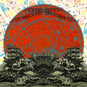
Wanderlust: For Wanderlust, I didn’t want to use the typical green-blue tones of the world map/globe to represent as I felt that it was too restrained and didn’t really fit with the concept of wanderlust I wanted to portray. Hence, I decided to go with a bright coral to invoke the feeling of a setting/rising sun and the cool tones in the foreground and lines to balance out the large portions of red. For the background, I used a map with bright colours but amped up the white balance such that the colours appeared pastel and overexposed; this was to maintain the brightness and variety of colours in the background, while not allowing it to dominate the foreground image and thus make the focus of the composition too muddy.
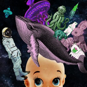
Self-exploration: The colours of this composition were blue, purple and green; the blue was used in the background to invoke the feeling of deep space and unexplored territories and the purple and green to represent the unknown – purple and green were a popular colour combination in vintage pulp fiction/ sci-fi book covers to depict weird creatures or aliens. Hence, I decided to use this highly contrasting colour combination to represent the unknown depths of the mind and the creatures that might lurk within. However, to keep things interesting, I tried to vary the hue, contrast and saturation of the colours used to still provide a sense of variety despite the binary colour palette.
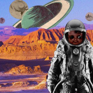
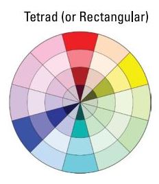
Me in 5 years: The main colour palette that I chose for this would be orange, blue, green purple – this tetradic colour combination was designed as an extension of the colour scheme in the previous composition, but adding on layers of complexity to invoke the feeling of maturing after a 5 year period. The colour orange was chosen as a dominant colour as it combined together with the image of the terrain to create an environment similar to Mars (or some weird off-world planet) which was the emotion that I wanted to evoke as a symbol for charting new territories. The blue and green served as little balances on the cool side of the colour palette to prevent the heavily saturated orange from dominating the composition.
