Zine – Concept
(cont’d from part 1) ONTO PART 2!
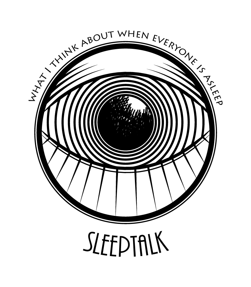
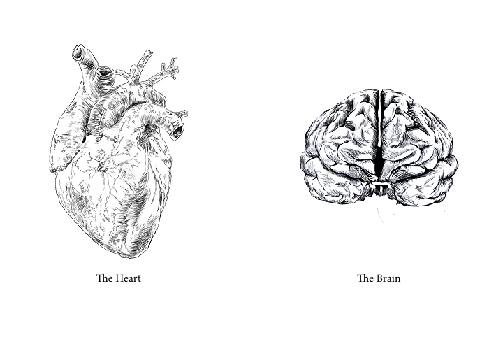
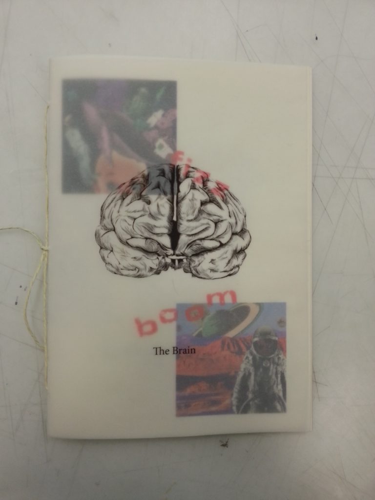
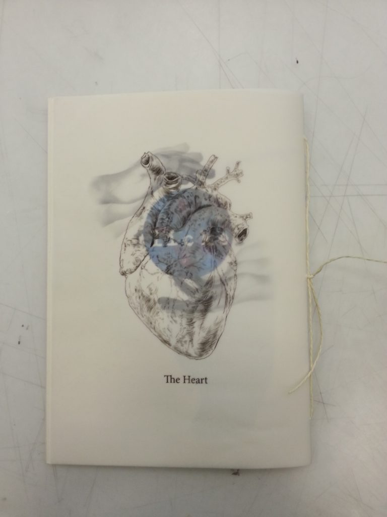
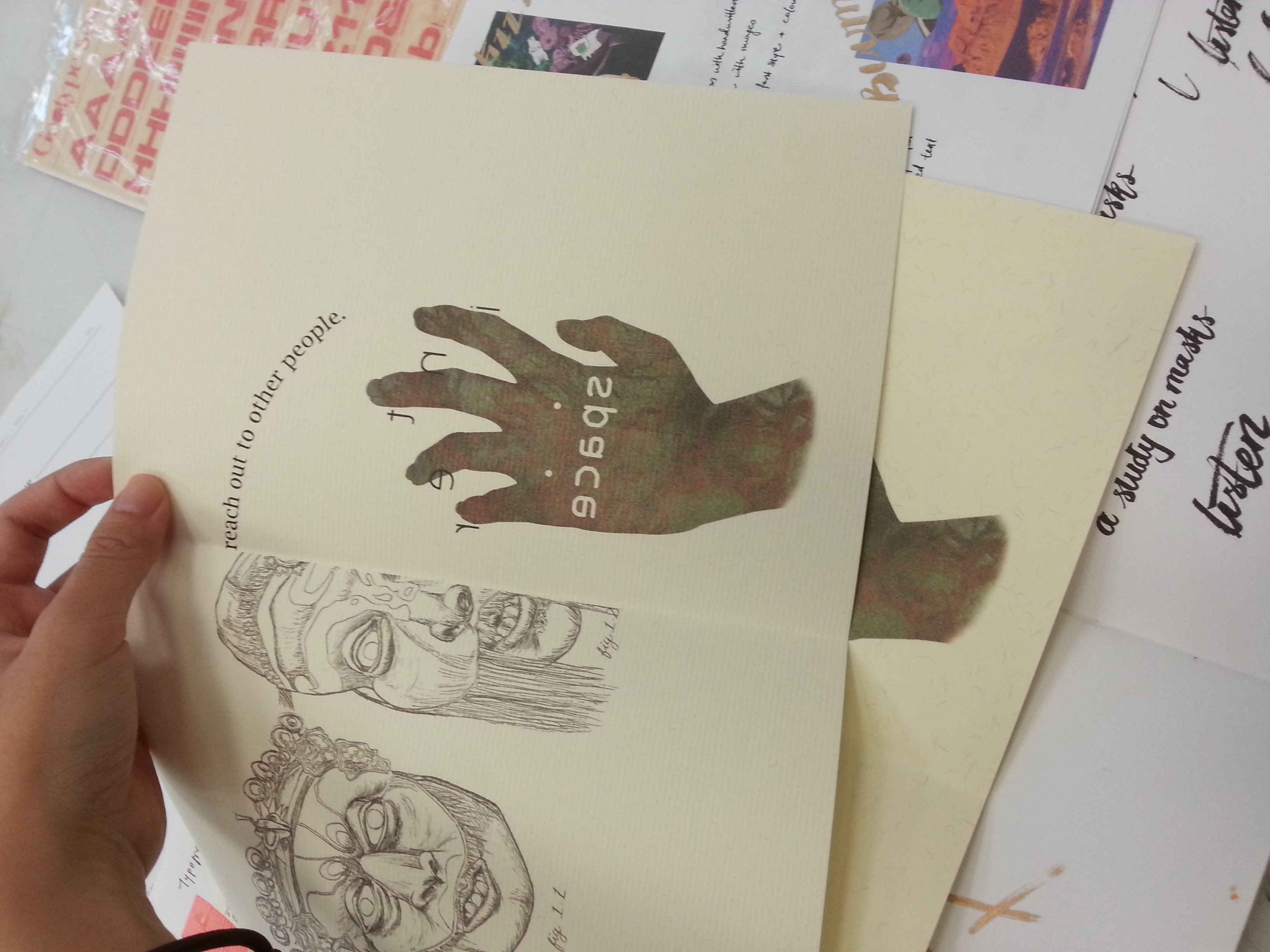
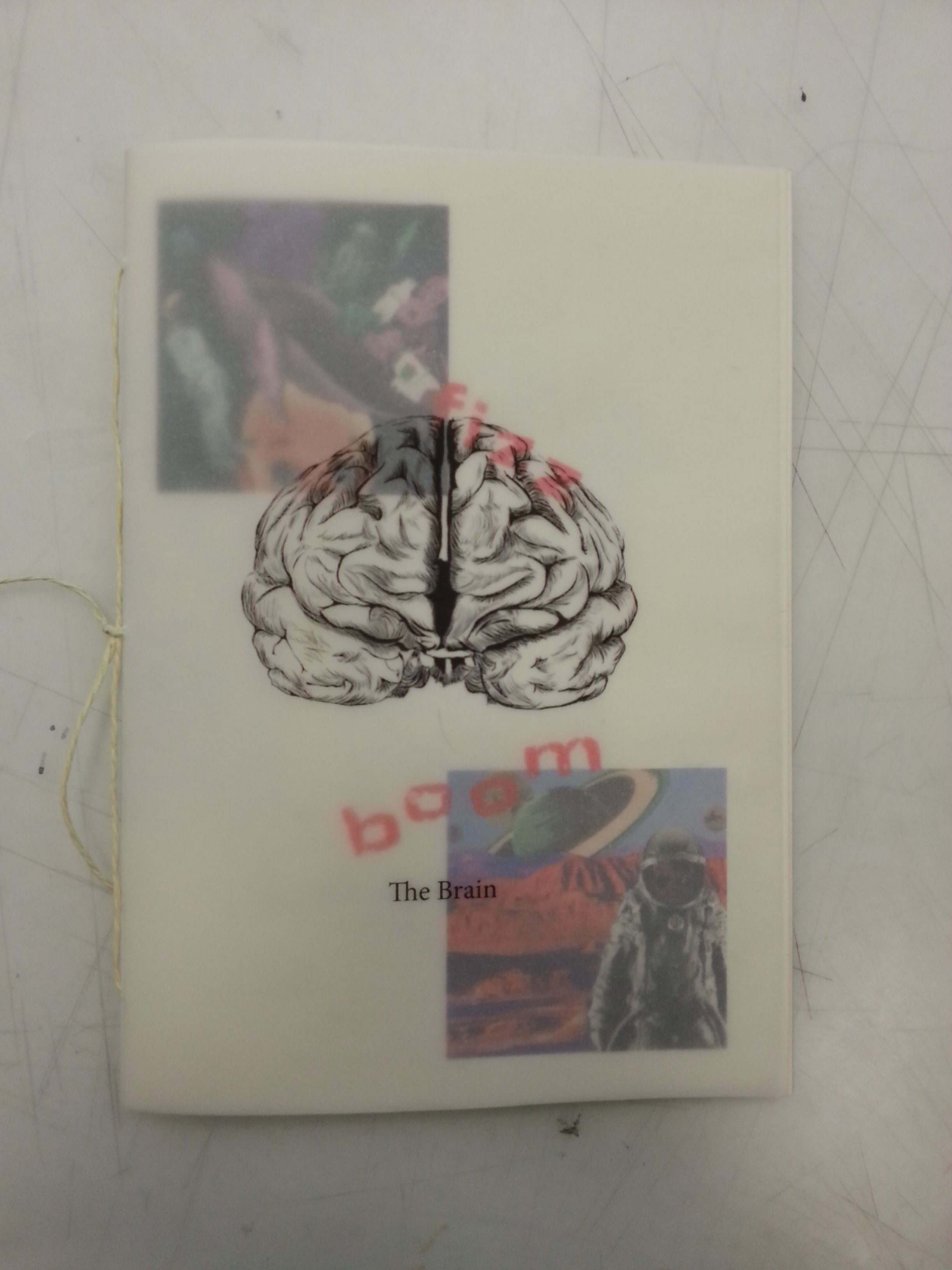
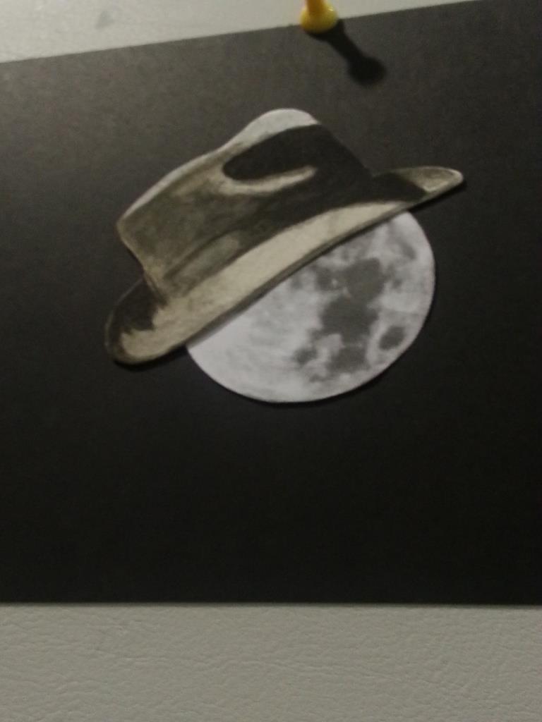
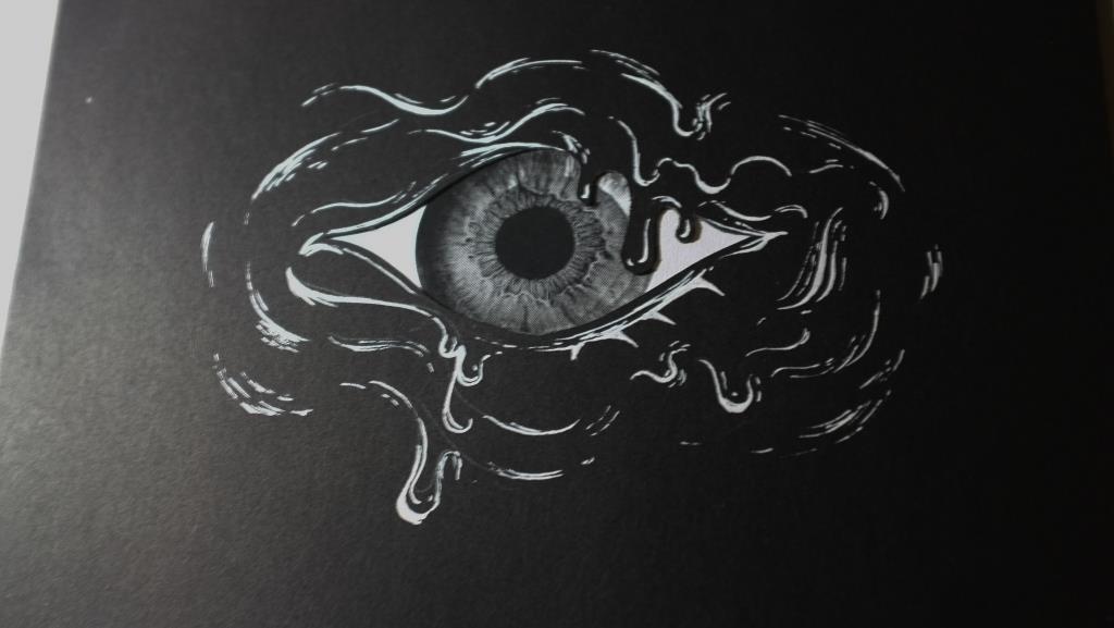
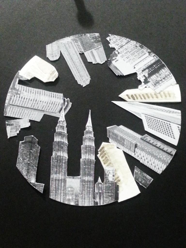
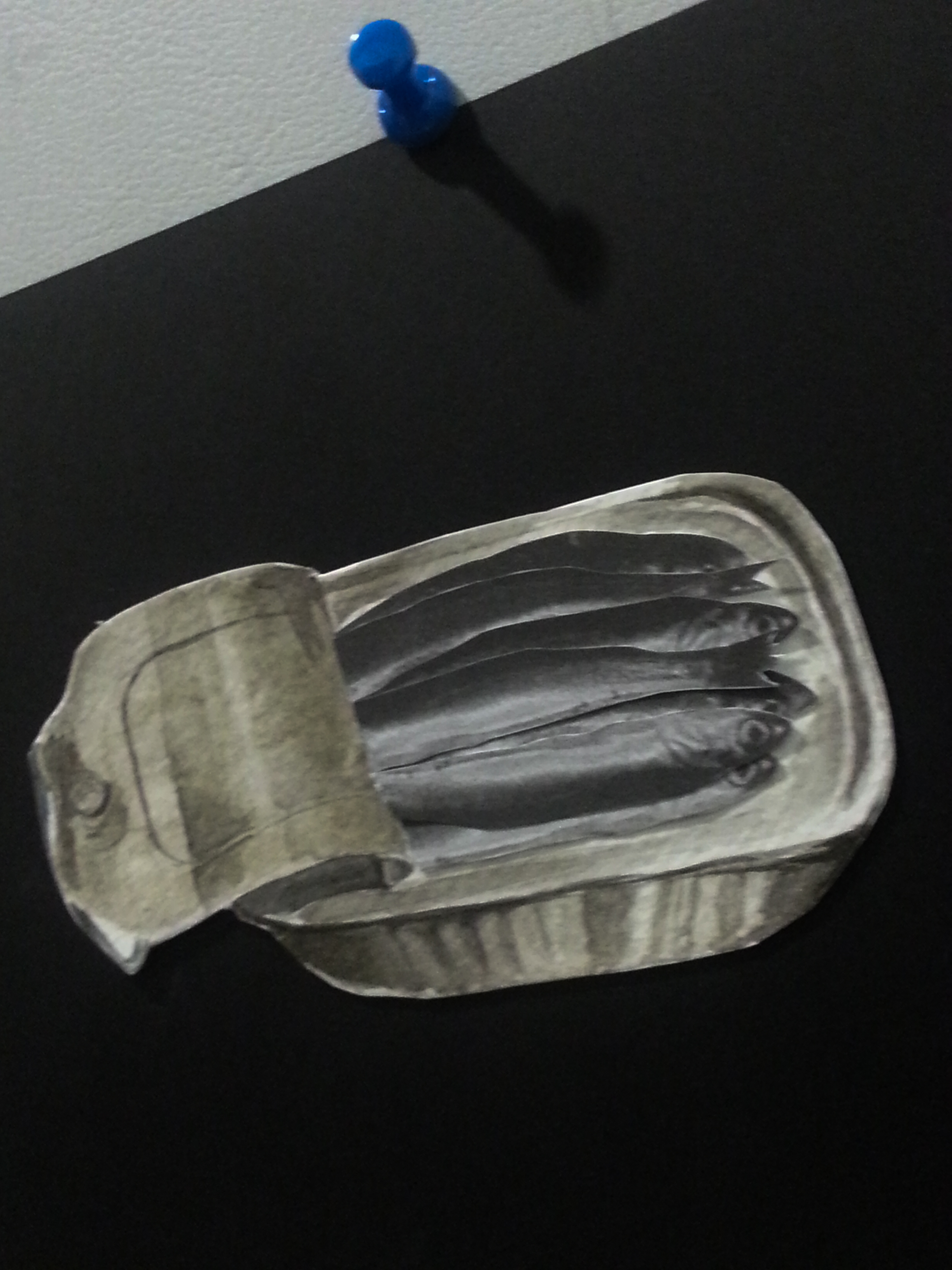
After developing the overall theme, I selected a few works (both personal and for school) that I felt fitted the theme better – I decided to organise the zine into 2 parts: The Heart and The Brain. The Brain contained the more whimsical, fun works while The Heart contained works that were more introspective in nature.
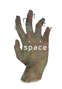
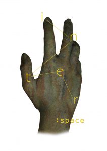
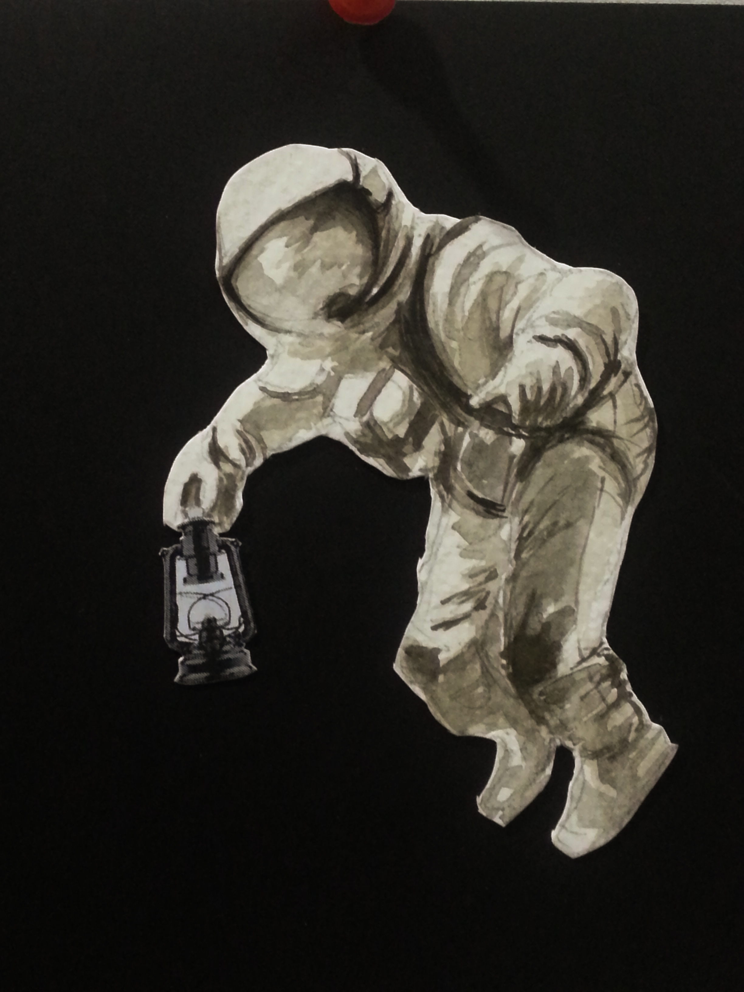
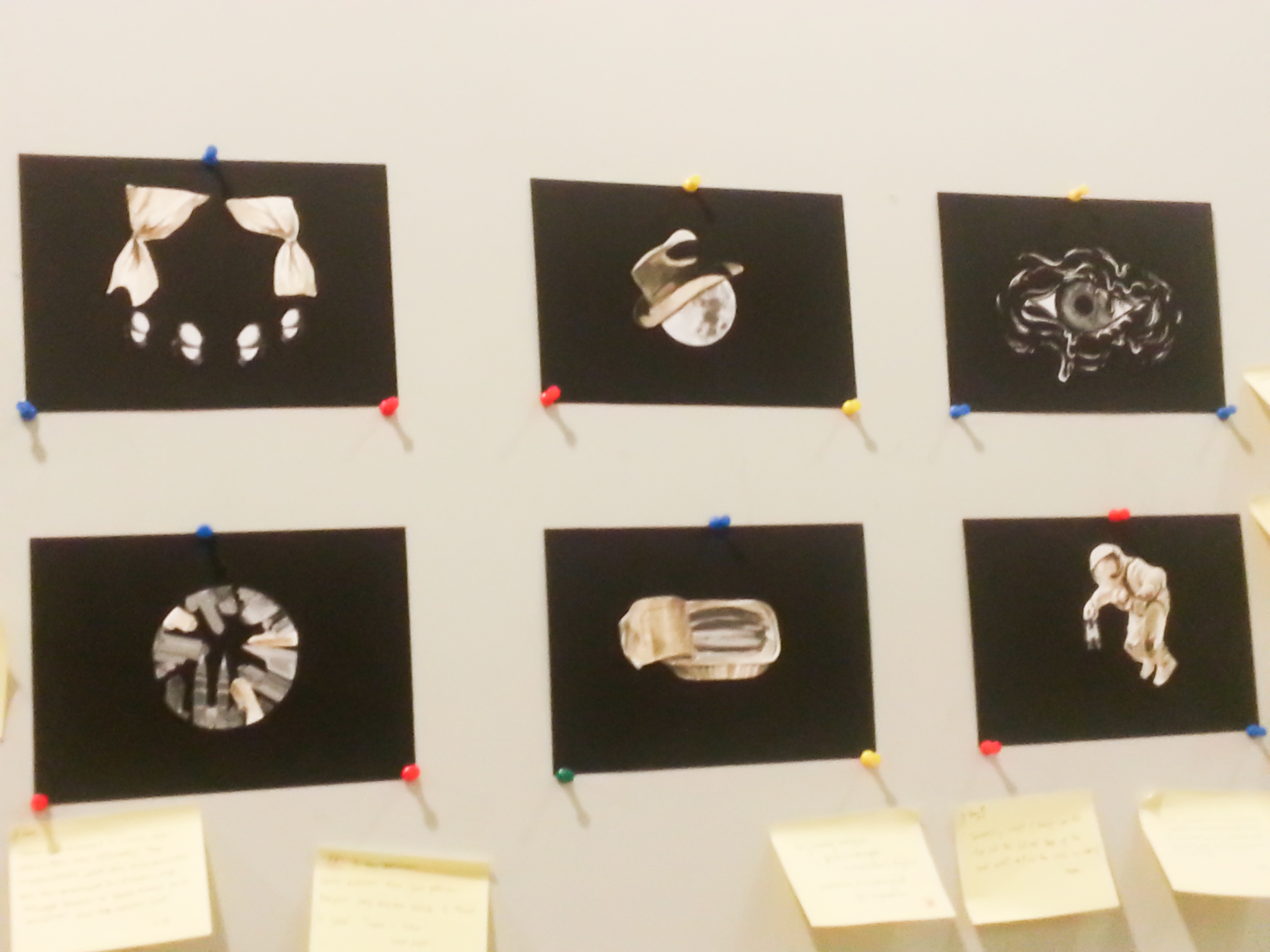
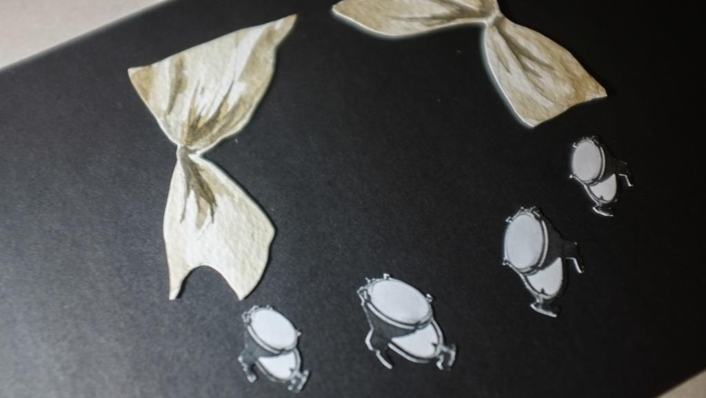
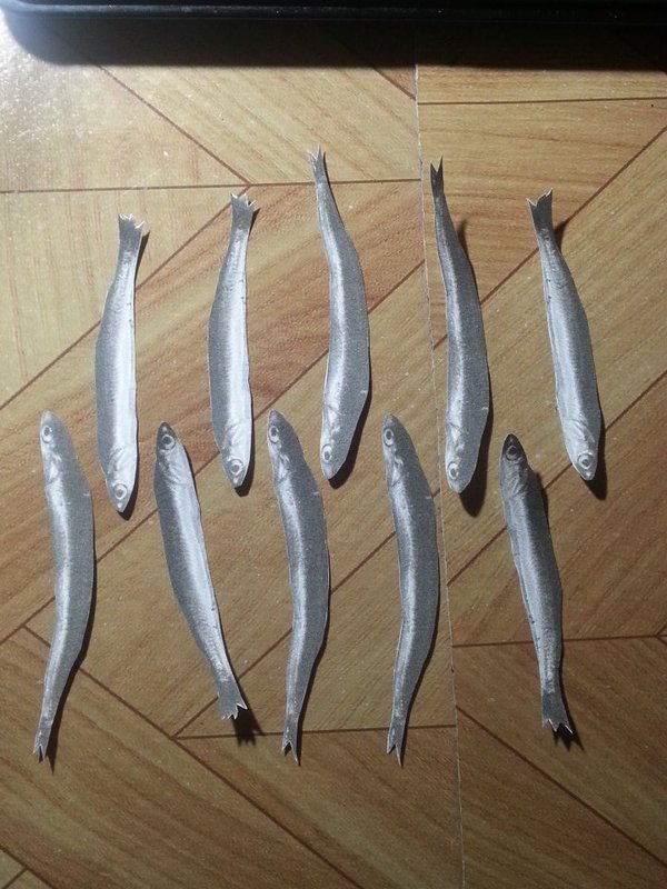
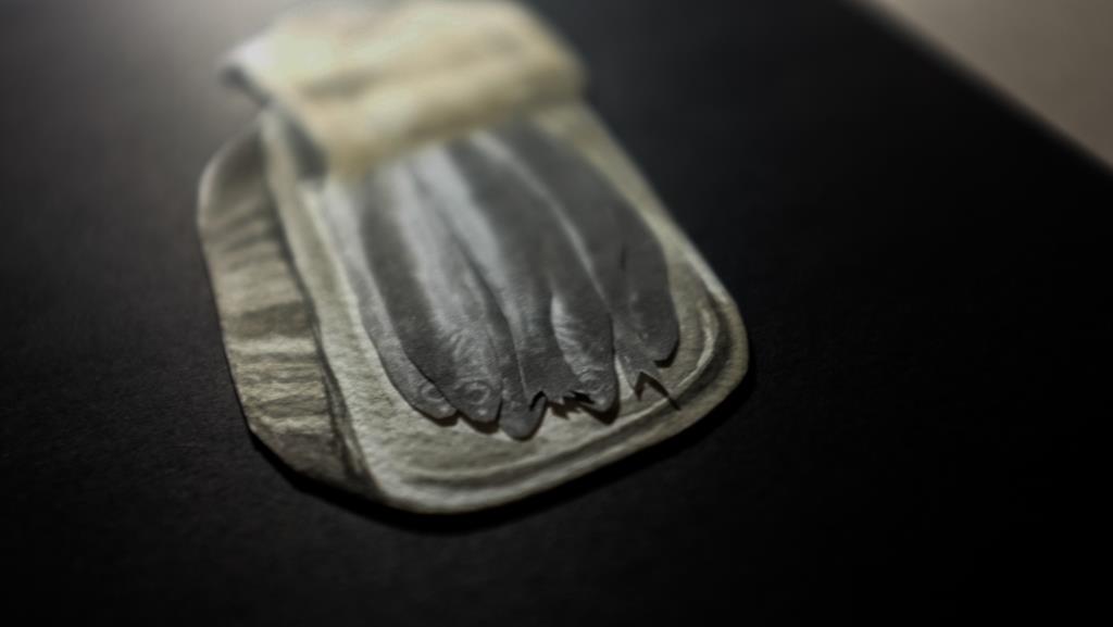
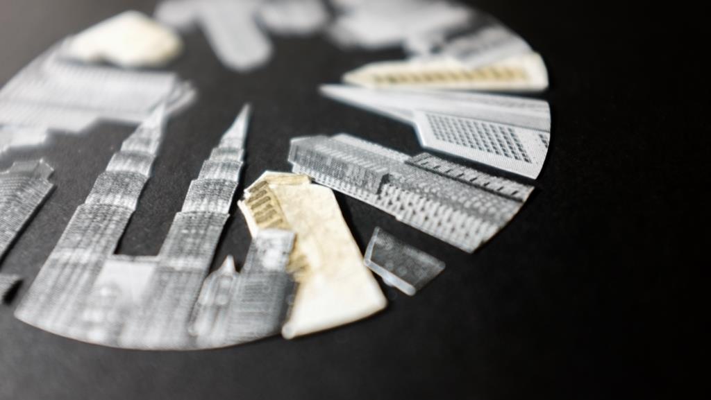
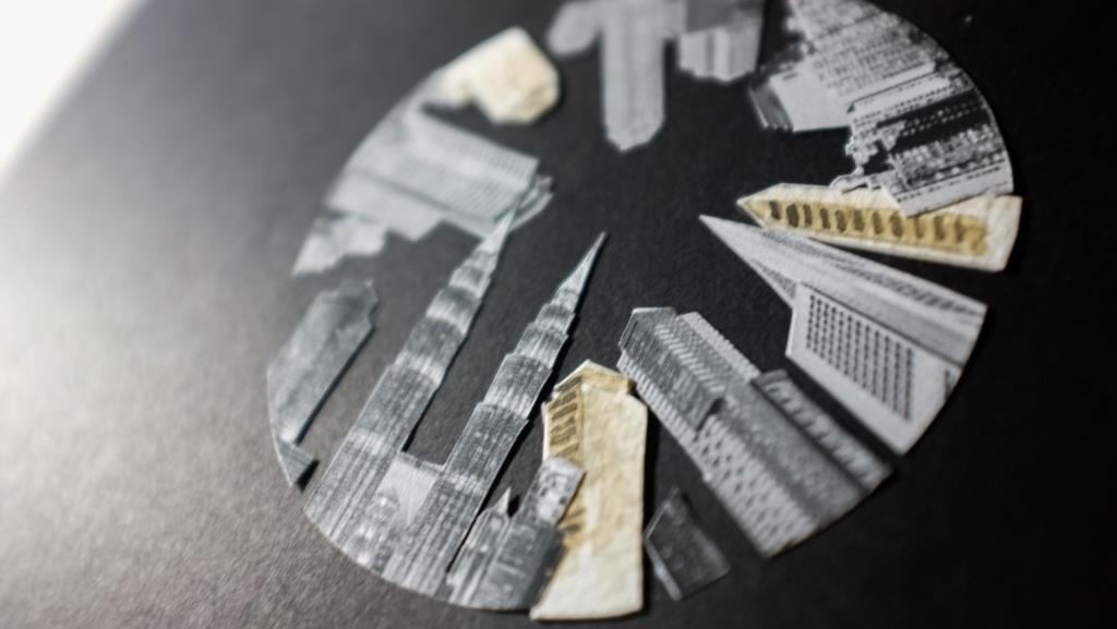
For the works, I selected a mix of photography, collage and illustration to create more variety in the zine.
These 2 designs were actually logos/ promotional material that I did for my friend! They didn’t get selected eventually, but I really liked them so I decided to put them into my zine.
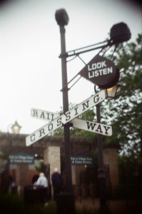
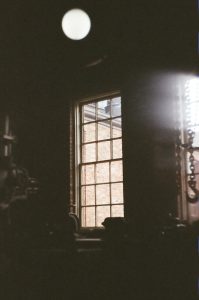
I also added a few of my personal film photos
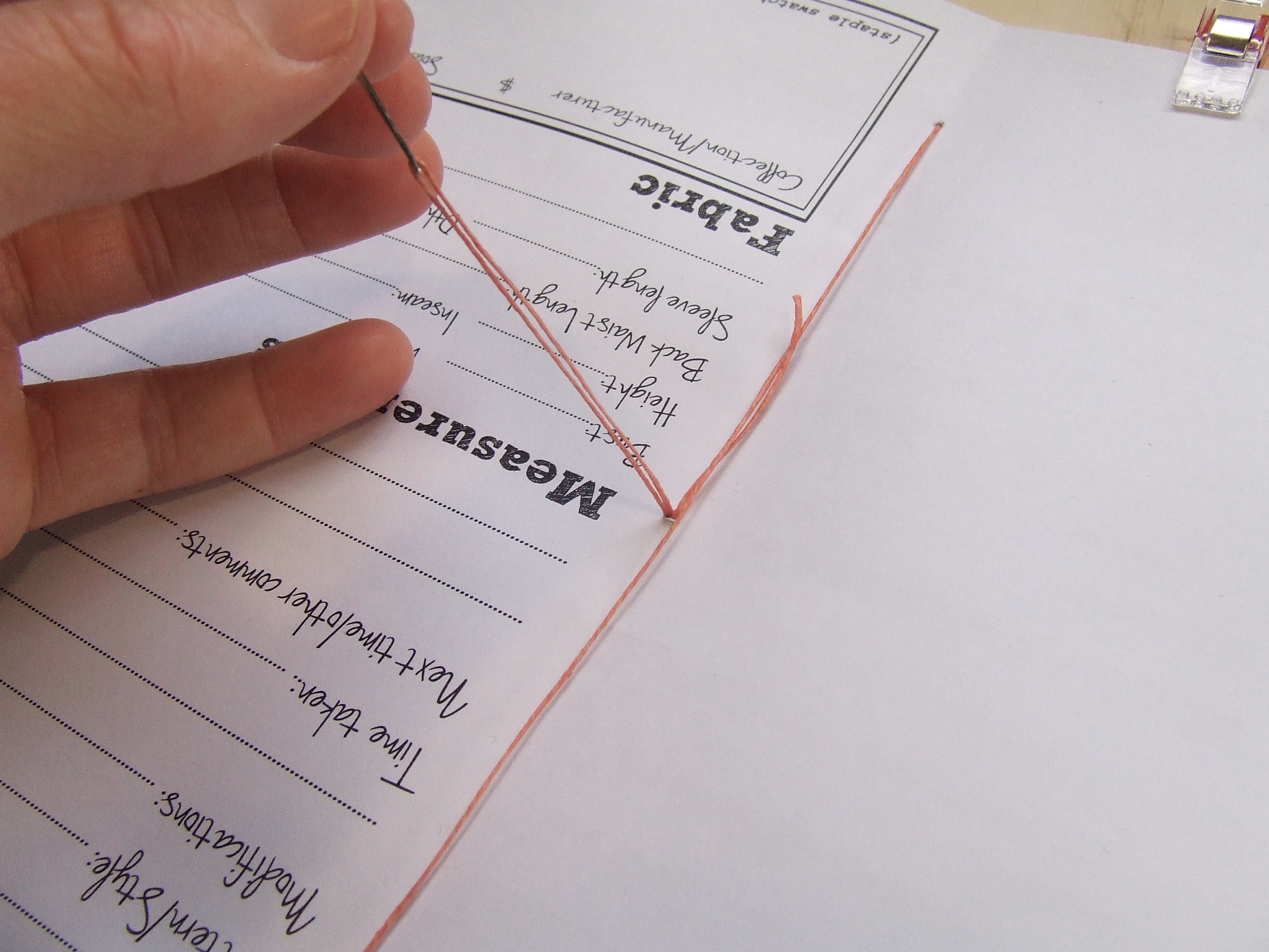
I also experimented with hand-binding, as I liked the handmade effect that it had which I felt gave the zine more personality. Unlike the tutorial which I used (here!), however, I used rough twine to add to the rough, handmade style that I was going for. I also switched the orientation of the booklet (inside becoming outside) as I preferred to have the last knot on the outside of the booklet – something which I found out after doing a mockup.
(From https://sewcompelled.wordpress.com/2013/03/15/saddle-stitch-bookbinding-tutorial/)
The switching of the orientation was also inspired by the group critique (thanks Heng Tong!) who suggested that I did a double cover zine to fit my zine format better.
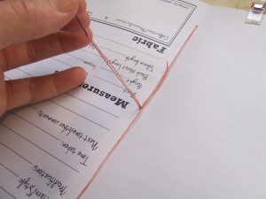
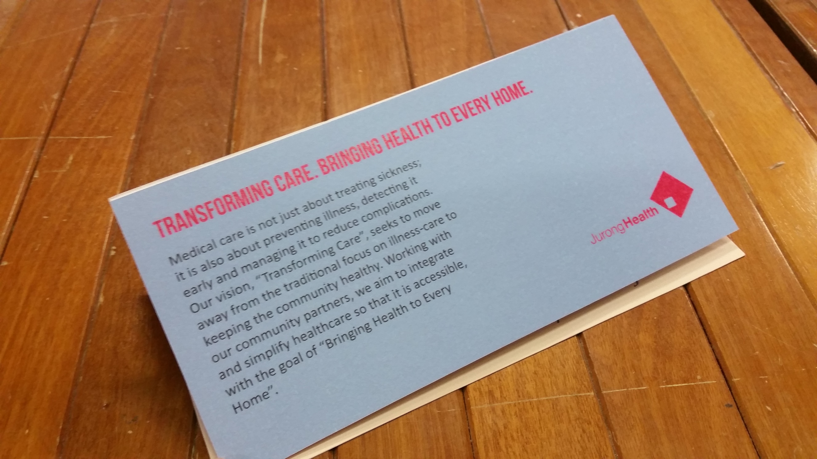
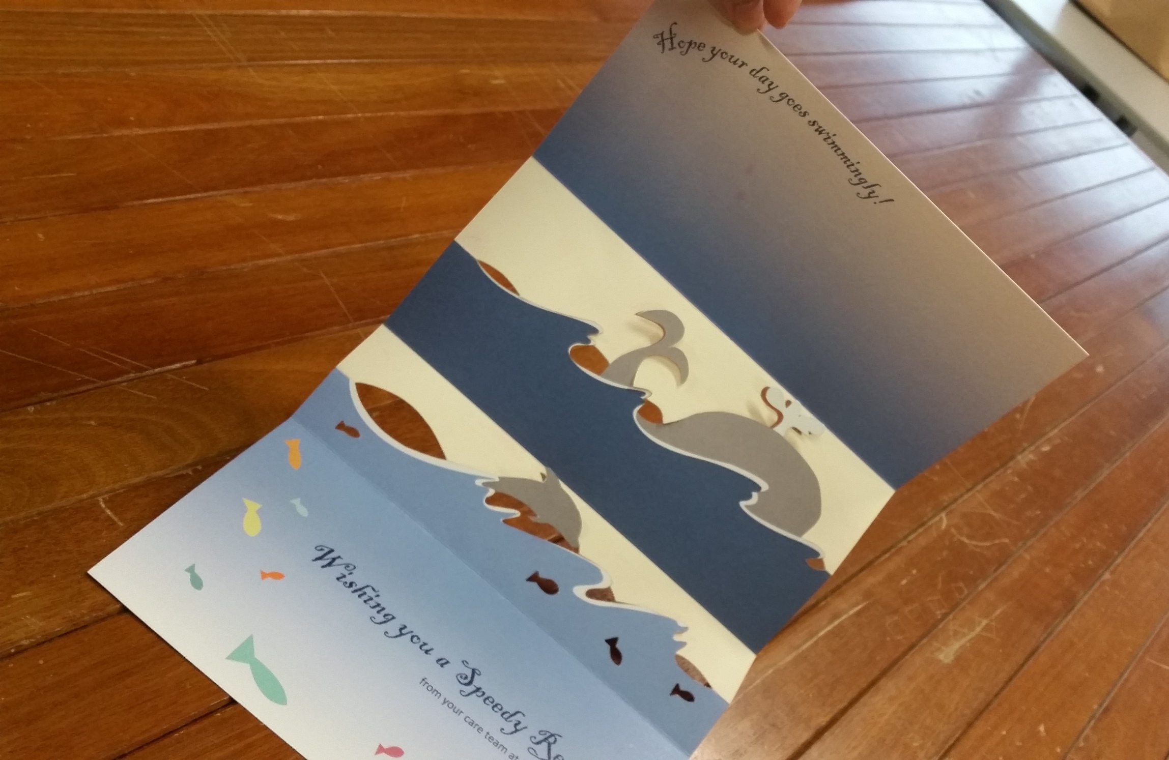
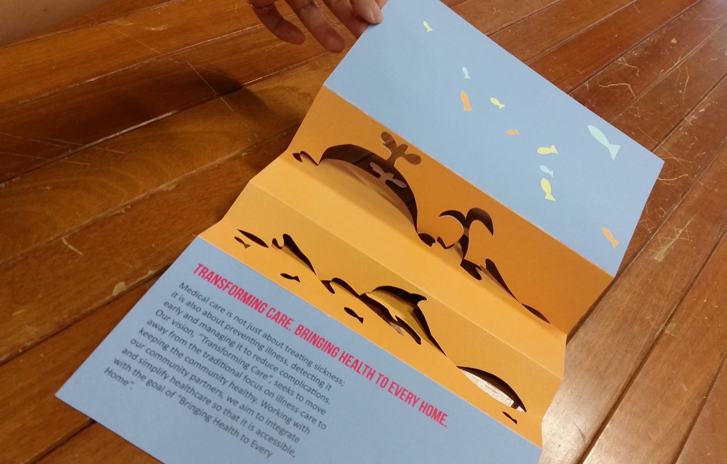
For this project, I also experimented with paper stock – I used tracing paper for the inserts and the covers as I liked the translucency and I printed the zine on cream/off-white paper: white paper felt too clean and glaring to me and I didn’t like the sterile look it gave.

View of the 2 different paper stocks
I tried printing on 2 different off white papers and eventually chose the one that had a lesser tint in the colour and gave me the crispest lines.
For the font, I tried a variety of styles to keep the zine interesting. It was hard to pick fonts that fitted the style of the zine but yet was also able to show individual colour for each work. All in all, I used 3 different methods:
Handwritten brush typography (black/silver/gold)
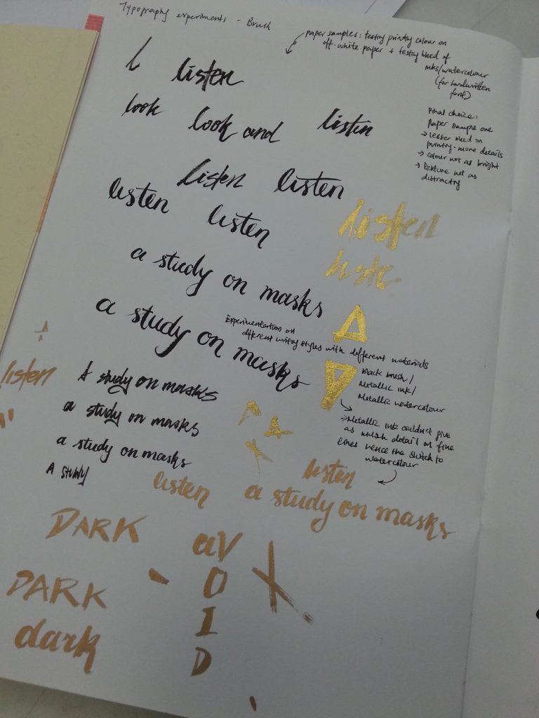
Experimentation with brush font
Black print
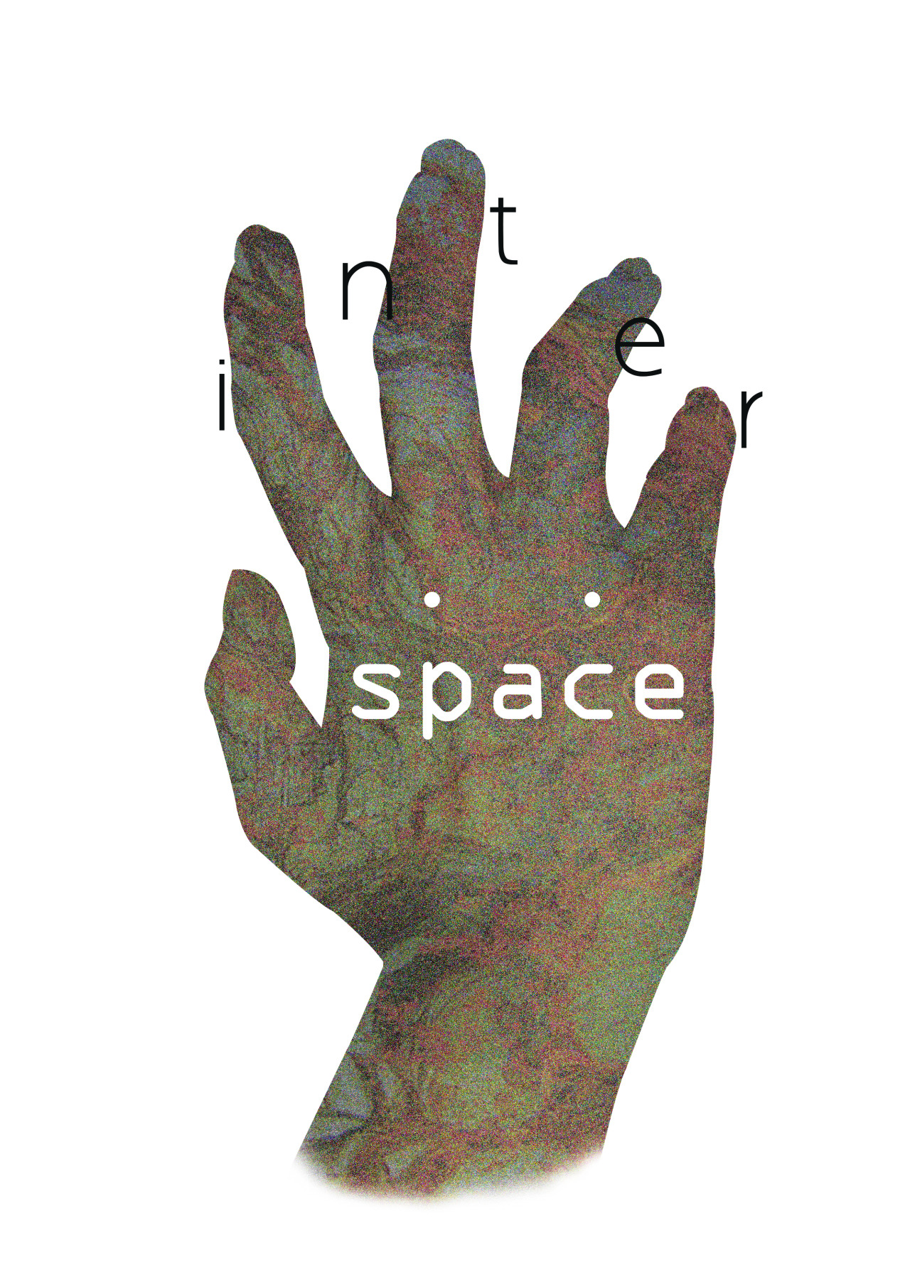
Trying my hand at print typography
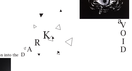
For this part of the zine, I tried to relate the words visually to the work – the increasing letter sizes of D A R K to simulate a torch shining into the darkness, and aVOID as a pun: a void, and a place that one should avoid at all costs.
Letter transfer (red)
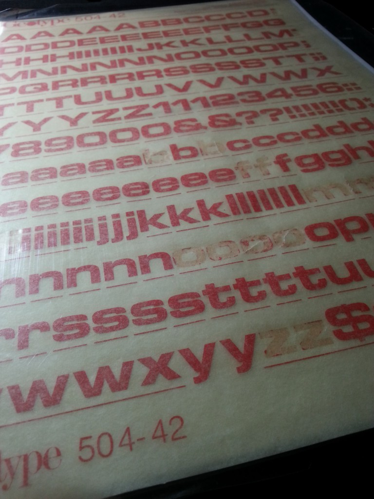
An interesting experiment
Another technique that I tried and had fun with was letter transfer! I found these (pretty old) transfer sheets sold outside artmark so I bought some to try out. I really like the vintage style and colour, and the irregular way it transferred onto the paper added personality to it which I liked, so I added it to my compositions as well.
Trying out brush typography in metallic colours (failed version)
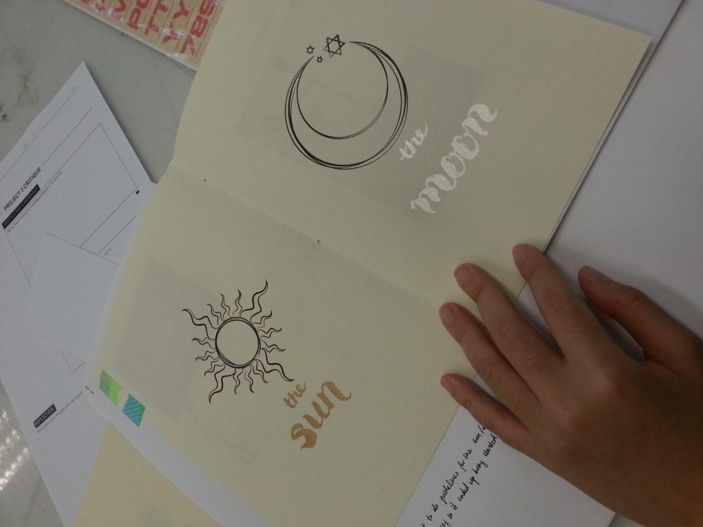
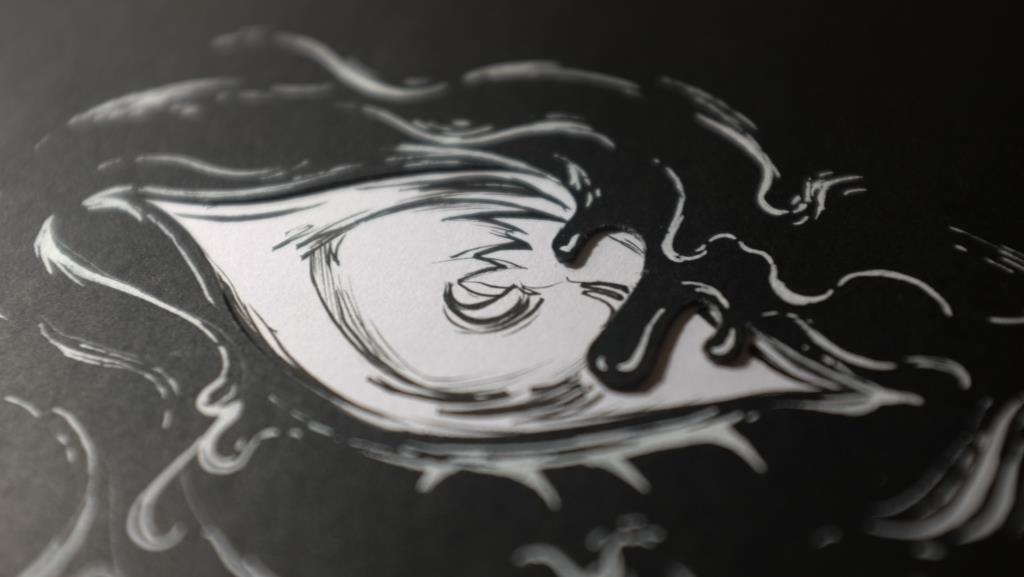
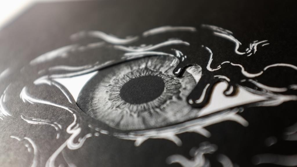
While doing all the experimentation for this zine, I experienced a few hiccups. One of them was the control of my hands on brush work. For my first iteration of the Sun/Moon work, I didn’t draw in guidelines (too much confidence ahhh) and so the final work ended up being misaligned so I had to redo it. It was kinda painful but at least I learned something from it!
Misaligned printing T_T
Another hiccup that I learned to resolve was on printing dimensions. When I did the printing for the mockup, the printing was somehow skewed. After a lot of fiddling around with the computer settings, I realised that it was because Adobe pdf sets the default printing size to letter (damn American dimensions). Luckily, I found out so I was able to change it for my final piece.
Final
Unfortunately I forgot to take photos of the contents but here’s a front/back shot of the final piece!
Front
Back
Reflections
All in all, it was a very satisfying and fun project and I really enjoyed it a lot! This project got my feet wet in Indesign (which I definitely have to learn to master) and I liked the experimentation with fonts that I did.
I would have loved to try more in terms of layout and cross page spreads, and perhaps more experimentation of layering and textures – perhaps a new zine created with totally new work would give me more leeway to do so.
Many thanks to the class for being super supportive and fun throughout this whole journey and Joy for being an awesome tutor ^^


