Project 3 “Speedy Recovery” – Visual Research and Moodboard

Initial development/ research


To start off the project, I went to research on various ways of creating pop-up cards- I knew some basic ways of creating pop up cards like the v-fold or the internal stand method but I wanted to experiment to try to find new ways of creating them.

Out of the many that I saw, I found a few that I thought could be developed and shaped to fit the project – in streamlining down the possible mechanisms, I mainly prioritized the ability for it to be contained on one piece of paper (to stay within the brief and cut costs) and the adaptability of the mechanism to fit with the get well soon concept.

(full moodboard can be found here: https://www.pinterest.com/fiefyefoefum/popup/)


01: Interlocking folds

368ab6db08b2ad0e4ee9056c82cfb650 2521c8ec0e85ccb4826376c997efaf0b

Personally I liked this concept as the mechanism and assembly was simple, only needing symmetrical die-cut shapes, but the final product could be something that was interactive and interesting. The idea of interlocking hands/ hearts/ things could also be very easily adapted to create the concept of giving care, fitting well with the brief.


02: Blooming Flower Bouquet

bfe2b51be66f3e25c53f11eddb145475

I picked this concept mainly for the element of surprise – I liked how the flower bouquet emerged out from the card to surprise the viewer as he/she opens it, giving more interactivity and interest to the card. However, this mechanism requires more than one piece of paper, and is harder to assemble.


03: Stacked scenery

cd00ea5711b8ac5168125b6653964c8f

I loved the quirkiness of this design – the multiple layer allowed for more complex images, thus this technique could be applied to different scenes. At the same time, the entire card could be contained within one piece of paper.


Project 2 “Combating Zika Outbreak” – Final

After the second round of edits, feedback was given that:

hierarchy/ negative space needed to be stronger
smaller text/ text did not have to be so huge to show emphasis
sweet spot of placement – the placement of the text was a little awkward and clunky
placement of mosquito bite – not very realistic

Feedback was also given that the image still looked too sexualised, despite the cropping.


Thus, I made some changes to the layout and central image to create the final:

zika2_edit-revised-final

The central image was changed into something more neutral, although the same treatment was applied to it.

The placement of the main slogan was changed as well, leading vertically along the neck of the female down to the mosquito bite, to create some kind of flow of reading for the eyes (instead of being a static horizontal block).

The secondary slogan and extra information were kept to the right of the poster (but not flush left) to continue on the reading flow from the mosquito bite, but still ensures that the text is easily readable.


Project 2 “Combating Zika Outbreak” – Initial thumbnails + development

After the initial brainstorming, I chose a few ideas to develop into draft pieces:

Hit By The Bullseye

zika1

This piece hones on the idea of the mosquito bite looking like a bullseye – marking the victim as a target for Zika infection.

Personally though, I found this concept to be a bit too overdone and too direct, which might defeat the purpose of the poster as people will tend to skip over it.

ZIKA – Not a Love Bite

zika2

For this poster concept, I tried to go for a more interesting/ provocative route – love bite referring to the mosquito bite but feedback from the class was that the concept was too sexualised and might not convey the  intended meaning well.

Suggestions were given to focus on other parts of the body (e.g. the neck) to put more focus on the mosquito bite.

Human Slurpee

zika3

Personally this was my favourite out of the three – I liked the slogan as I feel that it was the most original out of the three.

However, feedback was that the image of the slurpee was not obvious enough to convey that the poster was about Zika – the viewer had to look closely to the smaller tagline at the bottom to find out.

Hence, the central image could be clarified to serve the message better.

Revisions

After the first session, I made some revisions on the last 2 concepts based on my peers’ feedback:

zika2_06zz

This was a variation of the “love bite” concept, but I tried to focus on the mosquito bites on the neck to simulate hickies/ focus on the bites to make it less sexual. I did a few variations on colour/ layout as well:
zika2_01zz zika2_02zz


zika2_03zz zika2_04zz zika2_05zz

I also applied the same treatment onto the image of a man to create the “guy” version:

zika2_07zz zika2_08zz

For the “human slurpee” concept, I tried to change the image of a slurpee cup to something a little more direct – a blood bag! I also tried to juxtapose the image of a mosquito head to make the reference more obvious. For this concept, I mainly experimented with the relative size and placement of both the image and the text as the combined image of the mosquito sucking on the blood bag became very long in shape and quite clunky to manipulate.

zika3_edit

zika3_edit-5 zika3_edit2 zika3_edit3 zika3_edit4

Project 1 “Therapeutic Graphics” – Further Exploration and Final

After getting feedback from the class, I decided to do more research on the kinds of landscapes that could inspire me to create new forms of therapeutic art.

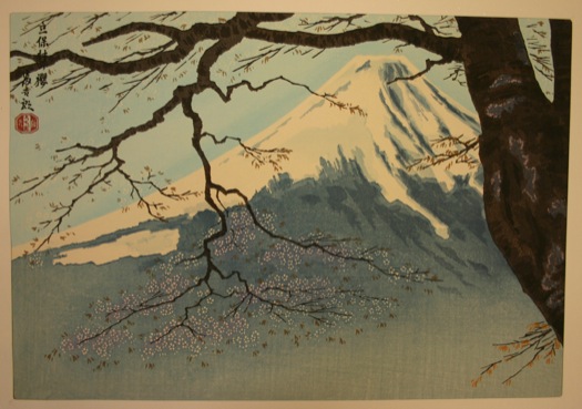
I turned to Japanese woodblock prints, both traditional (e.g. Hokusai) and modern as I felt that the clean shapes and natural forms depicted in the prints suited the style of my work.

ExportedVision_2004_177e

8498140_1

While both styles of Japanese woodblock prints often derived inspiration and subject matter from scenes in nature, he more modern woodblock print works were even more simplistic in style than the traditional ones and often reduced the landscape into simple silhouettes.

15092g1

bird-with-trees

40576g1

There were also a lot of overlapping shapes and colours to create texture. Hence, emulating that, I created my piece based on the idea of depicting one of the 4 seasons, spring.

colour test 02-01

Spring – Field of Flowers

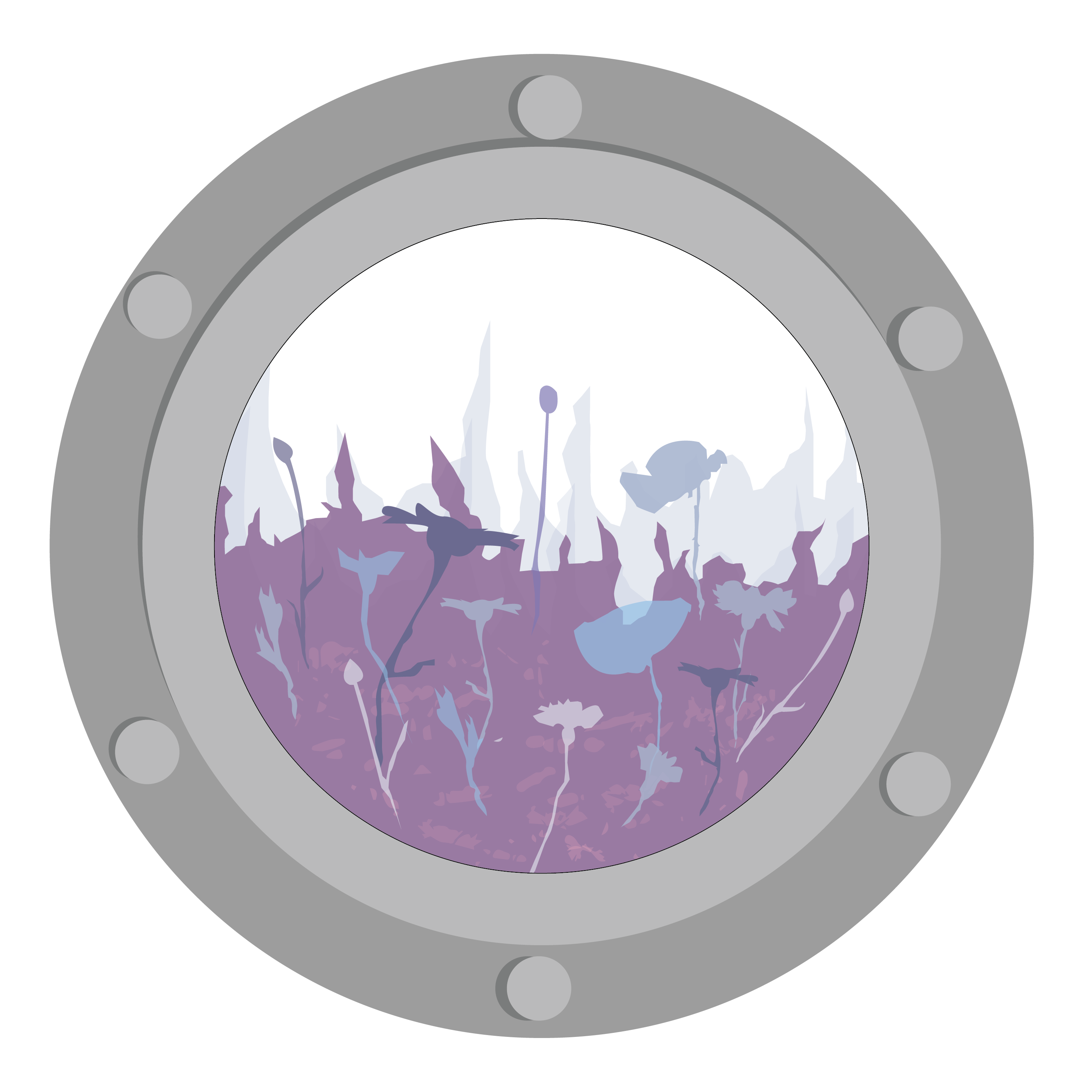
For this piece, I chose to depict spring as I wanted to explore a series based on the 4 seasons, and I felt that spring fitted the purple colour scheme the most. I played around with the various opacities and colour combinations to create variation in the work while still maintaining the clean cut shapes similar to the style of the woodblock prints.


I also explored an alternative composition (Summer) to explore the possibility of developing the format of the work into a series.

summer-01

Summer – Dunes of Sand


Project 1 “Therapeutic Graphics” – Research and Observations

Therapeutic Art

An art form that allows the viewer to seek “meaning, clarity  and healing”

For this project, we were meant to create an artwork for the J- Walk space within the Ng Teng Fong Hospital – the work was meant to adorn the windows of the public walkway that connected the hospital to Westgate.

We visited there during our first lesson (yay field trip!) and I took down some observations of the space:

20160808_112421

J – Walk

From the short trip there, I noticed firstly that the windows along the walkway were blocked out by very angular, rigid structures (including the thick window frames, V shaped pillars and bars on the exterior).

20160808_112429

20160808_112638

The sharp angular nature of the bars made the environment feel very cold and corporate.

Another thing that I noticed was that the space was mainly dominated by cool- toned/ neutral colours – the walls were painted white with grey fixtures and floors, and the light coming in from the windows also tended to wash out the area, making it seem cold and drab. Hence, both the colour and the structure of the space made it very clean, detached and sterile.

Thus, a graphic for the space would need to be able to combat the regular blocky nature of the space, as well as its lack of colour vibrancy.


After the field trip, I went back and did some brainstorming for ideas:

20160819_021621

Through my brainstorming, I decided to center my therapeutic graphic around organic textures found in nature to combat the harsh angular line found in the space. From there, I looked for inspiration online to create a moodboard on potential visual qualities I could use.

(All moodboard images can be found here: link)

moodboard 01 01 w

moodboard 01 02 w

I also did some research on the ways to depict these textures as artwork: while most of these textures seem pretty abstract, I realised that a lot of hospital artwork tended to be more narrative/ illustrative in nature:

Some examples of hospital graphics

Some examples of hospital graphics

Thus I also branched out on 2 ways of presentation for my research: I looked to collage style works as a way of integrating different organic textures, and illustration for the whimsical narrative style.

md w

md w

From there, I did a few little thumbnails to try out different abstract compositions.

20160826_203755 ZZ

I wan’t happy with the abstract compositions that I came up with, so I decided to go for a more narrative style in the work (more in the next post!).