The expression of the psyche in The Cabinet of Dr Caligari

The post-war (WWI) era saw a continued boom in film production and distribution all over the world, from Hollywood to beyond. With the streamlining of both the production and distribution of film, along with the value of film finally being recognized as being a form of media beyond fairground entertainment, film directors were given the chance to explore and execute more daring ways of planning, filming and editing films.

Compared to the early slice-of-life films created by the Lumiere brothers, Dr Caligari (dr. Robert Wiene) presents an odd and almost parallel presentation of the possibilities of portrayal in film: the Lumiere brothers aimed to recreate reality, making it as naturalistic as possible, while Wiene aimed to subvert it, creating a very subjective viewpoint of reality from an individual’s point of view. In fact, the success of Dr Caligari comes directly from how it managed to successfully express one’s internal psyche in a visual way – from that of a mass mob such as that of the German public, down to the exploration of the human’s inner self, something that has never really been explored in cinema before.

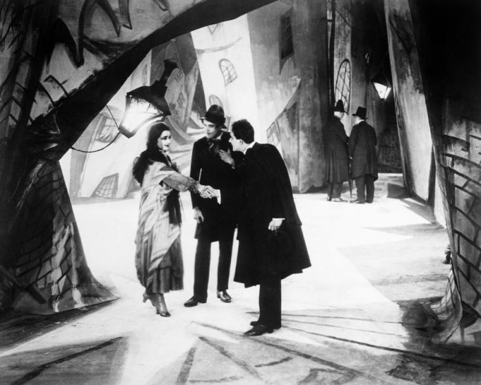
The period when Dr Caligari was created was a bleak time for the German public – Germany had just lost WWI with astronomical human and financial losses, leading to sky high inflation and terrible living conditions back at home. Coupled with the horrors of trench warfare experienced in WWI, the general mood of the German people was one shrouded with pessimism and trauma. Instead of providing a rosier alternate reality as a mode of escape from the harsh postwar realities, however, Dr Caligari creates a set and lighting that intentionally shows a twisted, distorted version of reality; the mise-en-scene is done such that the world in Dr Caligari appears to be visually harsh and even menacing. Thus, the expression of the filming is not turning inwards i.e. escapism from harsh postwar realities but rather outwards, openly expressing the sense of desolation and torment Germany faced after the war. The actors’ silhouettes and shadows are intentionally elongated with the carefully prepared lighting, and the set design itself is done expressively rather than naturalistically –rather than shooting the film on scene, an entire set is built, much like a theatrical setup. The landscapes of the set itself are also painted expressively – the buildings are done with no regard for visual perspective and often skewed to create rough, jagged edges and asymmetrical shapes, with streaks of light directly painted onto the set to heighten the dramatic effect. The jagged touch is also reflected in the style of the intertitle cards, with typography that was similarly jagged to contribute to the mood of the film. In a way, this sense of chaos and foreboding in the mise-en-scene of Dr Caligari is reflective of the state of anarchy Germany was in after the war.

At the same time, Dr Caligari presents an interesting exploration into the inner psyche of the individual, especially with the twist ending. With the reveal of the unreliable narrator, an interesting shift is brought into the telling of the story – the perspective of the narrator contributes to narrative itself, and the inner psyche of the narrator is made concrete, affecting the way the audience interprets the narrative itself.

Dr Caligari opens with the introduction of the narrator of the story – we see him telling the story to his companion, with an iris effect (a ring of blackness surrounding a small area) employed to reduce the focus to his face, before shifting and expanding to reveal the landscape in which the story was going to take place. This effect is used multiple times in the introduction, to ensure that the viewer is clear that the narrative of the film was shifting into that of the storyteller. With the reveal of the twist ending, this device becomes even more poignant – the iris effect essentially makes it such that the viewer slowly shifts into the perspective of the (unreliable) narrator, and thus experiences the subjective reality from his (inner) point of view. The set design and mise-en-scene furthers this ambiguity between reality and subjective vision – as mentioned earlier, the set is designed in a non-realistic way, and the lighting is used to emphasise that – low- key lighting is used in many of the scenes to create harsh contrasts and dark tones and shadows, both on the set and the characters, using a Chiaroscuro technique to raise the drama of the scene. This use of lighting also emphasises the makeup used on the actors – most of them having pallid, pale faces with strong dark circles – and the strong lighting casts strong shadows that makes them look more haunting and menacing. The actors also perform in an unnaturalistic manner, with their actions often exaggerated and jerky. Altogether, the mise-en-scene builds up a universe that is similar to but unlike reality, thus continuing the subjective viewpoint of reality from the mad man’s point of view.

Thus, Dr Caligari employs a strong, expressive visual style, attention to mise-en-scene and subtle transitions to build an uncanny world radiating with tension and foreboding, thus being able to convey anxieties and trauma of the German public, as well as to explore the subjectivity of an individual’s inner psyche.


Project 3 “Speedy Recovery” – Visual Research and Moodboard

Initial development/ research


To start off the project, I went to research on various ways of creating pop-up cards- I knew some basic ways of creating pop up cards like the v-fold or the internal stand method but I wanted to experiment to try to find new ways of creating them.

Out of the many that I saw, I found a few that I thought could be developed and shaped to fit the project – in streamlining down the possible mechanisms, I mainly prioritized the ability for it to be contained on one piece of paper (to stay within the brief and cut costs) and the adaptability of the mechanism to fit with the get well soon concept.

(full moodboard can be found here: https://www.pinterest.com/fiefyefoefum/popup/)


01: Interlocking folds

368ab6db08b2ad0e4ee9056c82cfb650 2521c8ec0e85ccb4826376c997efaf0b

Personally I liked this concept as the mechanism and assembly was simple, only needing symmetrical die-cut shapes, but the final product could be something that was interactive and interesting. The idea of interlocking hands/ hearts/ things could also be very easily adapted to create the concept of giving care, fitting well with the brief.


02: Blooming Flower Bouquet

bfe2b51be66f3e25c53f11eddb145475

I picked this concept mainly for the element of surprise – I liked how the flower bouquet emerged out from the card to surprise the viewer as he/she opens it, giving more interactivity and interest to the card. However, this mechanism requires more than one piece of paper, and is harder to assemble.


03: Stacked scenery

cd00ea5711b8ac5168125b6653964c8f

I loved the quirkiness of this design – the multiple layer allowed for more complex images, thus this technique could be applied to different scenes. At the same time, the entire card could be contained within one piece of paper.


Project 2 “Combating Zika Outbreak” – Visual Research and Moodboard

Aim: Create awareness and call to fight Zika

Task 1A: Visual Research

For the initial brainstorming, I looked at a variety of health communication posters and awareness campaigns, ranging from the old vintage ones to the modern, current campaigns.

(Full moodboard is here!)

eyes_7

I like this poster because of its

  • Poster/Illustrative style
  • Visually interesting graphics
  • Usage of typography to drive the message home
  • Captivating slogan

Captura-de-pantalla-2014-10-06-a-las-10.46.32

instagram

I like this campaign because of its:

  • Use of publicly recognizable symbols  to generate interest and rapport
  • Interesting manipulating of graphics to echo the message, with provocative slogan
  • Simple and clean layout

foto7

I like this poster because of its:

  • Juxtaposition of imagery (candy/ icecream to depict wounds) – generates shock
  • Simple, effective layout
  • Interesting, thought provocative slogan

tumblr_nw8fw2Dkhp1r5vojso3_1280

tumblr_nw8fw2Dkhp1r5vojso2_1280

I like this campaign because of its:

  • Interesting imagery – not too direct but metaphorical to generate interest
  • Clean colour palette
  • Clear and effective layout

Also something a little bit more out of the way but I liked this infographic that I found:

32e9cc5775b8f90ac1786dd453863337

I like the illustrative style present in the infographic that makes the serious topic more approachable and human, instead of being too clinical and distant. The use of the handwritten typeface and textures also add a handmade touch to the illustration, making it more personal and human.

Task 1B: Slogan and Moodboard

After doing some research on both health awareness campaigns, I thought of three main points from which one can raise awareness about Zika:

  1. Zika as a mosquito transmitted disease – preventing mosquito breeding in homes
  2. Zika as being potentially harmful to fetuses – dangers of Zika during pregnancy
  3. Zika as a sexually transmitted disease – importance of adequate protection

Thus, I thought of 4 potential slogans for the Zika awareness campaign:

1

Sex – Hand touching naked torso (Too hetero-normative?)

  • Zika – Not a Love Bite (could refer to mosquito bite (point 1) or sex (point 3))
2

Mosquito “kissing” unborn child in pregnant mother?

  • Zika – Kiss of Death (for pregnant mothers (point 2))
  • Zika – Breed to Bleed (raising awareness against mosquito breeding (point 1))
3

Mosquito in pet enclosure – for sale in pet shop Surrounded by breeding sources

  • Zika – Breeding an exotic pet? (raising awareness against mosquito breeding (point 1))

Reflection – Art Nouveau and Orientalism

Out of the many different aspects of the Art Nouveau movement that we covered in class, one detail that stood out to me was the introduction of Japanese art and oriental elements into (up till then) a primarily Euro-centric narrative of graphic design history, and how it drastically changed the aesthetics and graphic elements for graphic design of that time.

Orientalism was not really new to art – in works from the Renaissance and Baroque era, there were already Oriental subjects present: from figures in Middle Eastern dress to scenes of Turkish, Greek, African and even Egyptian cultures, to suit the patrons with a more exotic palette. However, what really stood out to me in Art Nouveau was that artists did not merely copy (or attempt to imagine) Oriental subjects, but instead assimilated uniquely Japanese styles of expression to create a new approach to their work.

With the Meiji Restoration, the opening of Japan’s ports to Europe caused a large influx of Japanese art, culture and crafts into Europe. Among those, woodblock prints such as those from the likes of Hokusai proved to be the most popular and influential, with its flat, linear style and blocky colours greatly influencing the poster artists of the time (e.g. Beardsley and Toulouse-Lautrec).

To me, this was really interesting as it was the first time we see Asian art being put on the same level as its European counterparts. With the very Euro-centric narrative of graphic design, it is easy to toss aside Asian-style art and graphics as mere craft, with little to no individual aesthetic sense. Thus, it is fascinating to see Japanese work being appreciated and mimicked to the point where it helped to direct an entire art movement with styles and ideas entirely foreign to its origin.

Reflection – The Industrial Revolution

It was interesting to learn about the industrial revolution at a more in depth level – previously, I studied history but focused more on modern world history (1900-) and I could not help but see similarities between the industrial revolution and what later happened (again) with the industrialisation and urbanization in the States in the 1920s. Once again, with the advancements in technology and production, the worker is alienated from the fruits of his labour and is delegated to a disposable role in the spirit of mass production to satisfy the growing demand for cheap consumer goods.

Perhaps that is why even with the ever improving technology and means of production, many traditions and handicraft skills still live on – despite their relative inefficiency, the ability to return to the tactile nature of the raw materials, to feel, touch and work with the crafts is something that humans crave; the authenticity of the handicraft is something we all need in the coldly productive and competent era of the machine.

And perhaps that was what William Morris was trying to achieve – in the Victorian period where everything was loud and excessive, he yearned for a return to the simplicity of the medieval ages where things were carefully and preciously made by hand, and handicraft was at its peak.

It is ironic though, that in his pursuit for this utopia, William Morris recreated the assembly line, albeit in another form – while the workshops he created to make his work were meant to cultivate the camaraderie of the collective and the artist guild in spirit, his top down control of the work meant that any kind of autonomy held by them was probably lost.

Project 1 “Therapeutic Graphics” – Further Exploration and Final

After getting feedback from the class, I decided to do more research on the kinds of landscapes that could inspire me to create new forms of therapeutic art.

I turned to Japanese woodblock prints, both traditional (e.g. Hokusai) and modern as I felt that the clean shapes and natural forms depicted in the prints suited the style of my work.

ExportedVision_2004_177e

8498140_1

While both styles of Japanese woodblock prints often derived inspiration and subject matter from scenes in nature, he more modern woodblock print works were even more simplistic in style than the traditional ones and often reduced the landscape into simple silhouettes.

15092g1

bird-with-trees

40576g1

There were also a lot of overlapping shapes and colours to create texture. Hence, emulating that, I created my piece based on the idea of depicting one of the 4 seasons, spring.

colour test 02-01

Spring – Field of Flowers

For this piece, I chose to depict spring as I wanted to explore a series based on the 4 seasons, and I felt that spring fitted the purple colour scheme the most. I played around with the various opacities and colour combinations to create variation in the work while still maintaining the clean cut shapes similar to the style of the woodblock prints.


I also explored an alternative composition (Summer) to explore the possibility of developing the format of the work into a series.

summer-01

Summer – Dunes of Sand


Project 1 “Therapeutic Graphics” – Initial Colour and Composition

After the initial experimentation with abstract compositions, I was dissatisfied with what I came up with and hence decided to branch into more narrative-based compositions.

I came up with a basic composition of a character within an imaginary landscape to create a dreamy atmosphere that the viewer could immerse within. To frame the image, I used the idea of a window-within-a-window by creating a porthole frame – to give the experience of peering out from a vessel (e.g. a submarine) to see new lands.

For the colour palettes, I picked colours from various nature photographs to compose a variety of colour palettes. Then I superimposed that colour palettes on the composition to test out the mood each colour palette could create.

Colour Palette

Colour Palette

(From top) Earth/Forest

Sky

Woods

Sunset

Colour Composition 1 (Earth/ Forest)

Colour Composition 1 (Earth/ Forest)

Colour Composition 02 - Sky

Colour Composition 02 (Sky)

Colour Composition 02

Colour Composition 03 (Woods)

Colour Composition 04 (Sunset)

Colour Composition 04 (Sunset)

Based on the critique from the class, most of them liked the second colour palette (sky) and thought it to be the most dreamy (and thus the most therapeutic). In contrast, many people found the presence of the figure slightly disturbing and to hold pretty negative connotations with regards to the viewer and the hospital environment – something that I didn’t really notice until I was done with the work.

Hence, I decided to

  1. Branch out on purple/ blue colour scheme
  2. Do up a more general landscape (without the character)

(to be continued in next post!)

Project 1 “Therapeutic Graphics” – Research and Observations

Therapeutic Art

An art form that allows the viewer to seek “meaning, clarity  and healing”

For this project, we were meant to create an artwork for the J- Walk space within the Ng Teng Fong Hospital – the work was meant to adorn the windows of the public walkway that connected the hospital to Westgate.

We visited there during our first lesson (yay field trip!) and I took down some observations of the space:

20160808_112421

J – Walk

From the short trip there, I noticed firstly that the windows along the walkway were blocked out by very angular, rigid structures (including the thick window frames, V shaped pillars and bars on the exterior).

20160808_112429

20160808_112638

The sharp angular nature of the bars made the environment feel very cold and corporate.

Another thing that I noticed was that the space was mainly dominated by cool- toned/ neutral colours – the walls were painted white with grey fixtures and floors, and the light coming in from the windows also tended to wash out the area, making it seem cold and drab. Hence, both the colour and the structure of the space made it very clean, detached and sterile.

Thus, a graphic for the space would need to be able to combat the regular blocky nature of the space, as well as its lack of colour vibrancy.


After the field trip, I went back and did some brainstorming for ideas:

20160819_021621

Through my brainstorming, I decided to center my therapeutic graphic around organic textures found in nature to combat the harsh angular line found in the space. From there, I looked for inspiration online to create a moodboard on potential visual qualities I could use.

(All moodboard images can be found here: link)

moodboard 01 01 w

moodboard 01 02 w

I also did some research on the ways to depict these textures as artwork: while most of these textures seem pretty abstract, I realised that a lot of hospital artwork tended to be more narrative/ illustrative in nature:

Some examples of hospital graphics

Some examples of hospital graphics

Thus I also branched out on 2 ways of presentation for my research: I looked to collage style works as a way of integrating different organic textures, and illustration for the whimsical narrative style.

md w

md w

From there, I did a few little thumbnails to try out different abstract compositions.

20160826_203755 ZZ

I wan’t happy with the abstract compositions that I came up with, so I decided to go for a more narrative style in the work (more in the next post!).

Assignment 3 Final Project – Initial and Revised Proposal

Project – Documenting Dakota Crescent


For my final project, I wanted to do something that was more personal and relevant to my own thoughts and ideas, and so I decided to pick Dakota Crescent as the subject of my last project.

Dakota Crescent was a place that I’ve always had an attachment to, due to the months of CIP work (painting and cleaning the houses of the residents there) that I did there 2 years ago – I got to know the place and its residents more intimately, and have grown to love the slow-paced lifestyle and atmosphere there that was so different from my own.

Hence it really came as a shock to me when the government announced last year that they had redevelopment plans for that area, and that all its residents were to be moved out by the end of this year.

20160419_050653 20160419_050706

Initial proposal: Immersive experience

Format: “Experience Booths” – enclosed booths/units where the film will be projected and displayed

Installation focus: Isolation of the viewer from other experiences/ heighten immersion in the film; documentation of first hand experience; capturing of atmosphere and mood

Film style: First-person/ wandering, focus on viewer experience and capturing of mood/ atmosphere; stitching together different viewpoints

Reference artists/ works: Rachel Whitehead, 03-FLATS

Techniques employed: Video moshing (covered in appropriation lecture)


After consultation with Ruyi, the proposal was scaled down to make it more feasible within the stipulated time for this project. Hence, upon research on different types of immersive films/ film-making method, the “experience booths” was changed to the Google Cardboard.