
There are 23 posts tagged prep (this is page 1 of 3).

To start off the project, I went to research on various ways of creating pop-up cards- I knew some basic ways of creating pop up cards like the v-fold or the internal stand method but I wanted to experiment to try to find new ways of creating them.
Out of the many that I saw, I found a few that I thought could be developed and shaped to fit the project – in streamlining down the possible mechanisms, I mainly prioritized the ability for it to be contained on one piece of paper (to stay within the brief and cut costs) and the adaptability of the mechanism to fit with the get well soon concept.
(full moodboard can be found here: https://www.pinterest.com/fiefyefoefum/popup/)
01: Interlocking folds


Personally I liked this concept as the mechanism and assembly was simple, only needing symmetrical die-cut shapes, but the final product could be something that was interactive and interesting. The idea of interlocking hands/ hearts/ things could also be very easily adapted to create the concept of giving care, fitting well with the brief.
02: Blooming Flower Bouquet


I picked this concept mainly for the element of surprise – I liked how the flower bouquet emerged out from the card to surprise the viewer as he/she opens it, giving more interactivity and interest to the card. However, this mechanism requires more than one piece of paper, and is harder to assemble.
03: Stacked scenery
I loved the quirkiness of this design – the multiple layer allowed for more complex images, thus this technique could be applied to different scenes. At the same time, the entire card could be contained within one piece of paper.

After the initial brainstorming, I chose a few ideas to develop into draft pieces:

This piece hones on the idea of the mosquito bite looking like a bullseye – marking the victim as a target for Zika infection.
Personally though, I found this concept to be a bit too overdone and too direct, which might defeat the purpose of the poster as people will tend to skip over it.

For this poster concept, I tried to go for a more interesting/ provocative route – love bite referring to the mosquito bite but feedback from the class was that the concept was too sexualised and might not convey the intended meaning well.
Suggestions were given to focus on other parts of the body (e.g. the neck) to put more focus on the mosquito bite.
Personally this was my favourite out of the three – I liked the slogan as I feel that it was the most original out of the three.
However, feedback was that the image of the slurpee was not obvious enough to convey that the poster was about Zika – the viewer had to look closely to the smaller tagline at the bottom to find out.
Hence, the central image could be clarified to serve the message better.
After the first session, I made some revisions on the last 2 concepts based on my peers’ feedback:

This was a variation of the “love bite” concept, but I tried to focus on the mosquito bites on the neck to simulate hickies/ focus on the bites to make it less sexual. I did a few variations on colour/ layout as well:


I also applied the same treatment onto the image of a man to create the “guy” version:


For the “human slurpee” concept, I tried to change the image of a slurpee cup to something a little more direct – a blood bag! I also tried to juxtapose the image of a mosquito head to make the reference more obvious. For this concept, I mainly experimented with the relative size and placement of both the image and the text as the combined image of the mosquito sucking on the blood bag became very long in shape and quite clunky to manipulate.


Aim: Create awareness and call to fight Zika
For the initial brainstorming, I looked at a variety of health communication posters and awareness campaigns, ranging from the old vintage ones to the modern, current campaigns.

I like this poster because of its

I like this campaign because of its:

I like this poster because of its:


I like this campaign because of its:
Also something a little bit more out of the way but I liked this infographic that I found:

I like the illustrative style present in the infographic that makes the serious topic more approachable and human, instead of being too clinical and distant. The use of the handwritten typeface and textures also add a handmade touch to the illustration, making it more personal and human.
After doing some research on both health awareness campaigns, I thought of three main points from which one can raise awareness about Zika:
Thus, I thought of 4 potential slogans for the Zika awareness campaign:

Sex – Hand touching naked torso (Too hetero-normative?)

Mosquito “kissing” unborn child in pregnant mother?

Mosquito in pet enclosure – for sale in pet shop Surrounded by breeding sources
After getting feedback from the class, I decided to do more research on the kinds of landscapes that could inspire me to create new forms of therapeutic art.
I turned to Japanese woodblock prints, both traditional (e.g. Hokusai) and modern as I felt that the clean shapes and natural forms depicted in the prints suited the style of my work.
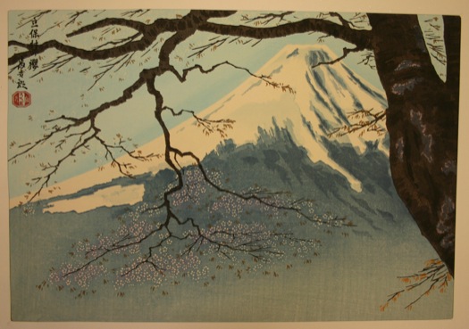

While both styles of Japanese woodblock prints often derived inspiration and subject matter from scenes in nature, he more modern woodblock print works were even more simplistic in style than the traditional ones and often reduced the landscape into simple silhouettes.


There were also a lot of overlapping shapes and colours to create texture. Hence, emulating that, I created my piece based on the idea of depicting one of the 4 seasons, spring.

Spring – Field of Flowers
For this piece, I chose to depict spring as I wanted to explore a series based on the 4 seasons, and I felt that spring fitted the purple colour scheme the most. I played around with the various opacities and colour combinations to create variation in the work while still maintaining the clean cut shapes similar to the style of the woodblock prints.
I also explored an alternative composition (Summer) to explore the possibility of developing the format of the work into a series.

Summer – Dunes of Sand

After the initial experimentation with abstract compositions, I was dissatisfied with what I came up with and hence decided to branch into more narrative-based compositions.
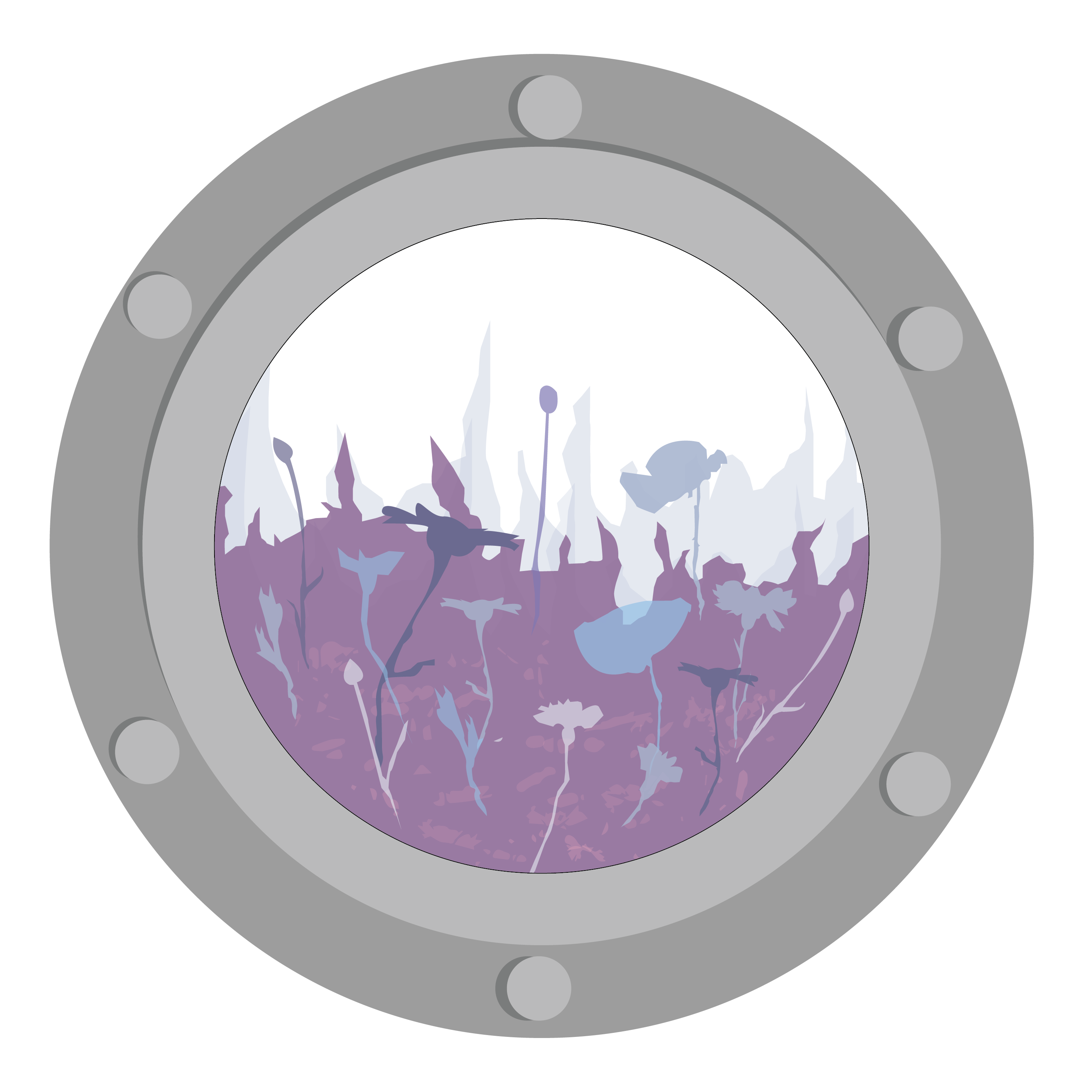
I came up with a basic composition of a character within an imaginary landscape to create a dreamy atmosphere that the viewer could immerse within. To frame the image, I used the idea of a window-within-a-window by creating a porthole frame – to give the experience of peering out from a vessel (e.g. a submarine) to see new lands.
For the colour palettes, I picked colours from various nature photographs to compose a variety of colour palettes. Then I superimposed that colour palettes on the composition to test out the mood each colour palette could create.

Colour Palette
(From top) Earth/Forest
Sky
Woods
Sunset

Colour Composition 1 (Earth/ Forest)
Colour Composition 02 (Sky)

Colour Composition 03 (Woods)

Colour Composition 04 (Sunset)
Based on the critique from the class, most of them liked the second colour palette (sky) and thought it to be the most dreamy (and thus the most therapeutic). In contrast, many people found the presence of the figure slightly disturbing and to hold pretty negative connotations with regards to the viewer and the hospital environment – something that I didn’t really notice until I was done with the work.
Hence, I decided to
(to be continued in next post!)

Therapeutic Art
An art form that allows the viewer to seek “meaning, clarity and healing”
For this project, we were meant to create an artwork for the J- Walk space within the Ng Teng Fong Hospital – the work was meant to adorn the windows of the public walkway that connected the hospital to Westgate.
We visited there during our first lesson (yay field trip!) and I took down some observations of the space:

J – Walk
From the short trip there, I noticed firstly that the windows along the walkway were blocked out by very angular, rigid structures (including the thick window frames, V shaped pillars and bars on the exterior).


The sharp angular nature of the bars made the environment feel very cold and corporate.
Another thing that I noticed was that the space was mainly dominated by cool- toned/ neutral colours – the walls were painted white with grey fixtures and floors, and the light coming in from the windows also tended to wash out the area, making it seem cold and drab. Hence, both the colour and the structure of the space made it very clean, detached and sterile.
Thus, a graphic for the space would need to be able to combat the regular blocky nature of the space, as well as its lack of colour vibrancy.
After the field trip, I went back and did some brainstorming for ideas:

Through my brainstorming, I decided to center my therapeutic graphic around organic textures found in nature to combat the harsh angular line found in the space. From there, I looked for inspiration online to create a moodboard on potential visual qualities I could use.
(All moodboard images can be found here: link)


I also did some research on the ways to depict these textures as artwork: while most of these textures seem pretty abstract, I realised that a lot of hospital artwork tended to be more narrative/ illustrative in nature:

Some examples of hospital graphics
Thus I also branched out on 2 ways of presentation for my research: I looked to collage style works as a way of integrating different organic textures, and illustration for the whimsical narrative style.


From there, I did a few little thumbnails to try out different abstract compositions.

I wan’t happy with the abstract compositions that I came up with, so I decided to go for a more narrative style in the work (more in the next post!).
Concept
Experiencing Dakota Crescent is an experimental and experiential film that aims to capture the atmosphere, mood and essence of the old Dakota Crescent estate before it gets fully reclaimed by the government for redevelopment. Through this film, it is hoped that the slow, leisurely lifestyle of the old estate so rarely found in the fast pace of Singapore can be accurately documented, while also showing how the modern pace of Singapore have affected the lifestyle of Singapore’s old estates.
The film is presented with the Google Cardboard in the style of a Virtual Reality (VR) experience, in order to create a totally isolated head space for the viewer to watch the film with minimal disturbances, and to ensure maximum levels of immersion. Video moshing, a glitch technique previously discussed in class, is also employed as a commentary on the limitations of such forms of documenting experiences, as well as the impermanence of digital memory.
Relationship between content and form
The clips themselves are shot in a roving, meandering style to create the immersive experience as naturally as possible by creating the illusion of a direct first person’s viewpoint of walking through the estate. Familiar public and shared spaces of the traditional HDB flat, such as the corridors, playgrounds and void decks are shot to build a sense of nostalgia for the viewer. At the same time, these shots of people’s living spaces are juxtaposed with the shots of empty lots in the old estate as a result of the redevelopment plans – showing not just a mere physical deconstruction but also a spiritual deconstruction of the Dakota Crescent estate. Certain iconic landmarks of the estate such as the Dove playground and the provisions shop block are also documented with a static camera shot to capture the atmosphere of the place accurately.
The shots are edited such that the motion of the camera is continued through the different shots, with the static camera shots dispersed between them to creae a sense of variation and rhythm. Vide moshing techniques are also used both as a transition between shots and conceptually to create a jarring difference with the slow, atmospheric shots. The sound design of the film was kept minimal to minimize interference with the moving image, but with the sound of wind chimes added to create a sense of nostalgia and transience.
Experimentation and presentation
The main experimentation for this project came in the format of presentation – the shots themselves were not driven by a narrative, nor were they edited sequentially. While the static shooting style was largely influenced by the film 03-FLATS, the roving camera motion was something that was relatively new and familiar, and therefore challenging to pull off. Another challenge during the process was the shooting of such atmospheric scenes in a slow paced way, while also keeping enough content in to keep the viewer’s interest.
Experimental video moshing techniques were also applied post-production as transitional effects – this was achieved via old glitchy software and intentional creating errors in the video files by erasing keyframes. The method undertaken was extremely risky as the errors created were randomised and permanent; hence a system of trial and error had to be employed to get the most satisfactory result out of the process. The use of video moshing was influenced by Rachel Whiteread’s deconstruction of physical spaces in her installation works, thus creating the inspiration for the use of data corruption to deconstruct a space digitally.
The film was presented in the form of the Google Cardboard, a VR viewer – although the film was not shot to be a VR experience due to the limitations in time and equipment, risks were taken to develop the film in that specific medium as the creation of an isolated, immersive space was crucial to the communication of the film’s concepts and message.
Care was taken through the shooting process to shoot in a slow, sweeping motion – to allow the viewer to fully immerse themselves in the film while still providing some sort of direction and focus in the film. Shots such as the exploration of the empty lots was also planned out beforehand to create smooth transitions without stopping at a particular point for too long. The soundtrack for the film was mixed between ambience sound recorded on location and sound clips of wind chimes to create some sense of musicality and transience in the film, while retaining the experiential, naturalistic style of the shots.
Bibliography
Desmond Lim. “People behind the Old Charm at Dakota Crescent.” The Straits Times. 9 July 2015. Web. 5 Apr. 2015. <http://www.straitstimes.com/singapore/people-behind-the-old-charm-at-dakota-crescent>.
Yuan Bin, Lei. “03-FLATS Official Trailer.” Vimeo. Web. 4 Apr. 2016.
While the initial conceptualisation for this final project went by really quickly, the process for this was one filled with trial and error – the initial idea I had for the installation was a full sized “experience booth”, which was unrealistic for a solo project under such a tight time frame. I wanted something that was deeply immersive as it was a crucial part of my work’s concept – but the technology available to me was limited. After doing much research online, I found the Google Cardboard – a VR viewer that on could create at home. While I was unable to film a true VR film, the Google Cardboard could still be adapted to show normal films while creating the sort of immersive experience I wanted. Hence, the Google Cardboard was chosen as my presentation form despite my inexperience with it (and thus the risks involved.)
For the filming of the film, I visited the location twice – once to recce possible shooting locations and once to shoot everything. The recce session was crucial to the filming as there were certain shots that I had to scout out beforehand, such as the interior shots of the apartments. It also helped me to determine the time of the day for the final shot – for my initial plan, I wanted to film from day to night but I realised after the recce that most of the activity and the mood of the place was in the late afternoon. Hence, the recce session helped to narrow down my series of shots and the focus of the subsequent shoot.
For the actual shoot itself, it mostly passed without much difficulties. It was the editing and post processing that had many challenges. While the cutting and piecing together the clips was relatively easy due to the pre-shoot planning, it was the creation of the video moshing technique that was hard to do. The video moshing called for the use of a very outdated version of freeware, which was buggy and crashed multiple times while I was processing the files. The technique itself was also randomised – hence I had no control over the results and I had to try multiple times to get the result I wanted. Despite the difficulties, I learnt a lot about experimental processing techniques and I found it a fun an interesting experience.
All in all, I really enjoyed doing this project, and the results that I was able to come up with. Doing this project, however, really made me feel the limitations of working solo – I had to cover all the bases myself and so was unable to do much in terms of scope and scale. Hence, I think working together in a team will be something that I would like to work towards for future projects.
Experiencing Dakota Crescent is an immersive film viewed from the Google Cardboard, a Virtual Reality (VR) viewer where users experience the film directly within an isolated head space, rather than merely viewing it passively from a flat screen.
Through the use of such a medium, Experiencing Dakota Crescent invites the audience to experience Dakota Crescent in a more direct manner – with the impending government plans for redevelopment, it might only be through such digital methods that local places with culture and heritage can be preserved.
Drawing inspiration from Rachel Whitehead and a film centering around the domestic experience in local public housing – 03-FLATS, Amy films the daily life in the Dakota Crescent estate from a first person’s Point of View to emulate the experience of being in the place directly. At the same time, multiple experiences and perspectives are stitched together, to reflect the multi-faceted nature of such a heritage-rich area, as well as the limitations of digital film in attempting to record and archive physical locations and experiences wholly. Through the use of video moshing techniques, Amy mashes the different experiences together, while constantly deconstructing it. The use of video moshing acknowledges the limitations of digital data in recording tangible experiences, while bringing to question the permanence of memory after a physical place is no longer in existence.

For my final project, I wanted to do something that was more personal and relevant to my own thoughts and ideas, and so I decided to pick Dakota Crescent as the subject of my last project.
Dakota Crescent was a place that I’ve always had an attachment to, due to the months of CIP work (painting and cleaning the houses of the residents there) that I did there 2 years ago – I got to know the place and its residents more intimately, and have grown to love the slow-paced lifestyle and atmosphere there that was so different from my own.
Hence it really came as a shock to me when the government announced last year that they had redevelopment plans for that area, and that all its residents were to be moved out by the end of this year.


Initial proposal: Immersive experience
Format: “Experience Booths” – enclosed booths/units where the film will be projected and displayed
Installation focus: Isolation of the viewer from other experiences/ heighten immersion in the film; documentation of first hand experience; capturing of atmosphere and mood
Film style: First-person/ wandering, focus on viewer experience and capturing of mood/ atmosphere; stitching together different viewpoints
Reference artists/ works: Rachel Whitehead, 03-FLATS
Techniques employed: Video moshing (covered in appropriation lecture)
After consultation with Ruyi, the proposal was scaled down to make it more feasible within the stipulated time for this project. Hence, upon research on different types of immersive films/ film-making method, the “experience booths” was changed to the Google Cardboard.