

There are 6 posts tagged Research (this is page 1 of 1).
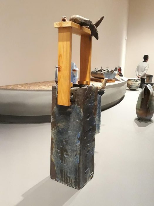


Out of all the works there, it was extremely hard to pick one true favourite as there were many works that stood out to me and piqued my interest. In the end, I decided to pick this piece – I like how it is unassuming at first glance, with its earthen textures and dull colours, but a closer inspection of the work reveals a teeny little frog sitting on the wooden edge, adding a whimsical flair to the work. Much like the concept of wabi-sabi, this work must be carefully observed for one to gain a full appreciation for it. I also love the use of both treated material (as seen in the cut and treated wooden handle) and the material in its natural state (as seen in the piece of wood propped on top of the handle). The juxtaposition of the two different states of the same type of material is very interesting to me.

To start off the project, I went to research on various ways of creating pop-up cards- I knew some basic ways of creating pop up cards like the v-fold or the internal stand method but I wanted to experiment to try to find new ways of creating them.
Out of the many that I saw, I found a few that I thought could be developed and shaped to fit the project – in streamlining down the possible mechanisms, I mainly prioritized the ability for it to be contained on one piece of paper (to stay within the brief and cut costs) and the adaptability of the mechanism to fit with the get well soon concept.
(full moodboard can be found here: https://www.pinterest.com/fiefyefoefum/popup/)
01: Interlocking folds


Personally I liked this concept as the mechanism and assembly was simple, only needing symmetrical die-cut shapes, but the final product could be something that was interactive and interesting. The idea of interlocking hands/ hearts/ things could also be very easily adapted to create the concept of giving care, fitting well with the brief.
02: Blooming Flower Bouquet


I picked this concept mainly for the element of surprise – I liked how the flower bouquet emerged out from the card to surprise the viewer as he/she opens it, giving more interactivity and interest to the card. However, this mechanism requires more than one piece of paper, and is harder to assemble.
03: Stacked scenery
I loved the quirkiness of this design – the multiple layer allowed for more complex images, thus this technique could be applied to different scenes. At the same time, the entire card could be contained within one piece of paper.

Aim: Create awareness and call to fight Zika
For the initial brainstorming, I looked at a variety of health communication posters and awareness campaigns, ranging from the old vintage ones to the modern, current campaigns.

I like this poster because of its

I like this campaign because of its:

I like this poster because of its:


I like this campaign because of its:
Also something a little bit more out of the way but I liked this infographic that I found:

I like the illustrative style present in the infographic that makes the serious topic more approachable and human, instead of being too clinical and distant. The use of the handwritten typeface and textures also add a handmade touch to the illustration, making it more personal and human.
After doing some research on both health awareness campaigns, I thought of three main points from which one can raise awareness about Zika:
Thus, I thought of 4 potential slogans for the Zika awareness campaign:

Sex – Hand touching naked torso (Too hetero-normative?)

Mosquito “kissing” unborn child in pregnant mother?

Mosquito in pet enclosure – for sale in pet shop Surrounded by breeding sources

Therapeutic Art
An art form that allows the viewer to seek “meaning, clarity and healing”
For this project, we were meant to create an artwork for the J- Walk space within the Ng Teng Fong Hospital – the work was meant to adorn the windows of the public walkway that connected the hospital to Westgate.
We visited there during our first lesson (yay field trip!) and I took down some observations of the space:

J – Walk
From the short trip there, I noticed firstly that the windows along the walkway were blocked out by very angular, rigid structures (including the thick window frames, V shaped pillars and bars on the exterior).


The sharp angular nature of the bars made the environment feel very cold and corporate.
Another thing that I noticed was that the space was mainly dominated by cool- toned/ neutral colours – the walls were painted white with grey fixtures and floors, and the light coming in from the windows also tended to wash out the area, making it seem cold and drab. Hence, both the colour and the structure of the space made it very clean, detached and sterile.
Thus, a graphic for the space would need to be able to combat the regular blocky nature of the space, as well as its lack of colour vibrancy.
After the field trip, I went back and did some brainstorming for ideas:

Through my brainstorming, I decided to center my therapeutic graphic around organic textures found in nature to combat the harsh angular line found in the space. From there, I looked for inspiration online to create a moodboard on potential visual qualities I could use.
(All moodboard images can be found here: link)


I also did some research on the ways to depict these textures as artwork: while most of these textures seem pretty abstract, I realised that a lot of hospital artwork tended to be more narrative/ illustrative in nature:

Some examples of hospital graphics
Thus I also branched out on 2 ways of presentation for my research: I looked to collage style works as a way of integrating different organic textures, and illustration for the whimsical narrative style.


From there, I did a few little thumbnails to try out different abstract compositions.

I wan’t happy with the abstract compositions that I came up with, so I decided to go for a more narrative style in the work (more in the next post!).


mmMMmmMMmm sexy patterns