
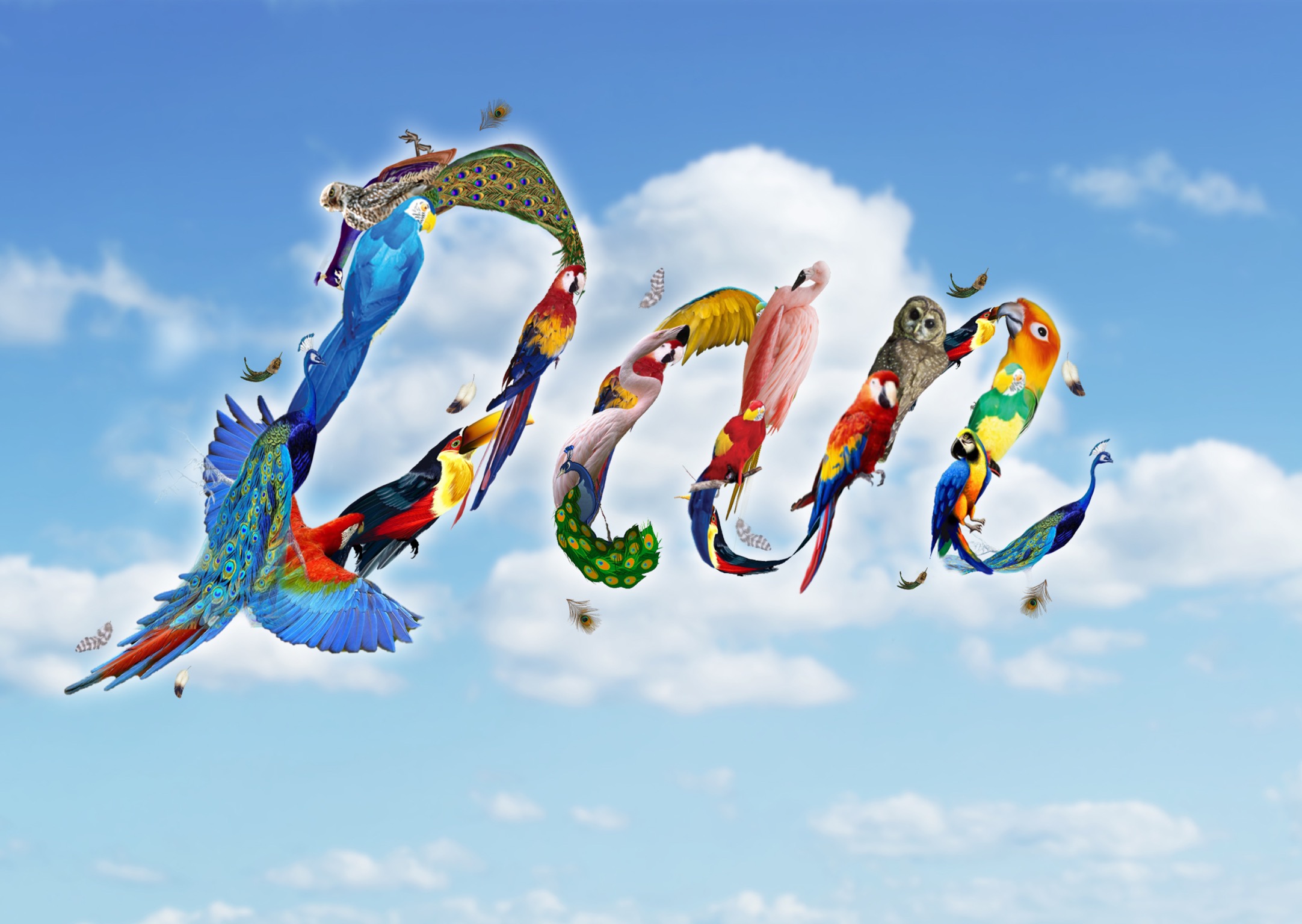
I am Free
I would like to call it ‘Birds of Paradise’ too. A universal representation of freedom would be birds. Hence, I decided to explore typography with birds.
Below was my initial idea. I downloaded birds brush tools and tried to paint it on the photograph. However, I felt that it does not look as convincing and use of photographs as background is not advisable. Hence, I decided to change the look.
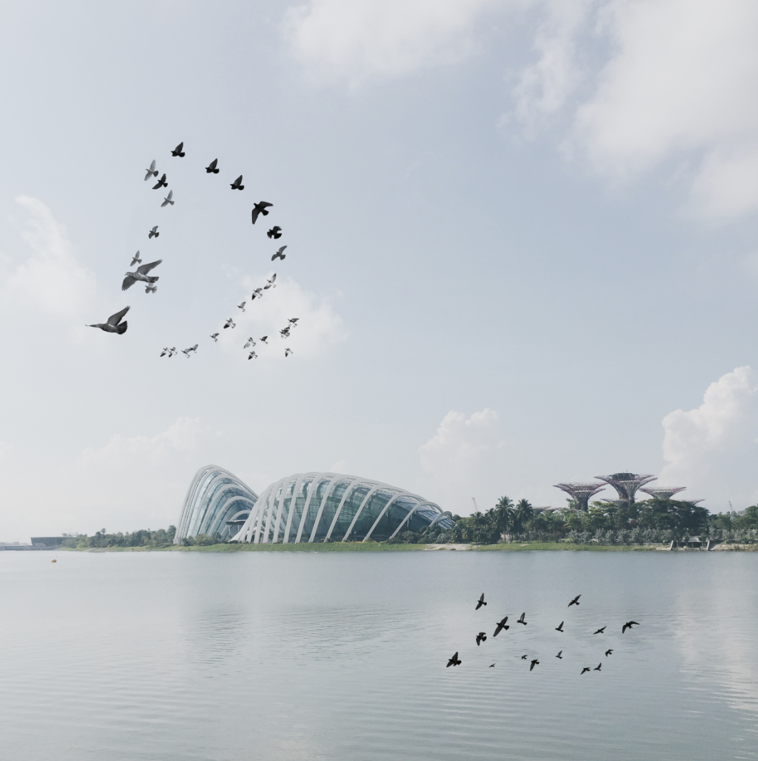
I decided to manipulate birds of different colours to form the shape of my name.
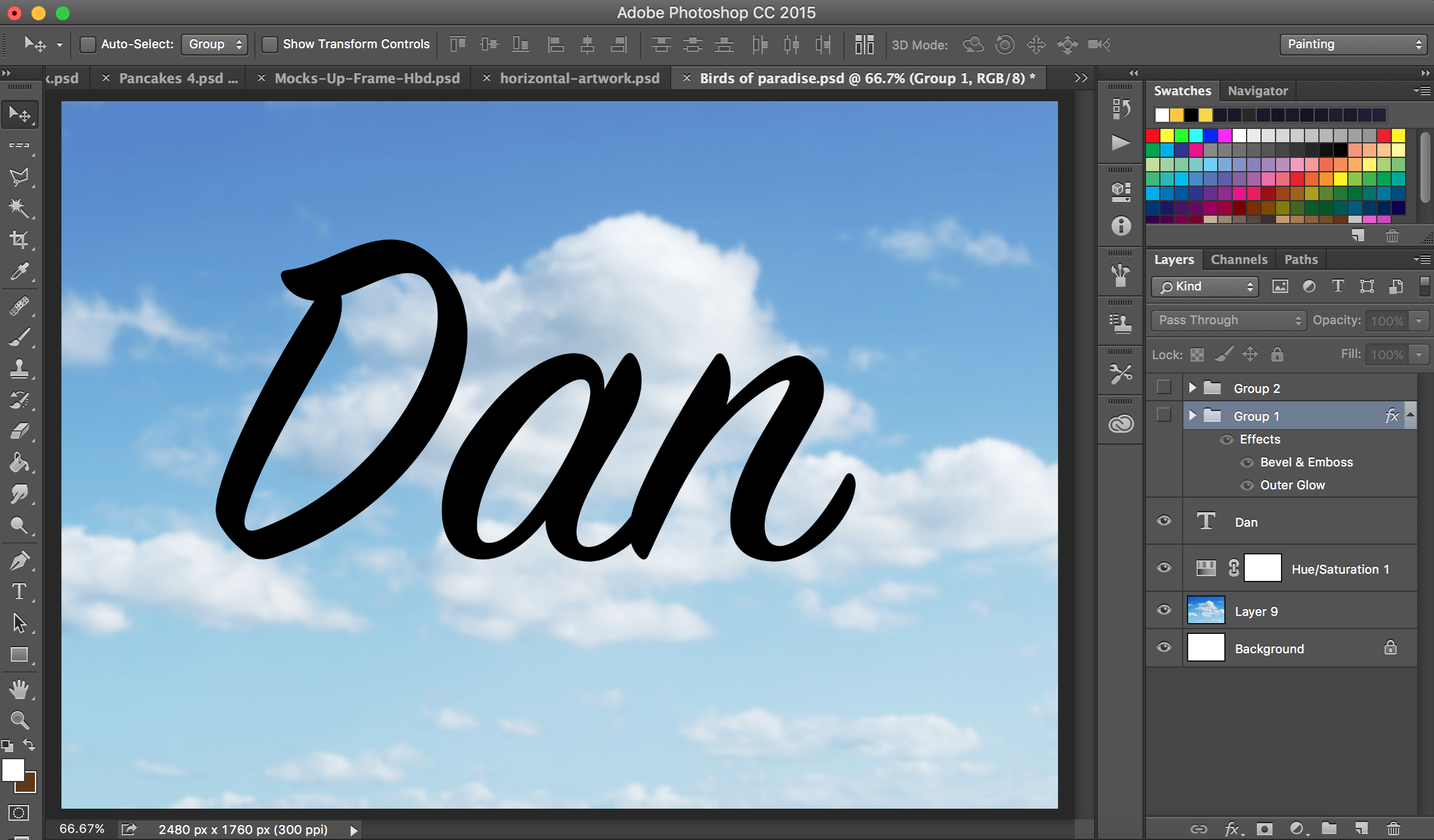
I started off with using an outline of my name in text.
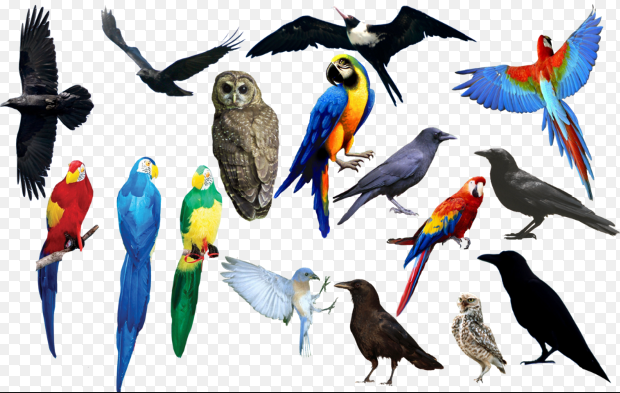
I find images of different birds online. I prefer to find those of colour as it will make the composition more appealing.
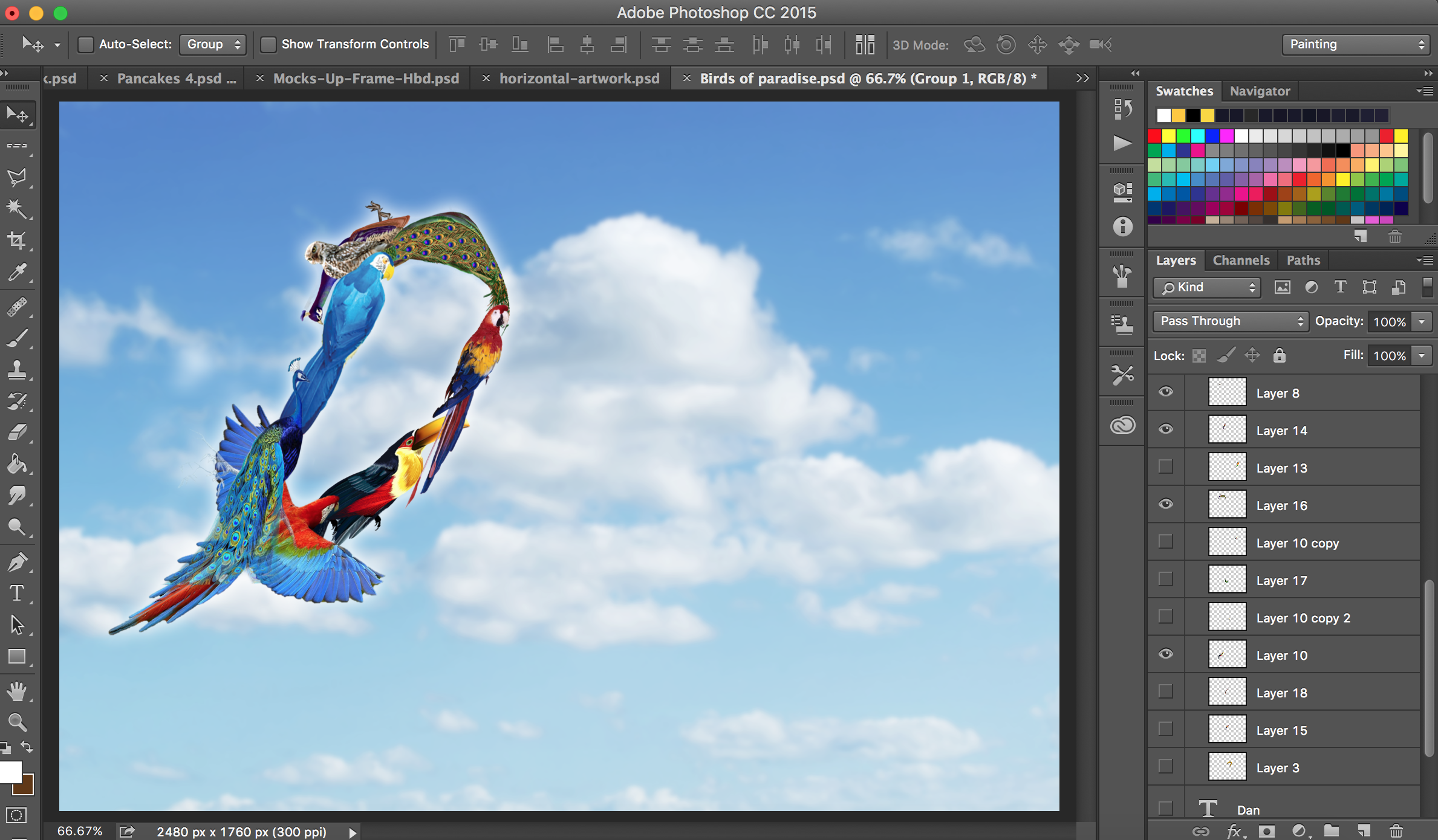
Manipulation of the birds
I find birds of suitable shapes and place them on the letters. I mostly use the skew tool to change the shape of the birds.
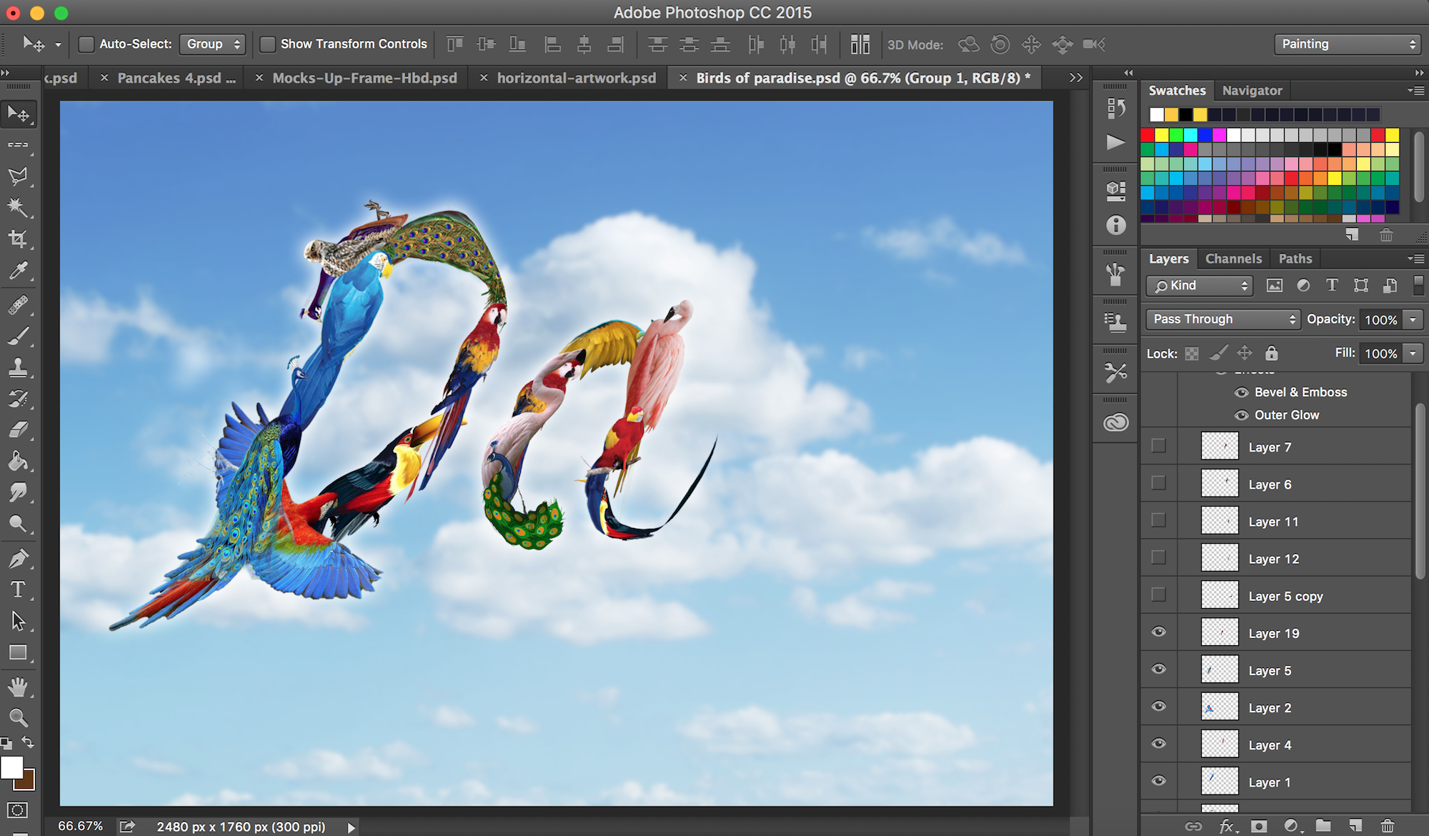
For the background, I chose the sky because it contrasted well with the colourful birds. White and blue also represents freedom. I lowered the opacity and applied gaussian blur to the background to make the foreground stand out further.
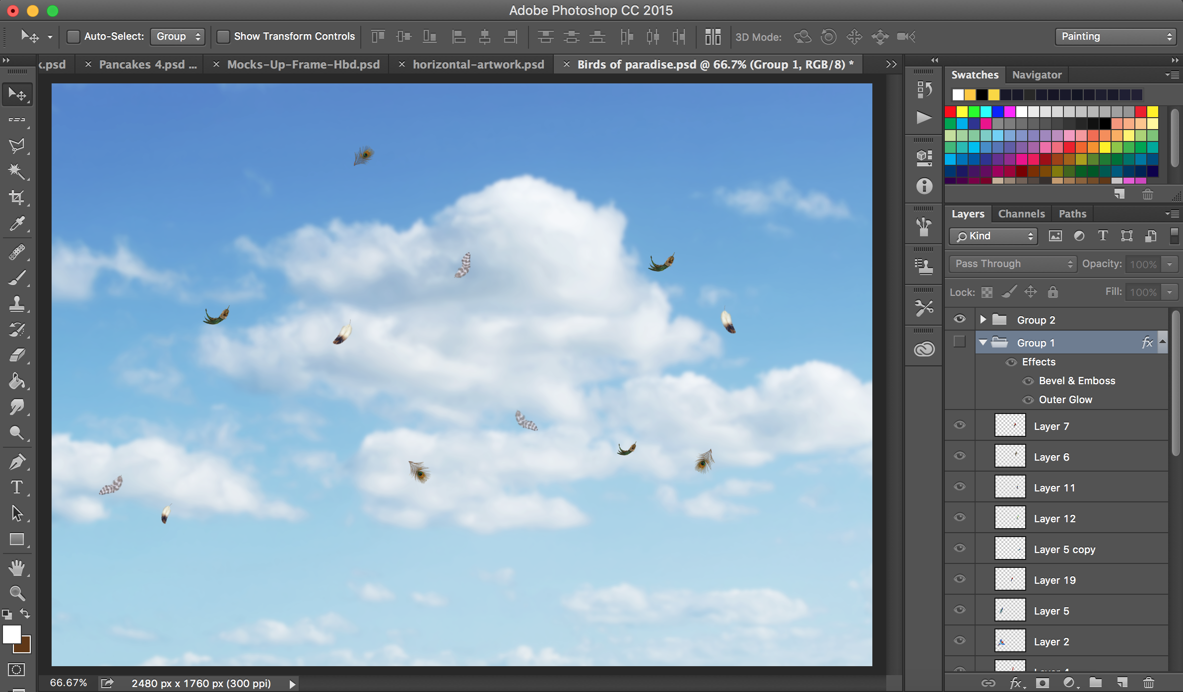
Loose feathers were added individually to give the composition a more realistic look.
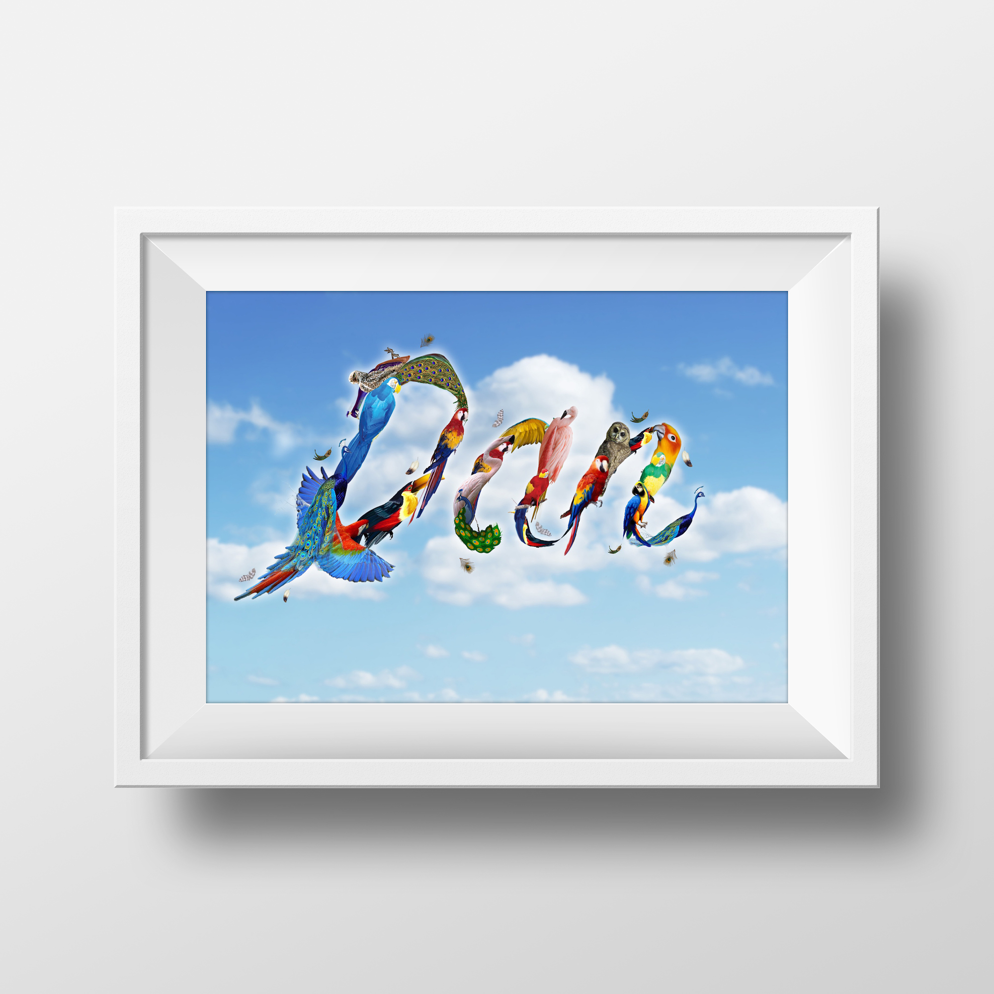
End State
—————————-
I am Sweet
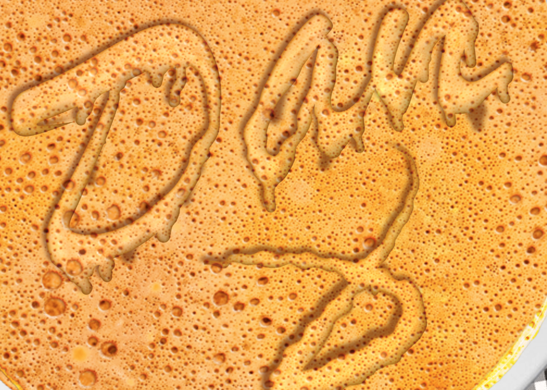
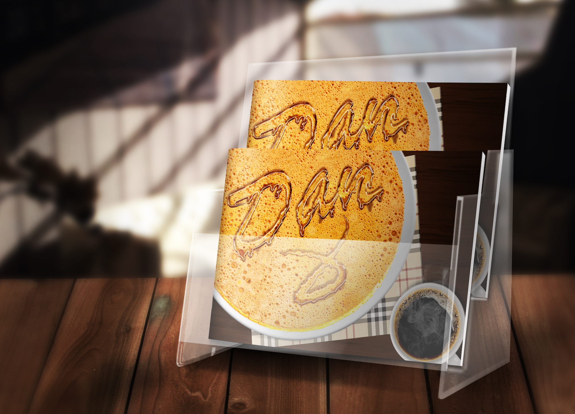
To give off the idea of sweetness, I feel that maple syrup would be a good representation as it is often used to complement pancakes and waffles.
Initially, I placed the pancakes in the middle and the cutleries at the side. However, after consultation putting it at the side would make it visually more interesting.
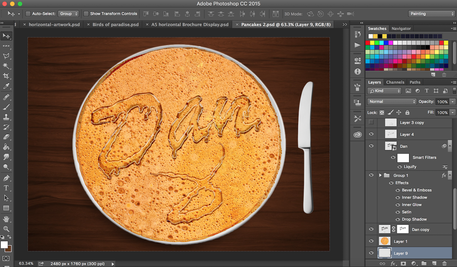
Pancakes are duplicated and lightened to make it look like there are numerous pancakes.
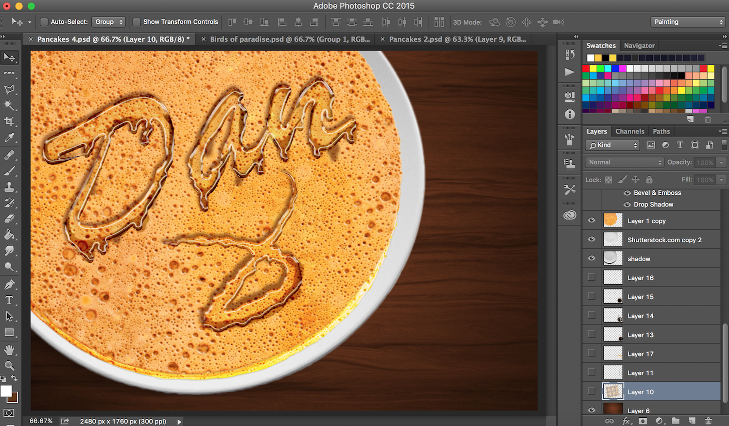
Table cloth was added to make it look more interesting.
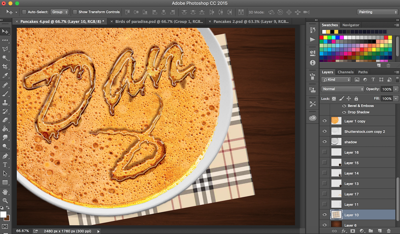
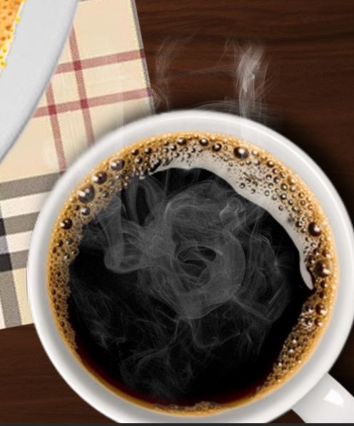
I was trying to make this pancake look more like pancakes because many of my friends thought that this is latte art. Hence, I played with scaling and added a cup of coffee next to it to emphasise the size of the plates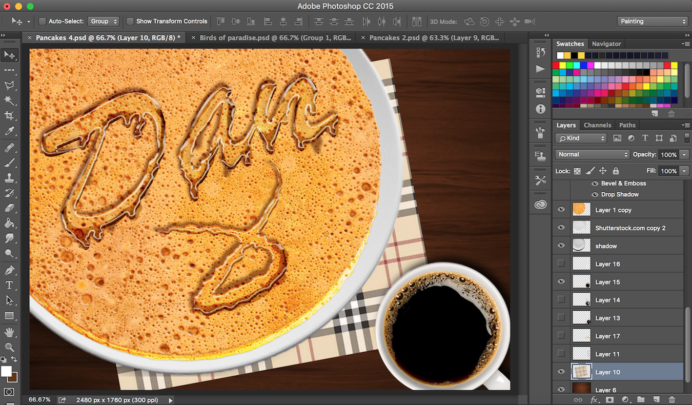
To make the coffee more realistic, I added smoke using smoke brush. I also rotated the cup such that the light is accurately shining from one point in the composition.
Importance of layers with different styles.
Only one layer visible below. (Does not look as appealing)
I wanted to use a white background but went ahead with a dark brown background instead for better contrast.
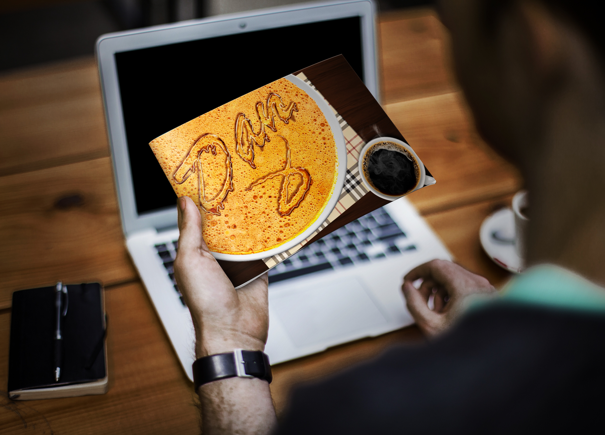
End State

—————————-
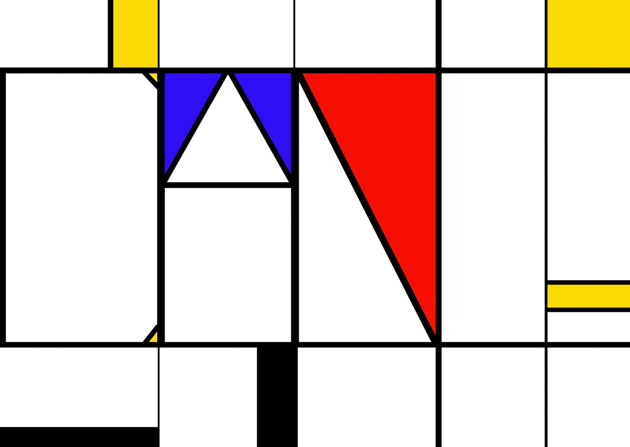
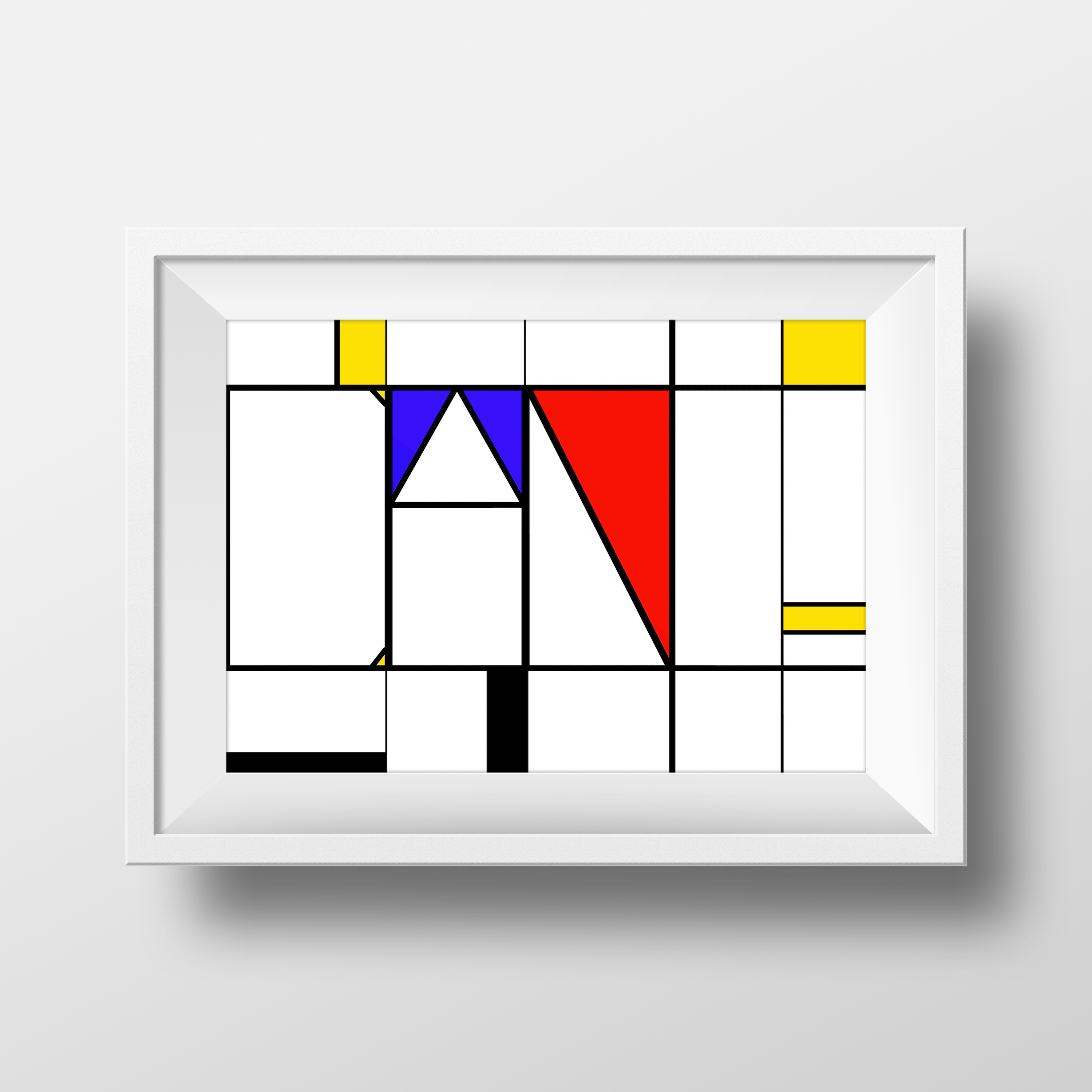
I am Abstract
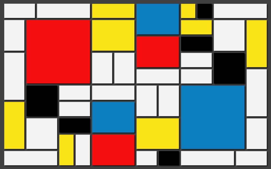
I was always fascinated with Piet Mondrian’s work and marvelled how simple yet appealing his artworks are. Hence I decided to recreate that look and add my name to it.
In Piet Mondrian’s most notable artwork, he simplified the subjects of his paintings down to the most basic elements, in order to reveal the essence of the mystical energy in the balance of forces that governed nature and the universe.
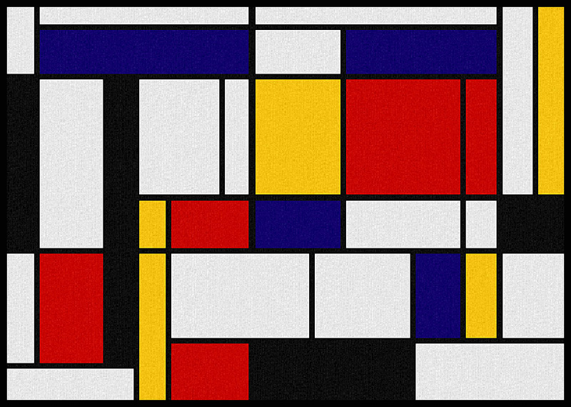
First Draft

Second draft
In the first draft, the ‘D’ is not obvious. Hence, I added ‘sides’ to make it look more like the letter ‘D’. I initially placed ‘DAN’ in the middle but change it to the side instead because it would make the composition more interesting.
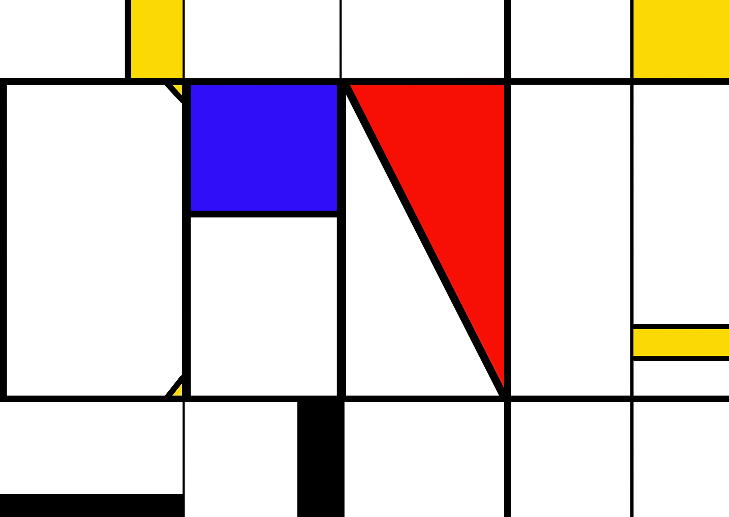
End State
The end state looks cleaner and full.
—————————-
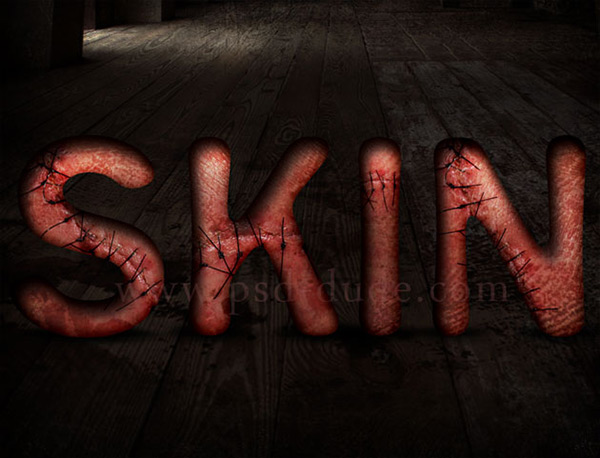
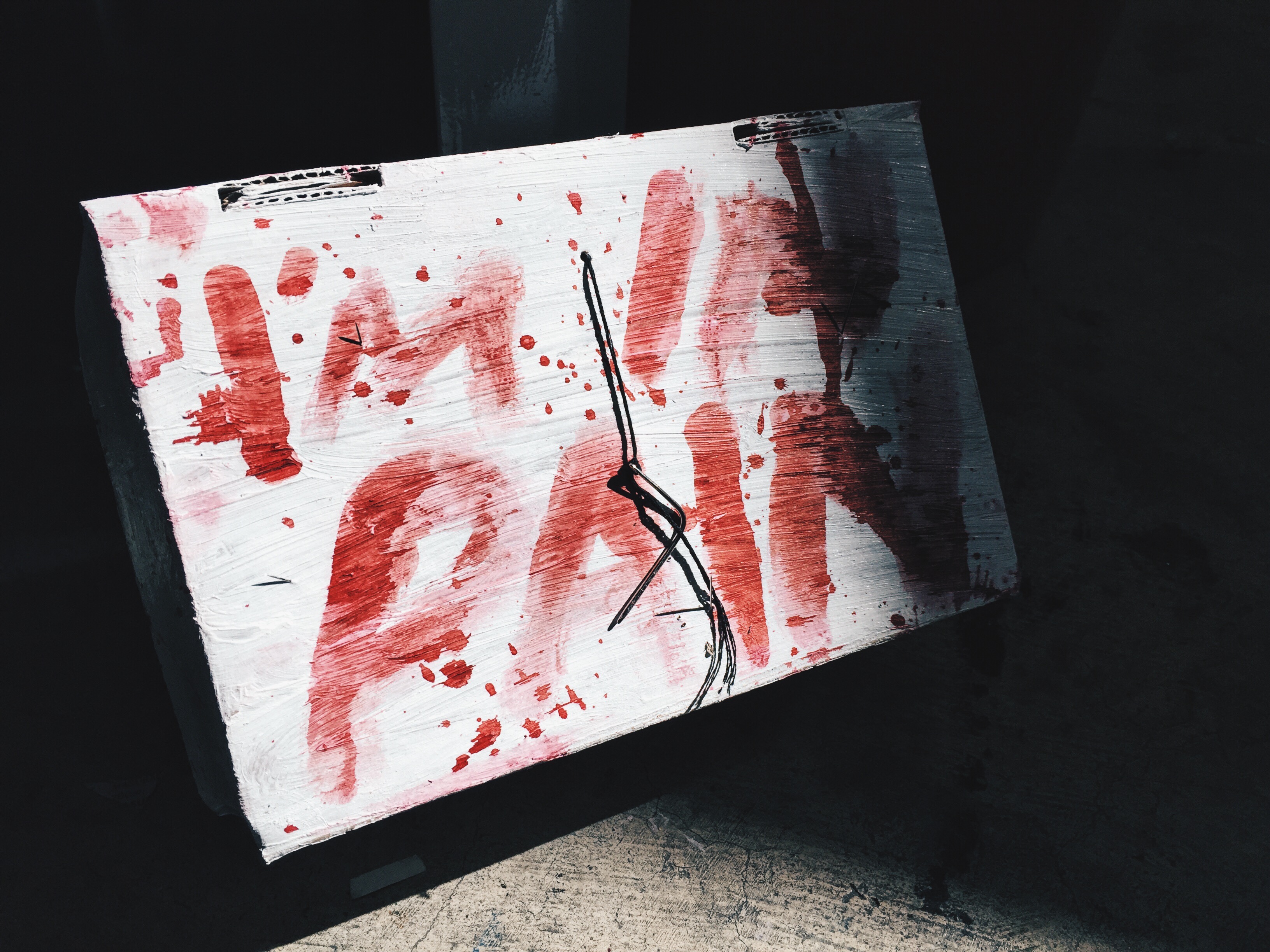
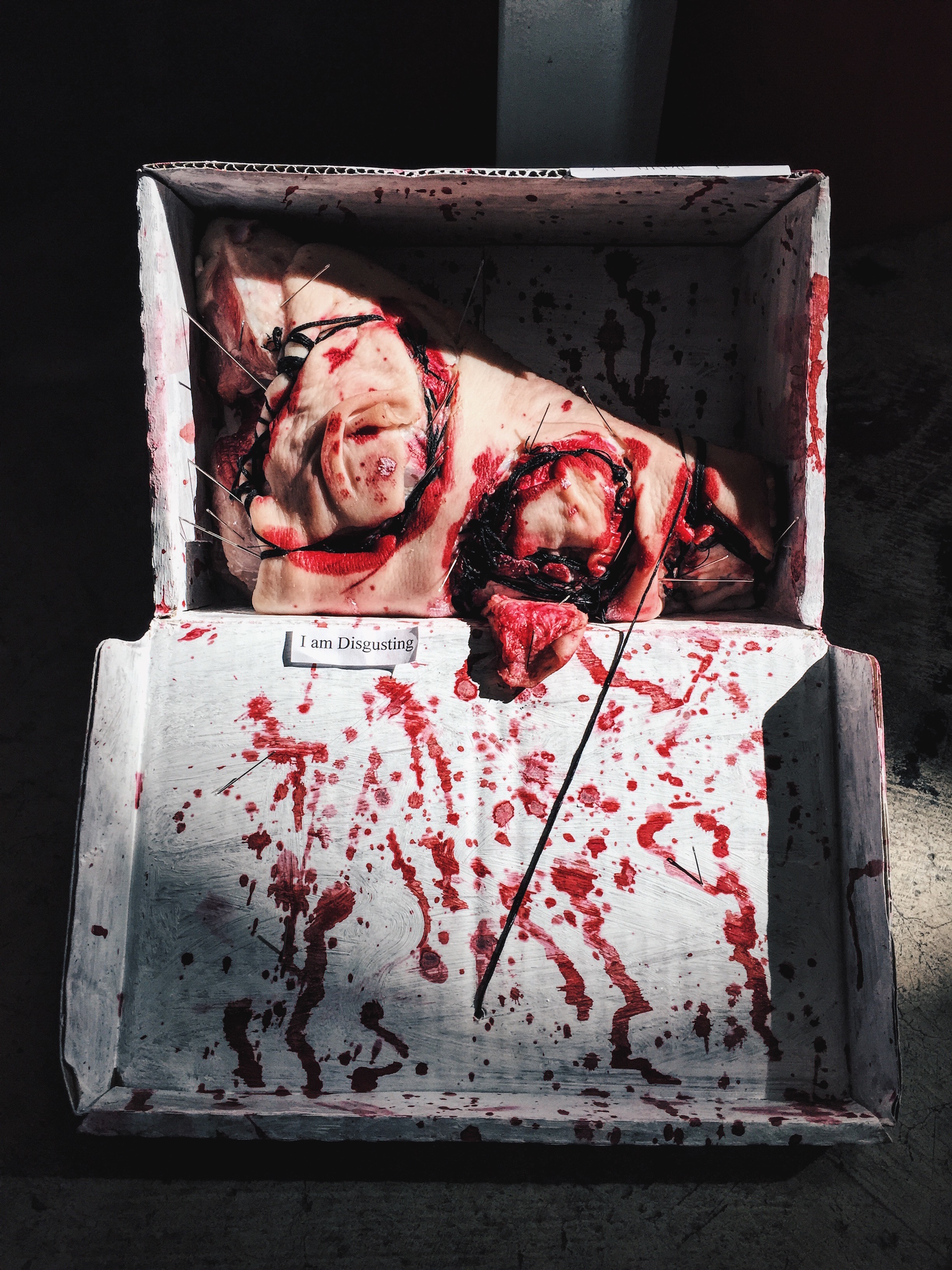
I am Disgusting
This idea came up pretty last minute after I finalised my 4 designs. I was surfing the net for more ideas when I chanced upon this typography where it is a texture of human skin with wound stitches on it. My very first reaction was disgust and it is memorable to me even after I tried searching for other typography designs. I wanted to create a similar typography digitally but I was afraid that it may not be as realistic. Hence, I decided to try creating it hands-on.
I’m someone who likes things that are gory and bloody. I always wanted to try something related to it and I thought this is the perfect opportunity.
Being an avid fan of American Horror Story, this idea looks similar to a scene in the show where one of the character actually stitched herself to two other people while she is still awake. (She was very high at that moment). I remembered that I was disgusted watching that scene as well. I guess why certain ideas worked because it creates a shock value and that image did a good job on it. The director managed to disgust the audience by showing something which is out of the world; crazy. I wanted to create the same effect on my audience.
Here are some inspirations from American Horror Story.
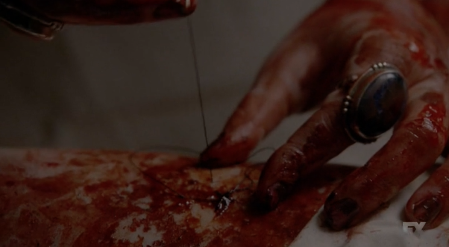


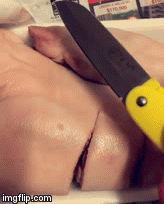
I was thinking of where I could purchase something that is similar to human skin. I went to the supermarket to look around and I decided to go on with the pig trotters. I bought some thick and thin needles and black threads and proceed on to sew onto the meat. (I didn’t managed to take many photos because my hands are all dirty from touching the slimy meat.)
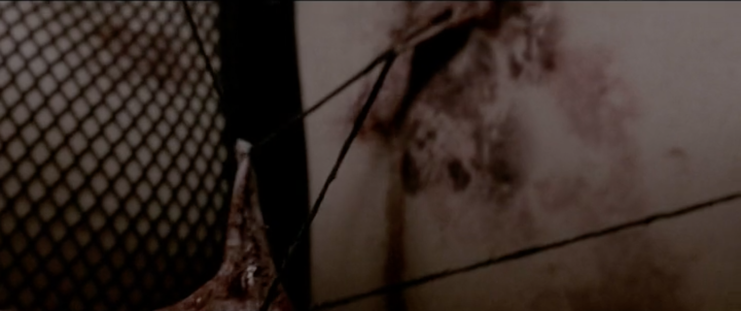
I also looked up on Youtube on how to stitch a wound and I wanted to stitch on the skin but the pig’s skin was really really tough. It is almost impermeable and the needle I used was pretty thick yet I still cannot pierce through. (It’s like a Nokia phone, so strong) In the end, I had to slice the skin really strongly with a knife and stitch on the meat inside instead.


It takes patience to slowly stitch and I took hours interacting with the meat. It is quite heavy and hard to handle it. It was not easy to form the letters. While I was working on the meat, I was actually watching the American Horror Story scene at the same time. I have to confess that I actually had a ‘moment’ stitching the meat.
Creation of box
I painted the box with white acrylic paint and tried to give it a textured look. White background would contrast well with the skin and blood. I dabbed red food colouring on my fingers before splattering on all sides of the box.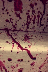

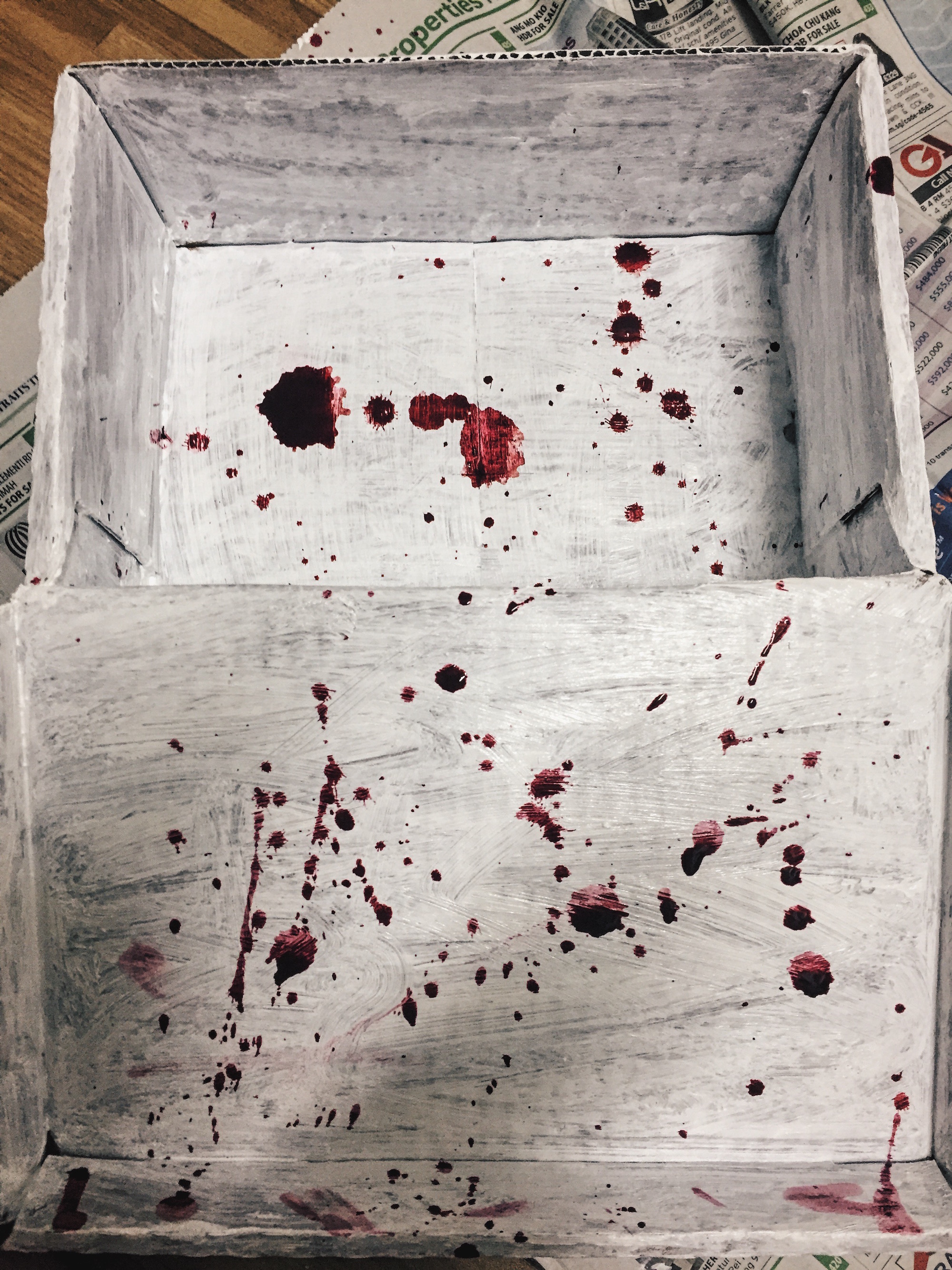
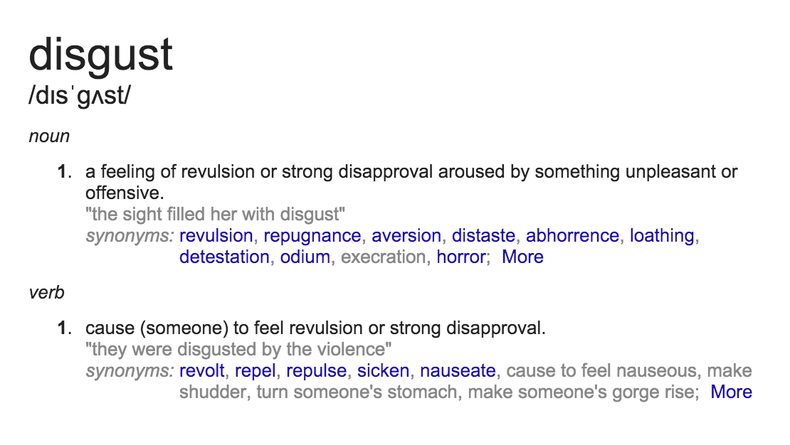
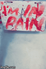
I was pretty much affected by the entire process; sawing through the skin and fats and piercing through the raw meat. It was a bloodied process. After stitching, I dabbed on the stitches with red ink again to emphasis on the outline. I initially wanted to name it ‘I am in Pain’ but I couldn’t shake off how disgusted I felt, with the meat and myself. I decided to name it ‘I am Disgusting’ instead.
I looked up for the meaning on dictionary to be sure.
(And to be honest, this is the sickest work I have ever done to date. I was thinking how did Lady Gaga managed to wear that meat dress on that night!)
End State

Others
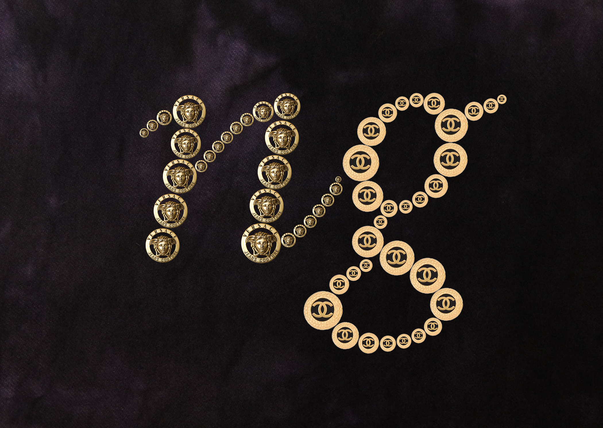
I am Brand-Obssessed
Use of gold Versace & Chanel buttons on black velvet background to give off luxurious feel. ‘Ng’ is my surname.
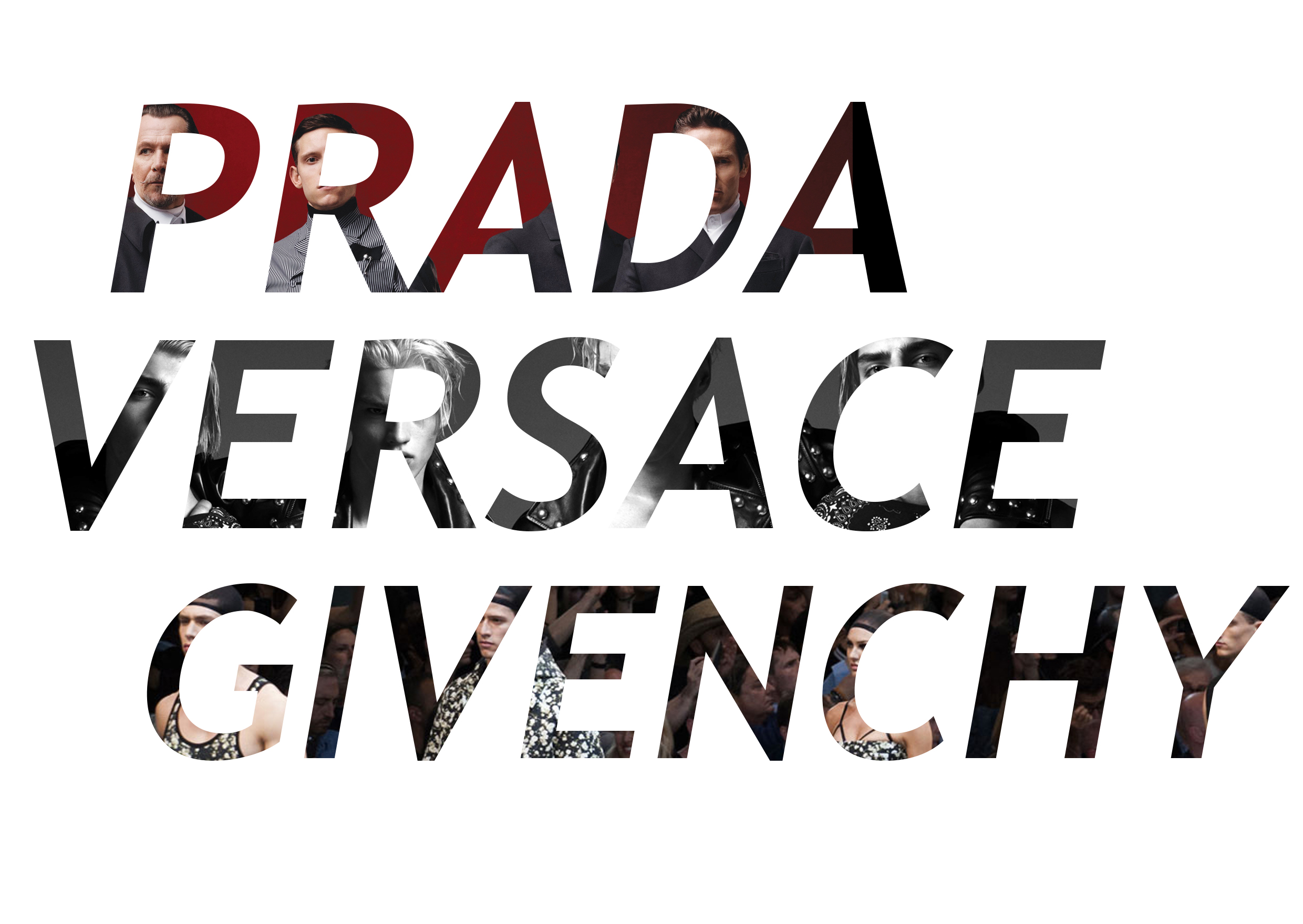
I am Brand-Obssessed
List of my favourite brands. ‘D’ in Prada, ‘A’ in Versace and ‘N’ in Givenchy forms my name vertically.
I am a Coffee Addict
Superimposing my name on coffee foam as coffee art.

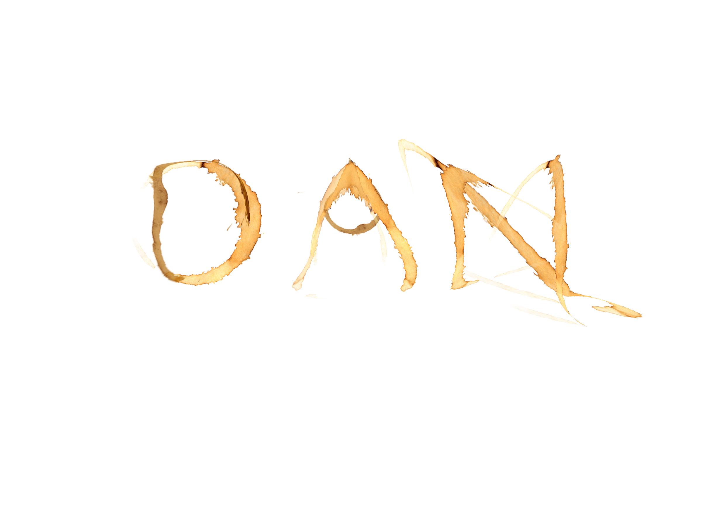
I am a Coffee Addict
Use of coffee stains to form my name.
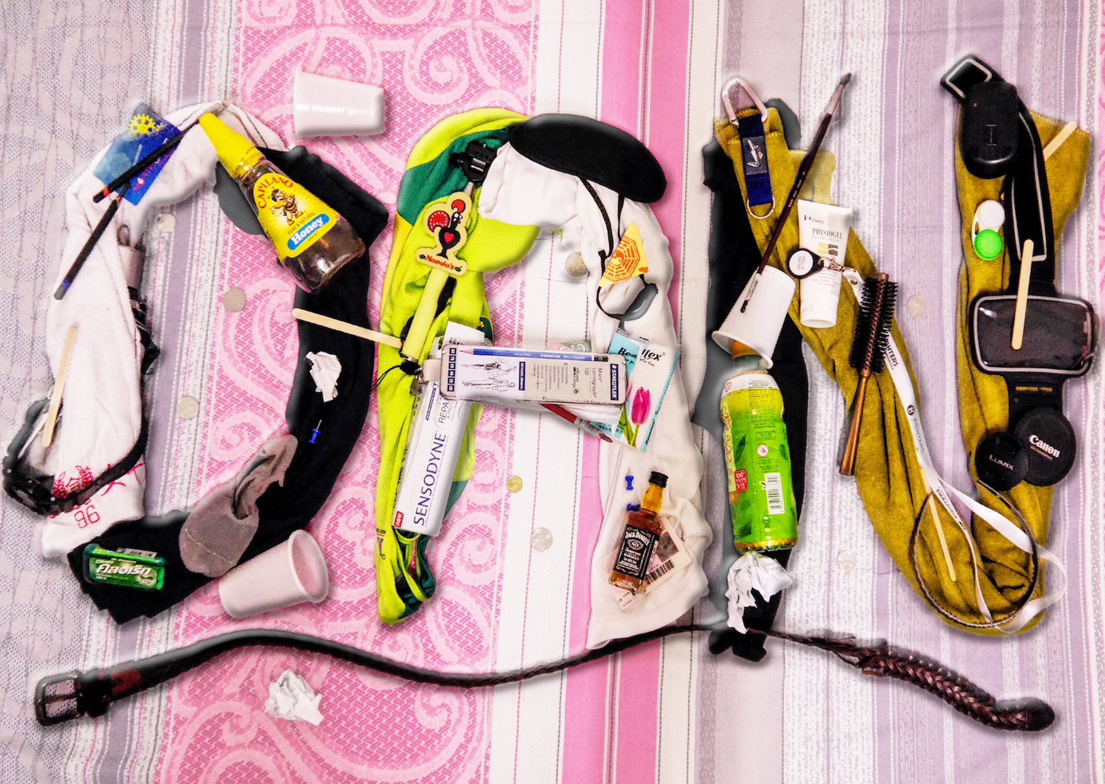
I am Messy
Ironically arranging random items to make it look messy and slipshod.
You must be logged in to post a comment.