Beyond The Seas – Case Studies

Before I chose Nexus as my elective, I saw a few works done by my peers in Year 2 Semester 2. I was really inspired by their creative work and I knew that I could put my final work done in Nexus in my portfolio for future use.

Idea 1 

This video in particular, intrigued me and inspired me to take on Media Art Nexus. I want to create something similar. This is a Lady Gaga concert intro for Coachella 2017 and I thought the transition and concept is really experimental and cool.

I found out that it is produced by a creative studio in London called Lobster Eye founded by Andrea Gelardin and Ruth Hogben.

I proceeded to find out more about the studio and discovered that they produced the interludes for Lady Gaga’s Joanne Tour Concert too.

I love their work because it’s very stylised, and weird at times but it can really attract attention because of the fast transitions and interesting visuals.

Some of my favorite stills

I also like this bathtub scene where Rihanna shot for Samsung: Antidiary x Samsung. Once again, it is pretty stylised and ‘cool’. I like how it is so minimalistic yet captivating. I believe it is not only because they engaged a superstar like Rihanna but also the use of water as an element in the video.

My favorite stills

Lastly, I also like the campaign done by Gucci for fall/winter 2017.

Instead of casting models, they ventured into a different style and played with imaginary and fantasy. The campaign include monsters, aliens, and characters inspired by the movie, Star Trek. I saw the campaign before Ina mentioned about it during the first week of school. I love the visuals because it is so different from usual campaigns that we saw for luxury brands. The direction and style is beautiful and stunning.

With these inspirations in mind, I am thinking of producing visuals with a Chinese model and playing with the 4 elements: Earth, Fire, Water, Air. I also want to experiment with video transitions, making it look trippy and fast.

Shooting Techniques Tutorials

On how to work with drones. I intend to use it in one of my shoot.

Also working with gimbal and using Zhiyun Crane. One of the best gimbal for DSLR.

I will be working with a model so this video is great for preparation.

Also will be working with lights in some shoots.

As the senior batch had mentioned that one of the challenges faced is the long panel with made it hard for them to fit one video in the long panel alone because the other side will be empty. Hence, I might put several video clips together like the ones seen in Kendrick Lamar’s MV, Humble.

Kendrick Lamar Humble video

And also something similar to the intro of this video showing the Holi Festival in India.

Post Production Tutorials

Most of my time will go to post production. Cinematic LUTS could help me speed up with my work.

Effects

Tutorial to split the clips for the long panel.

Idea 2

I was thinking if I ever were to ditch the stylised model shoot, I could try something more abstract and aesthetically-pleasing like filming the process of bath bombs dissolving in a water container. Footages of bath bombs dissolving are mesmerising and calming to watch. I will take close up shots of the bath bombs dissolving and piece the footages together. I believe it will look beautiful when it is screened on the panel.

Stills

Ultimately, I will do either one but to be honest, I am very tempted to try out both ideas and try to merge the two concepts together. I am still trying to conceptualise the entire idea but this is the rough idea of what I am planning to do for Nexus in this semester.

Dan

Things I Wanted to Say to You But Never had the Courage

IMG_7943

Installation Piece

IMG_8028IMG_8029

Book

IMG_7920IMG_7917IMG_8027

Content

IMG_7944 IMG_7939 IMG_8030 IMG_7858 IMG_7938IMG_7921

Interaction

The public are given instructions on how to interact with the book and they are encouraged to pen down their feelings into the book and it allows them to share their feelings and experience where other people can read too.

Location

I chose this location because firstly it is a quiet spot in the library. The content that I wanted the public to pen onto the book is rather personal hence I felt that the spot that I chosen is ideal. It is secluded and sheltered from the public yet accessible. It is also close to the entrance. The people who usually visit the sofa are people who are alone trying to find some peace and stillness. This allows them space and time to ponder about their feelings and think about if there is anything they want to say to a certain someone. The availability of the table next to the sofa also gives the user space to write on the book.

Production

I bought fancy papers in order to create the book. The photos printed on the paper gave it an interesting texture, look and feel. I also used different paper texture for the cover and content because I want to differentiate the two. I cut down another hard paper to use as the spine. I sliced each A4 paper individually into A5 size and carefully lay on several layers of glue before placing the spine on it.

Artist’s Statement

#wordsforyou

How many of us have something we want to say to someone badly but never have the courage? How many times such thoughts spring up only after we observed the stillness of silence?

We tend to post our feelings on social media to convey a message, hoping that the intended receiver would notice what we truly feel. The rise of social media and the digitisation of messages seemed to have transformed words into hashtags.

In the booklet, the artist compiled a list of things he would want to say to someone but never had the courage to. Only one sentence appear in every pages exclusively. The placement of the words at the bottom of every page symbolises the possibility of the end of the relationship should he say the words out.

The artist wishes to collate the words that are never said from different people and share with the community. He believes that the collective voices of people who pen down in the booklet allows it to contain an immense amount of bottled up feelings. It is only when a reader peruse the book do they realise that many others may have the exact same words that they wanted to say to someone but never had the courage to. 

————————————————-

Lessons Learnt

I appreciate that we get to try to produce an installation for our 4D final assignment. I was always amazed by the works presented in museums and art shows and I was thrilled to be able to produce one myself too. From planning, to changing of ideas to submitting the idea for approval and working with relevant parties gave me the idea of how it is like curating an installation piece for the public. This assignment is relevant to my major in Visual Communication in terms of showcasing the work and working with space.

Update 15/4: Writings by the public. Short listed two of my favourite.

IMG_8196

IMG_8123

Project 1 Walking Home 2

Password: walkinghome

Title: Tell Me You Love Me

Medium: Video

Work description: When it comes to task 2, I decided to change the concept of my home. I decided to explore something more intimate to me. Hence, I focused the project direction to the in-depth relationship with my parents instead. Parents is an interesting idea to explore because it connects people. We all have parents and we bound to be something in common to share. I am grateful that I have a good relationship with my parents such that I could communicate with them on issues and I felt that our relationship greatly strengthen after I started working for them. We have more topics to discuss about albeit disagreements. I noticed that I rarely or rather, never said ‘I Love You’ to my parents and I started questioning this issue and realised that some words don’t have to be said in order to convey its meaning. Meanings can subsume under other words that could also be delivered effectively. I used different imagery, scenes and dialogue to represent the feelings that I feel about my relationship with my parents. I feel the most effective medium to convey the idea of closeness would be the use of dialogue. The recorded human voice provides a sense of intimacy between the speaker and the listener. It gives an almost real life familiarity as if we’re hearing the voice first hand. The use of soundtrack is a supplementary medium to deliver the emotions and ideas that I was trying to convey.

I guess the advantage of using still images to convey an idea would be that your audience are only focused on the single piece that is presented at the period of time as opposed to moving image where multiple things can occur simultaneously. The limitation is that a still image may not evoke as much emotions or pique as much interests compared to moving imagery. The role of sound work as I mentioned above act as a supplementry tool to accentuate the emotions and/or ideas that the artist is trying to convey. However, one must note that while the layering of sound effects may be interesting, one should vary the volume of different sounds because it may distract the audience/listener when they are viewing your work.

Zine

When we first got our assignment of producing a zine, I was pretty excited. I always wanted to create my very own magazine to show my friends and I am glad to learn InDesign because this skill is essential in the magazine industry.

Art Direction & Concept of Zine

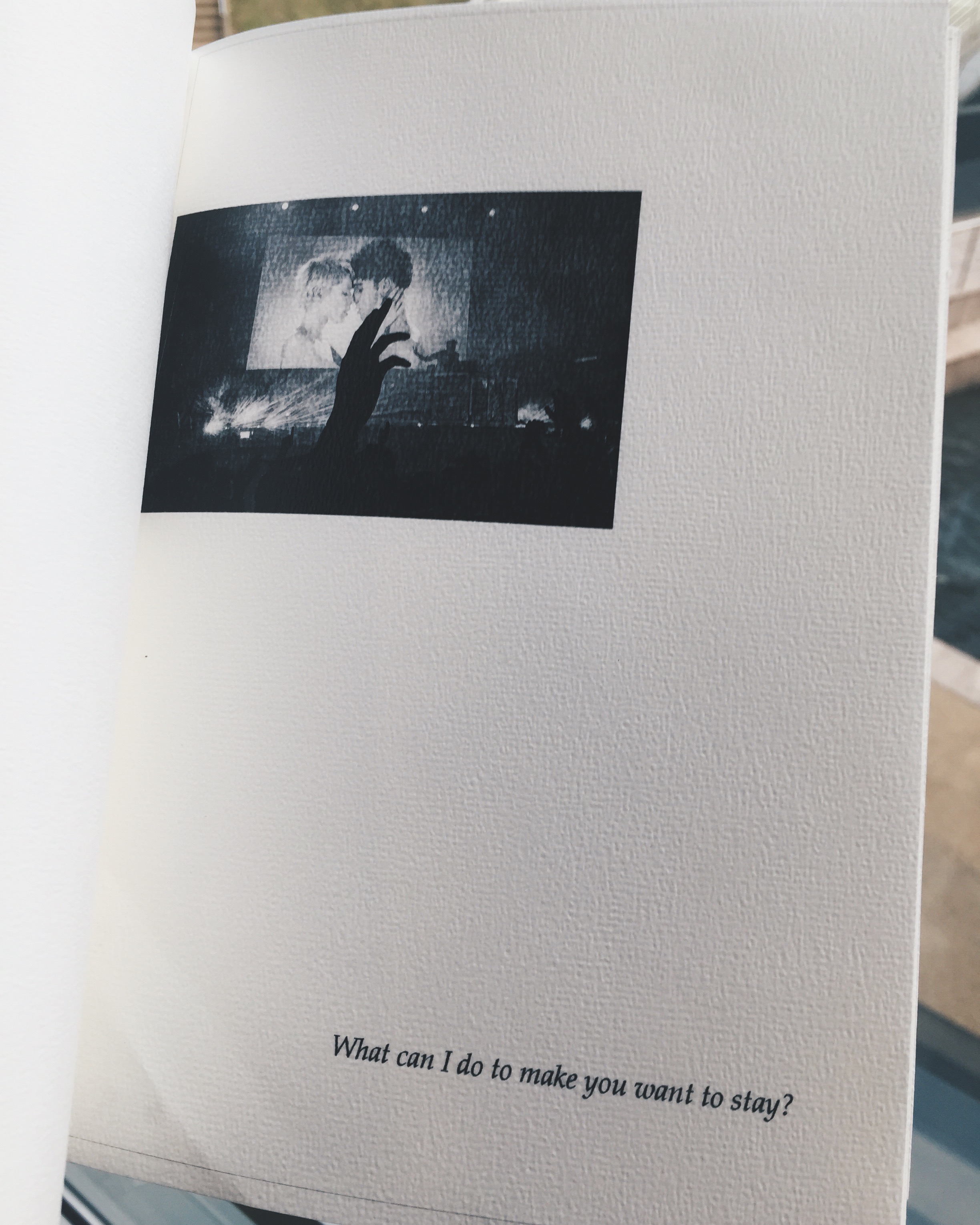
I initially wanted to tap on the concept of ‘Love’ for my zine. I’ve complied a list of stories that I wanted to write about love from the previous assignment, ‘Point of View’. However, our tutor advised us to try to not tap on other concepts and it would be better to showcase the work that we have done in semester 1 & 2. *Guess I’d have to leave my ‘Love’ to next year’s assignments then. Nonetheless, I am thrilled to complied my past works into one magazine. I thought that it is also a great opportunity for me to prepare a portfolio where I can show my future interviewer the works that I have done in school.

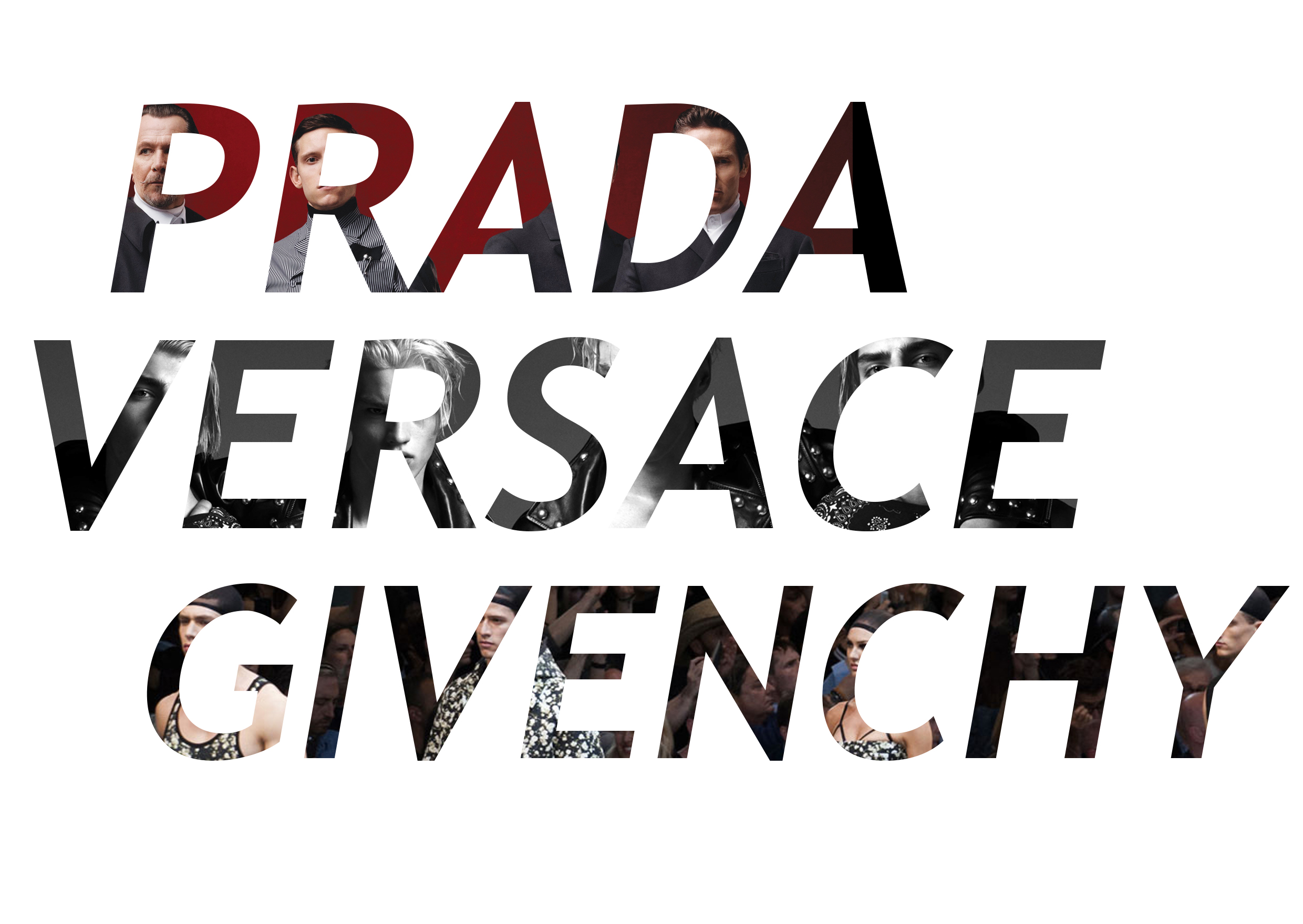
I didn’t include everything that I have done into the zine but instead, I chose the best works and incorporated them into my portfolio to the best of my ability. The concept for my zine would be professional and creative. I want it to be eye catching and interesting. It is crucial in the selection of content. However, I knew that because I am using my past works for this assignment, formulation of content is relatively less important than composition now. I categorized my works into 3 categories: Photography, Arts & Crafts & Illustration. All these in which I have experimented in 2D class.
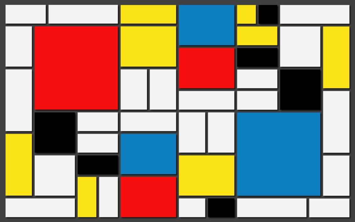
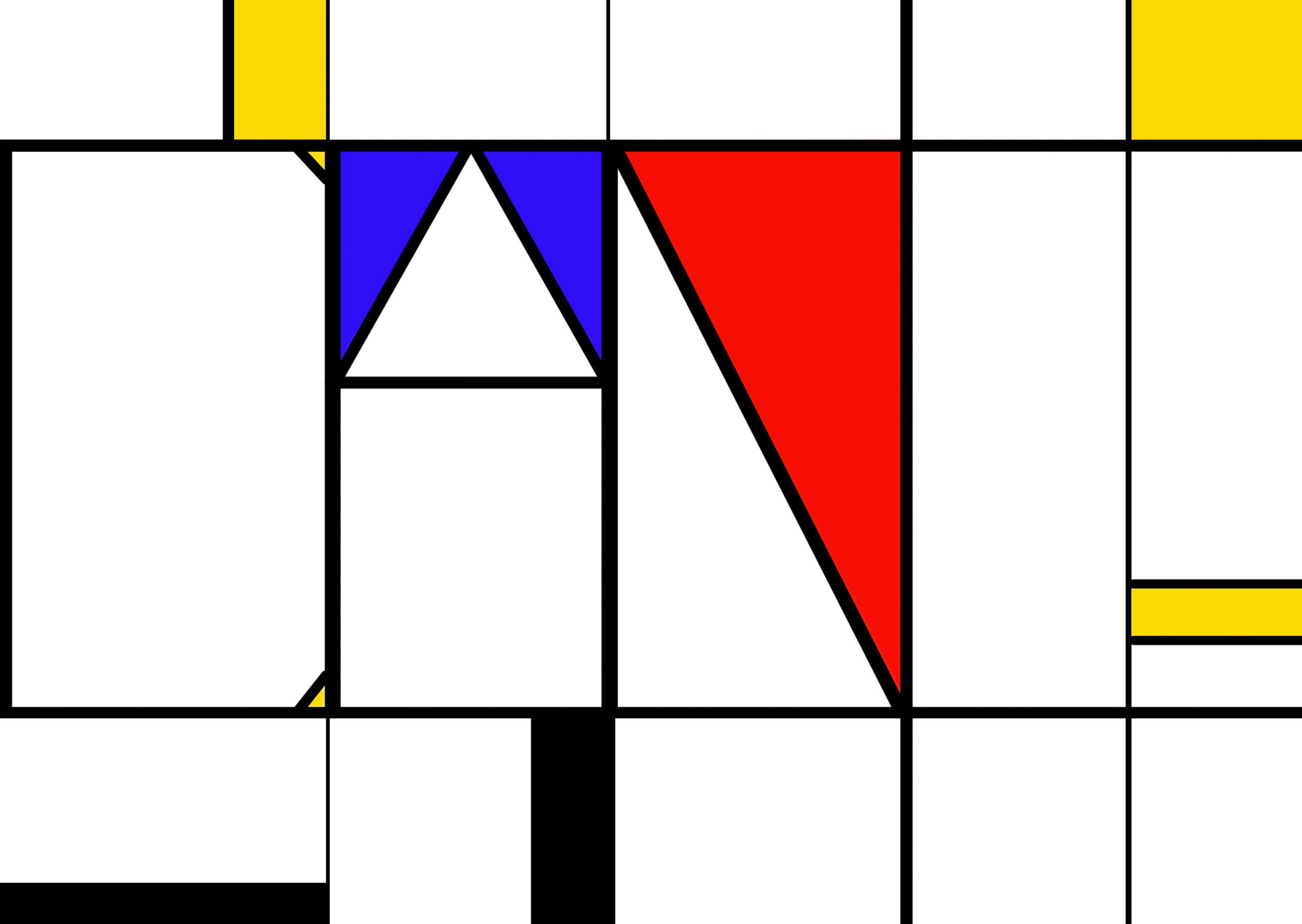
Front & Back Cover

1 2 Front Cover 3

Final

For Presentation ConfirmedFront

For Presentation Confirmed

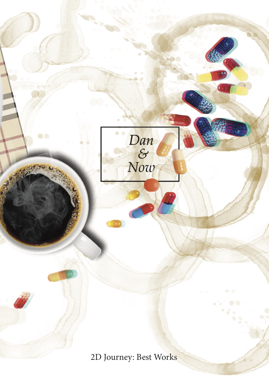
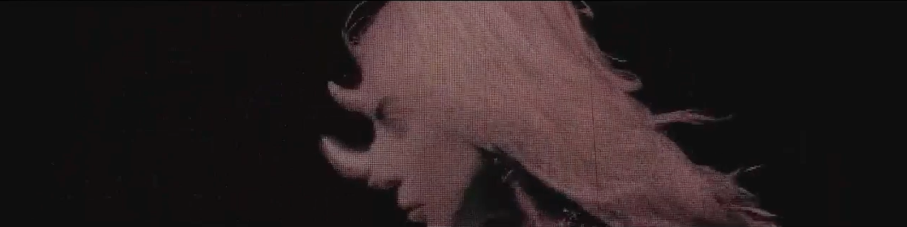
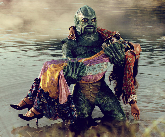
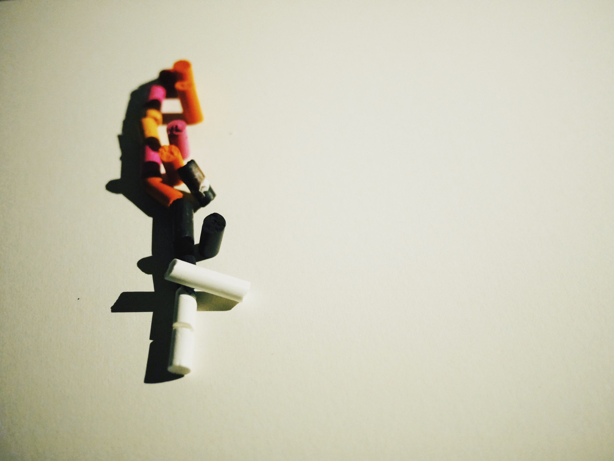
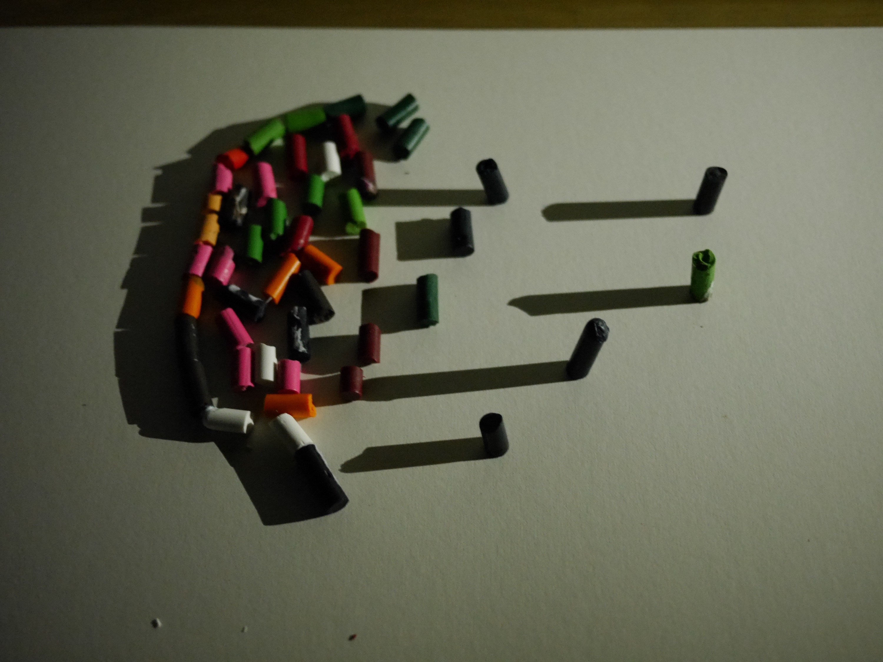
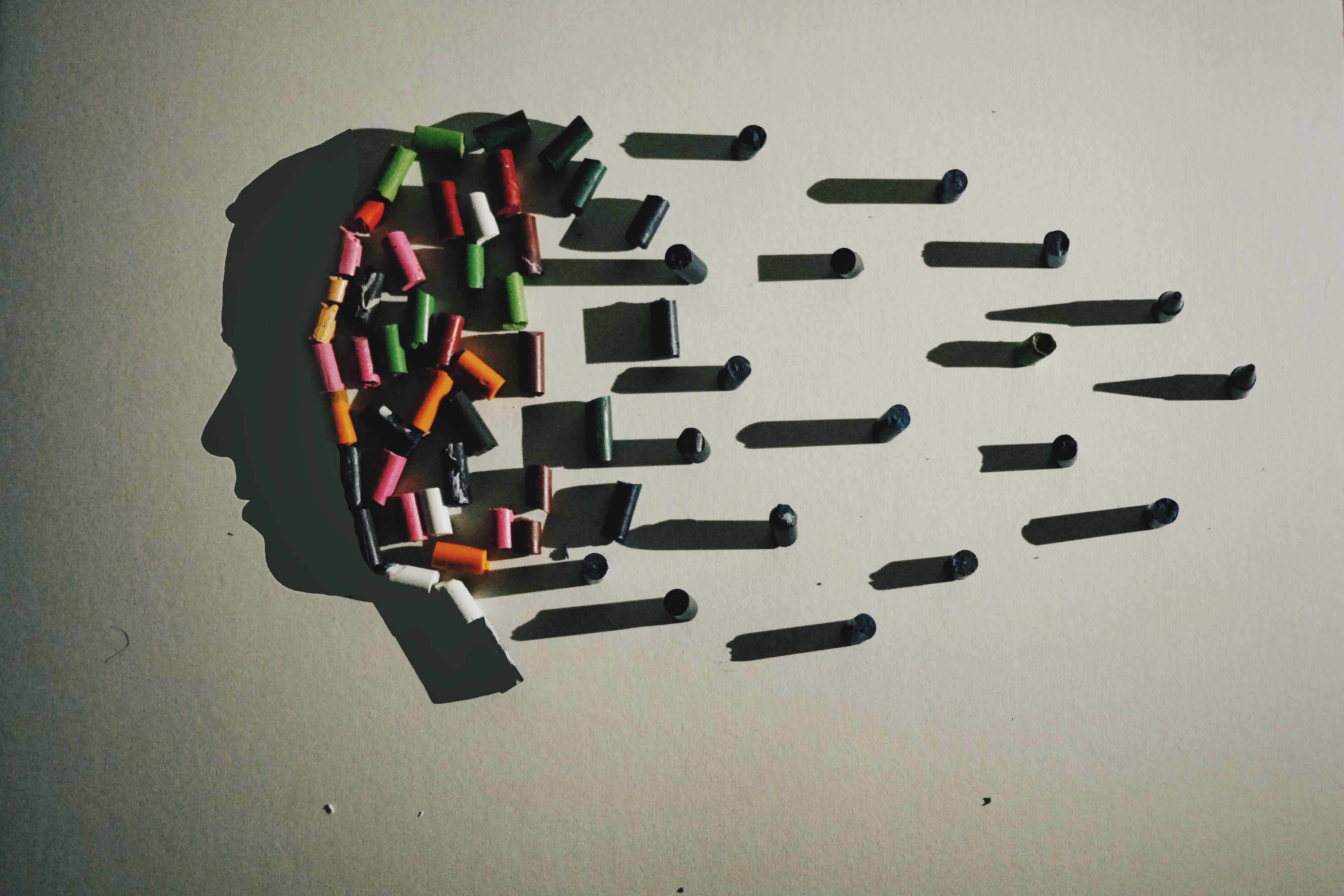
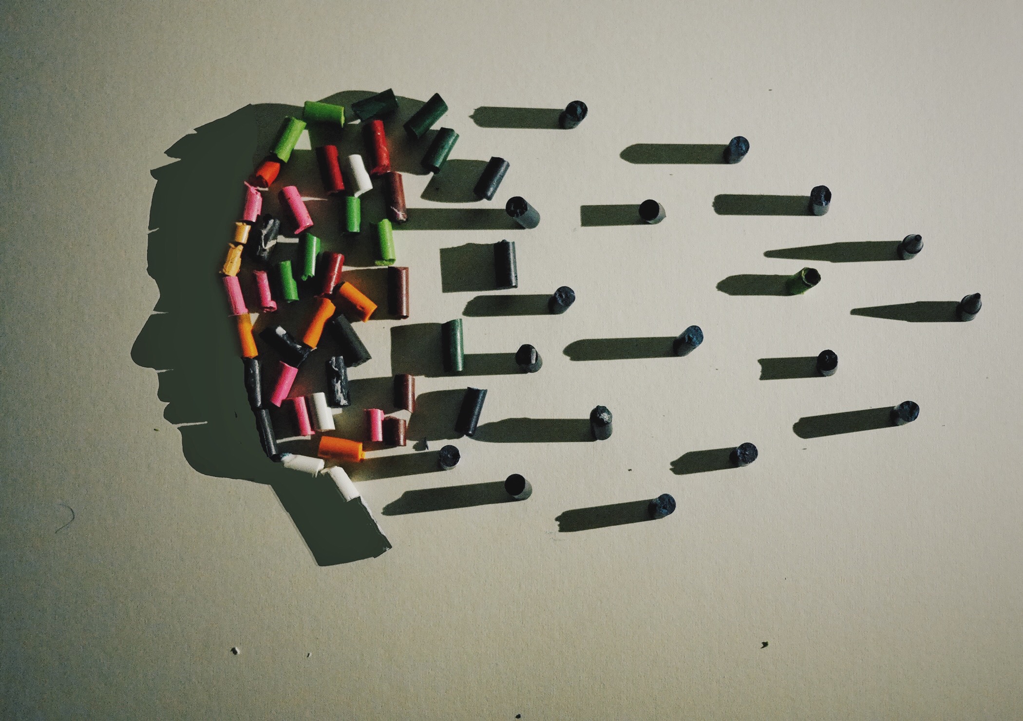
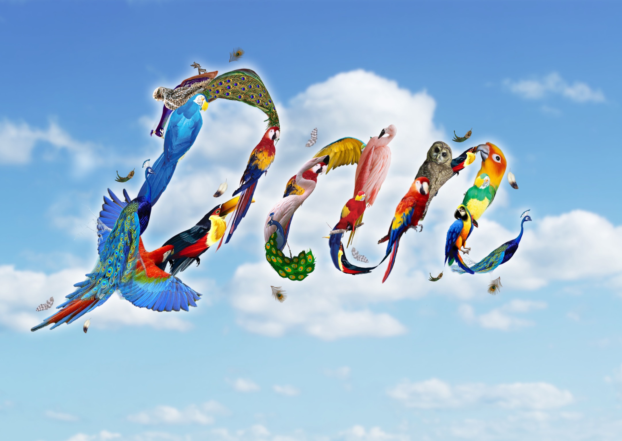
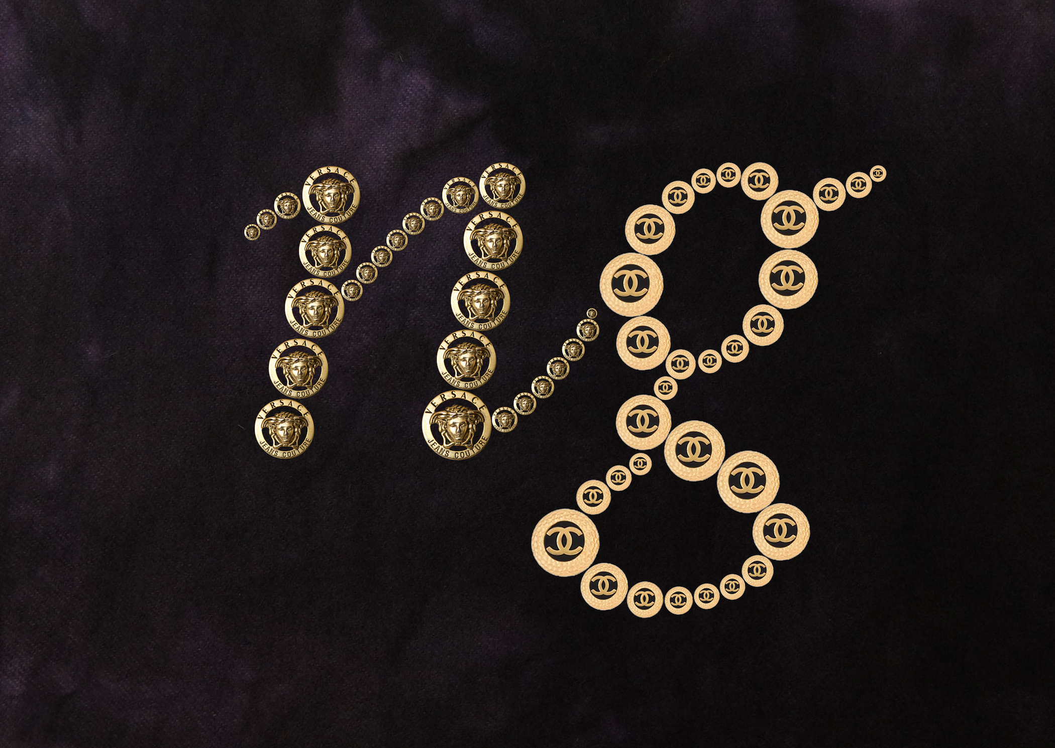
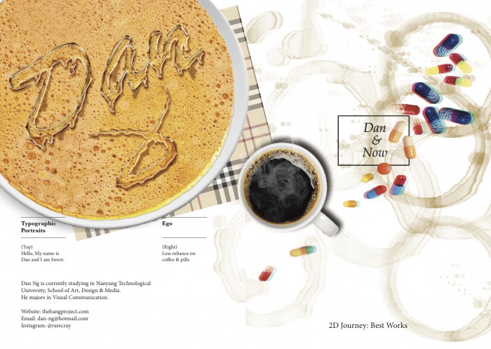
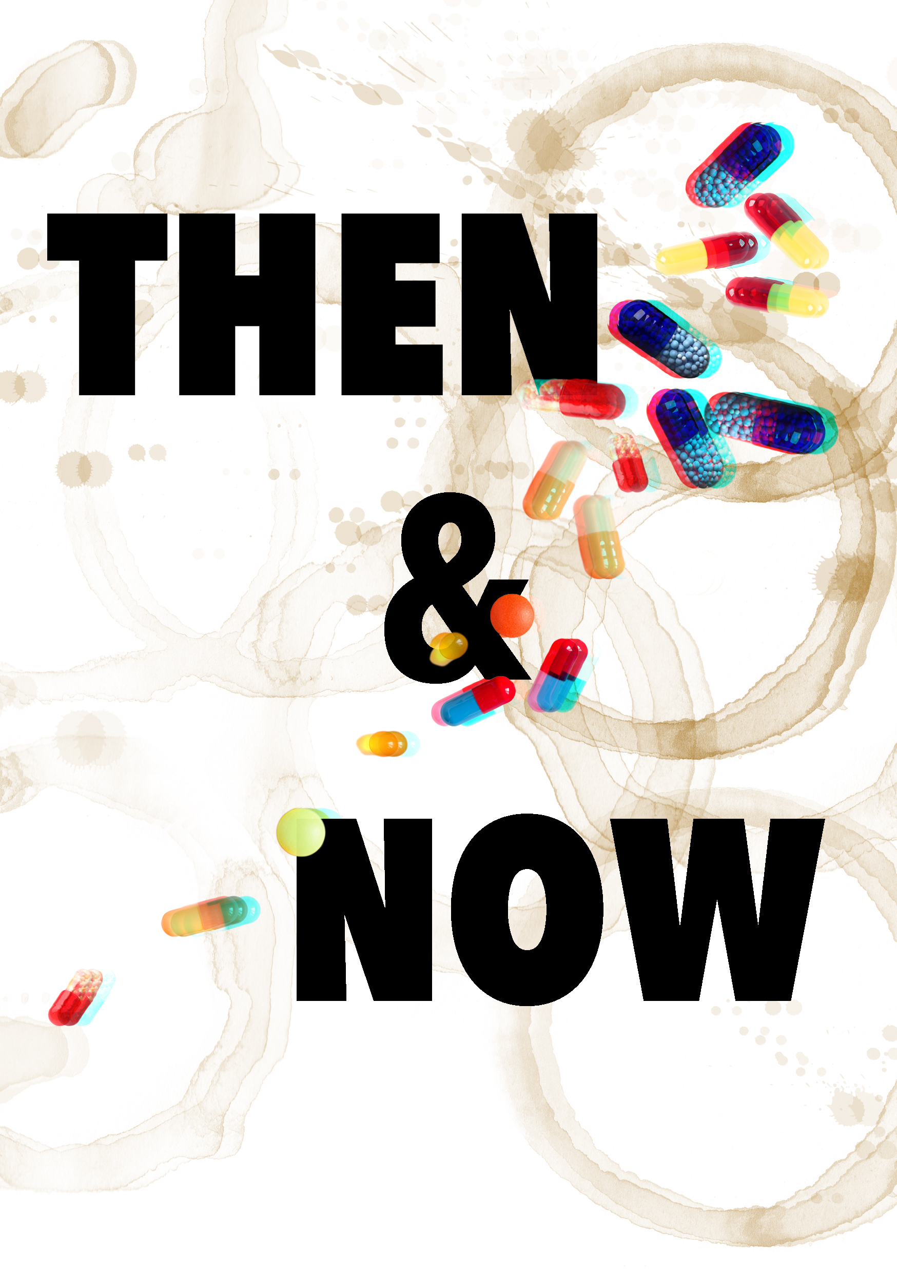
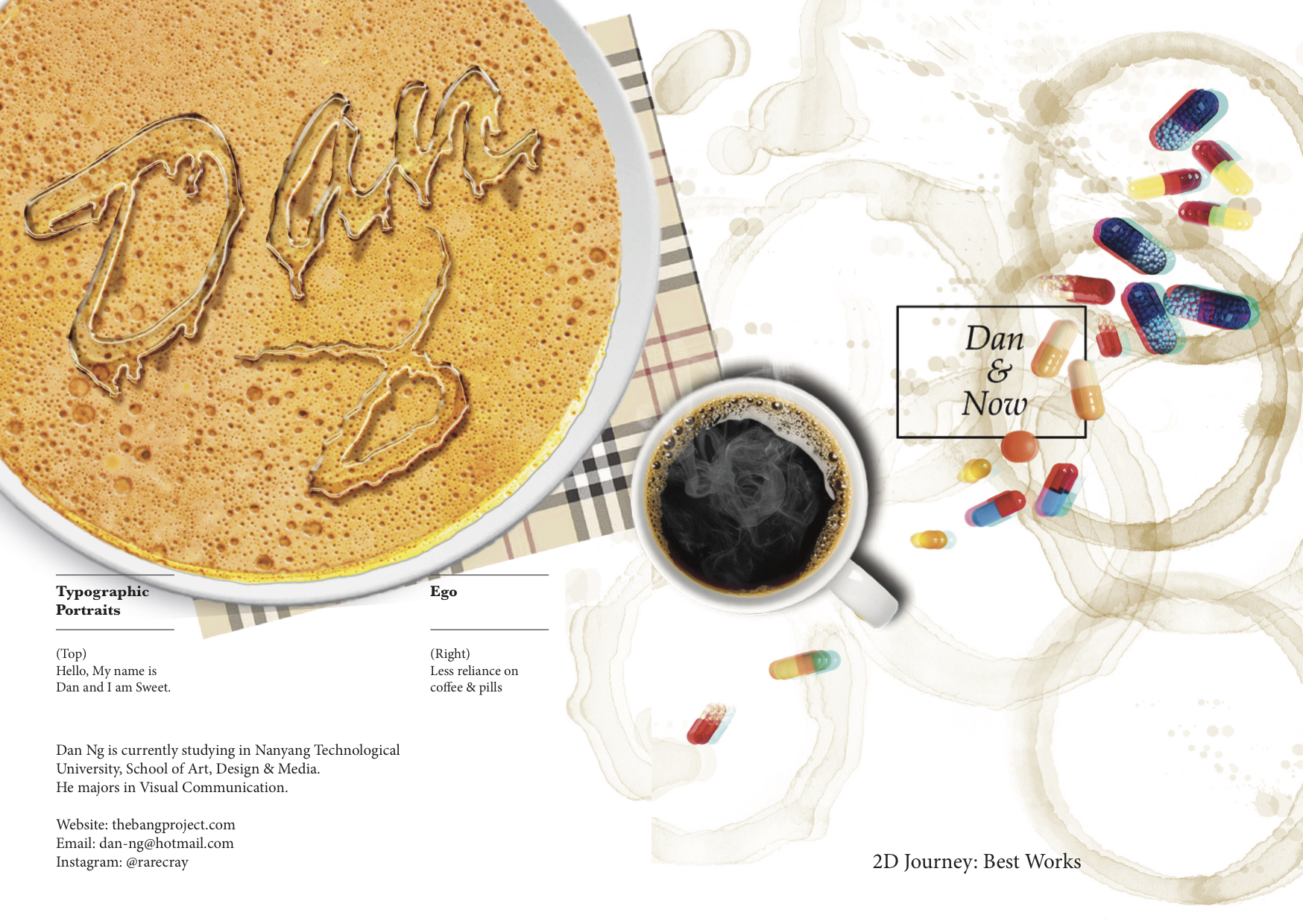
I particularly liked my ‘Less Reliance on Coffee & Pills’ visual from semester 1 assignment, ‘Ego’. I felt that almost all the modules that I have taken requires me to consume large amount of coffee and pills. Not that it is something very bad but I love the irony of showcasing the zine yet the cover is a representation of what created and holds the work together. I spent a great deal of time trying to produce an impressive front cover. I wanted to convey the idea of ‘Then & Now’ where Then represents the work that I’ve done in semester 1 and ‘Now’ represent the work that I have done this semester. To give the idea of ‘Then’ I chose to incorporate the visual of a old school TV screen as the background for ‘Then’ to represent the past and created a 3D effect on ‘Now’ to represent modern and new. To further add on to the appeal of the front cover, I overlay the image and text such that the pills are lying on top of the words.

It is with multiple of experiments playing with the sizes and focus of the texts  and imagery before I took a step back and look at my front cover. Sometimes, visuals have to be evaluated from both close and far. I felt that the entire composition looks really messy and it lacked focus. Everything on the front cover is desperately trying to grab your attention.

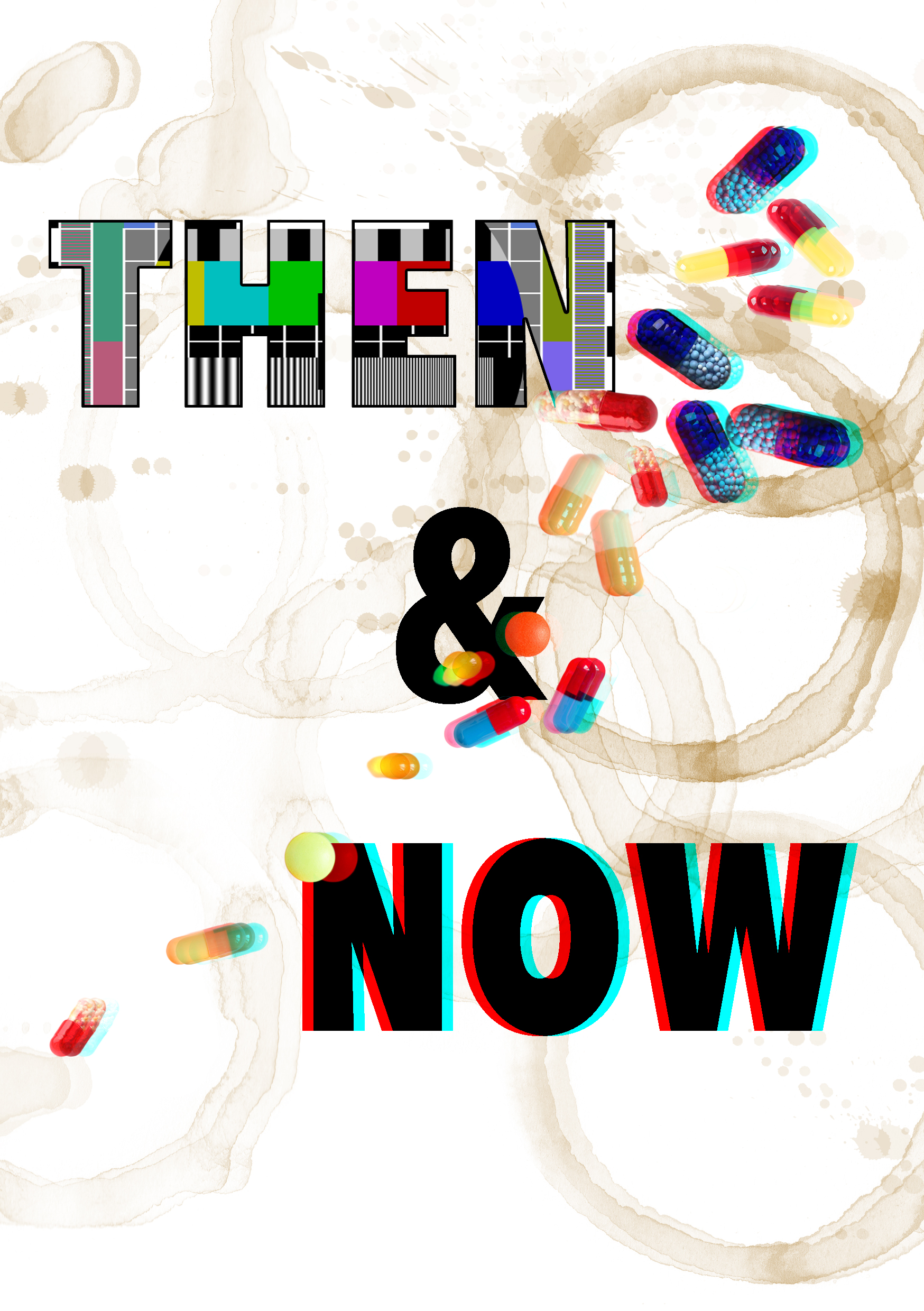
Without further ado, I scarp off the huge old school and 3D texts and replaced it with a simple black title font encased in a rectangle. We learnt that placing visual in the middle can be boring and mundane. Yet, I still went ahead to place my title in the middle. This is because the pills have already created an asymmetrical visual on the front cover. Hence, the placement of the title in the middle is negligible. In addition, the colours on the pills is able to compensate for the black on the title and box.
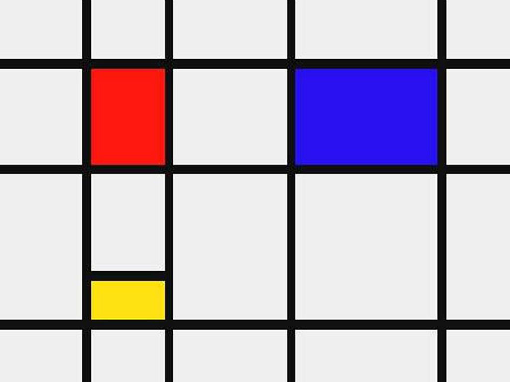
Back

For Presentation Confirmed copy

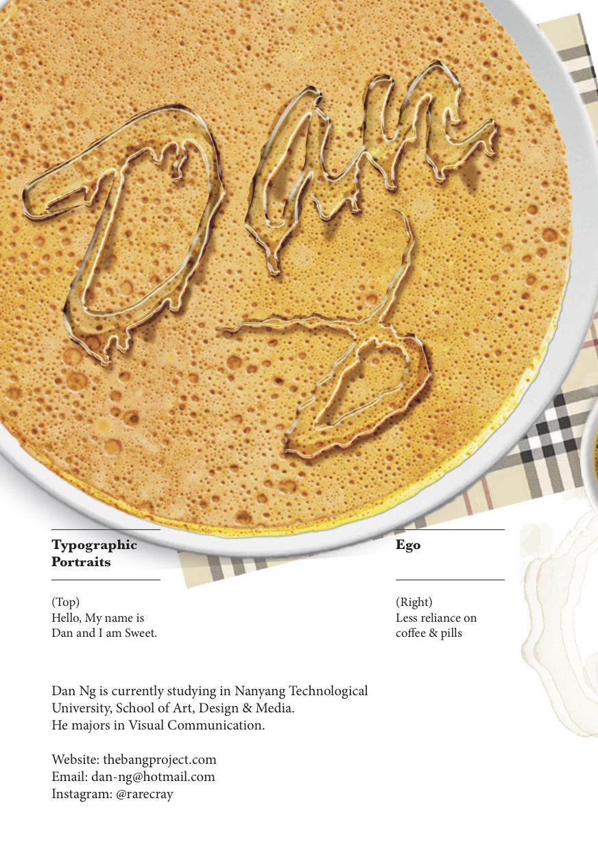
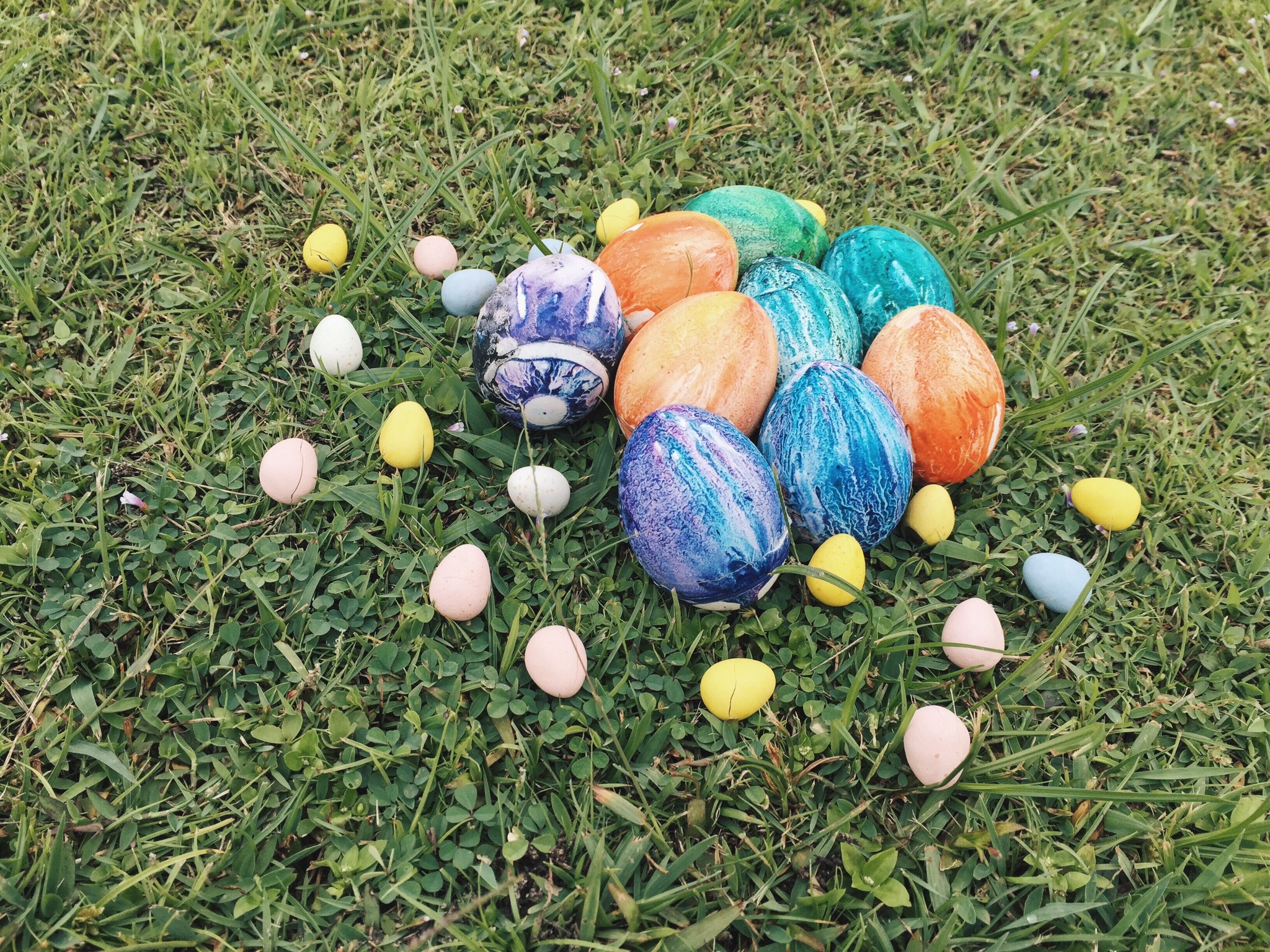
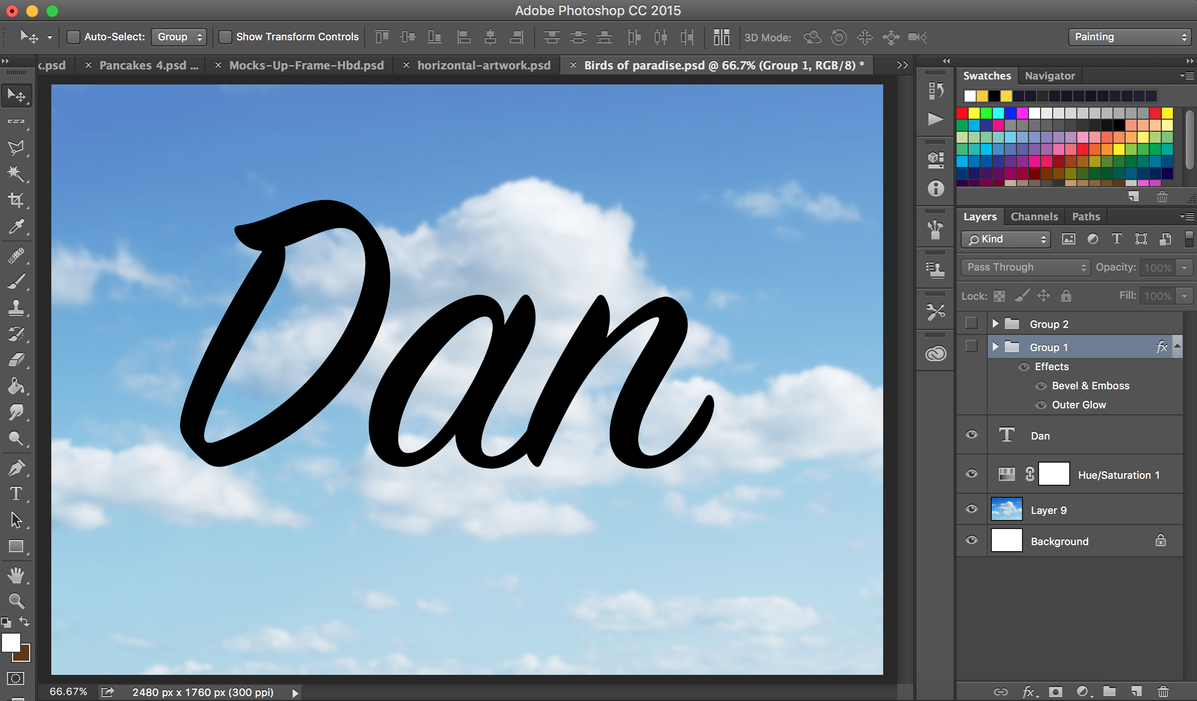
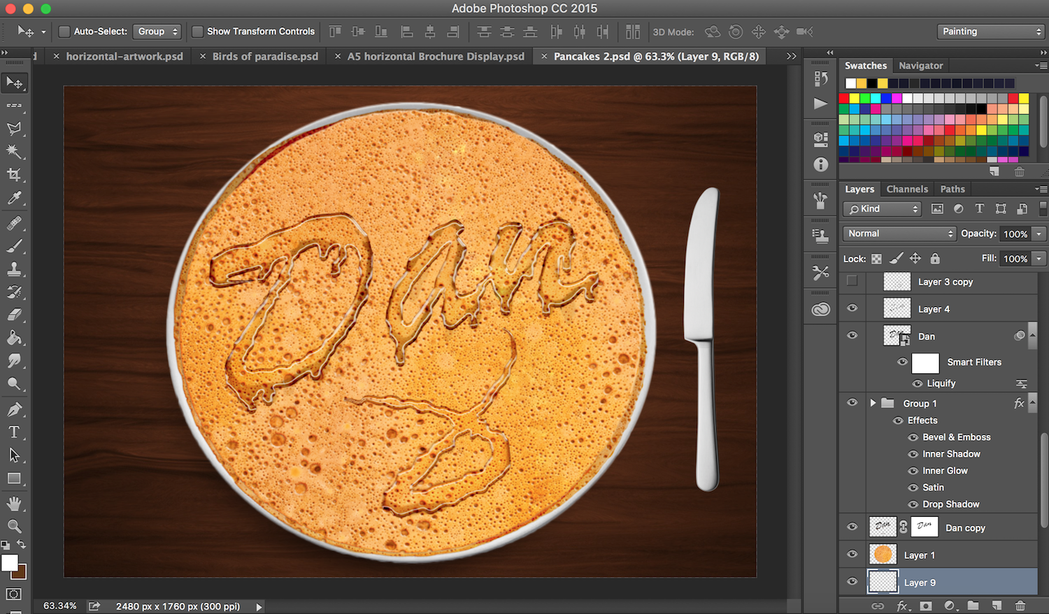
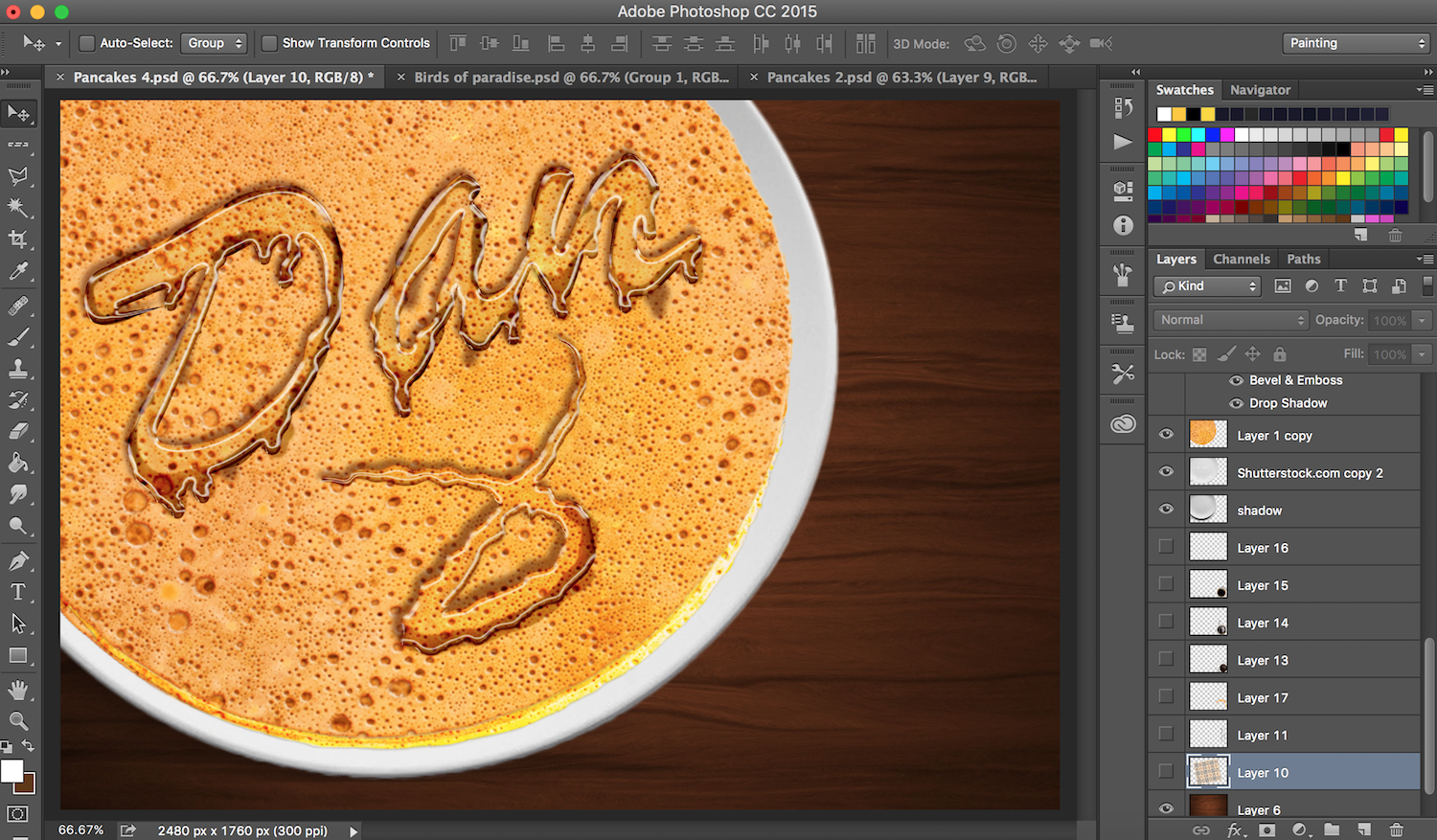
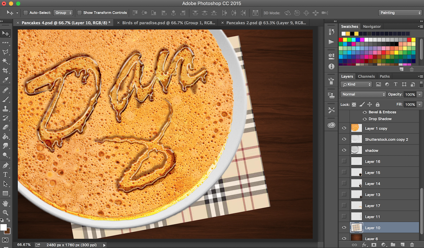
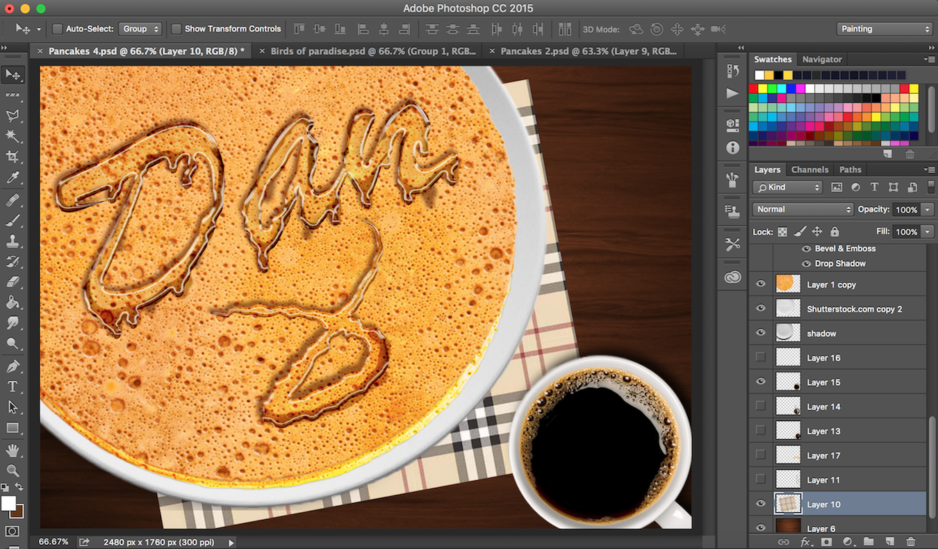
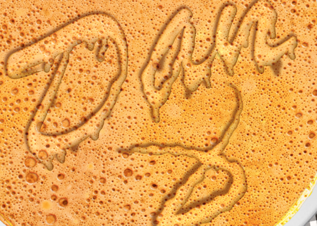
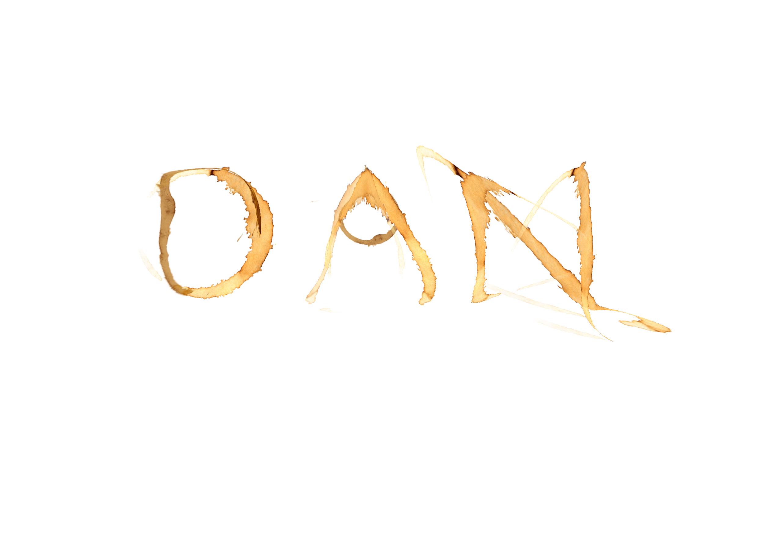
I was struggling to think of what to put at the back. I initially wanted to leave the back blank. But I thought I could incorporate more visuals that I’ve done. Bearing in mind that I cannot randomly choose a subject to place at the back, I opened up my files to search for relevant associated with coffee or pills. I thought that the ‘coffee & pancakes topped with maple syrup’ (Hello, My Name is Dan & I am Sweet) visual from ‘Typographic Portraits” fit the composition well since the front cover have coffee stains. Hence, it makes perfect sense to place the visual beside it.

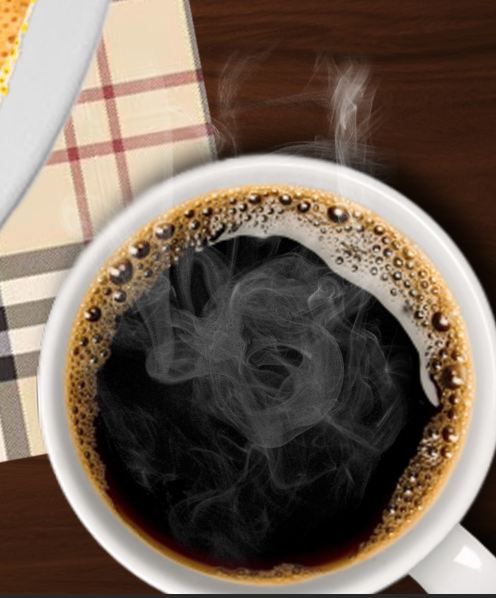
In addition, the pills on the front cover are piling up and increasing from left to right. Hence, the main focus is on the top right. To give the visual a better balance, the coffee is placed on the bottom left.

Photography

For Presentation Confirmed2

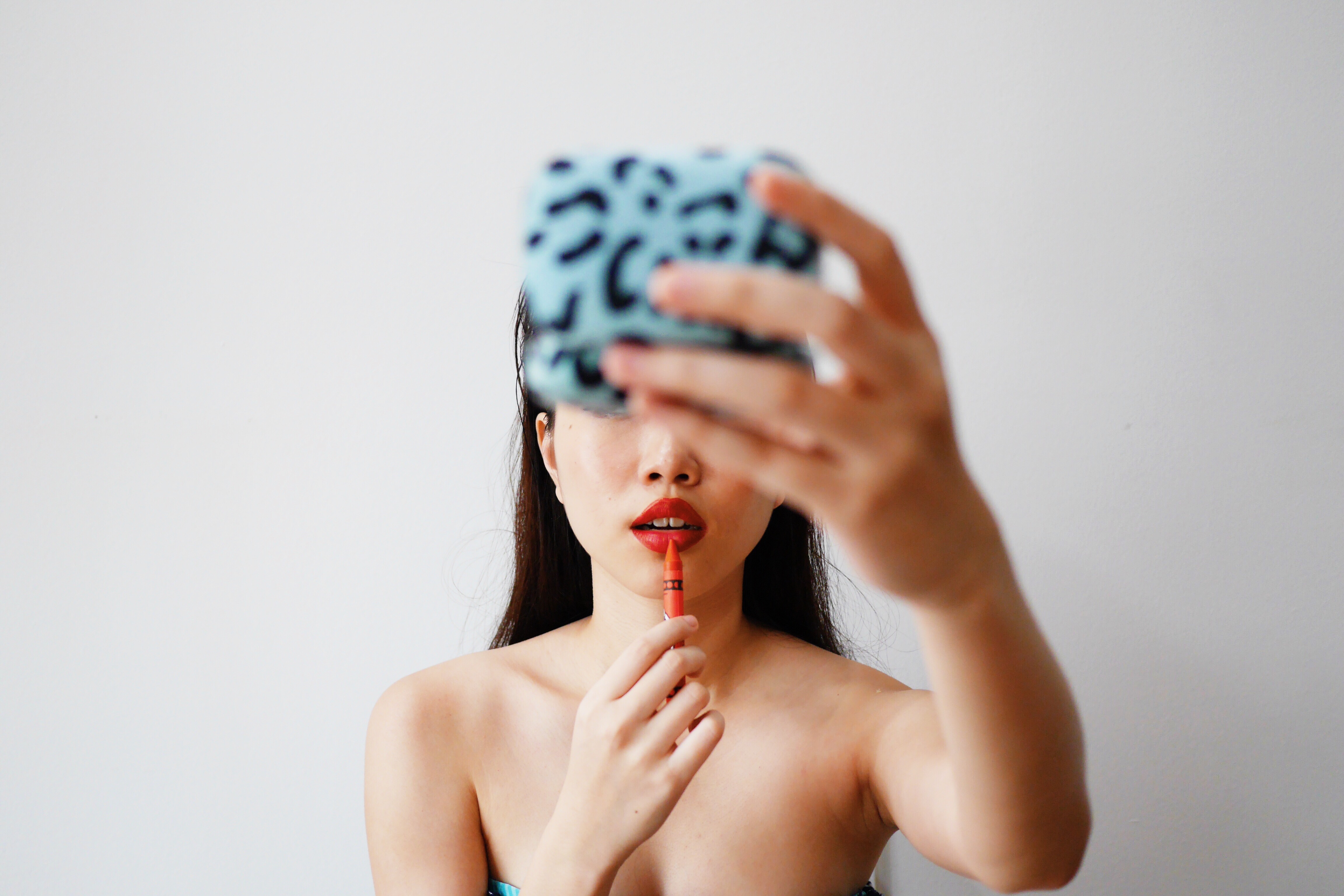
Moving on to Photography, I flipped open numerous magazines to get inspiration. Since my concept is professional, I left the background white. Another reason is because I want my photos to pop out from the zine. Hence, I don’t want any distractions in the background.

Title Consideration

The title font is a consideration when I piece the photos together. I chose a clean cut and bold font to represent photography because the photos I used are mostly strong and high in contrast between the subject and the background.

Hierarchy System

For Presentation Confirmed2 copy

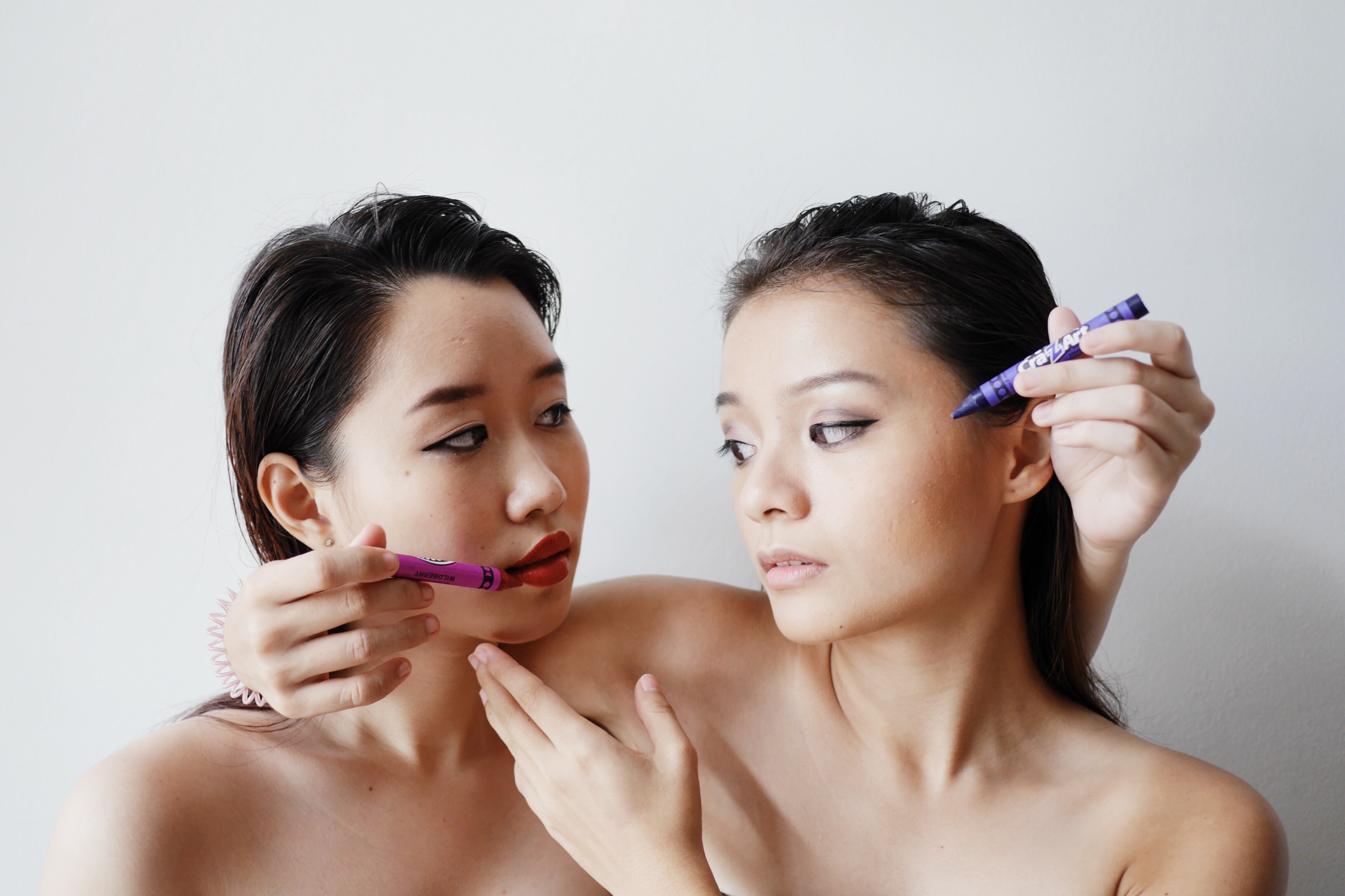
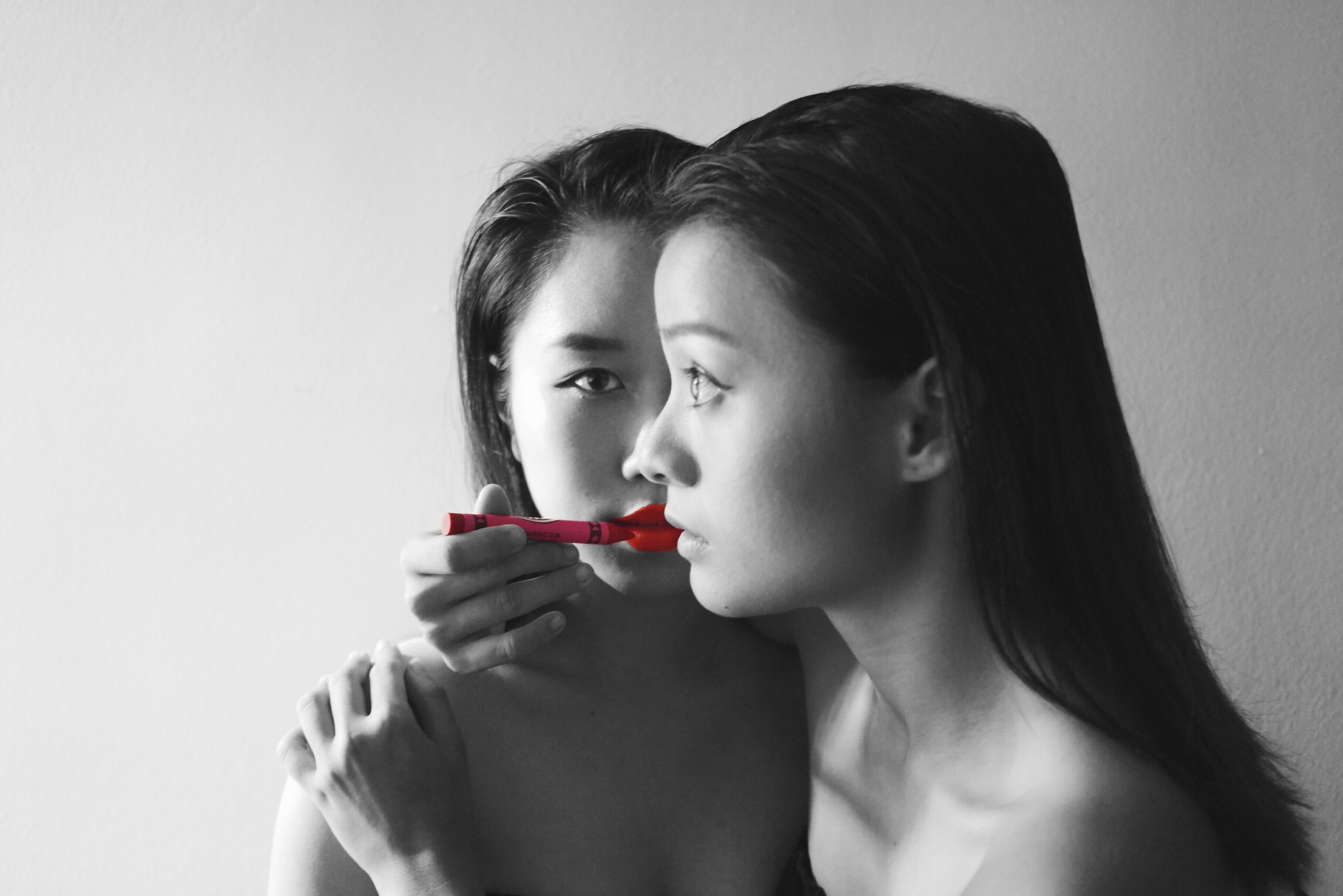
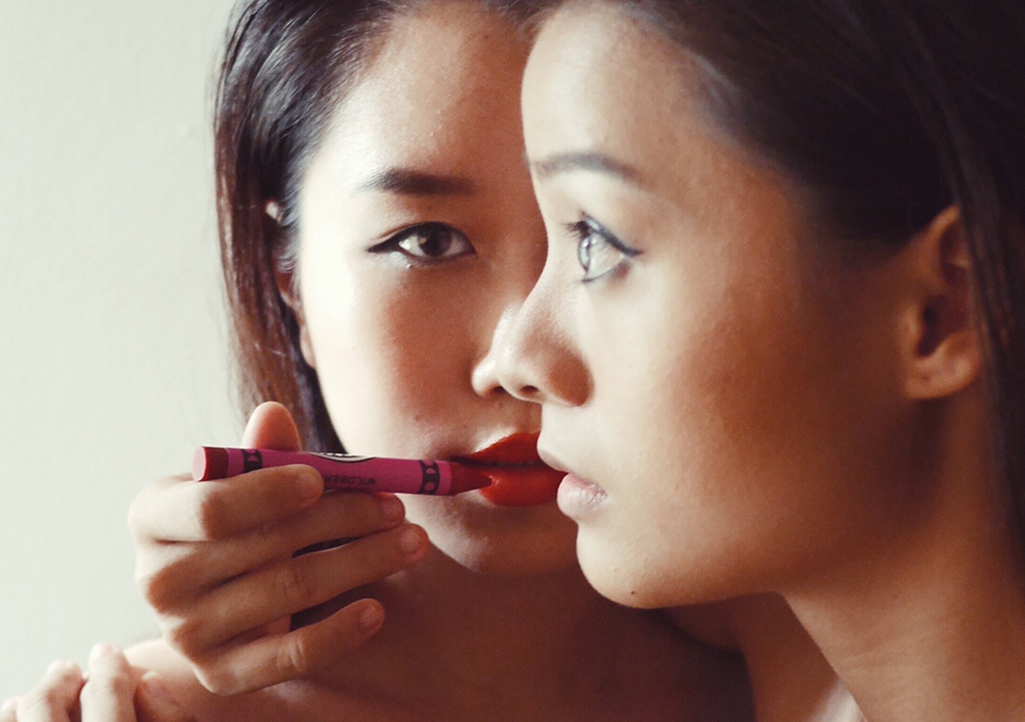
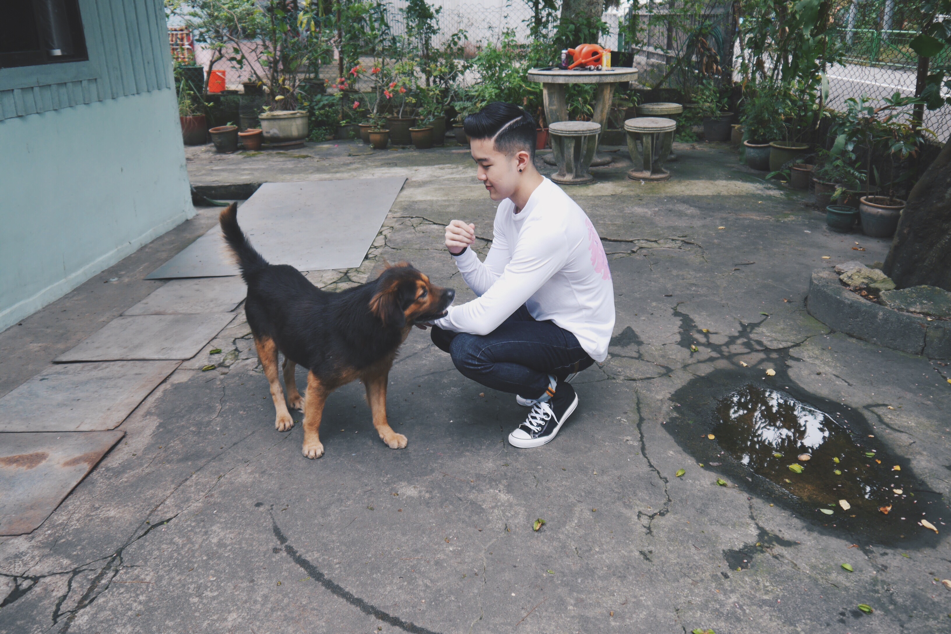
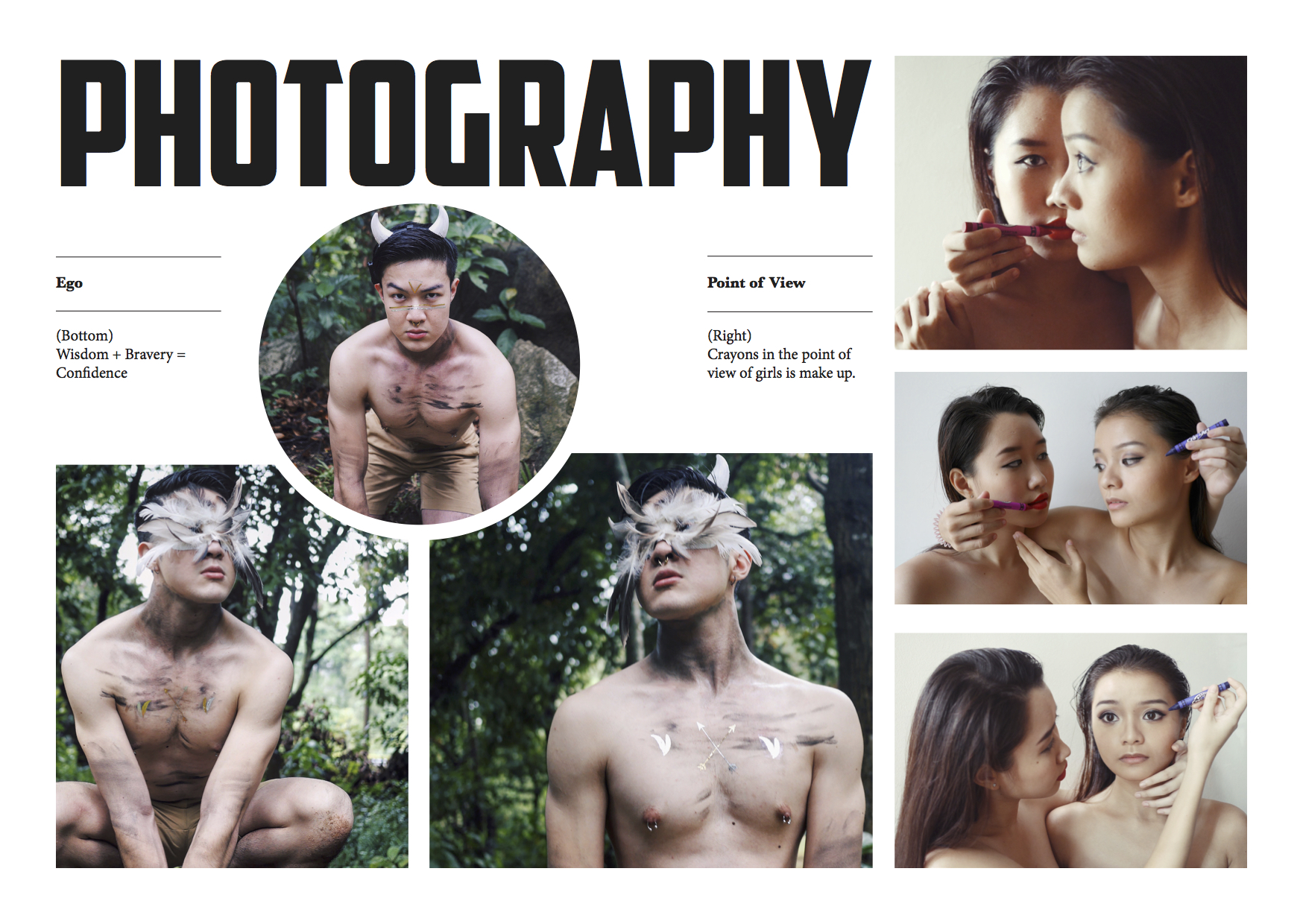
I wanted to included my photography work ‘Wisdom + Bravery = Confidence’ from my ‘Ego’ assignment. I played with the sizes of the frames and initially placed the Confidence on the round frame. I wanted to convey the idea of hierarchy system where Wisdom and Bravery is supporting Confidence.

However, based on the composition of the photos itself, it is better to consider of the direction in which the subject of the photo is looking. Hence, I placed ‘Wisdom’ looking to the right on the left, ‘Confidence’ looking to the left on the right and ‘Bravery’ looking straight in the middle. The end results gives the photos a dynamic triangular presentation.

Flow of Subject’s Focus

For Presentation Confirmed2


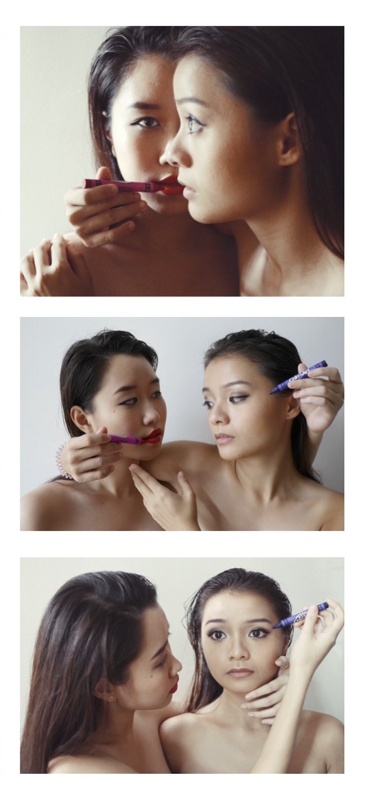
The focus of the model on the left in the top right photo is the strongest. Hence, I placed the image at the top and it occupies more space as compared to the other two photos. The two models are looking at each other in the middle photo. Hence, they are placed on the center. The model on the right is the main focus in the third photo.

In totality, there is a flow of focus in the right tier from left to right as it flows down.

Arts & Crafts

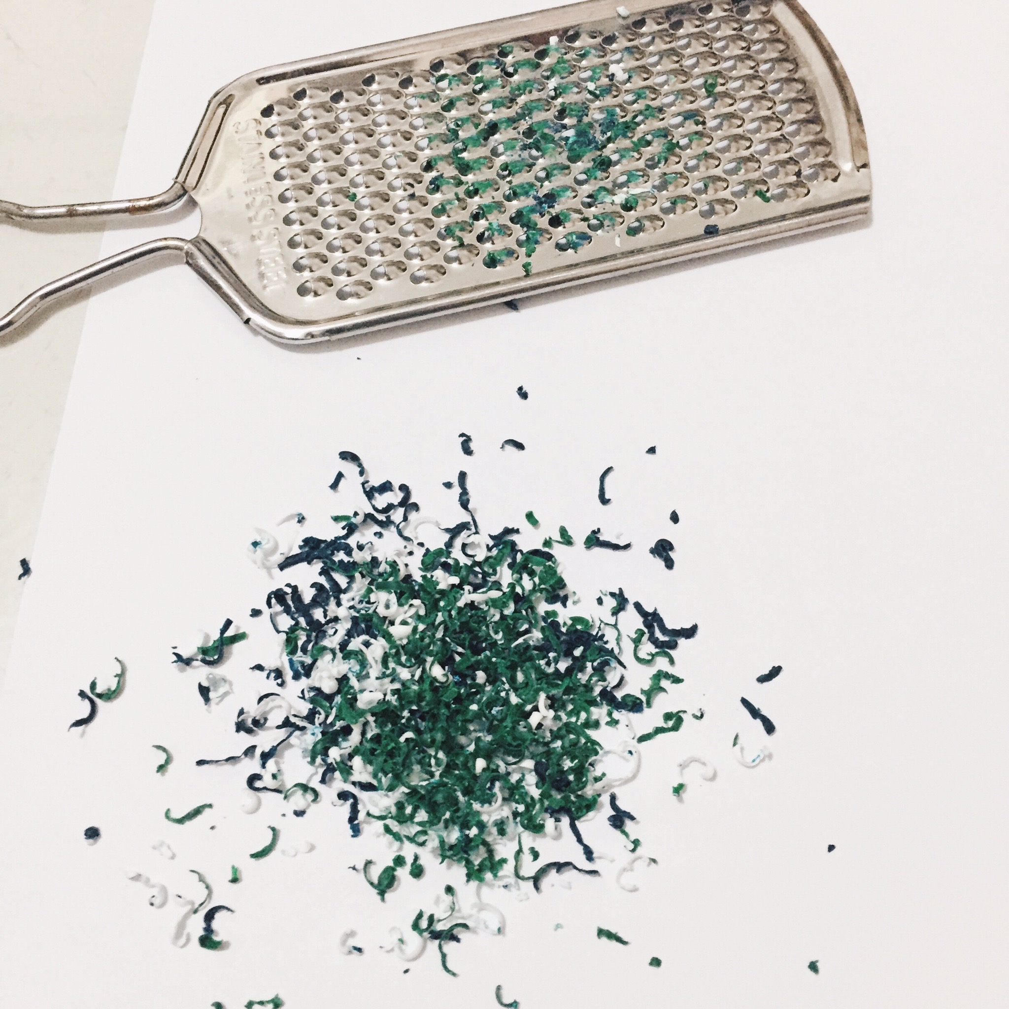
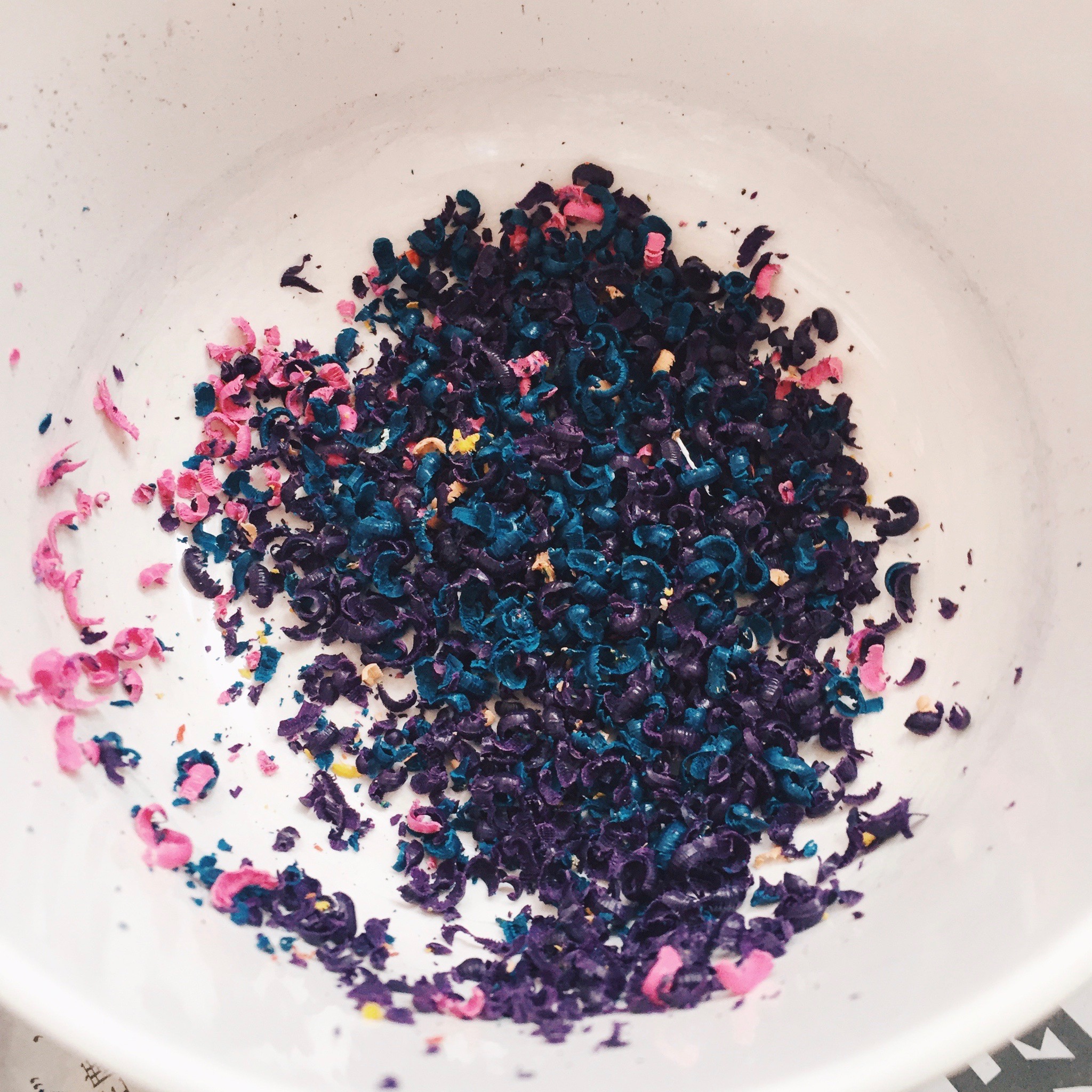
I’d consider myself to be the weakest in arts and crafts. I hate to do things hands-on where I have to get my hands ‘dirty’. However in 2D, I experimented with things I don’t know would work in the end but went on eventually. Most of the arts and crafts project came out decent or better than I expected. It is also because I felt that my arts and crafts work is the weakest, I placed the spread in the middle. They say always place your strongest work on the front and back.

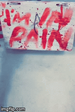
This was my initial composition.

Screen Shot 2016-04-07 at 21.16.54

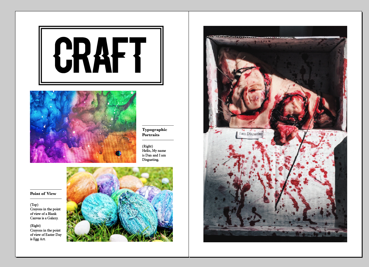
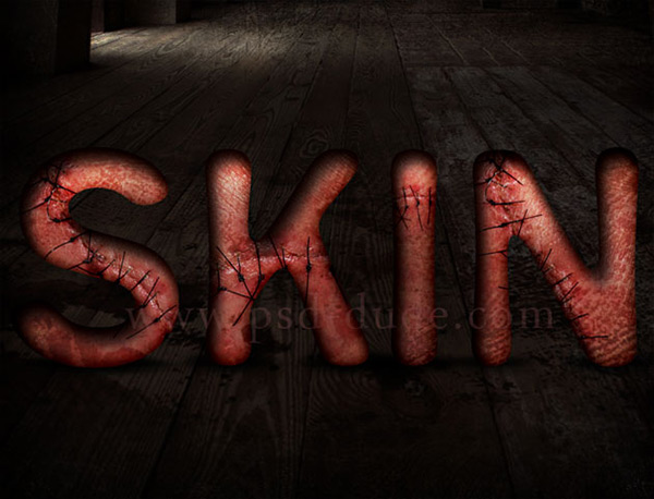
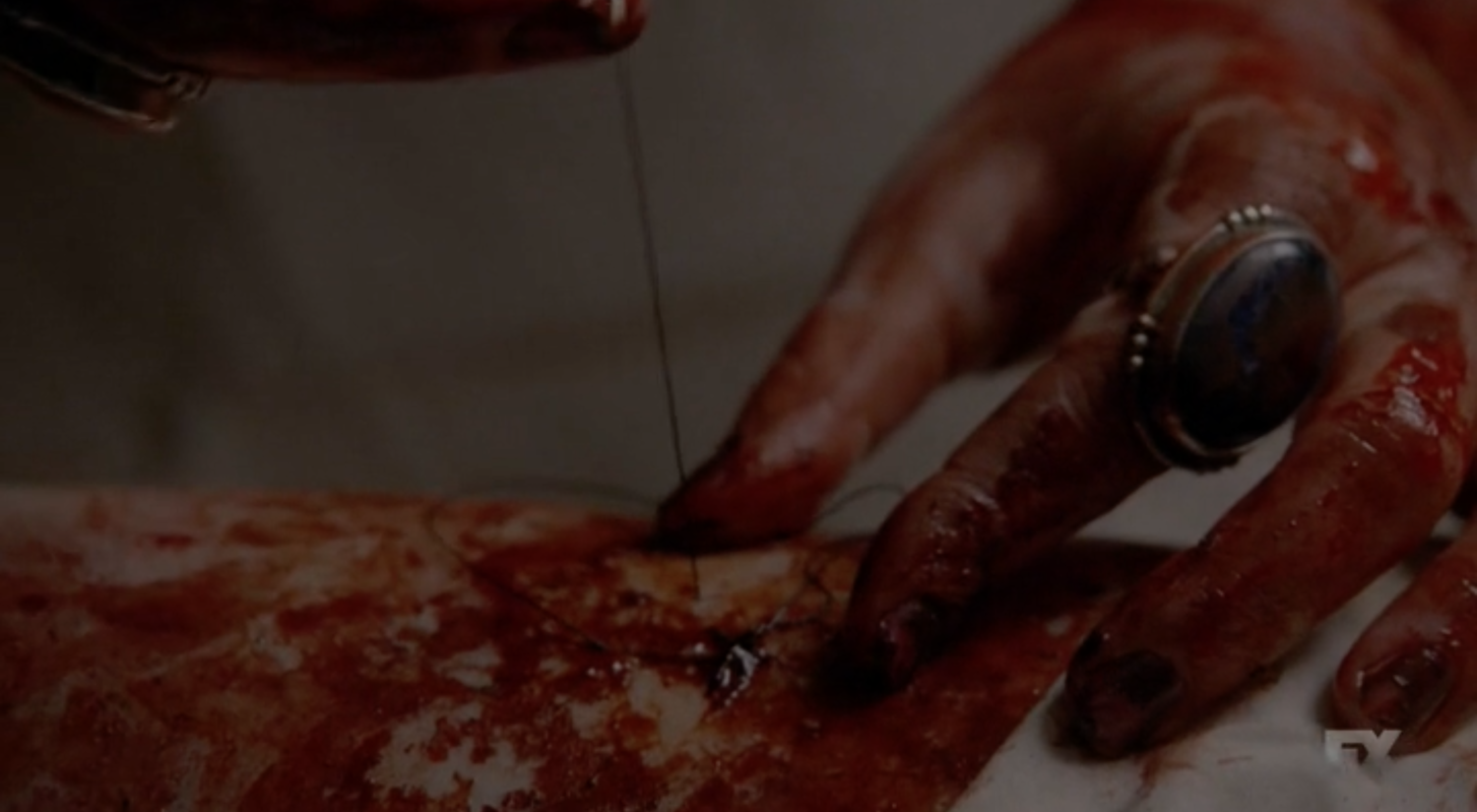
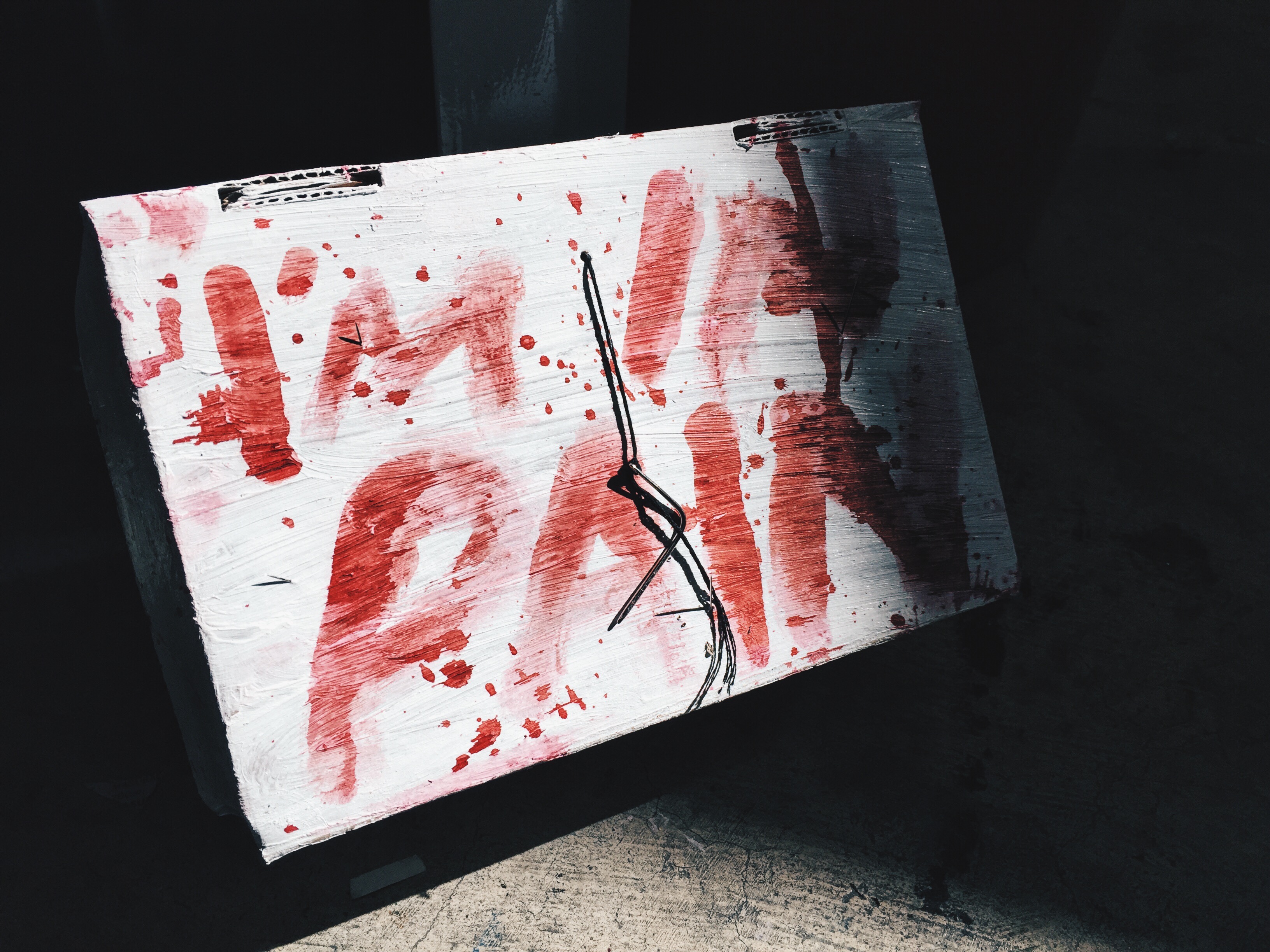
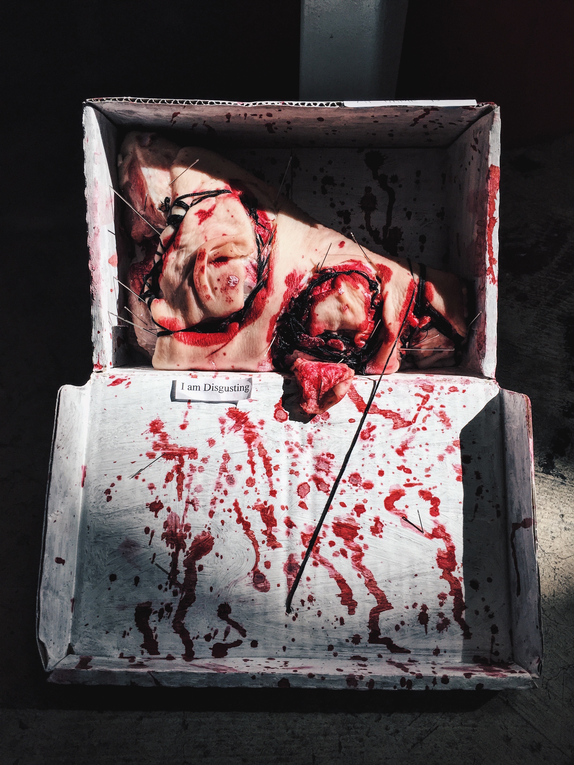
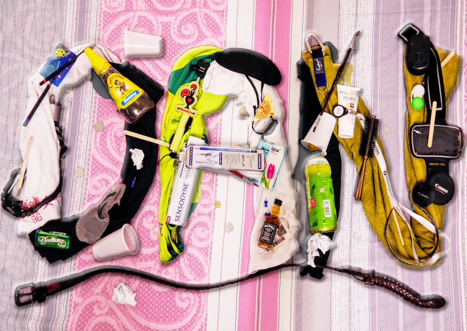
I felt that my ‘Hello, My Name is Dan & I am Disgusting’ visual is the most eye catching visual. Hence, I dedicated one page for it on the right. I also placed the two other visuals from ‘Point of View’ in it and they are chosen because both visuals are colourful; rainbow-like. To compensate for the colours, the title is left black. However, I hated the spread. I felt embarrassed by the composition I produced for Arts & Crafts. I hated it so much because it is so plain and boring.

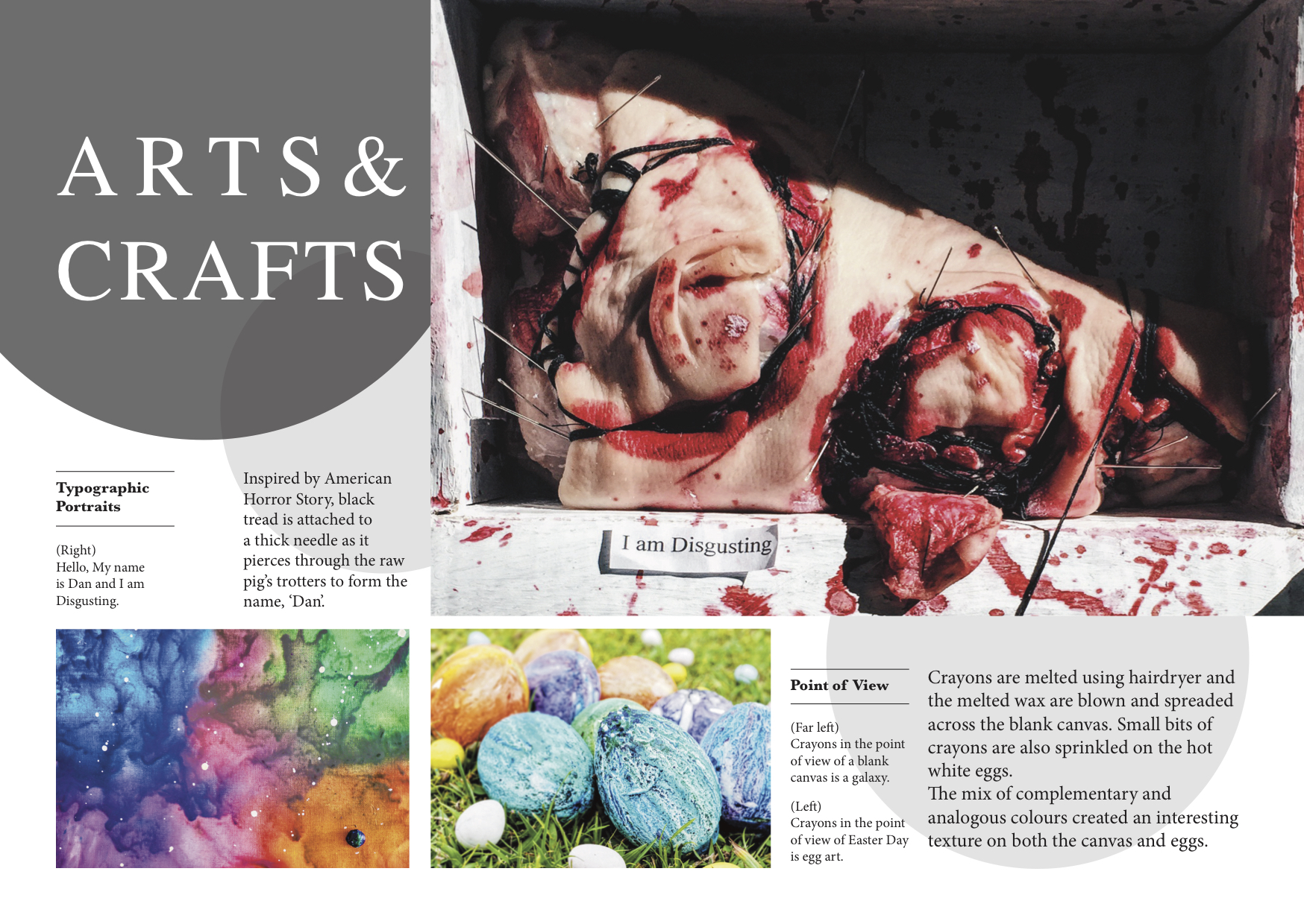
Change in Overall Design

I decided to play around with the composition again. I removed the boring title and the double lined box and replaced it with a boundless white text on grey circles of varying sizes and opacity. The reason for using round shapes is because it complements with the rectangular images or else everything will look too angular. It is because the images itself are pretty loud (gruesome meat & colourful canvas), I chose to use white and black for the title so as to not distract the reader too much away from the photos.

Focus is Important

I cropped out the box and the image tightly, showing only the meat itself. This brings focus wholly to the meat. In addition, I expanded the image such that it filled out through the bleed. Doing it this way will make the image pop out more.

Size Matters

Playing with image sizes, the two other photos are scaled smaller than the meat. After doing so, I felt that the spread is too plain without any description of the process. Hence, I wrote a short description of what materials I used and the inspiration behind the work of the 3 works. As compared to the initial spread, this new spread is definitely more appealing and interesting in composition. I also felt that the reading of this spread is also much easier as compared to the initial spread.

For Presentation Confirmed3

Illustration

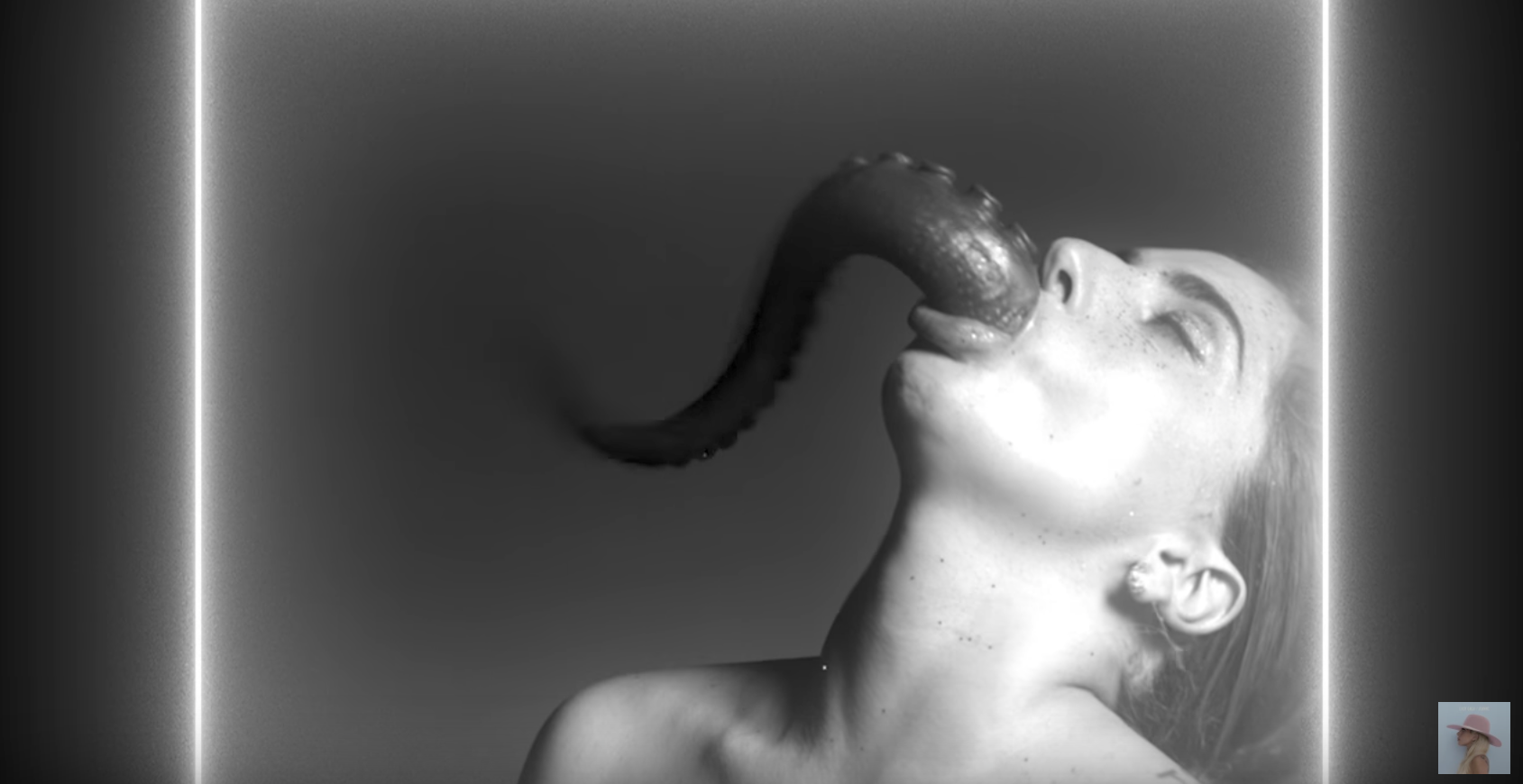
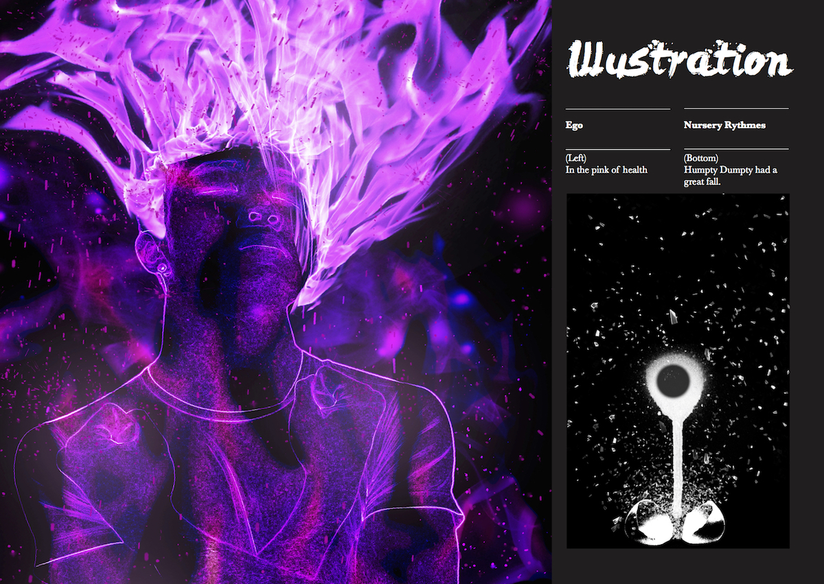
I felt that my ‘Illustration’ spread is the strongest among the rest. This is due to the eye-catching ‘In the pink of health’ from my previous assignment, ‘Ego’.

For Presentation Confirmed4

Title Consideration

In illustrations, it is common to use brushes to form your design. I used Levi brush to design the title because I felt that it best represents the idea of brushes.
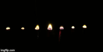
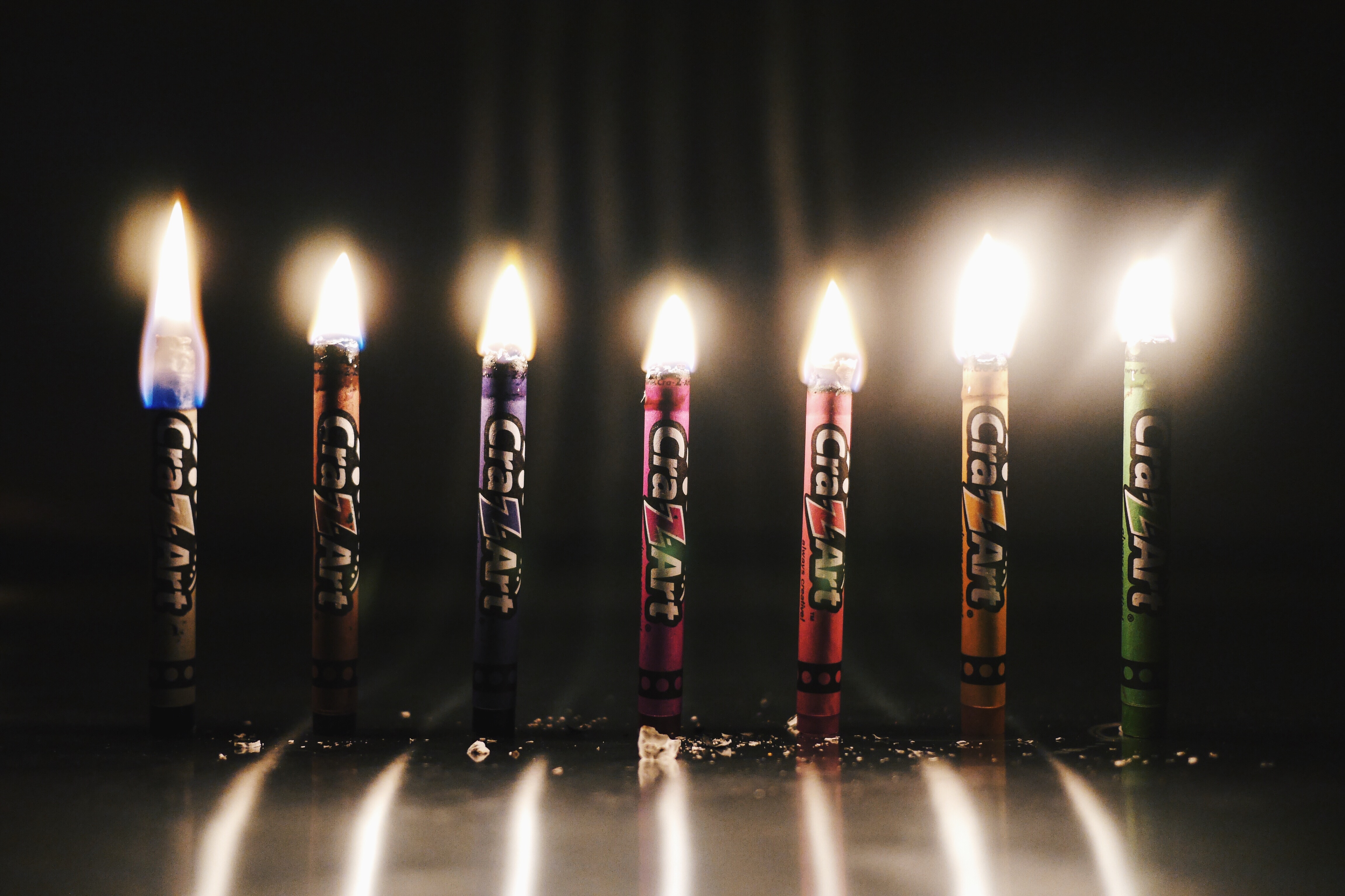
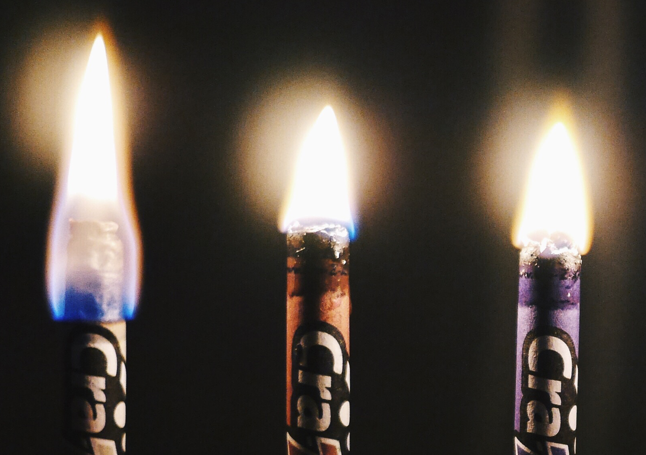
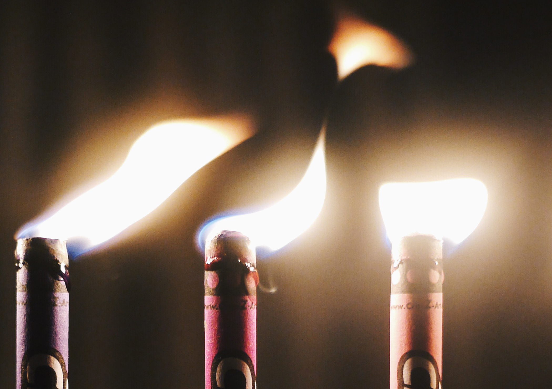
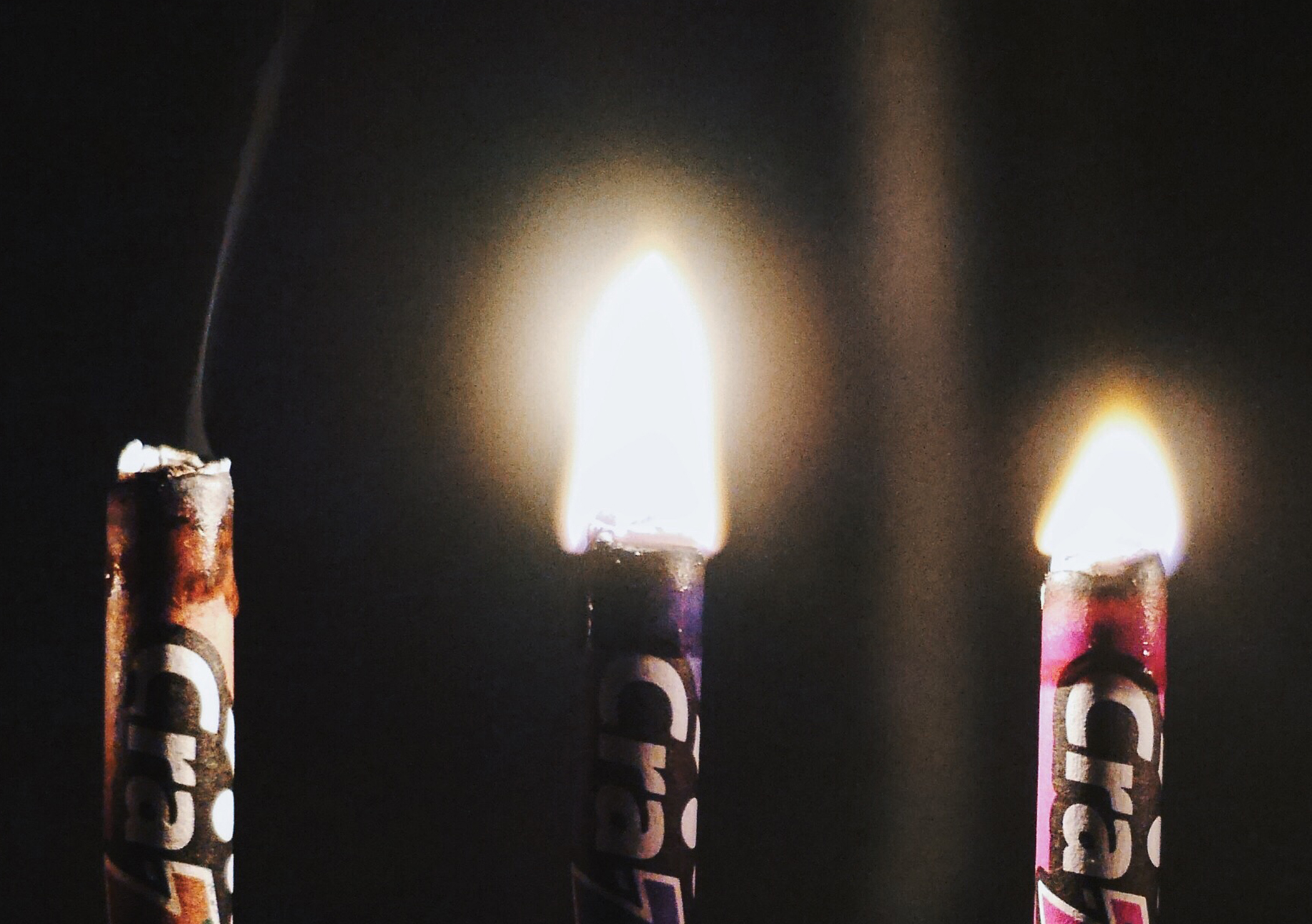
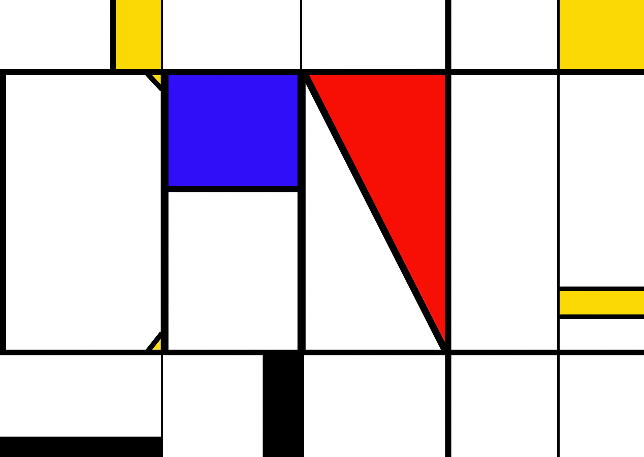
Fire

I scaled the fire visual so largely such that it fills up the entire left page. In addition, to make the spread more appealing, I placed it on one-third of the spread.  Since the background of the fire visual is black, I decided to make the entire spread black. This enables my visuals to pop out more.

Title Fonts Relevant to Work Presented

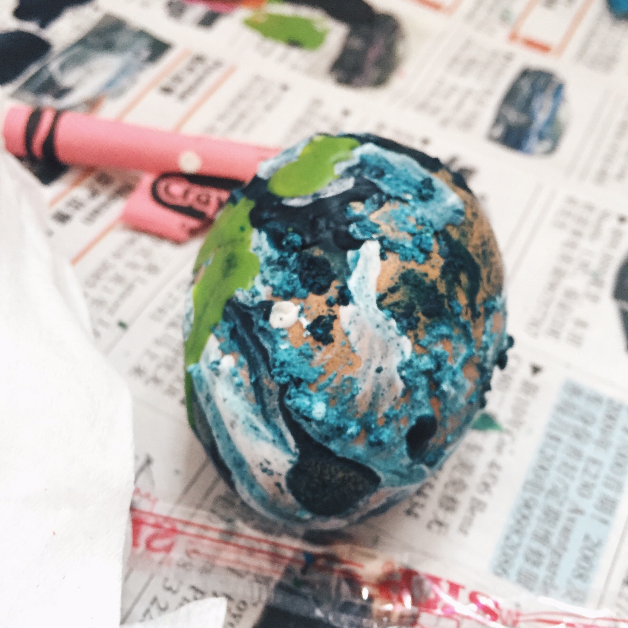
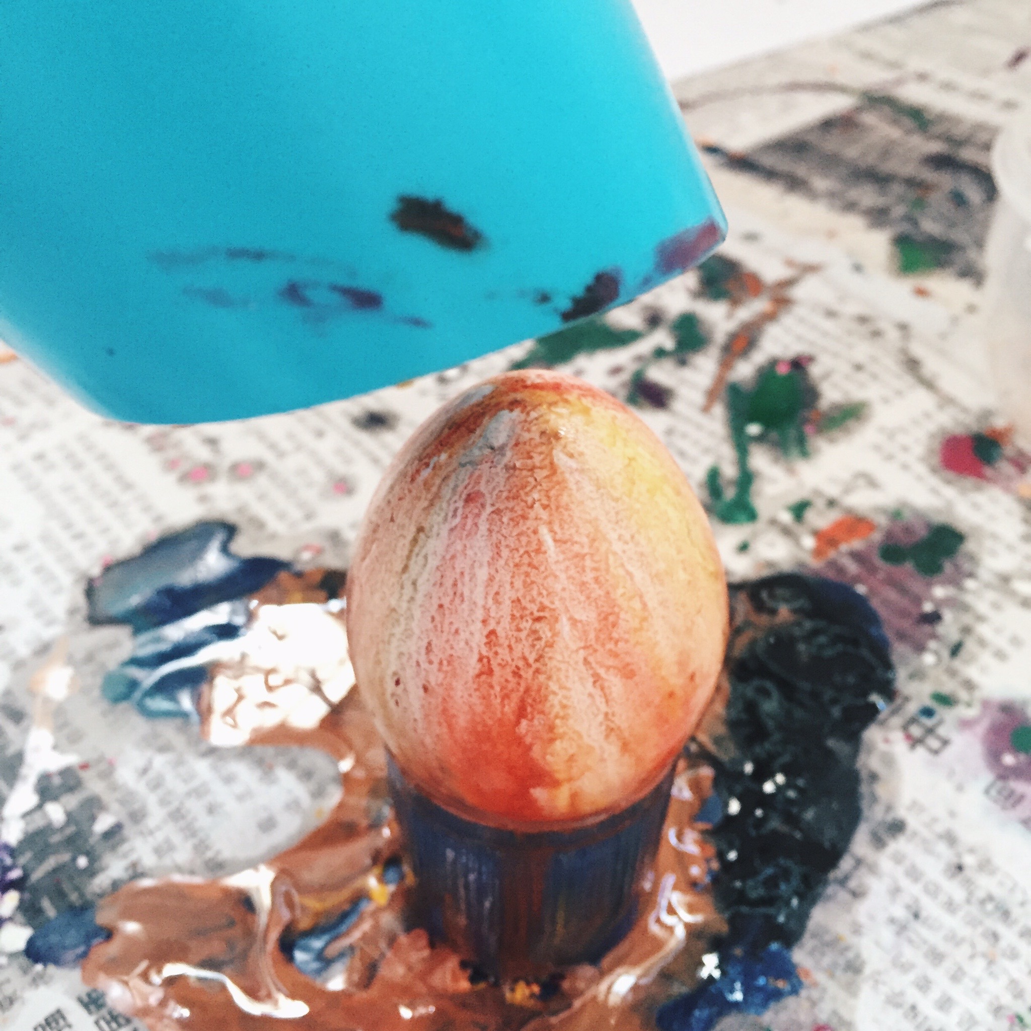
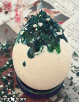
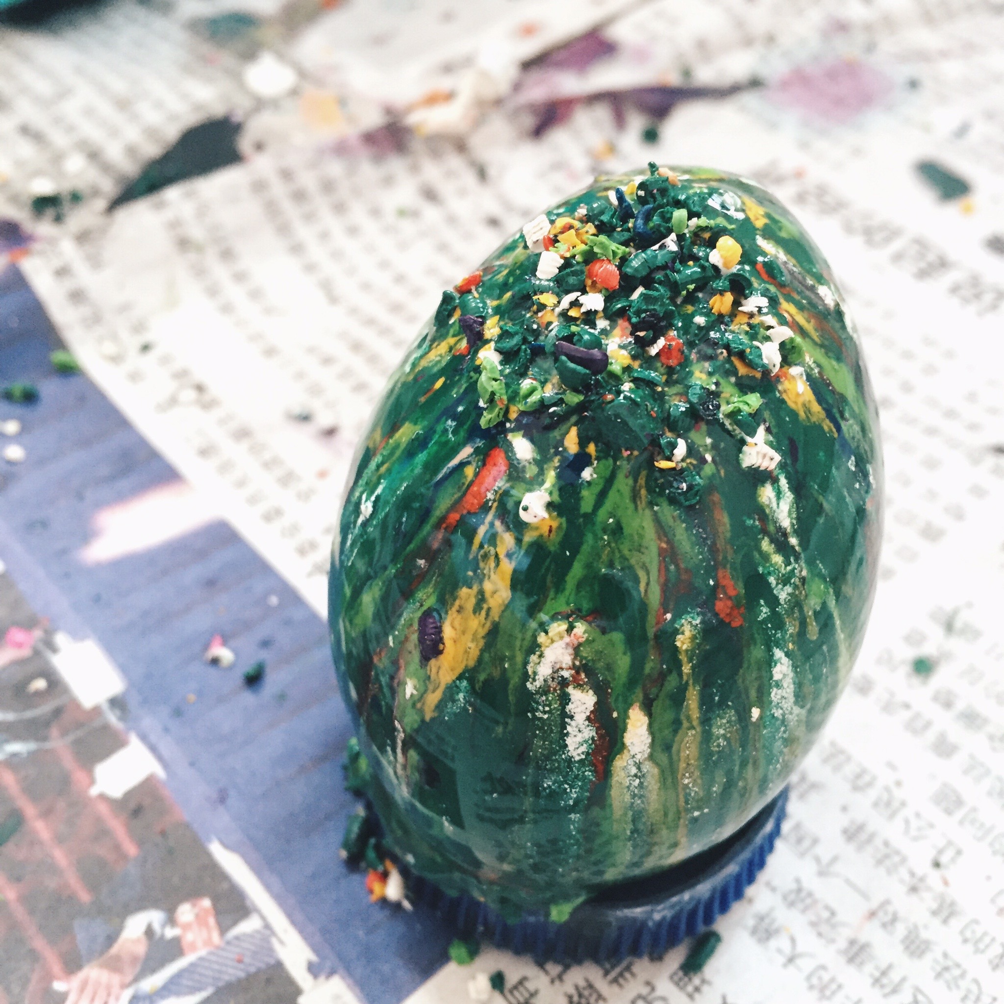
Since we are pushing for the idea of brushes, I looked back at my past works to find the visual that utilize beautiful brushes. I felt that my ‘Humpty Dumpty had a great fall’ from ‘Nursery Rhymes’ done in semester 1 is a perfect representation. Hence, I incorporated that into my spread.

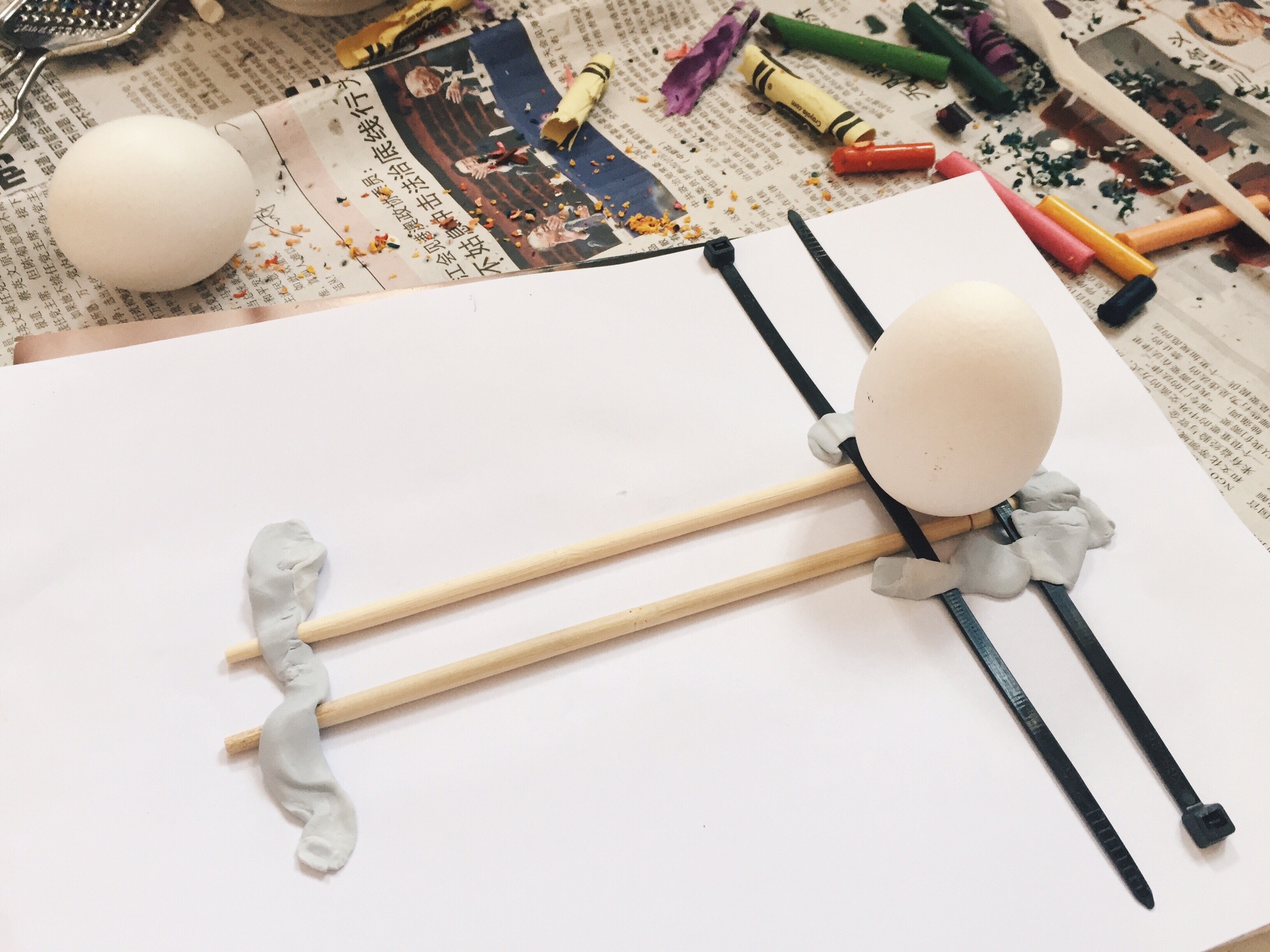
Direct Reader’s Attention to 1 Focus Point

In the original visual, the shattered glasses reached the top of the egg. In order to make the spread more interesting, I expanded the image and added more shattered glasses on top of the egg yolk. The resultant look is able to direct the reader’s attention from the egg to the top, and the title. I also flipped the fire image such that I am looking to the right. This would divert the readers attention to the title on the right. In the end, both the fire and the egg is going towards one focus point: The title.

———————————————————-

I felt that I’ve grown a lot as a designer. I have learnt a lot from this final assignment in terms of composition and technical skills. I am glad to learn InDesign because there are many uses for it.

Fin

Library

The furniture and fixtures that exist in the library are mostly clean and simple. At the studying area, the tables and chairs are mostly white. While the bookshelves are mostly black. The area was also occupied by beanbags and red sofa for users to read and spend their time in the library.

Here are some of the photos that I have taken in the library.

IMG_6788 IMG_6790 IMG_6791 IMG_6792 IMG_6793

The place is mostly surrounded by students all over NTU. Some told me that they find the ADM library to be one of the best studying spot in NTU. They love it that it is so quiet and the lighting in the library is pretty warm too with natural light shining in during the day. If not for studying, the students would be looking through the bookshelves to view at the books that interest them or to look for a particular book.

The people there are usually quiet and they sort of exist in their own world studying. This is because the library is really quiet. When you speak, it is really clear. Hence, the students wouldn’t want to disturb the others. Usually the people there would whisper and do minimal movement.

Although the ADM library is a great place, it is still a library where people come to simply just study. There are not much interaction going on within the library itself. Most of the people I spoke to simply viewed the library as a library itself. They wouldn’t think of it as a hangout spot or places to explore in NTU.

In the process of research, I am pretty interested in getting to know what the students are feeling at the point of time when they are studying. Some could feel angry (because they could not solve the questions on their paper). Some could feel happy (because their work is on the right path and they are looking forward to complete it. Or some might also feel stressed because exams are coming soon.

I recently visited an exhibition called SingaPlural 2016. The exhibition showcases the best design elements from the multi-faceted creative spectrum and there many amazing installations that encourage the audience to interact with the artwork presented. I was particularly intrigued by an artwork.

IMG_6776 IMG_6777
IMG_6778 IMG_6779
Memoirs of sense by C+C&CO X Rajee Vissa X Vera Kwok X Rick Smith

“How do memories remain for a lifetime? Recall can transport us despite our awareness of the present. Personal memories are reimagined through sensory memory stations. This immersive experience examines the persistence of memories through triggers of Sight, Sound and Smell.”

The work encourages the audience to use their senses to feel the object and based on their interaction with the object, take a piece of small round sticker provided and paste it onto the board. For example, the audience is required to approach a jar filled with flowers. Pick it up. Smell it. And based on their past experiences, and mood and perception, derive a feeling. Take a small round sticker provided and paste it on a board which include feelings like “Happy, Sad, Surprised, Angry’. I felt that this piece is pretty interesting because different people are made up of different experiences and past. Hence, when the stickers accumulated, viewers and audiences and see how certain smell, or visual resonates with most people.

I have a idea in which probably when the students approached the work, they could first indicate their current mood. Then view certain visuals that I put up, and smell certain scents before taking a small sticker and paste it on another board. They can see if their mood changes based on certain visuals. The visuals could be something disturbing, outrageous, peaceful. The smell can also range from calming to irritating to awakening (eg. coffee smell).

My vision would be to help the students to engage in something interaction and engaging. A point to visit when they’re stressed out from studying or reading. I also want the audience to question the reason for the feelings generated after interacting with the visuals or scent.

UPDATE 22/3:

Upon further research, I had another idea. Talking about timeout and reflection. During the class discussion on Monday, I heard from some classmates about their opinions on the ADM library. These are my findings:

  1. The ADM  library is simply a place where people come to borrow library for research, chill, watch video or study.
  2. The library is made up of students age group 19-25.
  3. Almost everybody who visited the library owns a smartphone.
  4. Almost everybody have an Instagram account.

I want to create something where audience can interact with the artwork. I want my audience to reflect their experience of coming to the ADM library and think back whether their time spent in the library is useful or not.  I thought of creating a Instagram poster. It measures 1m x 1.5m. It will be pasted on the wall with a cutout in the middle. I will place a mirror instead where users can take photo of themselves. The comment section below the mirror will have something like,

“I spent (numbers) (hours) (actions) in the ADM library.” (#hashtag)

For example, “I spent 30 minutes studying in the ADM library. #proud”

There will be numerous tags that the audience can paste their tags on the poster.

Example:

  1. Numbers: 1, 2, 3, 4, 5, 10, 20, 30, 40, 50
  2. Hours: minutes, hours
  3. Actions: studying, doing nothing, sleeping, researching
  4. #hashtags: #proud, #lazy, #happy, #whenwillschoolbeover, #missionaccomplished

After which, they will take a photo of it and most probably upload it to social media.

IMG_6839 copy

Based on the frequency of students using social media, I have a feeling many students will make use of the medium to post their actions in the library. Some may be proud that they spent 5 hours studying the library. This art work also kind of become an activity that the students can do when they are bored in the library.

I am thinking of placing the installation here.

IMG_7092

1

2

3

IMG_7363

Point of View – Crayons

For this assignment, I decided to use crayons as my object. My initial object was love but I think I will leave it for assignment 3. Crayons came as a spontaneous idea during consultation and my tutor told me that clients could throw you a random object and ask you to work on it in the industry and you have to base on your creativity to make it work. Hence, I took on the challenge to explore crayons as my object.

I am someone who prefer more of graphic designing and a little photography but this is the first time I am working with art and craft. To be honest, I don’t really like craft because I am not exactly very good with small little things and getting hands-on and messy. But for this project, I decided to go all out. This assignment have a mix of art and craft, photography and digital imaging.

Crayon in the point of view of Easter Day is egg art

Processed with VSCOcam with hb2 preset

I boiled the eggs for it to be hot before I can sprinkled the crayons bits on it.

Processed with VSCOcam with hb2 preset

I planned ahead the colour coordination before spinkling by putting the colours in the same as well as contrasting colours.

  • Yellow, red and orange.
  • Red, purple, and blue.
  • White, blue and green.

Processed with VSCOcam with hb2 preset

I’d like to named my first experiment the ‘Disappointed egg’. The colour look really bad on the brown egg and it was a mistake of mine to melt light green on the dark blue because it doesn’t really complement the colours.

Processed with VSCOcam with hb2 preset

Processed with VSCOcam with hb2 preset

I tried to dye the eggs in purple food colouring but still, it looks really off with brown eggs.

Processed with VSCOcam with hb2 preset

WHITE EGGS TO THE RESCUE. Not a lot of places sell white eggs so I had to deliberately go to the high end supermarket to purchase it.

Processed with VSCOcam with hb2 preset

Processed with VSCOcam with hb2 preset

Because I ran out of bottle caps, I constructed a makeshift system to hold on the hot eggs while I sprinkle crayons bits on it.

Processed with VSCOcam with hb2 preset

The texture that appeared on the eggs are beautiful and interesting. I really love the end state where the colours complemented each other giving the eggs a gem like look.

Processed with VSCOcam with hb2 preset

With the hair dryer, I can make the textured effect more obvious.

Processed with VSCOcam with hb2 preset

Processed with VSCOcam with hb2 preset

Processed with VSCOcam with hb2 preset

Mixing the crayon bits together.

10l3wo10l482 10l3yp

Spirnkling the magic on the hot white eggs. They are really hot and I burnt my fingers a few times.

Processed with VSCOcam with hb2 preset

Processed with VSCOcam with hb2 preset

Processed with VSCOcam with hb2 preset

Processed with VSCOcam with hb2 preset

Processed with VSCOcam with hb2 preset

I took my eggs up to ADM to take photos of them. I also bought chocolate eggs and place it around my gemstones to further enhance the textured effect as they contrast with each other.

Screen Shot 2016-03-08 at 15.03.11

Post-production where I focused on the turquoise egg by increasing the focus and blurring the rest of the eggs especially the orange one at the back because it stole the attention away.

Processed with VSCOcam with s3 preset

In addition, I cropped the image tighter to reduce the appearance of the orange egg.

Final

Processed with VSCOcam with s3 preset

—————————————————————-

Crayon in the point of view of fire is a candle.

Processed with VSCOcam with hb2 preset

Processed with VSCOcam with hb2 preset

I initially placed it on metallic gold paper but I want a clear reflective image of the crayons, hence I switched to sliver.

Processed with VSCOcam with hb2 preset

I lited the crayons with fire and it was pretty weak at first but it became bigger as time goes by. I discovered that the fire thrive on the liquid wax instead of the paper around the crayons.

10l4cu

I initially placed all the candles together and wanted to use the full image as my final work. However, the exploration of cropping my images came after consultation and I found it more interesting.

Candles

I cropped it to just three candles instead.

Processed with VSCOcam with hb2 preset

Equal standing.

Processed with VSCOcam with hb2 preset

It was a tough decision between the image above and below. The image above shows movement of the flames and it is not easy to capture the short flame. However, I felt that the image below has more ‘story’ and it is much more interesting as a composition. Thus, I chose the image below as my final work.

Final

Processed with VSCOcam with hb2 preset

—————————————————————-

Crayon in the point of view of an empty canvas is a galaxy / burst of colours

When it comes to creating the burst of colours, I had to plan the colours in advance as well. I chose to colour orange and green; purple and blue together because they are analogous.

Processed with VSCOcam with hb2 preset

Processed with VSCOcam with hb2 preset

I started off by placing the green crayon on the canvas an using hair dryer to blow it.

Processed with VSCOcam with hb2 preset

I wanted to give up half way because I simply cannot mix the colours well and it look really awful that I used my fork to scribble around because I was frustrated. However, I persisted and the colour managed to mix with with each other and the resultant texture was interesting as well.

Processed with VSCOcam with hb2 preset

To further illustrate the idea of a galaxy, I melted the white crayon and splattered it on the canvas to make it look like a burst of stars across the universe.

Processed with VSCOcam with hb2 preset

Processed with VSCOcam with s3 preset

Processed with VSCOcam with s3 preset

I initially settled for the idea of the galaxy but I further enhance the idea but creating a sphere made of melted crayons in blue and green and place it at the corner of the canvas. I placed it on orange because orange contrast with blue.

Final

Galaxya5

—————————————————————-

Crayon in the point of view of a girl is make up

Processed with VSCOcam with hb2 preset

Inspiration for eyeshadow – Purple eyeshadow

maxresdefault image

Application of a little purple crayon on the eyes.

Processed with VSCOcam with hb2 preset

Processed with VSCOcam with hb2 preset

Inspirations for hairstyle – Wet comb back look

I had a vision for a wet hair look for my models. Hence, I researched on it.

penelope-cruze-slicked-back-wet-hair-look Jeremy-Scott

Processed with VSCOcam with hb2 preset

Use of a lot of water to comb on the hair.

Processed with VSCOcam with hb2 preset

Processed with VSCOcam with hb2 preset

I initially placed a black background but it was too small to cover everything.

Processed with VSCOcam with hb2 preset

Photos worthy of mention

IMG_5144 IMG_5145 IMG_5146

IMG_5365

IMG_5151

The chose the image above in the end because the focus of both of my friends’ eye is really strong and in this visual, composition takes precedence. They are both placed in the center with my friend’s face trying to match my other friend’s face. To further emphasize the focus on my friends’ eyes, I cropped the image tightly to create a pyramid perspective.

Makeup1

—————————————————————-

Crayon in the point of view of light is a man

When it comes to compositing this visual, I had to place the crayons on a white piece of paper, switch off all lights in the room and shine the light at one spot.

Processed with VSCOcam with hb2 preset

However, I couldn’t get the image right and it look really off due to the lines created from the crayon breaks.

P1190316

I decided to photoshop the face of a man to the visual.Processed with VSCOcam with hb2 preset

I initially settled for the image above but I decided to further enhance and make the visual more realistic by adding lines from the original image to the face.

Screen Shot 2016-03-08 at 16.27.17

Final

ManConfirmed

—————————————————————-

Crayon in the point of view of a toddler are french fries. 

This is the last visual that I explored. I had a tough time coming with the idea but I decided to superimpose my niece into the visual and adding fries as grass and rain. I use purple as the background because it contrast well with yellow and I placed my niece at the 1/3 of the image to make the visual more interesting.

french fries2

I change my idea and tried to make the fries more subtle by changing the rain to yellow crayons only.

french fries3

However, I ditched this image because this is really not my style and it just does not look very presentable or interesting or relevant. Hence, I changed the concept. My final image is simple but more relevant to the title. I superimpose a macdonald fries holder holding only yellow crayons to make it look like french fries. I use black as the backrgound because it contrast well with yellow and red. I added light smoke to the french fries to make it look like it’s piping hot and delicious. I also place the subject at the 1/3 of the image to make it more interesting as a visual.

Final


Processed with VSCOcam with hb2 preset

Lesson Learnt

From this assignment, I learnt the importance of adaptability. Clients can throw you also random product for you to market and it is your job to make it as appealing and attractive as possible. I am more confident when it comes to working with random ideas now.

22

22 tells the story between my grandmother and I. Set in Lorong Buangkok where my grandparents have been living in the kampong for almost a century. It reflects the intimacy and tension between myself and her against the house as we converse about our lives, and the kampong house. In this film, I seek to explore the depth of our relationship and try to fathom what it feels to be in a place that fills with so many memories even though there is lack of strong physical connection. The film allow the exploration of silence and space together with conversation and close interaction.

Post Production

Screen Shot 2016-03-05 at 22.40.52

Video with no colour correction.

Screen Shot 2016-03-05 at 22.42.19

Video with colour correction. Layering of texts, video clips and sound.

Screen Shot 2016-03-05 at 23.09.24

Adjustment of sound levels

Typography Portraits

I am Free

I would like to call it ‘Birds of Paradise’ too. A universal representation of freedom would be birds. Hence, I decided to explore typography with birds.

Below was my initial idea. I downloaded birds brush tools and tried to paint it on the photograph. However, I felt that it does not look as convincing and use of photographs as background is not advisable. Hence, I decided to change the look.

Screen Shot 2016-02-16 at 21.15.30

I decided to manipulate birds of different colours to form the shape of my name.

I started off with using an outline of my name in text.

Screen Shot 2016-02-16 at 21.01.12

I find images of different birds online. I prefer to find those of colour as it will make the composition more appealing.

Screen Shot 2016-02-16 at 21.07.15

Manipulation of the birds

I find birds of suitable shapes and place them on the letters. I mostly use the skew tool to change the shape of the birds.

Screen Shot 2016-02-16 at 21.03.04 Screen Shot 2016-02-16 at 21.04.18

For the background, I chose the sky because it contrasted well with the colourful birds. White and blue also represents freedom. I lowered the opacity and applied gaussian blur to the background to make the foreground stand out further.

Loose feathers were added individually to give the composition a more realistic look.

Screen Shot 2016-02-16 at 21.13.00

End State

Birds of paradise BIRDS

—————————-

I am Sweet

To give off the idea of sweetness, I feel that maple syrup would be a good representation as it is often used to complement pancakes and waffles.

Initially, I placed the pancakes in the middle and the cutleries at the side. However, after consultation putting it at the side would make it visually more interesting.

Screen Shot 2016-02-16 at 21.55.10

Pancakes are duplicated and lightened to make it look like there are numerous pancakes.

Screen Shot 2016-02-16 at 21.55.49

Table cloth was added to make it look more interesting.

Screen Shot 2016-02-16 at 21.56.05

I was trying to make this pancake look more like pancakes because many of my friends thought that this is latte art. Hence, I played with scaling and added a cup of coffee next to it to emphasise the size of the platesScreen Shot 2016-02-16 at 21.56.19

To make the coffee more realistic, I added smoke using smoke brush. I also rotated the cup such that the light is accurately shining from one point in the composition.

Screen Shot 2016-02-16 at 21.56.31

Importance of layers with different styles.

Screen Shot 2016-02-16 at 21.57.17

Only one layer visible below. (Does not look as appealing)

Screen Shot 2016-02-16 at 21.57.53

I wanted to use a white background but went ahead with a dark brown background instead for better contrast.

End State

Pancakes 4

A5 horizontal Brochure Cover A5 horizontal Brochure Display

—————————-

I am Abstract


I was always fascinated with Piet Mondrian’s work and marvelled how simple yet appealing his artworks are. Hence I decided to recreate that look and add my name to it.

In Piet Mondrian’s most notable artwork, he simplified the subjects of his paintings down to the most basic elements, in order to reveal the essence of the mystical energy in the balance of forces that governed nature and the universe.

mondrian_1 inspired_bei_mondrian_by_manshonyagger-d35kfou 3265711_orig

First Draft

Abstractfirst

Second draft

In the first draft, the ‘D’ is not obvious. Hence, I added ‘sides’ to make it look more like the letter ‘D’. I initially placed ‘DAN’ in the middle but change it to the side instead because it would make the composition more interesting.

Abstract

Screen Shot 2016-02-16 at 20.25.39

End State

The end state looks cleaner and full.


Abstract2Mocks-Up-Frame-Hbd

—————————-

I am Disgusting

This idea came up pretty last minute after I finalised my 4 designs. I was surfing the net for more ideas when I chanced upon this typography where it is a texture of human skin with wound stitches on it. My very first reaction was disgust and it is memorable to me even after I tried searching for other typography designs. I wanted to create a similar typography digitally but I was afraid that it may not be as realistic. Hence, I decided to try creating it hands-on.

I’m someone who likes things that are gory and bloody. I always wanted to try something related to it and I thought this is the perfect opportunity.

Grunge_Horror_Photoshop_Text_Effect

Being an avid fan of American Horror Story, this idea looks similar to a scene in the show where one of the character actually stitched herself to two other people while she is still awake. (She was very high at that moment). I remembered that I was disgusted watching that scene as well. I guess why certain ideas worked because it creates a shock value and that image did a good job on it. The director managed to disgust the audience by showing something which is out of the world; crazy. I wanted to create the same effect on my audience.

Here are some inspirations from American Horror Story.

Screen Shot 2016-02-16 at 18.53.27

Screen Shot 2016-02-16 at 18.52.18 Screen Shot 2016-02-16 at 18.51.33Screen Shot 2016-02-16 at 18.51.46

I was thinking of where I could purchase something that is similar to human skin. I went to the supermarket to look around and I decided to go on with the pig trotters. I bought some thick and thin needles and black threads and proceed on to sew onto the meat. (I didn’t managed to take many photos because my hands are all dirty from touching the slimy meat.)

I also looked up on Youtube on how to stitch a wound and I wanted to stitch on the skin but the pig’s skin was really really tough. It is almost impermeable and the needle I used was pretty thick yet I still cannot pierce through. (It’s like a Nokia phone, so strong) In the end, I had to slice the skin really strongly with a knife and stitch on the meat inside instead.

zaa7k

IMG_4479

Processed with VSCOcam with hb2 preset

It takes patience to slowly stitch and I took hours interacting with the meat. It is quite heavy and hard to handle it. It was not easy to form the letters. While I was working on the meat, I was actually watching the American Horror Story scene at the same time. I have to confess that I actually had a ‘moment’ stitching the meat.

Creation of box

I painted the box with white acrylic paint and tried to give it a textured look. White background would contrast well with the skin and blood. I dabbed red food colouring on my fingers before splattering on all sides of the box.zaa2u

Processed with VSCOcam with hb2 preset

Processed with VSCOcam with hb2 preset

I was pretty much affected by the entire process; sawing through the skin and fats and piercing through the raw meat. It was a bloodied process. After stitching, I dabbed on the stitches with red ink again to emphasis on the outline. I initially wanted to name it ‘I am in Pain’ but I couldn’t shake off how disgusted I felt, with the meat and myself. I decided to name it ‘I am Disgusting’ instead.

I looked up for the meaning on dictionary to be sure.

Screen Shot 2016-02-16 at 19.14.37

(And to be honest, this is the sickest work I have ever done to date. I was thinking how did Lady Gaga managed to wear that meat dress on that night!)

End State

zaabj

IMG_4467

Processed with VSCOcam with hb2 preset

Processed with VSCOcam with hb2 preset

Others

I am Brand-Obssessed

Use of gold Versace & Chanel buttons on black velvet background to give off luxurious feel. ‘Ng’ is my surname.

buttons1

I am Brand-Obssessed

List of my favourite brands. ‘D’ in Prada, ‘A’ in Versace and ‘N’ in Givenchy forms my name vertically.

Brands

I am a Coffee Addict

Superimposing my name on coffee foam as coffee art.

Coffee

I am a Coffee Addict

Use of coffee stains to form my name.

Coffee Stains

I am Messy

Ironically arranging random items to make it look messy and slipshod.

messy

NTTDocomo: Xylophone


https://www.youtube.com/watch?v=ohe4Qh-j0t8

Title: NTTDocomo: Xylophone

Name of Artist: Morihiro Harano & Kenjiro Matsuo

Description: The video is a commercial by DOCOMO for the Touch Wood SH-08C, a limited edition phone of which there are only 15,000 being made. NTT DoCoMo created the Touch Wood phone in part to help the Japanese forestry industry, which is struggling due to a drop in demand for timber. By combining many pieces of wood, they were able to make a long, downhill track that was able to reproduce Bach’s Cantata 147, Jesu, Joy of Man’s Desiring. The instrument is tilted, and a wooden ball would roll down its length, producing sounds as it hit the wooden tiles. At the shoot, a sound engineer held a gun-microphone and chased the ball.

Morihiro Harano, creative director at Drill Inc., wanted to emphasize the feature by evoking the tactile sensation of wood—to awaken the common feeling everyone has that there is something good about wooden texture. Harano decided to magnify the sight and sound of wood in the ad, in the hope of making it feel almost touchable.

References: http://mori-inc.jp/