Week 7

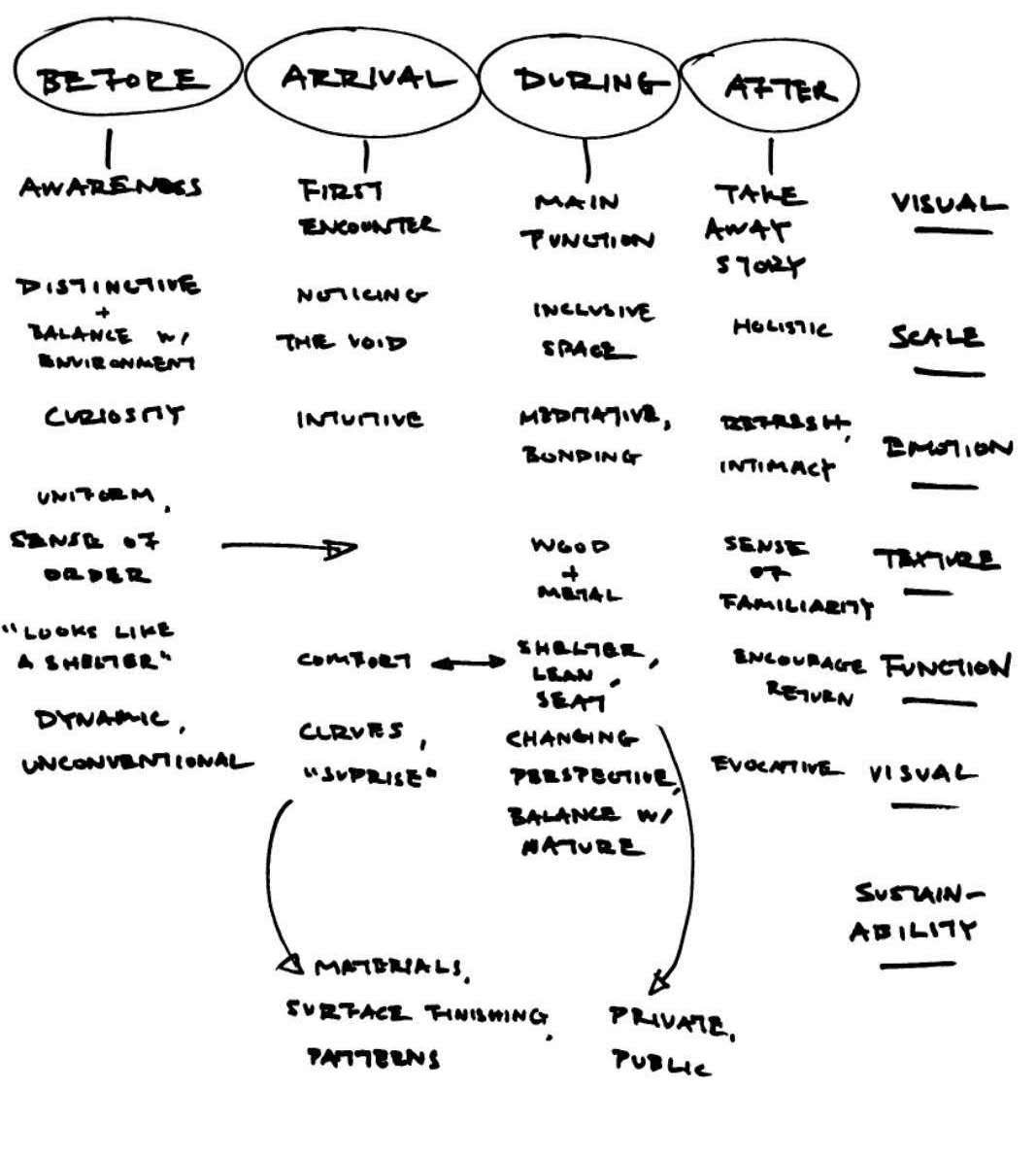
Recollecting our Idea

Inspiration

Our installation is inspired from the meaning of Nan yang; derived from the Southern Sea. We want to develop awareness on the school’s heritage by making reference to the origin of the school’s name, represented by a form that is both fluid and dynamic; combining private and public spaces in a seamless transition in a single installation to encourage people in NTU to interact with the installation in both personal and shared ways.

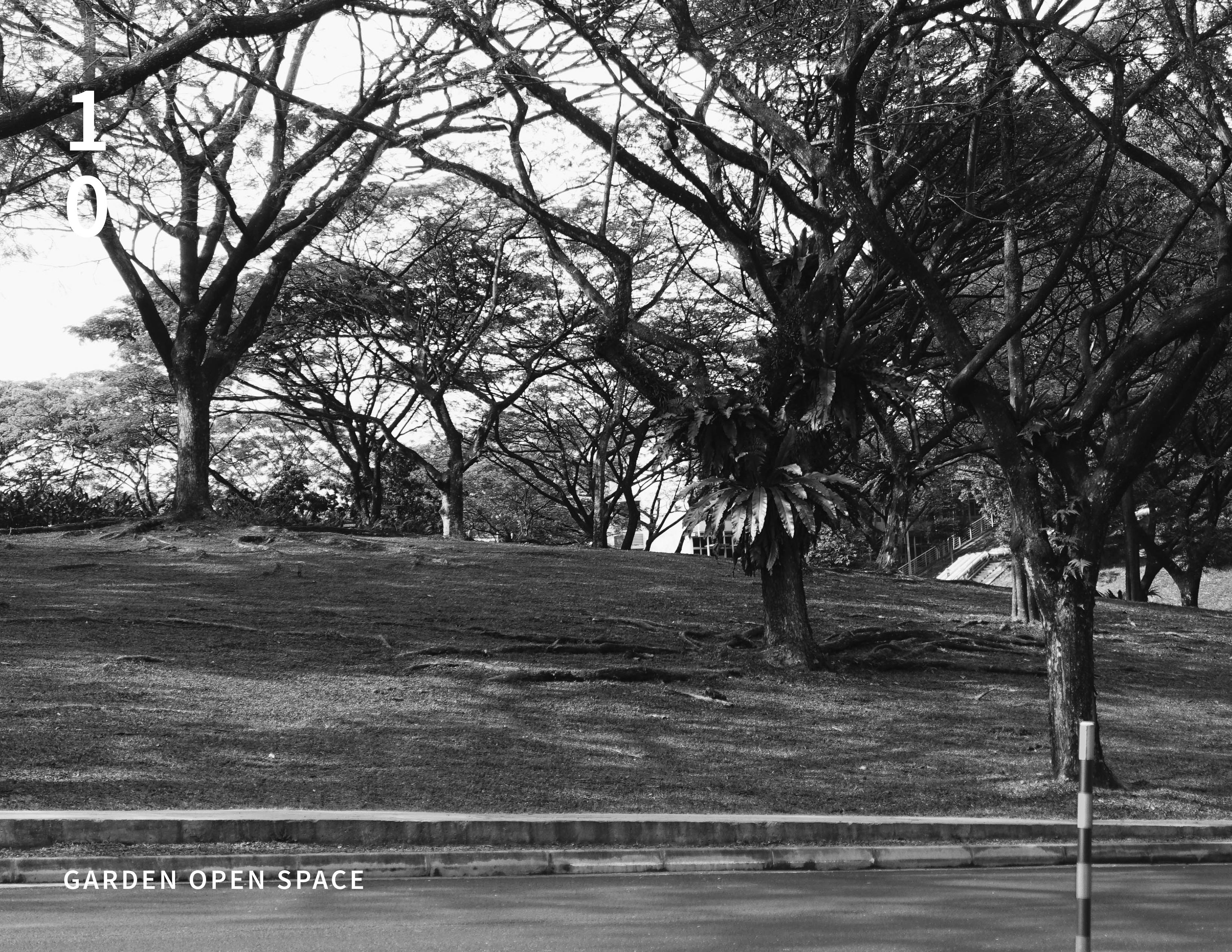
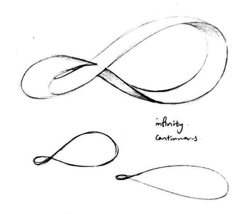
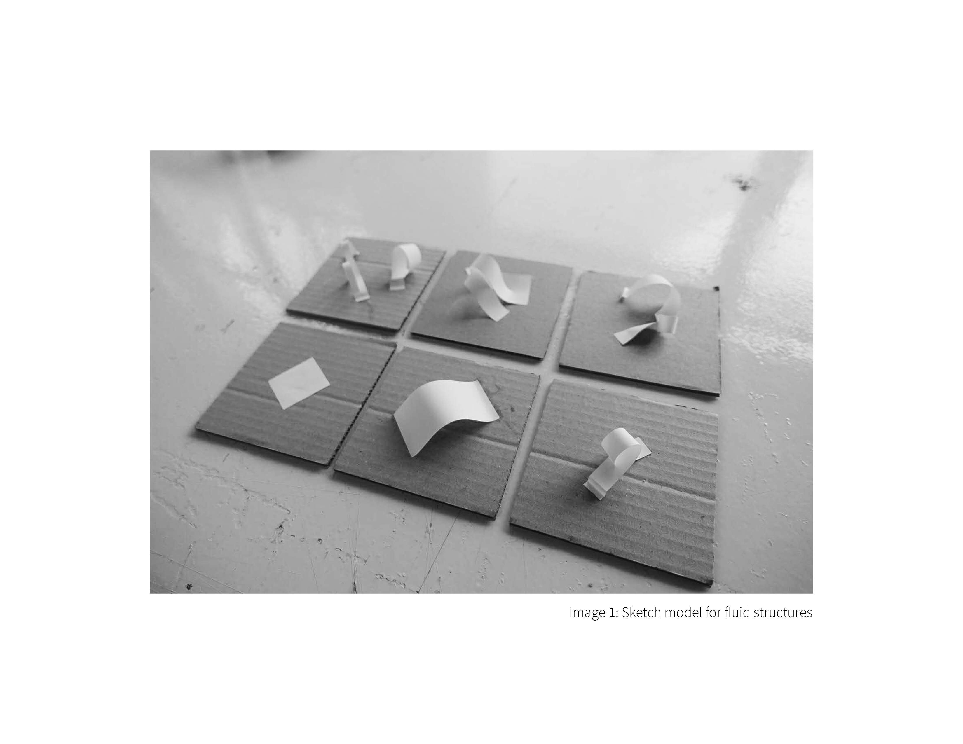
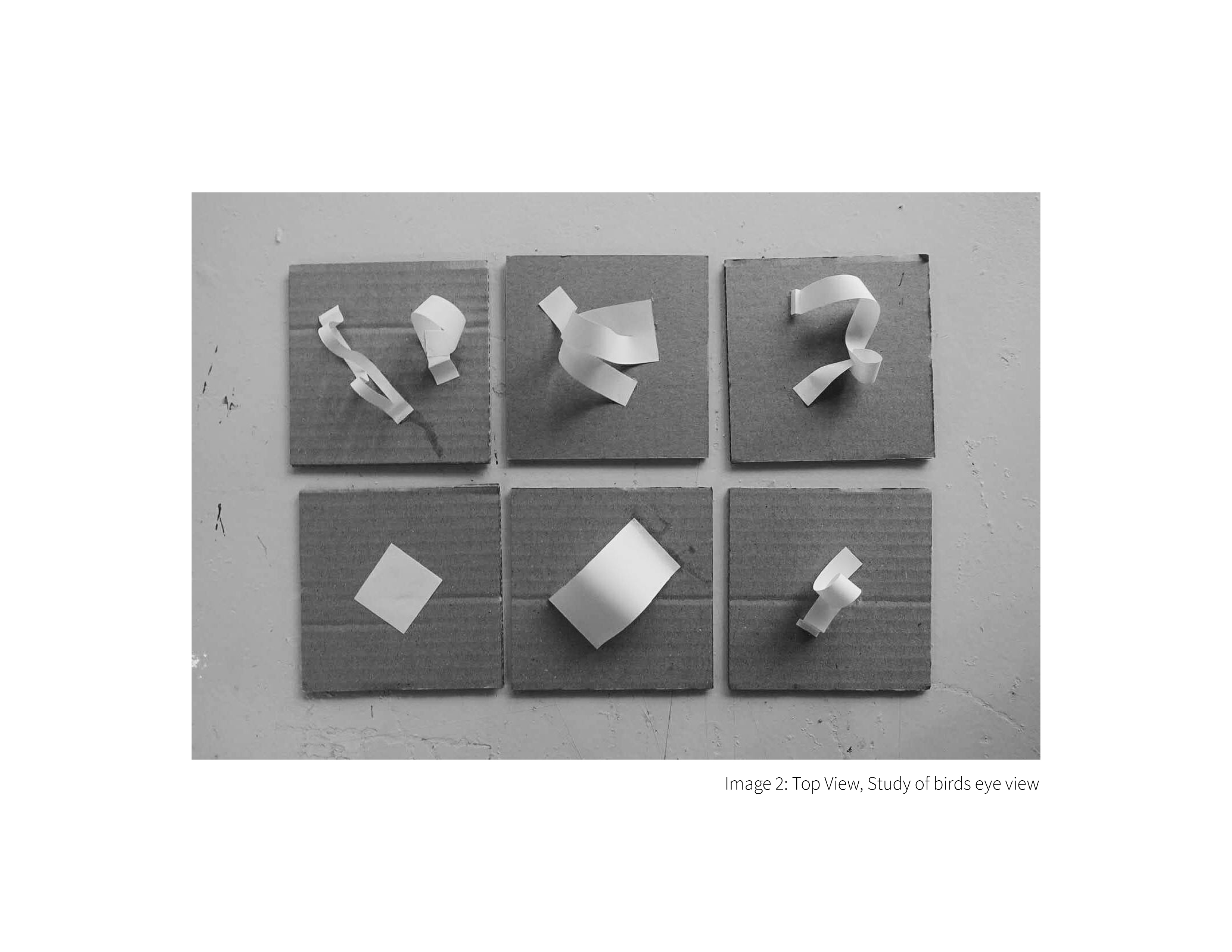
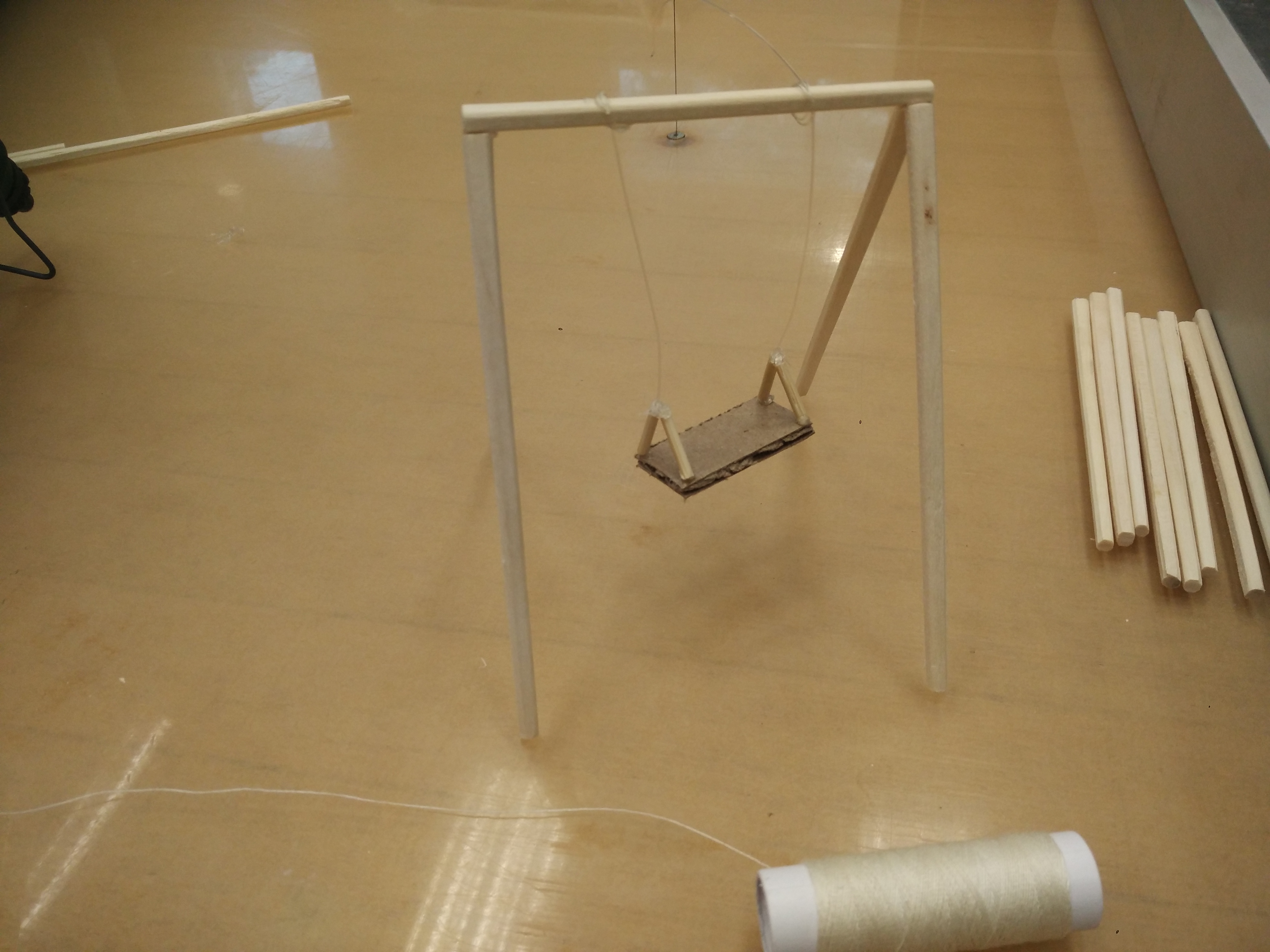
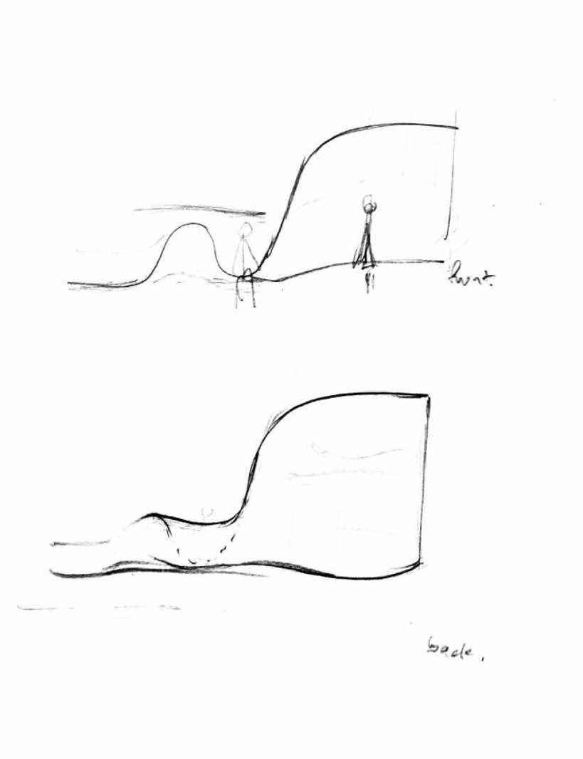
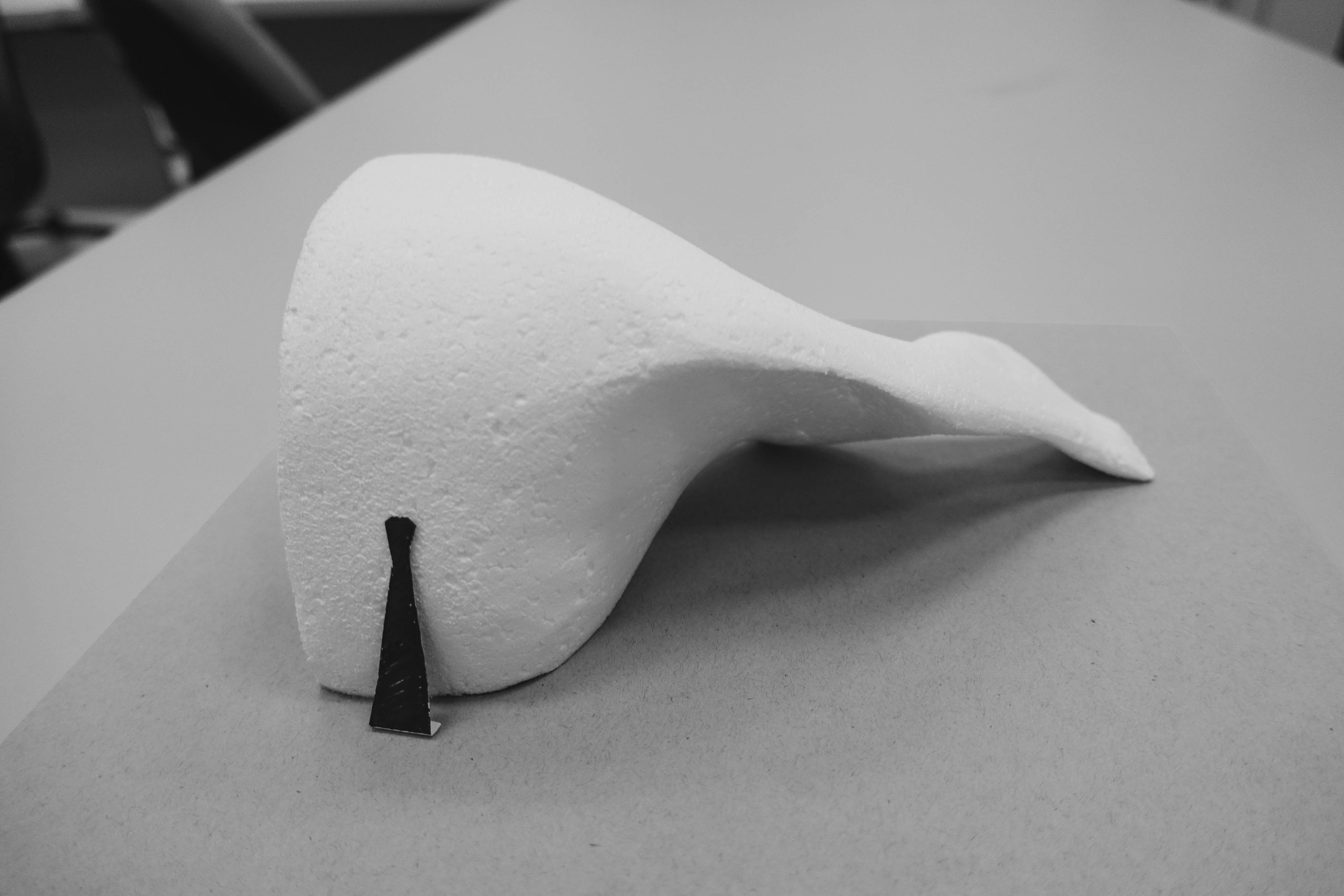
Returning to concept 1 (lighter form) in week 5, we continued to explore the mass and void in a fluid structure to be placed in a natural space within NTU.

Reflection

From feedbacks received in week 6, we would like to move away from the form of a moebius loop and return to the ribbon form that open and moves. Also, we have decided to subtract any straight folds and corners so as to avoid interrupting the fluid motion of the sculptural installation. We would also like to adopt using different materials/ different construction techniques to reinforce the utilitarian aspects of the installation without compromising on the emotional aesthetics that the sculptural form exude.

Further Developments

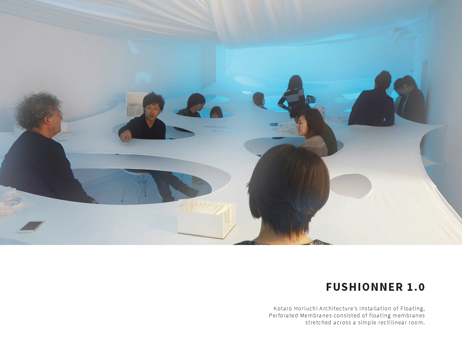
Formative references

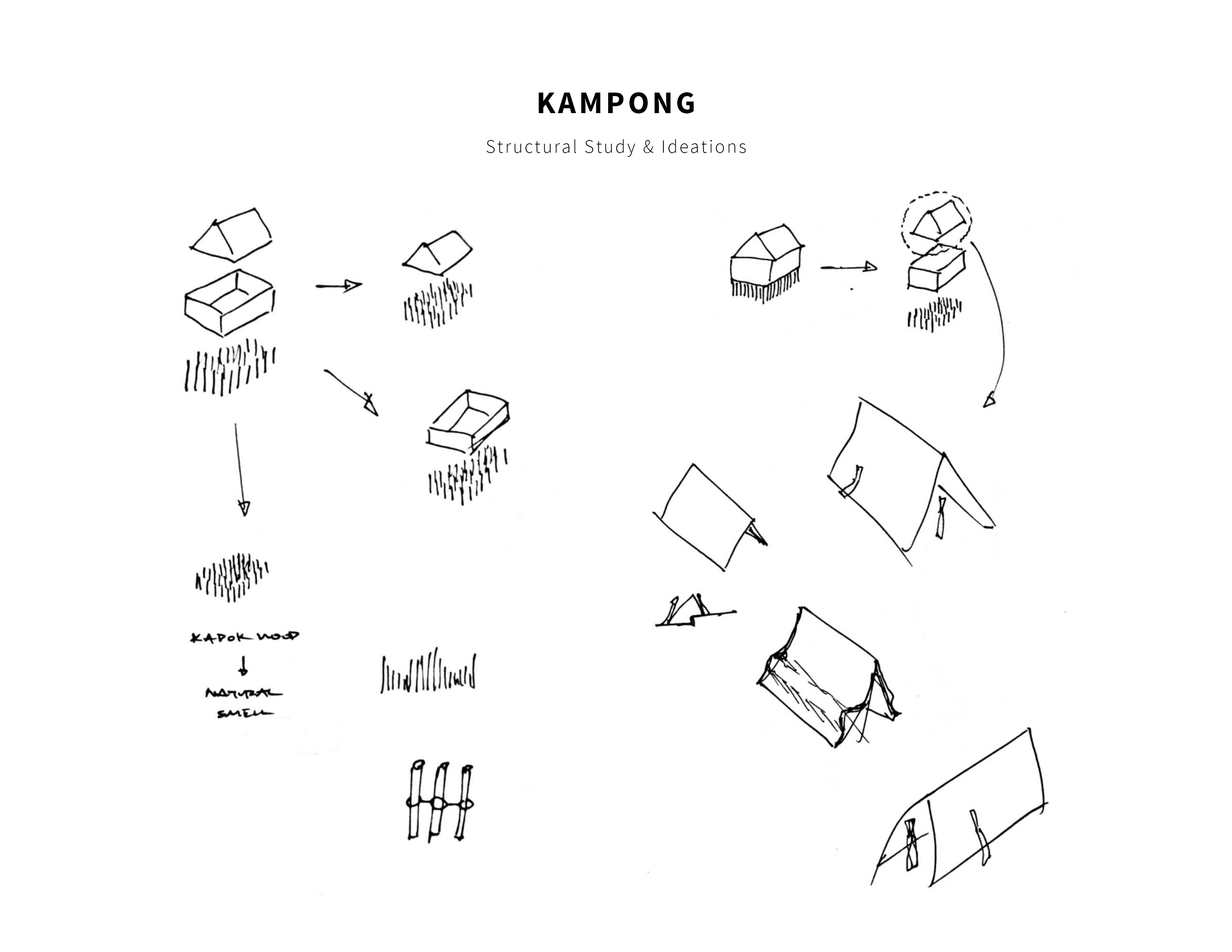
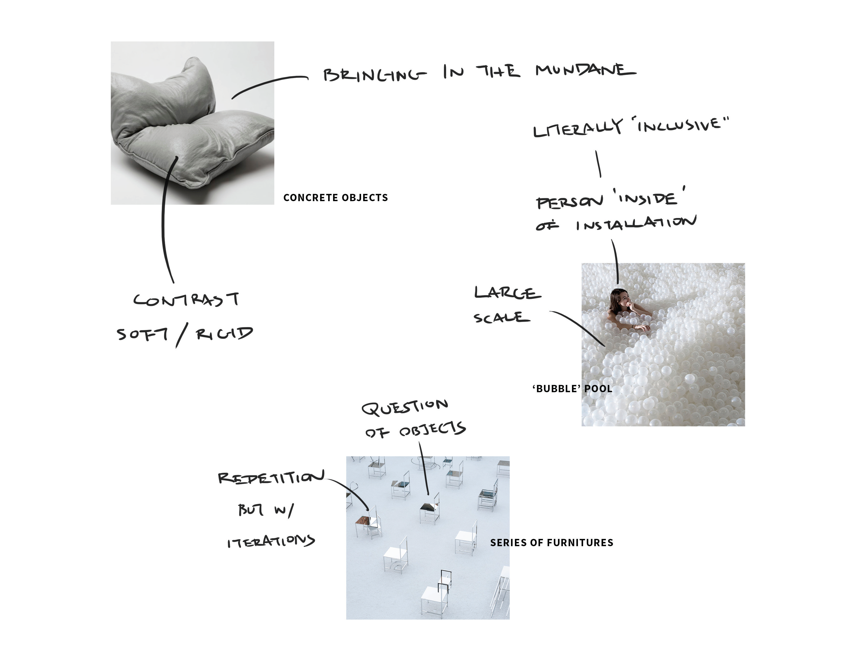
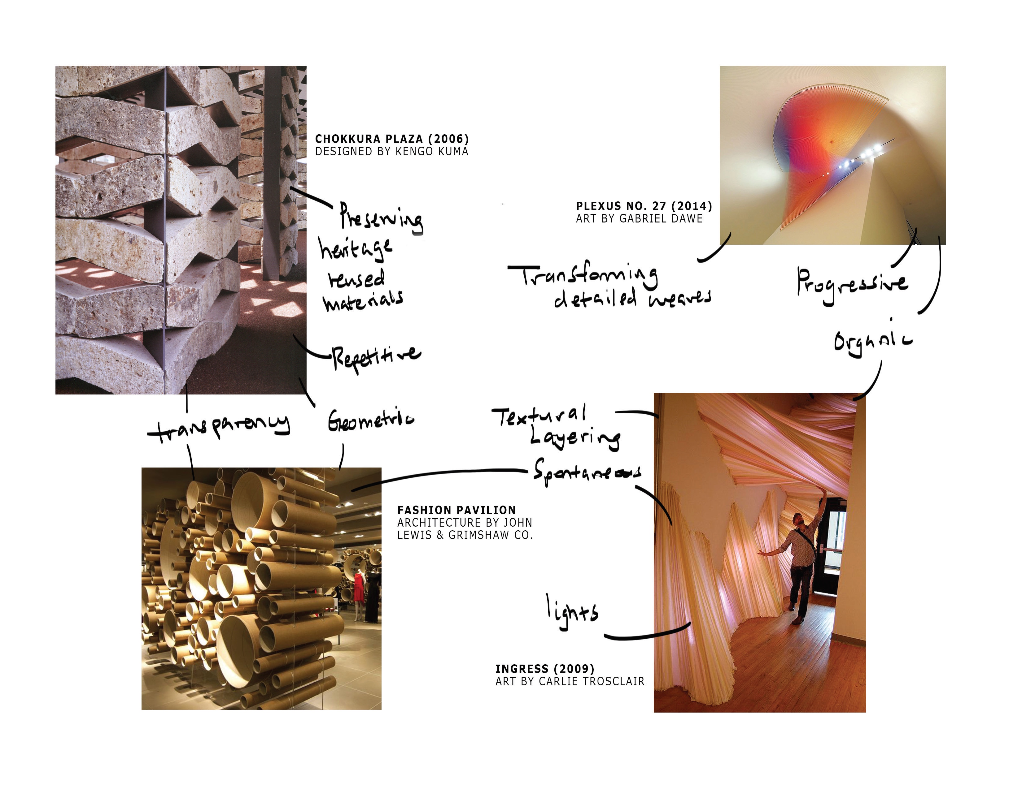
To give ourselves a better understanding of how to construct the fluid form and integrate different materials into its construction, we draw inspiration from a few existing architecture, installation and furniture works.


Seville roof – Metropol Parasol project in Seville by architectural team of J. Mayer

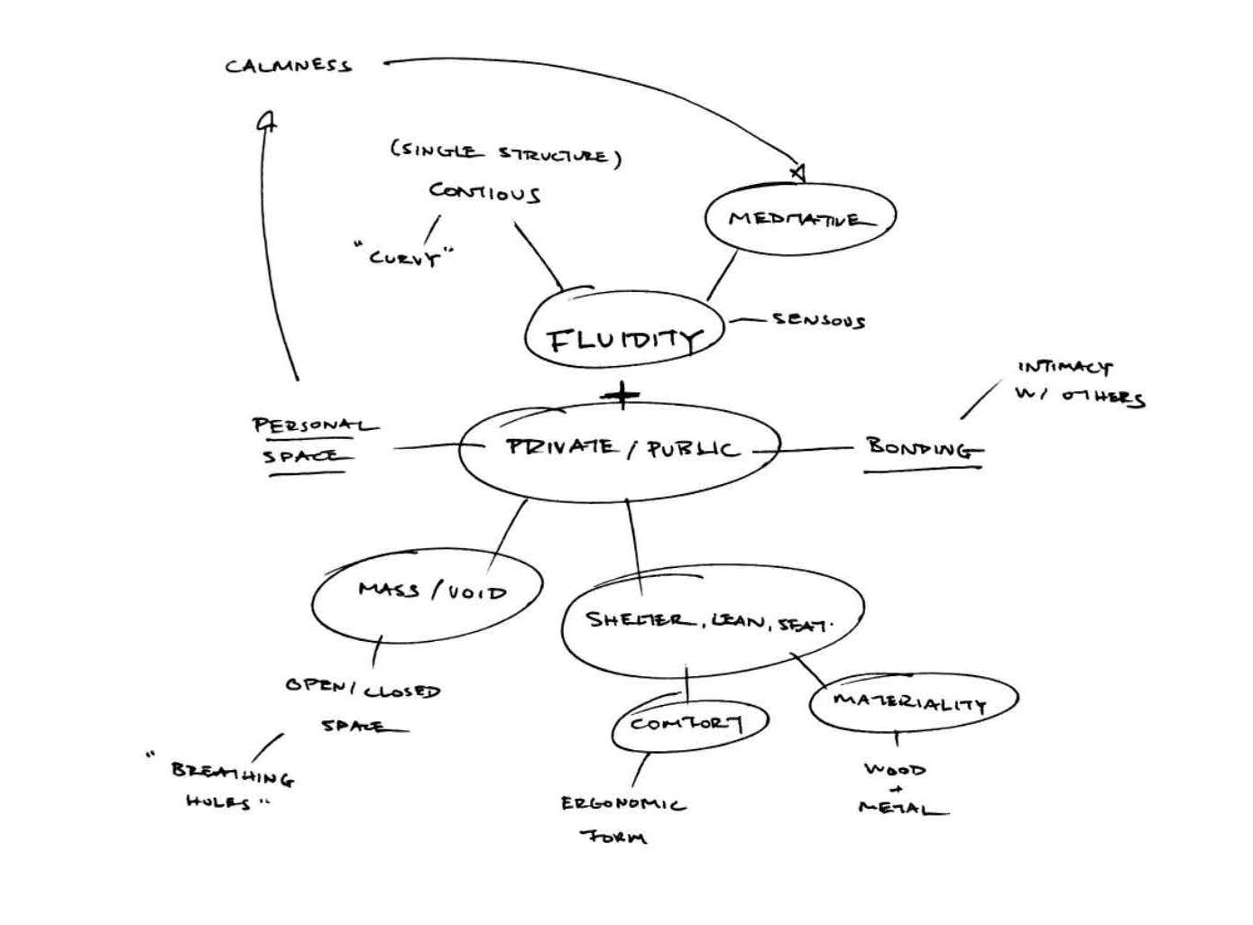
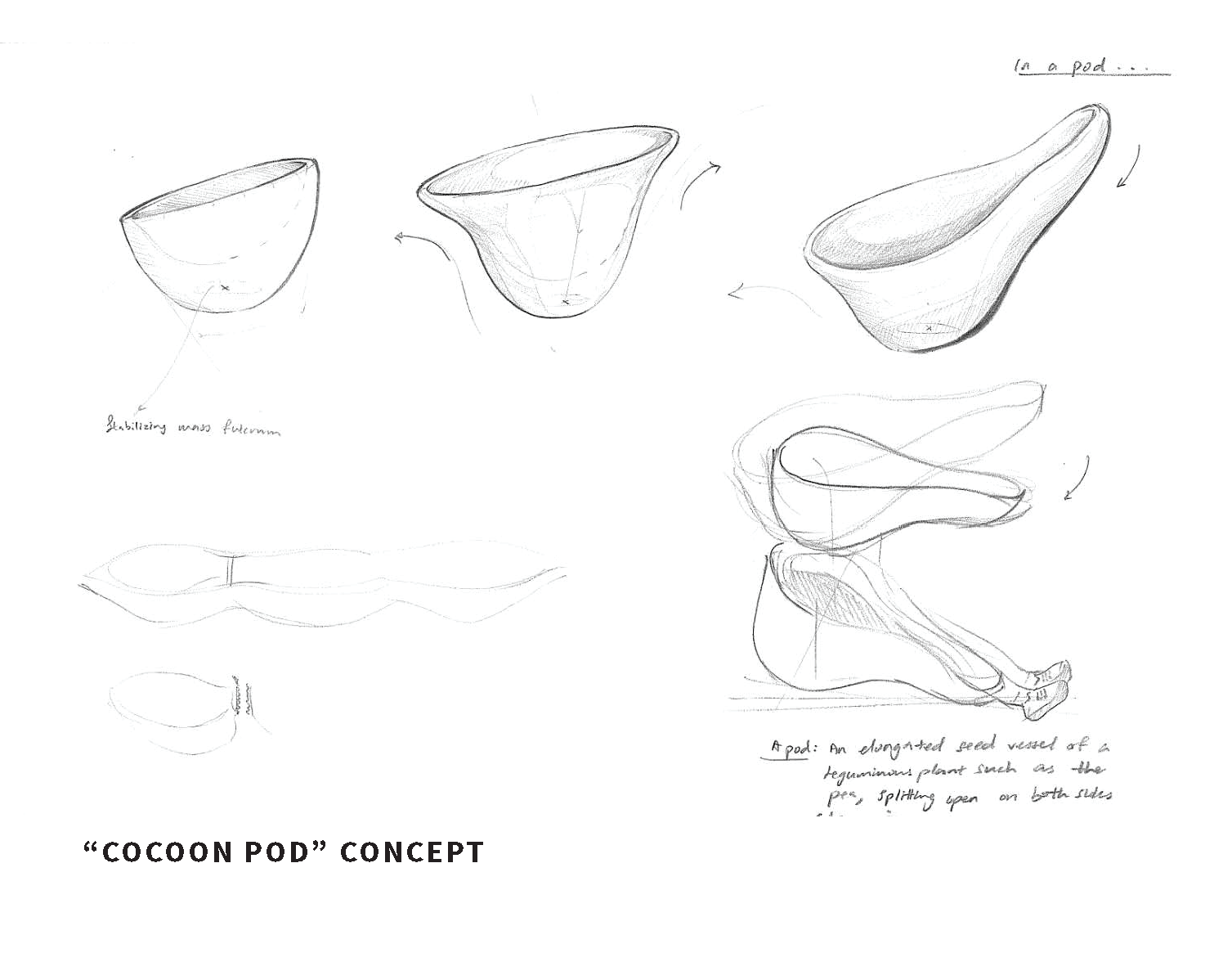
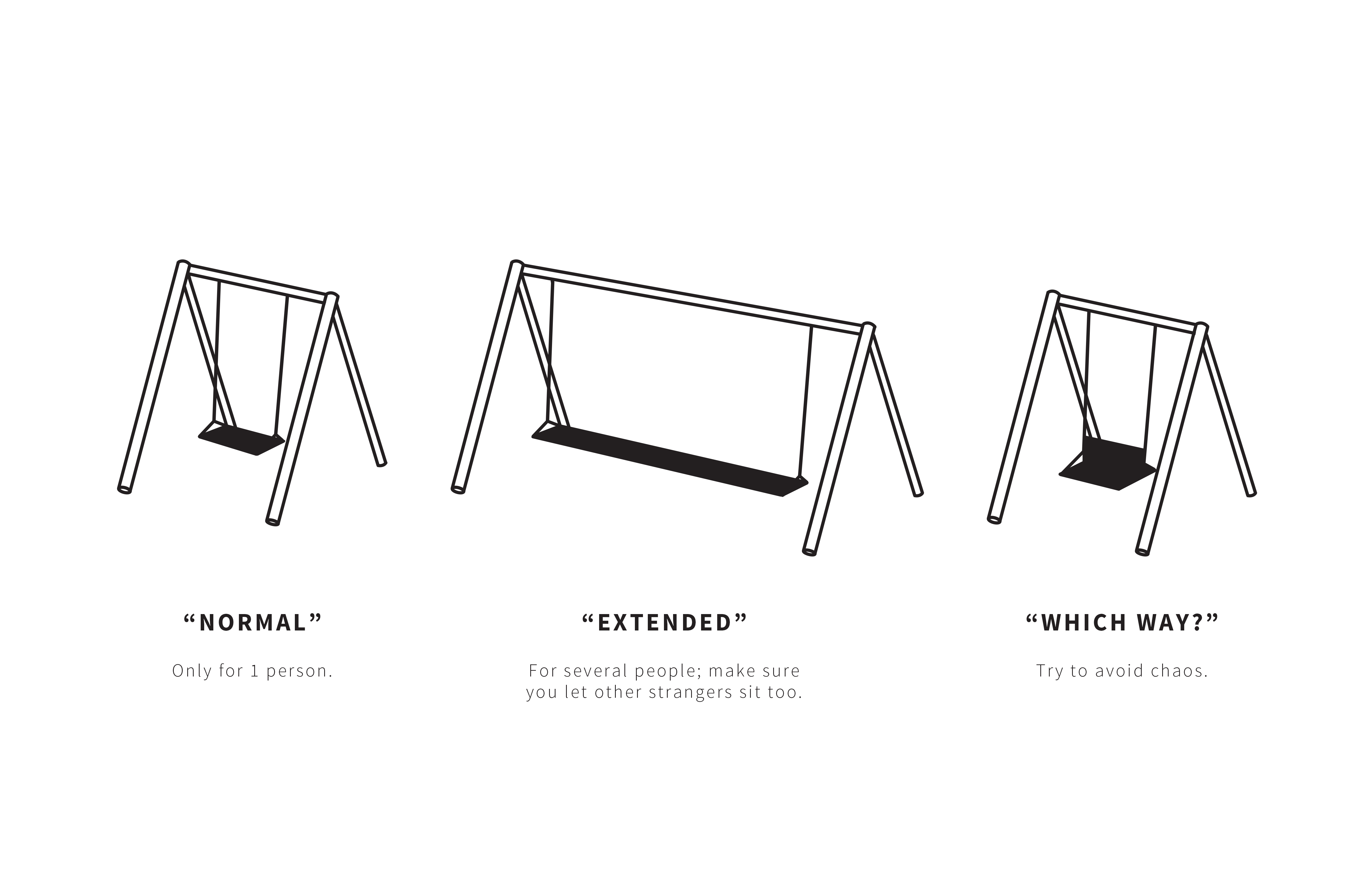
Incorporation (translating the meaning of fluidity into sculptural forms)


Full gridded sketch model of ribbon form that moves from an open to a closer space shown with two scaled figures
Scaled figures shown interacting with installation – standing and leaning

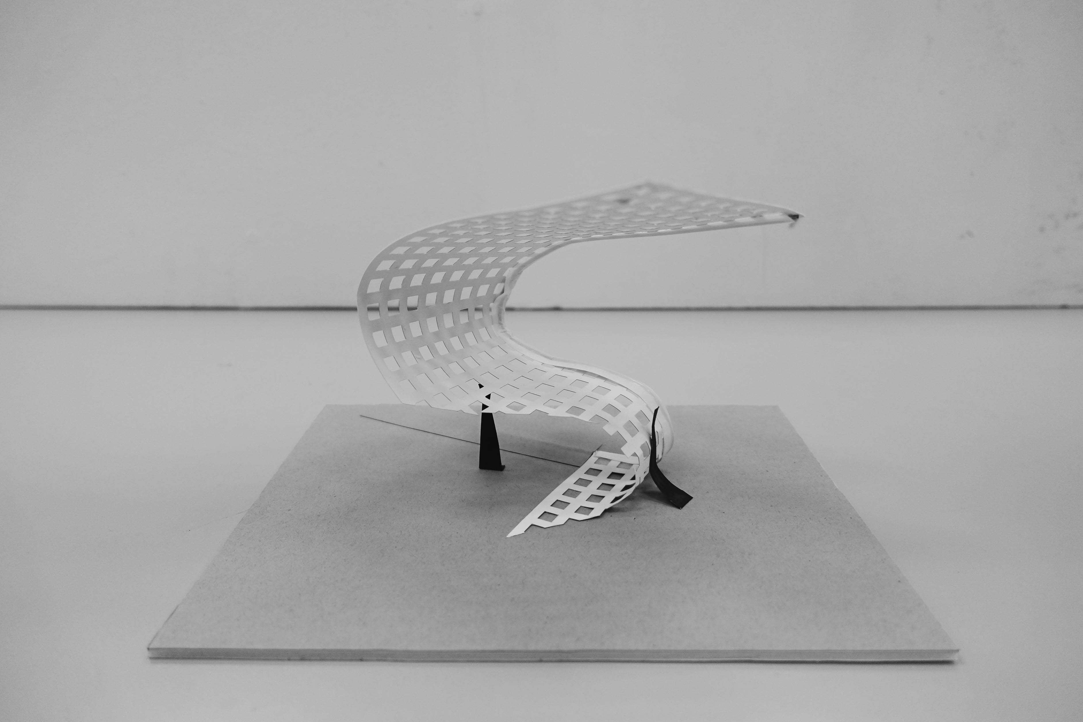
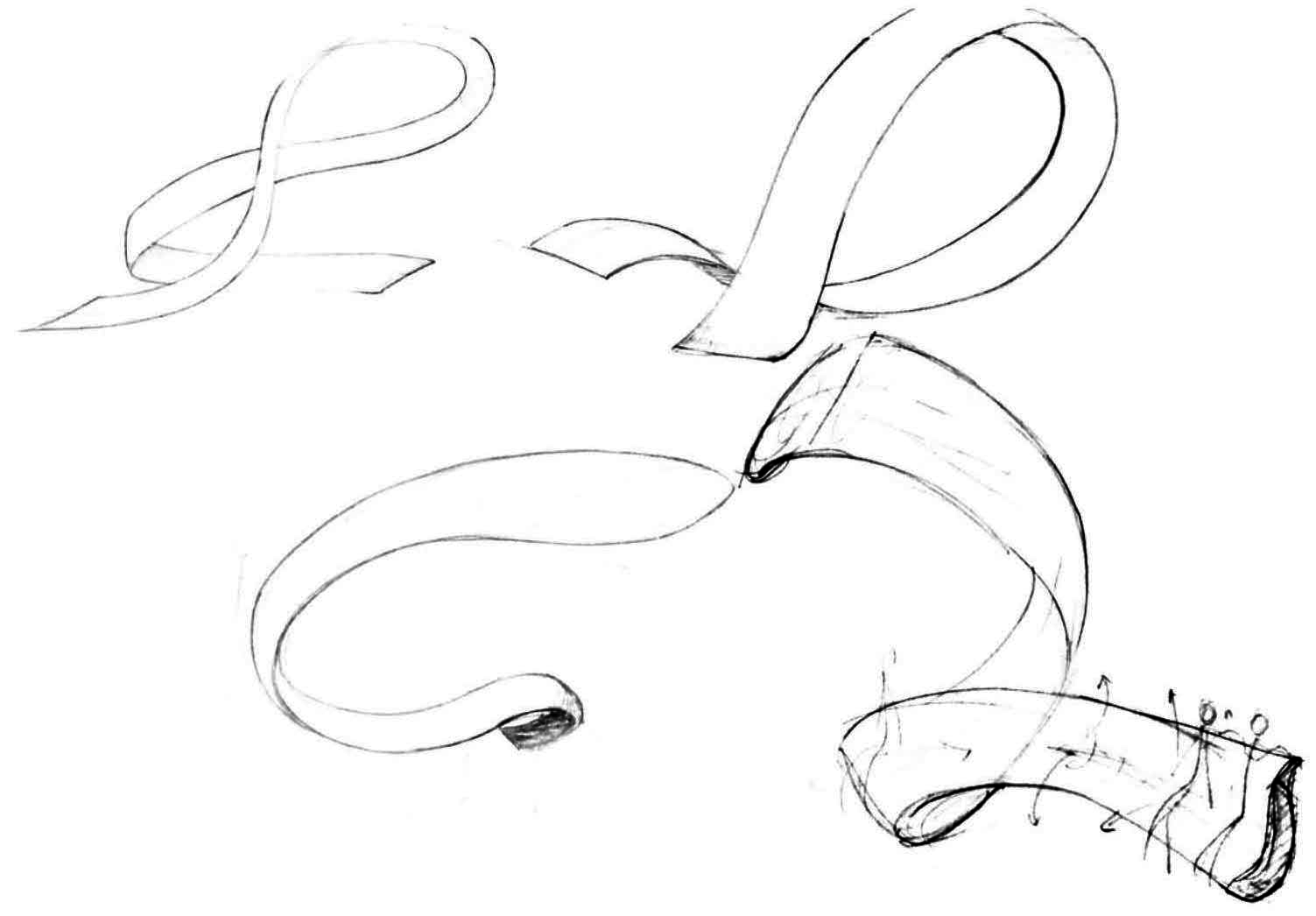
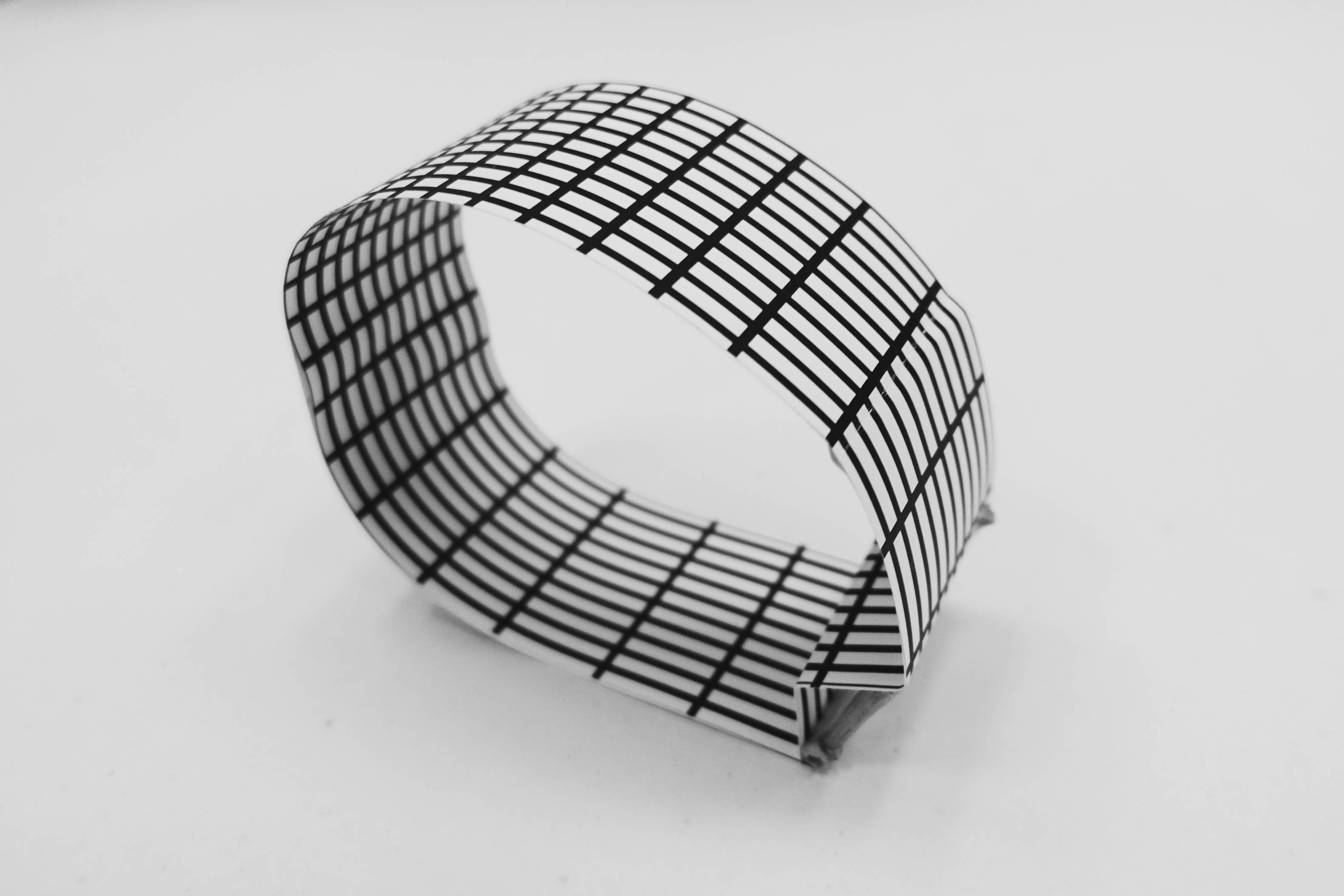
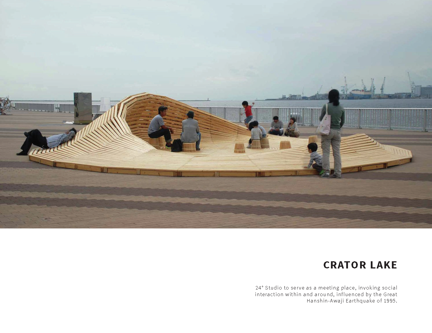
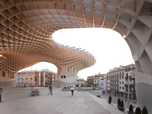
Making reference to the Seville roof, we developed the ribbon form that begins as an open roof, intended to be constructed in a similar way to the Seville roof, that curves into a closer space (material becomes denser with closed grids to eventually taper and join with the ground).

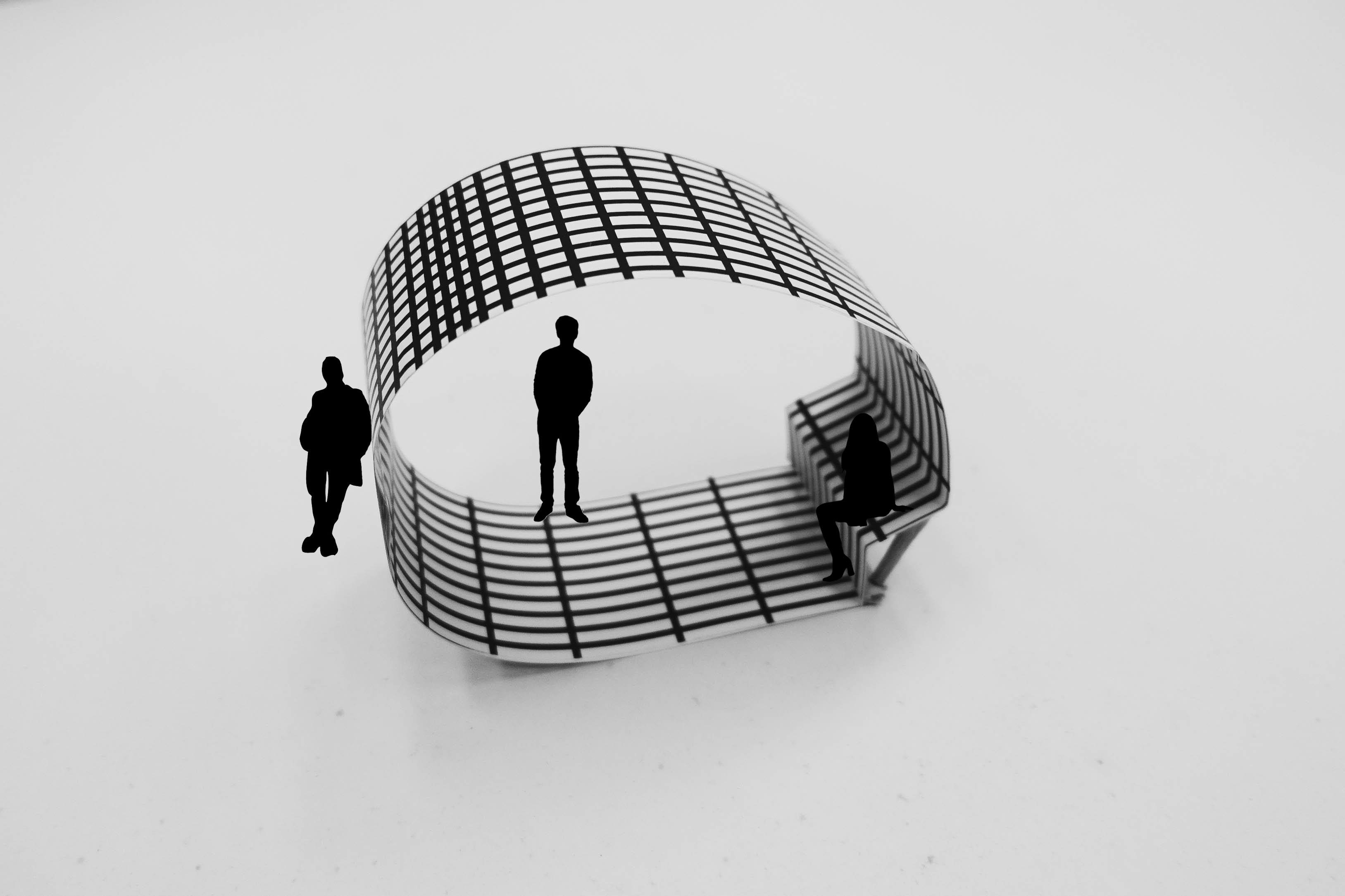
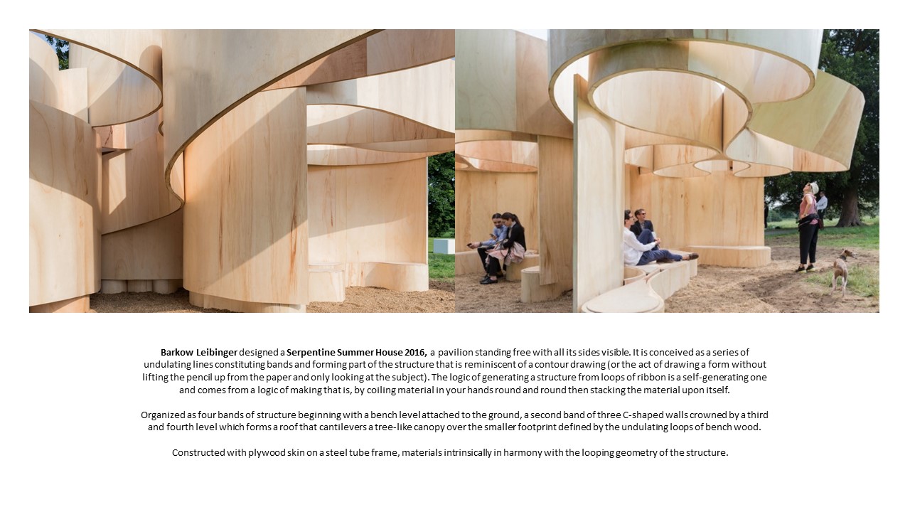
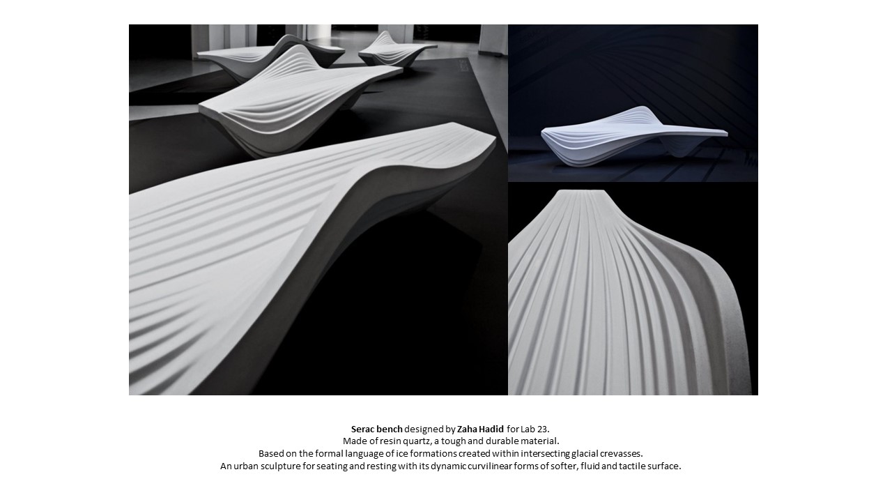
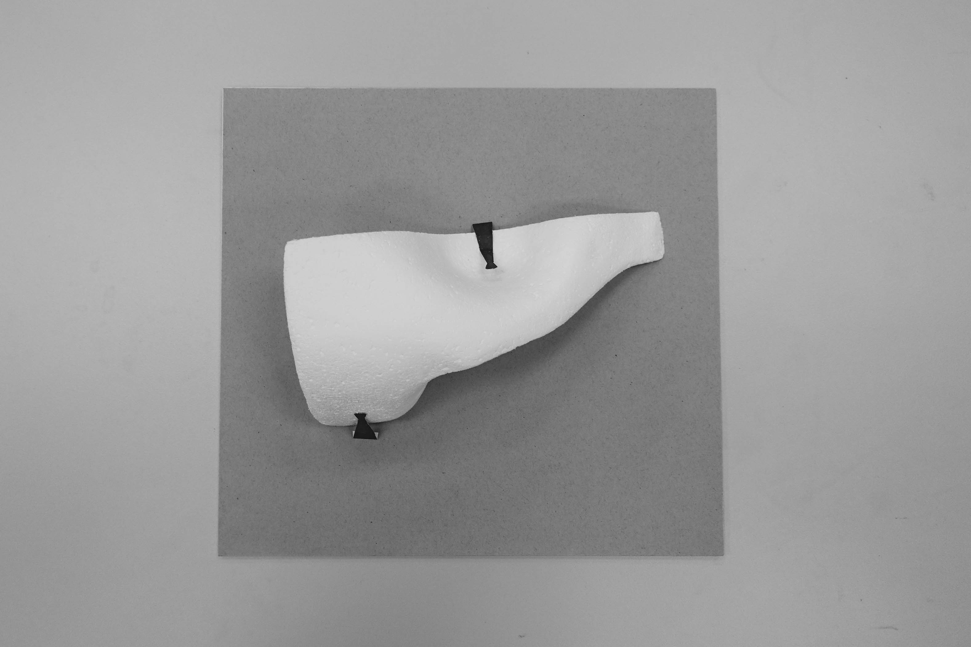
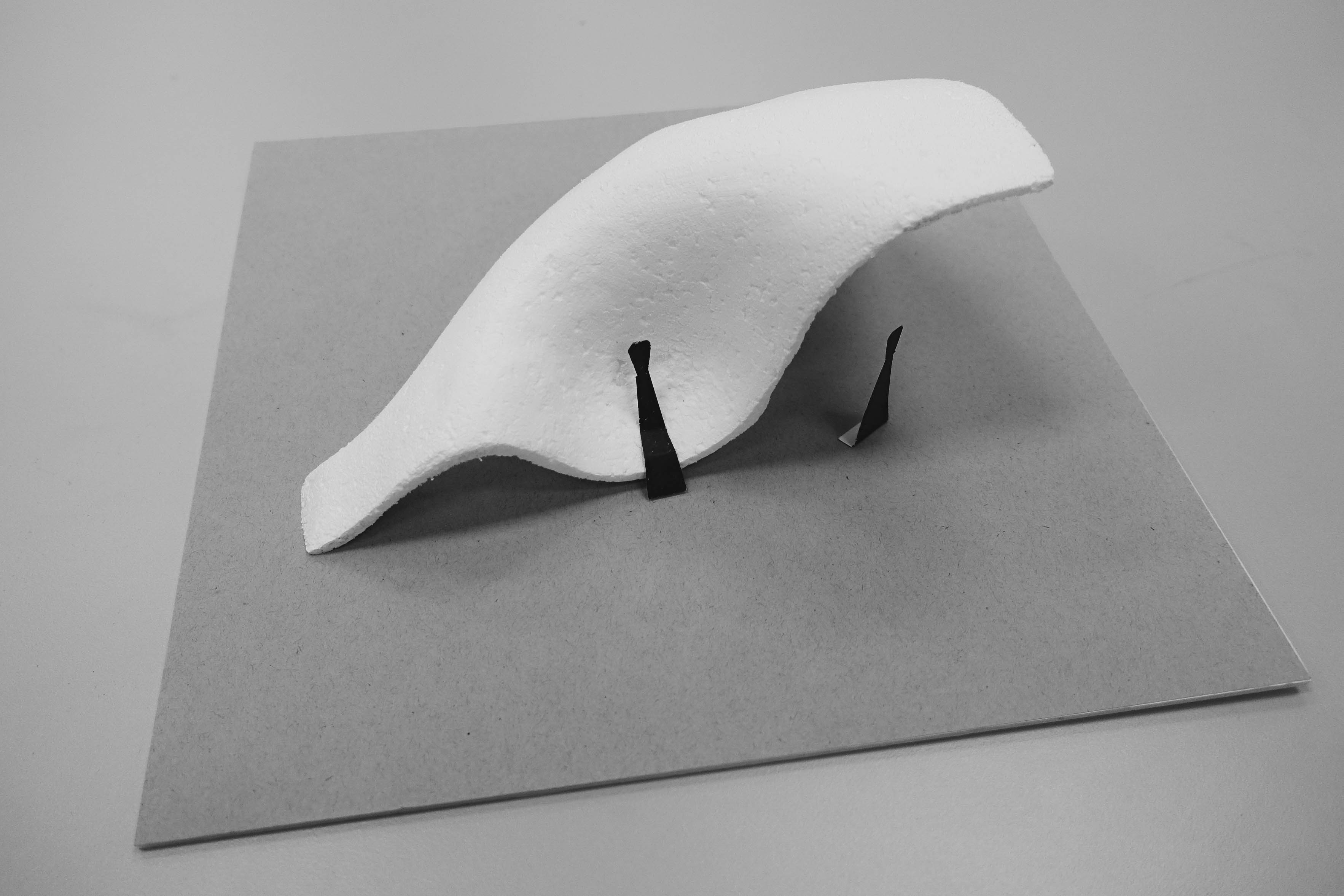
As a development to the ribbon form, we research on fluid forms by looking at Toyo Ito’s Taichung Metropolitan Opera House, Barkow Leibinger’s Serpentine Summer House 2016 and Zaha Hadid’s Serac Bench. We extended and folded one edge of the curvilinear plane to create a more organic form that incorporates utilitarian considerations for the sculpture to serve both functions as a private and public space.

Developed foam model displayed on the right of its initial form. Exploring different materials for sketch model making – Black foam, Styrofoam, Paper, Aluminium wire (for building armature).
Front view of developed foam model (before addition of grid)

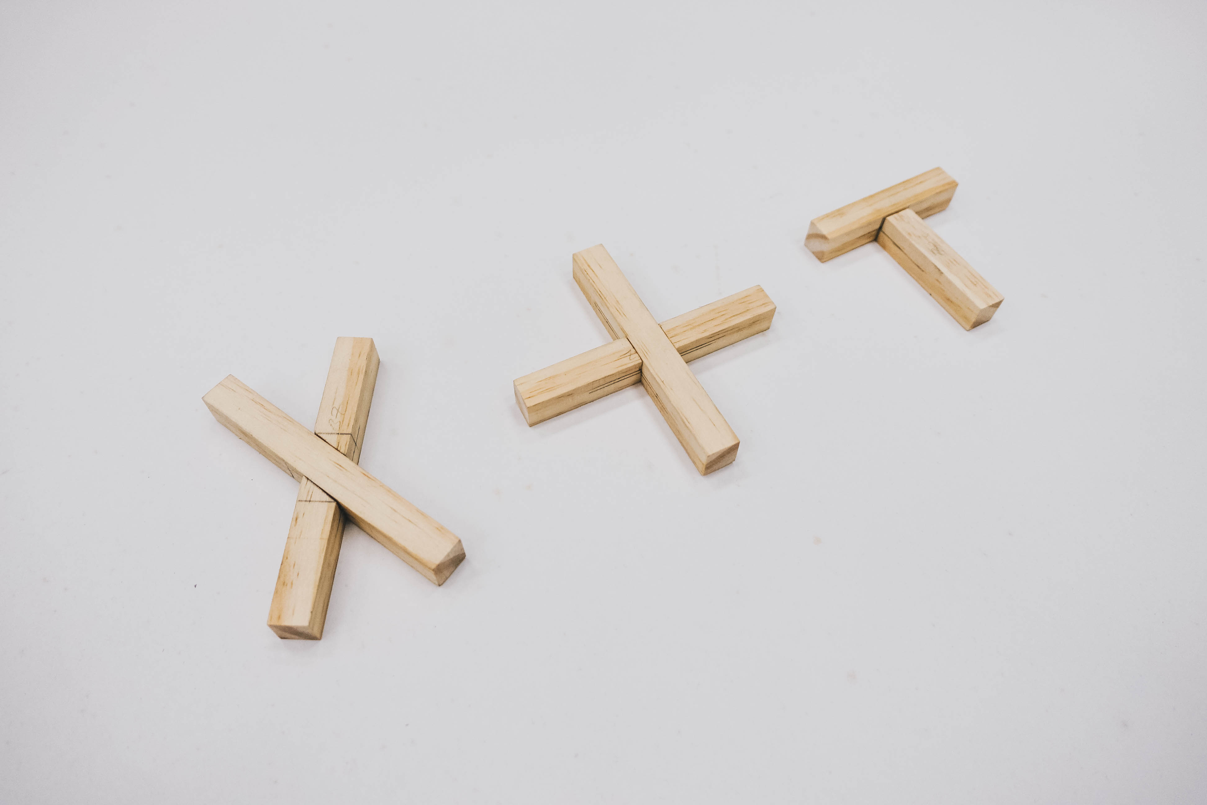
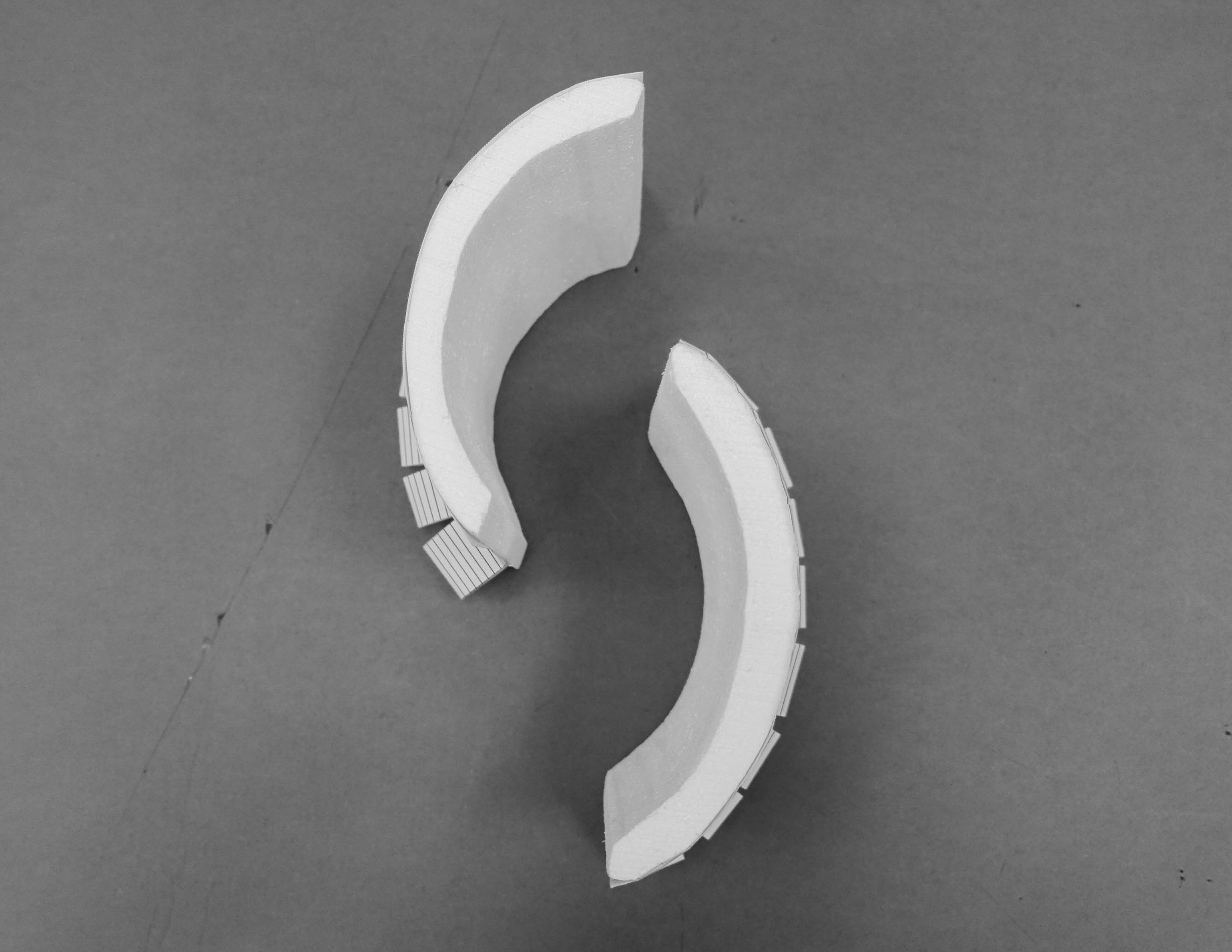
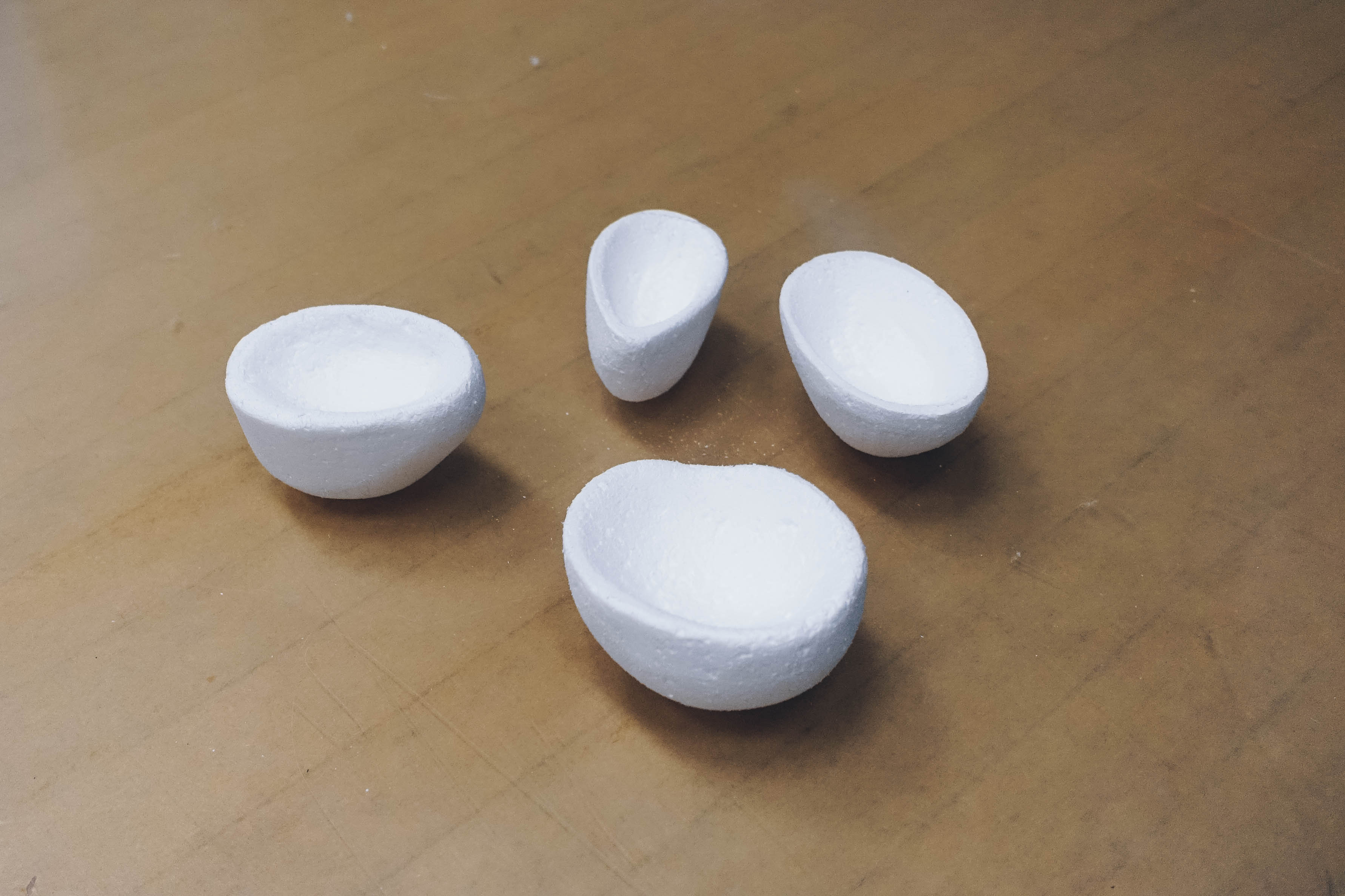
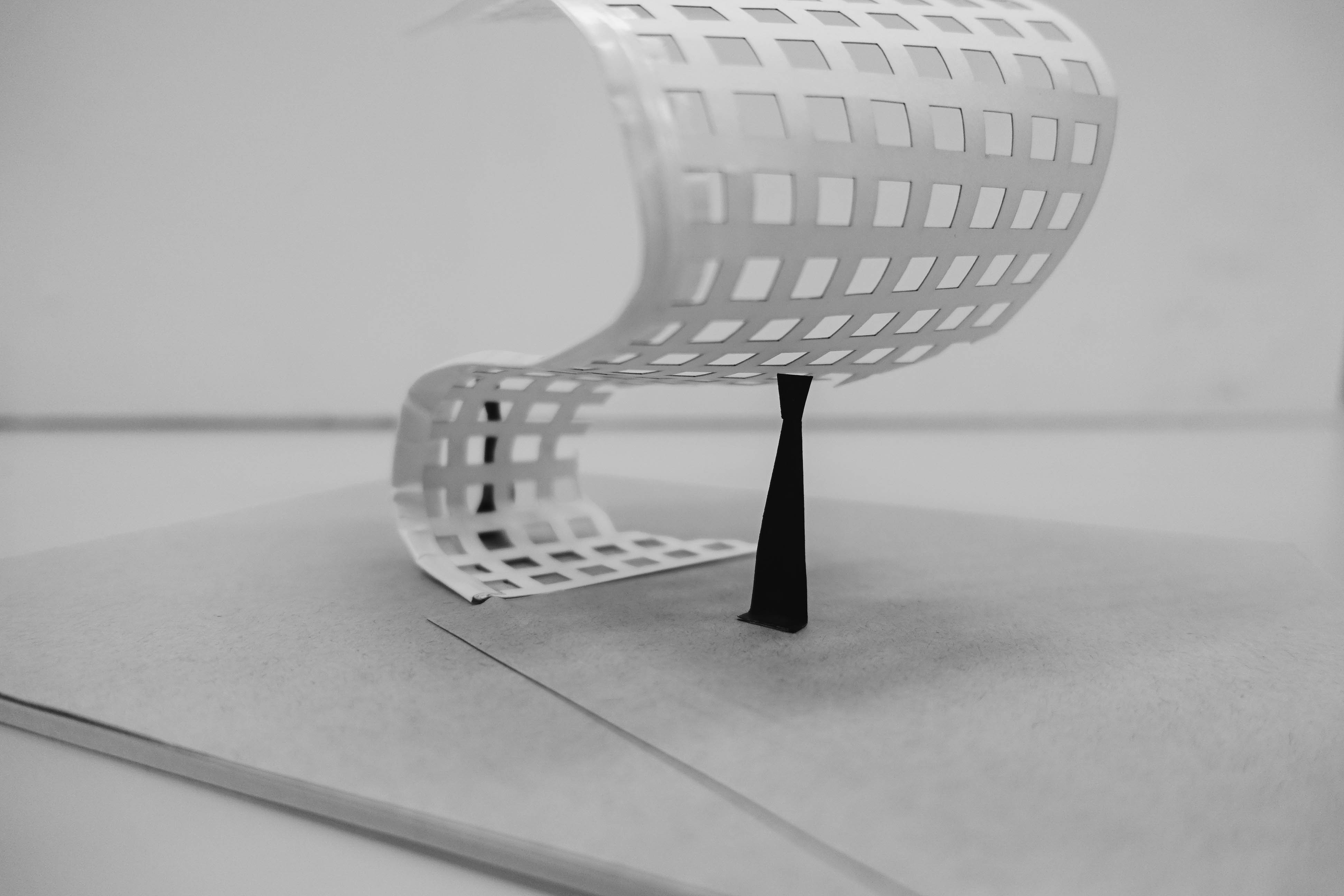
For the construction of the foam model, we thought of making reference to Marc Fornes/Theverymany‘s installation “Minima | Maxima” with the use of aluminium modules or joining wooden plates together in a similar fashion to create the curved surfaces.

Top view
Perspectival view (top down, front)
Perspectival view (top down, back)
Back view
Frontal view of developed foam model with gridded shelter

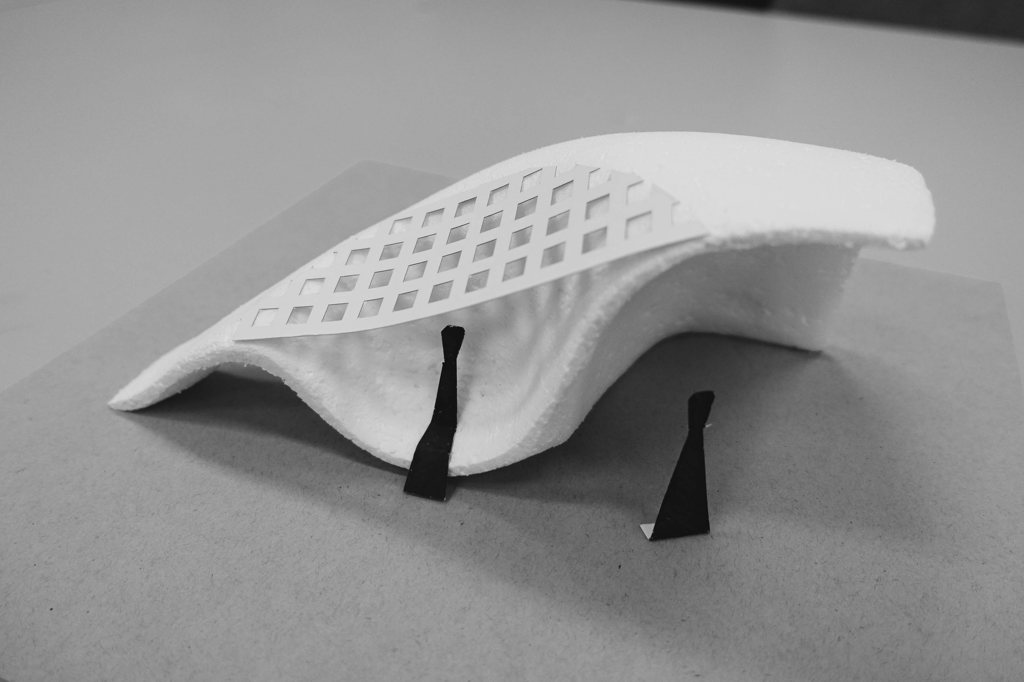
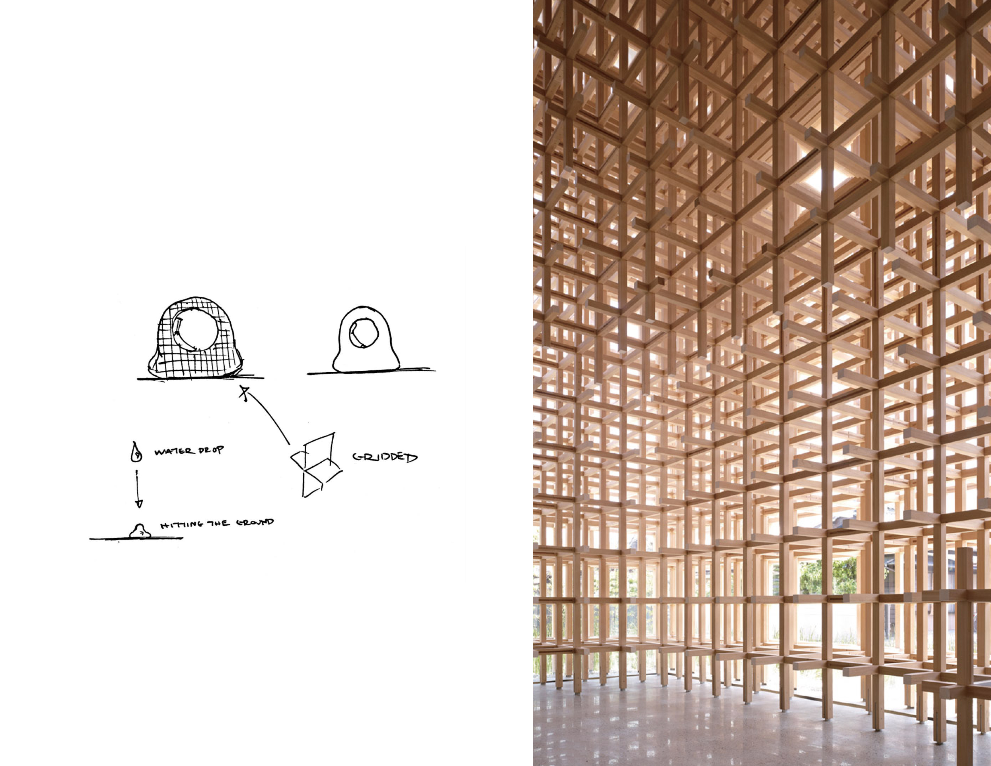
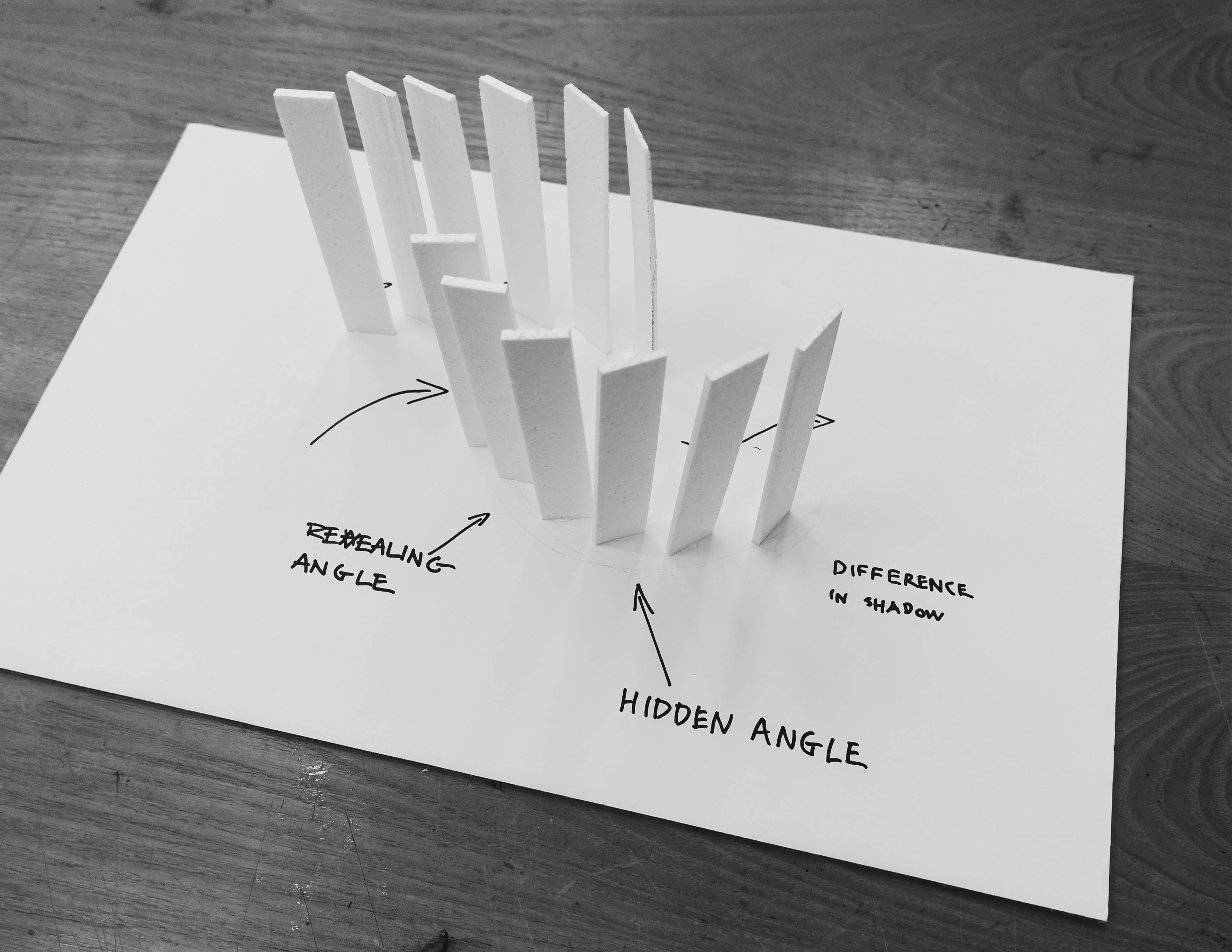
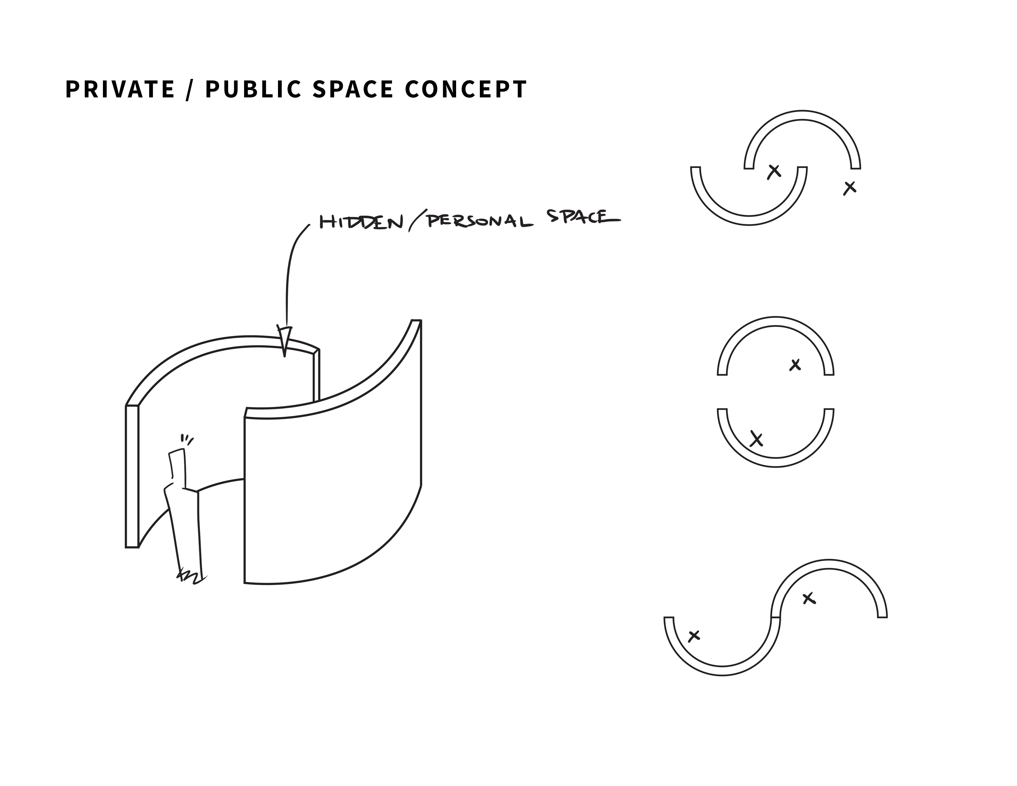
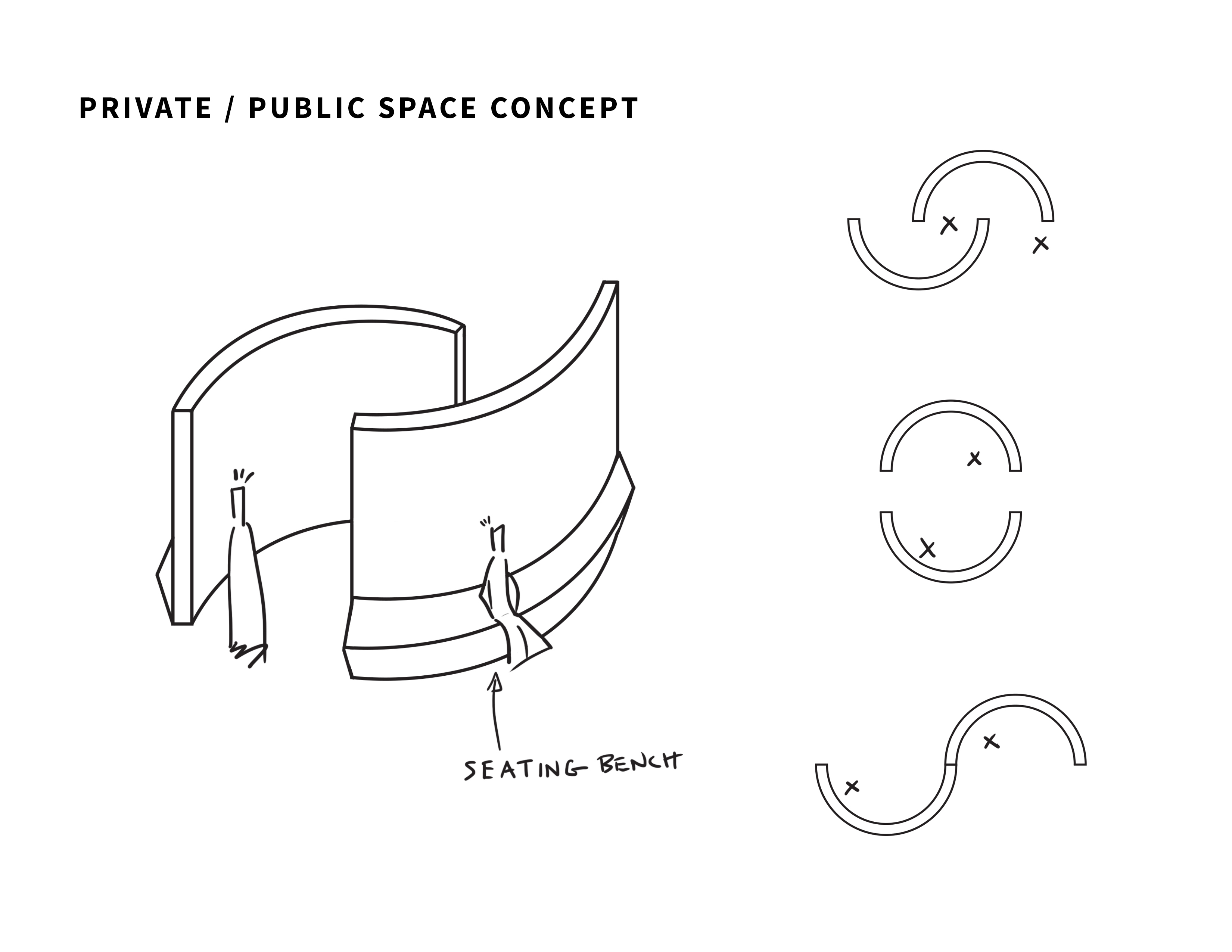
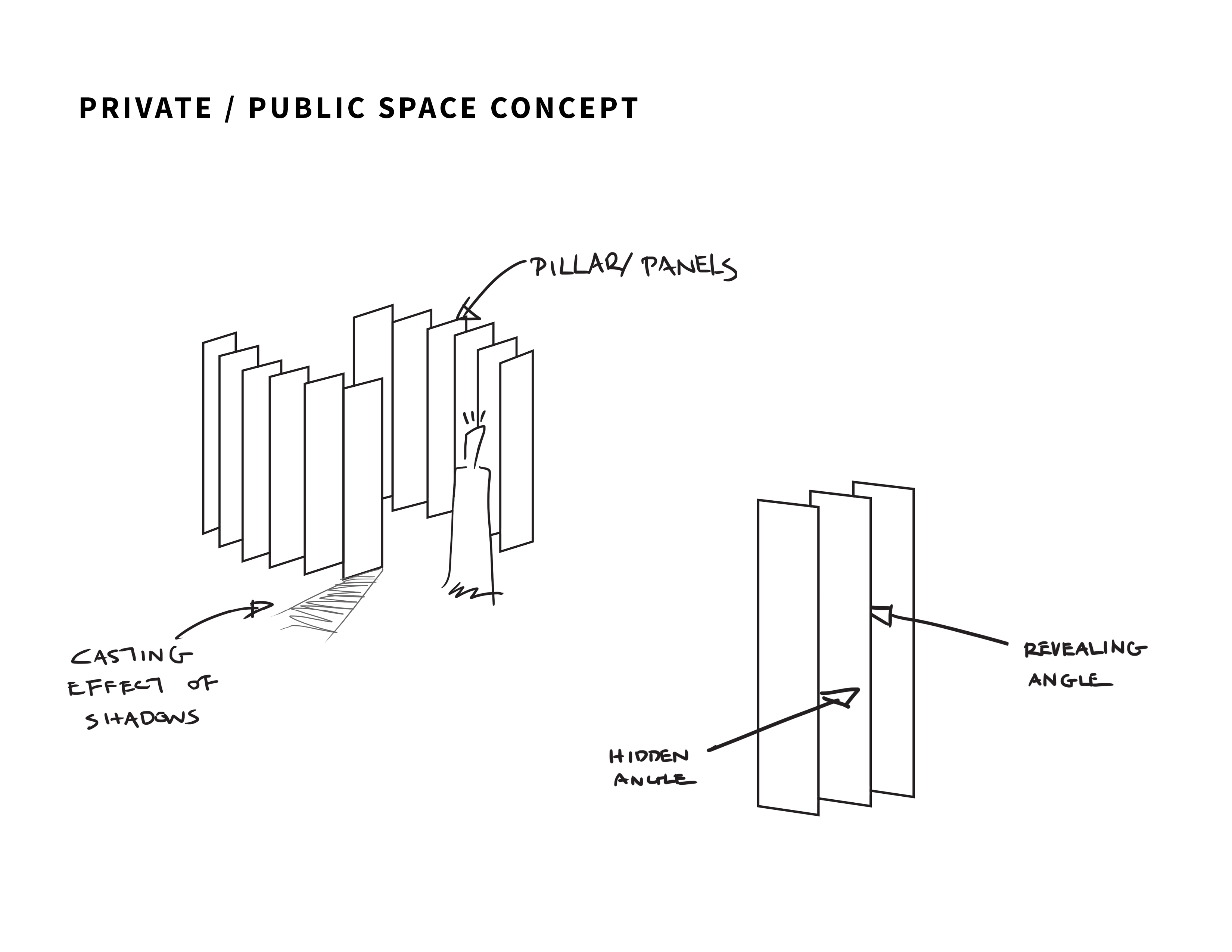
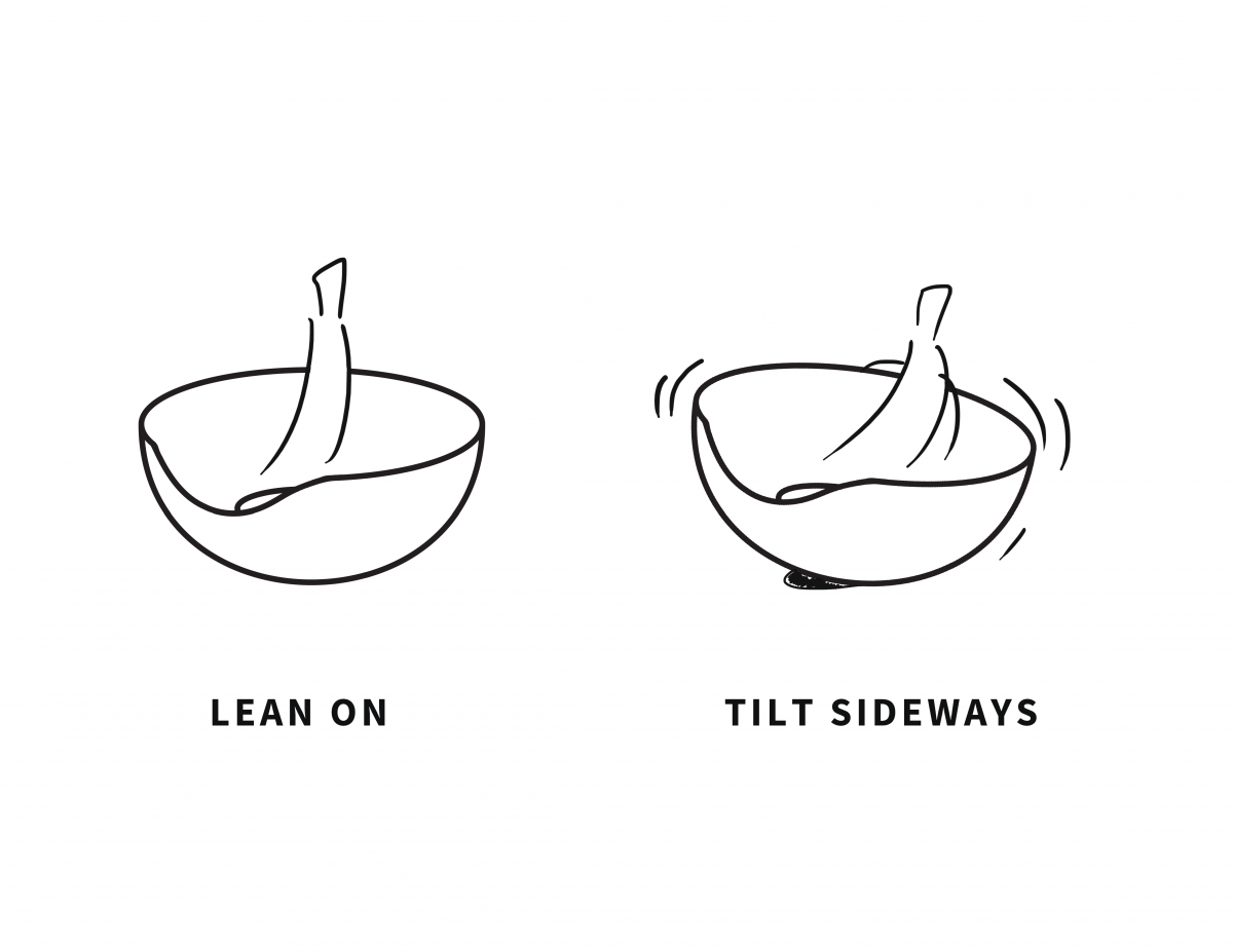
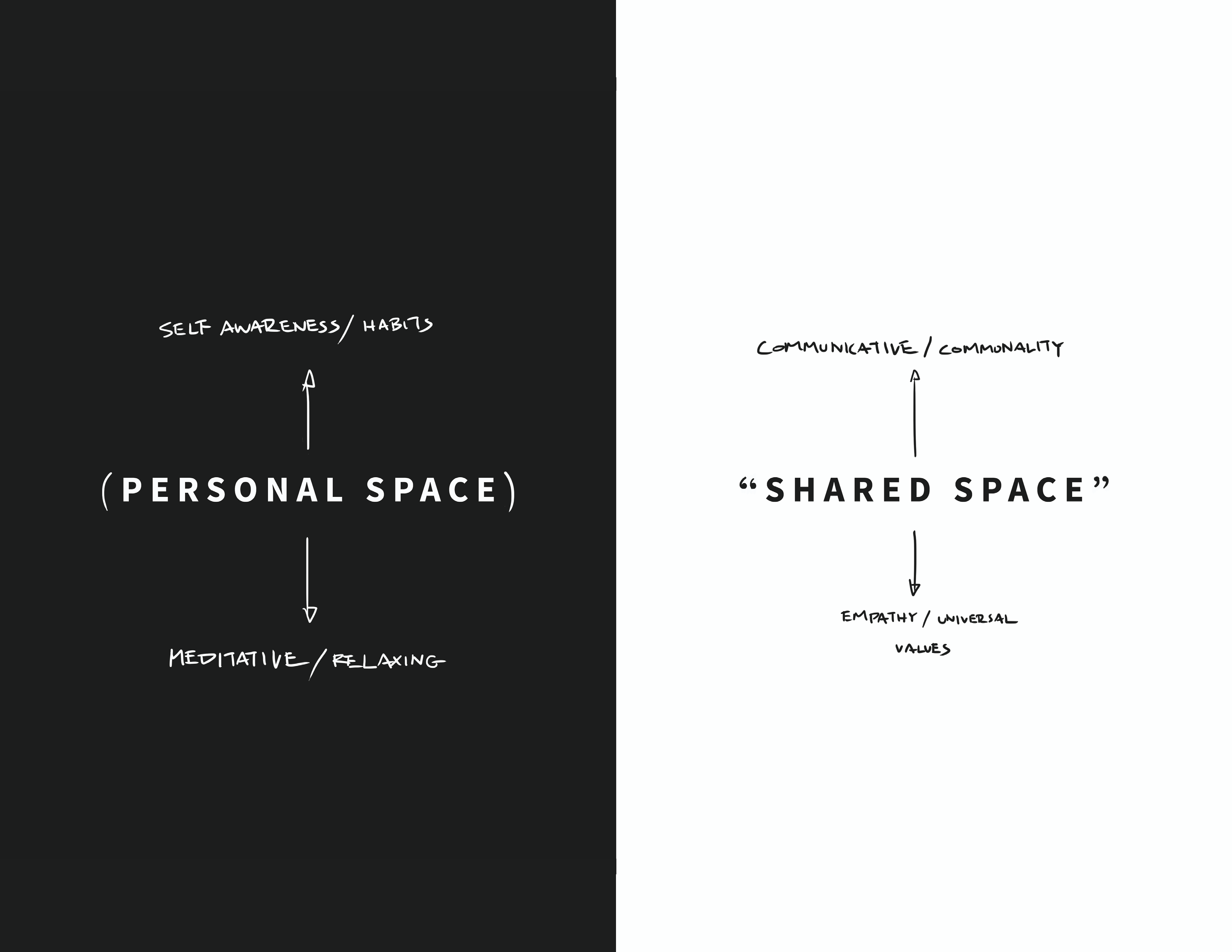
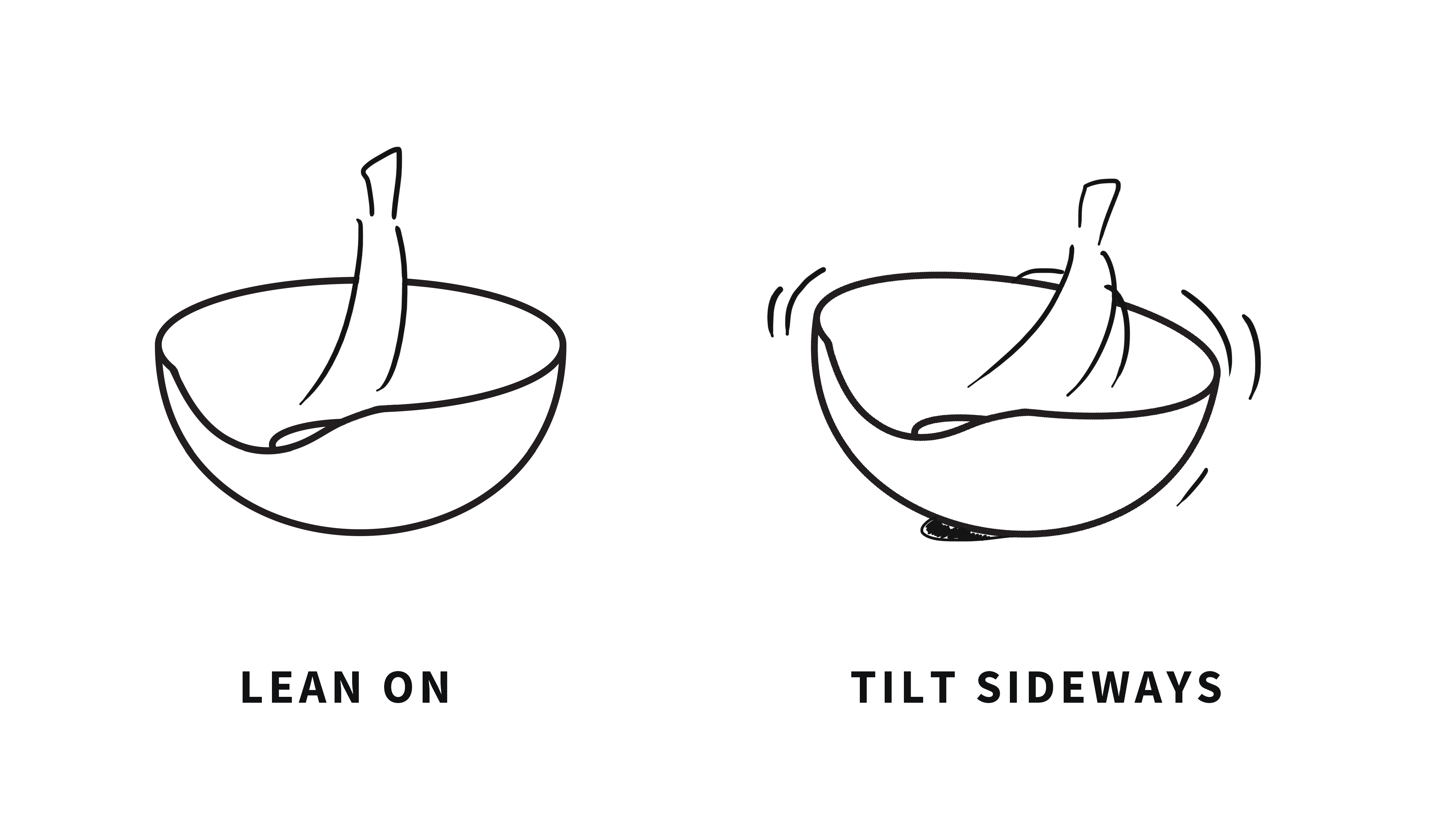
To emphasize on the personal space within the sculpture, we choose to seamlessly integrate the gridded structure from earlier development into the later development to serve as an open shelter without interrupting the fluidity of the form.

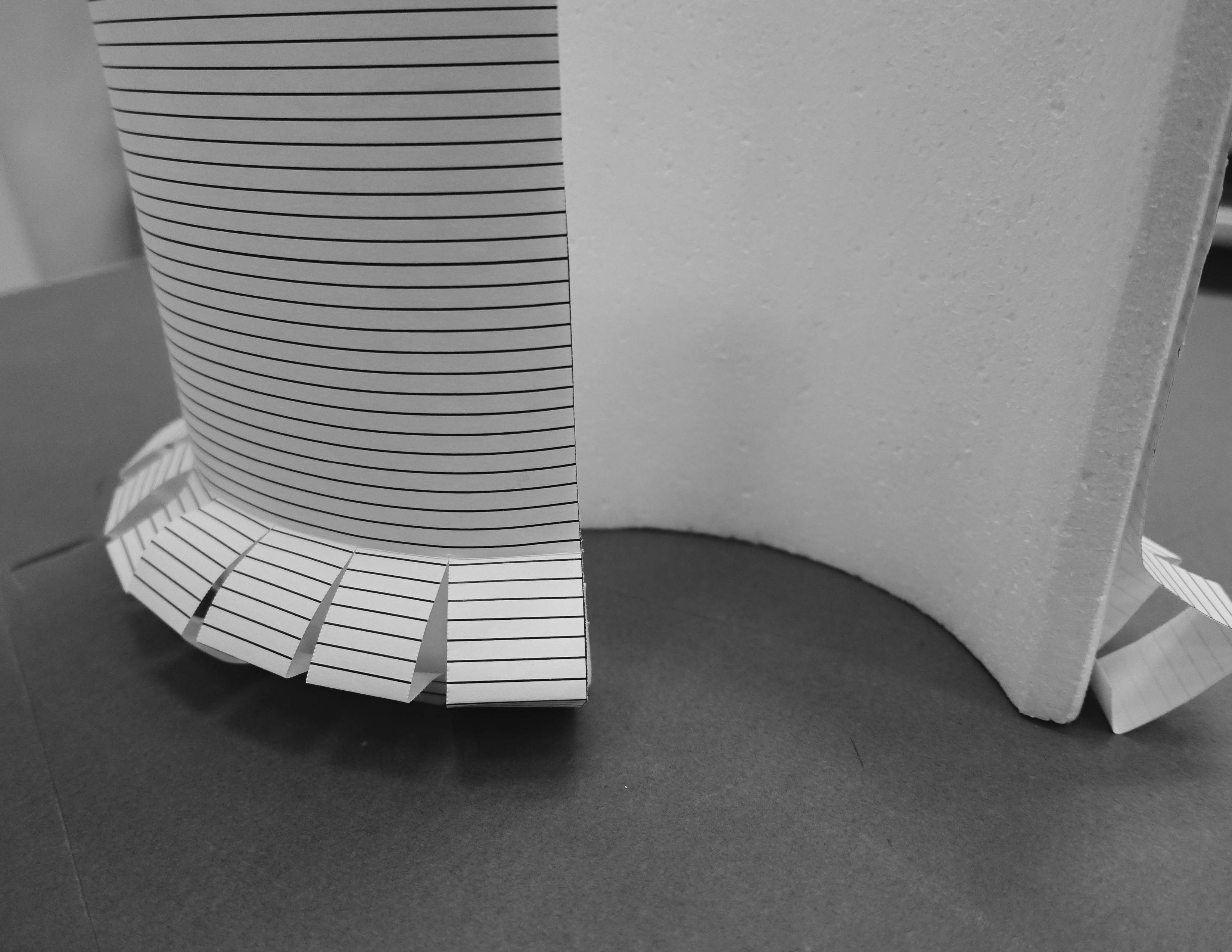
By representing the roof with the uniform gridded form, we want to reinforce the personal space within the installation and encourage our audience in the space to engage in visual meditation with the gridded shadow and its illuminated square voids casted upon him by the natural light. We hope that the user can focus on his consciousness as he meditates in the circular void sheltered by the square grids to achieve inner peace.

In a more symbolic explanation, the square provides well established boundary lines whilst the circle defines area. While the boundary lines of the square gives the user the feeling of security, its sharp edges and corners is observed by people outside the space as a delimitation, a sign that tells them not to go beyond the lines.

Future explorations

We would like to research in detail to find out which materials and construction methods work best to bring out the fluidity of the form.

Week 6

Week 6

We decided to work on Concept 1 (lighter form) to further explore on mass and void in a fluid structure to be placed in a public space in NTU.

To be more specific with our selection of space in NTU, we thought of incorporating our installation within a natural space to achieve a balance between architectural installation and nature.

Also, we want to utilise the natural shading of the existing natural space in NTU for a cooler experience.


Defining Public and Private Space

User Experience Mind map

We drafted a mind map to develop the user journey which helps us define their experience in each stage of the journey.

Conceptual Mind map

Identifying the key words for the aesthetics and function of our concept.

Further exploration with Concept 1

Interaction with the Installation

We made a mock up of a continuous curvilinear structure that encompasses both public and private space in a seamless transition.


People in NTU (students, faculty members and visitors) can interact with the structure as shown in the image above.

Considerations of Materiality

To further develop our idea, we retain the material considerations from Concept 2, which were wooden grid structure, to build the curvilinear form of Concept 1 because we thought that a gridded structure presents a more open structure that gives the sculpture permeability, allowing the sculpture to ‘breathe’ and the user to connect with the outside while being on the inside.

In addition, the gridded structure can serve to convey a visual direction in our installation as the lines give a sense of order in the construction of the fluid form.

Metropol Parasol project in Seville by architectural team of J. Mayer


With reference to the Seville shelter, we would like to make use of a similar gridded structure for the construction of our installation.

The gridded structure can serve aesthetically as a porous membrane that balances void and mass. To add on, we imagined that the organised and controlled shadows casted by the gridded architecture of the installation under natural light can stimulate visual meditation, using the sense of sight to focus on one’s consciousness.

Perhaps glass planes can be held into place within the grids that serves as a rain shelter. Our choice of glass would be for its transparency into the natural environment, which allows people to look up at the sky and relax their eyes with the greenery surrounding the installation.

Juxtaposing a gridded structure with the natural environment was meant to achieve a sense of balance between man and nature whilst preserving man’s desire for order within chaos.

We intend to explore different smaller modules to be used in the construction of the overall dynamic form.

As part of our exploration on the construction of the wooden grid structure, we made some half lap joints with pine wood.

Half lap joints – diagonal, cross, T (from left to right)

Perhaps the cross lap joints can be chamfered at different angle as they connect to form a dynamic curvilinear plane.


Week 5

Reflection from last presentation (Presentation 3):

From the previous presentation, our idea revolves around the notion of the name “Nan yang” where we derived the concept of a fluid structure to represent the southern sea which inspired the name.

In this presentation, we hope to retain the concept of a public and private space represented in a fluid form inspired by the name “Nan yang” so that we preserve significant historic value of the school’s origin.

We decided to remove side elements that proved to be less significant, such as the Kampong structure and the bulky appearance of the form due to its vertical erected structure.

Also after we broke down the components of the Kampong architectures, we sort of lost both the traditional meaning along with the familiar structure of the original form.

Presentation 4

Two potential concepts that we have agreed on developing would be the concept of a lighter fluid form vs a heavier fluid form along with the explorations on shared and personal space.

Concept 1 (Lighter form)

Stripping the bulk to the essence of a fluid structure for a lighter appearance, we have subtracted the physical mass of the fluid form into curvilinear planes.


The curvilinear planes are design to fold, intersect/ wedge and weave into each other in such a way to represent the seamless transition from private to public space in a continuous water flow.


Concept 2 (Heavier form)

For this concept, instead of referring to the fluid structure in a linear plane, we decided to create a more volumetric structure that reflects the interaction between a falling water droplet and the ground.

The heavier mass is represented by the surface closest to the ground. To balance the mass, a circular void floats above it.

Toyo Ito’s architecture using fluid and continuous form

Week 4

Placing an installation in context of Nanyang Technological University (NTU)

Proceeding with our presentation from last week, we realised a need to formulate a concept that ties in with the context where we plan to place our installation in order to create an installation piece that embodies substantial meaning to allow us to later develop on its construction. For our installation, we would like to look into the roots of Nanyang and incorporate its history in the installation to remind students of the initial beginnings of the University.

Our inspiration
南洋

Our context is Nanyang Technological University (Chinese: 南洋理工大学), a University we are currently studying in at Singapore. Looking into the name of the school, we extracted the keywords, Nanyang (Chinese: 南洋; pinyin: nán yáng), and did a deeper research into its essential meaning. According to oxford dictionary, “南洋” in literal meaning, is known as “Southern Ocean” located at the warmer geographical location of Southeast Asia.

Breaking “南洋” into its individual characters, we derive a couple of adjectives: 南 which means south and 洋 which means vast and extensive.

We would like to refer to the keywords: vast, extensive and ocean/sea/water/fluid as our inspiration for the design of our installation.

You can read up on more of NTU history from here.

Kampong

As NTU is a University in Singapore, we would like to incorporate some elements from Singapore’s traditional landscape as a memory to share with international students who are unfamiliar of Singapore’s traditional landscape. Kampong is a type of traditional housing in 19th century Singapore’s landscape.

We plan to subtract parts of Kampong architecture and incorporate the parts into the form of our installation design.

External References

On top of the new inspiration for our conceptual installation piece, we would like to retain our initial research into the tension of personal and shared spaces in NTU which we did in previous presentations.

As a recap, we derived the tension of personal vs public spaces from the adjectives: hidden vs noticeable which we picked out from George Perec’s extract in week 1 which we found relatable to students in NTU – Students in NTU are constantly affected by the tension between private and shared spaces in the open environment of NTU.

Also, referencing “Crater Lake” by 24 degrees Studio, we would like to create a space that serves as a meeting place to encourage social interaction among students within and around it.


In addition, these are some suggested links we looked into for the explorations of the tension between interior and exterior spaces:

DESIGN BEYOND FORM: THE ART OF YOSHIOKA TOKUJIN

RAAAF + barbara visser reject seating in the workplace with faceted installation

Our Concept

With our inspiration and references in mind, we wish to create an interactive space within the public space of NTU that provides both values of privacy and social interactivity on top of its significance as a space that reminds students of the school’s heritage.

Construction of Installation (Still in progress)

We have broken down the construction of our installation into three parts: Form, Material and sustainability, and Function and Interactivity.

Form

Our installation takes on a dynamic and extensive form translated from the fluidity of water and symbolic attributes of the Chinese character 洋.

We developed two Designs base on our concept:

Design 1
Peering into the hidden spaces between the walls. Surface of concrete wall protrudes to transform into a bench for NTU students to seat on.


Design 2

Design 2 does not have protruding surfaces that serves the seating function. Instead, it is described by repeated revolving modular panels that are positioned in the same dynamic flow like form 1. The modular panels are inspired by the many vertical wooden pillars that were used to support Kampong houses.

Structural study and ideations of Kampong architecture


Material and sustainability

For Design 1, our choice of material would be concrete. Concrete is hard, durable and stable, providing a sense of security to its users, serving itself well as a wall that provides privacy to its users.

For Design 2, our choice of material would be a Southeast Asian wood, such as Kapur and Meranti that are often used in the infrastructure of Singapore’s landscape.

Function and Interactivity
Exploration on various placements for Design 1
Illustration to narrate usability of Design 1
Illustration to demonstrate utilitarian value of Design 2
At certain angle, the revolving panels can reduce the line of visibility when looked across, providing students with a private space behind the panels and revealing voids that provides students with a communicable line of visibility.

Design 2 serves as screens/ walls/ pillars that provides different levels of visibility at different angles and interaction.

The mechanical revolving action of the screens is a possible function that we would like to include into the installation piece.

Summary

To summarise, we hope to create an installation that encompasses both private and shared spaces to serve as a common area where students of NTU can seek recuperation/ betterment/ a hide out from the stress and heat of life and provide them with an opportunity to meet and interact with one another within and around the interactive space.

Presentation slides

Week 3

Moving on from week 2

From page 123 of the reading “The Beautiful And The Nice” by philosopher, Vilém Flusser,

Every scientist is also an artist and a politician, every politician is also a scientist and an artist, and every artist is also a scientist and a politician.

I mean like…really? Are scientist, artist and politician all alike? This absolute statement seems to convince us into believing that artist have the power to do what scientists and politicians can do in the world we live today, which is obviously not true. If we read into the context of where this quote lies, we will see more than what we have already seen. Artist have the power to create like politician and scientist does. This ability to create differs as to what we propose to create. What do we as artist propose to create then? We propose to create a unique experience with beauty that appeals to human.

In short: every human communication is an aesthetic one, as it always transmits a model for concrete experience, and in this sense, we are all artists.

Week 3 Presentation

From Week 2, we decided to broaden on the idea of hidden vs noticeable from our Week 1 ideation. Our in-class presentation for week 3 can be visited in this link.

To elaborate on what we have presented on week 3, we have selected a few slides to talk about.

We start off creating a mood board from research on artists, designers and architects who experiment and explore different ways of incorporating materials and forms to convey their ideas and propose an experience. One example would be an uncanny way of using concrete to describe the form of a pillow. Another would be Kengo Kuma’s Chokkura Plaza which was constructed out of preserved stones from its original building.


Next we shared our conceptual direction which is the relationship between Personal and Shared space which we developed from Hidden vs Noticeable.

A mood board is not sufficient to give us an insight into what kind of installation we want to make, so we looked into a few existing installation that deals with the tension of personal and public space in the historical context of a real environment. “Crater Lake” by 24 degrees studio ties in most closely with our initial explorations into human and the act of sitting.

Cocoon concept

We further developed our concept of “sitting” along with an experience of a private space in a public space with a cocoon concept.

Some sketch iterations we did to describe the form of the installation
Styrofoam sketch models to explore movement produced by different forms of the cocoon


Reflection

After our presentation, constructive feedbacks were given to us. We decided to return to our initial point of juxtaposing what is hidden and noticeable in a space – creating a space that provides students privacy and a meeting place for social interaction at the same time using sustainable materials that speaks a narrative that is unique to NTU and the students’ life.

There are some other ideas we had yet to explore:

Rejecting our initial direction

We realised that we need an independent direction/ a significant characteristic of our installation that would allow it to stand on its own without a strong dependency on a function to bring out its true value. Function should not be the initial focus of our project. It should not spur our reason to create. Neither should we be focusing on how the object works nor how the form is designed to bring out the most effective utilitarian value. Our idea needs something more significant than a utilitarian value, a material representation and a beautiful form. It needs a reason, a story to tell, a narrative, a unique experience, a memory to speak on its own.

The interactive part of our installation should be anchored by an existing memory which we would look into for next week (week 4).

Week 2

Day-to-Day Data by George Perec

After our discussion, we picked out a few opposite adjectives from the reading to produce a sketch model for the proposal of an installation in NTU.

The opposite adjectives are: organisation vs chaos, mundane vs abnormal, cause vs effect, hidden vs noticeable.

We did some research work on existing designs and art works to inspire us in the making of our sketch model. We came to the decision of making different iterations of swings to convey the opposite adjectives and to introduce to our audience new ways of seeing the existing objects in an uncanny way. The concept of playfulness and fun came from the thought of making an installation that would bring our audience back to childhood carefree times admist the stressful environment of the University. We re-use “the swing” to evoke a sense of childhood familiarity that all of us have experienced before and re-designed “the swing” by adding more elements to make the familiar unfamiliar and provoke people to question the normalities of “the swing”. “The swing” that is normal to people becomes abnormal as people do not know how to use the iterated versions of “the swing” which they have originally gotten use to.

“The Swing” sketch model showing two iterations alongside the original swing
Close up on the third iteration of the swing

We made our sketch models out of cardboard, cotton thread and chopsticks. Our initial trial with nylon fishing thread was too stiff and produce a swing that looks stiff.

Stiff and awkward supports made of nylon fishing thread

During our class discussion, we question the swing that has been brought out of what was thought to be normal and we question the act of sitting. Were we suppose to sit? If we were to sit, in what position will we want to sit? What do we want to sit on?

Sitting on the swing is an interaction that comes with a cause and effect – a push and pull that results in our forward and backward movement that repeats in a continuous linear loop.

With our addition through elongation and seperation, we question: What will happen if we lengthen the seat of the swing? Will our audience be able to use it as we planned for them to do so? Will they be willing to share a seat with strangers? What will happen if we seperate a seat in half along the horizontal axis? Will our audience know which half to sit on? Will our audience be able to swing on it?

Another suggestion made in class was to subtract the swing, such that the swing is removed and what is left is just its holding support. This questions: Will people still see the swing as a swing? Will people be able to formulate that what has been left behind use to be a part of the swing?

Conceptual Illustration of the swing

The swing is an animated object when a human interact with it. It becomes an inanimate object if there is no human interaction towards it. In order to draw attention to our audience, we hope that producing various uncanny versions of the swing would appeal to the thoughtful minds of our audiences and make them want to interact with the swings.

Cardboard exercise

For the later part of the class, we made different sculptures with 10cm x 10cm cardboards, describing different types of nature, namely: Rain (1), Angry Wind (2) and Pinocchio flys out of the whale’s spout (3).

Yusho’s Cardboard Forms. In order of (2), (3), (1) from left to right.
Xin Hong’s Cardboard Forms. In order of (2), (3), (1) from left to right.