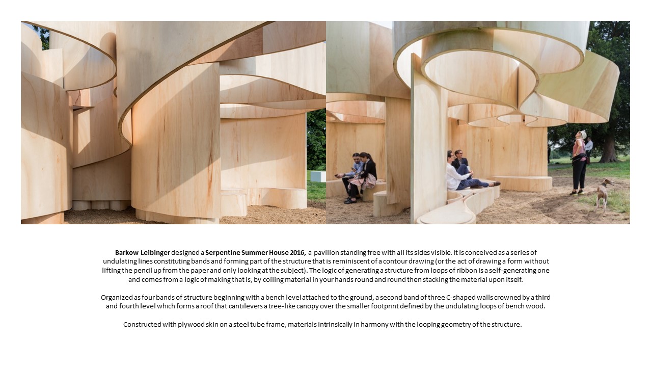
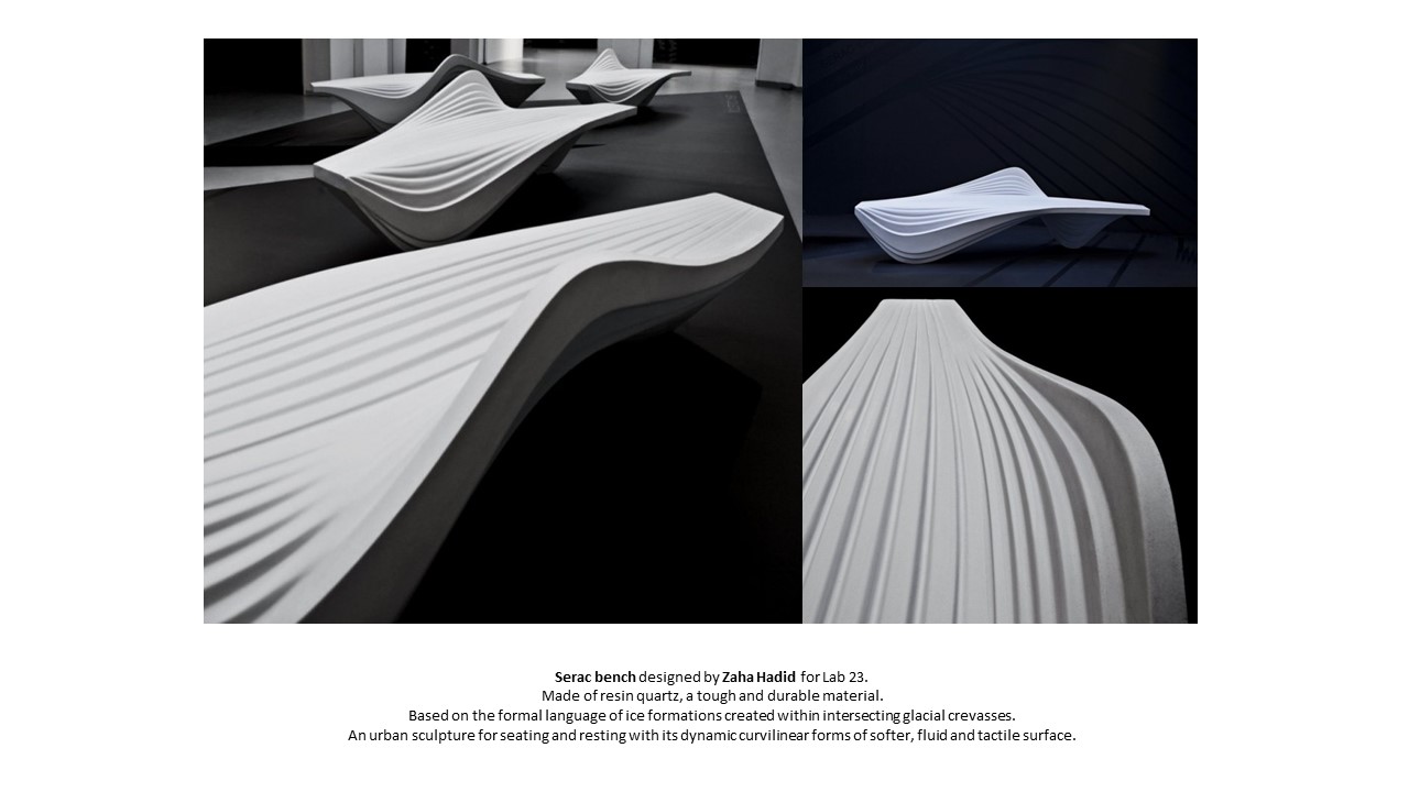
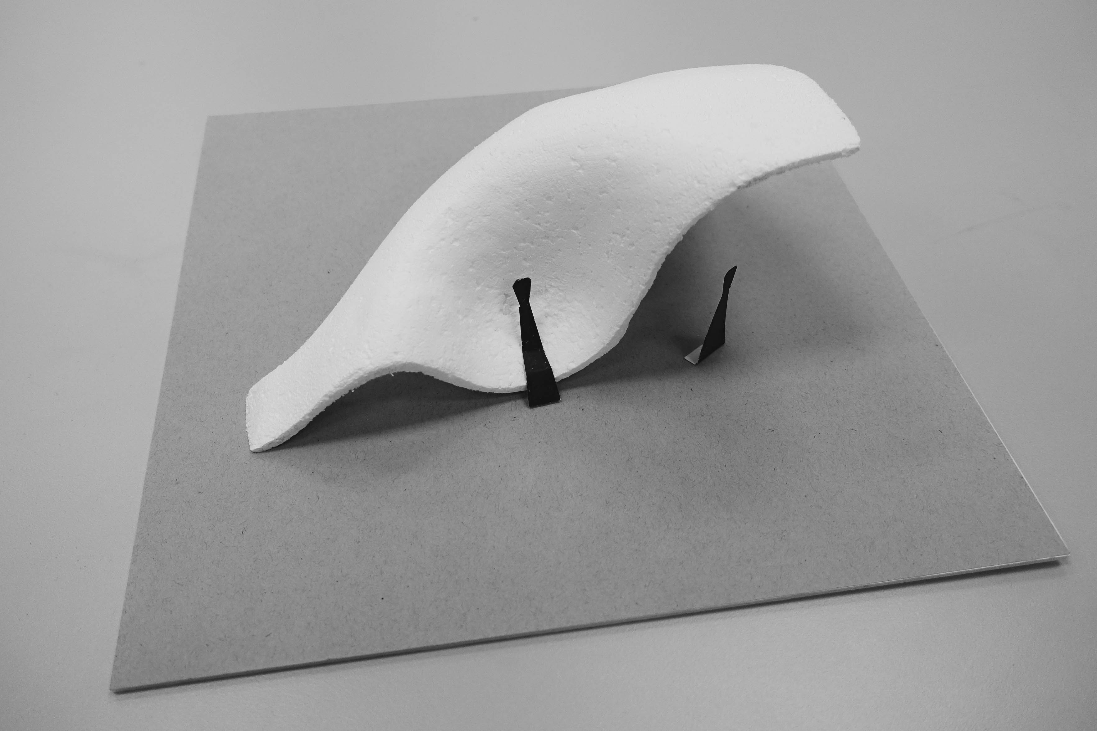
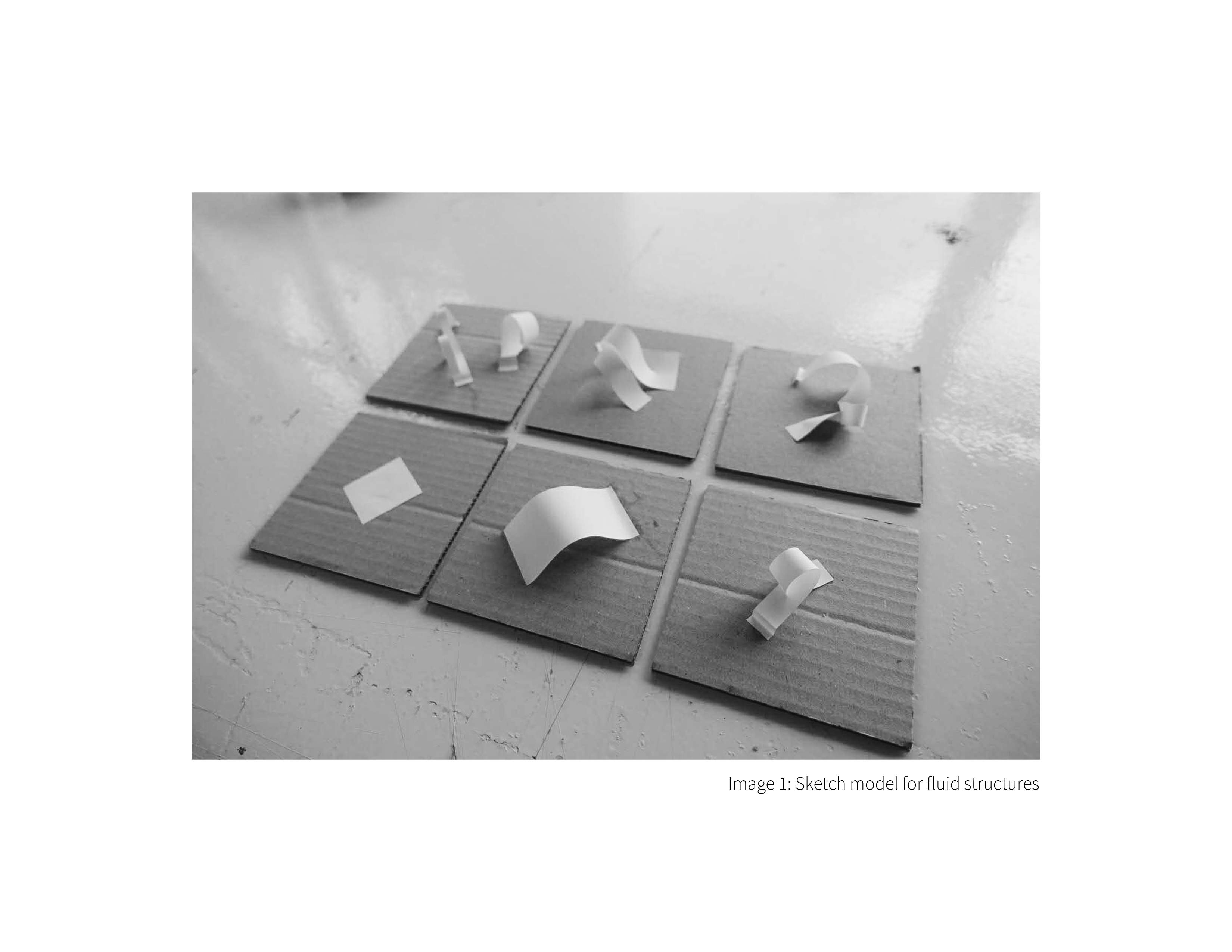
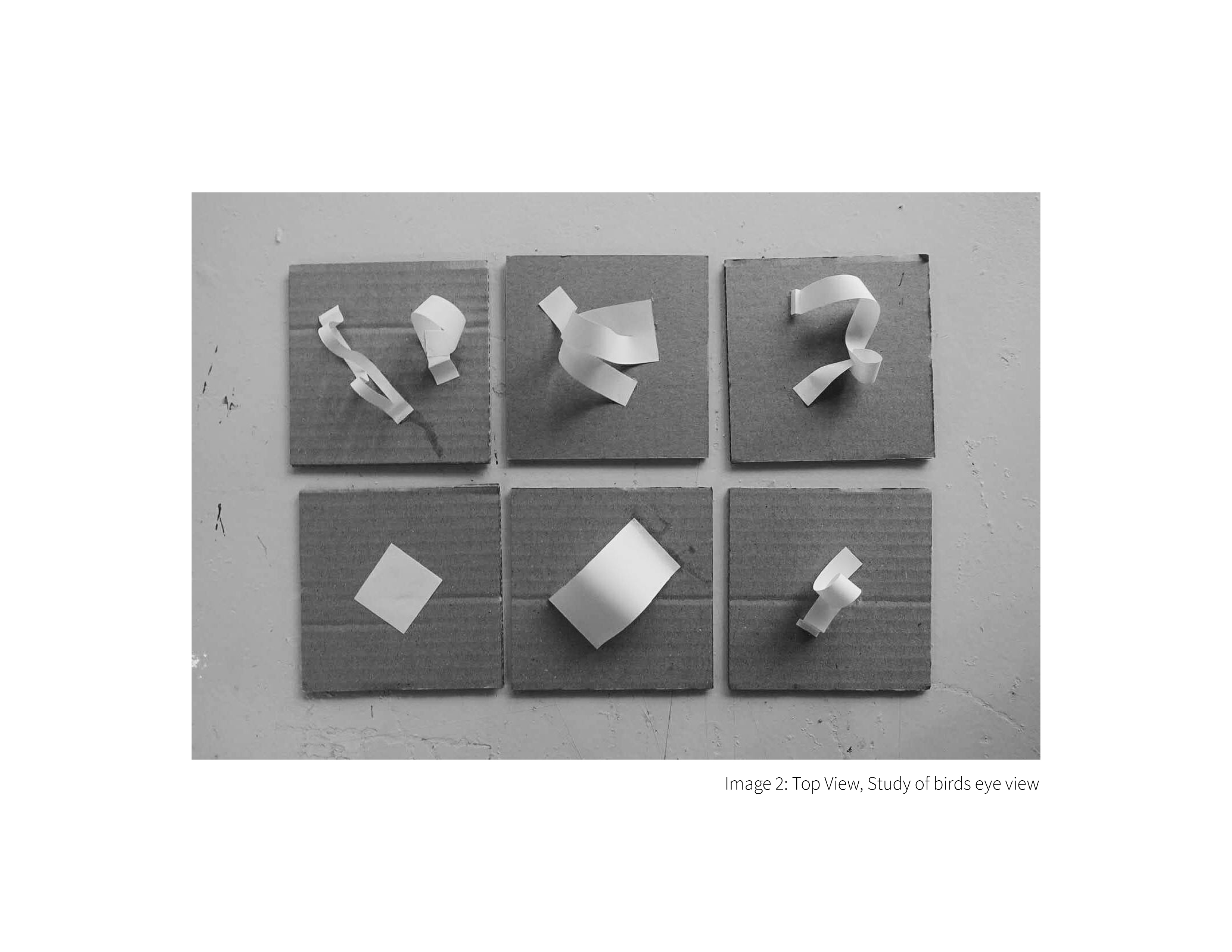
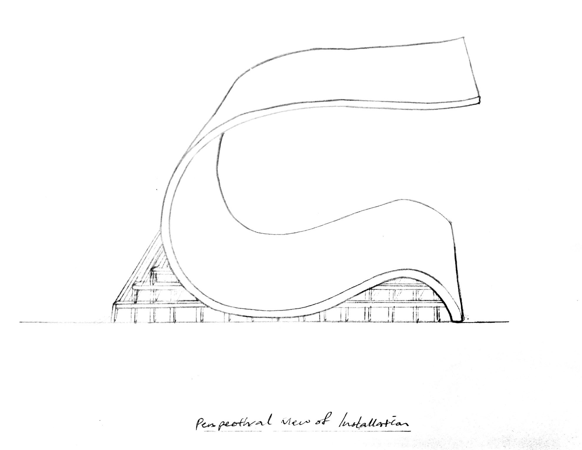
Week 10

Proportion

Previous shape (left), new shape (right)

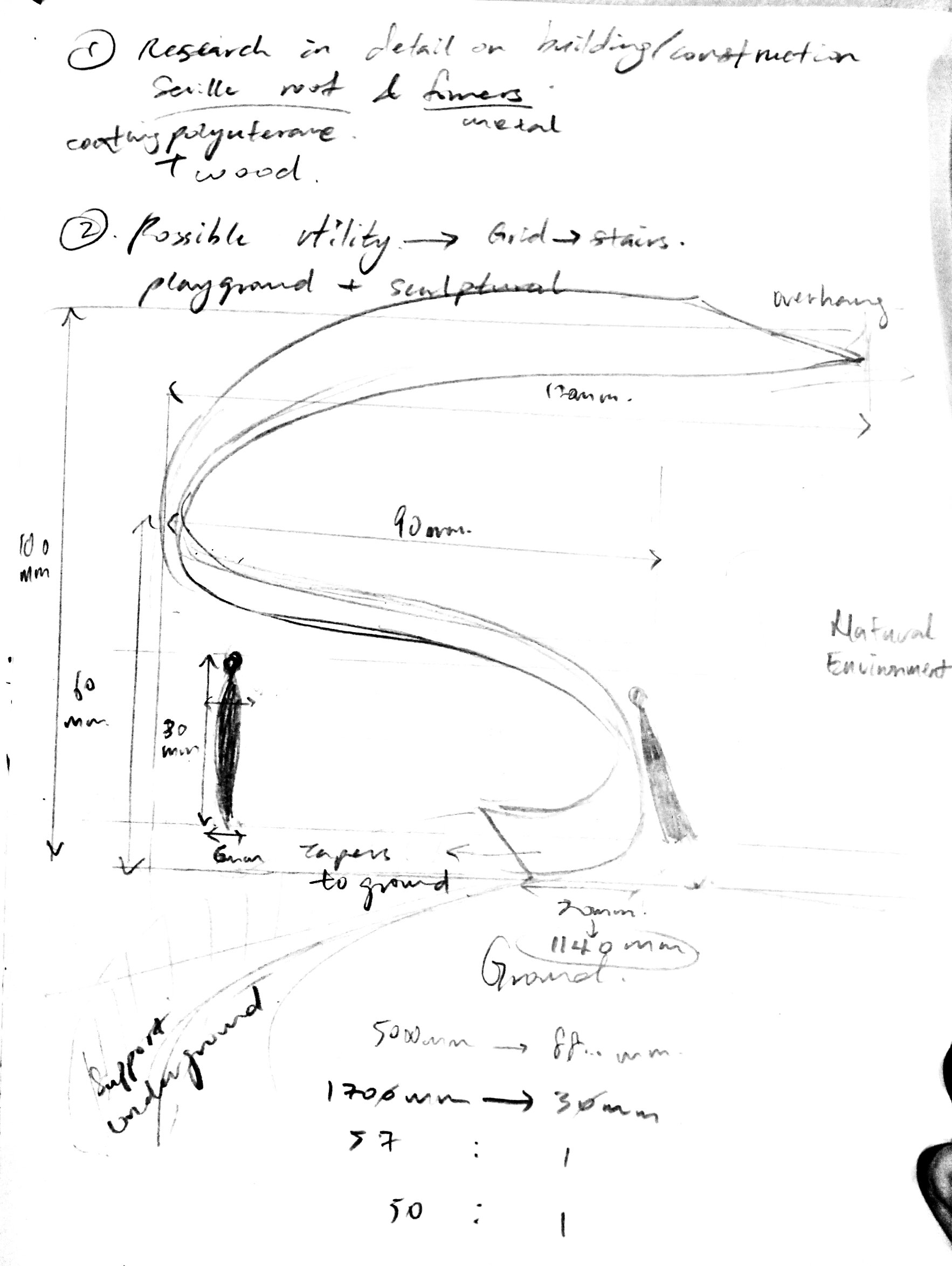
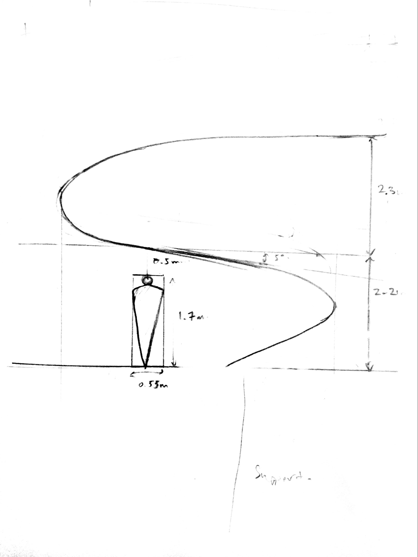
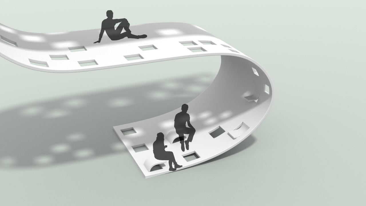
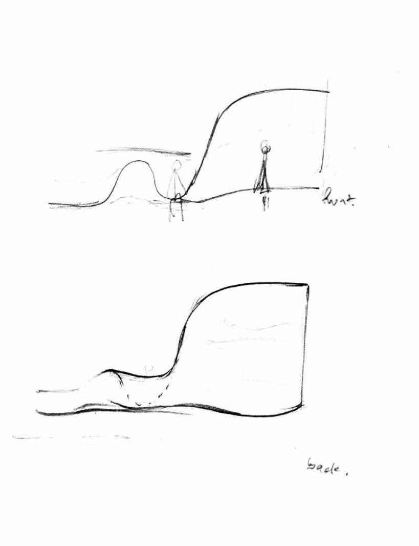
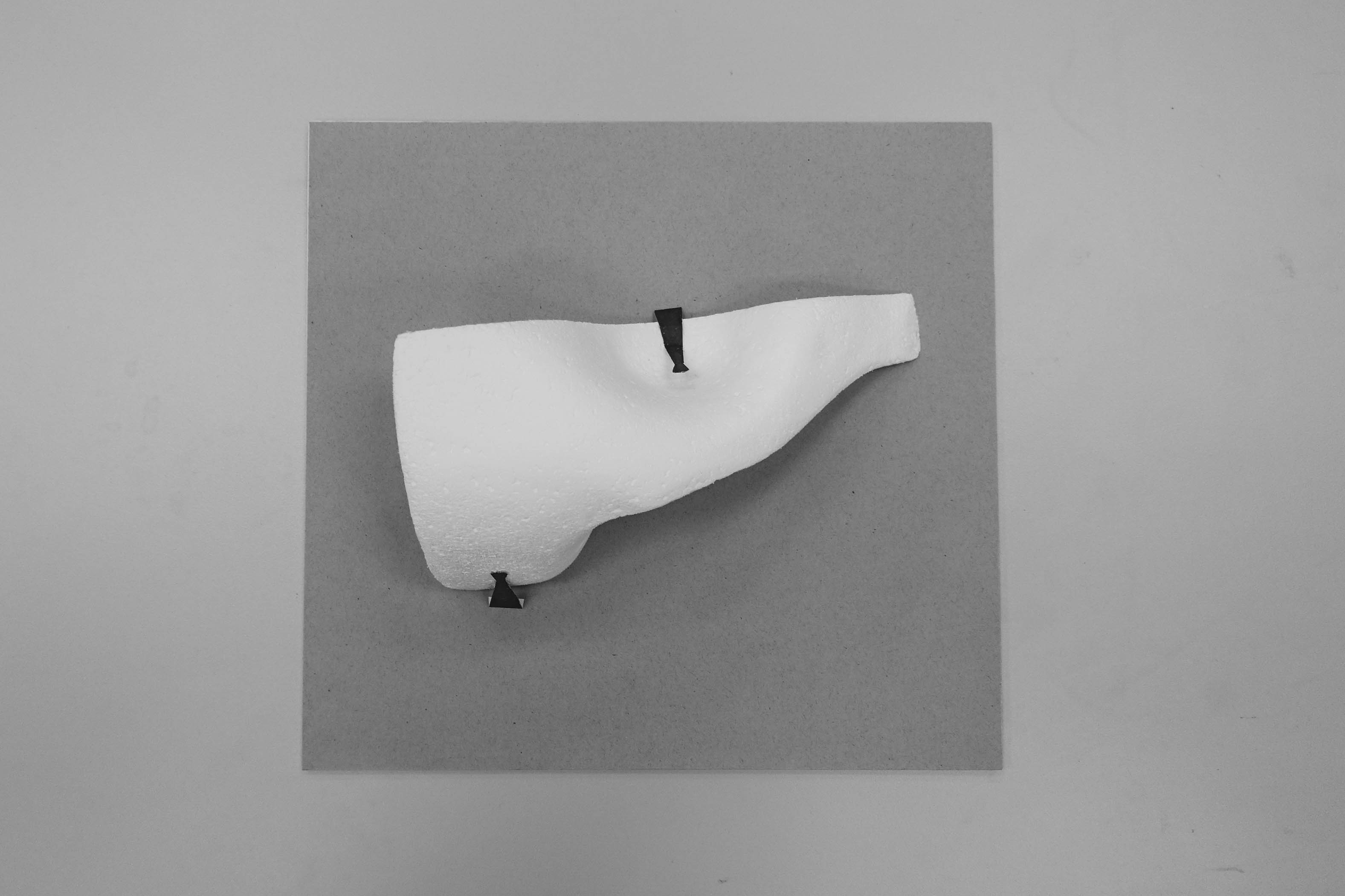
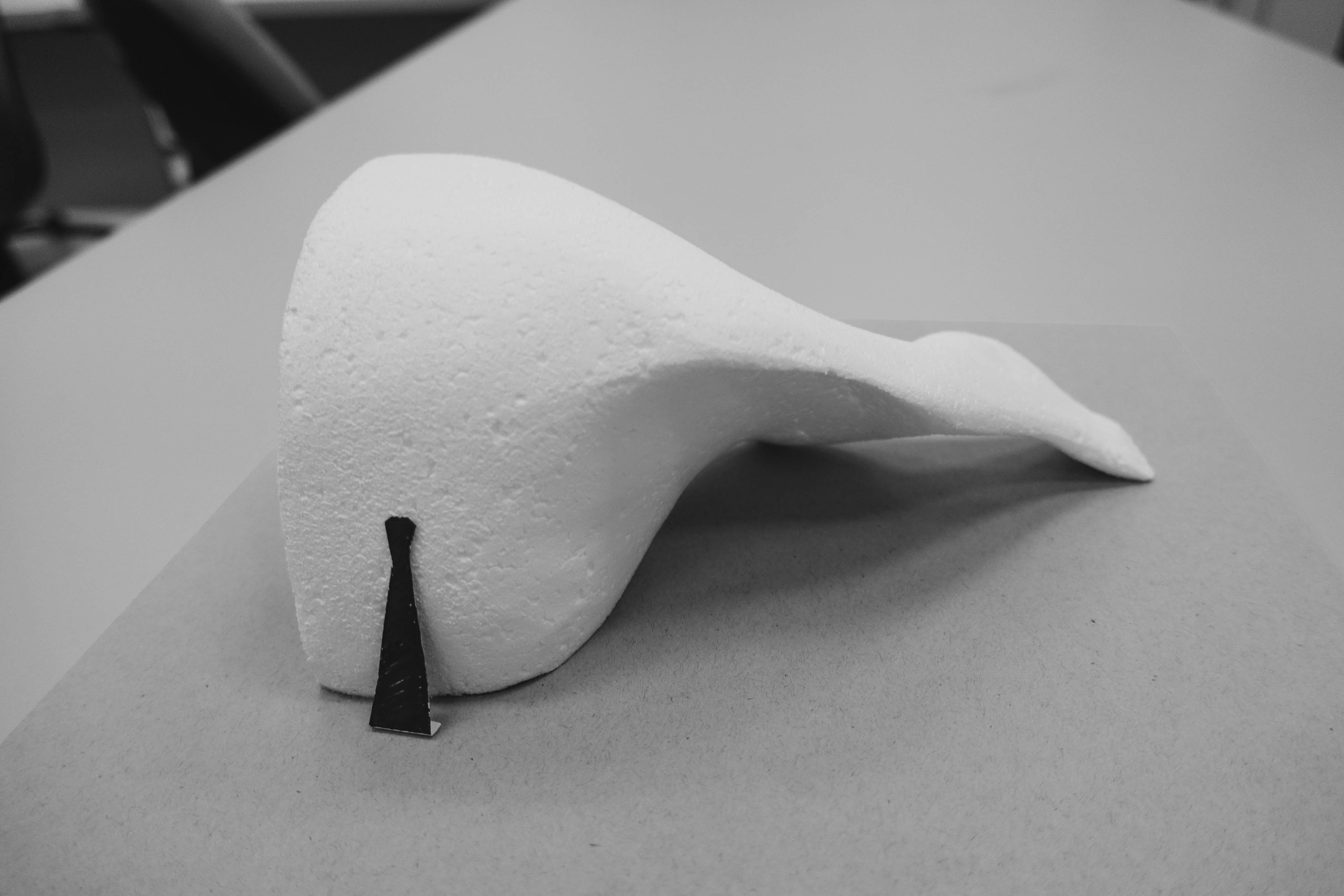
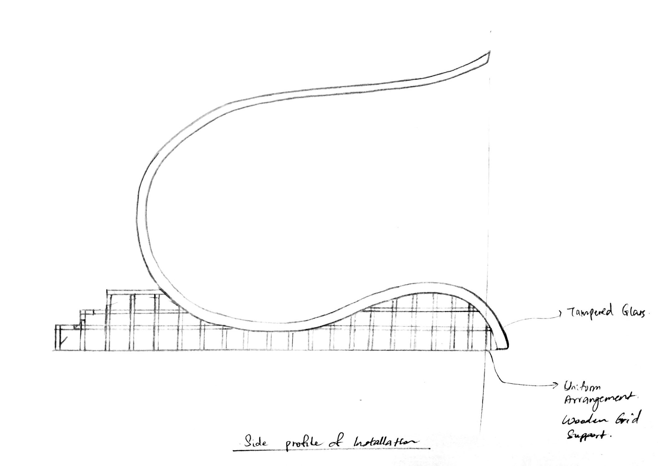
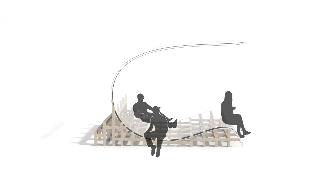
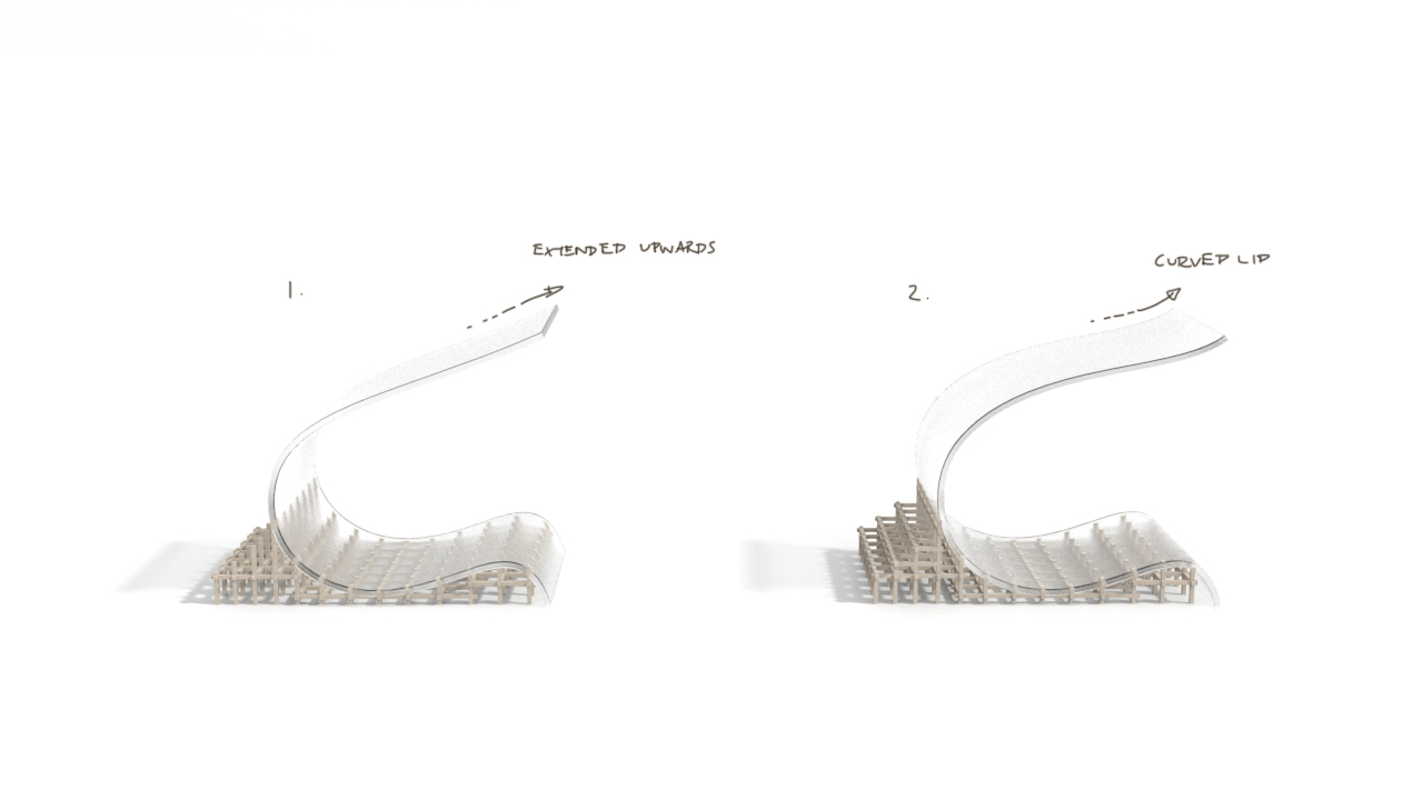
For this week, we decided to re-design and re-proportion the shape of the installation. To inject more dynamism into the shape, we have changed the direction and distance of the curve by increasing the inclination and having an upward progression for the spaces between two surfaces. We can observe that the space between the ground and the first curve in the first direction is smaller than the space between the surface of the first curve and the second curve in the opposing direction.

Blue shade represent space between first curve and ground, indigo shade represent space between second curve and first curve

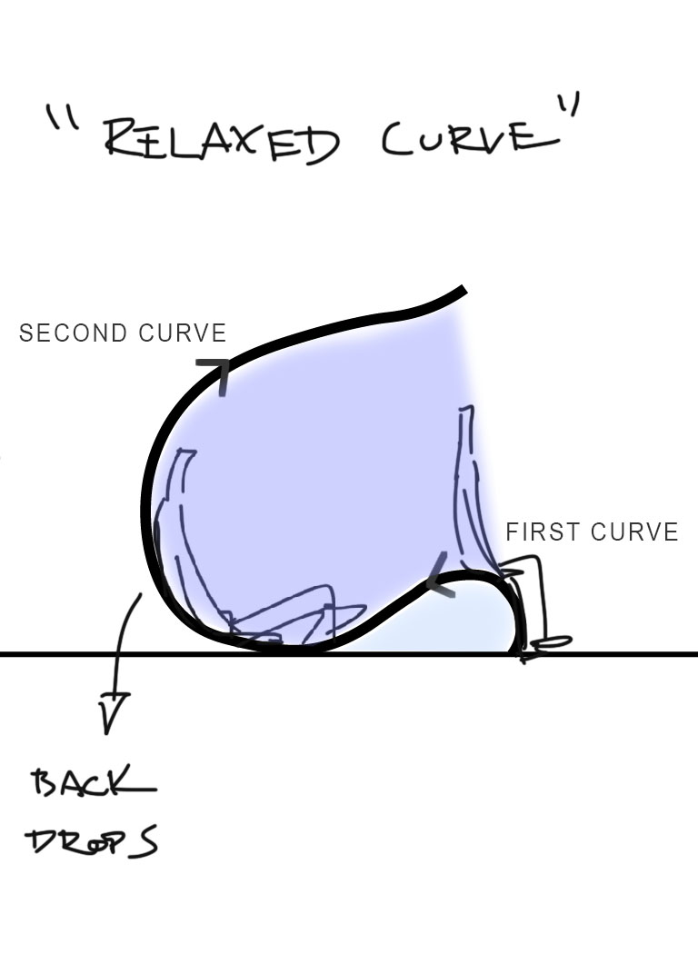
By increasing the space between the second and first curve, the upper part appears elevated and floats above the lower part, reducing the sense of unbalance. By tilting the previous shape backwards and resting the shape at an angle to the ground, the curve appears more relaxed and less static.

Material and sustainability

GFRC Concrete for curvature and Metal rods as supports
Clear Glass for curvature and wooden grids as supports
Frosted Glass for curvature and wooden grids as supports


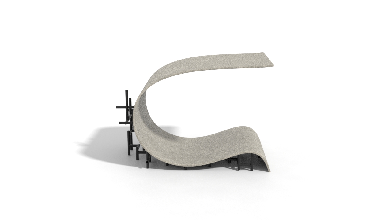
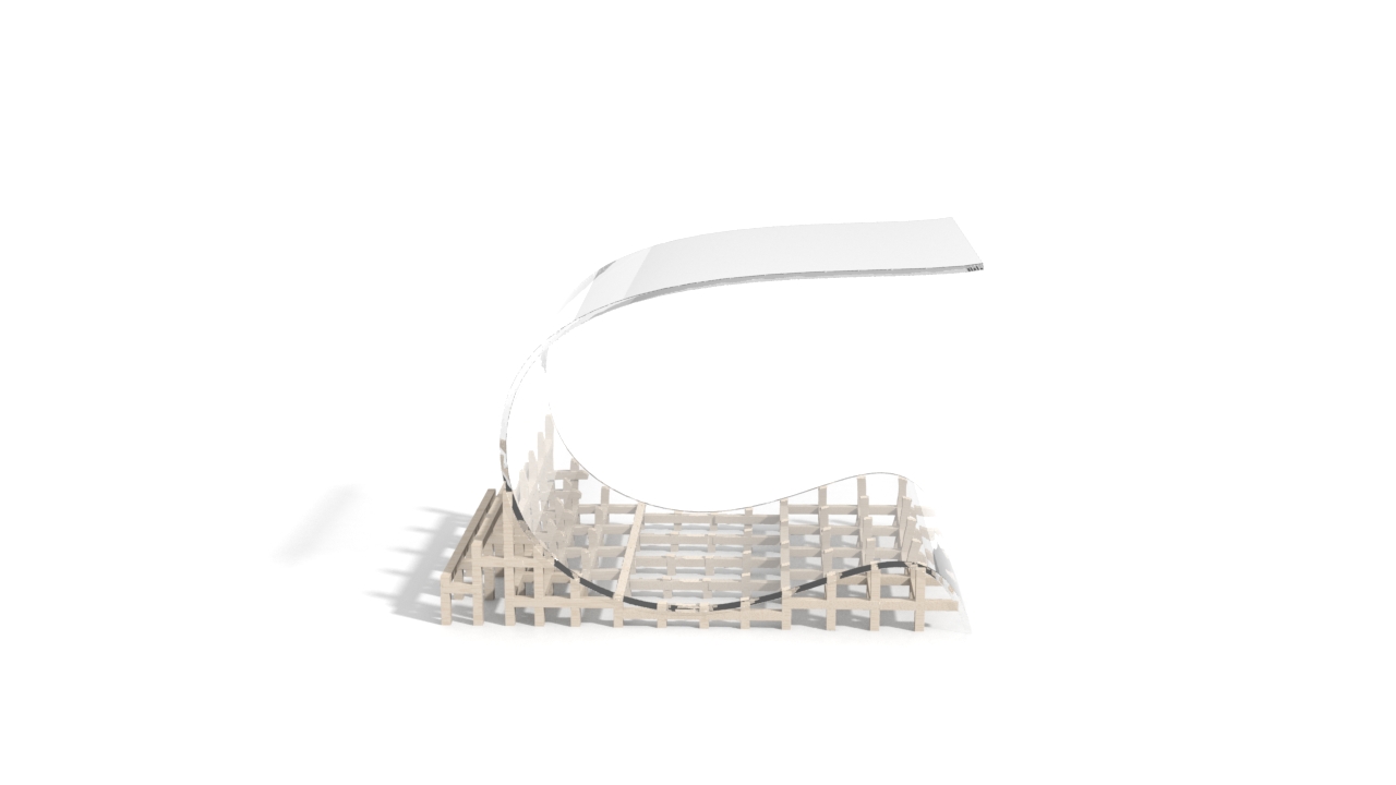
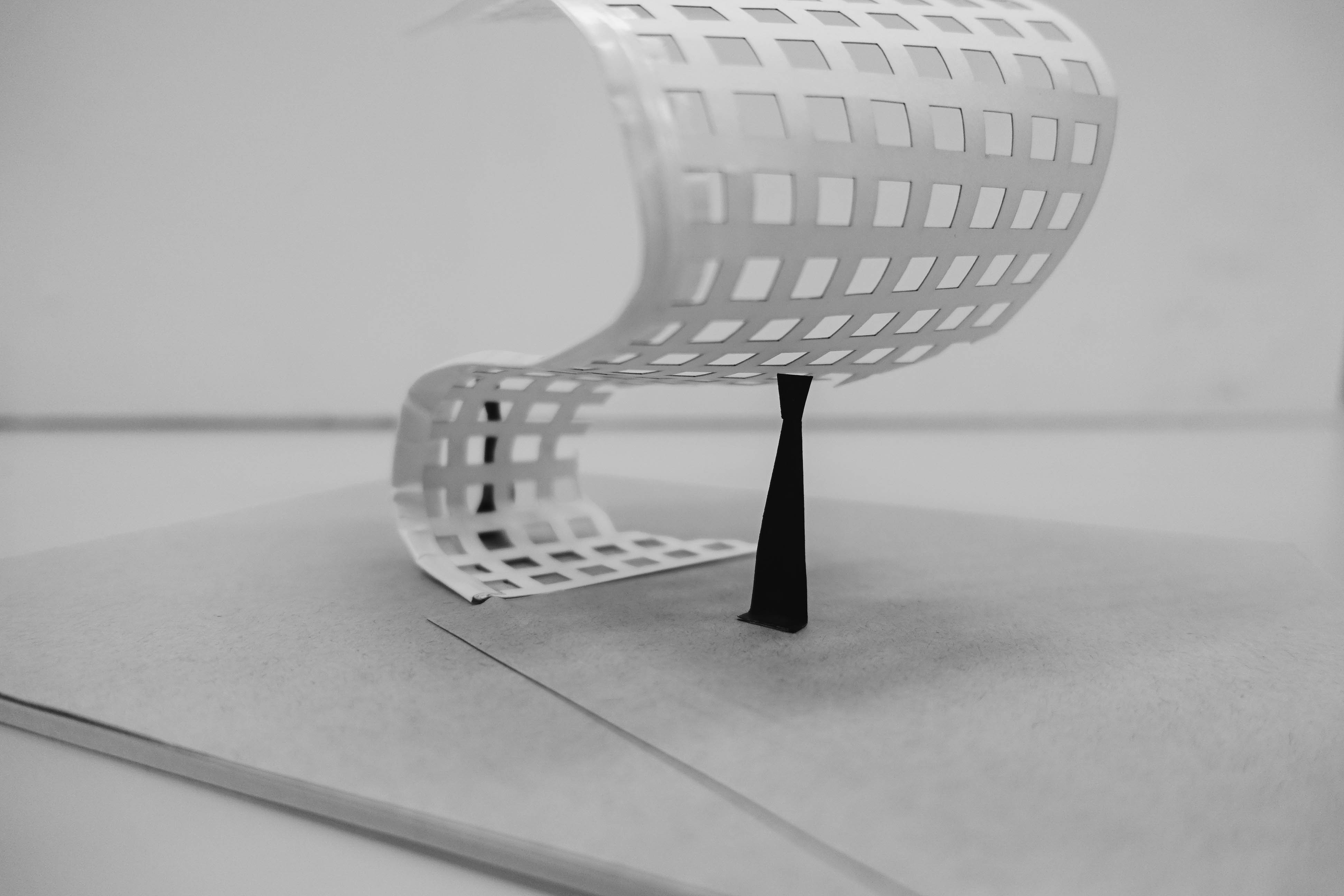
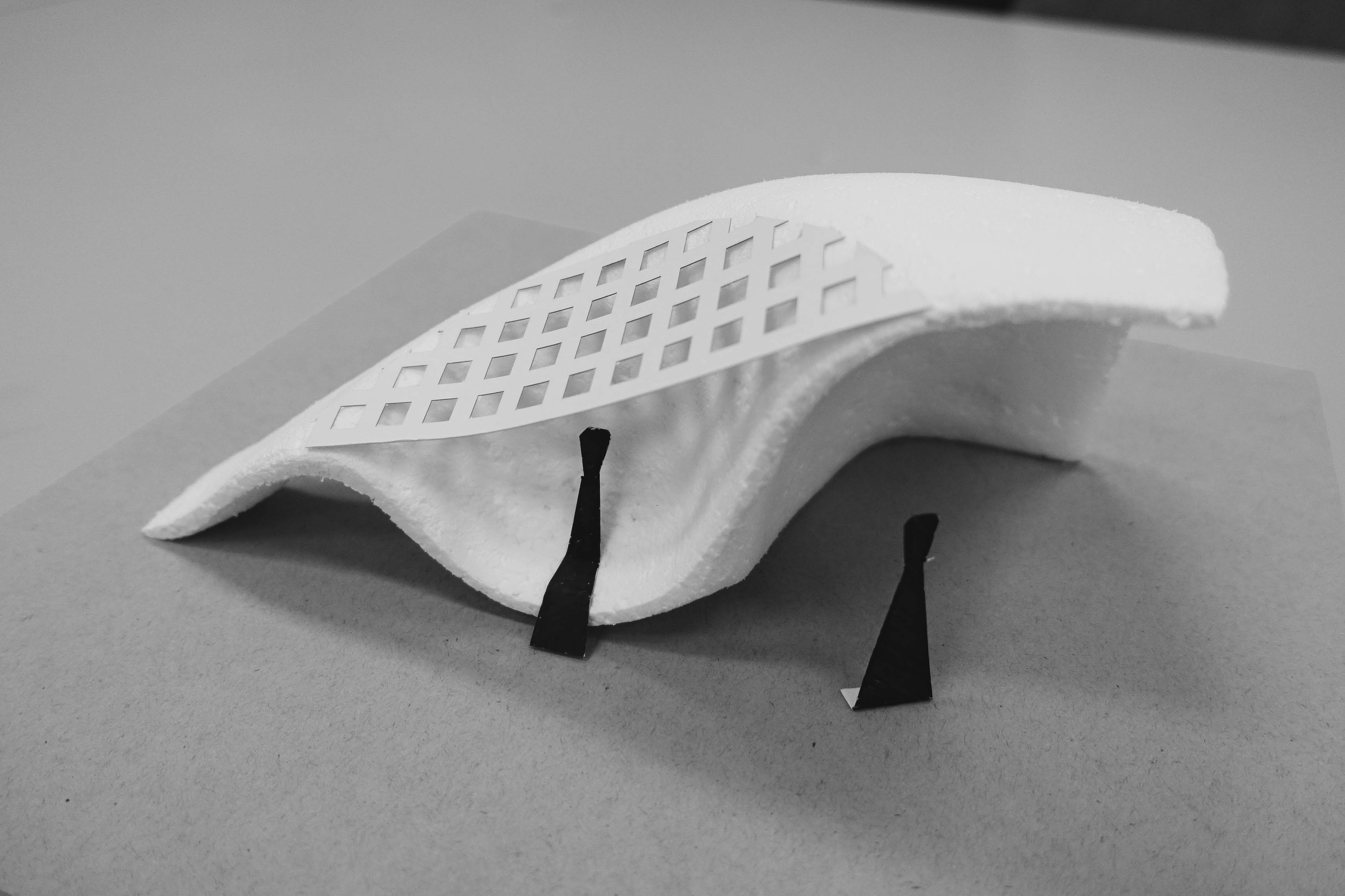
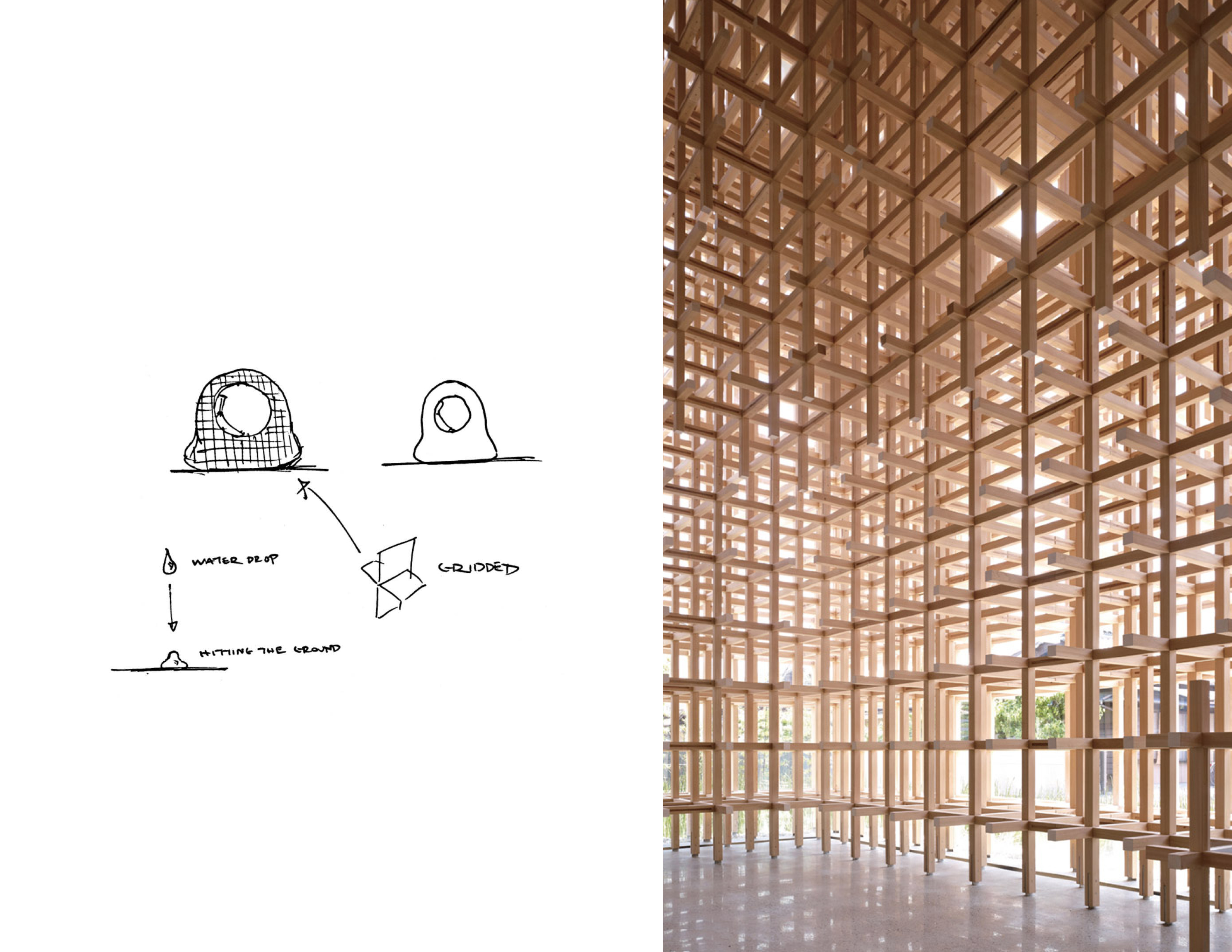
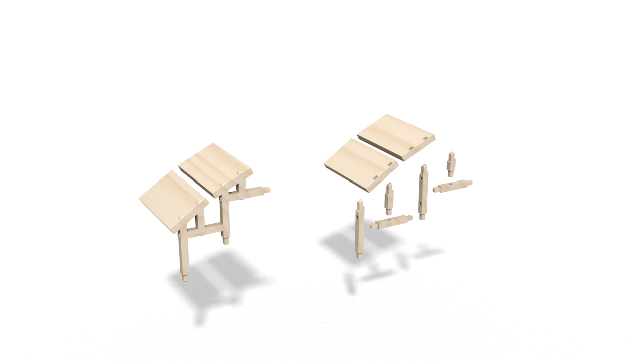
We have incorporated grid supporting structures beneath the curvature for a couple of reasons.

Firstly, the grid serves as a pedestal to elevate the curvature.

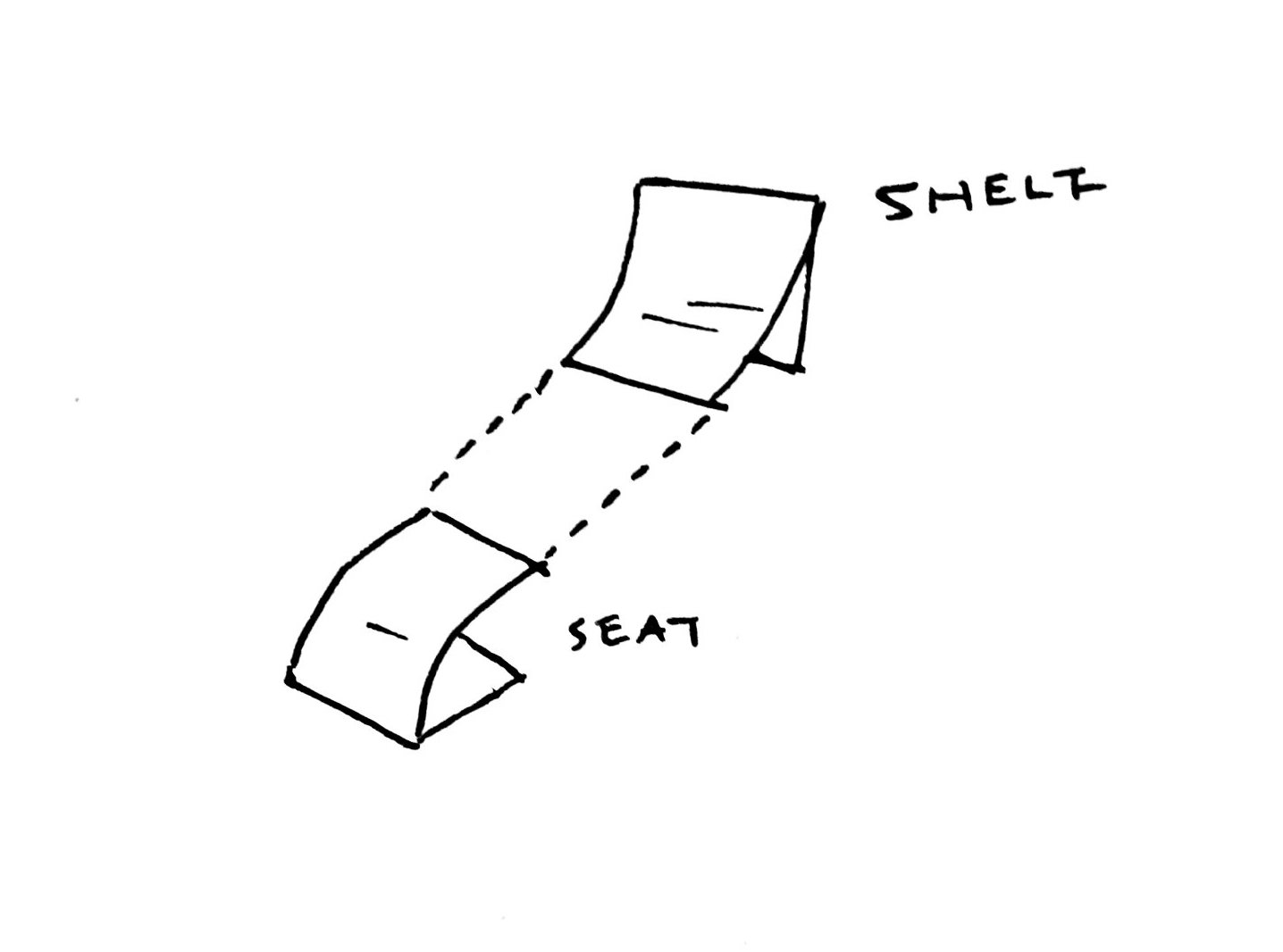
Secondly, the grid serves as a elevation above the ground by approximately 350 mm so that users can sit comfortably on the curvature at that height.

Thirdly, the grid serves as a contrasting element. Juxtaposed with a rigid and uniform grid, the curvature appears to be fluid and dynamic.


In order to understand what translucent material would be best suited for construction that is safe and strong, we did a research into the different types of glass and properties of thermoplastic that projects an appearance like glass.

Properties of thermoplastic

Polycarbonate: This plastic is 300 times stronger than glass, is resistant to most chemicals, is twice as lighter than glass, has high abrasion and impact resistance. It can transmit as much light as glass without many distortions. Applications include window, green house glazing etc.

Adapted from Glass as a Building Material. (n.d.). Retrieved March 25, 2018, from http://www.understandconstruction.com/glass.html

House for Tousuienn by Suppose Design Office. Example of polycarbonate.

We would like to propose using semi-transparent polycarbonate for the construction material of the installation as its transparent property is closest to fluid.

Polycarbonate has been said to have a lifespan of at least 10 years and can be recycled.

Other than the choice of polycarbonate, we also propose using GFRC concrete or wood for the construction of the installation. GFRC is a sustainable material and has a longer lifespan than polycarbonate. Wood would be a more affordable choice of material. It is also a material that is versatile and exude a warm shade (as compared to metal) which makes it a more inviting material.

Aesthetic and function

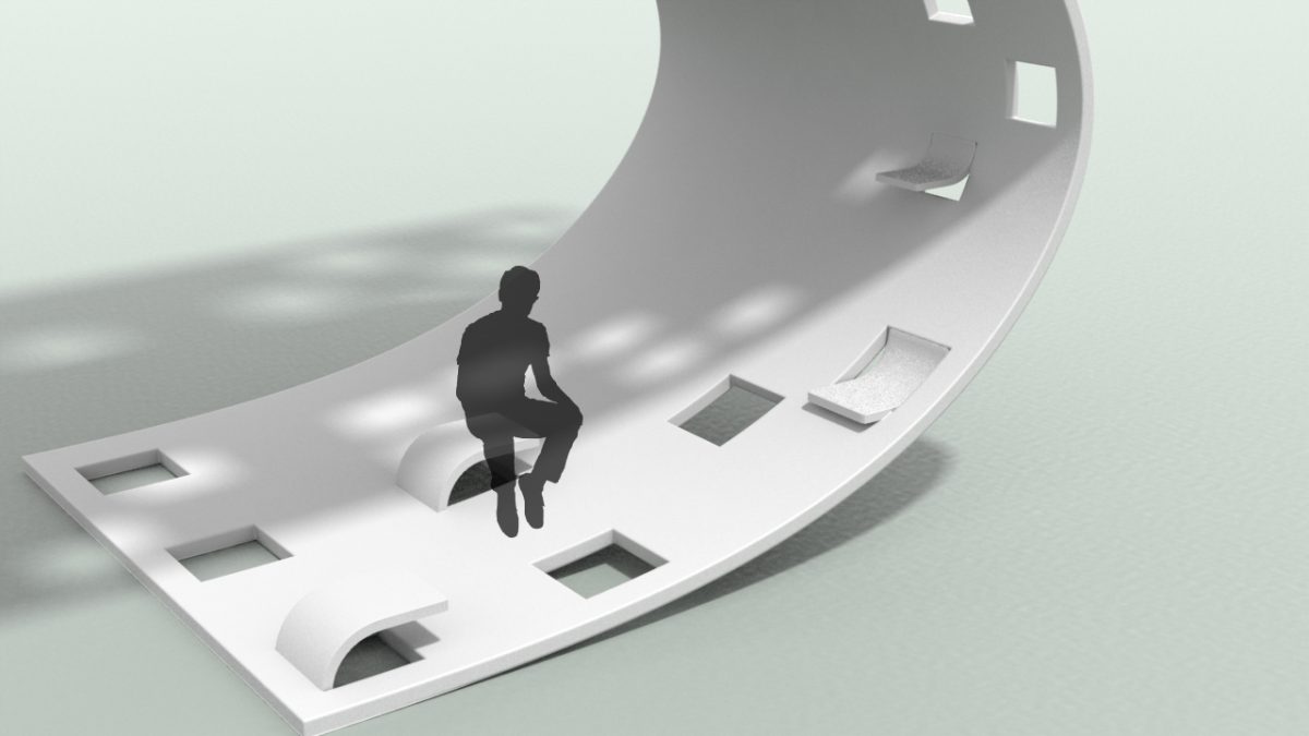
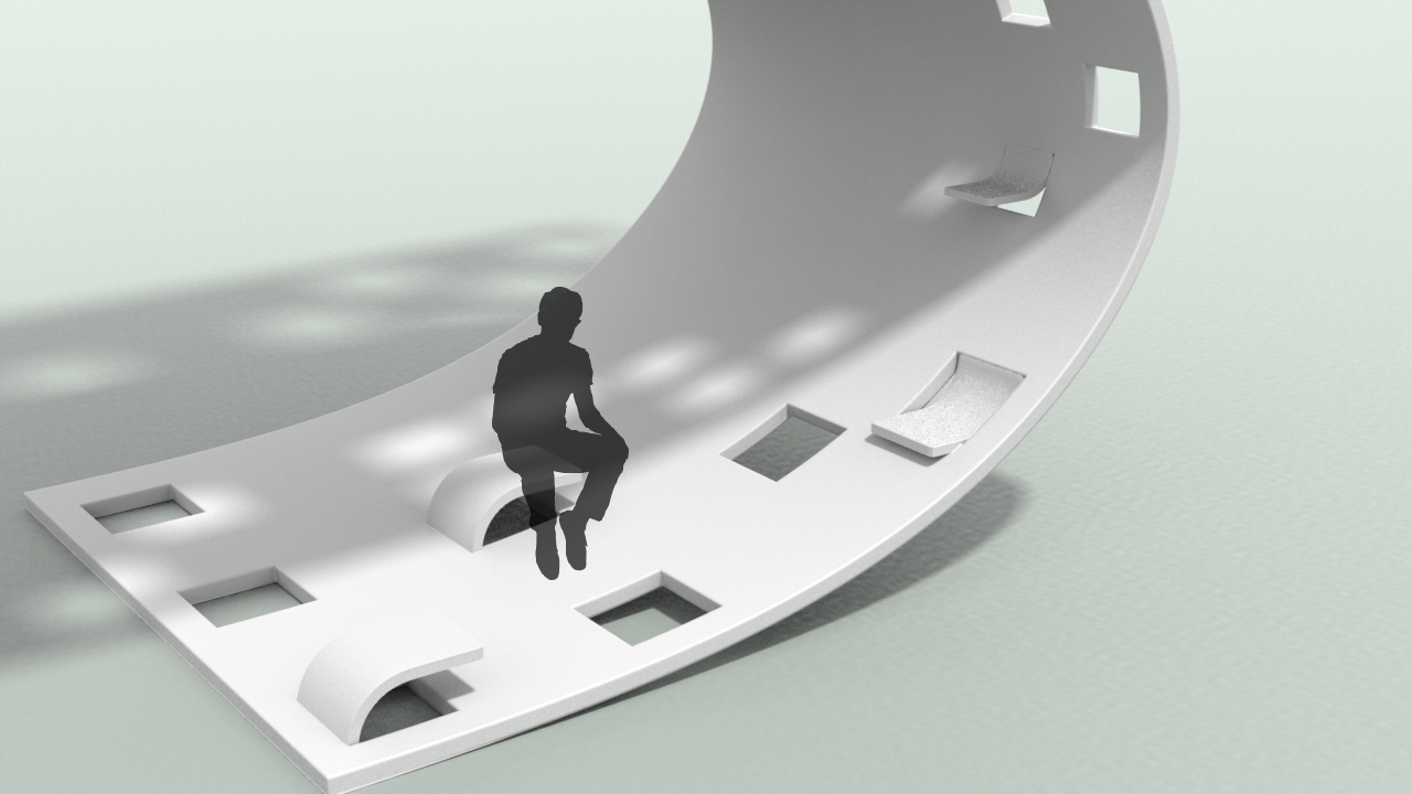
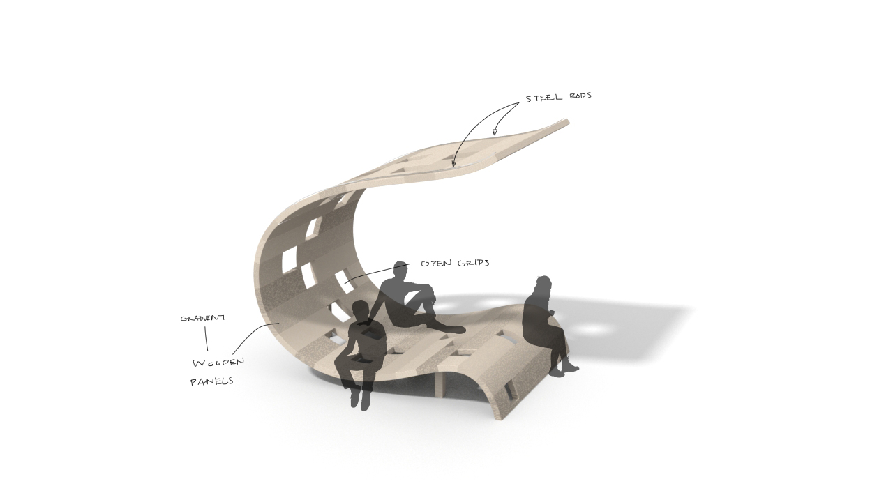
The new shapes does not require any rails and ladder since it no longer have a second level. Although we have altered the presentation of the shape, we still retain the concept of a personal and public space within a single sculpture.

Rendering with GFRC Concrete

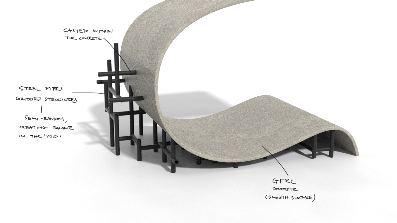
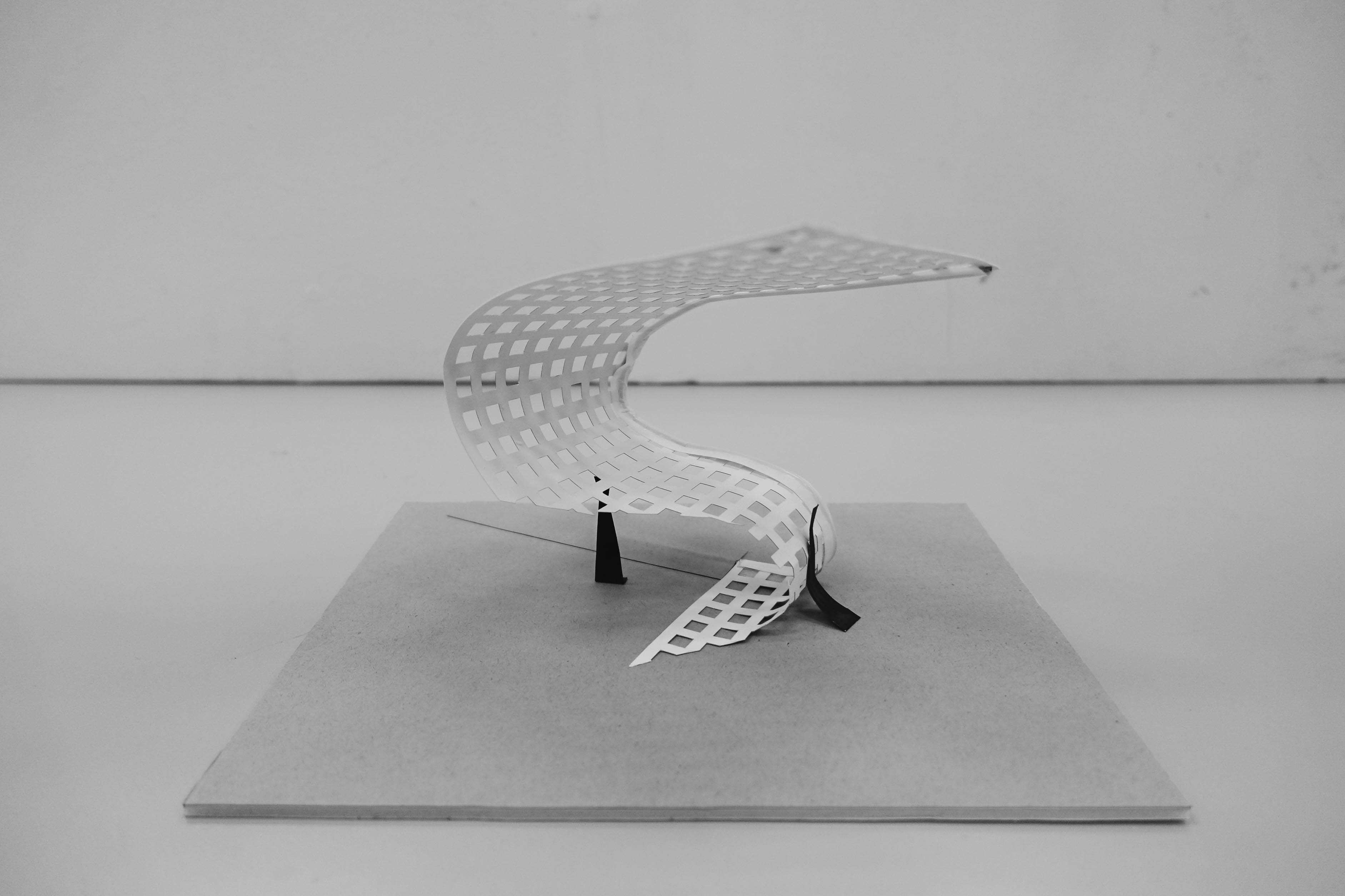
For the Concrete model, the metal rods are organised in random order like the random arrangement of square holes represented in last week’s model to complement the dynamic flow of the curve.

Rendering with semi-transparent polycarbonate

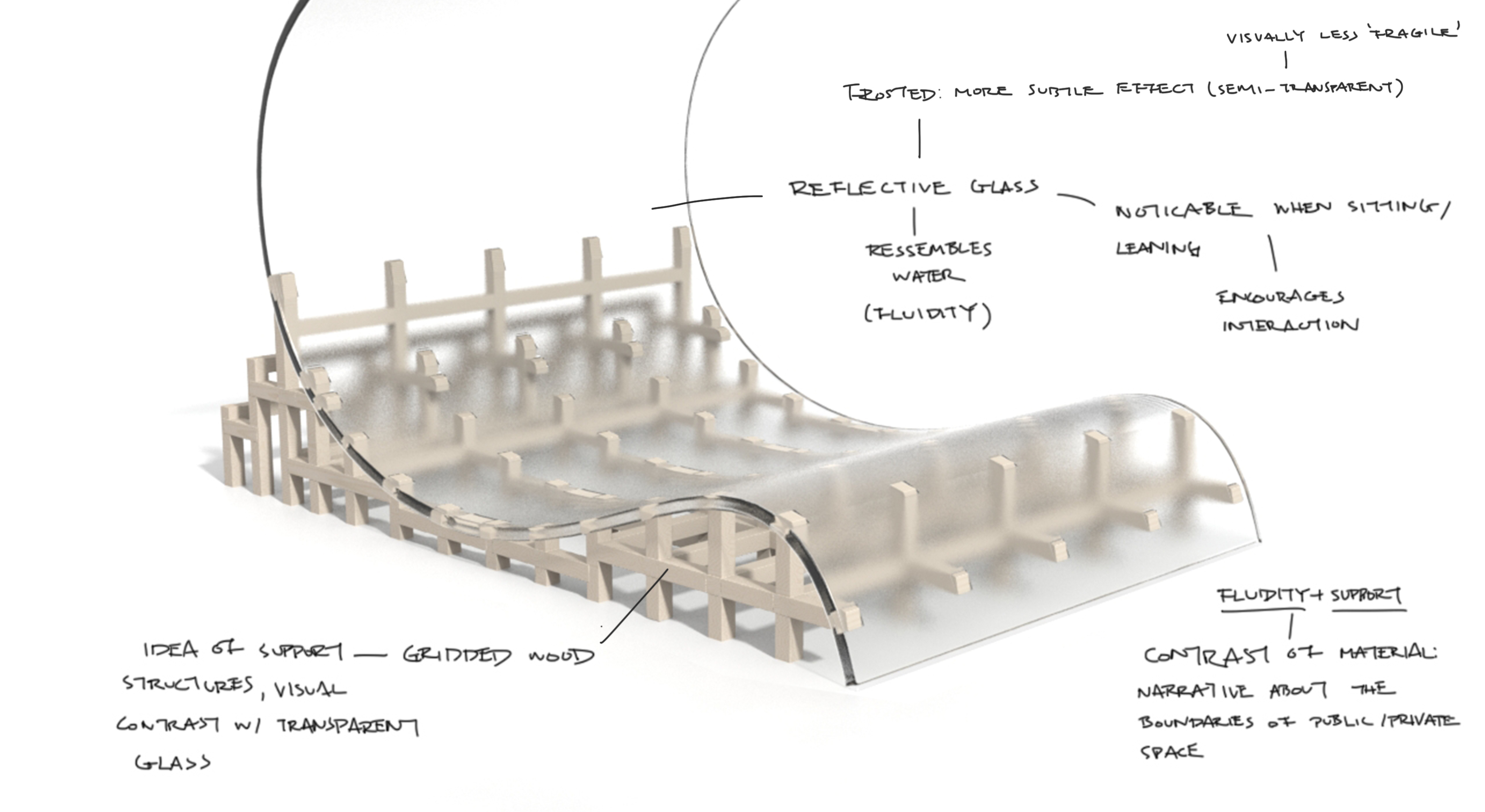
Whereas, for the polycarbonate model, the wooden rods appears more organised than the metal rods in the concrete model. This is to create a contrast between the dynamic curve and static grids.


Rendering to scale


Rendering to scale – grid supports connect to wooden panel for leaning
Mortise and tenon joinery technique for the construction of the wooden grid supports and wooden panels at the back of the curvature.


Dynamism

Renderings with subtle difference – exploring how extending straight and upwards is in comparison to a gradual curve upwards – which is more dynamic and fluid?

Other than a polycarbonate sheet, we continued to explore with grid patterns on the curved sheet. We rearranged the square holes in hierarchical progression to convey dynamism. In terms of construction, we would like to portray the square holes with wooden panels that are connected with metal bolts and supporting frame.

Rendering of model in wood with randomly arranged square holes in hierarchical order (Big squares at top and progressively smaller squares at bottom); supported and elevated by metal frames.


If the installation with patterned surface appeals more to people, we plan to research deeper into the arrangements of square holes in the curvature such as by following a certain mathematical progression or a pattern derived from an abstract representation of the location (eg. ariel view of grass patch at location/ arrangement of windows of buildings at location).

Week 8

Simple, Fluid, Curvilinear

Simple, fluid, curvilinear form which we have selected

During this interim, we further developed the open ribbon form which we have decided on and researched further into possible construction methods.

Development of Form

In order to visualise the form in the natural environment, we thought about the scale of the form by multiplying it in the ratio of 1:50 (1=10cm).

Conversion to real scale – centimetres to meters

Alongside deciding on the real scale of the installation, we came up with a few different iterations of the form, exploring mainly on alterations to the base of the installation (where most people would interact with at their height). For example, a form that curves and taper to the ground would provide more void for people to stand in, whereas a form that curves and meets the ground inclined at an angle would provide a slope or protruded surface for people to lean or sit on.

Different alteration to the base of the curvilinear form

Additionally, we realised that the curvilinear surface for the middle section of the installation can serve as a second deck where people can access by climbing on the grids of the structure.

To design a more stable standing sculptural installation, we thought of incorporating some supporting beams that is attached to the sculpture underground. The underground supporting beams would act like an anchor or the root of the sculpture, holding the sculpture in a stable upright position.

Incorporation of a second deck and underground supports
Further developmental sketches on function of installation

Instead of constantly repeating a fix number of grids in a systematic order to create the curvilinear surface of the installation, we would like to bring attention back to our idea of personal and shared spaces in the single installation by playing with transparency of material and varying depth. As such, we have subtracted voids of the curvilinear surface as it progresses from up to down. The opacity of the curvilinear surface near the base reflects mass and describes a gravitational pull, making the sculpture appear more stable and secure at the base and more porous as it progresses upwards.

In addition, to echo the improvisational aspect of the natural environment where we intend to place our installation, we incorporated randomness to the order of the squared grids as shown in the two right-most 3d renderings in the image below.


Rendering of developed forms From left to right: Metal sheet used with water jet cutter to achieve consecutive grids at uniform order, light coloured wood with grids at random order, darker coloured wood with grids at random order
Rendering of installation made of light coloured wood with scaled humans to portray intended interaction

As we brainstormed on the possible incorporation of functions to the form of the design, we came up with the idea of a open flap that serves as a seat. However we thought that the feasibility of the incorporation is very low as the flap may breakaway from the installation due to wear and tear as a result of human activities.

Rendering with possible function as a flip open seat that can flip in both directions

We liked the idea of the open flap inspired from the dog-ear pages of a paper (eg. in an old textbook) as it evokes feeling of nostalgia and hints on the revelation of what is beneath the surface. As a further development on the open flap, we came up with a curved extrusion that is joined permanently to the curvilinear surface of the installation to serve as both seating and shelving.

Illustration of installation with curved shelves and curved seating protrusions
Rendering showing human seating on curved extrusion and curved panels that serves as shelves
A rendering showing a fraction of the curvilinear installation with user interaction

We decided on the direction of the curve extrusion by connecting them with an imaginary chain in void to suggest fluidity and continuity.

Imaginary connection between two curved extrusion


Example of a two deck space in a singular unit

Materials and construction methods

Some materials we would like to consider with construction would be:

  • Concrete UHPC
  • Polyurethane
  • Water jet cutter to cut a metal sheet

Future developments

For our future developments, we have looked at two different presentation of architectural design – daring vs cautious. For example, House H by Sou Fujimoto describe clearly defined rooms within a singular continous living space that features two ladies sitting precariously on the edge of a second storey veranda, displaying a daring architectural design. In contrast to House H, we would like to create an installation that is more cautious by integrating safety considerations into our design.

House H by Sou Fujimoto

We would also like to consider using Glass Fibre Reinforced Concrete GFRC which we would share more about in our next post. You may read up more on its sustainable quality here.

Week 7

Recollecting our Idea

Inspiration

Our installation is inspired from the meaning of Nan yang; derived from the Southern Sea. We want to develop awareness on the school’s heritage by making reference to the origin of the school’s name, represented by a form that is both fluid and dynamic; combining private and public spaces in a seamless transition in a single installation to encourage people in NTU to interact with the installation in both personal and shared ways.

Returning to concept 1 (lighter form) in week 5, we continued to explore the mass and void in a fluid structure to be placed in a natural space within NTU.

Reflection

From feedbacks received in week 6, we would like to move away from the form of a moebius loop and return to the ribbon form that open and moves. Also, we have decided to subtract any straight folds and corners so as to avoid interrupting the fluid motion of the sculptural installation. We would also like to adopt using different materials/ different construction techniques to reinforce the utilitarian aspects of the installation without compromising on the emotional aesthetics that the sculptural form exude.

Further Developments

Formative references

To give ourselves a better understanding of how to construct the fluid form and integrate different materials into its construction, we draw inspiration from a few existing architecture, installation and furniture works.


Seville roof – Metropol Parasol project in Seville by architectural team of J. Mayer

Incorporation (translating the meaning of fluidity into sculptural forms)


Full gridded sketch model of ribbon form that moves from an open to a closer space shown with two scaled figures
Scaled figures shown interacting with installation – standing and leaning

Making reference to the Seville roof, we developed the ribbon form that begins as an open roof, intended to be constructed in a similar way to the Seville roof, that curves into a closer space (material becomes denser with closed grids to eventually taper and join with the ground).

As a development to the ribbon form, we research on fluid forms by looking at Toyo Ito’s Taichung Metropolitan Opera House, Barkow Leibinger’s Serpentine Summer House 2016 and Zaha Hadid’s Serac Bench. We extended and folded one edge of the curvilinear plane to create a more organic form that incorporates utilitarian considerations for the sculpture to serve both functions as a private and public space.

Developed foam model displayed on the right of its initial form. Exploring different materials for sketch model making – Black foam, Styrofoam, Paper, Aluminium wire (for building armature).
Front view of developed foam model (before addition of grid)

For the construction of the foam model, we thought of making reference to Marc Fornes/Theverymany‘s installation “Minima | Maxima” with the use of aluminium modules or joining wooden plates together in a similar fashion to create the curved surfaces.

Top view
Perspectival view (top down, front)
Perspectival view (top down, back)
Back view
Frontal view of developed foam model with gridded shelter

To emphasize on the personal space within the sculpture, we choose to seamlessly integrate the gridded structure from earlier development into the later development to serve as an open shelter without interrupting the fluidity of the form.

By representing the roof with the uniform gridded form, we want to reinforce the personal space within the installation and encourage our audience in the space to engage in visual meditation with the gridded shadow and its illuminated square voids casted upon him by the natural light. We hope that the user can focus on his consciousness as he meditates in the circular void sheltered by the square grids to achieve inner peace.

In a more symbolic explanation, the square provides well established boundary lines whilst the circle defines area. While the boundary lines of the square gives the user the feeling of security, its sharp edges and corners is observed by people outside the space as a delimitation, a sign that tells them not to go beyond the lines.

Future explorations

We would like to research in detail to find out which materials and construction methods work best to bring out the fluidity of the form.

Week 5

Reflection from last presentation (Presentation 3):

From the previous presentation, our idea revolves around the notion of the name “Nan yang” where we derived the concept of a fluid structure to represent the southern sea which inspired the name.

In this presentation, we hope to retain the concept of a public and private space represented in a fluid form inspired by the name “Nan yang” so that we preserve significant historic value of the school’s origin.

We decided to remove side elements that proved to be less significant, such as the Kampong structure and the bulky appearance of the form due to its vertical erected structure.

Also after we broke down the components of the Kampong architectures, we sort of lost both the traditional meaning along with the familiar structure of the original form.

Presentation 4

Two potential concepts that we have agreed on developing would be the concept of a lighter fluid form vs a heavier fluid form along with the explorations on shared and personal space.

Concept 1 (Lighter form)

Stripping the bulk to the essence of a fluid structure for a lighter appearance, we have subtracted the physical mass of the fluid form into curvilinear planes.


The curvilinear planes are design to fold, intersect/ wedge and weave into each other in such a way to represent the seamless transition from private to public space in a continuous water flow.


Concept 2 (Heavier form)

For this concept, instead of referring to the fluid structure in a linear plane, we decided to create a more volumetric structure that reflects the interaction between a falling water droplet and the ground.

The heavier mass is represented by the surface closest to the ground. To balance the mass, a circular void floats above it.

Toyo Ito’s architecture using fluid and continuous form