Placing an installation in context of Nanyang Technological University (NTU)
Proceeding with our presentation from last week, we realised a need to formulate a concept that ties in with the context where we plan to place our installation in order to create an installation piece that embodies substantial meaning to allow us to later develop on its construction. For our installation, we would like to look into the roots of Nanyang and incorporate its history in the installation to remind students of the initial beginnings of the University.
Our inspiration
南洋
Our context is Nanyang Technological University (Chinese: 南洋理工大学), a University we are currently studying in at Singapore. Looking into the name of the school, we extracted the keywords, Nanyang (Chinese: 南洋; pinyin: nán yáng), and did a deeper research into its essential meaning. According to oxford dictionary, “南洋” in literal meaning, is known as “Southern Ocean” located at the warmer geographical location of Southeast Asia.
Breaking “南洋” into its individual characters, we derive a couple of adjectives: 南 which means south and 洋 which means vast and extensive.
We would like to refer to the keywords: vast, extensive and ocean/sea/water/fluid as our inspiration for the design of our installation.
You can read up on more of NTU history from here.
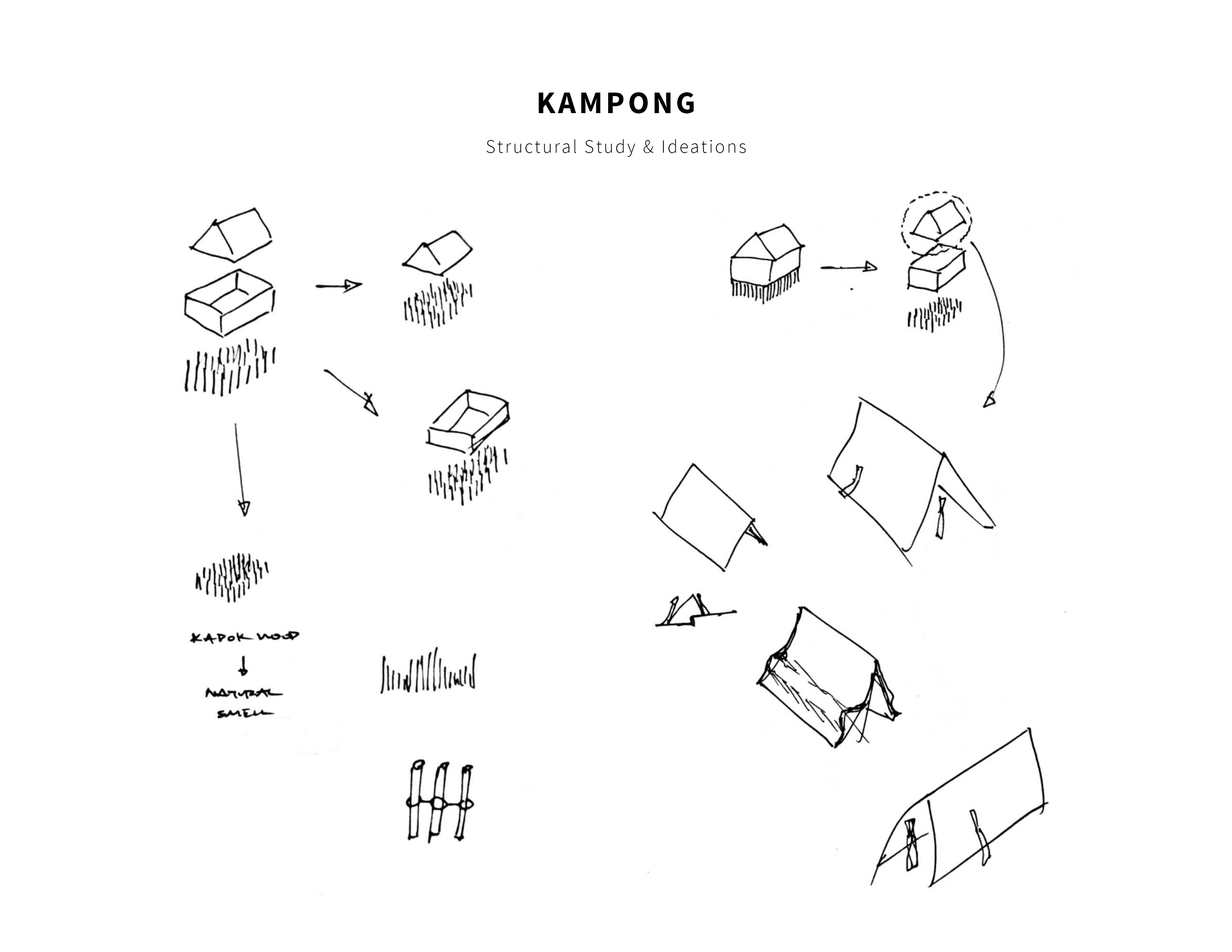
Kampong
As NTU is a University in Singapore, we would like to incorporate some elements from Singapore’s traditional landscape as a memory to share with international students who are unfamiliar of Singapore’s traditional landscape. Kampong is a type of traditional housing in 19th century Singapore’s landscape.
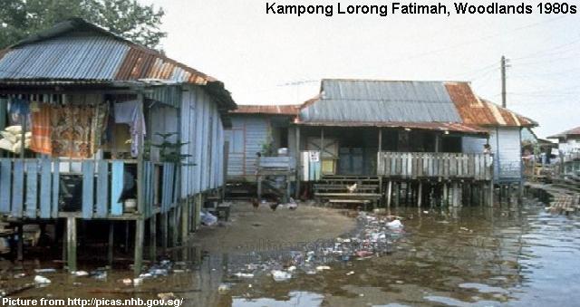
We plan to subtract parts of Kampong architecture and incorporate the parts into the form of our installation design.
External References
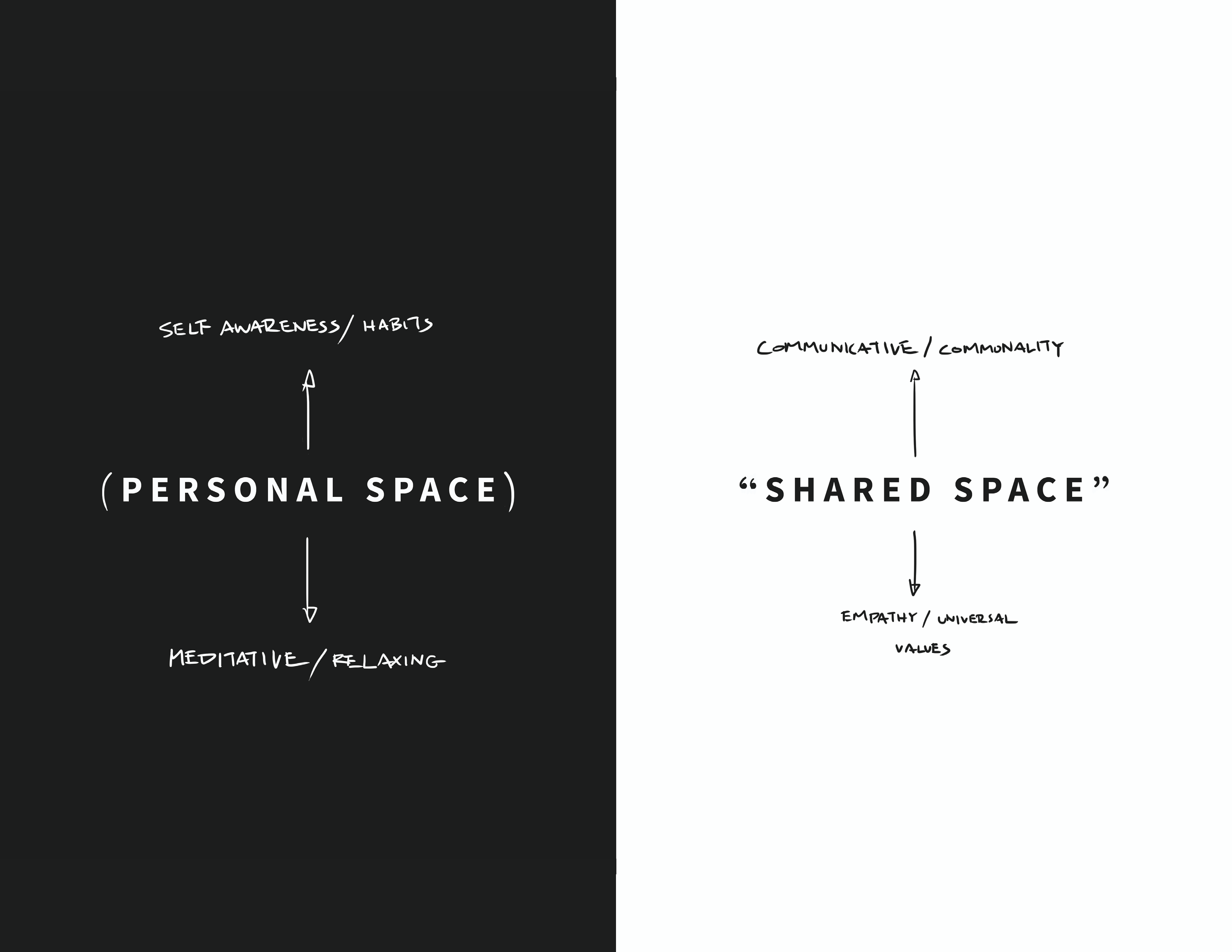
On top of the new inspiration for our conceptual installation piece, we would like to retain our initial research into the tension of personal and shared spaces in NTU which we did in previous presentations.
As a recap, we derived the tension of personal vs public spaces from the adjectives: hidden vs noticeable which we picked out from George Perec’s extract in week 1 which we found relatable to students in NTU – Students in NTU are constantly affected by the tension between private and shared spaces in the open environment of NTU.
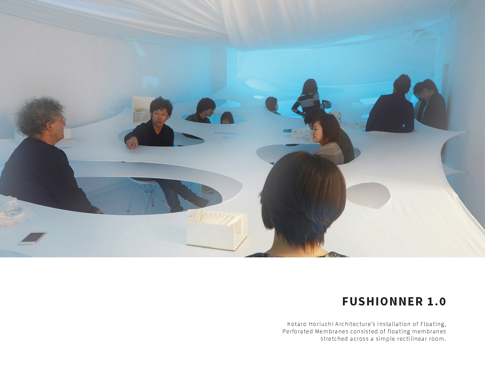
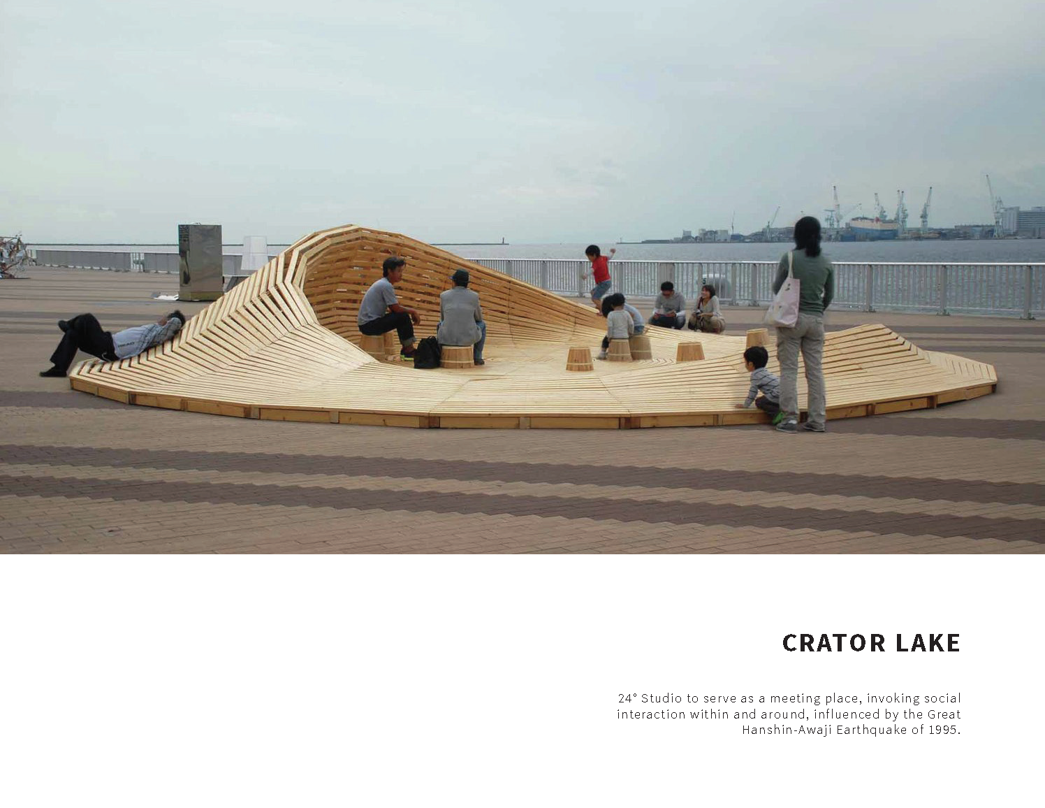
Also, referencing “Crater Lake” by 24 degrees Studio, we would like to create a space that serves as a meeting place to encourage social interaction among students within and around it.
In addition, these are some suggested links we looked into for the explorations of the tension between interior and exterior spaces:
DESIGN BEYOND FORM: THE ART OF YOSHIOKA TOKUJIN
RAAAF + barbara visser reject seating in the workplace with faceted installation
Our Concept
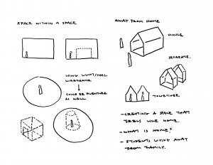
With our inspiration and references in mind, we wish to create an interactive space within the public space of NTU that provides both values of privacy and social interactivity on top of its significance as a space that reminds students of the school’s heritage.
Construction of Installation (Still in progress)
We have broken down the construction of our installation into three parts: Form, Material and sustainability, and Function and Interactivity.
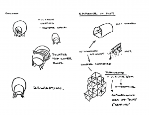
Form
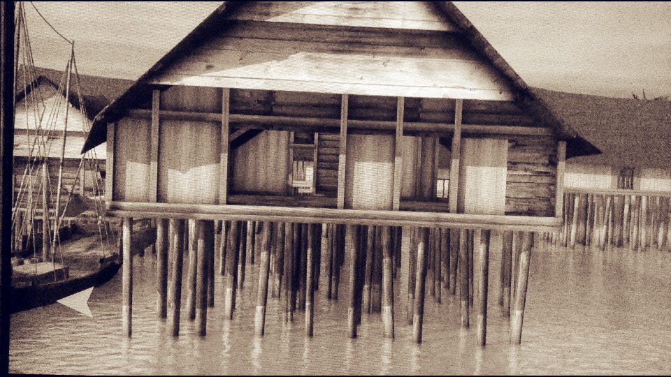
Our installation takes on a dynamic and extensive form translated from the fluidity of water and symbolic attributes of the Chinese character 洋.
We developed two Designs base on our concept:
Design 1
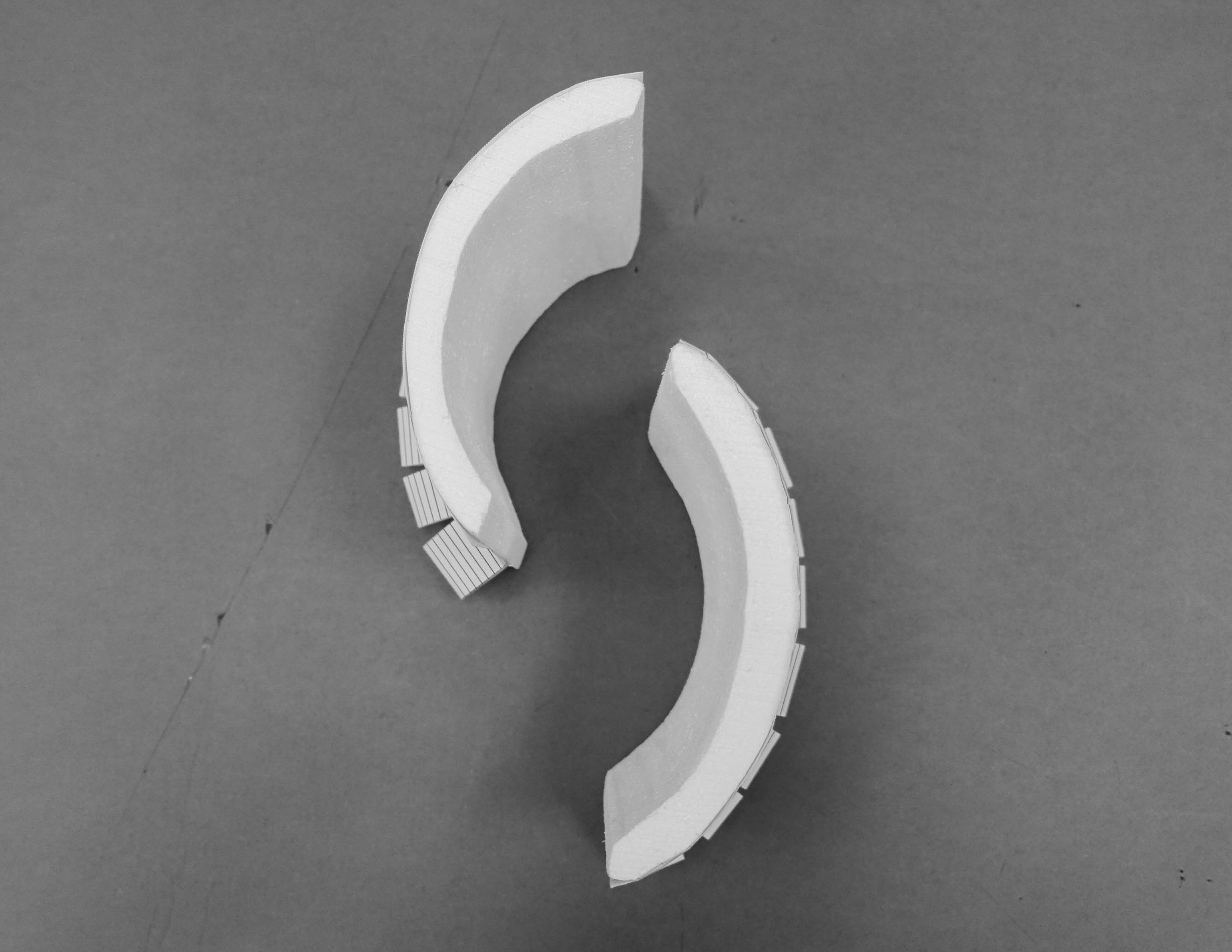

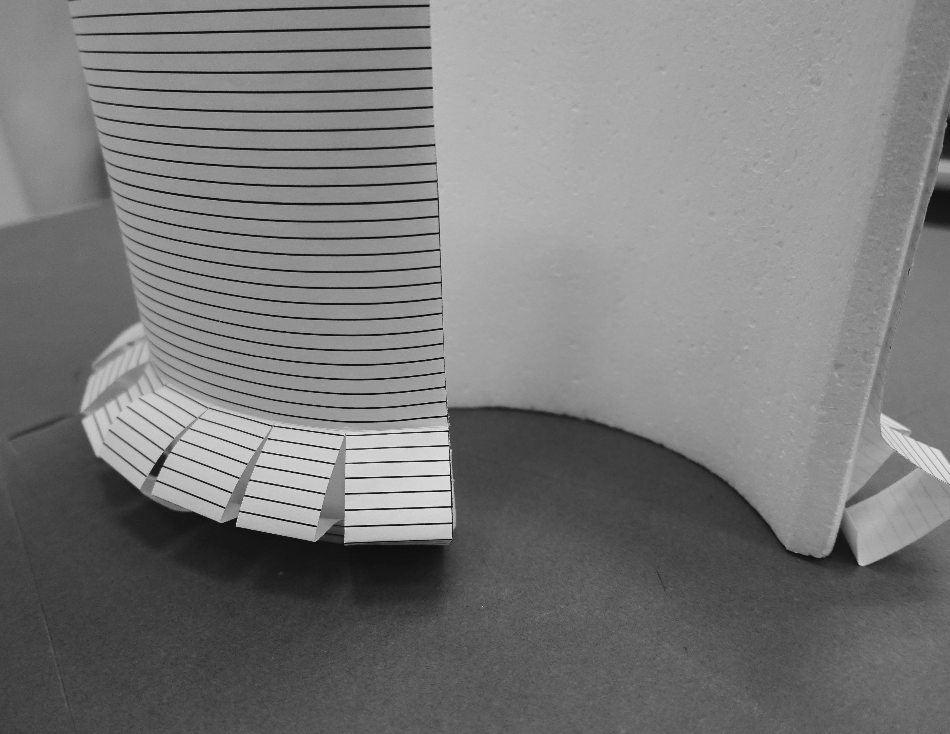
Design 2
Design 2 does not have protruding surfaces that serves the seating function. Instead, it is described by repeated revolving modular panels that are positioned in the same dynamic flow like form 1. The modular panels are inspired by the many vertical wooden pillars that were used to support Kampong houses.
Material and sustainability
For Design 1, our choice of material would be concrete. Concrete is hard, durable and stable, providing a sense of security to its users, serving itself well as a wall that provides privacy to its users.
For Design 2, our choice of material would be a Southeast Asian wood, such as Kapur and Meranti that are often used in the infrastructure of Singapore’s landscape.
Function and Interactivity
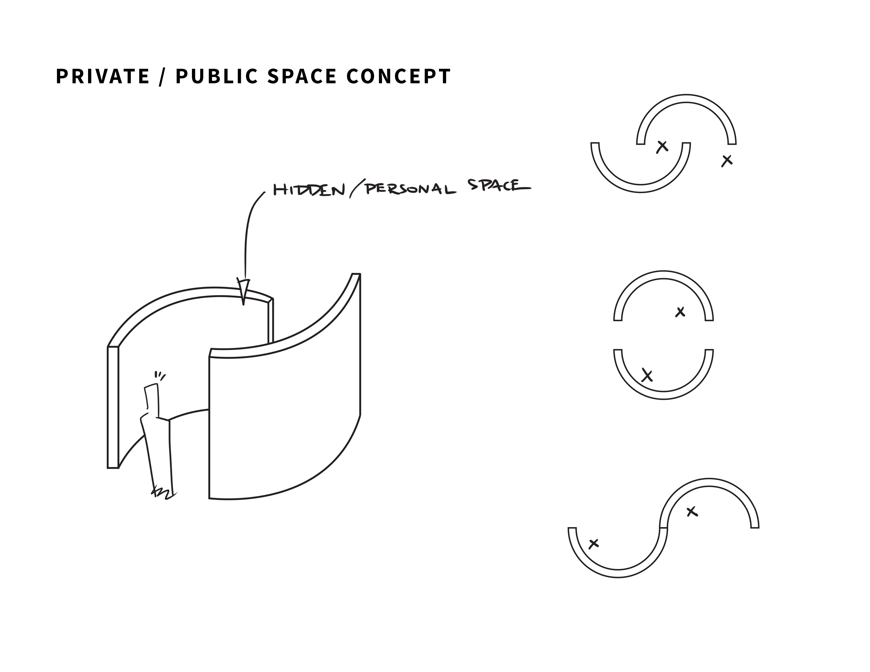
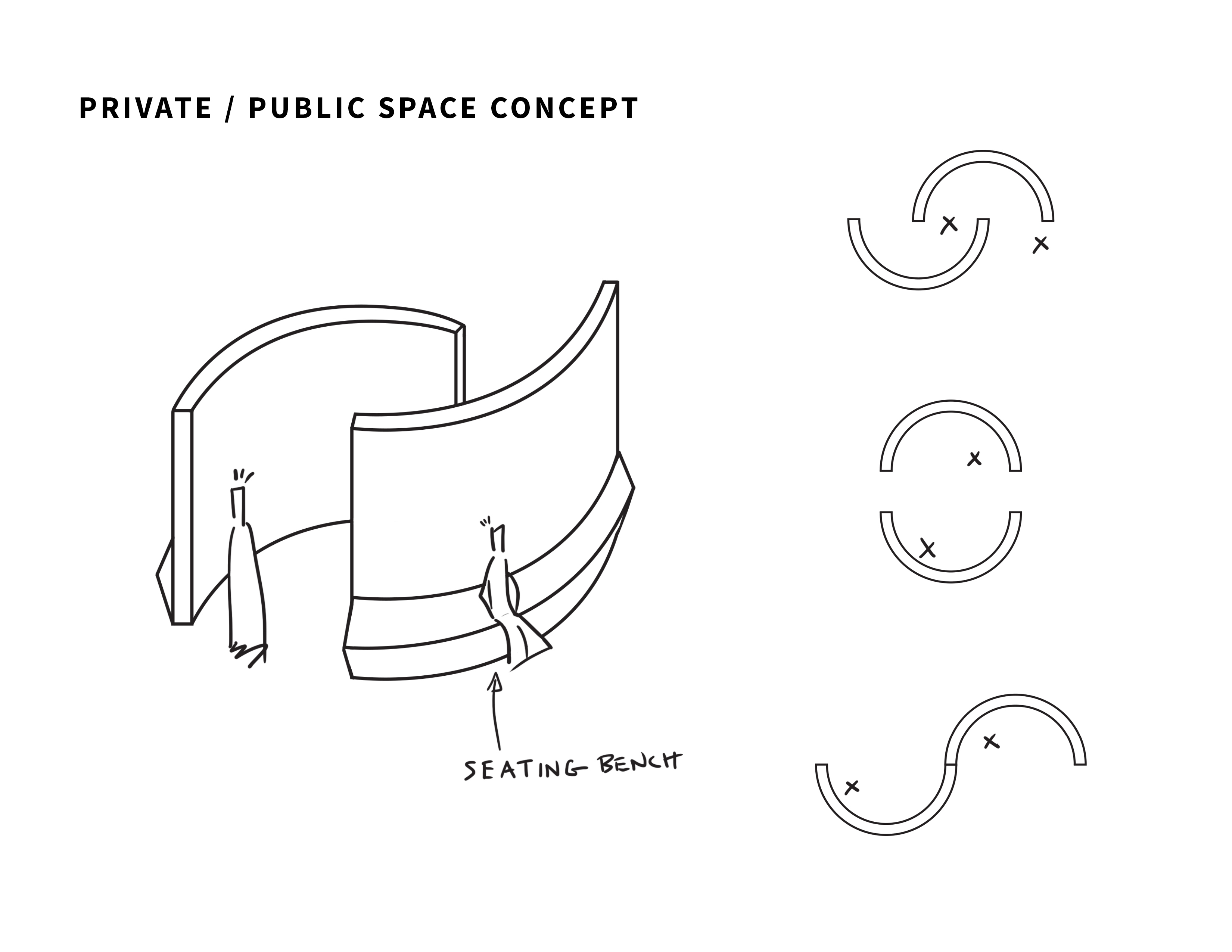
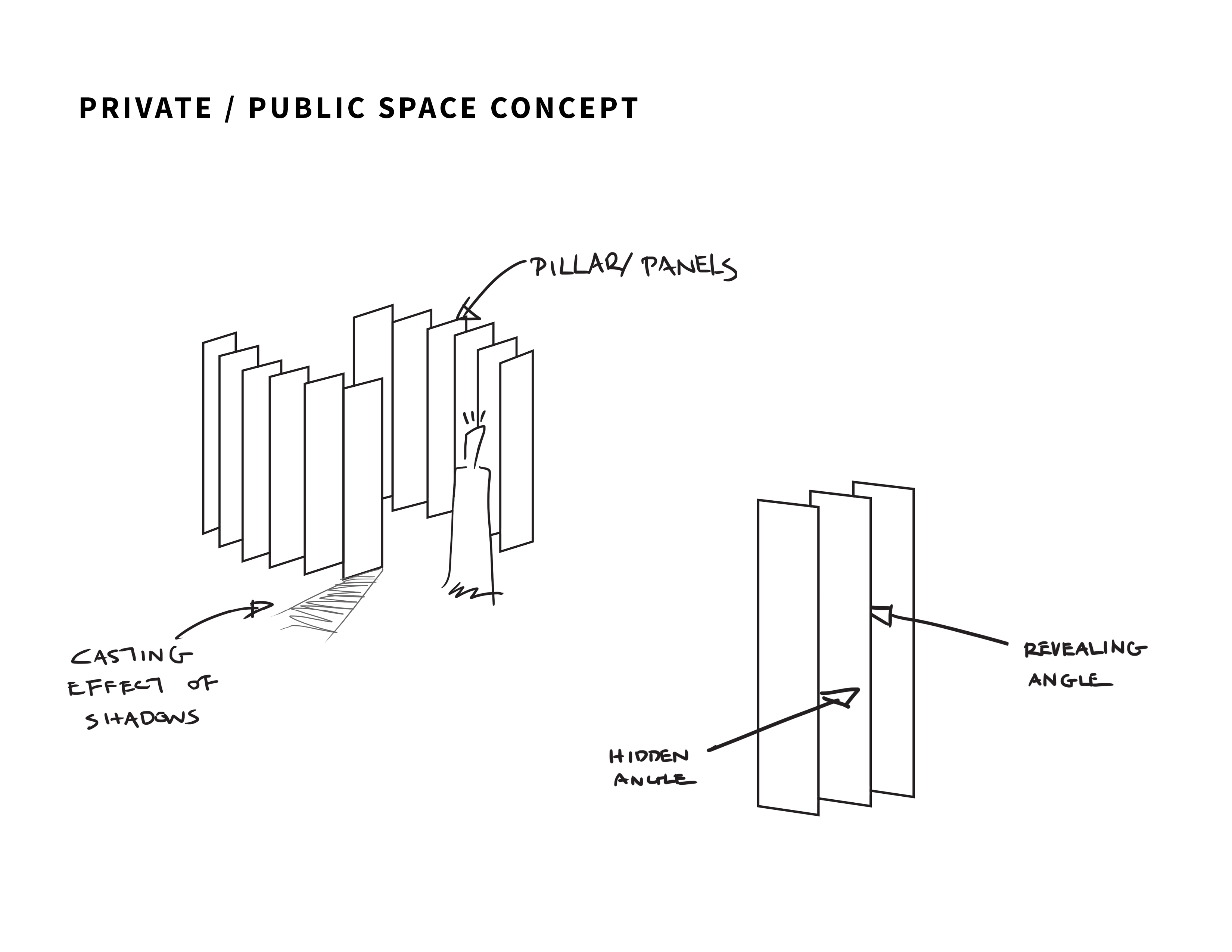

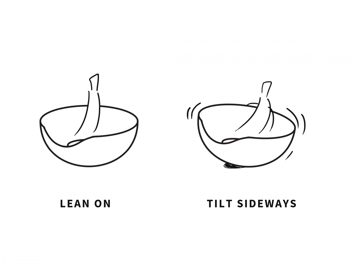
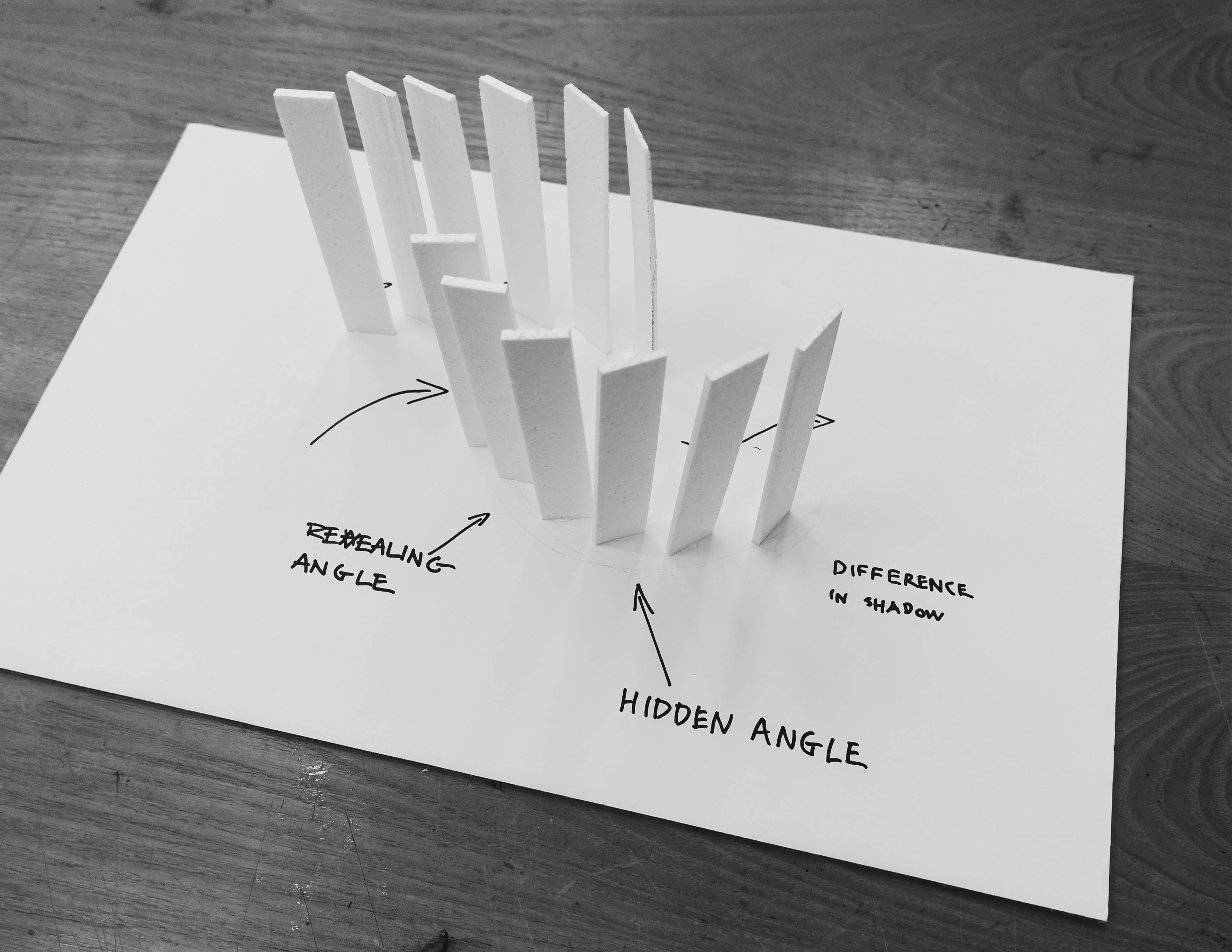
Design 2 serves as screens/ walls/ pillars that provides different levels of visibility at different angles and interaction.
The mechanical revolving action of the screens is a possible function that we would like to include into the installation piece.
Summary
To summarise, we hope to create an installation that encompasses both private and shared spaces to serve as a common area where students of NTU can seek recuperation/ betterment/ a hide out from the stress and heat of life and provide them with an opportunity to meet and interact with one another within and around the interactive space.