how would you express your emotions through lines?
Project Brief:
Use the concept of lines to interpret a set of 18 different emotions, with the use of different mediums and method in creating the different emotions being anxious, embarrassed, bizarre, exhausted, fragile, systematic, lyrical, turbulent, nonsensical, psychotic, ambiguous,, spontaneous, distracted, sloven, sensual, aggressive, awkward, and indecisive.
Research & Exploration:
By looking up the definitions of all the emotions on the internet, I started the journey on creating the emotions. Having to know more of each emotions and what they really are, it gave me a better idea on how to approach this project.
Stage 1 | Ideation
With all the definitions on hand, I am able to start sketching and generating ideas on the different emotions.
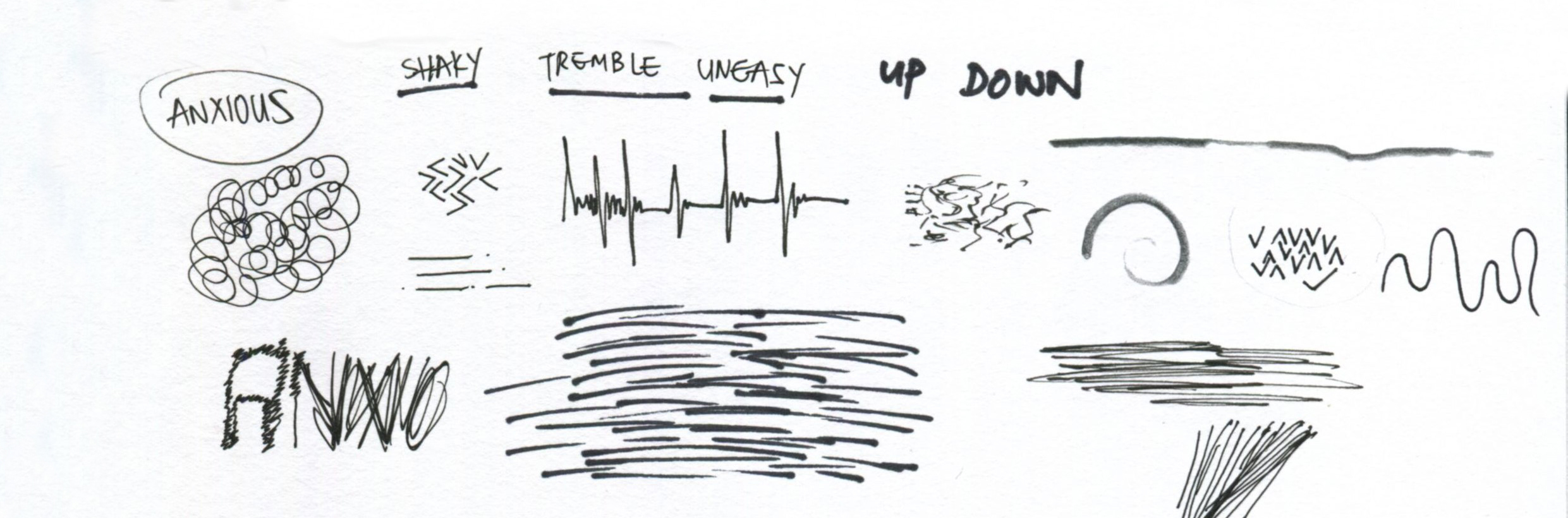
Anxious: shaky, tremble, up and down
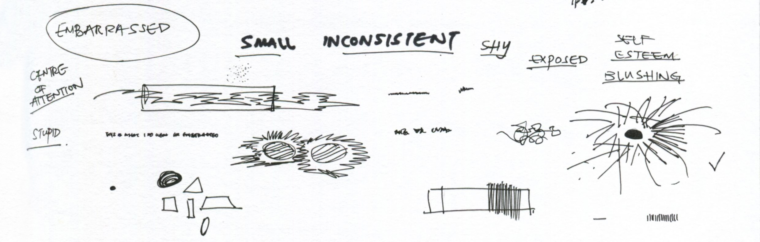
Embarrassed: shy, exposed, blushing, centre of attraction
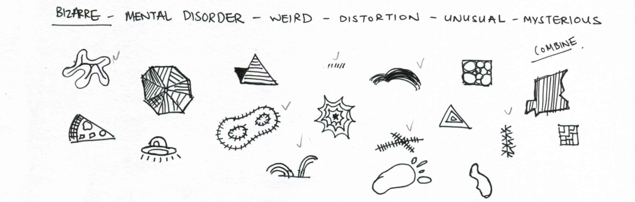
Bizarre: weird, unusual, mysterious
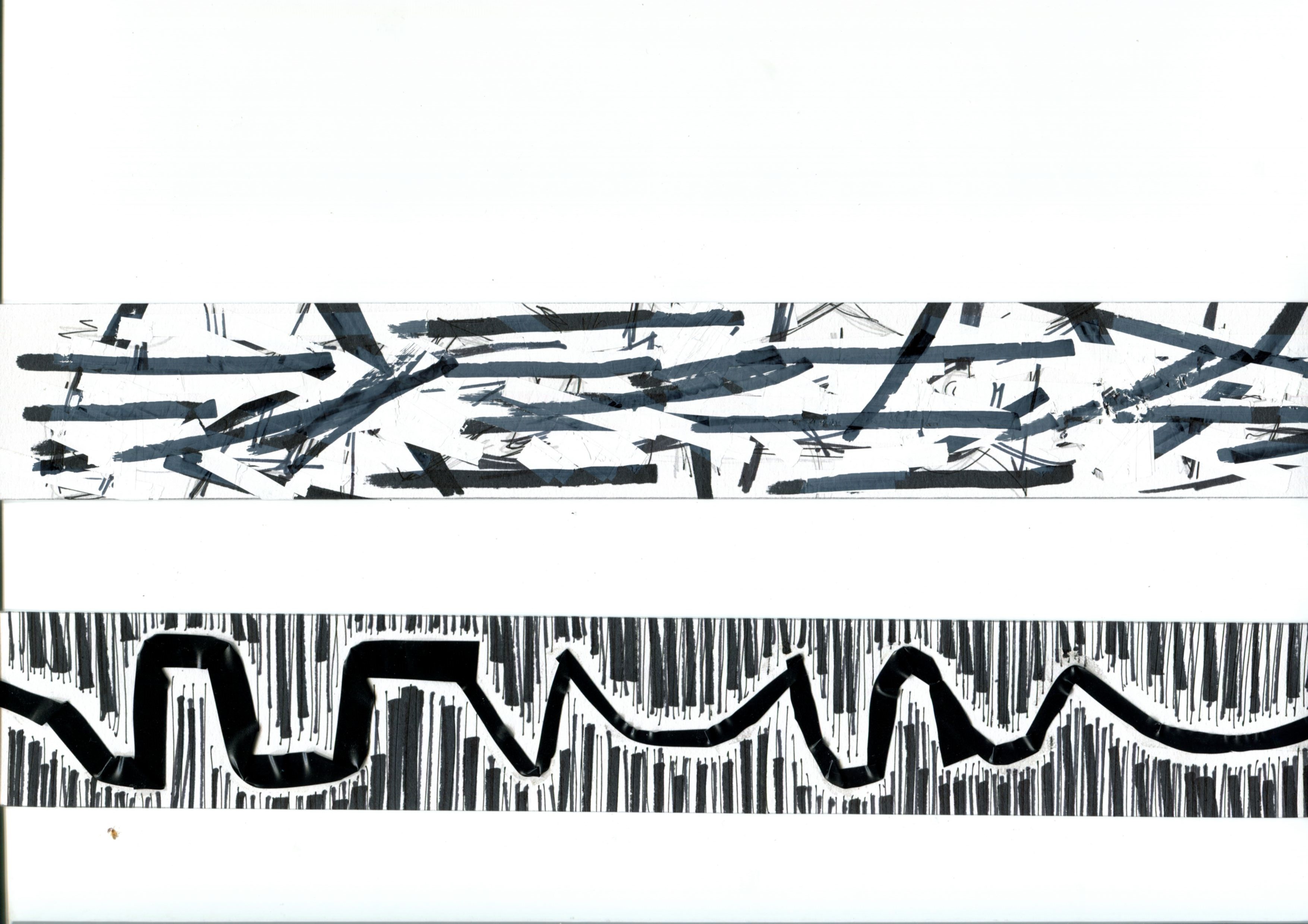
Exhausted: tired, used up, empty

Fragile: delicate, brokeen, weak, brittle, shattered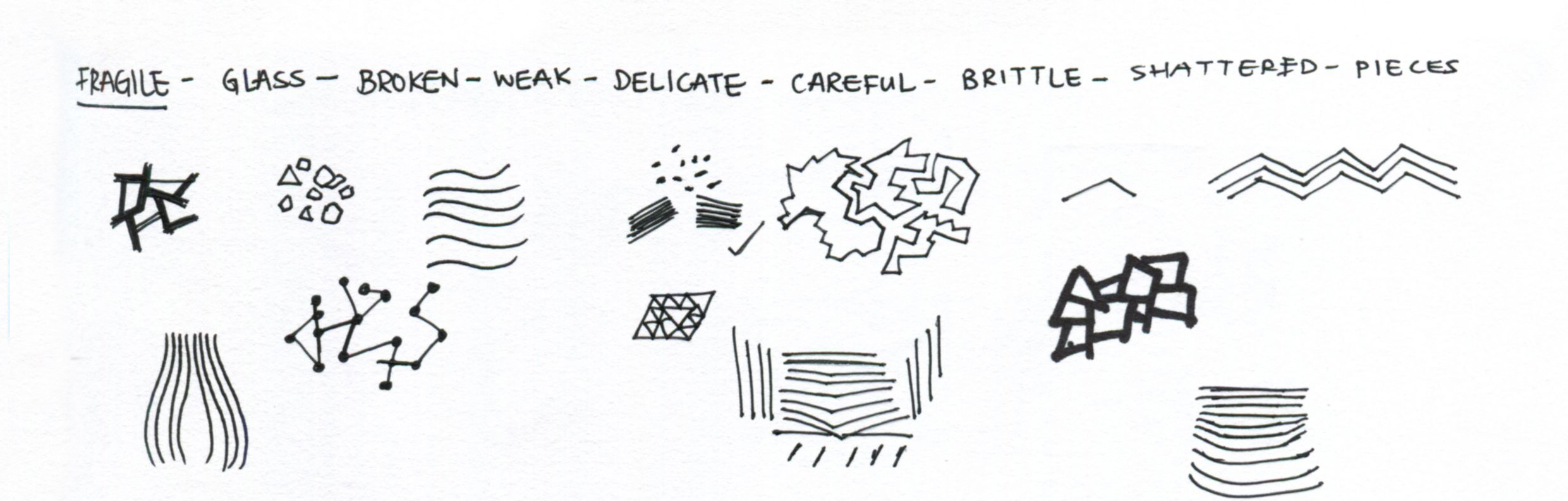
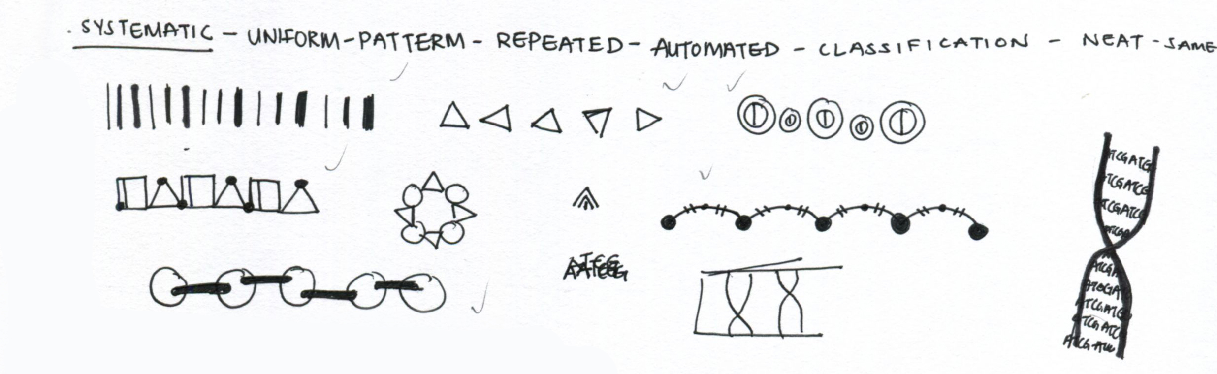
Systematic: uniformed, patterned, repeated, automated
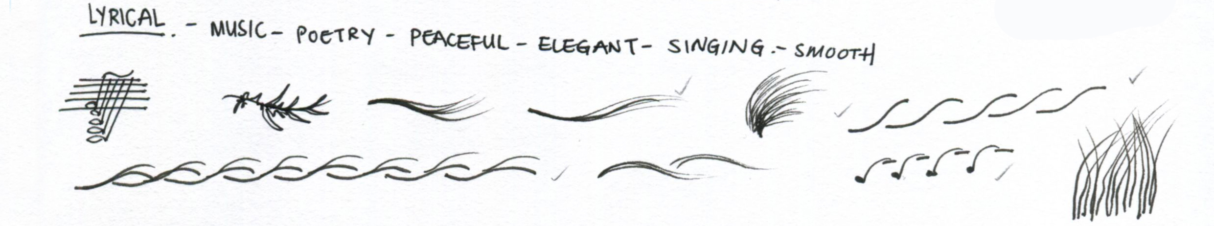
Lyrical: music, poetry peaceful
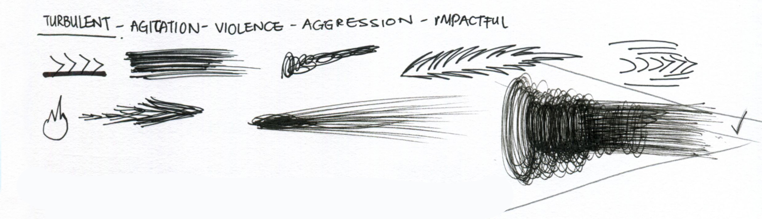
Turbulent: violent, impactful, agitation
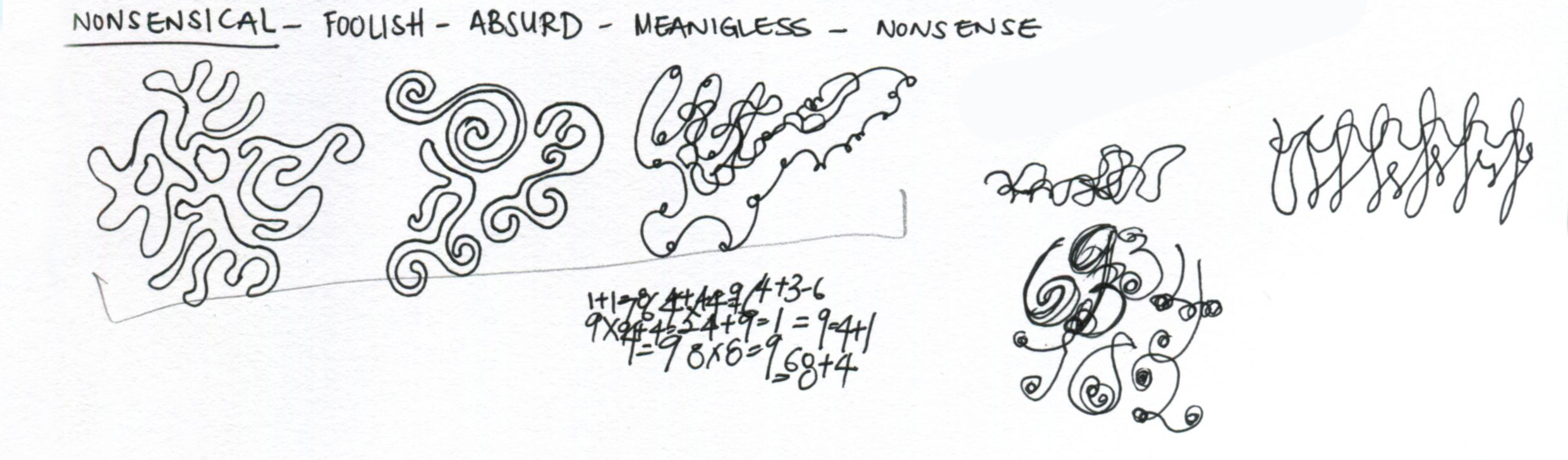
Nonsensical: foolish, absurd, meaningless
Psychotic: crazy, mad, disturbed, insane

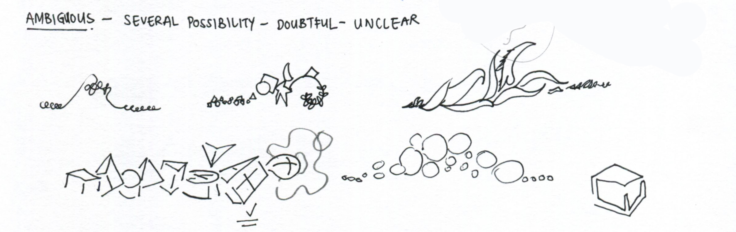
Ambiguous: several possibility, doubtful, unclear
Distracted: bored, lost focus, loss of attention

Sensual: fleshly, lewd, arousing

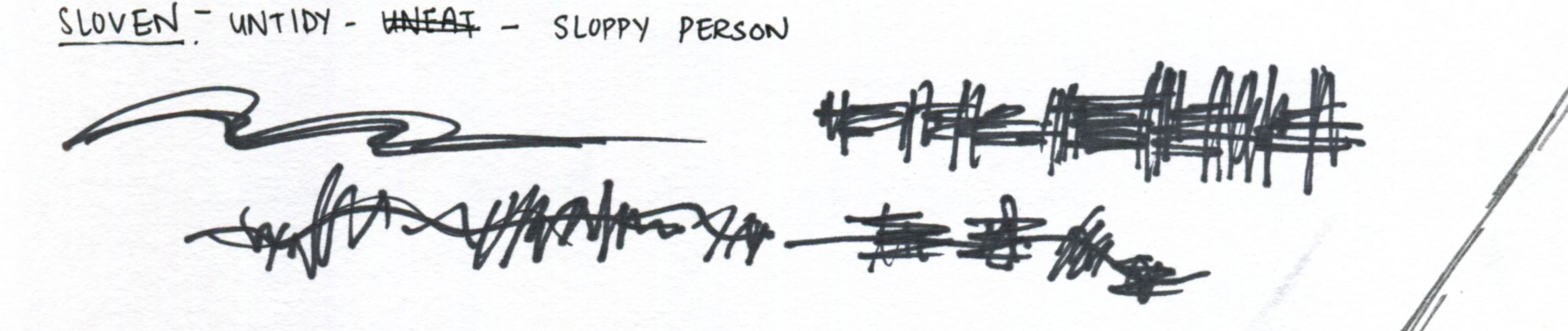
Sloven: untidy, messy, sloppy
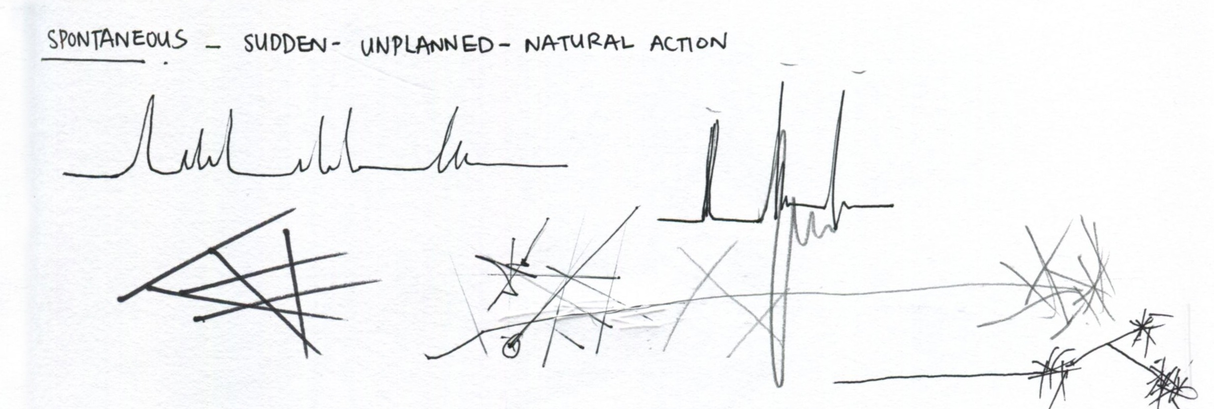
Spontaneous: sudden, unplanned, natural reaction
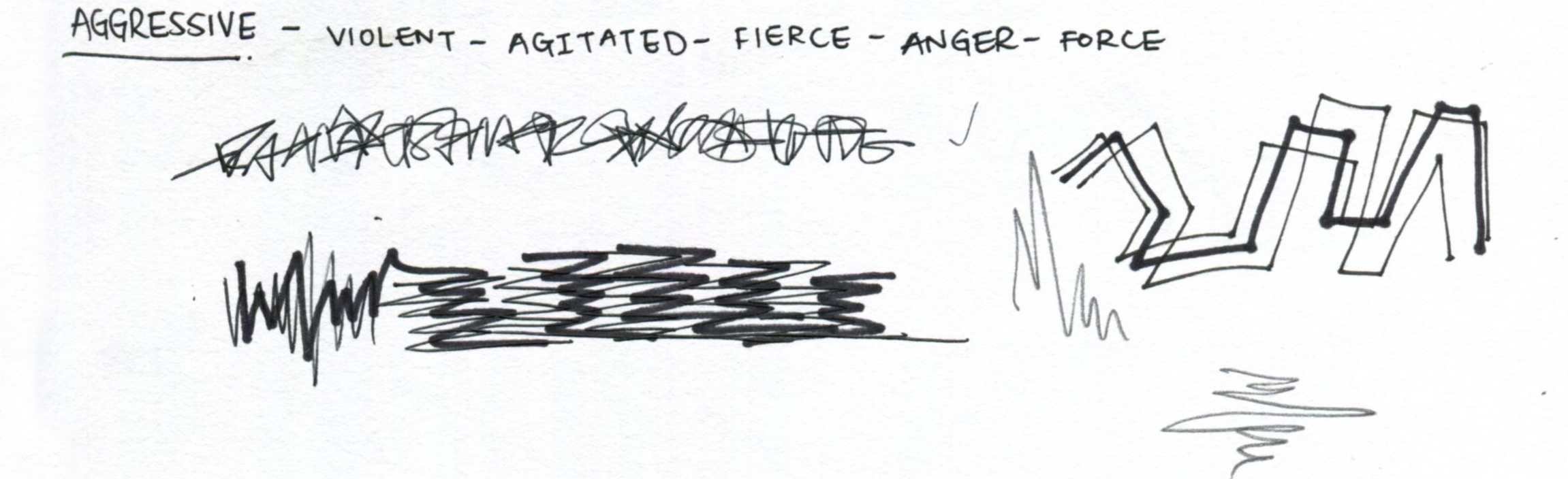
Aggressive: fierce, anger, force
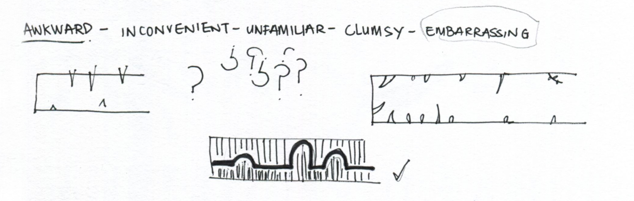
Awkward: inconvenient, unfamiliar, clumsy
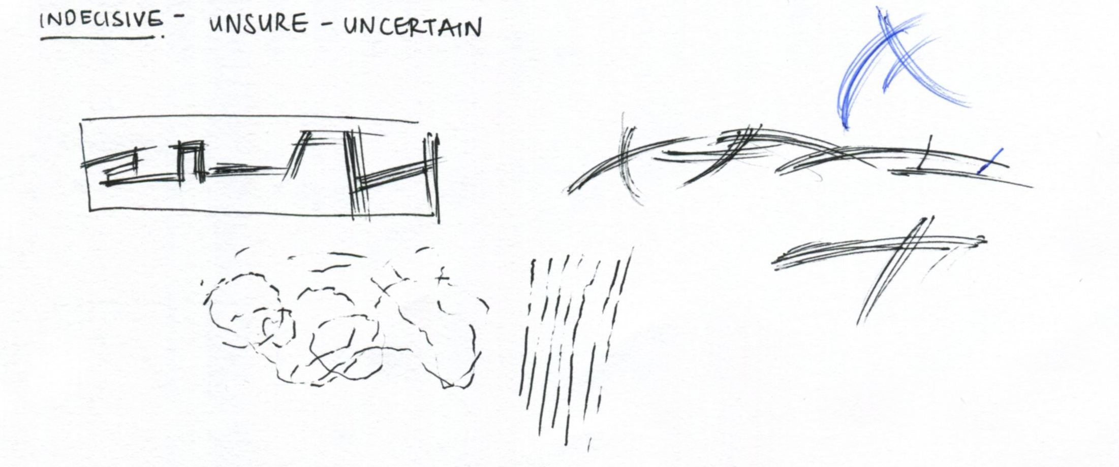
Indecisive: unsure, uncertain
Stage 2 | Execution
Having sketched out the different ideas on the emotions, I proceeded with the execution on a smaller scale of the final product. The main mediums used were markers, fineliner pens, and pencils. I also had in mind what were the possible mediums i could use for the final product.
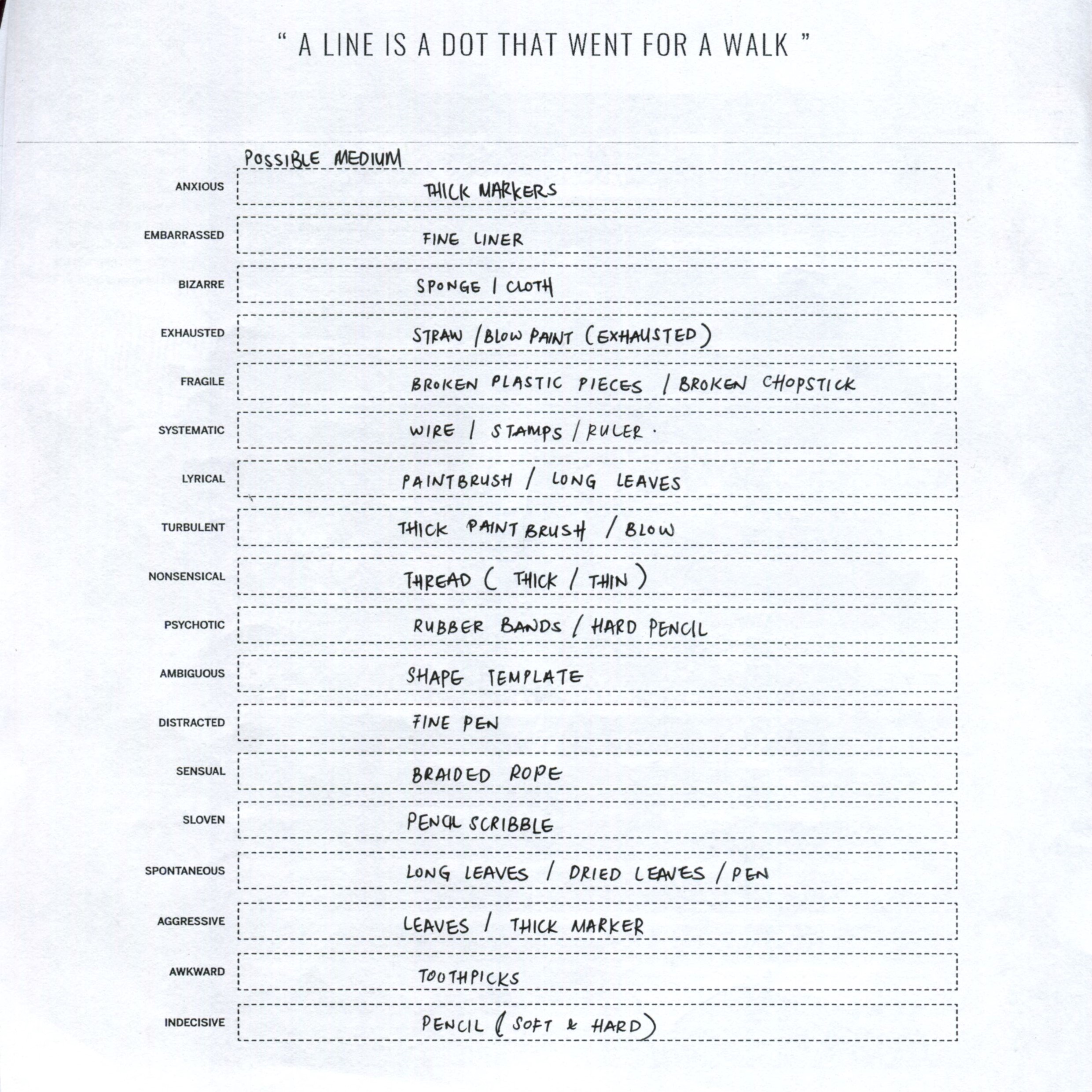
↑↑ possible mediums that can be used.
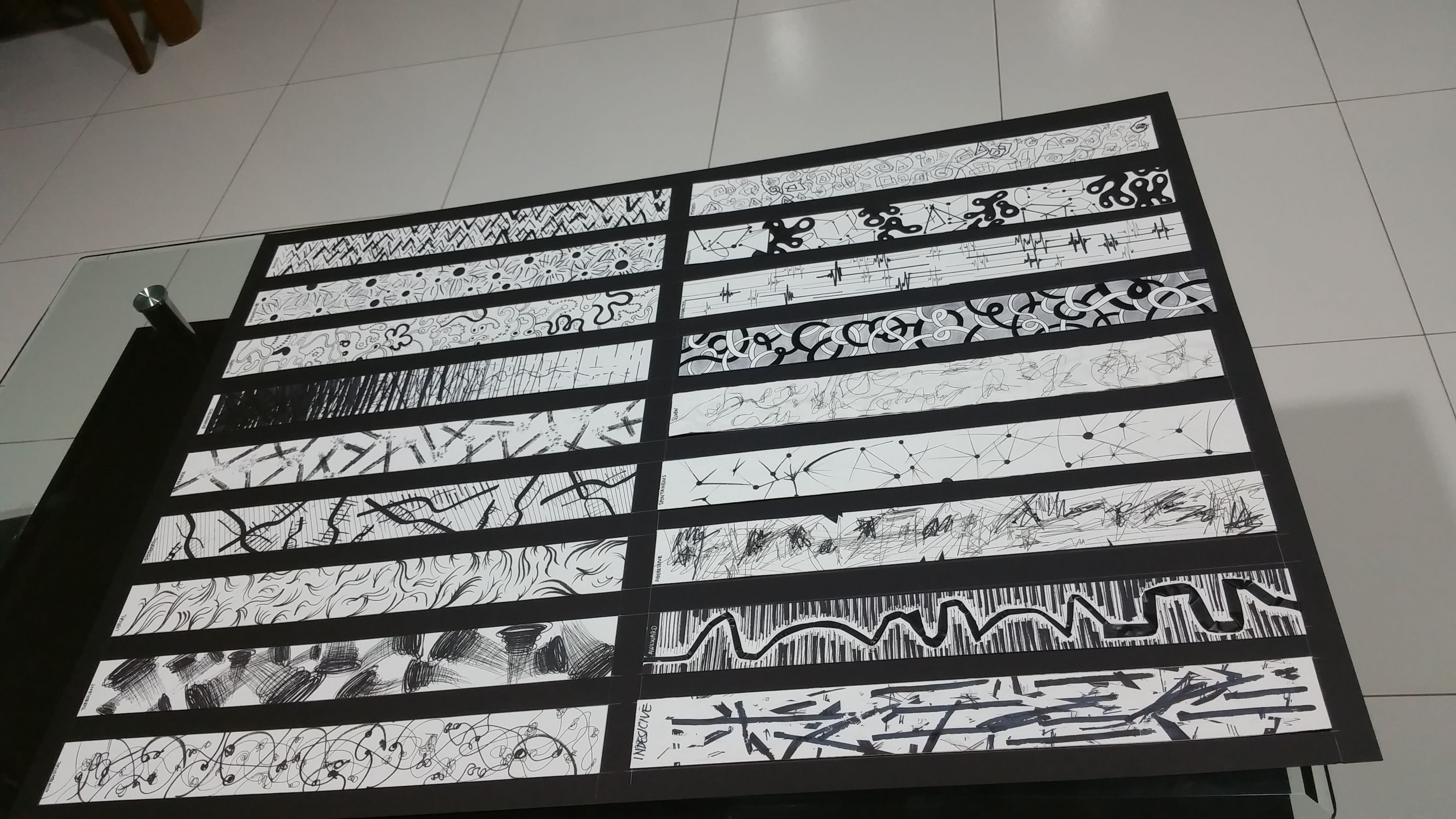
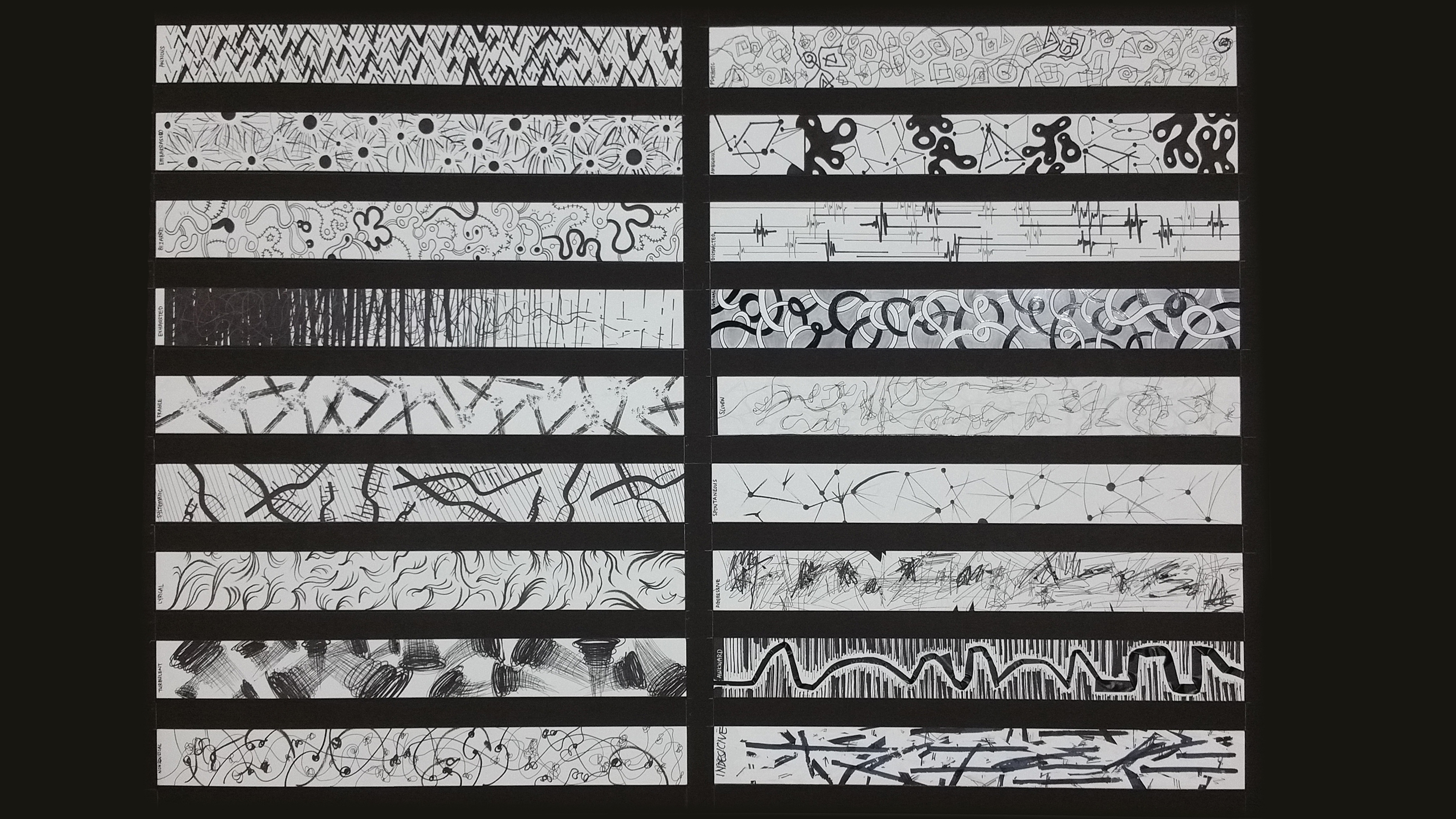
Finalising the artwork.
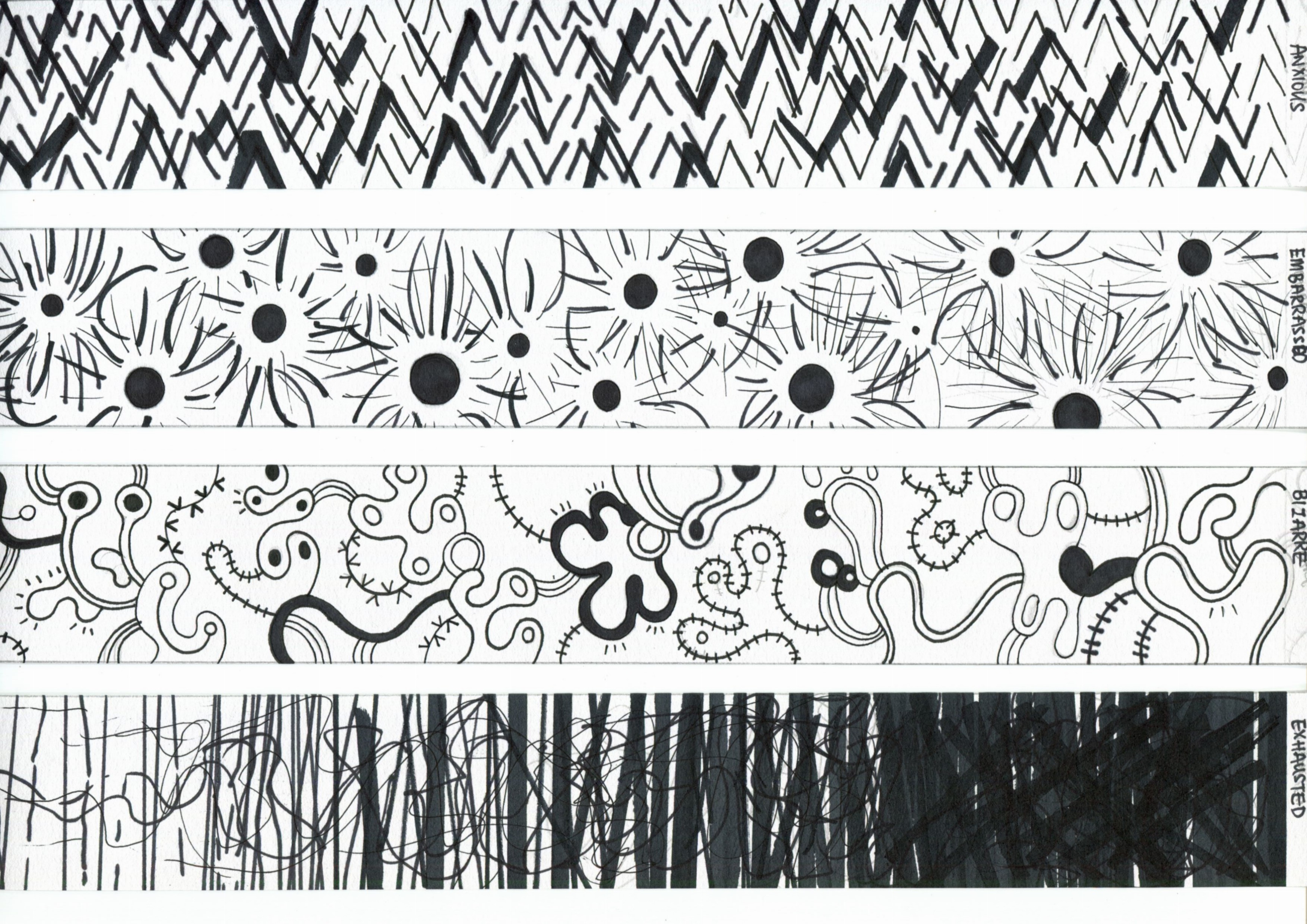
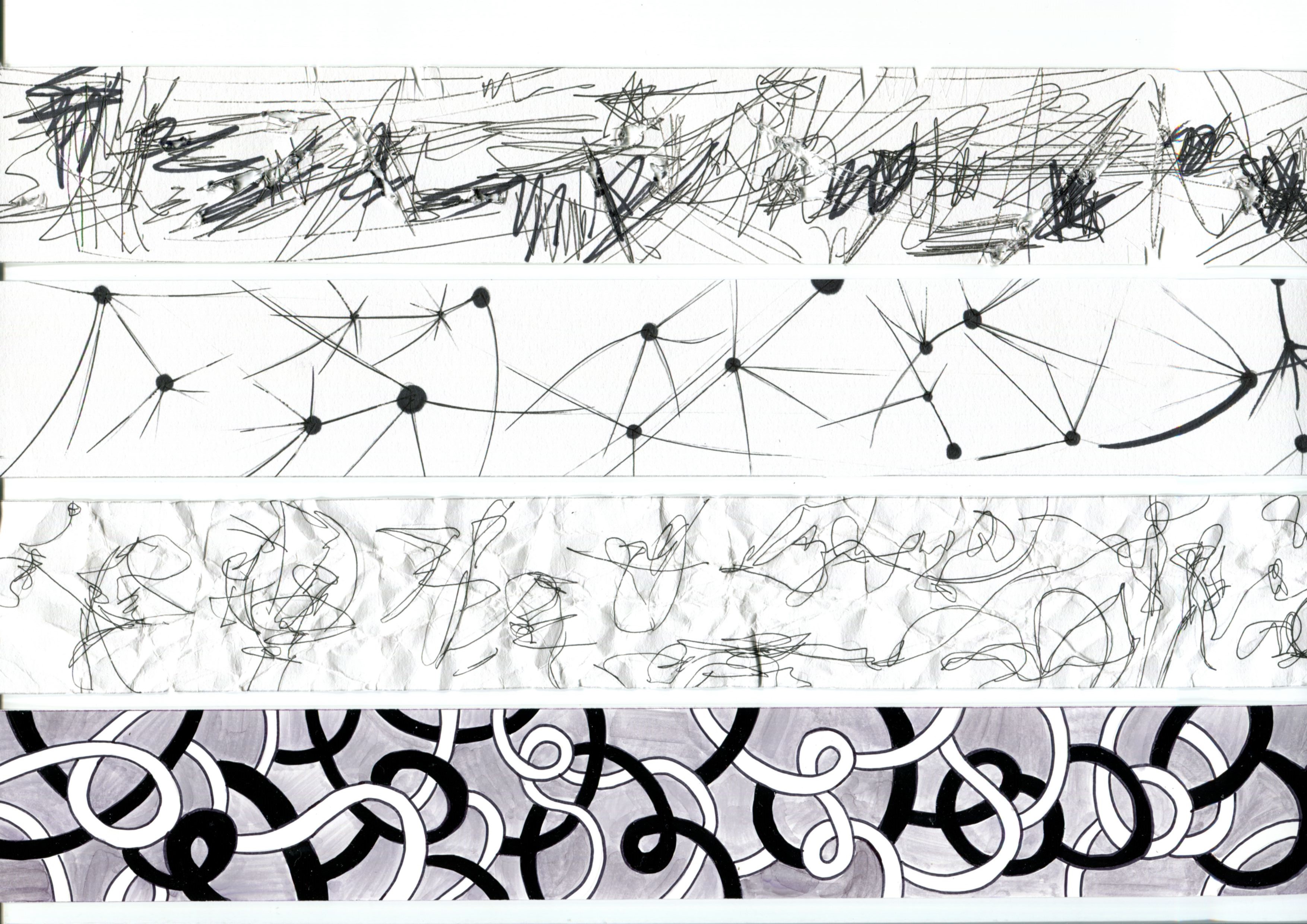
(Description in order with sequence of strips)
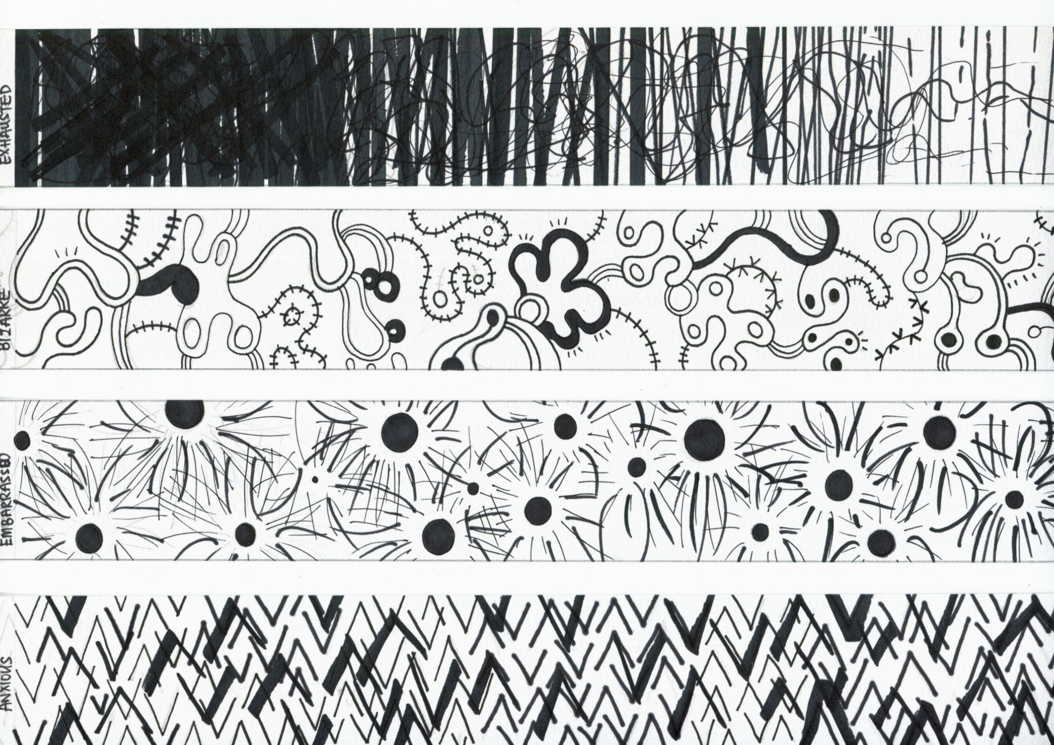
Exhausted: The use of thick markers and slowly dying down to finer marker lines depicts the sign of exhaustion and being worn out.
Bizarre: Using organism-like illustrations is how I think of bizarre, as microscopic cells, which we cannot see with our naked eye and it could look like anything.
Embarrassed: Having the black dots as a person, the lines around it, be it going towards or distancing away, conveys the idea of one being the centre of attention when done something wrong/ unexpected, hence feeling embarrassed.
Anxious: Thick and thin up down arrows would be how being anxious can be shown.

Fragile: The use of the cross section of a wooden chopstick with ink stamped, shows the structure, and by dapping the ‘broken pieces’ with the broken tip of the wooden chopsticks, shows the pieces broken when something has snapped/ been broken into half.
Systematic: An abstract of the DNA structure.
Lyrical: Curvy and wavy lines; as though leaves are bristling through the wind. Done with calligrahy pen.
Turbulent: Impactful and fast, with thick markers and thinner markers to portray the fast movement.

Distracted: a sudden surge in activity after a period of constant concentration. Thick and thin lines can be related to different people with different kinds of distractions.
Ambiguous: Organic shapes, and then geometric shapes. What could it be?
Psychotic: The doctor said to the mad men, ” Now, draw me proper squares, circles and triangles.”
Nonsensical: Curvy, yet with some illegitimate scribbles in it. You call that a curve? That’s nonsense.
Aggressive: Hard, sharp lines. Even tore up the paper. You,ve gotta chill man.
Spontaneous: Let the dot be a soccer ball. Imagine someone kicked it and its going everywhere out of a sudden.
Sloven: I drew it on a piece of crumpled paper. Acceptable i guess?
Sensual: Inspired from the human muscles, curvy and sleek with different tones.
Indecisive: Not sure on which medium to use. Used correction tape to make amendments over and over again.
Awkward: Let the lines be some sort of a construction. You have to get from Point A to Point B. The black tape is path you have to take, awkward.