
In the previous post, I’ve researched and introduced several principles of design. Following which, I went on to applying and exploring these principles. Inspired by nursery rhymes, I put together different graphic elements into an art canvas.
With different compositions and the application of a few design principles, I came up with several artworks which I find some of them turned out to be pretty interesting.
I have taken more towards the approach of symmetry, leading lines and the Rule Of Thirds. I find them very pleasing to the eye and it catches my attention easily, which is the reason why I decided on this approach to adopt.
Here are some of the first few explorations I’ve made.
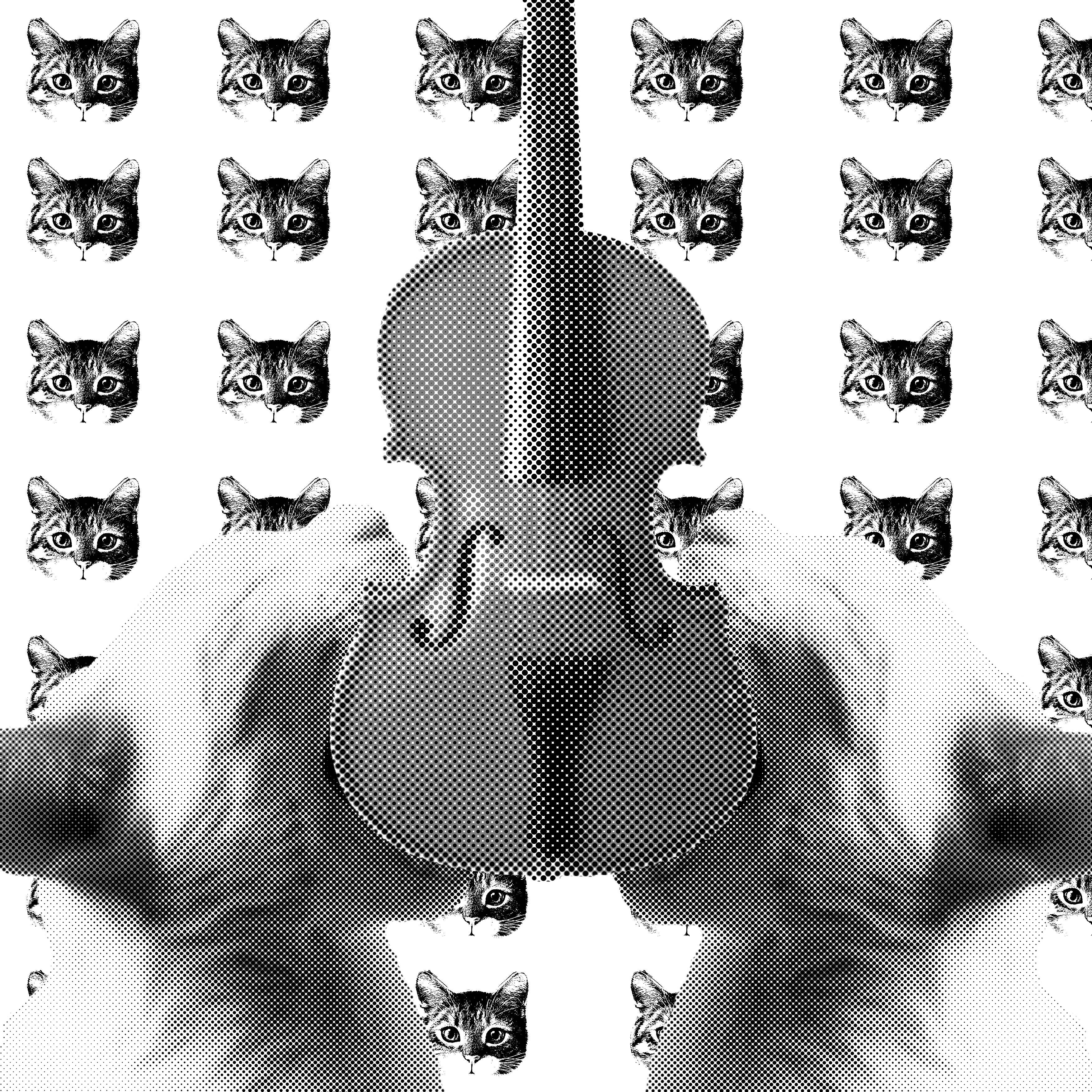
Hey Diddle Diddle! The Cat and The Fiddle
This would not be a good graphic image as the foreground appears to be blur after the post processing, while the background is very clear and sharp. This should not be the case.

All the King’s horses and all the King’s men.
Initially I liked this image as I feel that it has a strong emphasis on the subject in context of the sentence of the rhyme. However, I feel that this image lacks of a variety of elements. The smaller illustrations are the same as the main subject. Therefore, it makes the image look flat and uninteresting.
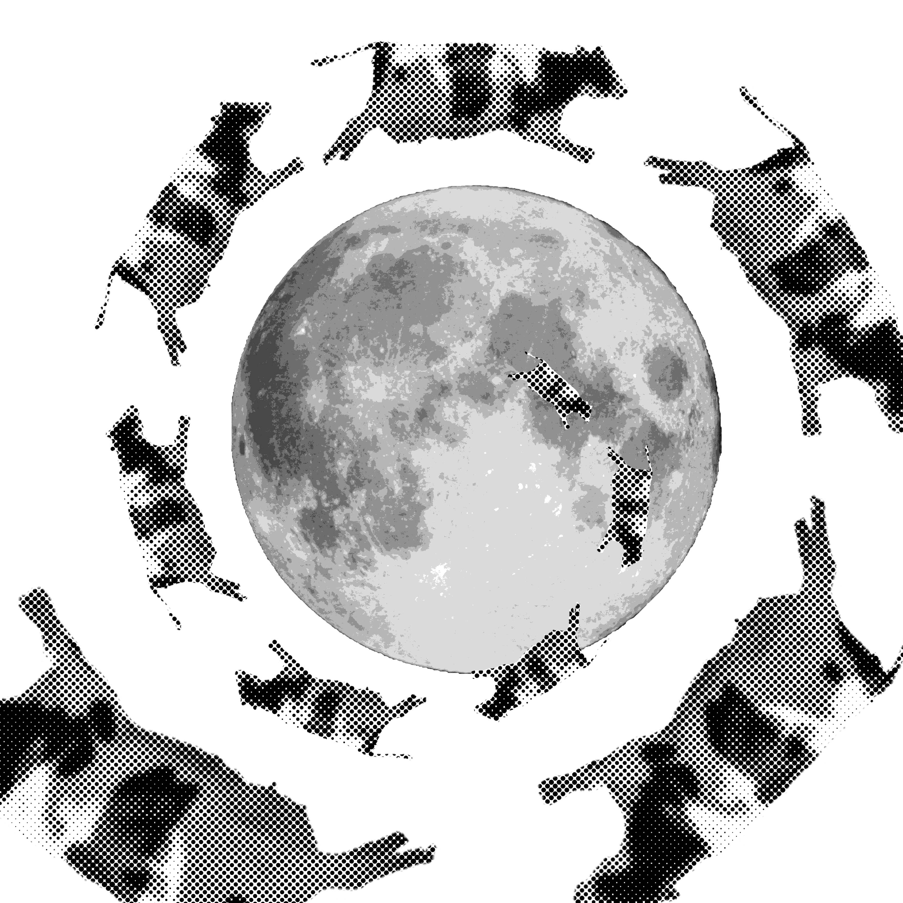
The cow jumped over the moon.
This image is a good intepreation of leading lines. However, it looks plain and lacks context in showing more background instead of just the moon.

Humpty Dumpty sat on the wall.
The framing of the image which shows Humpty Dumpty sitting on the wall is one thing i like about this composition. One thing that can be improved on this is having more perspective on the wall and Humpty Dumpty itself. This would make the image more dynamic and interesting.
After exploring on different sentences of the rhymes, I proceeded to explore more on bolder, out-of-the-box compositions. These are the final ones which i chosen for submission.
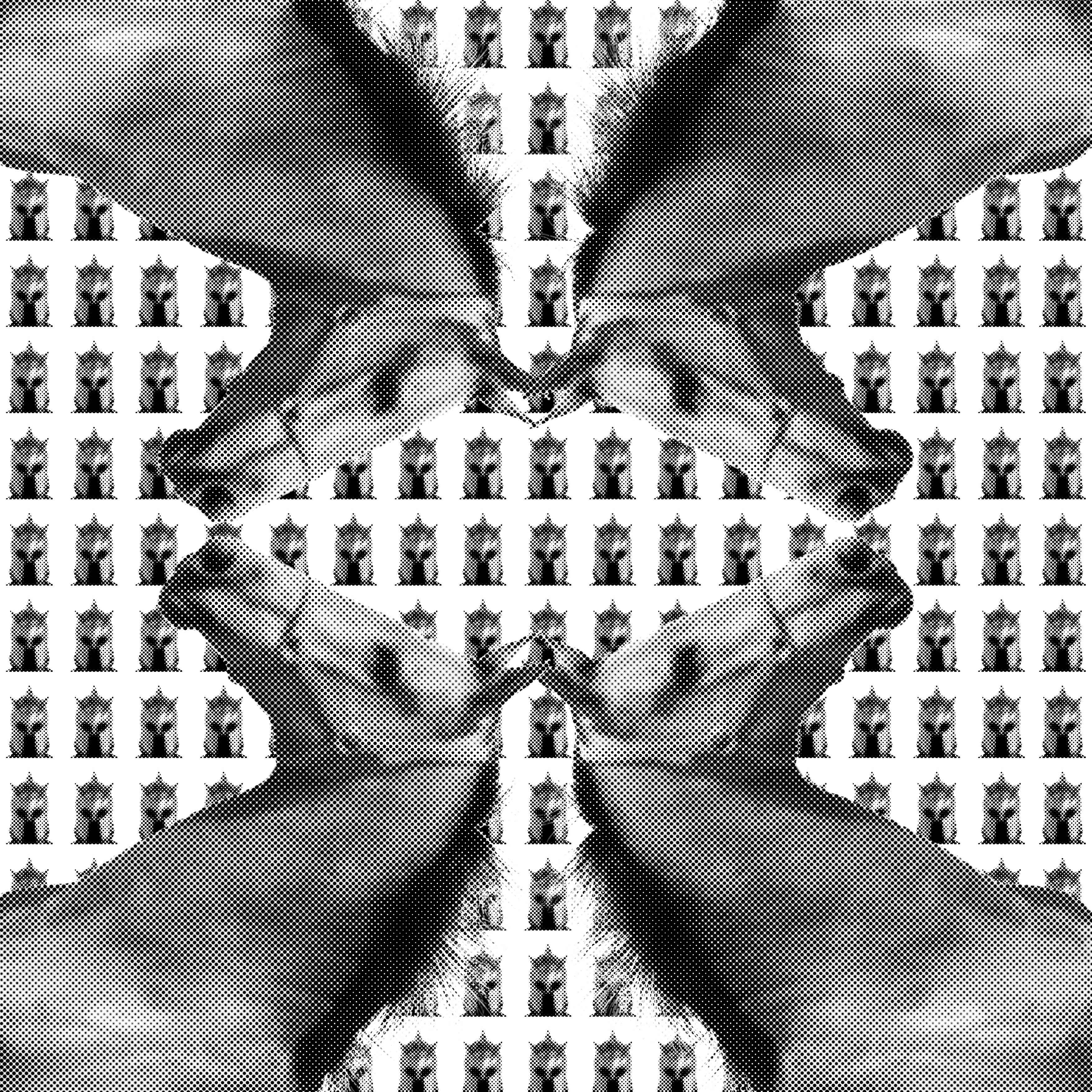
All the King’s horses and all the King’s men.
I have chosen this one to be my final piece is because I find that it falls safely in terms of composition and design principles. I also like how it turned out when I placed the horse heads on 4 different corners of the artboard.
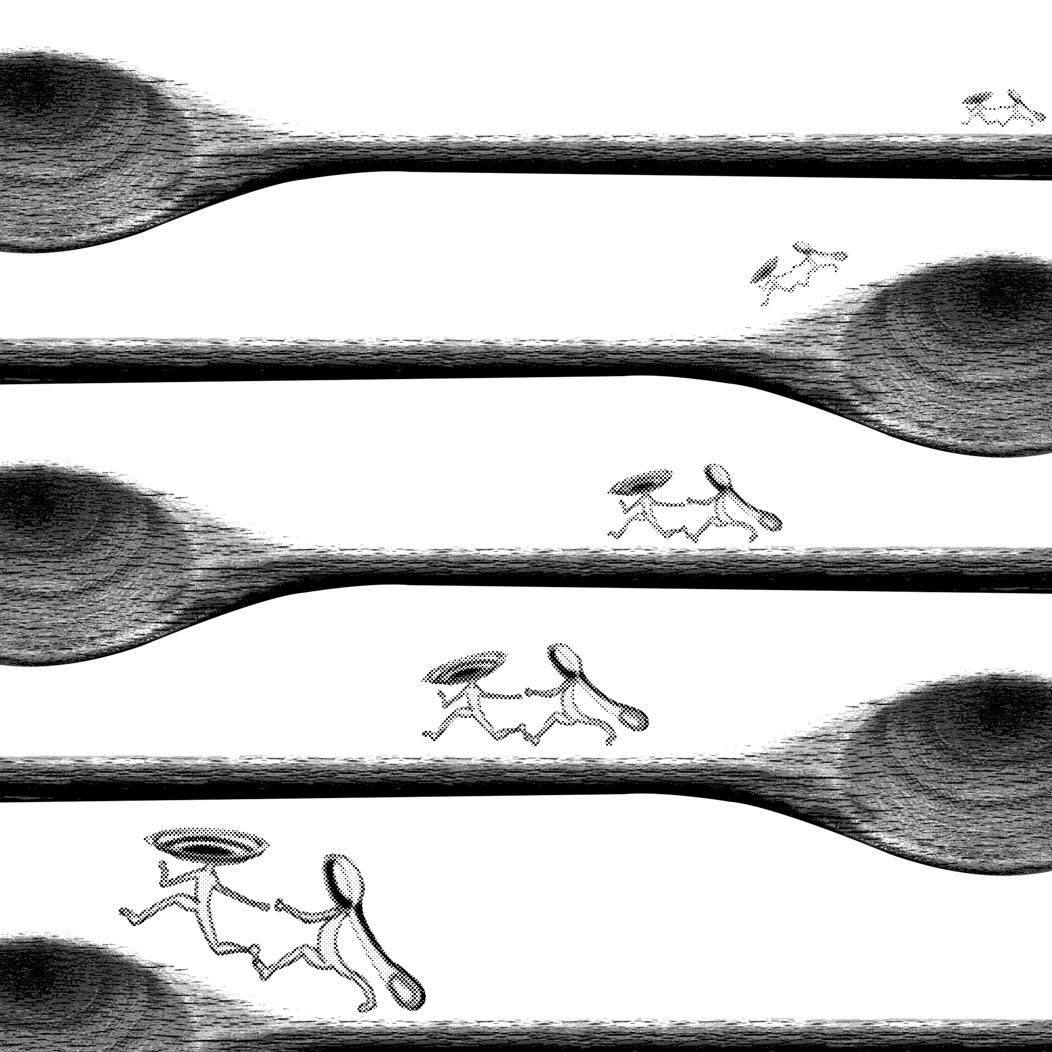
And the dish ran away with the spoon.
The strong diagonals of the dish and the spoon runing is very interesting as it shows them getting clearer on each wooden spoon. It looks very simple and clean yet interesting.
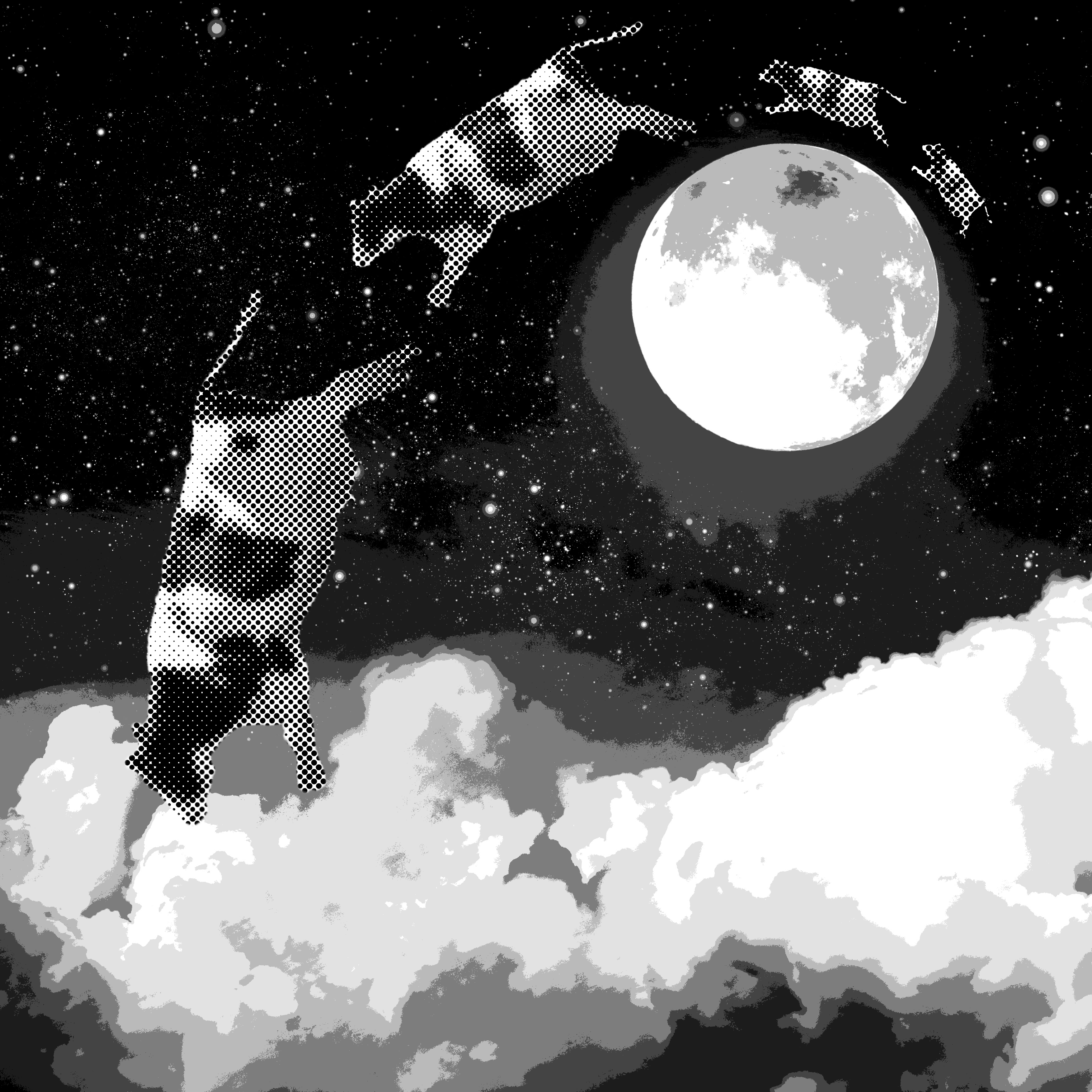
The cow jumped over the moon.
As compared to the previous tryout which I have done, this image shows more context. Having a stronger background, the cow immediately blends into the background that shows not just the moon, but also clouds and stars.
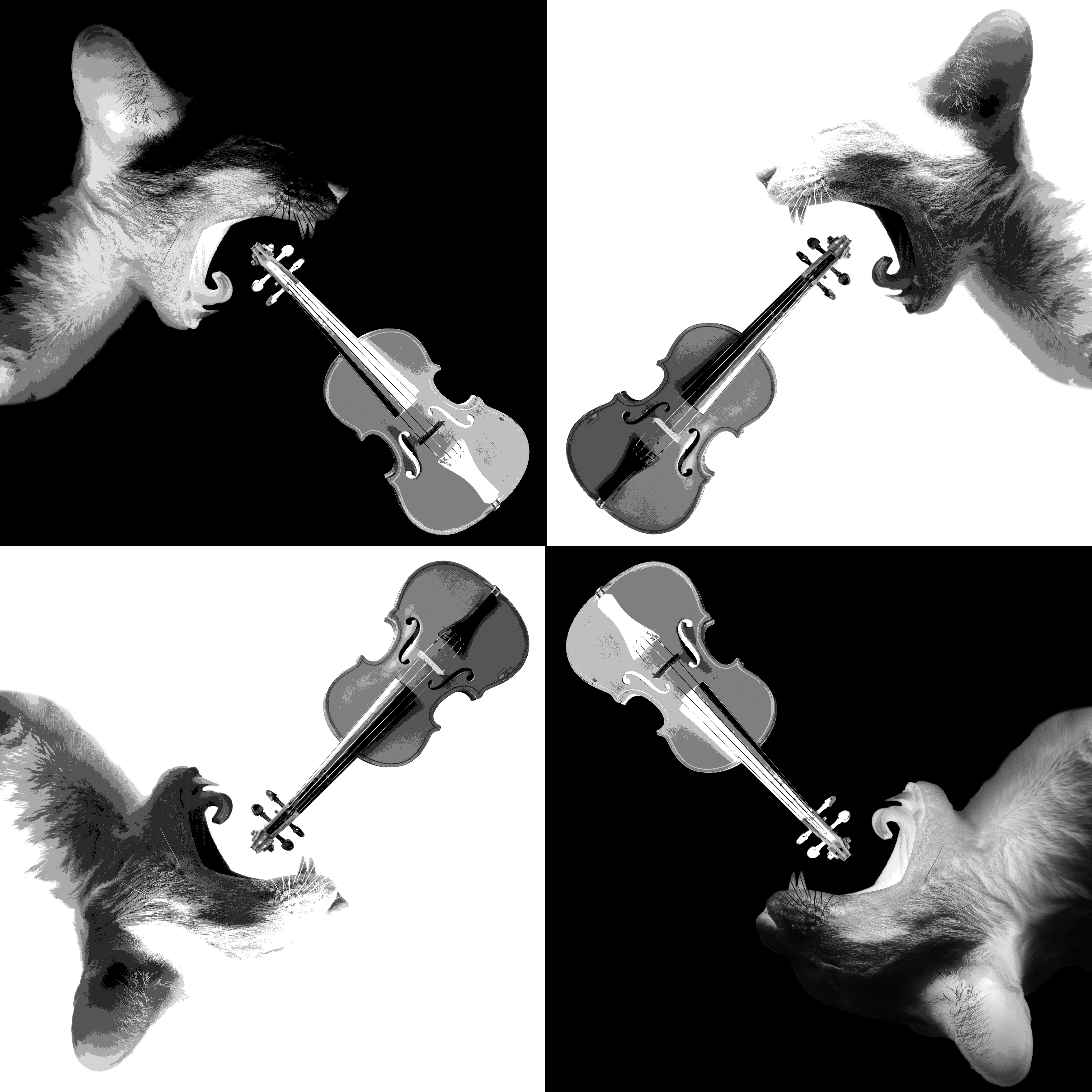
Hey Diddle Diddle! The Cat and the Fiddle.
Last but not least, playing with inverted grayscale is something new which I tried. I found that the inverted and normal grayscale image of the cat complements each other well, hence I decided to place them alternately and it did form an interesting composition afterall.
Through this project, I have learnt to think more creatively. By thinking out of the box, I am able to get results which are more unconventional which ultimately will make my work different from others.