
Okay. This is a post on my final project, Ego, which got me to find out who I am. I am Hong Sheng anyway, if any of you haven’t known yet.
I feel that it was a very interesting project for me to work on as a last project for the module as well as to put a full stop to this semester. Everyone put up their best show for this project and they really turned out really nice.
In the process of working on this project, I figured out my shortcomings, and also how to work on them to be a better person. So, what have I done for this project?
A whole lot of thoughts and ideas on how I can translate what I think in to visuals during the brainstorming stages.
↓
Me, A Better Me, An Ideal Me and lastly, Me In 5 Years.
The above definitions of ME, were what we were required to work on. After research and ideas and sketches and ditching of ideas after sketching them out, what you’re going to see next will be what makes up to the above definitions.
ME.
hobbies + creativity
A BETTER ME.
time management – procrastination
AN IDEAL ME.
detailed planning + networking
ME IN 5 YEARS.
grabbing opportunities + hard work
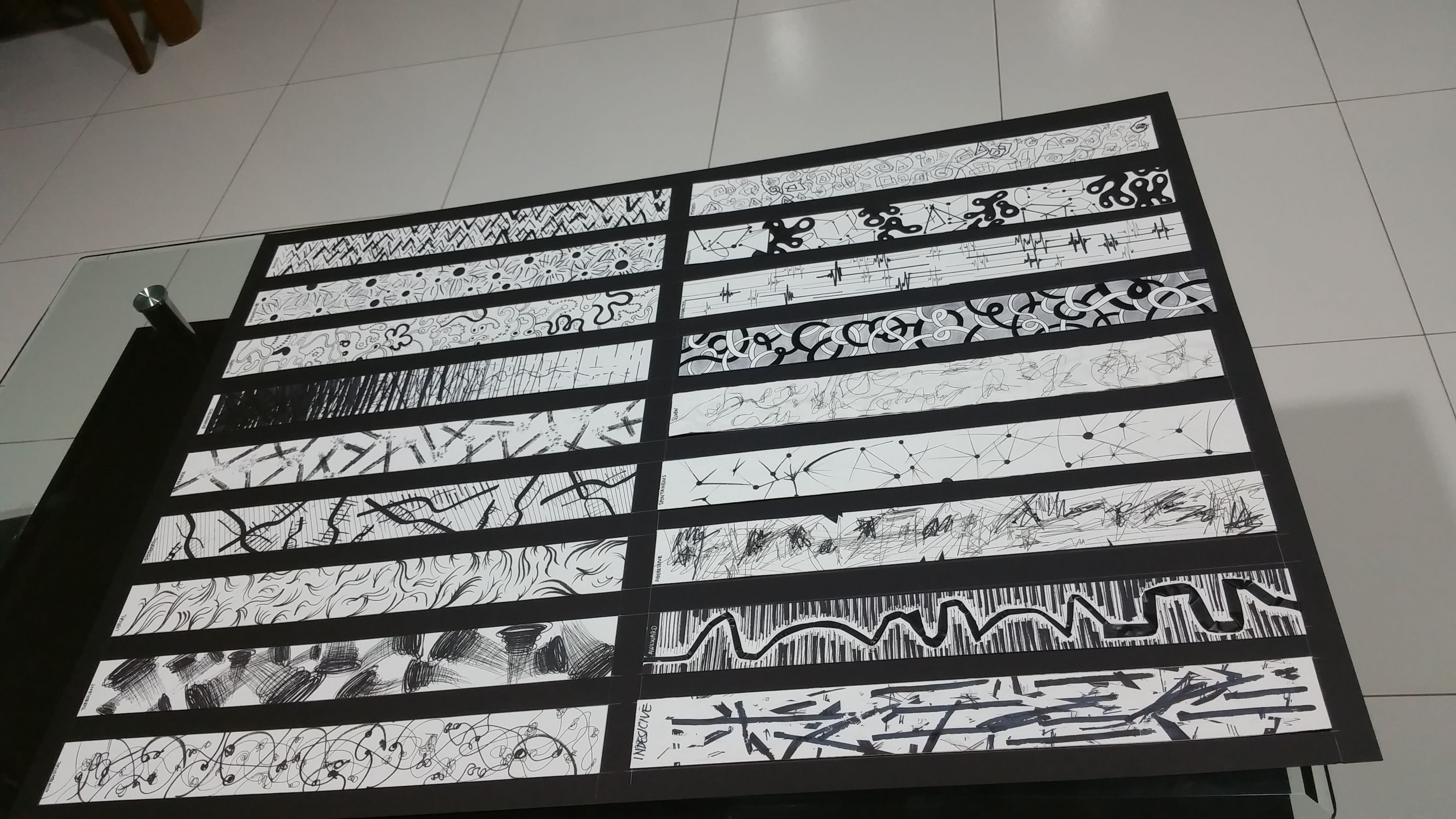
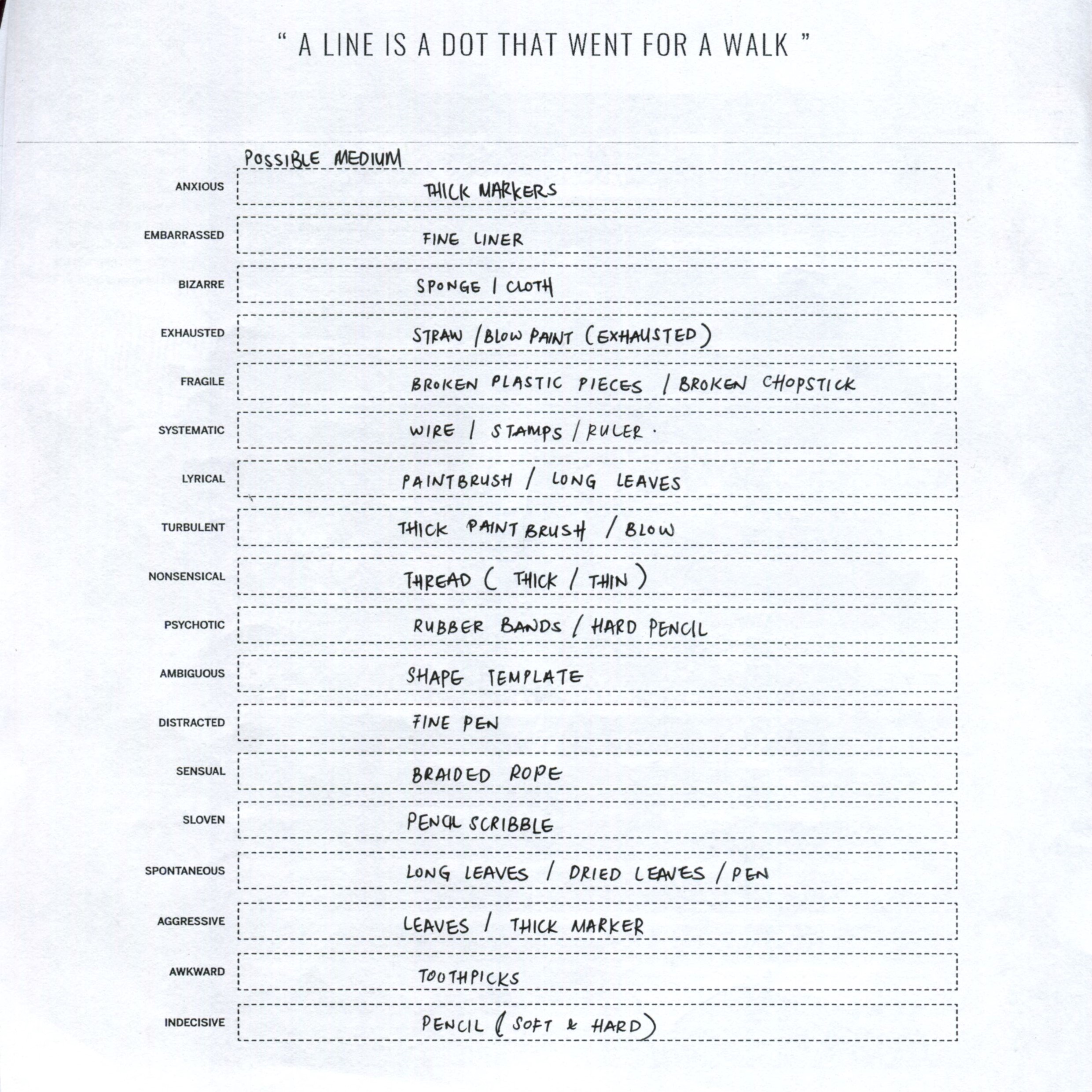
Ideation Sketches.
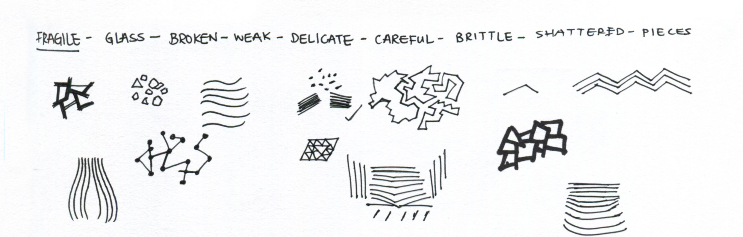
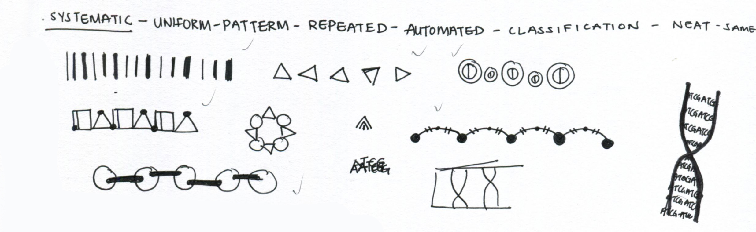
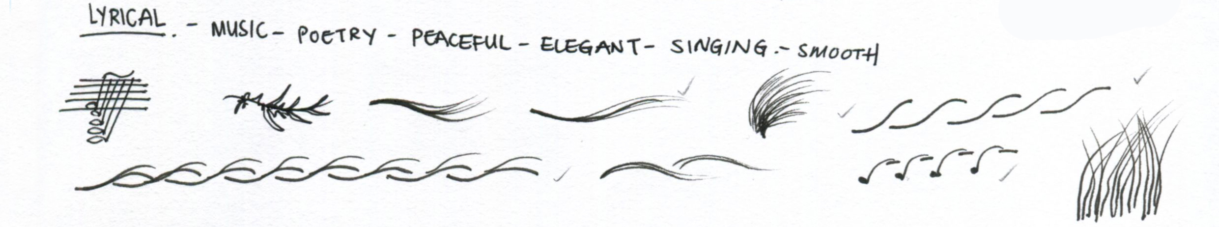
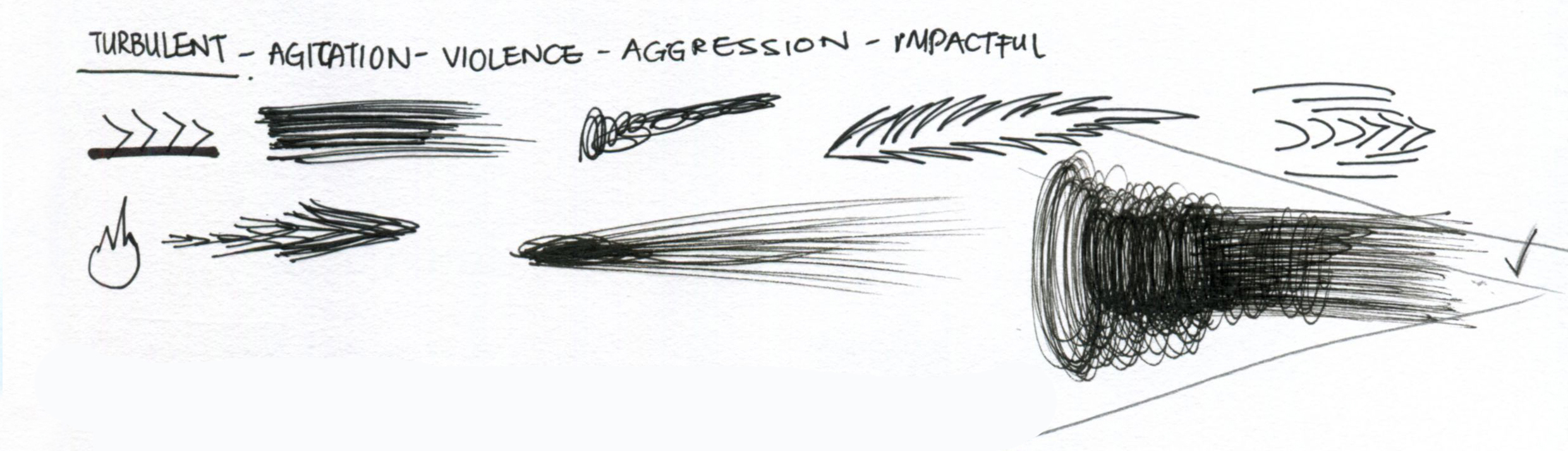
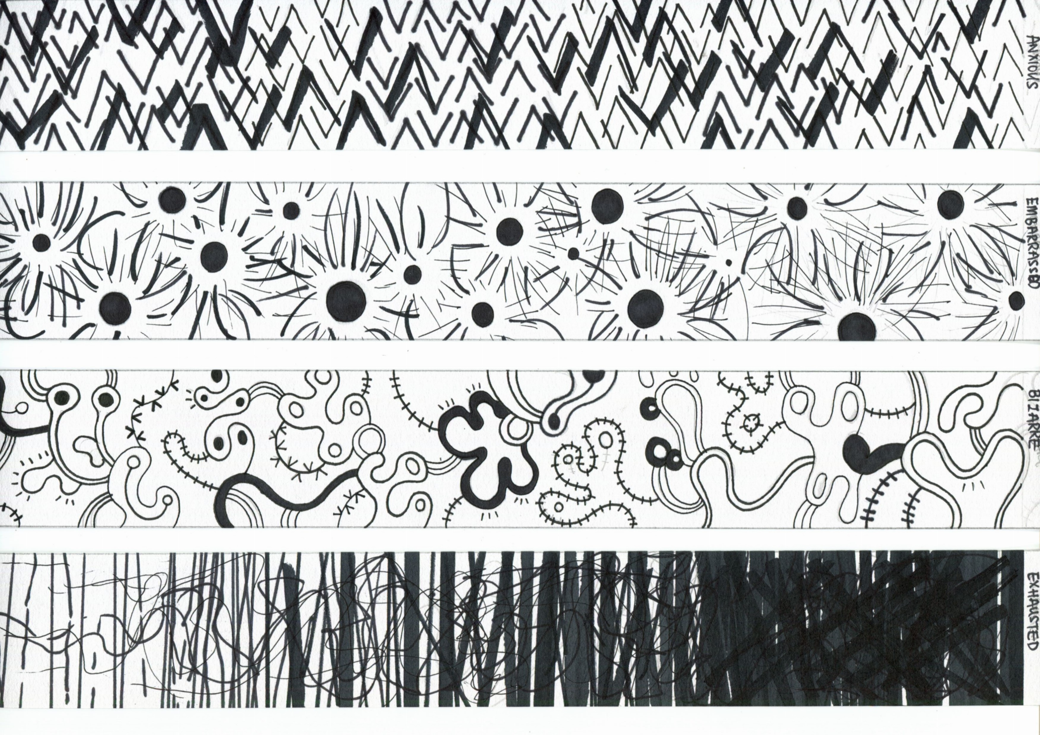
What defines ME?
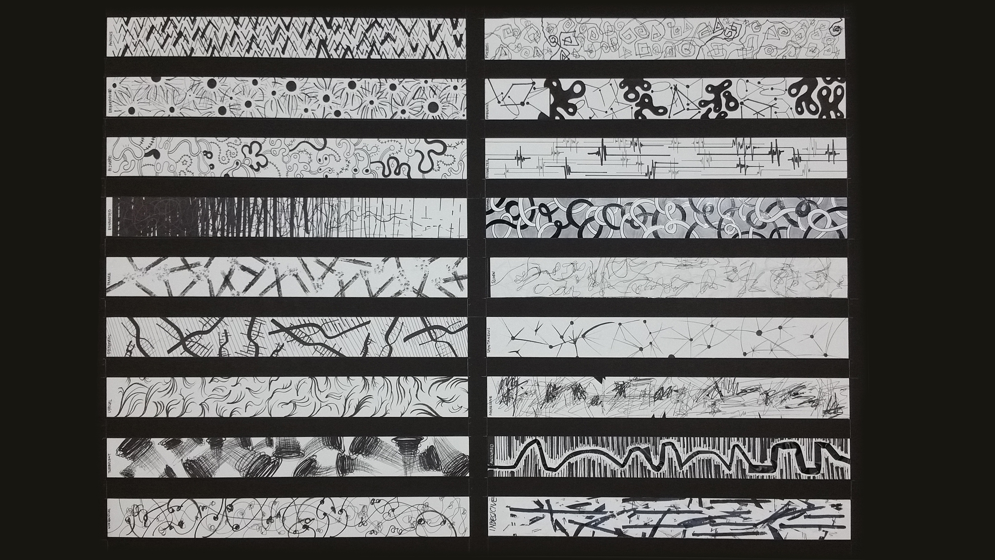
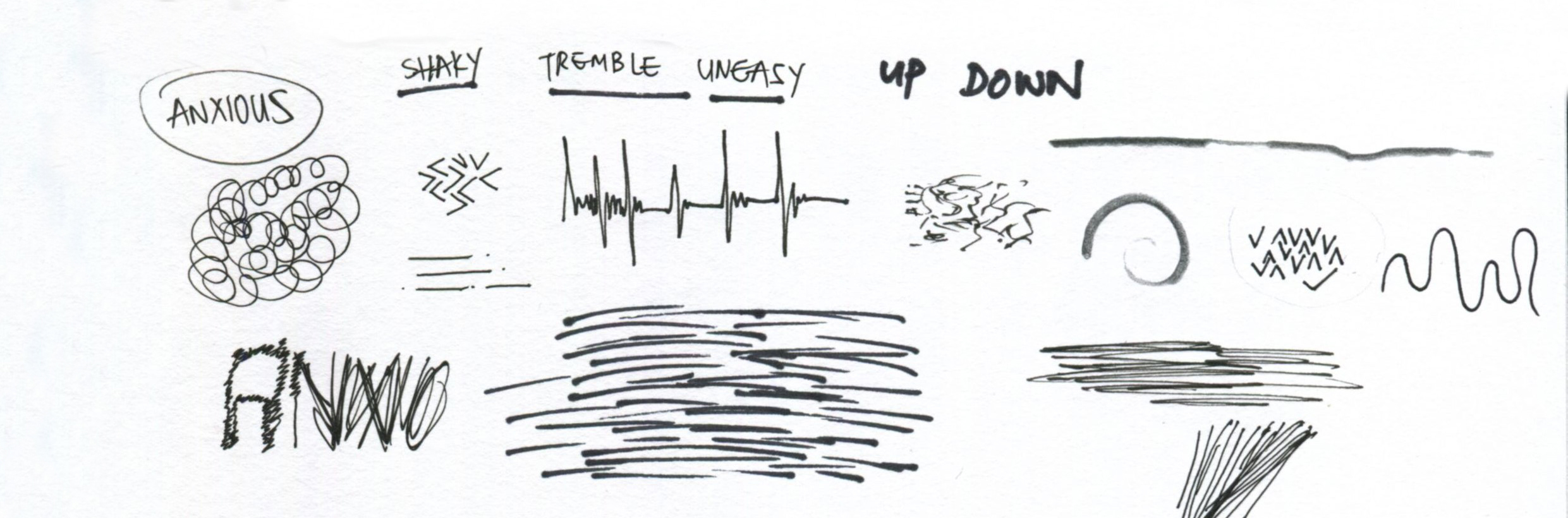
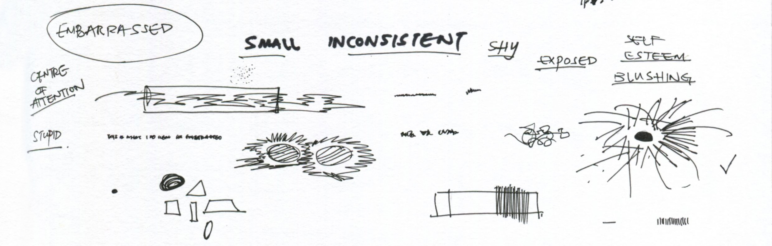
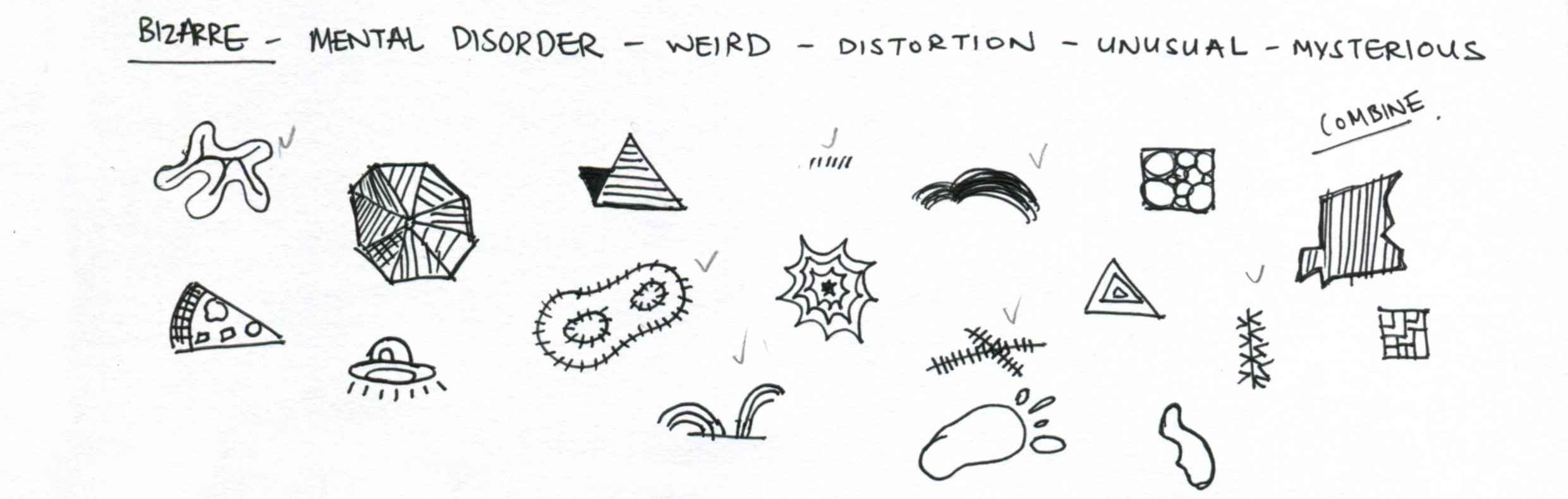
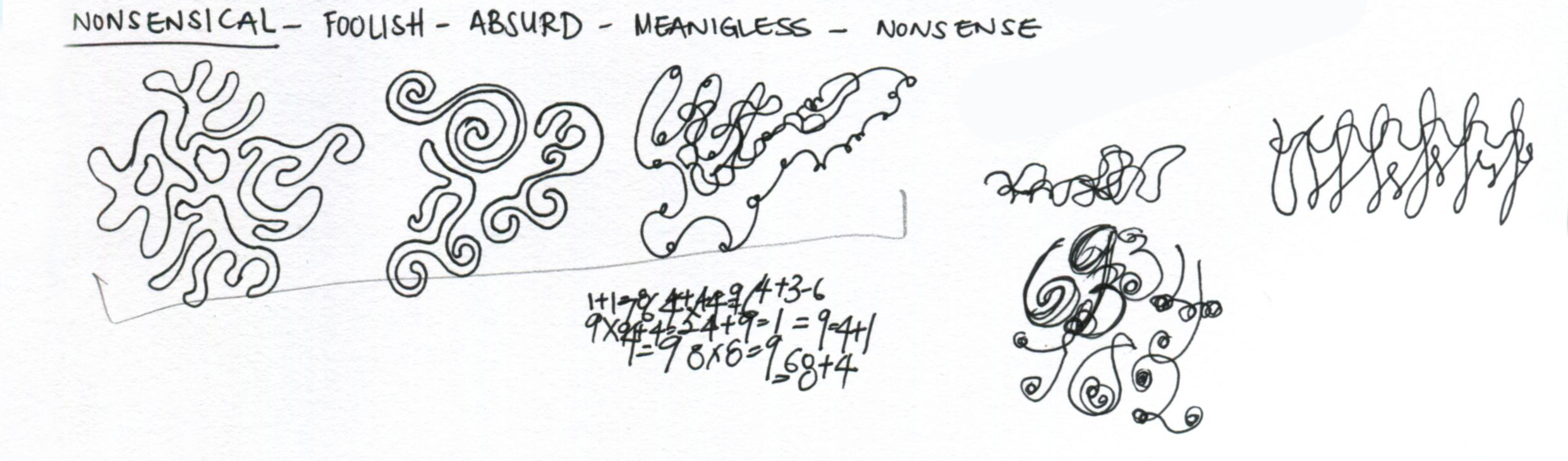
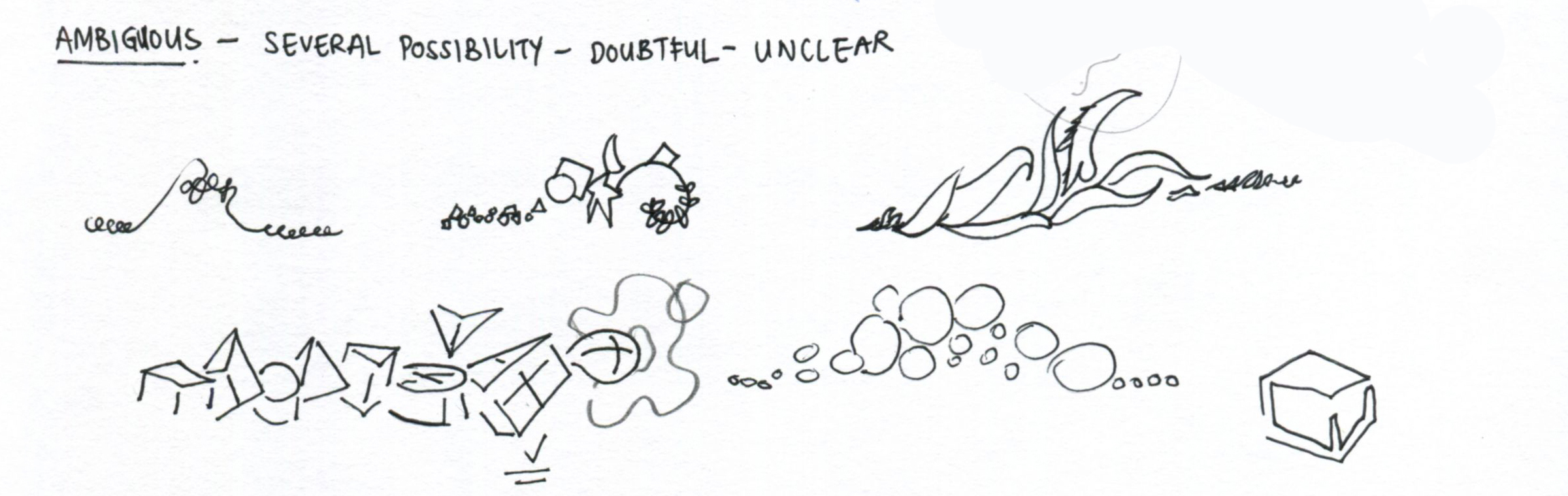
I started off with doodling down what would actually define me as I thought it would be easier for me to narrow down into certain details if I wanted to. By doing this, I wouldn’t be restricting myself to what I think, but I would also have a wider range of directions that I can move towards. With these keywords, I am now able to filter and pick out those that I actually feel that it would be nice to develop them into visuals.
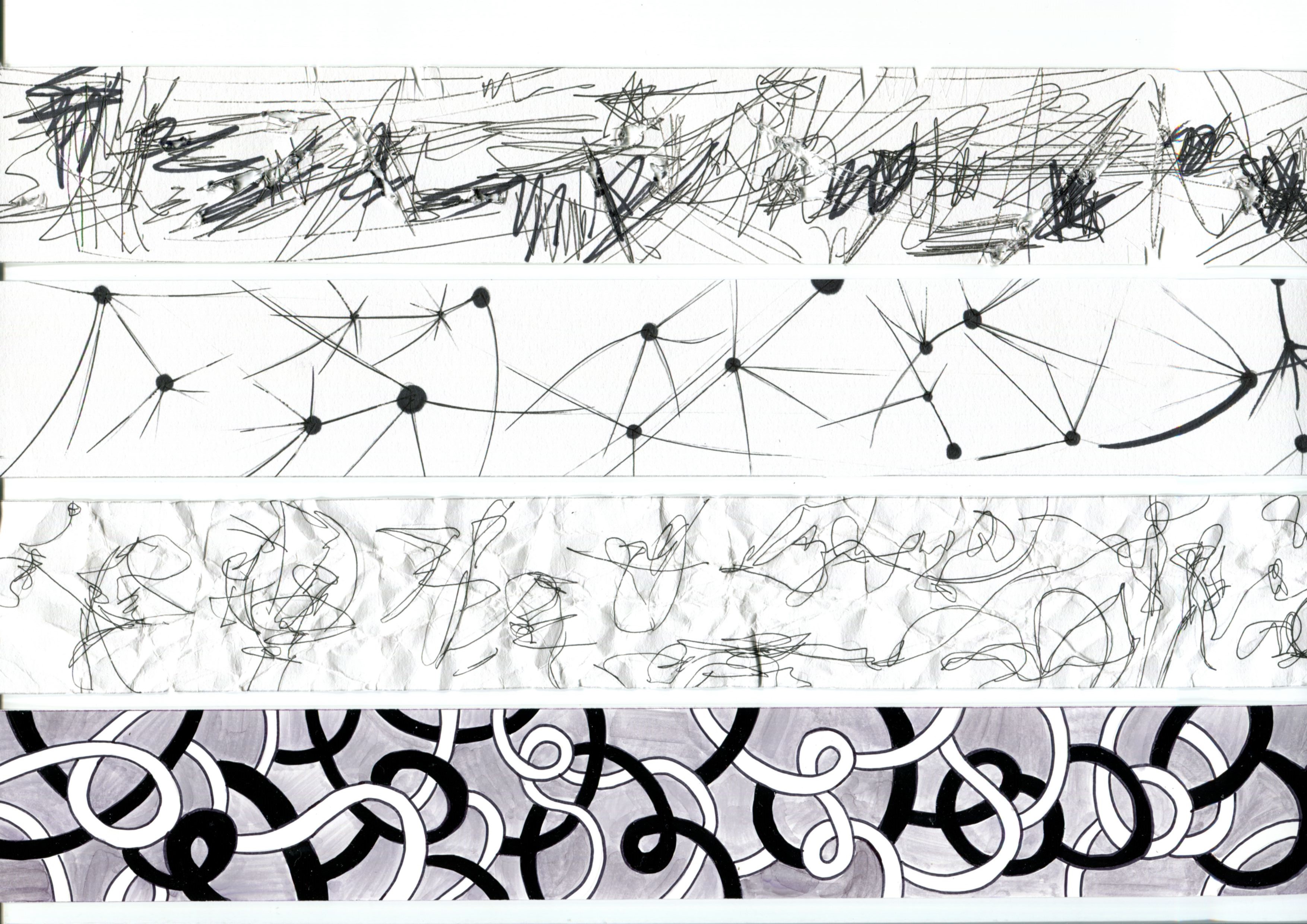
Thumbnail Sketches

After this sketches, it’s time for me to move on to more detailed experimentation on how I want my definitions to look like as an equation.
HERE IT IS!

nah, there’s no pizza.
BUT THERE’S ME!
To define me, I would say that it is a combination of hobbies and creativity. I have a lot hobbies and interest. The main ones being shoes, cars, gadgets/ technology and most importantly, basketball. I love to collect shoes, especially limited edition ones. So many shoes but so little money right? As for cars, I like to look at how a high end luxury cars such as Lamborghini, Ferrari are being aesthetically designed. I also collect car models as a hobby. Lastly, technology is one thing that I would be constantly be updated with as I love how technology has evolved and advanced throughout the years as well as the significant breakthrough each time it improves.
I designed the hobbies panel in a diagonal manner such that it shows movement, complimented with the blurred basketball texture. The three different ‘balls’ that are about to be scored into the hoop signifies the aim I have in my hobbies: To collect a lot of shoes, get more car models, as well as be a tech-savvy guy.
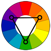
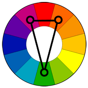
Colours used: Complementary colours (Orange + Blue) on Black.
Being creative with whatever I do is something I like. Having knowledge on design prior to University, I’ve grown to think out of the box, looking at things from another perspective. Rather than dull boring books and studying (i don’t like to read), I have this light bulb that stands out in orange and blue, containing all my creative materials; including coffee.
Colours used: Complementary colours (Orange + Blue) on Black.
What happens when you add hobbies and creativity? You get ME! Using a pencil to form the lines of a basketball on the light bulb rocket, it’s prepared to launch my potential in my world of basketball to greater heights!

A Better Me.
Time management
No one is perfect. But there will always be room for improvement. I am someone who loves to procrastinate, which I believe a lot of us do. Hence for this equation of a better me, would be based on Procrastination. Usually, and normally, we would not be given only ONE assignment to work on. When there are a lot work given to me, time management kicks in and I am really very poor at it. When I have poor time management, I tend to procrastinate. All the time. There’s always tomorrow right? Well, sometimes it kills. Poor time management would result my work progress to snowball and accumulate to a point of disaster: sleepless nights. At the time management panel you can see a small clock at the corner with broken pieces, me leaving everything for tomorrow and a mess of work accumulating and I seem to be running out of time.
Procrastination
So I figured out that I would have to take out something, or make 24hours to 48hours in order to improve myself. But taking out something would be easier I guess? Then I would say I will minus procrastination. Without procrastination, I will have more time for work, do my work today instead of tomorrow, and also have my work planned nicely.
Better ME!
As the equation suggests, after removing procrastination from my already poor time management, I would be able to be a better person, at least in terms of how I handle work and stress. In the panel, it shows a better me with orange rays signifying enlightenment and a clock with different books in stead of number. This is to show that I have planned my time well and I have my workload distributed properly.
Colours used: Complementary colours (Orange + Blue) on Black.
Next up: An IDEAL Me!
Detailed Planning.
For this equation, I decided on what would be an ideal me, as a designer. Personally, I like to plan my things ahead of time. I would plan for the whole week on Monday, this is what I usually do. With a calendar as a backdrop to show my planning habits, I also illustrated a pie chart divided into different parts to depict the amount of time spent. The majority green shows work, the bigger orange part shows my social interaction and the smallest orange pie, rest and sleep. Well, designer don’t really sleep. Green gives me the feeling of having something accomplished, and orange gives me the feeling of comfort and rejuvenation. With me holding the pie chart, I hope to allow viewers to know that I am in total control of my won work rest cycle, on top of my planning habits.
Networking.
Networking. Yes. Without networking, to me, it would be very hard to be successful in anything that we are trying to achieve. For me to become an ideal me, I believe that I would need to improve on my networking skills. Networking skills like talking to people, pitching my ideas, presenting my works, public speaking, and coffee. I have centralized myself in the middle of the square, forming a triangular composition, it directs the viewers to me right away with the added help of a bright gradient background. My multiple hands shows me trying to gain a wider network of contacts, which I believe that is very crucial for me to be successful.
Ideally,
I should have more contacts (people shaking hands with me) and confidence, get better at talking and all other kinds of presentation skills. I feel that networking is very important no matter what field we are in. It is the door to endless opportunities, be it opportunities we provide, or be it opportunities that come through the door. Again, I’ve used triangular composition, with all the different handshakes leading to me, complemented by a bright blue background.
LAST BUT NOT LEAST!
well, it’s good to have dreams right?
Here’s what I want to be in 5 years.
Realistically, in 5 years’ time, I would have graduated from school and SHOULD have a year of experience in the industry. But what would I want to be in 5 years? Allow me to elaborate further…
As mentioned previously above, networking opens up a window for opportunities. So what happens when you come across opportunities? GRAB THEM! There may be a lot of opportunities out there, but if I dun grab them, I might never ever get to. In a clear blue sky full of hope and opportunities paper planes, I am grabbing onto one of them and yes, that’s a good move to make.
Right, I have an opportunity to work on something, what’s next?
DO IT!
I believe anyone in the creative industry would know that when there are assignments and projects, there are hardly any sleep. No such thing as day and night. So when I have the opportunity to work on a project, I would definitely prove my worth. How do I do that? Hard Work. Working in the day and night, trying to get the best out of my work would what I see myself be doing in the 5 years to come. With me making up a triangular composition, the differentiation of day and night is illustrated by splitting the image into two different shades of blue which I hope to give viewers the idea of me working hard through the day and night.
Me in 5 years?
Upon imagining myself having to work for at least a year after graduating, I feel that I should have a certain level of skill sets built up, as well as a wide range of network. That would also mean that I would be slowly gaining experience on all sorts of people, work, and also gone through a hell lot of shit the culture of working creative industry. With all the hard work I put in, I believe i can fly that I would be mature and strong enough to be a product designer of my own, and also have my own set of thinking and skills as a budding product designer.
And that’s me ! To sum it up, I feel that I am able to convey my thoughts more effectively through visuals and I am also very happy with the final work that I produced. Thank you Shirley for your guidance. It has been a wonderful semester. See you next sem!

Final Artwork.