Okay, this is going to be a long post. So prepare your popcorns, the show’s starting!
PRESENTING TO YOU: Monochrome to Colour!
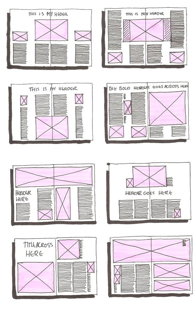
 In the front cover, a very simple layout is adopted. The title is framed up by a rectangular outline. It was initially a bold straight line, but taking a step backwards and looking at it, it felt very rigid and boring. I went on to trying out different stroke styles and finally decided on this one. It gave of a very sketchy impression, which totally fit into this cover page.
Also, in the front cover, the splatter-like background is actually taken from the first project we did in 2D, Lines. What I did was to scan in the works, and then selected a few to develop on by making it into a vector file, so as to eliminate the possibility of it being pixelated as I will be playing around with the scale of the texture.
In the previous post, I mentioned about using ‘handwritten’ fonts instead of clean and formal fonts. Indeed, using ‘handwritten’ fonts fits into the zine better as compared to using san serif fonts. However, I have also tried out different kind of ‘handwritten’ fonts before deciding on this simple ‘handwritten’ fonts.
IFC & Page 1
 Moving on to the IFC, it is kind of a mini introduction about myself. Laying then into three panels, with round text boxes placed at the thirds of every panel, it leads the eye from ‘text to image, down to text then image, then to the large image dominance of the last panel then to the text’. I post-processed the images to be de-saturated, near to monochrome, as I did not want it to be the main focus of the zine.
1st Panel (ALCOHOLIC)
If you haven’t known yet, I LOVE to drink but I AM NOT AN ALCOHOLIC.
This is the text which is in the description box:
People might call me an alcoholic, but the fact is, I’m not! Personally, I just like to try out different brands of beer, as well as appreciating the aroma, fragrance and the after taste of beer.
2nd Panel (AUTOMOTIVES)
I love photography, and I believe a majority of creative people love it too. However, I have a side hobby other then photography, and that is to photograph super cars around town.
Text:
I have a part time hobby, and that is go around town and hunt for supercars.
3rd Panel (SNEAKERS!)
Well, I LOVE SNEAKERS. Do I need to say more? 13 pairs should explain everything I guess?
Text:
Since young, I have been obssessed with the beauty of shoes, and how shoes can complement a set of outfit. Till date, I have a range of collections with 13 pairs of shoes.
Page 1
Moving on to the first page, it is about me going into university after polytechnic ans National Service. The background in first page are actually the sketches I have done back in Poly days, while I was in Product Design. It fades in from the IFC, so that it leads the viewer to the first page after reading the IFC.
The text box and heading is centralised as it is sort of an introductory description about me enrolling into university for further studies. I did not really want to clutter the page with images as the background is already one with plenty of sketches, which was sufficient to fill up the page. The heading and text in the middle would supplement the page and it feels complete just like that. Again, it is in monochrome, and I used white font on a grey text box, such that it separates with the cluttered background.
Here’s the text:
After spending three years in polytechnic, followed by two years of National Service, it was time for me to further my studies. Hence I applied for university.
All that i have achieved in polytechnic would now become a thing of the past, a fond memory which will always stay with me.
Moving on to university, it would be a whole new exeprience i would say. From meeting new friends from different backgrounds, learning new skills as an undergraduate, to looking things at a whole new perspective.
 Page 2 & 3
Right smack in the middle of the zine, pages 2 and 3, talks about the transition I have into university. This spread would be the last pages that are in monochrome. Shall not bore you guys with the words, as I will be putting them below.
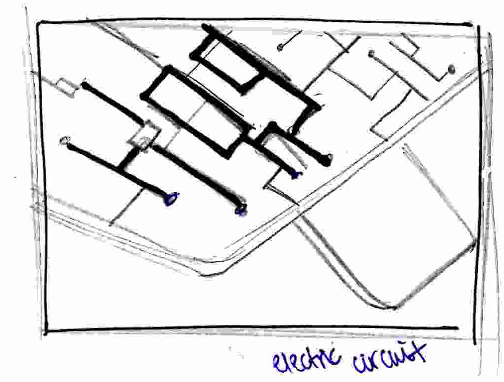
In terms of the layout, I chose my 3D project to fill up the whole spread as it would be interesting to have a huge image to showcase the details in my model making. I also felt that this model was very nicely done and I liked it a lot, hence including this into my zine. Before deciding on this orientation, I actually did a lot of rotating in illustrator, just to look for the correct angle which complements the layout and also look aesthetically pleasing at the same time. This orientation of the image has the spiky parts pointing towards the right of the spread, which was perfect for me to add in my heading and text information. In this spread, I also used white fonts on grey text frames, as my background was dark and the texts will feel like it is floating on nowhere if there was just the texts and no frames.
Here is how I feel when I first started University:
Initially, I thought university would function like how any normal polytechnic would.
I have never been so wrong in my life.
University studies felt more independent, where one has to plan his own timetable, and take responsibility for his own education. I have to admit it was quite a culture shock for me at the start. However, as time passed by, things took a turn for the better with the help and advise from my friends.
If one were to ask me how I survived the first foundation year, I would say it was my friends who motivated me to push on.
Why circular text boxes in my pages?
In my IFC , pages 2 and 3, used circular text boxes as I felt that the images used were not very ‘loud’ and it would look super boring if I were to use rectangular boxes to frame up my texts. By using circular text frames, it would make subject more interesting to read and it is also pleasing to the eye.
 Page 3 and IBC
-Page 3-
Finally some colours! This the last part of the transition, which is me, currently in university. By monochrome to colour, colour means the new perspective I have seen in University as compared to my past, and also the things I have learnt in the foundation year itself.
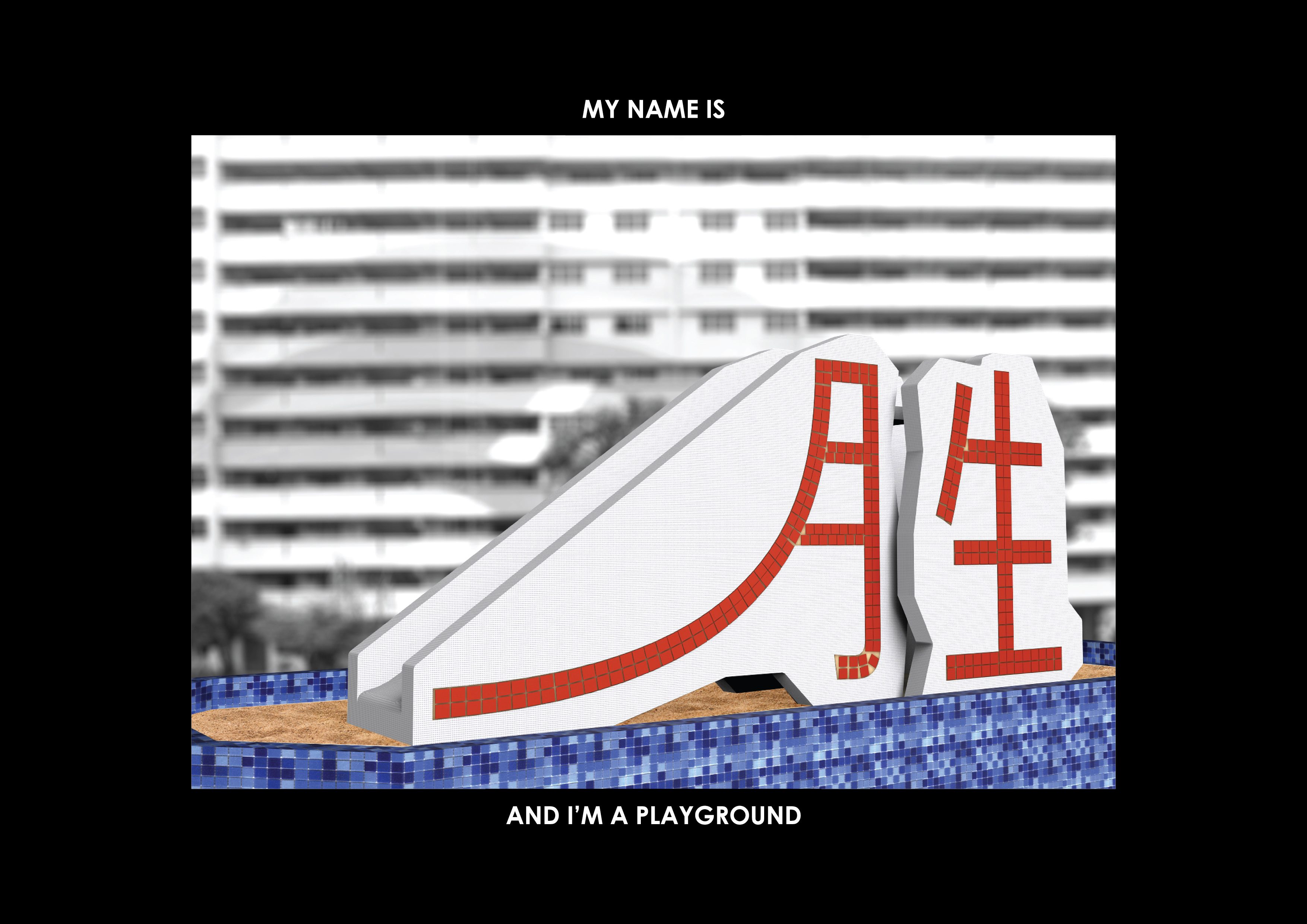
In this spread, it is a shared spread. The layout style is similar to the previous page, but this spread has a strong separation. In the middle of the page is from a 2D project, Typographic Portrait, where I am a bottle opener. As a product designer, naturally I will like things related to products. Another reason for selecting this to be in the middle is the symmetrical aesthetics it has.
In Page 3, the man with angel wings is actually me, popping out from the corner of the page. By having ‘me’ popping out, it symbolises ‘me’ reflecting on my foundation year and my experience in university.
So how do I feel about the upcoming years in Uni?
It has been a very fun and interesting foundation year for me, despite all the whining to each other about the lack of time we have for our projects. Well, these experiences are just part and parcel in the life of a arts/ design student isn’t it?
I find it amazing where so many different designs can be produced, when the same brief is given to everyone. This is one of the reasons why I chose to continue doing Product Design. I feel that through different design outcomes, one can actually see the thought process of an individual.
Looking forward to the upcoming year in university, it would definitely be rewarding in terms of experience, and I would certainly be excited to meet new friends and learn from their experiences.
-IBC-
In the IBC, there is a lightbulb vector again, popping out of from the corner of the page, with a rectangular text box on top of it. It talks about the different people I have met in University, and my excitement to meet new people and gain new experience. With similar styles in the two pages/ one spread, there is a focus on the text boxes, which leads viewer to the images below it. I felt that this composition is more of unique? Usually I have images leading to texts, now I have texts leading to images.
Do I feel excited for the upcoming years?
In this foundation year I have interacted with people from different disciplines, made friends who had strengths in different education aspects. It was really an eye-opener for me as I was able to step out of my comfort zone, allowed myself to observe and learn these valuable skills from them.
Graduating from this foundation year and advancing to specialisation, I believe that I would meet more people from even more interesting backgrounds, as well as gaining more exposure to the real working world.That being said, I am also prepared to step out of my comfort zone to accept the challenges I have in the upcoming years of university education.
*Fun fact: The background is also taken from the ‘Lines’ project!*
Realised that it isn’t circular text frames on both pages anymore?
Reason: These two pages are very heavy on imagery and graphics, I felt that it could actually strike a more balanced composition using rectangles. It could work with circular frames, but it worked BETTER in rectangles.
LAST BUT NOT LEAST.
BACK COVER!

So how do I look here? Yes this is me, holding up my shirt. Before this image was a more cropped off image which didn’t sit well in the frame. After which i found this image which luckily, fitted well in this frame, creating a stable triangular composition. I took the image, posterised the images and brought down the saturation.
Having the hand extending out of the frame as an extra touch gives a more dimensional impression. I felt that it was necessary as it would actually feel very constrained if i were to fit the image into the frame entirely.
Again, the frame is also done using a sketchy stroke, and the background pattern is in sync with the front cover which actually shows a consistency in terms of style. Being front and back covers, having consistency in styles gives the zine a sense of character which I feel that is very important in any publication.
With this, I shall sign off as a graduate from ADM Foundation 2D!
I have made some awesome friends in class which I believe to be very important in the future as I would never know when I need their help with anything. I have also seen how creative my friends are and I believe that I can also be like them one day.
It has been an exciting and fun journey with Shirley, and I would have her to thank to be able to pull through this 2D module. Without her guidance and teachings, I would still be stucked in my comfort zone, not willing to try out new things in my work.
Thank you Shirley.


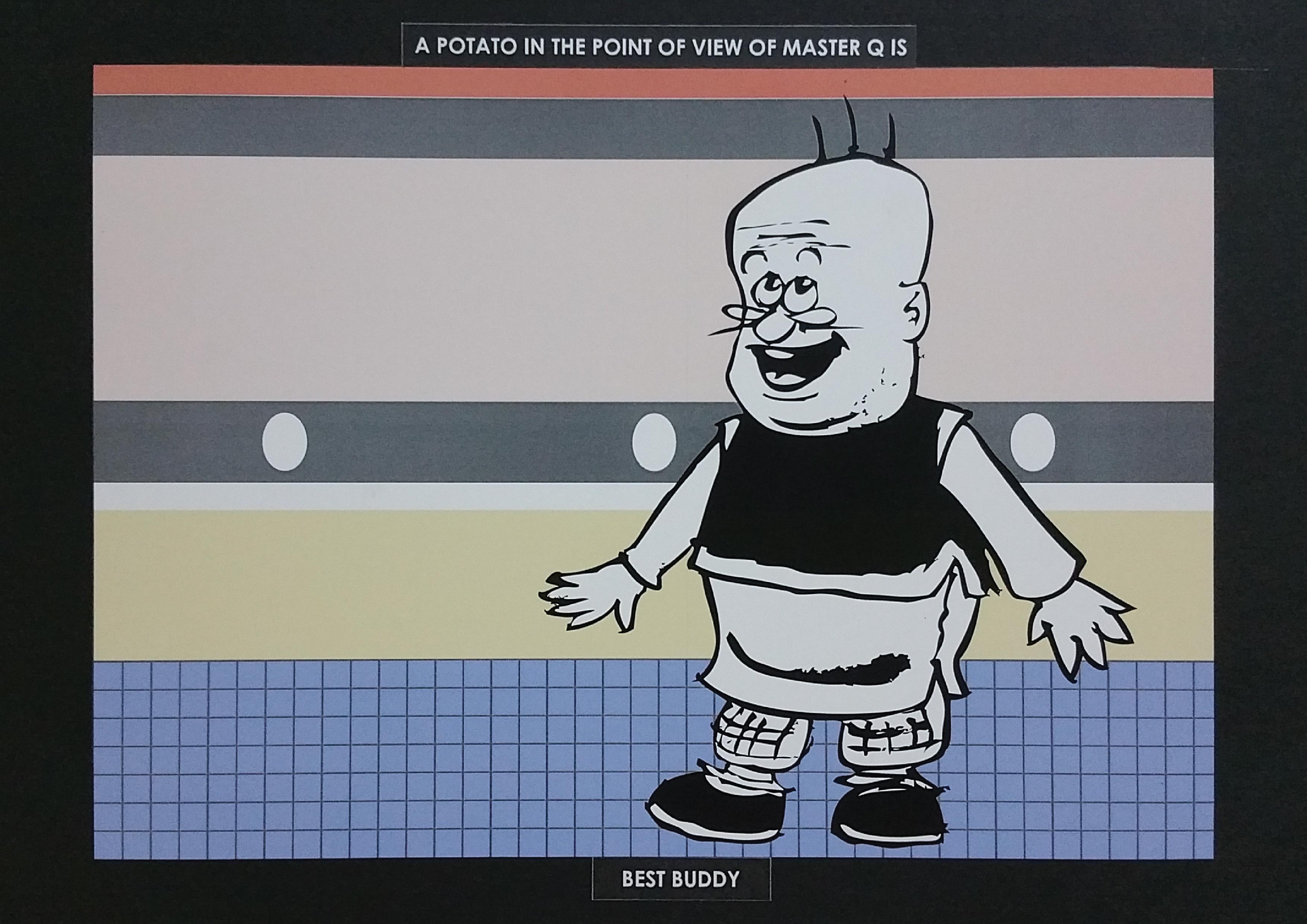
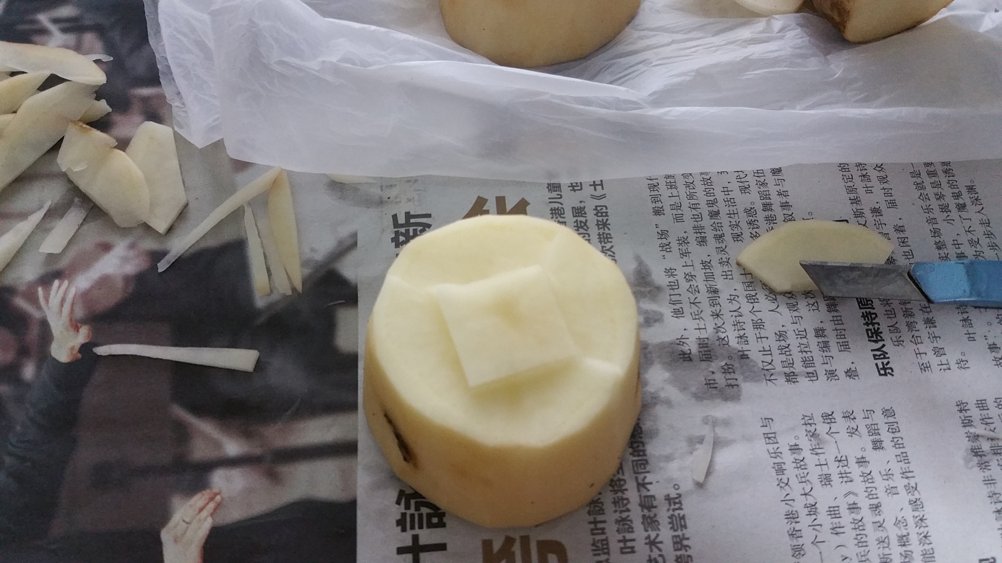
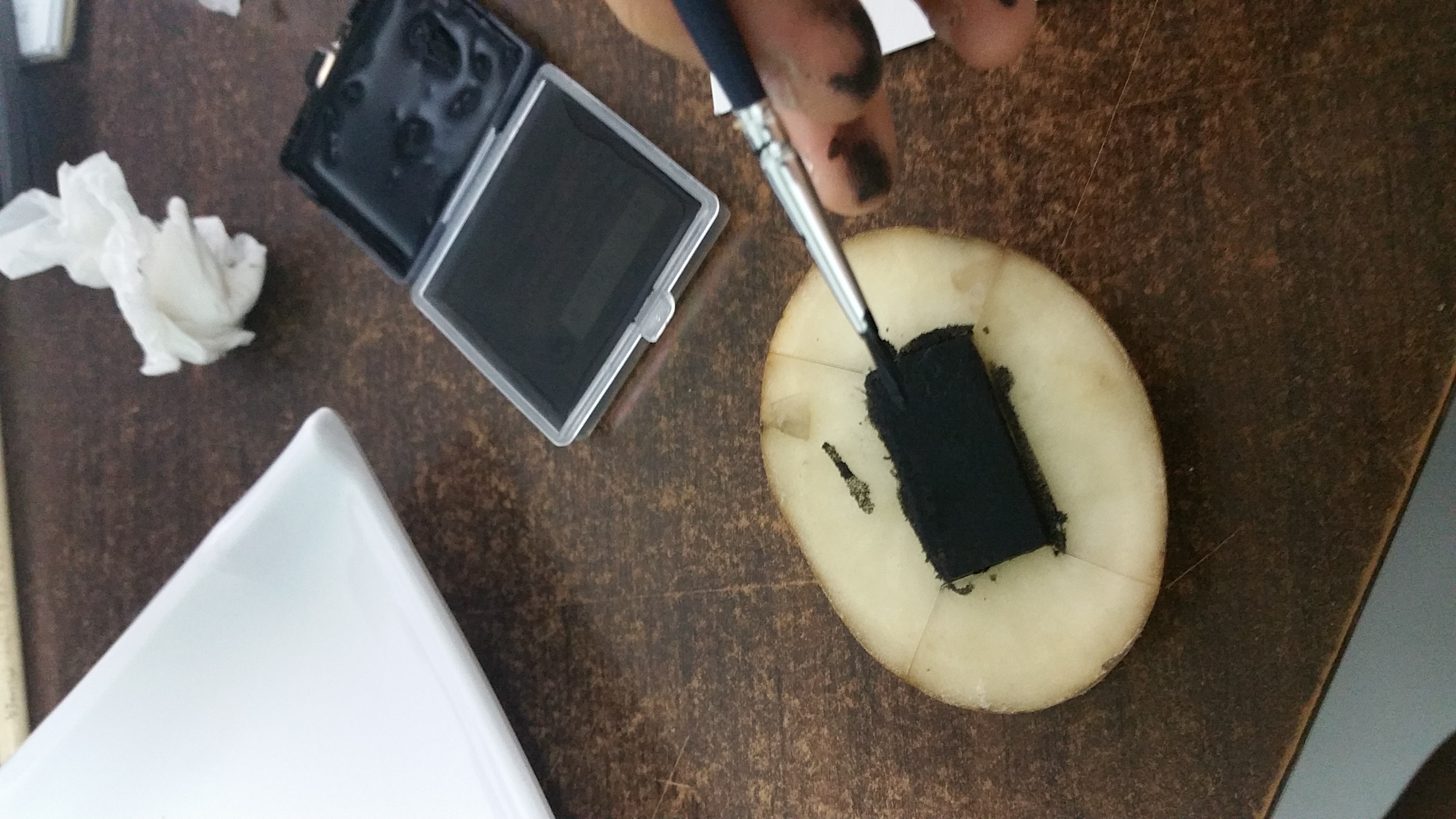
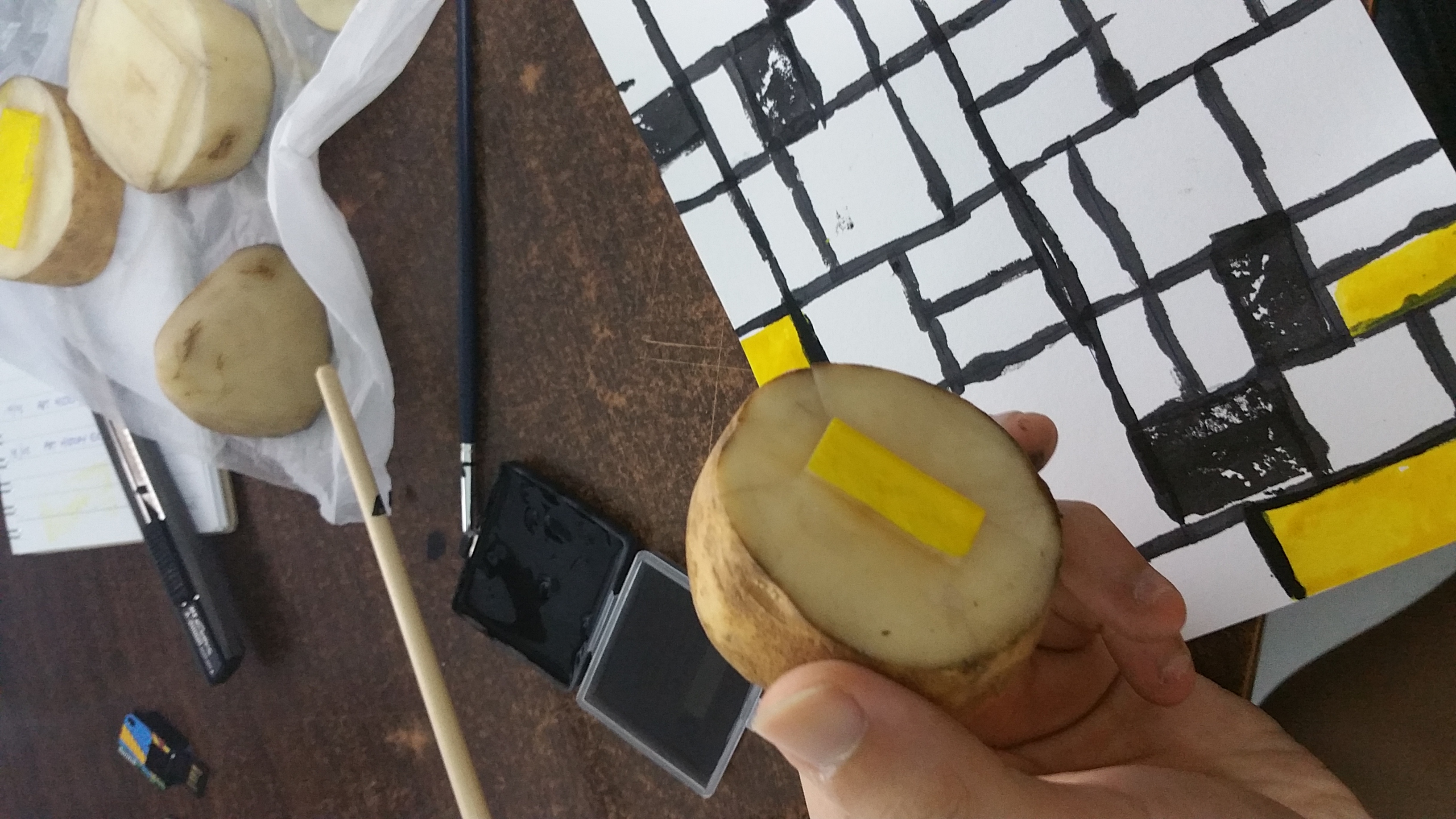
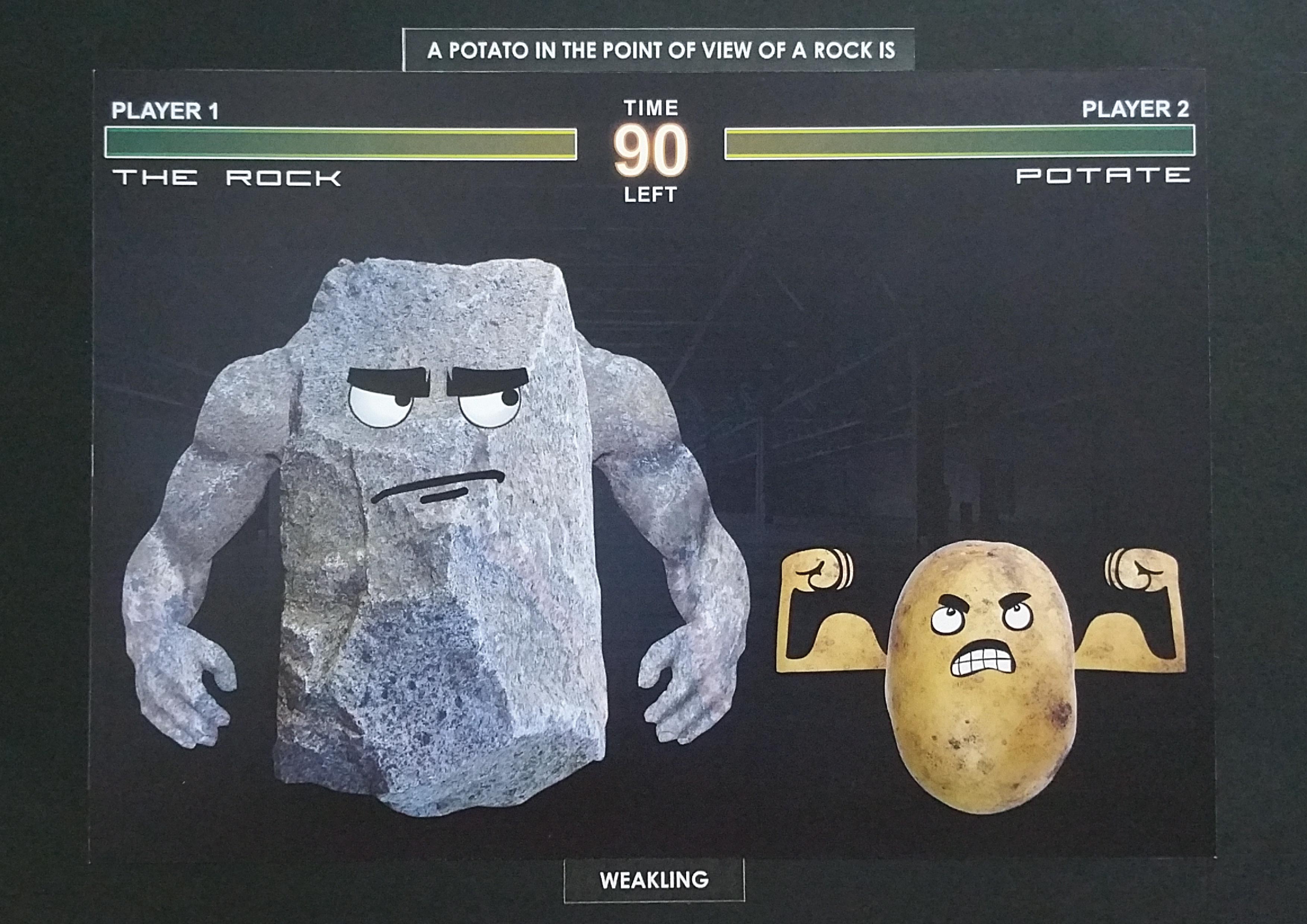 A potato in the point of view of
 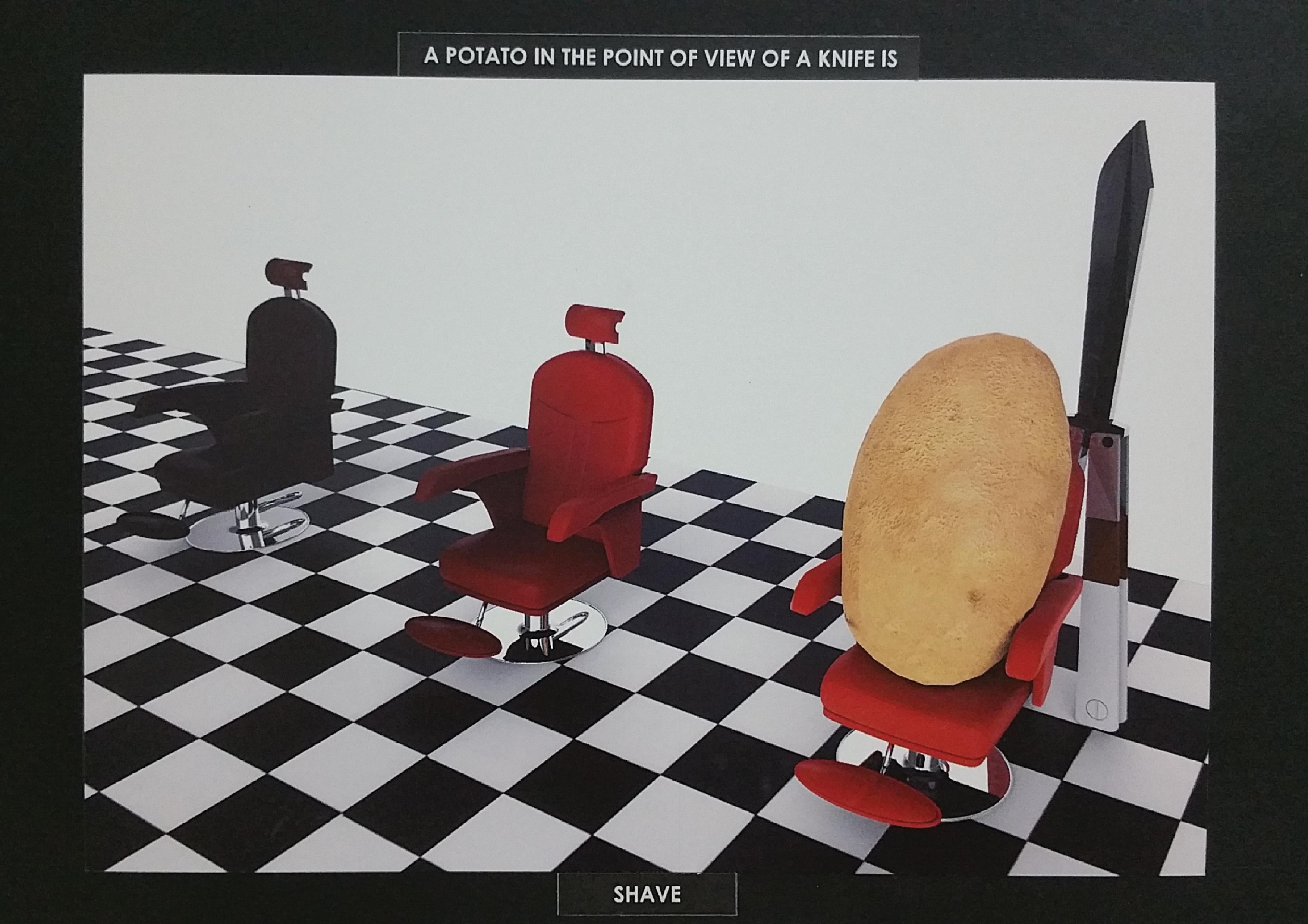 A potato in the point of view of a
 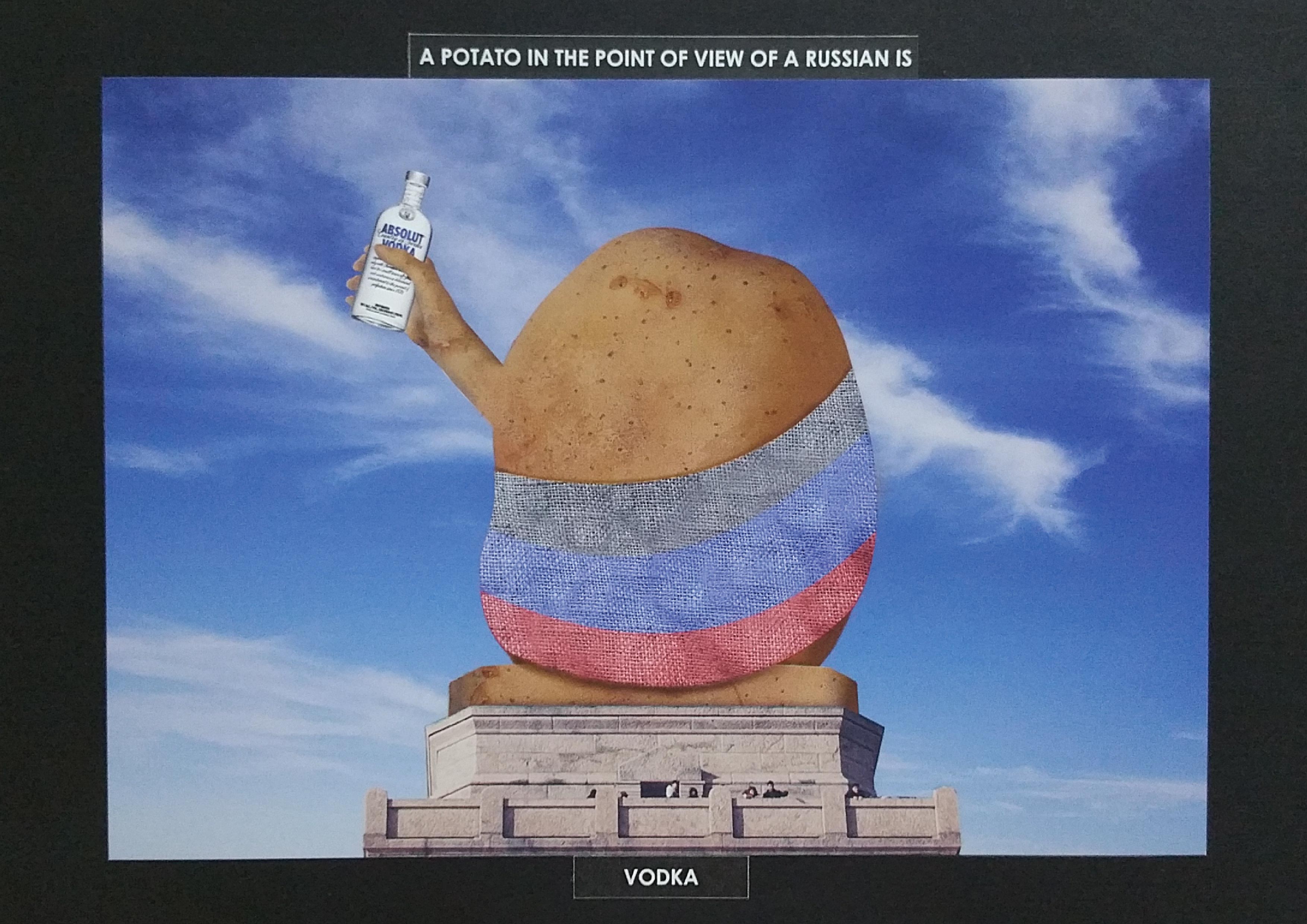 A potato in the point of view of
 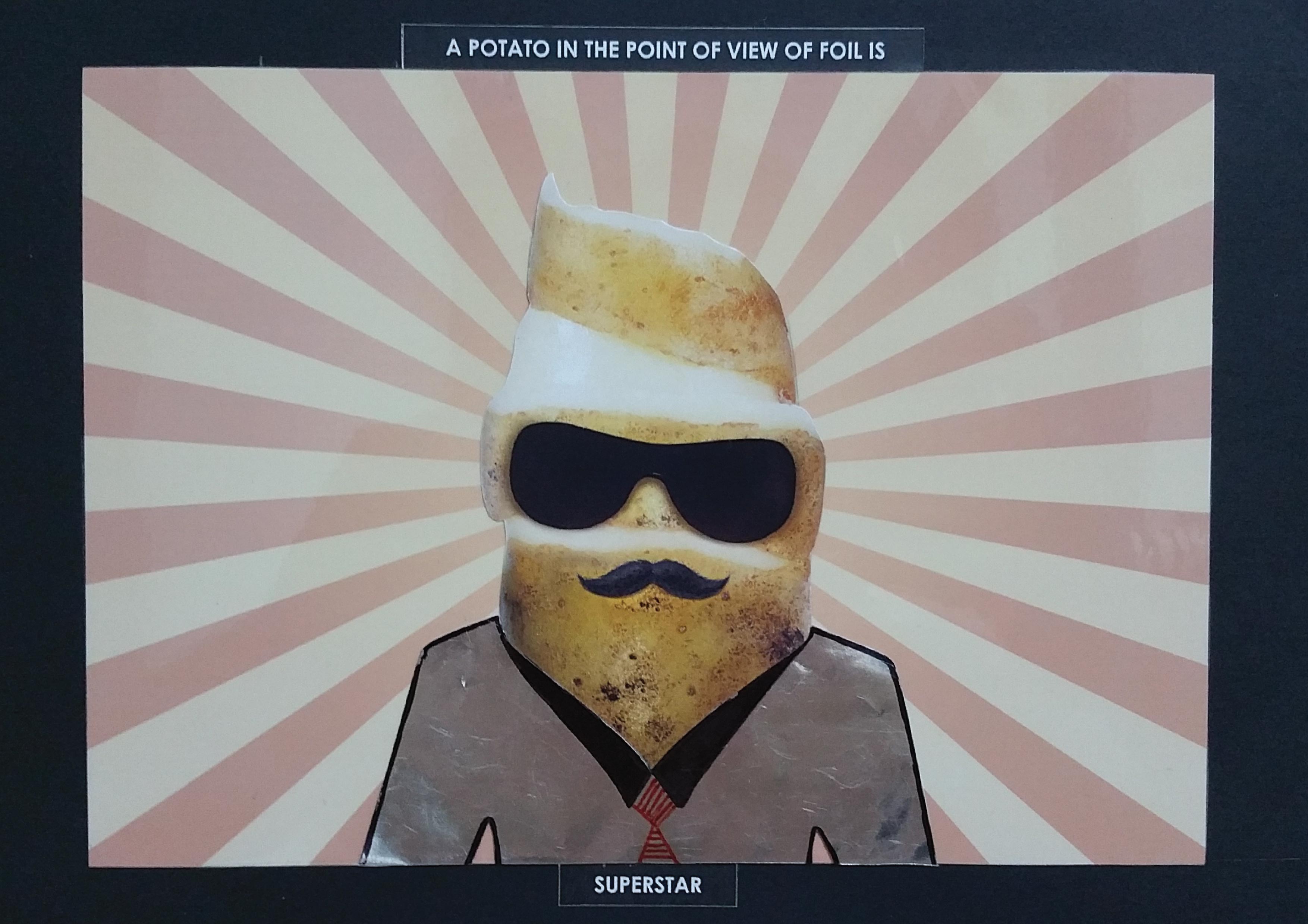 A potato in the point of view of
 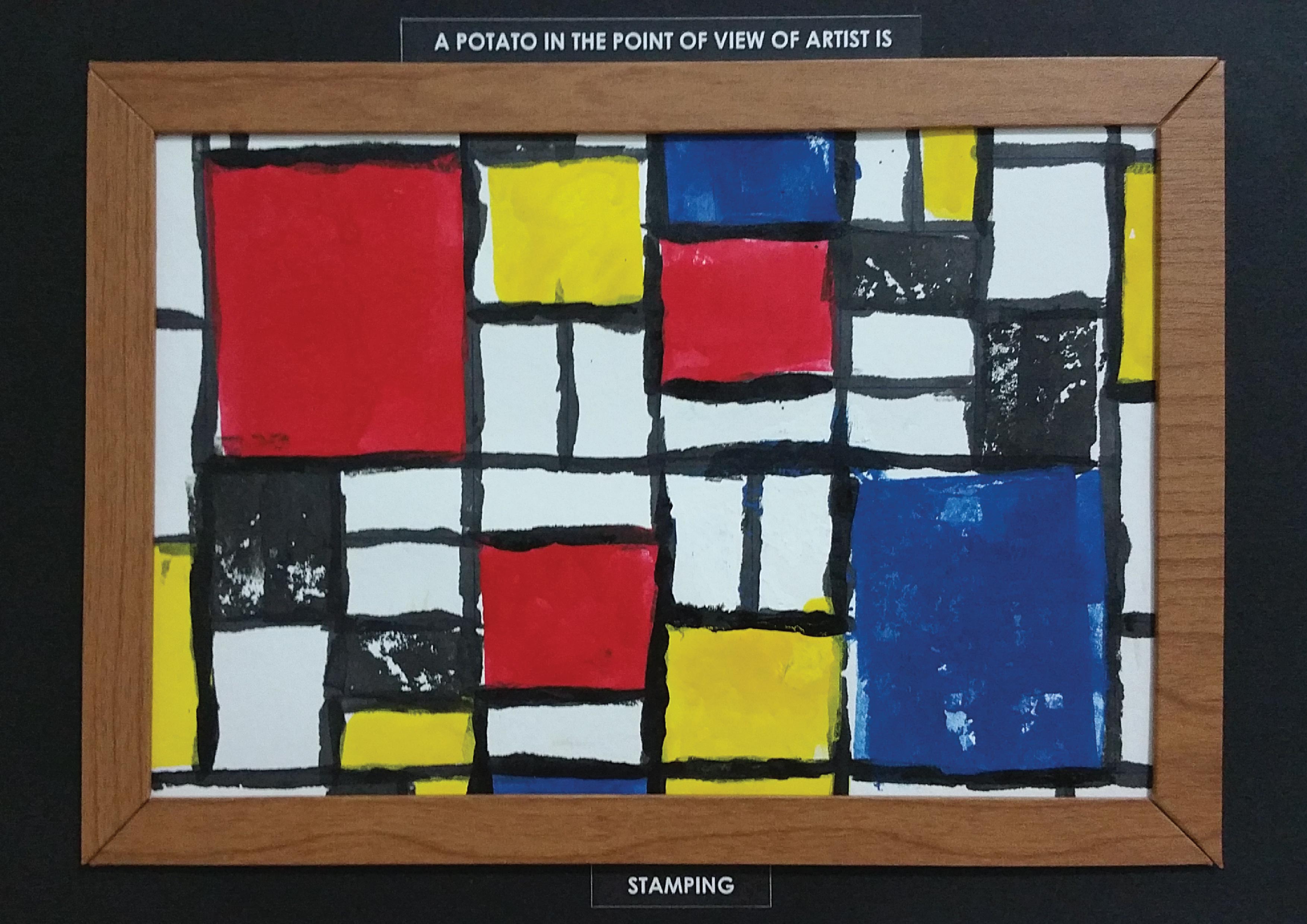 A potato in the point of view of an