Monochrome To Colour (i)

Finally the last project for 2D! TO be honest, it felt very surreal having to end the semester so soon. We were just having illustrator lessons and now I’m here updating my OSS for the last project of 2D.

So the last project for the foundation year was zine, somewhat your own publication. With that being said, it was a free brief as to the style and the kind of paper we wanted, which also means everything was up to us.

Being our ‘own’ publication of 8 pages, I wanted to create my zine with entirely works of my own. With this idea, I started researching on zine ideas where I came across alot of different creative and inspirational zines. I wanted my zine to be more minimal, large graphics and solid lines to present my works.

In terms of font selection, I thought of using cleaner and simpler fonts, but it felt very formal and corporate. After consultation with Shirley, we decided on ‘handwritten’ type of fonts, so as to bring a friendlier approach since it was a more personal project reflecting on our work.

I have named my zine to be ‘Monochrome to Colour‘, as I wanted to include works from the past in polytechnic and then transit the viewer to my current university life; as well my showcasing my works in my ADM foundation year.

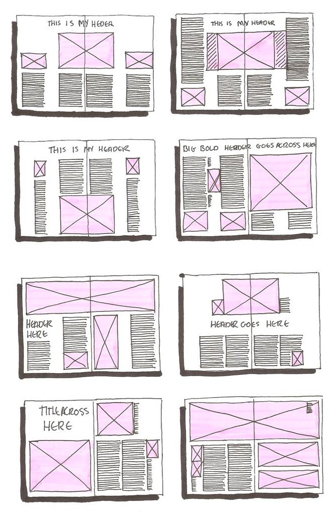
Below are some of the research and inspirations I have for my zine:

3554ca16423845.562ab84b5a12348e0cb9c57c05e85f22ec721aa4d4553layoutexampleslayoutexamples5

Together with all these layout guides found online, I had a rough idea on how I want to execute my work. But first, I had some rough sketches done up, which is what I have been doing since the very first project. I feel that by including the sketching phase in my creative process aids me alot in my development as sketching is instant and I do not need to worry about the idea disappearing just because I am stuck with the technical parts on software. And so, I went on sketching and indeed, more ideas became clearer and I found how to better execute my ideas.

To the next post please!

TIME FOR THE FINAL PIECES!

Here are the 6 final images for my project, Point Of View, with the subject as a potato.

Project 2-01
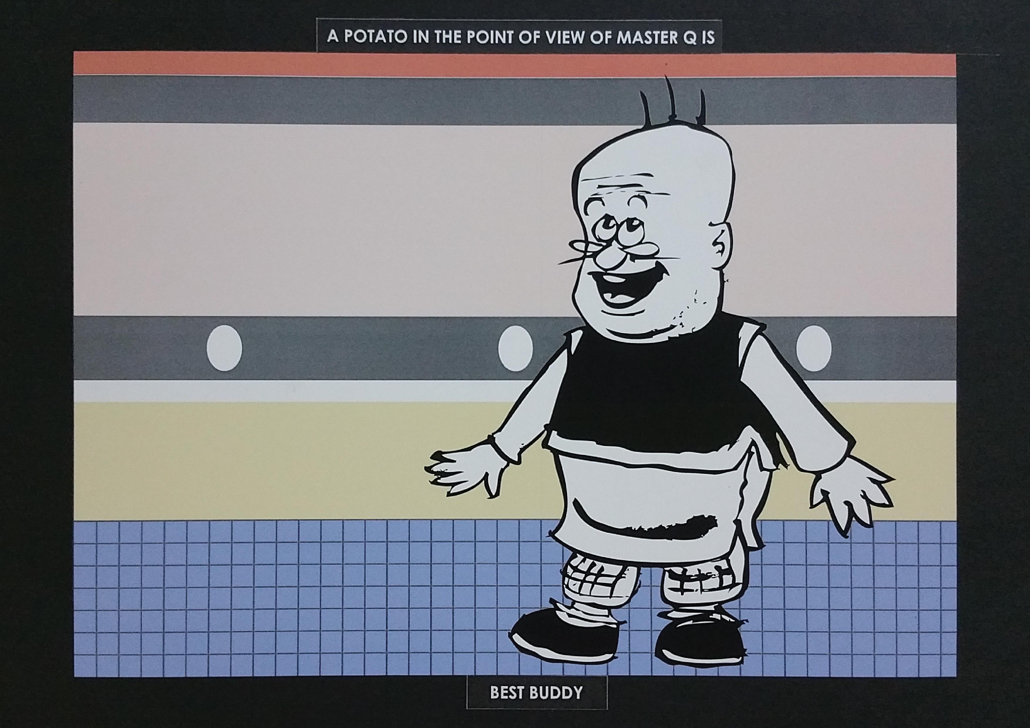
A potato in the point of view of Master Q. is best buddy.

How this idea came about as my first idea was that this Hong Kong comic back in the 90s, were all the hype. Relating this to my project, using a potato, it is a very straightforward understanding. Instead of using Master Q himself in the composition, I used the colours of his clothes, which I thought would be the most iconic feature of this character. Placing Mr. Potato in black and white would allow him to stand out from the colourful background. Another detail to be mentioned would be the placement of Mr. Potato at the thirds of the composition. This would make the image more interesting to look at, as well as showing the full details of the background.

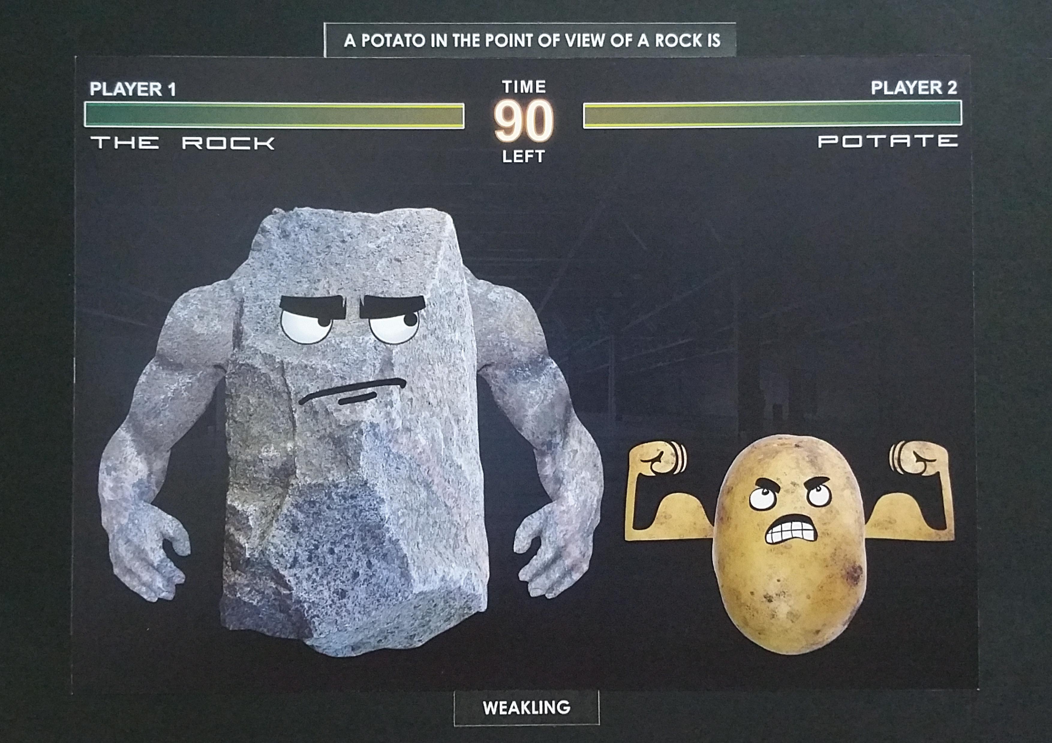
Project 2-02A potato in the point of view of rock is weakling.

Next up is a round of game fight between the muscular rock and the ignorant potato. Potato is jealous of the rock, who is so strong and tough, hence trained day and night to come to this day, where he can take him one on one. The image is formed with an arcade game fighting scene, where there are elements where one can see in a typical classic arcade fighting game. The rock, naturally strong and tough, need not do anythings to show his prowess, while the weak potato is trying very hard to prove that his training is going to pay off, and that he is stronger than the rock. This brings me to the composition, where the rock is placed in the two-thirds while the potato is placed in the one-thirds of the image to show the hierarchy of their size.

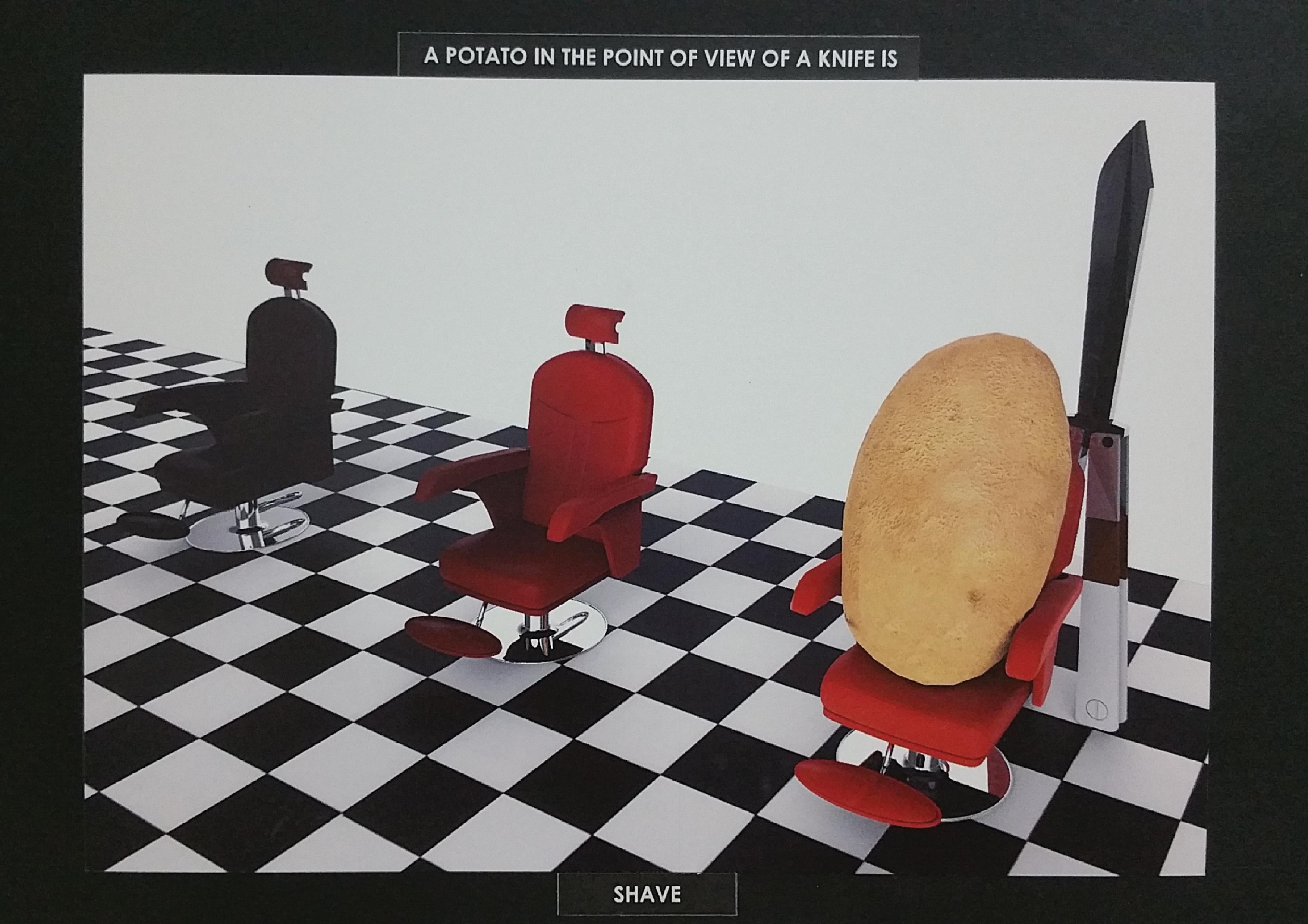
Project 2-03A potato in the point of view of a knife is shave.

We humans go to the barbers to cut our hair. So where do potatoes go to? Barbers too. This image is 3D rendered, and the potato is shown sitting on a chair, waiting for its hairdresser, the butterfly knife to attend to him.

The setup is based on a retro barber shop, with black and white tilings and red chairs. The potato again is placed at one-third of the image to make the image more interesting to look at, as well as to suggest a sense of depth in the barber shop.

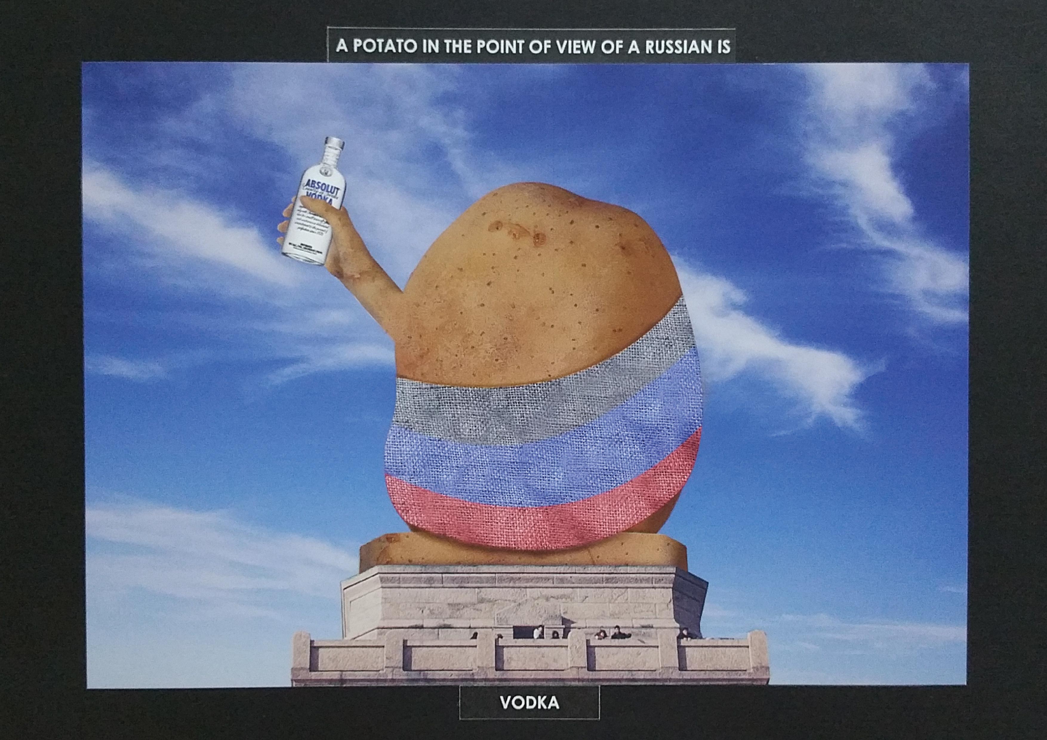
Project 2-04A potato in the point of view of Russia is vodka.

VODKA! Many of us do not know that one of vodka’s ingredient is potato. Upon knowing about this fun fact, I decided to go ahead with the idea of relating vodka and potato. After more in-depth research, I found out that Russians drink alot to keep their body warm, hence the decision to include Russia into the image.

The image above is inspired by the statue of liberty in New York, just in the context of a potato. The potato is holding a bottle of vodka, and he is clad in the potato sack which symbolises the Russia flag.

In composition context, it is a central triangular composition so as to convey the impression of the stability of the image, similar to how stable the Statue of Liberty is.

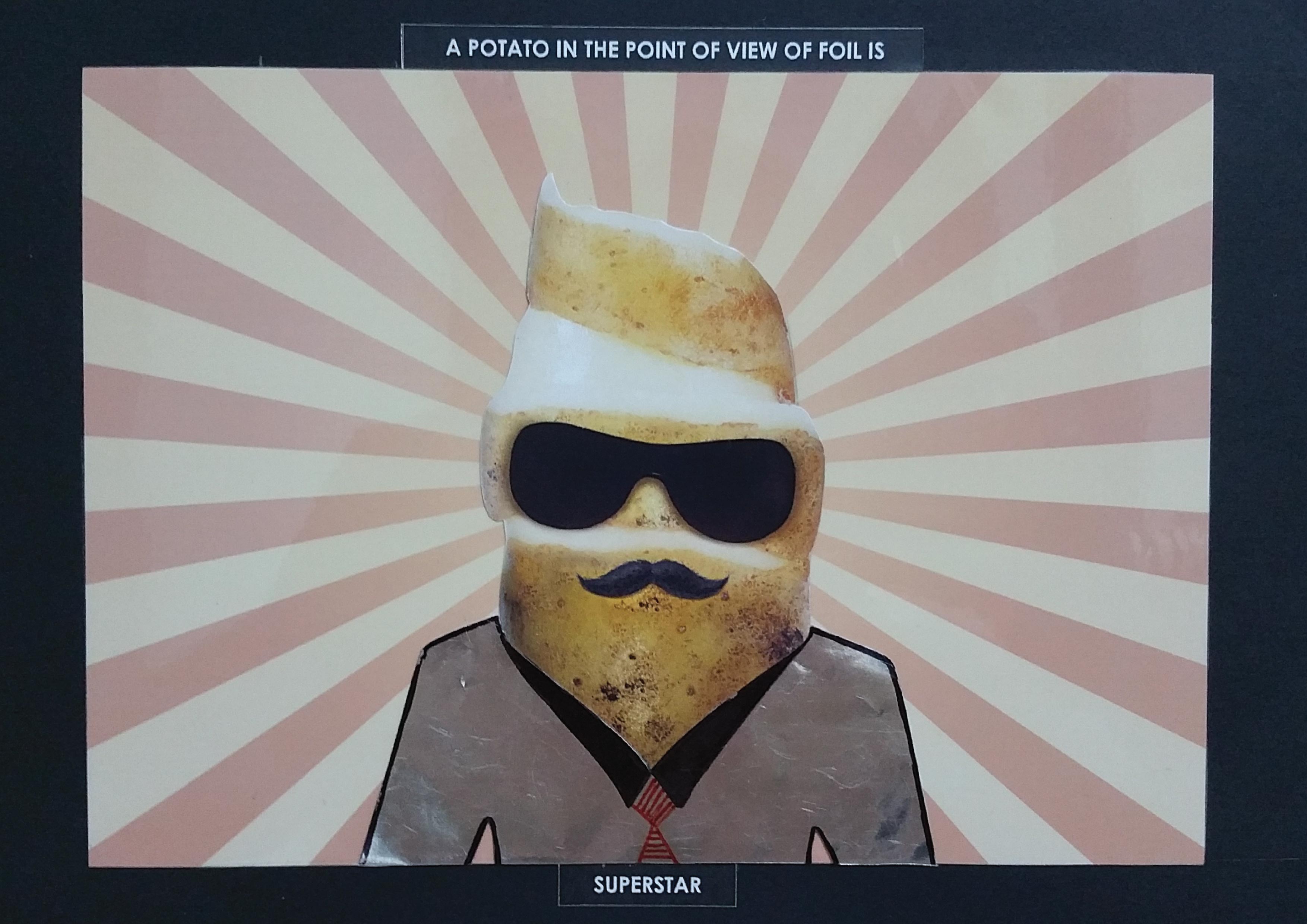
Project 2-05A potato in the point of view of foil is a superstar.

Often we consume potato chips and dispose of the packaging. In this image, it shows that actually, when the potato is inside the packaging, they are labelled as a superstar awaiting their time of glory (when we open up the packaging).

The shirt, is made with the inner side of the packaging of potato chips, to bring the image into the context of them living in the their glamourous world. The skin acts as their hair, to make them look more suave and superstar-like.

It is a central composition with radiating lights which brings the viewer’s eyes to the potato, making him the focus of the image.

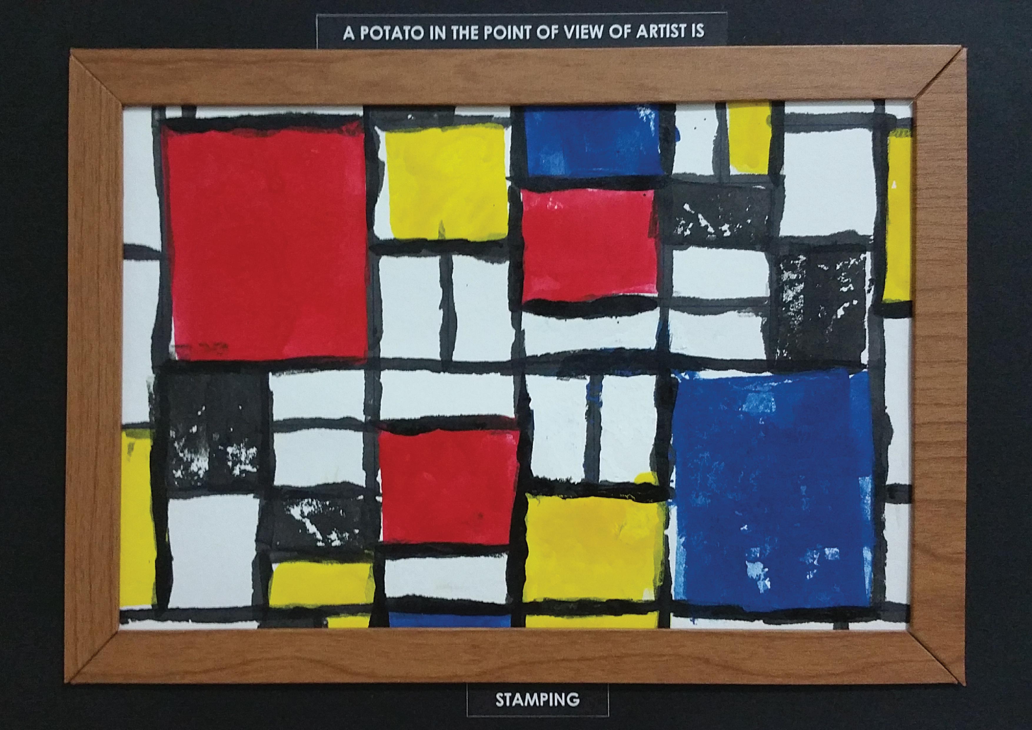
Project 2-06A potato in the point of view of an artist is stamping.

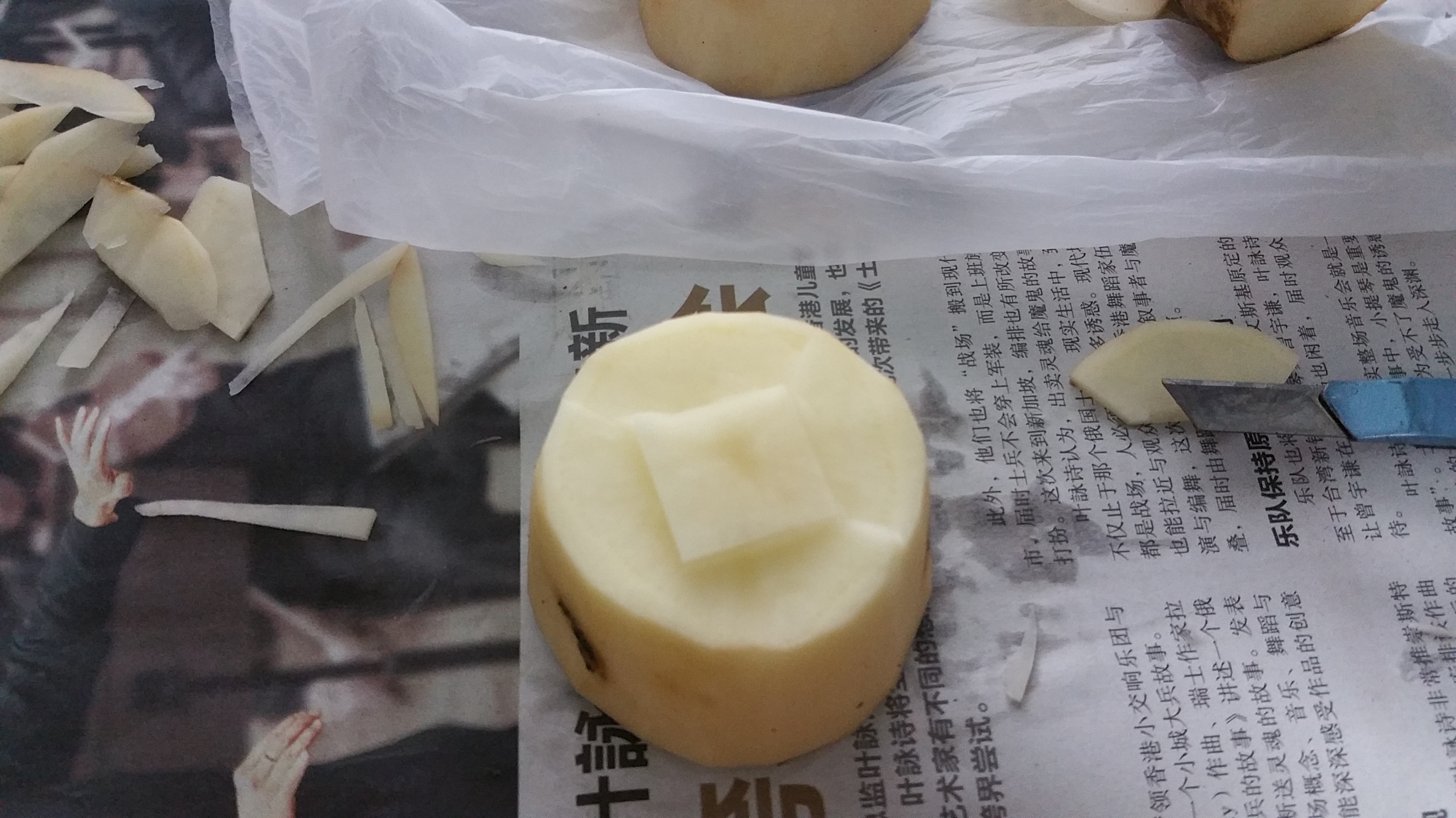
Lastly, we remember that we used to cut shapes out from raw potatoes, paint them, and then stamp them onto a blank piece of paper. This idea inspired me to make use of potatoes, to compose this image instead of including potato in it.

Inspired from Piet Mondrian’s “Composition” artwork, I took reference from his masterpiece, and recreated his work, out of stamping. The reason for choosing his work is because it comprises of the 3 primary colours, red green and blue.

Why red, green and blue? It brings us back to the basis of art, where the first few colours we interact with are these three basic colours. With the wooden frames, the whole image would simulate an artwork being framed and hung up in a museum.

When Potatoes Potate.

imgcc020

With the initial 18 ideas which I thought could be developed, I filtered them down to what seems to be more interesting to work with. As such, I started to build my final art works. There wouldn’t be much talking, so let the pictures do the talking!

20160314_225435

Cutting potatoes up into shapes just like how we used to do it when we were younger.

20160314_225423

IMG-20160314-WA0027

20160314_225428

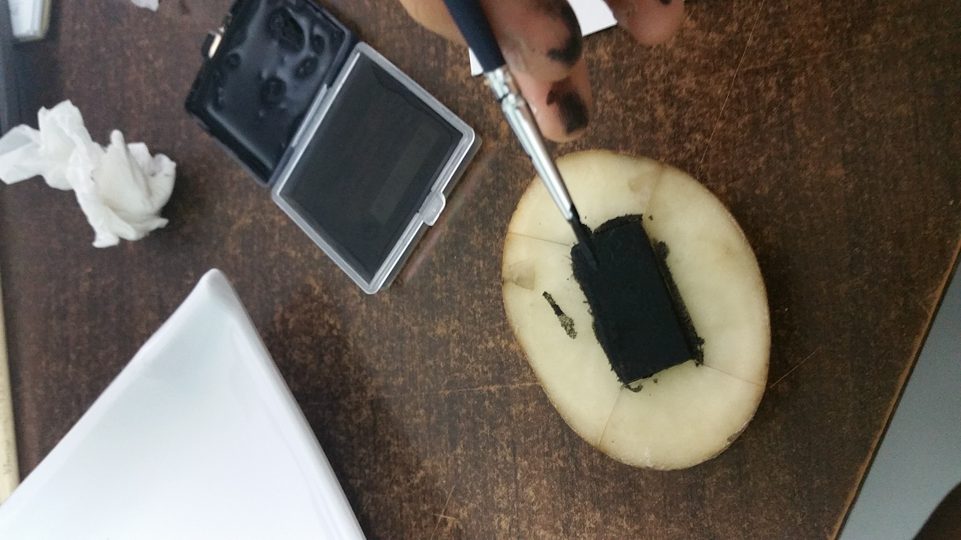
Here’s where the fun part comes in. Putting in the colours!

20160314_233458

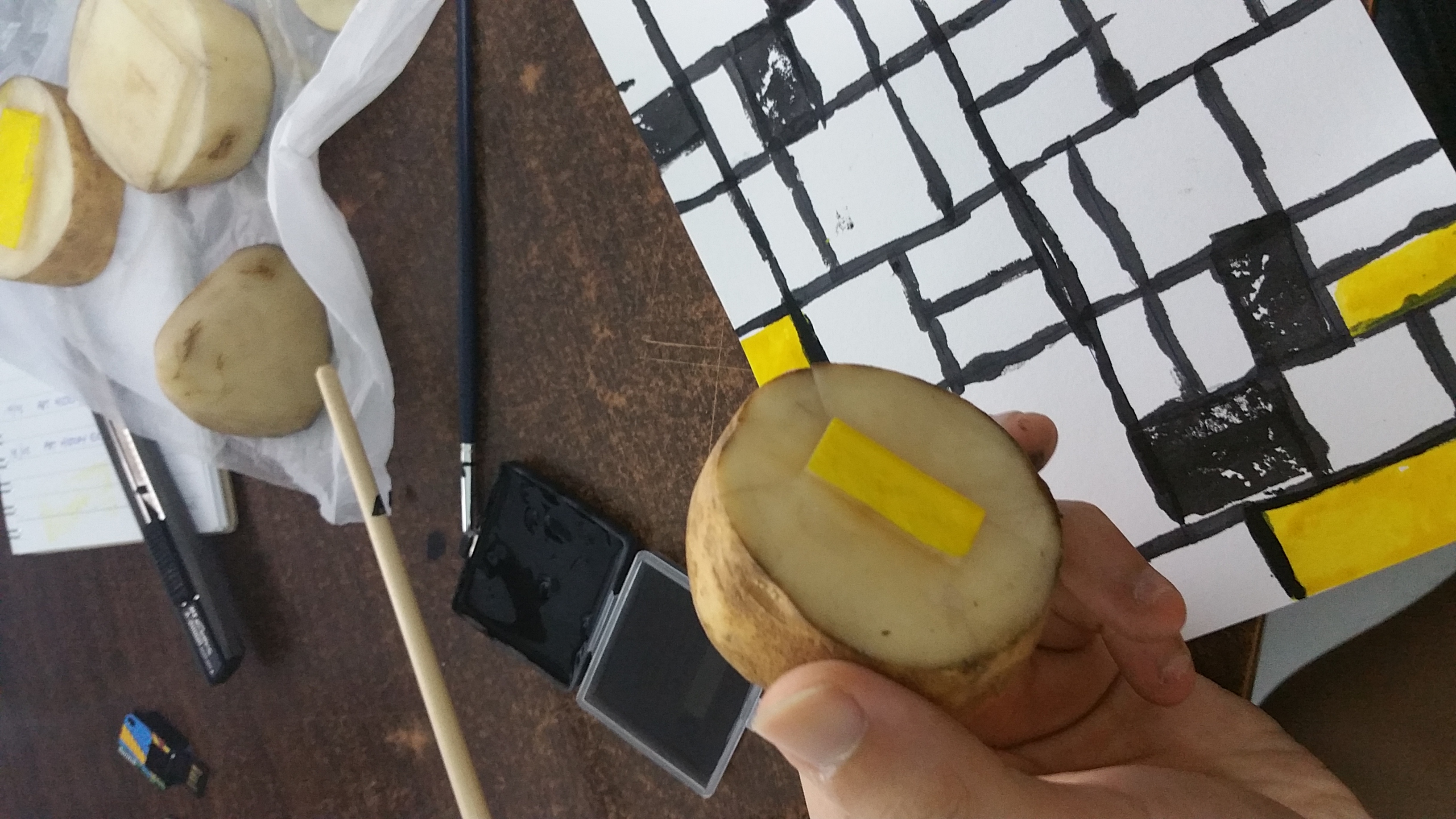
I have to admit that it wasn’t easy to actually achieve straight lines using potato slices.

20160314_234528

Putting colour onto the shapes which i cut prior to the actual painting process.

20160314_234535

TADA! Nope, this is not the final piece. This is just 10%(?) I left this to dry so that I can continue with other colours without smudging them together. So next up, making the frame!

20160229_135335

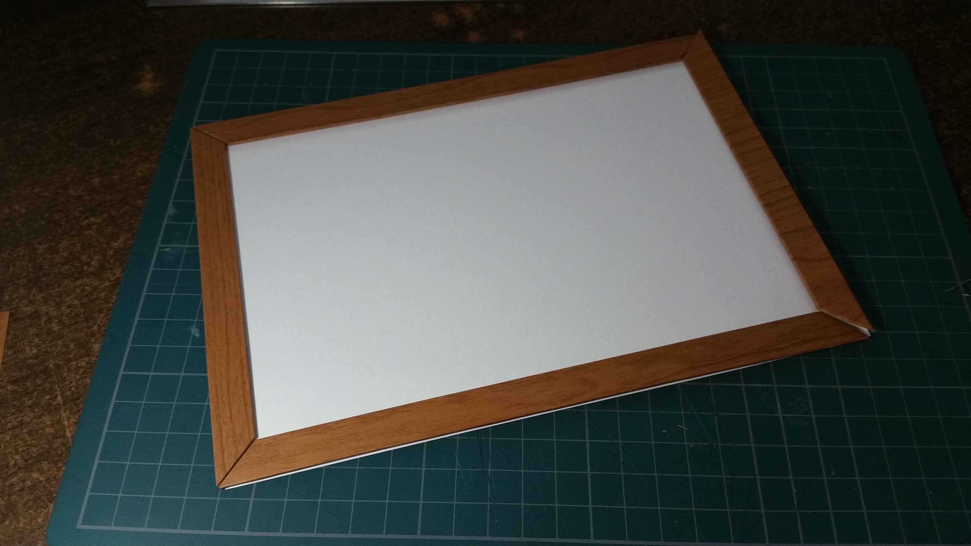
After measuring a suitable size for the ‘frame’, I proceeded to cut out 4 sides of the ‘frame’ and then used wooden laminates to wrap it, to simulate a wooden frame.

20160229_135300

20160229_135307

20160229_141624

And the ‘wooden frames’ are done! After this part, the black paint have dried already, which means I can continue putting in the other colours.

20160314_235333

20160315_003559

*inserts fast forward footage*

Alright, done with composing the artworks! As for the other 5 images, they were more or less digitally illustrated, I would reveal them in their final form in the next post. Till then!

Looking at things dffiernetly.

My name is Hong Sheng and I am done with Project 1. This new project is going to be something like, what if one day you wake up, and you find out that you have turned into something else? How would you look at everything around you? Which also means, using an object, and look at things from THEIR perspective: Point Of View.

Given this project brief, the first and only thing that came to my mind was to use potato as my subject. Yes, potato. So here are some “point of view” ideations when I first started.

img019

Once again, as always.

PROJECT ONE!
A start of a new semester, and of course, the start of a new project! Given this project brief, I found the project interesting as we are going to put our name into context of something. Having the freedom to explore ‘anything’, I was able to allow myself to go into different directions so as to come up with interesting ideas.

First off, research is the most important part of this project. With no research, there wouldn’t be inspirations or any ideas on what I wanted to do. And so, I started my research.

What is typography?

Typography is the design and use of typefaces as a means of communication. It is considered to have begun with Gutenberg and the development of movable type. But typography has its roots in handwritten letter forms. Typography encompasses everything from calligraphy through digital type and type on Web pages. It also includes type designers who create new letter forms as well as designers and calligraphers who use the letters as part of their designs.

– Typography uses typefaces and the white space around and through them to create a whole design.

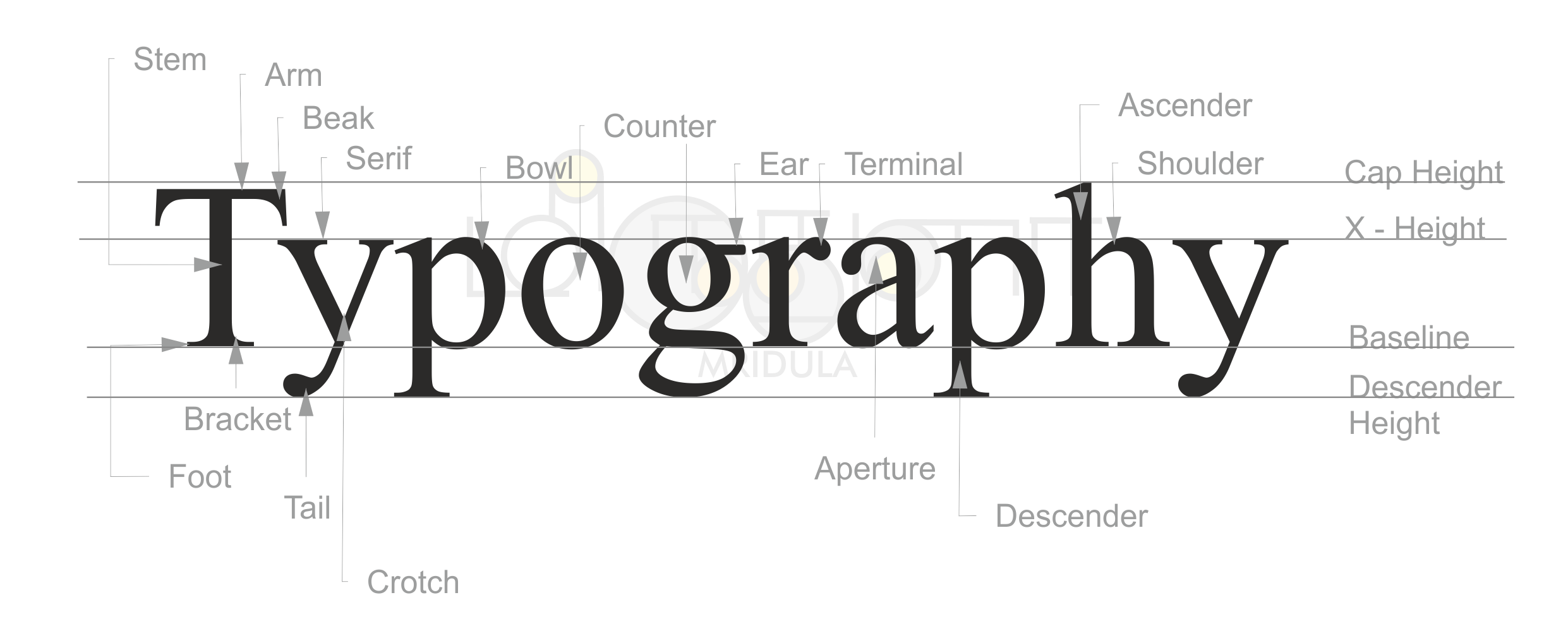
I also researched about the anatomy of a font type, as I have always been very interested in the study of a font type. There are actually different parts in a single font, as well as the spacings between the fonts, they have terms for it too! So this is an infographic on the different parts of the font.

parts-of-a-character1

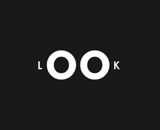
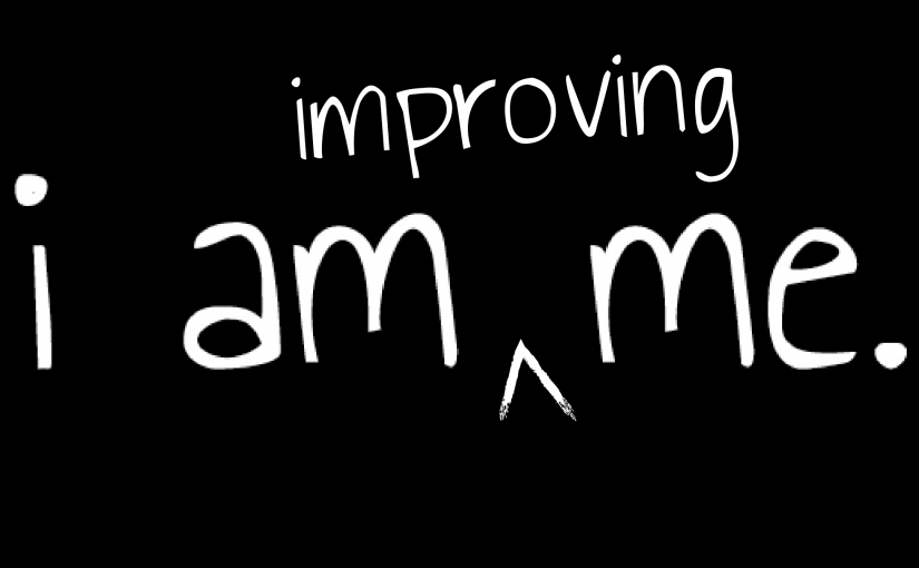
After looking up on typography design, I came across some images which would be some of my inspirations for the project. I wanted my work to be more of minimal, straight to the point, playing with negative/ positive spaces and of course, a piece of work that is visually pleasing.

Delicios-Typography-Experimentation-Franc-Navarro-1-a
2b4c8c0d3b645e5b392be79bee6cc7ee

half_m typography_logo_17 pause_m 09_typography_in_logo

After looking up the web for inspirations, I began exploring on what I could be. I gave myself room to be open to anything, so I can arrive at different interesting ideas. Eliminating and filtering out, there were several ideas that I thought could be quite interesting to go into further development. And so, sketches and ideas started to generate in the sketch book, which brings you to the Process post

Till then!


When ideas starts to get churned out.

GOOD NEWS! 4 FINAL SUBMISSIONS INSTEAD OF 6!

Having done up the research in the previous post, I went ahead with the ideation process where I filtered down my explorations to the few selections below (eliminating 2 out of the 6):

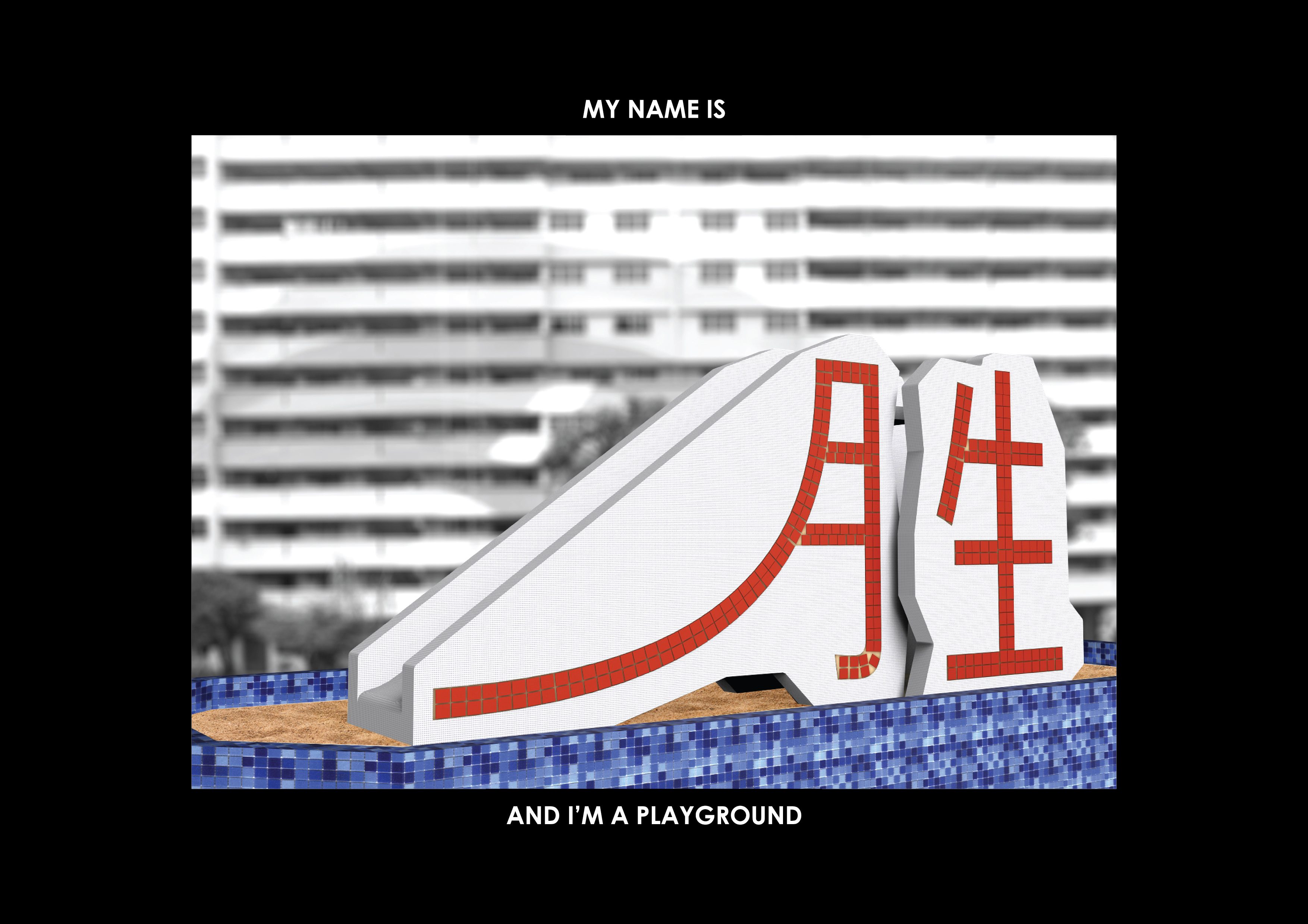
1) My name is Hong Sheng and I am a Playground
2) My name is Hong Sheng and I am a Circuit Board
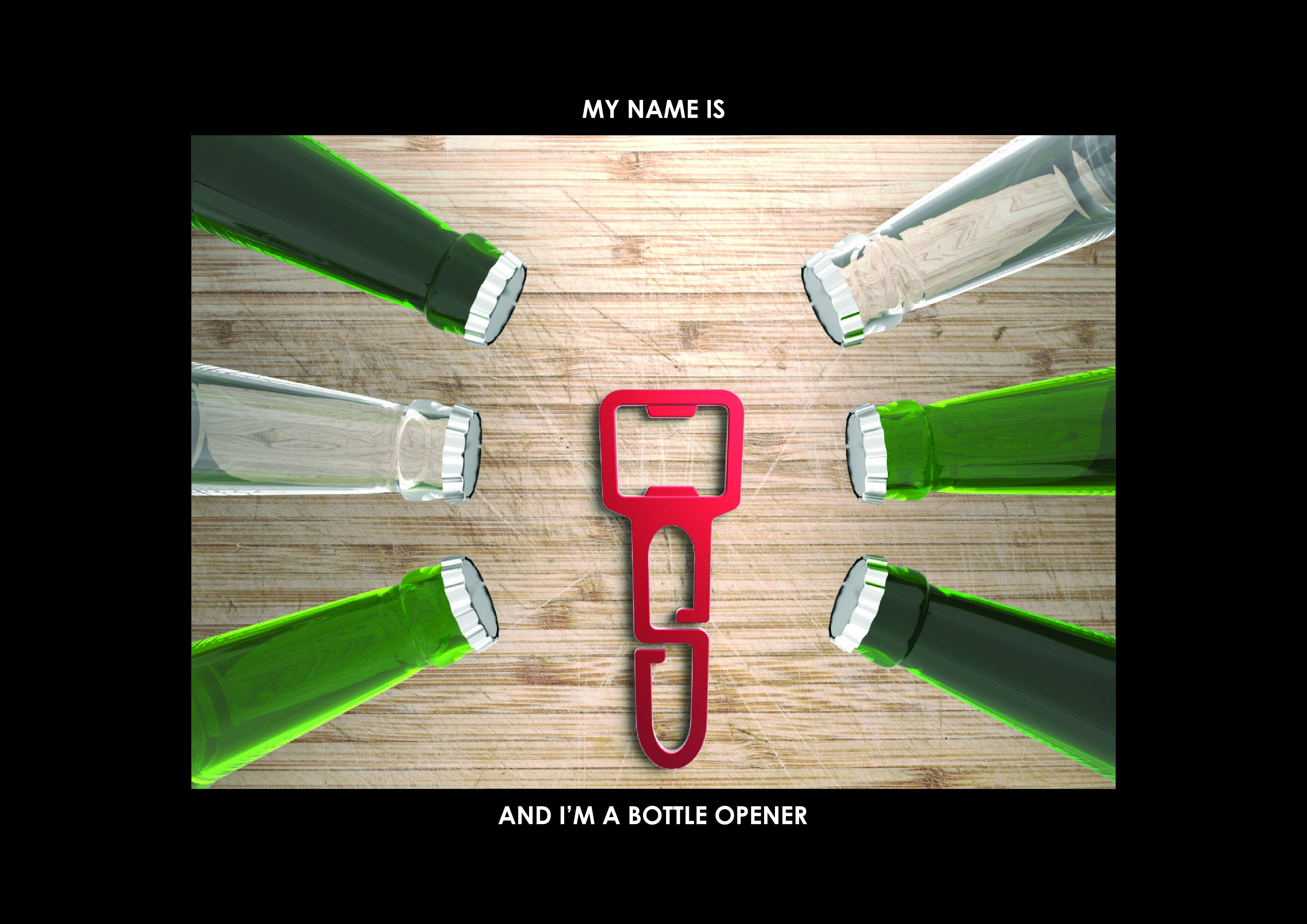
3) My name is Hong Sheng and I am Beer
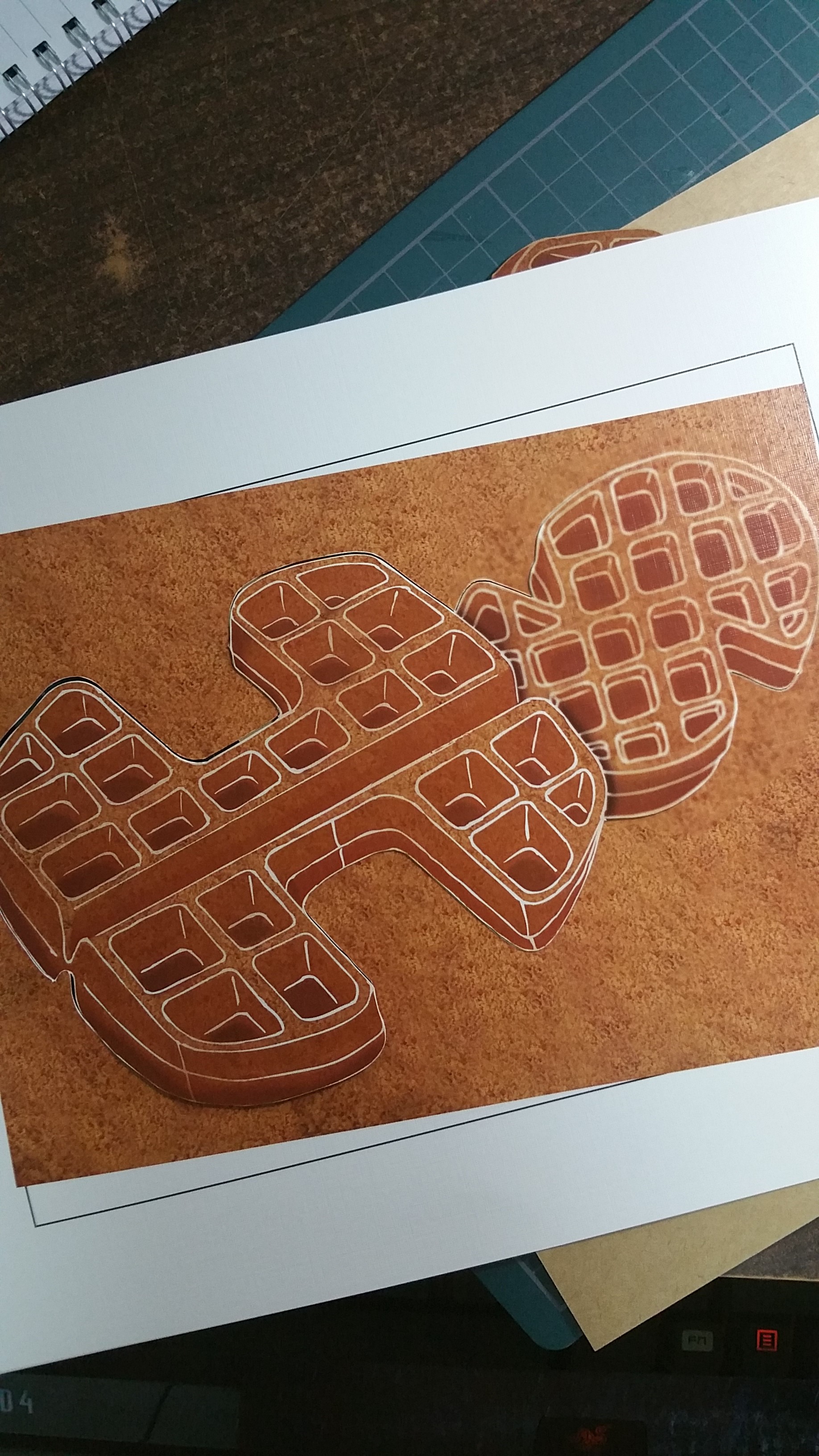
4) My name is Hong Sheng and I am a Waffle
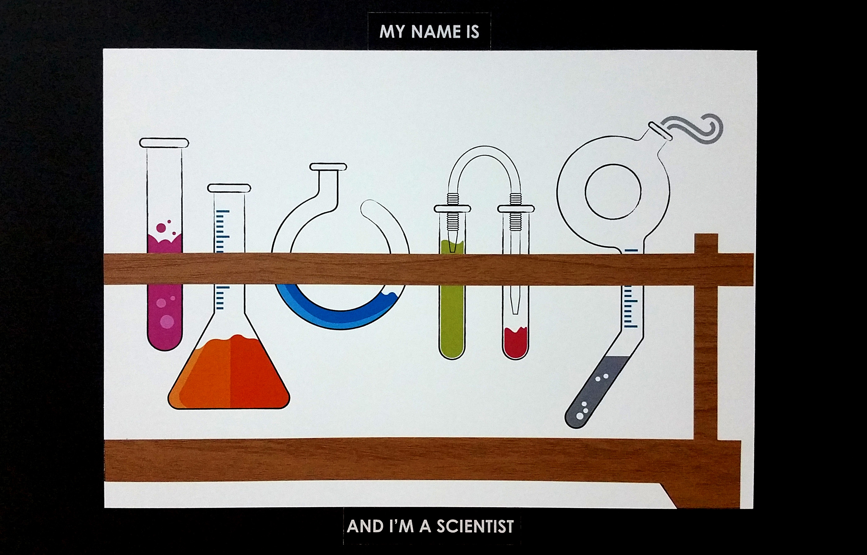
5) My name is Hong Sheng and I am a Scientist
6) My name is Hong Sheng and I am a Magnet

PLAYGROUND
CandlelightOaksPlayground1

I chose playground as one of the further developments as I found the subject itself interesting to play around with, especially the slides, and stairs leading up to the upper platform. Having chosen this subject to develop, I proceeded with the sketches to generate more ideas.

img017

Using ‘Sheng’ in my name written in Mandarin, I made use of one stroke in the character to be the slide as I found it to fit perfectly into the context. With this discovery, this shall be into one of the finals! Not this of course, the final one would be modelled out and rendered to bring out the context.


CIRCUIT BOARD


rOfduA8

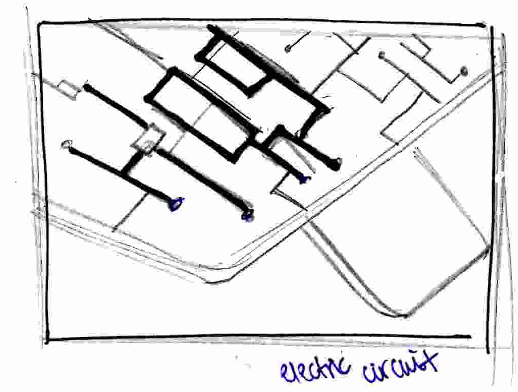
Well, as a product designer, as well as partly a geek, I chose a circuit board to represent me. Being just straight lines, I found it relatively easy to work around with. To make the final outcome more meaningful(?), I actually planned to have a piece of green acrylic mounted and have the metal circuits to be created by think stripes of tape. However, after seeing the sketch below, I believe you would understand why I did not select this to be one of the final artworks to be submitted.
img014

Here’s the reason why. After sketching out the concept, I found that it was actually quite plain looking. Even if i executed the idea with different materials, it would definitely look nice but it will not be as interesting as the others I would feel.


NEXT UP, BEER !

Beer-Bottles-with-Brand-Names1

save water, drink beer. (kidding)

Beer, being my favourite-est beverage, is also chosen to be an experimental subject for this project. After ecploring around the area of beer foam, I found that I got stuck working with beer foam. Therefore, I steered myself towards another direction without leaving the beer topic. And that is… BOTTLE OPENER! Without a bottle opener, how would one have access to beer right? So I went forth to develop the idea of ME as a bottle opener.

ss1

I realised that I could actually play with negative space in this case. The H in my name could actually be the opener, and the S could actually be the handle. Now this is interesting. While doodling on this idea, I thought to myself how awesome would it be to have a bottle opener which is inspired from my name. This also means, it’s going for the finalist selection!


Waffle

waffle

Not much of a reason why I chose waffle to be one the further developments, just that I really like waffles a lot. Bearing this favourite snack in mind, I thought that the grids could be of an interesting aspect of the waffle I could work on. Other than the repeated patterns that forms the waffle, an idea struck me while I was considering the execution of this work: materials. I decided to play around and explore different paper textures to achieve a different result, as compared to just a print. BUT! First things first, sketch it out!

20160126_172051

Using freehand sketch, I managed to get hold of the basic shape of the waffle which I wanted. After drawing it out, I proceeded to scan the sketch into the computer and make the drawing into a vector so that it was easier to work with.

Waffle

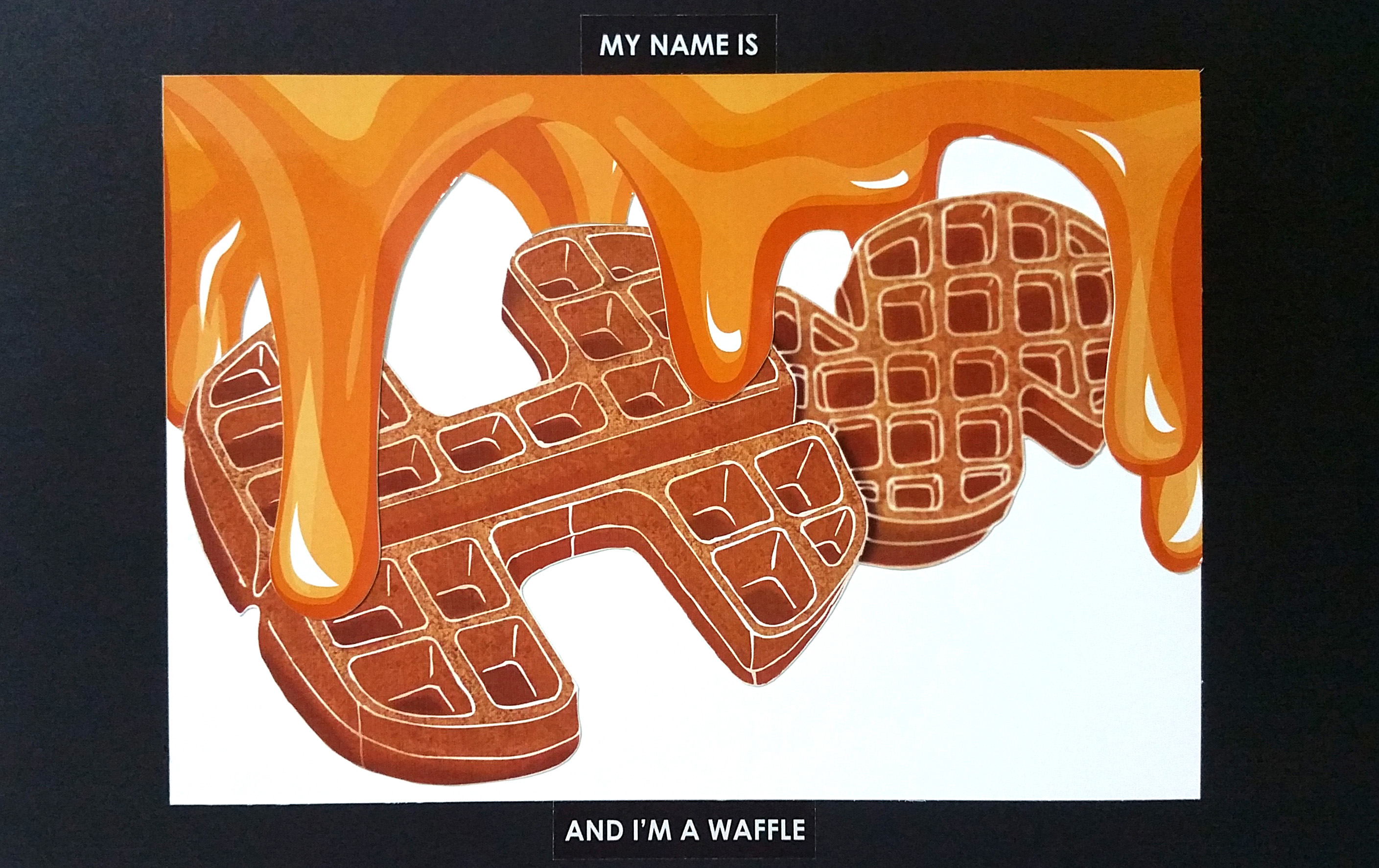
Having done so, it was time for me to add life to it, so it looks like a waffle, not just a monotone sketch. After this was done, I knew I had to add in something to put this waffle into context, say some honey?

honeyvect

In illustrator, I got hold of the vector of honey and put them at the top. The idea behind this was to show the honey flowing down the waffle which is my name. Also, to simulate the liquidity of the honey itself, I considered this to be printed on glossy paper.


Scientist

img4

Why scientist? To be honest, I was never good in my science since young. People might say, why do you still like science when you’re not good at it? Well, I dislike science, but I love LAB TIME. It was just like a playground to me. All the apparatus, tools etc. They were all very interesting to me. This was why I chose scientist as one of the shortlisted subject. Not aspiring to be a scientist, but to just enjoy playing around around with the apparatus.

img018

The initial sketch was satisfactory, forming ‘HONG’ with lab equipment, resting them on a test tube rack, where it is supposed to be. Happy with the sketch, I brought this idea further in Illustrator.

scientistpro

Using purely vectors, I wanted to keep this subject as simple as it could be lest it becomes too cluttered when I add in too much details. I wanted the focus to be on the main apparatus, not the small details. There will still be details, but they are not the main focus. However, after looking at the digital sketch, I felt that it could be pushed even further.


LAST BUT NOT LEAST, MAGNET.

800px-VFPt_cylindrical_magnets_attracting.svg

Magnets have always been a very intriguing object to me. How could a plain piece of metal be attracted to each other?! Hence, I went to look it up more in-depth in Google, and came across images like what you see above. I found these lines very interesting and got me inspired.
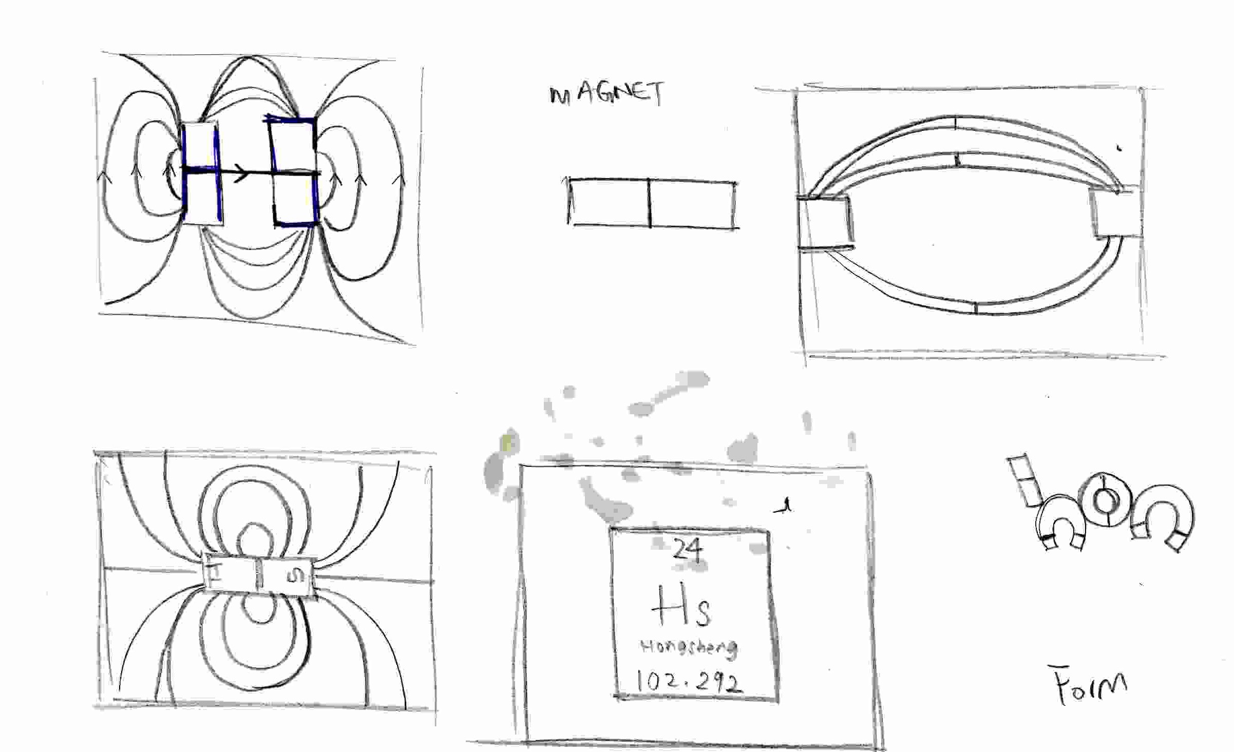
img013

Magnets have N and S ends in order for them to be attracted to the opposite side. What if the N and S ends are changes to H and S ? This is the inspiration I got from magnets. Other than being two ends of a piece of metal, could I be a magnetic field? I don’t know. I got stuck. As much as I got stuck, I did not let go of this idea as I really like it. I wanted to use real magnet to see if things could work out, but eventually it did not. Which means, MAGNETO IS OUTZ.

With these processes, I was able to decide between the 6, which 4 to select for the final submission. They are:

  1. P_ _ _ _ _
  2. S _ _ _ _ _ _
  3. W_ _ _ _ _
  4. B_ _ _ _ _


The Fantastic Four.

THIS IS WHERE.
THE FANTASTIC FOUR.
ARE CREATED.


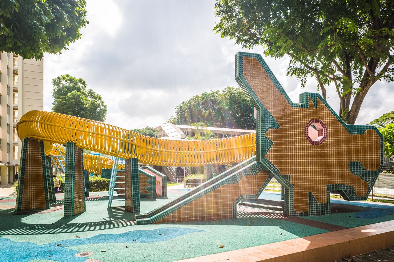
First off, inspired by the iconic dragon playground in Singapore, the first final artwork is this.

Dragon-playground
no it’s not this.

This is the one.

PLAYGROUNDPrint

Using my chinese name ‘SHENG’ in mandarin character, it is modeled out in 3D and then rendered. To further enhance this image, the small details you see that makes up the character and the border around it are actually tiles which is used in playgrounds in the past. Colours used are very friendly and it pops as there is an image of a HDB building in grayscale. I feel that this composition brings out the ‘feel’ of the past, whereby playgrounds are actually the heaven for children.


Bottle openerPrint

This, is also modeled in 3D and then rendered to a image. Composition, made up of 6 beer bottles, 3 pairs of repeated colourways. The 3 colours represent my 3 favourite breweries, Corona, Carlsberg and Heineken. They are placed in such a way where all the bottle points to the main focus, which is ‘me’, a bottle opener, also rendered in red.


Scientist20160216_014936

After printing out the vector image of the scientist that forms my name, I felt that something was still missing. *YES THE TEST TUBE RACK IS MADE OF WOOD!* Realising this ‘further enhancement’, I gave the test tube rack its ‘skin’ which is a artificial wooden laminate. Upon adding the wooden laminate to simulate the test tube rack, I felt that it complete the art work which filled up the ’emptiness’ I felt while executing it.


AND THE FINALE.

Before the finale, some behind-the-scenes on how I put this piece of work together after printing.

20160216_004830

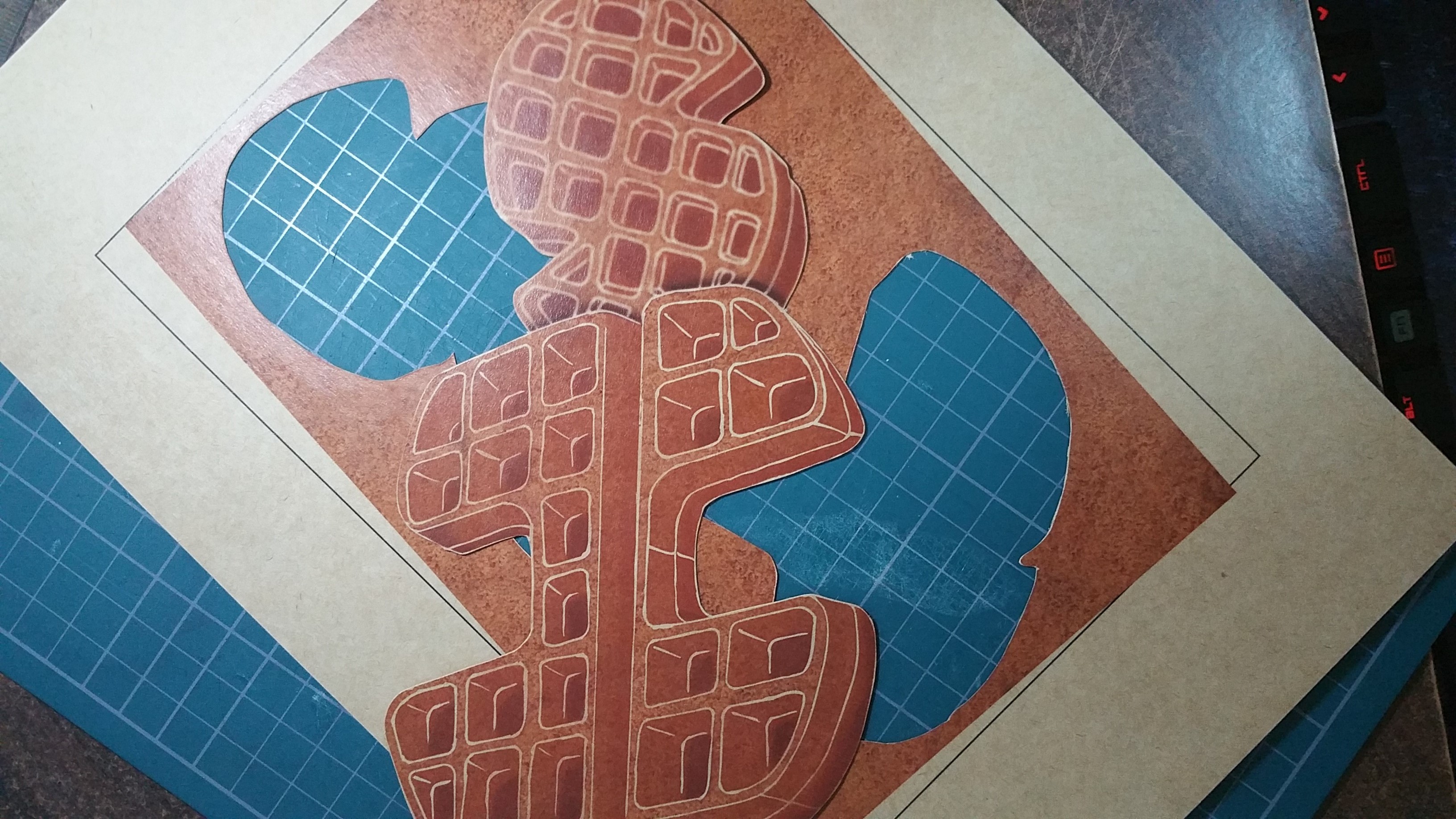
Printed out on textured paper, it did give the waffle a contextual sense of touch. It looked more like a waffle as compared to printing it on normal paper.20160216_004836

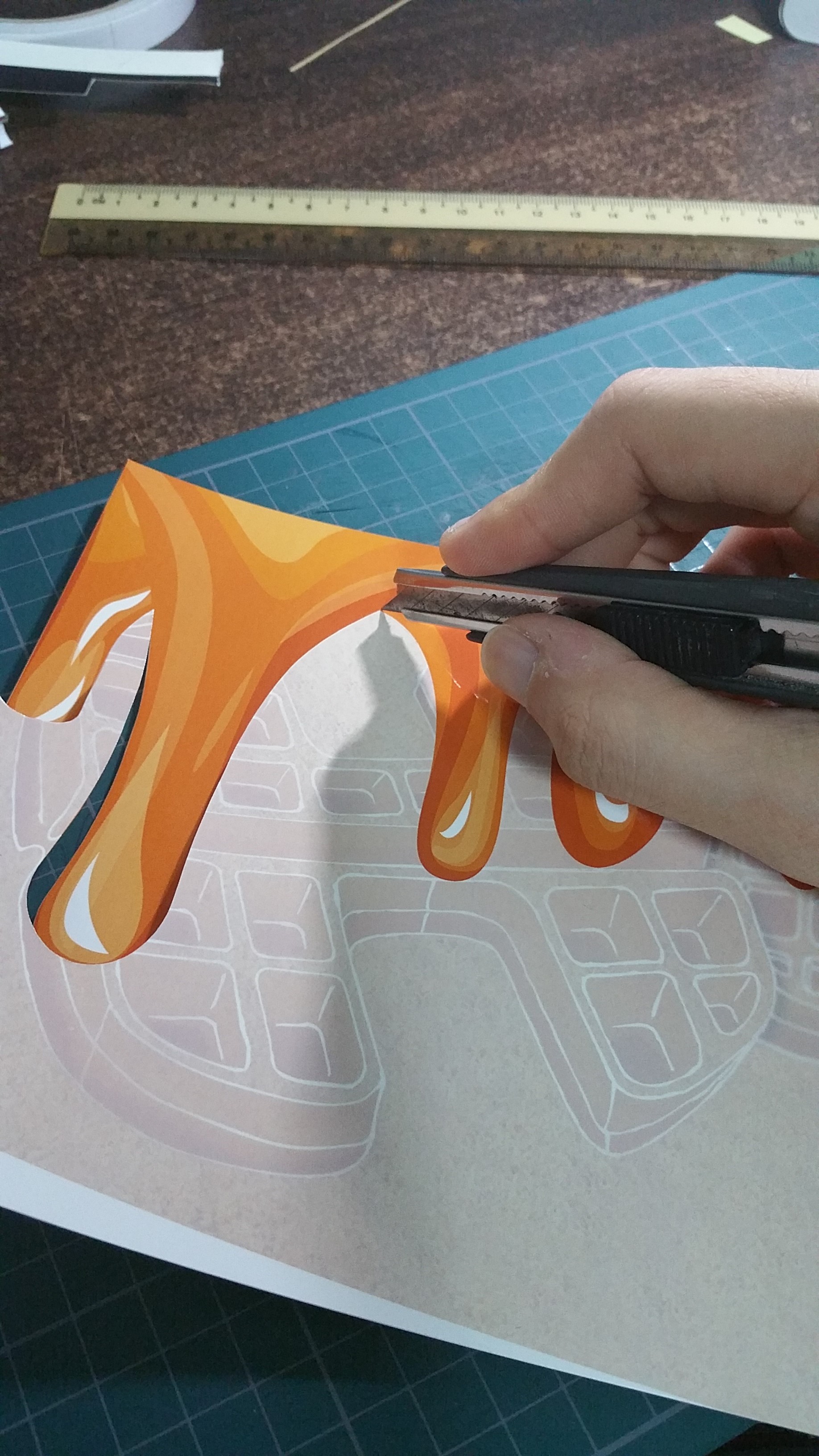
Cutting them out was not an easy job as the edges had to be relatively smooth, else it would not look as ‘crispy’ as a fresh waffle would. Next up would be the ‘glossy’ honey I mentioned earlier.20160216_005909

One could not really tell from the photo, but it is printed on glossy paper and then laminated with a glossy finish. The finish was exactly what I wanted to achieve.

AND TADAAAAA.

WAFFLE!20160216_014847

This final piece is my favourite one, not that I am biased against waffles, but I really like how the different textured paper brought about a sense of touch and sight. Other than physical aspects, I felt that the colours in this artwork worked out well, simple yet straight to the point.

And this sums up my first project of 2016! Till next project!

Cheers!


Chapter 1 : Fallen

Kira and Blazino goes into an empty room to recite the charm. Upon reciting it, the charm is torn into half. Right after the charm is being torn into half, immense pain starts to overwhelm their consciousness. The pain doesn’t seems like its going away, instead it feels increasingly excruciating.

With the pain in their head intensifying every second, it feels like the ground is starting to crumble into where it seems like a blackhole. Grasping onto their heads, Kira and Blazino lose their balances and collapse,  putting them into a comatose.


BLAZINO
“Gosh, my head hurts. What just happened… ” Blazino supports himself up from what seems like a long fall. Rubbing his eyes to have a clearer picture, he was taken aback by the darkness he was swallowed into. With the only source of light being the blood moon, the abandoned mansion gives off an uninviting aura. “Kira! Kira!” Blazino calls out to Kira, but she is nowhere to be seen.


KIRA
Kira’s eyes shot open from the impact of the pounding in her throat, causing her to hyperventilate as she woke up drenched in a cold sweat. Mustering all her energy, she push herself up. Standing alone in the middle of a room, Kira starts to shake in fear and yell for help.
” Blazino! Where are you? “,  cried Kira, but to no avail as darkness swallowed her words.


With the mansion windows sealed shut, Kira and Blazino are trapped separately in one of the rooms.


Aim:
Both of you are stuck in separate rooms. Firstly, each of you have to get out of the room, so as to find each other and eventually escape the abandoned mansion together.

Kira: The door is sealed tight. You look around to find other means of escape and saw that a vent which you cannot reach with your height. You have to leave the room so as to search for Blazino.
(You are allowed to use your inventory items.)

Blazino: You are facing a locked door. You attempt to forcefully open it, and to your surprise, it feels shaky. You have to leave the room so as to search for Kira.
(You are allowed to use your inventory items.)


Fallen : Continued

KIRA:
As she line up the books into a stable stack, Kira thought that she would definitely make it out there easily.  Kira tip-toes and reaches out her hand for the vents. Upon having a firm grip with both hand on the edge of the vent, one of the books starts to feel unstable, as if the stack of books might collapse any time. Not wanting to stay there a single second longer, Kira gathered all her energy and jumped to get her elbows onto the edge of the vent, securing her balance. She looked back onto the ground and saw the books collapse into a mess. Having no time to waste, Kira looked back up ahead and all she saw was a tunnel of darkness. Out of a sudden, a loud thud traveled down the vents, sending chills down her spine, not knowing what caused the thud.

BLAZINO :
With merely a few scratches on Blazino’s multipurpose knife, he managed to break open the door and exit the room. The hallway seems to be misty, with very low visibility. Blazino could still make sight of his surroundings, even though he thought that it was complete darkness. Blazino then was reminded that Kira might be in trouble. Being worried about her, Blazino got rid of his fears immediately and started his search for Kira. Pacing down the hallway as quickly as he could, Blazino went past a room and caught a glimpse of a figure whom looked like Kira. Blazino stopped at an instance.

“Kira, is that you?”, Blazino called out with a heart full of hope.

At that exact moment, someone tapped on Blazino’s shoulder. Thrilled, Blazino turned towards the direction where he was tapped.


LORE II : Housing

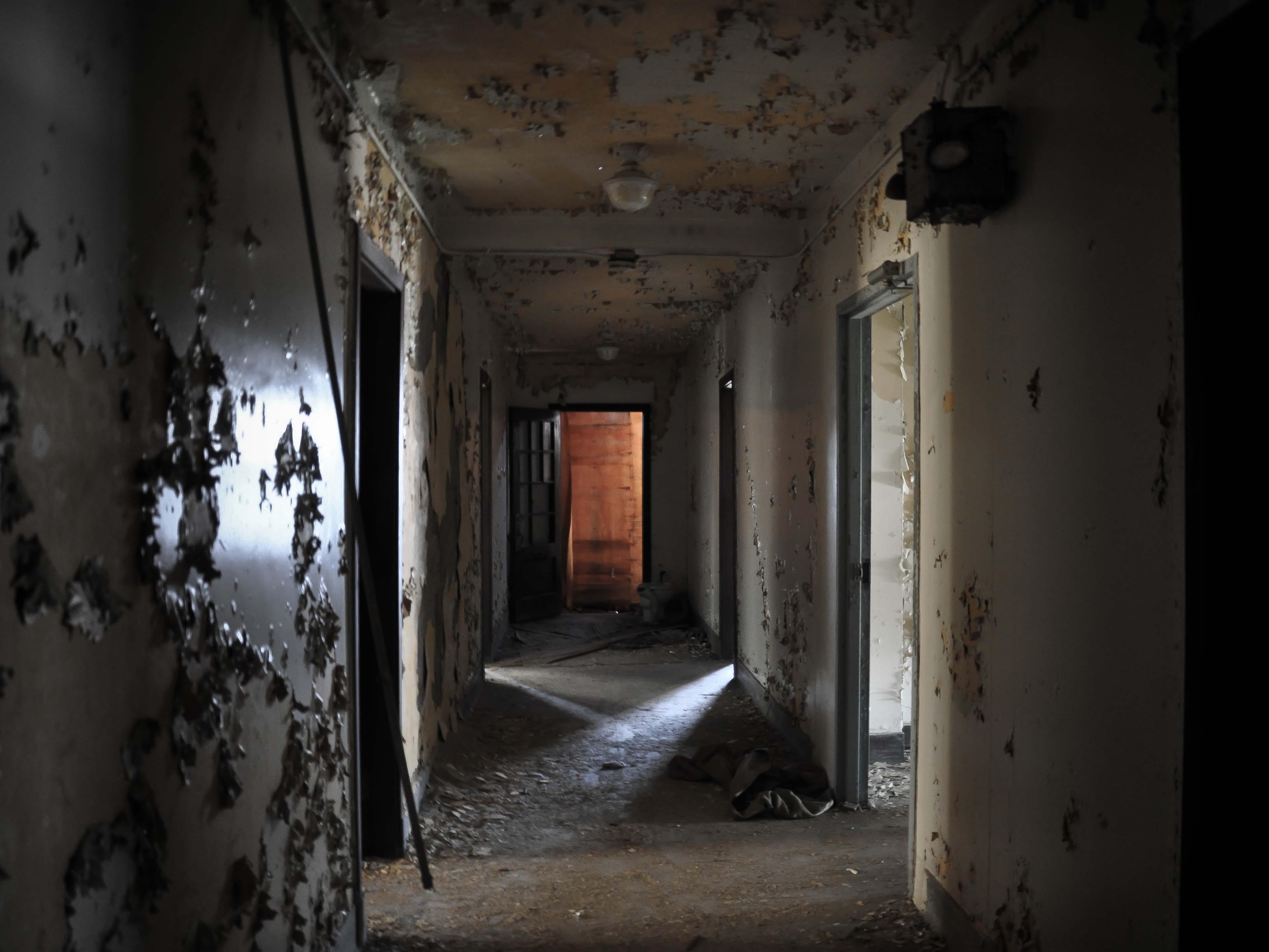
americas-12-scariest-real-life-haunted-houses

Fallen
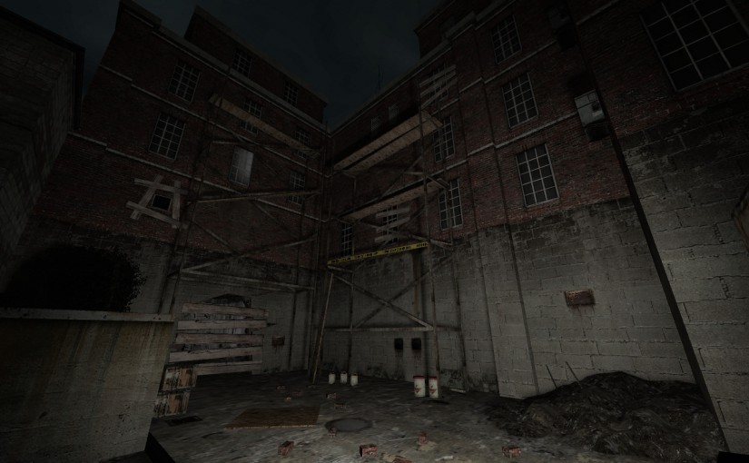
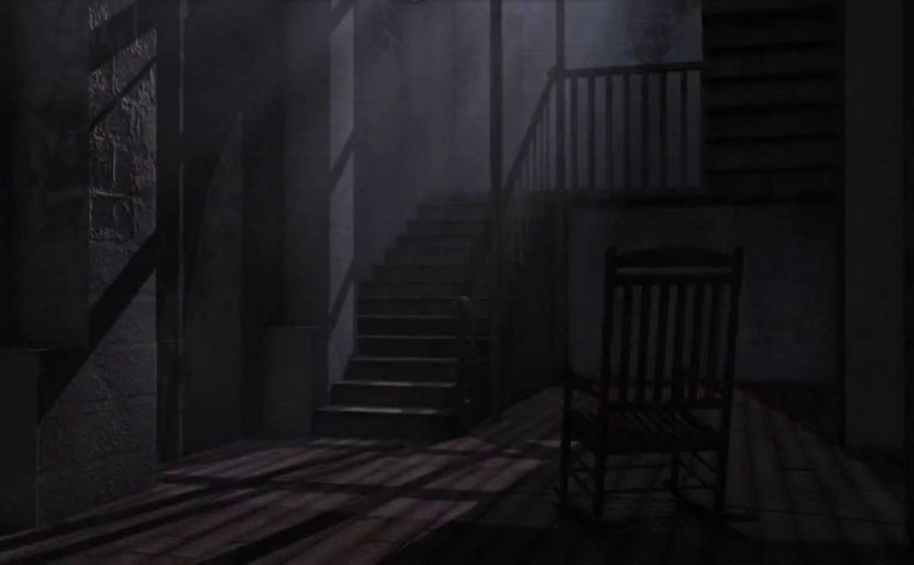
Cracking sounds coming from underneath, feeling a sense of instability. The cold wind howl within the compact room, sending chills all over. With the air filled with an unpleasant smell that does not seem to go away, making it unbearable and difficult to breathe. Within the mist of darkness where you could barely see, lies a maze that is beyond imagination. A place filled with lost souls, whom fed on those who are weak in their mind.

LORE : Connected Souls

1-HORROR-STORIES-FIRST-DAY-OF-SCHOOL

BACKGROUND STORY
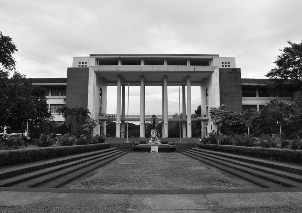
Back in 1979, Kollins University was known for its famous curse on media. It is known to signify a friendship that would last forever. However, rumours have been going around stating that whoever attempts the charm have gone missing and never returned. Sightings and voices related to the charm were also reported almost every year. Almost no one dared to question the disappearance of these people, in fear of being a victim themselves.


CHARACTERS
Both of you were inseparable buddies ever since day one of college. In 1996, the day before your graduation, both of you understand that there will be going separation. However, not wanting your friendship to distant after graduation, hence agreed on trying out the mystical charm which has been done by many.

You are equipped with 5 inventory slots excluding 1/2 the charm. Inventory items are the things you bring to college.

*Example: Laptop, hand-phone, writing materials, books, lighter (if your character even smokes)

*Notes:
– You have limited resources; electronic devices will run out of battery, you might even run out of ink/pencil lead, etc.
– You are also allowed to use your inventory items as weapons.
– You are able to pick up / drop items along the way, including your charm.

State in the comments:
1. Your character name
2. Gender
3. You may describe your personality
4. Your attribute points (Strength, Agility, Intelligence)
5. Your inventories


Upon having your attribute points and characters, you’ll activate the charm and the story begins.